
There’s a lot to cover on Wednesdays. We should know, as collectively, we read an insane amount of comics. Even with a large review staff, it’s hard to get to everything. With that in mind, we’re back with Wrapping Wednesday, where we look at some of the books we missed in what was another great week of comics.
Let’s get this party started.
Written and illustrated by Jason Howard
Lettered by Fonografiks
Reviewed by Luke Cornelius
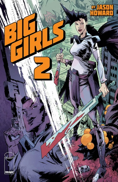
“Big Girls” #2 launches us right into the action, with Ember fighting against a trio of Jacks and becoming overwhelmed due to her hesitation to kill one of them. Thankfully, Apex and Devon come to her assistance and together they take down all three. By throwing us straight back into the action, Howard opens strongly with some great visuals, such as Devon leaping off a building to slice a Jack in half, but then slows the pace down for the rest of the issue, exploring the moral greys of the status quo.
After seeing the execution of Alan firsthand, Ember is still unsettled by her role which is furthered by the possibility of intelligence and humanity within the Jacks. Even though the series is only two issues in, Howard has made the morality of the Preserve feel complex by putting the audience alongside Ember as she questions her position in the operation. By focusing “Big Girls” #2 on the moral complexities, and the potential for less animalistic Jacks, Howard makes the book an interesting read, while raising further questions about the Mistake and the megaorganisims. However, while the subjects of the conversations are interesting, some of the dialogue feels stilted and the final scene between Martin and Gulliver feels disjointed due to it being too busy. Howard introduces an area far outside of the Preserve and some of the characters who inhabit it which disrupts the conversation, making the final page reveal feel underwhelming.
Howard’s artwork throughout the issue is fluid and dynamic which makes the opening action sequence feel energetic whilst being easy to follow. There’s a strong sense of surrealism in the sequence, where, for a moment, you forget the scale of the Big Girls and the Jacks as they fight, only to notice the buildings barely reaching their knees afterward. It gives the issue balance by maintaining a sense of fun before dealing with its complex moral themes. The colorwork in the opening sequence reflects this too, with Howard attributing the fight with pulsing colors from panel to panel, before fading to muted grey and blue tones, giving a calmer tone to the issue.
Overall, “Big Girls” #2 is an interesting second outing for the series that builds on its moral complexities, with Howard providing strong visuals to support it, although its final scene feels disjointed and closes the issue in an underwhelming fashion.
Final Verdict: 6.9 – “Big Girls” #2 further underpins the characters with moral complexity but is weakened by its stilted dialogue and disjointed final scene.

Written by Tini Howard
Illustrated by Marcus To
Colored by Erick Arciniega
Lettered by VC’s Ariana Maher
Reviewed by Joe Skonce
For the most part, the books of ‘Dawn of X’ have done a good job at being accommodating for people who haven’t been faithful readers of the mutant world of the Marvel Universe. Sure some stories are enhanced by being a longtime fan or reading older runs, Kate Pryde and Emma Frost’s relationship is a big one, but at no point does it ever feel like you have to do homework to enjoy the world of Krakoa. This is not the case with “Excalibur” #12, a comic with a large cast of characters that had not been introduced in the book before this point, anchoring a larger plan that is difficult to follow.
Much of “Excalibur” #12 focuses on the Externals, a group of ancient and immortal mutants who are a key part of the mutant formerly known as Apocalypse’s plan for Otherworld. The problem is that these characters just show up with no introduction and are treated with a certain level of familiarity. While it’s largely in service of Apocalypse doing an ominous monologue about their squandered gift of immortality, it was sometimes difficult to follow what was going on. While Tini Howard does an excellent job of writing Apocalypse, giving his dialogue a growing intensity as the issue progresses, it didn’t do a great job of explaining just what was happening. It seems that his purpose was twofold, creating a powerful gate to the otherworld and prove to his coven the power of immortality on unlocking your true potential, but this wasn’t entirely clear on the first pass.
Continued belowYet, while the story wasn’t entirely clear, the art made “Excalibur” #12 an exciting read. Marcus To does a good job of creating dynamic setpieces, best represented in the sequence where Richtor unleashes his true power. The rage that builds over the pages culminating in a beautiful and destructive pyre is truly stunning, with Erick Arciniega’s coloring showing the raw energy Richtor can control. In general, too, the fantasy elements of “Excalibur” continue to be a delight. Every superhero should have at least one chance to wear fantasy garb. The art certainly enhanced the issue overall, even if the story was confusing at times.
6.5 – While the story of “Excalibur” #12 is not entirely clear, the art creates an engaging story.

Written by Greg Pak
Illustrated by Daniel Bayliss
Colored by Francesco Segala
Lettered by Jim Campbell
Reviewed by Jim Malakwen
After the last issue’s jaw-dropping revelation that Mal is actually the notorious Bandit King, “Firefly” #20 delivers yet another exciting, action-packed chapter that raises the stakes for the intrepid Serenity crew.
As always, Greg Pak’s writing captures the tone and wit of the much-beloved, yet unfairly canceled series. Longtime fans will delight at the recognizable character interactions between the likes of Kaylee, Jayne, and the rest. Pak’s understanding of Whedonesque dialogue really makes the story come to vivid life.
“Firefly” #20 also sees some changes in the artwork. Daniel Bayliss replaces Lalit Kumar Sharma who penciled the previous issues in the current story arc. While the latter did a commendable job, particularly in how he rendered action scenes, Daniel’s illustrations seem more suited to the material. Characters are often depicted in wide group shots that adequately reveal the varied alien planets. Also, he rarely uses a close up on his panels, but when he does, he successfully renders the required emotion of the characters. Additionally, his panel arrangement is simple yet dynamic, and he uses splash pages sparingly.
Colorist Francesco Segala’s vivid hues complement the artwork wonderfully. Especially in the action sequences. As expected from a Space Western, there are quite a number of heists and chase sequences filled with gunfire and explosions. The use of orange and yellow in these scenes plus the cooler greens and blues in calmer moments really stands out.
The story was well-paced and promises more conflict in subsequent issues. While Mal and his crew are playing a dangerous game, their opponents are getting wise to their act and biding their time before the final confrontation. Time will tell what lies in store for Mal and his friends.
Final Verdict: 7.9 – “Firefly” #20 is a fine installment that sets up the inevitable conflict between Mal and Blue Sun.

Written by Mike Mignola and Steve Mannion
Illustrated by Mike Mignola and Steve Mannion
Colored by Dave Stewart
Lettered by Steve Mannion
Reviewed by Ryan Fitzmartin
When it comes to pulp action, it doesn’t get much better than Hellboy bashing Nazis. Big Red is long dead in the main Mignolaverse continuity, but here we get a fun, old school one-off featuring Steve Mannion’s own pulpy hero, Fearless Dawn. The comic is short, snappy, and reminded me of the old school Hellboy team-ups. An interdimensional portal brings the two heroes together, and they fight Nazis. It’s a flimsy plot, but the perfectly simple kind that serves for a team-up one-off like this. There’s no need for any over-complication.
The largest delight here is having Mignola draw Hellboy again. He provides a few pages as a bookend, while Mannion covers the majority of the book. We’ve not had Mignola Hellboy art in over a year though, and the few pages provided here are a reminder of what a rare pleasure it is. Mignola’s work is so distinctive and haunting, he’s truly in a league of his own. His longtime colorist Dave Stewart returns here, and Stewart’s coloring of Hellboy is almost as iconic as Mignola’s lines. Mannion is no lightweight, and his art is stylish and funky, reminding me somewhat of Richard Corben’s work on Hellboy.
Fearless Dawn is a neat character, with style and spunk. Her energy meshes well with Hellboy here, she balances his deadpan vibe with a slightly more comedic and zany bent. Hellboy fans will surely be pleased with any chance to see Mignola drawing his signature character. This comic will easily be a must-have for dedicated Hellboy fans and serve as a bridge to new fans of Fearless Dawn.
Continued belowFinal Verdict: 8.7 – A worthy one-shot featuring two creators displaying the uniqueness of their characters.
Written and Illustrated by Andrew MacLean
Colored by Jordie Bellaire
Reviewed by Derek Uibelhoer
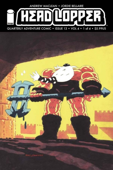
“Head Lopper” #13 puts the reader in the middle of the action as we nervously follow Norgal the ‘Head Lopper’ on a quest to restore a blocked waterway in a dark cave. The action is tense, and the mostly wordless panels are moved along quickly by loud sound effects; the whole ordeal feels like an epic boss battle from Zelda, and sure enough, is closed out with a triumphant award ceremony held by a noble fish-person atop a realm that looks uncannily similar to that of Zora’s Domain! It’s nostalgia at its best here as MacLean proves to be a master at mixing up elements of old to make something wholly new. “Head Lopper” #13 makes quick work of drawing us in–as well as filling us in with a nifty prologue and map!–before setting up the larger plot of this fourth volume only to have it diverted by, you guessed it, a new quest! Because let’s face it, the coin is always running low, and who can resist a call to adventure!
Andrew MacLean has been one of the hardest working creators in comics today. I say this because there is a very short list of authors who write and draw their own work, an ambitious task that is undoubtedly time-consuming, and MacLean is not only one of them, but arguably one of the best of them. By blending the rigid panel layout, hand-lettered sound effects, and highly stylized shadowy figures of Mignola’s “Hellboy” with the legible linework of Hergé’s “Tintin” and the childish whim of Saturday morning cartoons, MacLean has managed to carve out a visual style that is uniquely his own. The dialog and characters in “Head Lopper” are balanced with the right amount of humor and stoicism, while MacLean’s exposition firmly roots the reader in epic fantasy. He is joined this issue by the Eisner award-winning colorist, Jordie Bellaire, whose colors have carried a continuity since the second arc and continue to add a new level of depth to each page of MacLean’s linework. Bellaire’s cool palettes capture the dread of shadowy cities and stealth missions, while bright accents of yellow and flashes of pink help shock the reader and heighten the action in select sequences.
To sum it up, Andrew MacLean’s quarterly adventure comic is back, and it has never looked better! From the hand-painted cover which has the look and feels of an old school cartoon title card to the dark inky pages of finely hatched black lines which are brought further to life by a unique palette of moody blues, purples, and pinks, this book is a treasure to behold. With over 40 pages of gorgeous art, action, and good old fashion lore, “Head Lopper” #13 more than lives up to its heightened price tag, and is the perfect jumping-on point to a series that is always worth the wait.
Final Verdict: 8.5 – “Head Lopper” #13 stands out on the shelves as being one of very few quarterly comics that is well worth its price of entry; it is painstakingly written and drawn by Andrew Maclean, and colored beautifully by one of the industry’s best, Jordie Bellaire. If you are a fan of old school RPG’s, or ‘Adult Swim’ TV series like “Samurai Jack”, do yourself a favor and jump on board the new arc of this series.

Written by Max Bemis
Illustrated by Eryk Donovan
Colored by Cris Peter
Lettered by Taylor Esposito
Reviewed by Christa Harader
“Heavy” #1 is a black-humored jaunt into a particular kind of Purgatory – the kind that involves shooting a lot of alternate reality jerks in the face so history can preserve whatever goodness it’s got. Bill’s racking up the goodwill points until he can be reunited with his wife, but his new partner might throw a wrench in everything.
Bemis hits the right tone with the dialogue, and while there’s too much of it for Donovan’s small-paneled layouts at times, the script is still tight enough that most of the jokes land. Donovan’s style is cartoonish enough to add a lot of interest to what would otherwise be a needlessly gritty visual, and there’s some intricacy here worth poring over. Peter’s palette goes for some Technicolor rainbows that liven up the book and reinforce Bemis’s wryness. The blood’s often got just a touch of pink to it, as well, which helps up the violence’s unreality and good cheese-factor.
Continued belowEsposito has a lot of work to do to make this book readable, but succeeds with a no-frills, right-leaning font and grey narration boxes. A few balloon placements stand out because there’s just no other place to put them without covering a face or significant portion of critical art in a panel. Those pieces of dialogue should be considered by the team, and possibly removed before the letterer goes to work.
Overall, “Heavy” #1 is entertaining and has enough heart to generate interest. Most importantly, the crotch jokes land well. What’s not to like?
Final Verdict: 8.5 – “Heavy” #1 delights with gallows humor and a fresh take on Purgatory and punishment.

Written by Christopher Cantwell
Pencils by Cafu
Colored by Frank D’Armata
Lettered by Joe Caramagna
Reviewed by Quinn Tassin
Christopher Cantwell knows a thing or two about tech moguls and Marvel Universe geniuses. Now, the Halt and Catch Fire creator and “Doctor Doom” scribe brings us an inspired take on Tony Stark with “Iron Man #1.” The issue follows Tony as he lets go of quite a bit- his business, his Malibu mansion, his relationship- and begins his journey to discover himself. What we get is an incredibly effective fresh start for the Armored Avenger. Cantwell has a clear affection for the character that shine through every page; he immediately captures Tony’s voice and makes this new status quo feel completely believable.
Cafu’s art is pitch perfect and Frank D’Armata’s colors match the pencils perfectly. Together, the two create an atmosphere that perfectly matches the thematic tones of the book; it definitely feels like a superhero book but also more grounded than most. Their action sequences are brief but great and full of energy. The drag race is a particularly fun moment and it’s convinced me that this is the perfect team for any eventual Fast and Furious comic. Then, of course, there’s the new armor, designed by Alex Ross. It’s a perfect mixture of throwback features and contemporary design and it looks wonderful in action.
There’s one moment and one scene that most well define the whole comic. The moment: Tony and Janet’s breakup. It’s understated and emotionally honest and communicates the whole mission of the book clearly and effectively. Then there’s the whole brownstone party scene. Tony surrounds himself with people connected to his old life, actively rejects them, connects with an old flame (a beautifully written Patsy Walker), and ditches the whole affair to do his Iron Man thing with her. The whole thing displays a clear understanding of Tony Stark, a commitment to his current status, and a care to give Tony a great partner (for this arc, at the very least). All in all, we’ve got a thoroughly great comic on our hands in “Iron Man #1.” I’m very excited to see where Cantwell takes us.
Final Verdict: 8.7- “Iron Man #1” is an everything a comic lover can be looking for and a strong new beginning for Tony Stark


