
There is a lot to cover on Wednesdays. We should know, as collectively, we read an insane amount of comics. Even with a large review staff, it’s hard to get to everything. With that in mind, we’re back with Wrapping Wednesday, where we look at some of the books we missed in what was another great week of comics.
Let’s get this party started.
Written by Tom King
Penciled by Tony S. Daniel
Inked by Tony S. Daniel and Danny Miki
Colored by Tomeu Morey
Lettered by Clayton Cowles
Reviewed by Gustavo S. Lodi
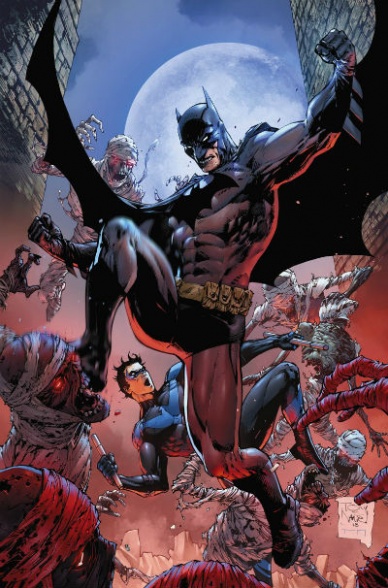
“Batman” #55 continues the tour-de-force that is King’s run on the caped crusader. Ever since the wedding issue, it has become clear that the writer was preparing his audience for the long game, which coincides with how the main villain of the series is also laying out his master plan.
Before delving into the story and its main reveals (no spoilers in here), a proper explanation must be given to Daniel’s art. No stranger to the Batman mythos, his skills are only partially put to good use here. From a narrative perspective, this story is laid out in two distinct moments, which clash violently only the last page. For the moments where Batman and Nightwing are flying over Gotham, Daniel’s art is perfect: the superheroic poses, the larger than life visuals; they are all rendered beautifully.
However, for the moments where a mysterious assassin lays down his single attack, Daniel’s style is ill-suited. “Batman” #55 is one of those rare issues where two artists would actually be better than one. Readers might wonder what someone with a more grounded, down-and-dirty line work would make out of those story beats.
Back to King’s script, this is a viciously written destruction of hope; and what a great piece it is. After dedicating the last issue and this one reinforcing Bruce’s bond with Dick, the writer offers teases of how massive the loss of that friendship would be. The dialogue between them truly reads like a father and son relationship that has evolved into the purest form of friendship, so the stakes are obviously high towards the end of the issue.
“Batman” #55 has been largely spoiled online, but what matters from a review perspective is how well structured and laid out it is. The pieces are gradually being revealed on the game board and the anticipation of what will happen to the main characters could not be higher.
Final Verdict: 7.0 – An excellently written piece, that loses opportunity points on how it could be visually built, but more than makes up for it for the virtue of its narrative. “Batman” #55 is another must-have on King’s run.
Written by Jeff Lemire
Penciled & Inked by Dean Ormston
Colored by Dave Stewart
Lettered by Todd Klein
Reviewed by Ken Godberson III
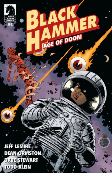
Since its inception, the story of “Black Hammer” has focused around the farm, what it is and where did these heroes end up after the defeat of the Anti-God. And now we (and Lucy Weber) finally get our answers from both Colonel Weird and Madame Dragonfly. I won’t spoil exactly what it is and why this happened to the heroes, but all I will say is that it does feel thematically fulfilling. It ties into the discussion of if the villain is gone, are heroes needed, and stitches that notion into the very fabric of the universe itself.
But the bigger concern is how this revelation impacts the heroes, in particular, Gail and Abe. The former had such a desperation to get back to Earth to get out of her child form. The latter was actually happy on the farm and the life he had stitched together. The rage and sorrow at having what they’ve wanted being so close only to have it ripped away resonate amazingly, in particular, Abe who has just fallen apart and demands Tammy be brought back. They are definitely the high points in an issue that could’ve been too expository if it didn’t have the emotional weight here.
Continued belowOrmston and Stewart are very good as always. They have an ability to switch from the more noir-inspired beats, like at the beginning with flashbacks of Lucy Weber’s search for the heroes, to the more bizarre and cosmic such as the Para-Verse with all of it feeling coherent. With that said, there is something that concerned me, and I finally realized what it is. When it comes to character expression, Ormston’s sketchy style works on a more big, vivid scale. However, when it’s smaller beats, it becomes a bit hard to tell. The example for me came near the end, where Abe is supposed to be completely broken by sadness but… to be honest… he looks stoned.
In the end, “Black Hammer: Age of Doom #5” serves as a much-needed payoff to questions that have hung over the series since its inception. It isn’t the greatest issue of the series, but it is one that needed to happen. It is the closing of one door and the opening to a much larger story that I am looking forward to reading.
Final Verdict: 7.0 – Questions are finally answered in an issue that is enhanced and hindered by its artwork.
Written by John Alison
Illustrated by Christine Larsen
Colored by Sarah Stern
Lettered by Jim Campbell
Reviewed by Tom Shapira
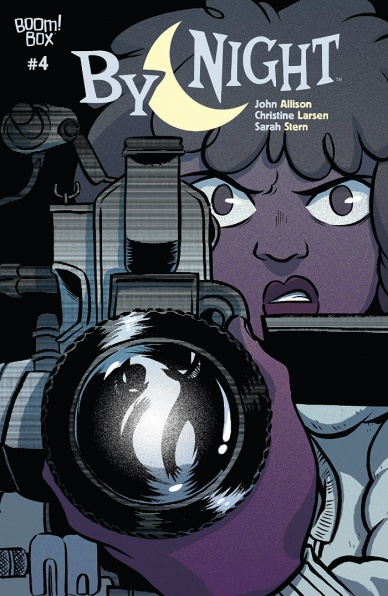
Four issues in and I am still not quite sure what is this series about. In plot terms it’s obvious – there’s a portal to another world and our protagonists are trying to solve both the mystery of the fantasy realm and uncover the secrets behind the portal technology in this world – but in terms of greater story, I am rather lost. There are ideas here about smaller towns dying once the manufacturing heart is uprooted and childhood friends rekindling connections and generation gaps and the 80’s nostalgia.
There’s a lot of thematic content but so far none of it seems to come together. This is rather weird because if there’s one thing we can agree about John Alison is that he’s very good at taking quick pacing and making it appear relaxed: in series like “Giant Days” and “Bad Machinery” he could spend long stretches of time on the characters just being themselves and it still felt like the plot moved forward. Here, less so.
Still, “By Night” is not without its charms – Christine Larsen and Sarah Stern give us some decent cartooning with strong character stuff, there are some fine touches in the fantasy world this month after the last few visits proved a bit too generic, and this time they get to show they can pull of a good chase scene as well. Allison has a particular way with character speak and interaction that is always a joy to read – so even if I’m not quite sure where we are going I’m enjoying the ride.
Final verdict : 7.0 – this series really needs to start providing some answers before it features any more questions; still, fun is fun.

Written by Tini Howard
Penciled by Chris Sprouse & Ron Lim
Inked by Karl Story, Walden Wong, & Scott Hanna
Colored by Jesus Aburtov, Erick Arciniega & Israel Silva
Lettered by VC’s Joe Caramagna
Reviewed by Eric Goebelbecker
‘Ziegenfarm’ opens with Captain America and Bucky running reconnaissance east of Danzig in July 1944, where they encounter three escapees from a nearby concentration camp. Tini Howard’s Captain America is an earnest young man. He even salutes the escapees when he introduces himself. He’s still a super soldier, but the shine hasn’t worn off his boots yet.
While Howard’s Captain America is letter-perfect, she doesn’t skimp on the supporting cast. Howard brings the five primary characters to life for us. Bucky and two of the refugees share memories of what they craved from home while they were in captivity. “You guys have fairs?” the young hero asks as he yearns for a doughnut.
Sprouse’s Captain America is lean and fast, moving like the younger man that Howard portrays in the story. But he’s still Cap and places a hand on Bucky’s shoulder to calm the young man when he gets too excited. The action is tight and up close, putting us in the middle of things as he spars with German troops and saves one of the escapees from a land mine. When the group climbs a tower toward the end, we see how high they’ve climbed by looking down with them.
Continued belowDespite a list of creators, the art and inks are smooth and well-integrated. The book has a clean feel, and Cap stands out like a Hollywood character, with nary a scratch or a smudge. This is a contrast to the serious material in the story, but it works. Captain America is a literal symbol of hope for the refugees.
But where this story really stands out is the accuracy of the setting and the details. Even the map Captain America surveys for a way out is an accurate depiction of the terrain around Stutthof. Stutthof was one of the most brutal of camps in the Nazi system, where prisoners were tortured and experimented on. The escapees share bits of their stories with Cap and Bucky, and we’re reminded of what happens when a regime declares war on people that are different.
Final Verdict: 9.5 – “Captain America Annual” #1 takes us back to the Golden Age with a story about hope and endurance.
Written by Lee & Michael Allred
Illustrated by Rich Tommaso
Inked by Michael Allred
Colored by Laura Allred
Lettered by Shawn Lee
Reviewed by Chris Egan
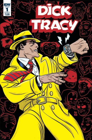
After nearly 30 years, “Dick Tracy” is back on the case with a new revival miniseries from IDW Publishing! At the start of this story, we are well into Dick Tracy’s career and as usual, he does what he thinks is right with no sympathy for behind the scenes politics. This is classic, 1930’s style Dick Tracy. The yellow trench coat and hat are there, arch-nemesis Big Boy is pulling the strings of corruption and trying to bring down Tracy. Upon making a huge arrest that doesn’t sit well with his Chief, Dick is forced to turn in his badge. He joins the force in the City By The Lake and attempts to bring down Big Boy and his web of crime. This debut issue is a successful 1930s throwback with all the whiz-bang charm of the original comic strips. However, it has an identity crisis from time to time. Right off the bat, Tracy’s big arrest involves hackers, software, and Silicon Valley; with burner phones being mentioned later in the book. The only “futuristic” technology that should be involved here is his famed communicator watch.
If they wanted to bring the character into the modern age it could have worked, but because this is set in its own original era, those little nods are wildly out of place and kept rolling around in my head the entire time I was reading the issue. Apart from the unnecessary modern tech and phrases, this is a well done Dick Tracy comic. Lee and Michael Allred understand the character’s history and motives and keep it light and fun. This will definitely appeal to fans new and old, but those who don’t appreciate old detective tales or noir stories won’t have their minds changed here.
Rich Tommaso’s illustrations are perfect for this book. Simple and clean, he absolutely captures the vintage look of the original strips and comic books. Michael & Laura Allred’s heavy inks and colors keep it classic while giving us something better to look at than old faded pages. It truly looks like a gorgeous reprint of any of the old “Dick Tracy” comics. This works just as well as the continuing original “Archie” comic does. It is possible to keep this 83-year-old character alive without dropping him into a completely modern setting.
This is an enjoyable kickoff to a new miniseries. It’s a solid callback to the beginning of comic books that could be truly great if it takes more creative risks, that don’t involve computers and cell phones, in the upcoming issues.
Final Verdict: 7.0 – A good start getting “Dick Tracy” back into the spotlight and only loses its way when it dabbles in unnecessary details.

Written by Matthew Rosenberg
Illustrated by Andy MacDonald
Colored by Tamra Bonvillain
Lettered by Travis Lanham
Reviewed by Dexter Buschetelli
Time travel is confusing. Time travel in the Marvel universe is even more confusing because it is a multiverse. Or is it an omniverse? Again, confusing.
Continued belowMatthew Rosenberg has been playing with this trope of comics and fiction with “Multiple Man” to great effect, though it can be difficult for the reader to wrap their head around at times. With twists that would give M Night Shyahimalayan a veritable Happening, the Jamies romp across time and realities has been quite the ride.
Issue number 4 is easily the weakest of the five-issue series so far, but that’s like being X-Pac in Degeneration X in 1998: it’s still pretty cool. What bogs the issue down is how incomprehensible it can be. Rosenberg has done a great job up to this issue juggling so many Jamies but this week’s installment threatens to crumble under the weight of all those…well, Jamies. Following along with each individual dupe and how they tie into the overall story is still fun, but was much more of a chore this week than previously.
As has been the case so far the art team of Andy MacDonald and Tamra Bonvillain has been as perfect a combination as you could ask for with this type of tale. Story beats like the Swimsuit Edition universe and the page containing 20 panels of facial reactions are handled deftly. Characters are expressive, colors contrast well, and the composition within each panel balances well and guides the reader’s eyes across each page.
This series has built up quite the head of steam, and with the reveals, in the opening and final pages of this issue, we are left with a great deal of anticipation for how Rosenberg will wrap this mini up. Who will live? Who will die? The answer to both questions is most certainly Jamie.
Final Verdict: 8.7 – Too Many Multiversal Multiple Men and yet somehow not enough.

Written by Aaron Gillespie and Scott Snyder
Illustrated by V Ken Marion
Colored by Dinei Ribeiro
Lettered by Deron Bennett
Reviewed by Gregory Ellner
As is to be expected, Aaron Gillespie and Scott Snyder’s writing on “New Challengers” #5 comes with a lot of intrinsic baggage of the previous issues, much as would be the case in any issue this far into a story arc. Very little is really explained as far as who the individual Challengers are, having been explained in previous issues, with most of the focus being on their leader, Prof. Nevertheless, the focus on Prof’s backstory allows us to understand the real nature of the conflicts in “New Challengers,” presumably leading into a finale of the arc. What is given of the other Challengers is exactly as much as is needed to understand their personalities and conflicts, and no more than that amount.
V Ken Marion provides highly detailed faces and facial expressions, along with very dynamic motion in the action-heavy adventurous nature of this series. Cracks in reality are jagged and intrusive, while individual multiverse images are much smoother. The detail is especially apparent in the undead-like “evil” versions of the Challengers, whose visages are truly disturbing both destroyed and in one piece.
Dinei Ribeiro’s uses of color help to define the overall darkening nature of the story relatively muted on the whole with the exception of the always-colorful suits of the Challengers themselves. The darker tones and heavier shadows deep in the Dark Multiverse contrast against the oppressive lights brought forth by shattering elements of reality itself, both of which are separate from the sepia tones used for certain flashback scenes.
While “New Challengers” #5 may take some time to understand for newcomers, it’s still a rather fun look through this climactic moment in the “New Challengers” series as a whole.
Final Verdict: 7.0- An interesting story with well-done artwork and colors, though perhaps held back a bit by the necessity to understand prior continuity.
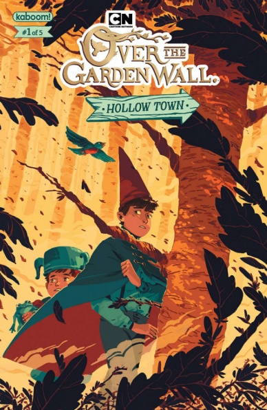
Written by Celia Lowenthal
Illustrated by Jorge Monlongo
Coloring Assistance by Kike J. Diaz
Lettered by Mike Fiorentino
Reviewed by Elias Rosner
There is something off about “Over the Garden Wall: Hollow Town” #1 but then, there has always been something off about this franchise. It is steeped in Americana, dripping with autumn and drenched in the oppressive, cold darkness of the woods. In that regard, “Hollow Town” captures the essence of the series perfectly. The color palette is warm and autumnal while the page layouts disorient us while never moving the focus away from Wirt and Greg. The first two-page spread appears as if it were being viewed through a fish-eye lens, further distorting their journey. It’s an effective way to get us to feel what is occurring to them, as we are slowly being brought deeper and deeper into the strange and unknown. Additionally, this disorientation contributes to the deep foreboding and claustrophobic atmosphere of the woods and, by extension, the narrative.
Continued belowI would be remiss if I didn’t comment on the clever use of paneling throughout the issue. No two pages appear the same and they are all treated as canvases; each one sets out to craft a particular tone and convey a particular message. In particular, the two pages with Wirt’s raft falling apart and the subsequent page with the catfish are my favorite as they showcase just how well Monlongo understands how to layout a page clearly, even while things are chaotic, and firmly establish a setting.
However, the art does have some stylistic drawbacks. While the characters are expressive enough, the oversized eyes and constant shifts in perspective warp faces, losing many of the subtler emotions that the show was so great at portraying. Additionally, the story is too heavily reliant on dialogue to push things along, especially near the start. It feels extraneous, even though the banter between Wirt, Greg, and Beatrice is funny. It, along with the lighting choices, undercuts the darker visuals of the series, although this may be a function of the medium changes and the story choices. As unsettling as the opener is, I hope we get some more of that good ol’ “Over the Garden Wall” spook soon.
Final Verdict: 6.9 – A great start to the ever-expanding Over the Garden Wall franchise that captures the atmosphere of the show almost perfectly with some stylistic hiccups that will take some getting used to.

Written by Brian Michael Bendis
Illustrated by Michael Gaydos
Colored by Michael Gaydos
Lettered by Joshua Reed
Reviewed by Michael Mazzacane
Pearl is an artist, both with a tattoo gun as well as the kind that shoots bullets, which in a roundabout way makes “Pearl” an art book. I would never recommend simply reading a comic for the art, writer Brian Michael Bendis handily keeps his end of the bargain, but Michael Gaydos’s work along with the work of tattoo designer Diego Martin and artist Jessica Schaufer brings the presence of the art forward in such a way that it dominates thought on the book. Gaydos uses the double page spread in some interesting ways this issue. Primarily double pagers are meant to evoke “BIG” moments, but here he uses the space to break down procedure and presents everything in a clean left to right reading orientation. They use four pages to break down a young Pearl learning to tattoo on a banana, using these tall thin vertical panels to emphasize the curve of the fruit, creating a sense of calm. A panel schematic that is mirrored in the dialog-driven spread on the next set of pages. The art team contrast that panel layout later on in a dialog-driven sequence between Pearl and her Yakuza contact, Mr. Kai, using square panels to shot-reverse-shot the dialog off one another and show each person as diametrically opposed.
Gaydos goes more experimental in the closing pages of the book, taking the book in a graphic design-heavy direction. Pearl has a job to do: hit four men at a club. The rhythm of the music is literalized in the neon onomatopoeia that makes up the background. The vibrant neon color scheme is a shock but still fits within the tri tonal neo-noir palette Gaydos worked in plays.
Bendis’s dialog reads a bit too cute or aware and trying to be clever at times, but the second issue does an excellent job building the world Pearl exists within. The issue jumps back and forth in time with a turn of the page, each sequence showing how Pearl growing as an artist but never truly free. She’s either in a teacher/student relationship with her Mom or experiencing the seemingly intrinsic claim the Yakuza have on her existence.
Final Verdict: 7.5 – “Pearl” keeps the artistic quality of the first issue and further expands the world, as the job of the titular character keeps getting more and more complicated.

Written by Jason Aaron
Illustrated by Christian Ward
Lettered by VC’s Joe Sabino
Reviewed by Alexander Jones
Over his long tenure at Marvel, author Jason Aaron has shown his allegiance toward both Thor and Wolverine. This issue is laser-focused on the two cast members and expertly establishes the strong relationship the duo had together before illustrating a bleak future. The opening sequence between the two cast members is written incredibly well, featuring charming dialogue and a great recollection of an untold past event.
Continued belowIt doesn’t take long for Aaron to start exploring his more dystopian outlook of the future. Aaron immediately starts paying off plot threads he has been exploring since the very start of his run with the character. Seeing the plotting of his work payoff so far into the future is mind-boggling, but this installment strikes a potent emotional core between Wolverine and Thor. When readers get to know the new wrinkles in their relationship, the grounded nature of the plot feels particularly dour. The comic does a great job blending different tones with jokes and action sequences. The tale is also full of fan-favorite Marvel mainstays that will make longterm readers really intrigued.
Christian Ward’s artwork is another asset for the book. His contributions to the story highlight the bleak tone of the issue. Ward’s opening sequence featuring two friends reminiscing about the past does look strange due to his natural, sci-fi aesthetic. However, when the back half of the issue calls for the crazy amount of detail and coloring, his work naturally lends itself towards the approach. Ward and Aaron also seem to have a strong understanding of the scripting process due to how some of the pages are structured and the big, exciting cliffhanger sequences.
“Thor” #5 does a great job celebrating Aaron’s work at the publisher. The title builds on his previous plotting while establishing the future of the title. Despite the more insular focus the issue has, the plot ramifications for the comic are potentially major for the future of the series. While Ward’s art can be slightly difficult to interpret during the average talking head scene, when the issue calls for spectacle, he does a particularly great job delivering on the content.
Final Verdict: 7.5 – “Thor” #5 is a striking dystopian tribute to two of the greatest heroes Marvel ever published.

Written by Donny Cates
Penciled by Ryan Stegman
Inked by JP Mayer
Lettered by VC’s Clayton Cowles
Colored by Frank Martin
Reviewed by Matt Garza
“Venom” #6 wraps up what has been a stellar arc, in which the entire creative team has fired on all cylinders. Donny Cates once again delivers a script that adds fascinating new mythology to the Symbiotes. Despite the outcome of the issue, I don’t think we’ve seen the last of Knull. And while it’s cool to see Eddie, his Symbiote, and Rex essentially powered up to the max, with guns and grenades aplenty in their armament, Cates delivers a deep character driven story. The cliffhanger at the end is quite heartbreaking for our anti-hero and really seems to be the main focus of the book thus far. When Rex first bonds with Eddie, he lays it all out on the table. Eddie Brock is afraid of being alone. The bond that Eddie has formed with his Symbiote takes center stage thus making its final declaration of love for Eddie all the more tragic.
Cates’s compelling story works in unison with the kinetic artwork that Ryan Stegman delivers each month. The book is horrifically beautiful with plenty of action to keep fans on the edge of their seats, gritting their teeth. JP Mayer’s inks only compound Stegman’s linework, giving it layers of incredible detail. Frank Martin’s colors give the book a tone that’s a mashup between horror and action, and by the end, tragedy. Let’s not forget Clayton Cowles’s lettering. Cowles gives cringe-worthy life to Knull’s villainous voice akin to nails scratching on a chalkboard.
Now, Cates, and company have posed their question: Can Eddie Brock survive alone? There’s no doubt that Venom will come back in fantastic fashion, though Cates can afford to let the result of this issue breathe a little so he can really delve into the psyche of Eddie Brock.
Final Verdict 8.5 – “Venom” #6 ends with a bang. With wonderful art and an engaging story with great character beats, this series continues to impress and has quickly become one of Marvel’s best.
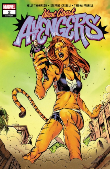
Written by Kelly Thompson
Illustrated by Stefano Caselli
Lettered by VC’s Joe Caramagna
Colored by Tríona Farrell
Reviewed by Michael GovanContinued below
If the stampeding land sharks in “West Coast Avengers” #1 didn’t make it clear that readers are in for a fun time, this issue definitely does. This title doesn’t take itself too seriously and has a very strong sense of humor. The caption boxes undercut or subvert the dialogue. The West Coast Avengers speak to the camera in The Office style confessionals. Quentin Quire continues his established trend of wearing hilariously meta t-shirts (the standout is ‘I de-vamped Jubilee and all I got was this lousy t-shirt’, hands down). The comedy is especially evident with the villain, the delightfully weird B.R.O.D.O.K. (Bio-Robotic Organism Designed Overwhelming for Kissing).
The art team on this book is top-notch. With B.R.O.D.O.K., they just lean into the delightful absurdity. Farrell colors the villain so tan, he’s tangerine. He literally glistens. Caselli draws B.R.O.D.O.K. with long ‘Fabio-esque’ hair, leather pants, and perfect abs. Though his head isn’t M.O.D.O.K. massive, B.R.O.D.O.K.’s is still unsettlingly large on his frame. Stefano Caselli draws really expressive faces and that helps sell the humor. His backgrounds are distinctly California and Farrell’s colors are beautiful. The sunset during the opening battle, with the turquoise sky fading into orange is just great.
Finally, the characters really make this book enjoyable. The team that Kate Bishop has assembled are mostly her friends and that shows in their interactions. The West Coast Avengers are more casual than ‘Earth’s Mightiest Heroes’ typically are. Her back-and-forth with the elder Hawkeye is familiar as well as the spat with her best friend, America Chavez. Clint is right to tell Kate that the early days of a team are always hard but you can tell that they are starting to come into their own.
Final Verdict: 8.0 – The creative team on “West Coast Avengers” makes babysitting B.R.O.D.O.K. a thoroughly fun time.


