
There is a lot to cover on Wednesdays. We should know, as collectively, we read an insane amount of comics. Even with a large review staff, it’s hard to get to everything. With that in mind, we’re back with Wrapping Wednesday, where we look at some of the books we missed in what was another great week of comics.
Let’s get this party started.

Avengers #11
Written by Mark Waid
Illustrated and Colored by Mike Del Mundo
Lettered by VC’s Cory Petit
Reviewed by Alexander Jones
“Secret Empire” was a weird time for the main “Avengers “book. The series quickly mashed a lot of different heroes together and lost momentum and focus. The initial Kang the Conquerer arc of the title felt flooded with prose and despite lots of good issues in between, the comic never got the momentum it needed. Now that all the continuity has been set aside and “Secret Empire” is no more, writer Mark Waid and artist Mike Del Mundo finally have a fresh start to put this book on the right track.
“Avengers” #11 is full of beautiful character moments which continually blossom as the pages in the issue start to turn. Waid cuts straight into the heart of each founding hero with an uncanny sense of optimism. Lots of times, comics are filled with high stakes or tense writing. In lots of parts about the issue, the conflict is set aside and this weird band of Avengers ends up finding strange common ground. By pairing off heroes into groups of two, Waid finds some fantastic chemistry that the title has never carried before.
Mike Del Mundo’s insane, vibrant and beautiful work adds the tiniest of detail to regular moments that makes this comic truly wonderful. Watching Hercules drink coffee has never been quite so suspenseful. Mundo has a ton of fun with the proportion of Spider-Man’s huge eye slits in-costume and finds the time toy with wild facial expressions. The vividly strange color palette adds even more substance to the work and further illustrates Mundo’s raw ability. The last page of the comic in particular shows off some of the aspects he brings to the work with how different each character is drawn, Spider-Man is lankier and exaggerated while Captain America is more realistic.
The only aspect of the book which disappoints is the plot thread between Thor and Sam Wilson. While nothing about this character and the encounter is technically bad, the scene doesn’t have the same inventiveness or enthusiasm as all the other threads in the comic. In an issue filled with amazing plot threads, this is is virtually the only one that didn’t jump off of the page and become real.
Even though the book was lighter on villains and had little conflict, Waid accomplished something wonderful in “Avengers” #11–he was able to show why his team of heroes are different from any other that came before and weaved some delightful and complex character dynamics between multiple teammates along the way. This series has always had an incredible level of potential and with the latest installment of the book, Waid and Mundo are finally able to show it off!
Final Verdict: 8.0 – “Avengers” #11 is full of complex character dynamics and an undying enthusiasm for the mundane.

Big Trouble in Little China: Old Man Jack #1
Written by John Carpenter & Anthony Burch
Illustrated by Jorge Corona
Colored by Gabriel Cassata
Lettered by Ed Dukeshire
Reviewed by Kent Falkenberg
Big fan of Kurt Russell’s tight jeans and tank top in the 1986 original?
Never even seen the film?
It doesn’t really matter which side of that divide you fall into. Any appreciation of “Big Trouble in Little China: Old Man Jack” #1 hinges on how much you appreciate an autumn-years trucker staring down a Floridian hellscape, the “Hellpocalypse” to be precise, with self-narrated John Wayne bravado, crass, blue-collar charm, and nary a clue as to what’s really going on. Let that colorful gumbo simmer alongside some demons reminiscent of the Kirby-esque hellspawn your neighbor had airbrushed graffitit-style on the side of his panel van in the late ’80s, and you’ll have a good idea on what you’re getting.
Continued belowAnd there’s no learning curve here. When we first meet Jack, he’s in heaven. Or at least, his version of it. John Carpenter and Anthony Burch populate his paradise with greasy diners, nudey-magazine racks, and 24-hour liquor stores on every corner. Jack’s content enough to pass the time knocking back his hooch, flipping through his favorite periodicals, and not wasting a thought on the blazing rampart of fire encircling his otherwise empty town. With efficiency, we get a clear sense of Jack’s voice and personality
From that point on, Carpenter, Burch, and artist Jorge Corona just let “Big Trouble in Little China” rip along at a frenzied, irreverent pace. A female voice pleads for help through a CB radio with constant reassurance that she’s both extremely attractive and between the ages of 18-24, though Corona is clever enough to always show a lifeless, disconnected cord dangling from the CB mic. A Freightliner semi – shiny and chrome, with Haulin’ Ass stamped into its grill – launches through a towering wall of flame. We visit the Hell of Minor Discomforts!!!, where Corona’s knack for over-exaggerated facial expressions and hand gesture ensures we feel the full torment of that one time a waiter said to enjoy a meal and you said, “You too!”…
All the while, Corona plays loose with his paneling. There’s already a jagged, crackling verve to his thickly inked lines. But when his panels stack unevenly, squeeze together, tilt side-to-side, rotate axis so their plane bends inward, it seems to keep the pace racing. There’s an irregularity to the layout that’s a giddy match for the off-kilter nature of the story.
“Big Trouble in Little China: Old Man Jack” is the perfect type of licensed comic. It’s got the style and swagger of its parent, while very much remaining it’s own beast. Nothing here is impenetrable – Jack proves that himself driving head-on into that fencing of hellfire. Overall, it’s one spirited romp through the apocalypse.
Final Verdict: 8.0 – Big time fun in little installments.

Black Hammer #13
Written by Jeff Lemire
Illustrated by Dean Ormston
Colored by Dave Stewart
Lettered by Todd Klein
Reviewed by Elias Rosner
What happens once you’ve reached your lowest point? Where can you go from there? Is there anything you can do? If you’re the main trio of “Black Hammer,” the answer is simple; the answer is no.
“Black Hammer” #13 opens up on an image we’ve come to expect, Abraham leaving his gym, depressed, living in a cycle of sadness and loneliness. In fact, it’s such a common image, I thought there had been a printing issue at first – it just turns out that we’re finally seeing the moments before each hero is called into battle…or at least the moments for the three of our heroes. (It’s telling that we don’t get cutaways for the dead heroes or for the two who know more than they are letting on.)
Ormston and Lemire structure this issue beautifully, cutting between flashbacks keyed to Abraham, Gail, and Barbalien and the present, using the page turns to really twist the screws on our emotions. The saddest of these has to be Gail’s. She was happy, content, and ready to leave the world of superheroes behind when she’s pulled away from it all and then trapped, in a form she hated, in a place unknown, where all she has left is the bitter memories and the vices to chase them away.
I bring this up not because its new (we’ve known why Gail hates this reality since her origin issue) but because this is the issue where, for the first time, all three of our most vulnerable characters have fully given up. Abraham and Barbalien were both given a new start but by the midpoint of this issue, that loneliness from before their final fight has returned. They are defeated and it’s shown on beautiful panel with all three of them just sitting around a table, silent, sharing a bottle of whisky, all looking down: Barbalien shrouded in angry shadows, Abraham sadly staring at his drink, and Gail, hollow as she always is.
But, as the old cliché goes, when you’ve reached rock bottom, the only place left to go is up (with a little help from a friend). We’ll just have to wait a few months to find out just how far up they can go from here.
Continued belowFinal Verdict: 8.5. “Black Hammer’s” most recent arc goes out, not with a bang, but with a KRA-KOOM!

Gasolina #1
Written by Sean Mackiewicz
Illustrated by Niko Walter
Colored by Mat Lopes
Lettered by Rus Wooton
Reviewed By Kate Kosturski
The couples with the strongest relationships are the ones that have common interests…and that includes fighting drug traffickers and the supernatural. Amalia and Randy, newly married, are on the run to Mexico trying to live a quiet life as farmers. But there is no such thing as quiet when you return from the fields to find dead people all over your house…and your boss asks you and your wife to find their missing son (who also happens to be your new wife’s nephew), caught up in a drug war that isn’t your standard drug war. There’s something paranormal lurking in these plains — and while it will scare the world, at least Amalia and Randy have something to keep their marriage together.
If I had to sum up this comic in three words it would be: Lovecraftian Breaking Bad. Mackiewicz crafts a world with just enough exposition to introduce the world, but allow for individual interpretation — show rather than tell (this is a comic, after all). Niko Walter doesn’t shy away from realism in his drawing, pulling no punches with the detail of gruesome in murder — panels and pages spattered in blood and richly detailed scenes of violence and its aftermath. Mat Lopes’ coloring, when not a palette dipped in shadows, is rich in the dulled earth tones of the desert. You can almost feel the smoke in the back of your throat and the heat on the back of your neck when you see Amalia and Randy in the fields. Even times when color turns pastel in moments of mundane (Amalia checking on a teenage patient) seem dulled in nature; this is by no means a happy world, nor will it see happiness anytime soon. I was hoping for something a little more creative in Rus Wooton’s lettering and panel layout with such a complex story; perhaps this took a backseat to the writing and art to allow for proper setup of this universe. I hope that we can see some risks here in future issues, but not so much that it takes over from the story.
What brought Amalia and Randy on the run to Mexico? What’s lurking in the deserts that’s more dangerous than cocaine or heroin? I’m rather eager to find out.
Final Verdict: 7.6. A fine debut that fans of both Breaking Bad and Supernatural will appreciate in equal measure.
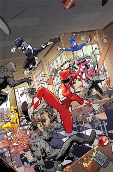
Go Go Power Rangers #3
Written by Ryan Parrott
Illustrated by Dan Mora
Colored by Raul Angulo
Lettered by Ed Dukeshire
Reviewed by Matt Lune
You would think that a series set before the action of the TV show on which it’s based would be extremely limited in the changes it can make to the characters, or the journeys they can be taken on. It’s the curse of the prequel, any prequel, that we all know how they’re going to end, and the joy of getting there for us is balanced with the writer’s burden of being extremely limited. The great thing about “Go Go Power Rangers” – as a series but specifically this latest issue – is that no one seems to have explained this curse to writer Ryan Parrott.
The issue opens with a flashback to the early days of Blue Ranger Billy Cranston, as he plays in the park with a familiar friend, before moving to the present and seeing just how that friendship has evolved. This is not the only example of the bonds of friendship being tested in this issue, as Kimberly’s boyfriend Matt – the only member of their group not to be turned into a Power Ranger – is starting to get paranoid that he’s being left out of all the secret whisperings of his friendship group. There’s also the massive crush that Yellow Ranger Trini is harboring for Red Ranger Jason, which is destined not to end well, all of which make “Go Go Power Rangers” #3 a perfect example of the space this series has been granted to really explore these characters, at a depth never seen on the television show.
Continued belowIt’s becoming more and more evident that this series is not so much a prequel to the Mighty Morphin’ Power Rangers TV show from the 90s, but rather a perfect companion piece to the darker MMPR comic book series also currently being published from Boom! Studios. The fact that this issue barely contains any actual Power Rangers action (and even that, near the end of the issue, is fraught with interpersonal drama) is a testament to just how well Parrott is developing his lead characters- not to mention the depth granted to pretty much all of the supporting cast.
Artist Dan Mora is such a good fit for this book. When action is required – which, despite the claim above, there is plenty of – Mora’s exaggerated linework and dynamic framing captures the very essence of colorful fun that this franchise is known for. More importantly, however, is the character work, which this series is so devoted to developing. The body language, the facial expressions and the sheer emotion that Mora pours into every character help make this book not just another cash-in on an overplayed franchise, but a fresh, vital chapter in the lives of heroes that – despite them being characters that many of us grew up with – we honestly know nothing about.
“Go Go Power Rangers” #3 may be the best issue yet of this already stellar series. Its perfect blend of high school drama and superhero action is better than this franchise has ever known before, more suited to fans of the early (read: best) seasons of Buffy The Vampire Slayer, than the TV series on which it’s actually based. There’s room in this issue for every character to get a moment of genuine growth, and the burden of their responsibility is weighing down on every aspect of their lives in a fascinating way. Their lives are evolving, the relationships around them are changing, and the creative team are building a world with such agency and genuine threat, that “Go Go Power Rangers” feels less like a prequel and more like the main event.
Final Verdict:8.8 – Solid character development continues to deepen the lore and ultimately elevate the entire franchise.

Kill the Minotaur #4
Written by Chris Pasetto and Christian Cantamessa
Illustrated by Lukas Ketner
Colored by Jean-Francois Beaulieu
Lettered by Clem Robbins
Reviewed by Michael Mazzacane
“Kill the Minotaur” has been playing with the dynamics of the slasher genre since we got into the labyrinth. Now at the quest driven center, writers Chris Pasetto and Christian Cantamessa switch it by segueing into a ‘The Monsters Are Due on Maple Street’ styled tension as the sacrifices are psychically haunted and physically stalked by the Minotaur. With if not boring, unchanging, backgrounds to work with artist Lukas Ketner smartly drops out the background at points, allowing colorist Jean-Francois Beaulieu to fill the void with evocative coloring to play off the emotions on the casts faces. By erasing the one room, Ketner and Beaulieu come together to make tense imagery as everyone is backed into a corner and begin to turn on one another.
Even if Ketner tried to keep the special continuity of the labyrinth’s center straight, he gets plenty of mileage out of the emotive shifts on a character’s face panel to panel. By itself there is plenty told by the regretful side eyes glance Theseus gives Pirithous after a particularly nasty, entitled, outburst. Reactionary juxtaposition is fundamental to comics but Ketner smartly uses the full panel to create the image. In response to the outburst. He mirrors Theseus but removes Pirithous allowing Clem Robbins letters to fill the void and drive an emotional dagger deeper than any single set of sad eyes could.
Ketner’s page design comes together in a series of multi route spreads, that create classic cinematic tension by cross cutting Pirithous playing the rabbit and the rest of the sacrifices reading defenses and plotting among themselves. The spreads can be read straight left to right or vertically in thirds as Ketner gives view to three different spaces, micro sequences, at the same time. These are the kinds of pages that exemplify comics.
Continued belowFor all the artistic craft shown in the issue, it’s the twist Chris Pasetto and Christian Cantamessa give to the mythology that enriches the text thematically. As with most oral traditions, there isn’t a strict continuity but more an overall agreement on the big events. The origin of the Minotaur hangs on a general misogynistic frame you find in Greek myth, the main difference being the agency or lack thereof Queen Pasiphaë played. Pasetto and Cantamessa remove her from the equation and cement a Mad Max: Fury Road like statement, by showing the birth of the Minotaur to be from the blood of men and driven by the corrosive acts of powerful men.
Final Verdict: 7.75 – “Kill the Minotaur” crosses another threshold and continues to spin an intriguing take on the ancient tale with Lukas Ketner and Jean-Francois Beaulieu’s art.

Nightwing #29
Written by Tim Seeley
Illustrated by Paul Pelletier
Colored by Adriano Lucas
Lettered by A Larger World’s Dave and Troy
Reviewed by Gregory Ellner
As ‘Gotham Resistance’ continues, the various parts have seemed to come together in line with a tabletop roleplaying game’s dungeon crawl in structure. If “Teen Titans” #12 was a platforming challenge and puzzle, Tim Seeley’s writing on “Nightwing” #29 paints it as a heavier combat basis. Both in the domain of Freeze and outside of the multilayered labyrinth, there is a lot more focus on physical danger, and less on psychological horror.
Through reference to a certain wound, Seeley also manages to draw focus to an earlier, bizarre event in the ‘Nightwing Must Die!’ story arc that may have been missed beforehand as a through-line to ‘DC Metal.’ Furthermore, the Teen Titans have a lot more focus in this issue than they did in their own comic, having an entire scene for themselves and the remainder of the Suicide Squad that hints toward future events in the crossover.
Although Paul Pelletier’s artwork is dynamic, it has an odd way of being decidedly imprecise when viewed at a distance. Pelletier’s art seems to work better for static scenes, close-ups, and individualized “portraits” of characters such as Freeze and the hauntingly dangerous Damian Wayne of the Batman Who Laughs, while simultaneously making fight scenes, such as the ones that take up a sizable amount of “Nightwing” #29, be a bit too difficult to see well. However, the difficulties are seen past relatively easily with the help of colorist Adriano Lucas, whose use of distinct coloring for both differing scenes and characters makes identifying events much easier, especially in the case of the fight against Freeze.
While a better plotted issue than its predecessor in the ‘Gotham Resistance’ tie-in crossover, “Nightwing” #29 suffers a bit from having artwork that doesn’t really fit to the action-packed story.
Final Verdict: 7.0- Fun yet simple, “Nightwing” #29 helps to increase the threat level for the ‘Gotham Resistance’ crossover, but has some difficulties with actually physically portraying those events.

Secret Weapons #4
Written by Eric Heisserer
Illustrated by Raúl Allén
Colored by Patricia Martín
Lettered by Patricia Martín
Reviewed by Paul Lai
Fifty years ago, a story about a band of cast-off youth with strange powers forming an unlikely team of superheroes had a ring of novelty. “Secret Weapons” gambles that the formula still has legs.
This fourth issue of “Secret Weapons” finishes the introductory arc of a series we have followed and found to be a beautifully rendered prestige format team origin tale. It’s another example of Valiant investing in quality, artistry, and classically fun storytelling with updated twists. Curious readers like me, perhaps not deeply entrenched but sufficiently familiar with the Valiant universe, have enjoyed watching this team of rejected Psiots come together. In issue 4, Nikki (talks to birds), Avichal (turns to stone), Owen (conjures objects… and sometimes even useful ones), and former Harbinger/Harada renegade Amanda (technopath) achieve the longed-for team togetherness that gets Amanda out of the clutches of Rex-O and the Scavenger, whose hidden location is a knee-slapper discovery and whose comeuppance is poetic justice. All the proceedings end with a suitably warm bonding moment, ceremonially designating this team as Valiant’s young rebels.
Continued belowWriter Eric Heisserer, who we spoke to about the series, offers three pages of thoughts at the end of the issue about the transition from writing films (Oscar-nominated for The Arrival) to comics. The major difference? Wearing the director’s hat as well as the screenwriter’s as he guided visuals for the artists. But something definitely works in the combination of Heisserer’s maturation in the medium and artists Raúl Allén and Patricia Martín capitalizing on an increasingly unique visual toolbox of contemporary comics. Martín, also the letterer, is rightly credited as co-artist with Allén, though she was initially identified as colorist earlier in the series. I don’t know if the co-artist credit represents a shift in the workload or stands as an acknowledgement of the importance of Martín’s contributions, but their synchronicity as a team in page design, color communication and tone-creation, and vitality of action deserve applause. This issue is filled with eight-to-twelve panel pages that never feel cluttered for one minute, and both high drama and emotional denouements are doled out with a rhythmic control that is a breeze to read but a baroque work of clarity in design.
And it’s in utilizing that visual language where Allén, Martín, and Heisserer bring something new to what Stan and Jack or Claremont and Byrne often needed to tell rather than show in early X-Men, or Brian Vaughan and Adrian Alphona in “Runaways” needed two more issues of decompressed and wordier storytelling to ramp up. It hasn’t been Valiant’s approach to break entirely new and strange ground, so much as to execute familiar story patterns with satisfying momentum and energy. The close of the start of “Secret Weapons” accomplishes at least that much.
Final Verdict: 7.8 – Textbook ending for a team book origin story, which might be tired if not for the visual flair and clarity this creative team accomplishes. A prestige series sticks the landing with artistry.

Snotgirl #7
Written by Bryan Lee O’Malley
Illustrated by Leslie Hung
Colored by Rachael Cohen
Letters by Maré Odomo
Reviewed by John Schaidler
For the most part, “Snotgirl” #7 is more of the same, meaning you’re either going to totally love it or remain utterly unimpressed.
Like the others that came before it, this issue is packed with amazing outfits, snappy, sarcastic dialogue, self-obsessed jockeying for position and Lottie Person’s fabulous cascading neon green tresses. And nowhere is it all more on display than Cool Girl’s first Hater’s Brunch, where obsessively checking your phone while waiting 30 minutes in line for a table is part of the fun and taking pictures of your food is an essential part of your brand.
Leslie Hung’s artwork, as always, is stellar. In fact, it only seems to get better as the series progresses. Her line work is thick, decisive, and instantaneously clear (you can practically read it from across the room) even when the characters aren’t. Her panel work is great, as well, with an excellent mixture of white space and bold solid fields of Rachael Cohen’s incredible colors. Snotgirl’s personalized, distinctive green, of course, is a constant theme – giving the entire book it’s unmistakable look – but flipping through the pages it literally seems like Cohen uses every color in the color wheel.
Likewise, Bryan Lee O’Malley’s dialogue is clever and always on point, especially when he’s in Snotgirl’s head, channeling her inner neuroses. She’s calm and confident one moment, calling it like she sees it and putting others in their place, but riddled with self-doubt the next, twisting herself in knots as she constantly tries to second guess exactly what Cool Girl is thinking. It’s an astute, witty commentary on our social media obsessed culture that’s never quite flippant or simplistic.
Ultimately, I have to admit I’m not entirely sure where everything is going – especially with the sudden prominence of Cool Girl’s brother, Virgil, who seems to be emerging as a kind of puppet master – but at this point, I don’t really care. (Especially if it all leads to Comic-Con in San Diego.) There are so many interesting moments, so many well executed details, it’s plenty of fun as it is. The characters are rich and complicated, in their own shallow way, and even the simplest panel seems rife with intrigue. (The way that Sunny and Charlene’s doctor share a look than lingers, for example, seems to foretell a whole new potential subplot.) Seven issues into the run, it feels like we’re just getting started, and in this case, that’s a good thing.
Continued belowFinal Verdict: 8.2 Like Snotgirl herself, there’s a glitzy sheen to this book than communicates one thing, but underneath that façade, there’s a wonderfully complex and compelling truth that slowly reveals itself.

Star Trek: Boldly Go #11
Written by Mike Johnson
Illustrated by Megan Levens
Coloured by Marissa Louise
Lettered by AndWorld Design
Reviewed by Frida Keränen
“Star Trek: Boldy Go” #11 kicks off a new two-part story by bringing back Captain Garth, a character who hasn’t made an appearance in many years, and giving us a look into his origins.
Most of the story’s aspects aren’t anything we haven’t seen before in Star Trek or elsewhere and there can be a sense of familiarity for even those who haven’t watched or read anything with the character of Captain Garth in it before. The flashbacks take up a lengthy portion of the issue, nearly half of it. Writer Mike Johnson has been handling Kirk and his crew for a long time now so it’s no surprise he writes their interactions well.
Megan Levens’ artwork is simple but neglects neither the character’s expressions nor the backgrounds. There could be more variation in the character positions, though: in a lot of panels they just stand around looking a bit stiff. Marissa Louise’s bright colouring looks delicious with its many purples, pinks, oranges and greens.
This issue unfortunately felt like it was out of fresh new ideas and the cliffhanger at the end was a tired one, but perhaps it could be exciting for a younger reader.
Final Verdict: 5.5 – Not bad, but not memorable either.

Super Sons #8
Written by Peter J. Tomasi
Illustrated by Jorge Jimenez
Colored by Alejandro Sanchez
Lettered by ALW’s Dave
Reviewed by Nicholas Palmieri
“Super Sons” has been one of the purest creations to come out of Rebirth, and it tends to be the purest expression of its creators as well. For all the good that leads to, though, it means this title can also be a showcase for the creators’ negative qualities. I think this issue in particular leans towards the negatives in the writing.
First, let’s look at the positives, which are the same as any issue of “Super Sons.” Tomasi writes endearing characters and interactions. His children sound like children, they have clear and unique voices, and I always have a ton of fun reading the titular super sons quip back and forth. Jimenez follows suit, injecting pure expression into every line. Every last detail in his figure drawings oozes personality, from the effortlessly intricate facial expressions to the capes on the characters’ backs (sharp and straight for Damian, curvy and free-flowing for Jonathan).
However, as mentioned, this issue also gets into the Tomasi’s negative tendencies as a writer. I’ve found that, in multi-part arcs, Tomasi doesn’t know how to keep up the momentum midway through. Either things stop making sense or they lose their emotional ground, usually because Tomasi gets too deep into some uninteresting plot-specific details. That’s exactly what happens here, as he spends most of the issue giving an exposition dump on what this new world is, how it connects to what happened to the characters in the previous issue, and how it affects the two new characters we’ve just met. We get the information through a character telling us these things, so even though the information is illustrated, it still feels like pure information without any stakes to keep us invested. I might be more forgiving of this if it all ended up being important, but based on Tomasi’s previous work, there’s a good chance that only one small detail will end up being used in the concluding issue of this arc and the rest will be completely discarded.
Those negatives don’t necessarily take away from the positives the book maintains, but it does drag down the issue as a whole. As a single issue, I wouldn’t necessarily recommend this one to anyone who isn’t already following the “Super Sons” title. But the magic that makes the series so great is still there, so as one small stop in an ongoing, it’s bearable.
Final Verdict: 6.5 – An issue that showcases some of Tomasi’s negative storytelling tendencies, but there’s still enough positives from him and Jimenez to keep the issue likable.


