There’s a lot to cover on Wednesdays. We should know, as collectively, we read an insane amount of comics. Even with a large review staff, it’s hard to get to everything. With that in mind, we’re back with Wrapping Wednesday, where we look at some of the books we missed in what was another great week of comics.
Let’s get this party started.

Written by Dan Panosian
Illustrated by Marianna Ignazzi
Colored by Fabiana Mascolo
Lettered by Mike Fiorentino
Reviewed by Ryan Fitzmartin
Buffy The Vampire Slayer premiered in 1997, practically creating a new genre of supernatural teen drama. At the time, it was revolutionary and pioneering. Now it is the subject of many knock-offs and imitators. “An Unkindness of Ravens” is one of the less inspired versions. “Ravens” pulls from other influences too, ranging from Charmed to Roberto Aguirre-Sacasa’s “Chilling Adventures of Sabrina”. Aside from some very nice art on the opening prologue, there’s very little that’s unique here. Perhaps the story will develop more as “An Unkindness of Ravens” goes on, but issue #1 is exceedingly generic.
In fairness, there isn’t much I would describe as actively bad. The dialogue, art and plot are largely inoffensive. Fabiana Mascolo has almost completely copied Robert Hack’s Halloween/Earth Tones color scheme from “Sabrina”. This is fine for me, because I liked Sabrina, but Marianna Ignazzi’s lines lack Hack’s roughness and edge. Buffy’s signature chatter was a large part of the show’s appeal, but the writing in “Ravens” is shallow by comparison. Most of the characters talk in exposition, with only a few comedy lines making me crack a smile.
Most glaringly, the story is achingly boring and unoriginal. There’s a high school girl, with a dark past, who might have special powers. There’s girls with cliques, cute boys, a missing student, and shady adults. “An Unkindness of Ravens” has everything you need for an early 2000s show on the CW Network. Including a pretentious title. It’s all just so completely routine. The cliffhanger hook at the end didn’t grab me at all. If you really can’t get enough of supernatural high schoolers, maybe this comic will do it for you. There wasn’t enough here to engage me. Hopefully it will get better, but I doubt it.
Final Verdict: 5.3 – A highly routine and lackluster entry in a worn-out genre.

Written and illustrated by Sam Keith
Colored by Ronda Pattinson
Lettered by Shawn Lee
Reviewed by Elias Rosner
“Batman/The Maxx: Arkham Dreams: The Lost Year Compendium” is. . .such a strange book. It’s a reprint in the vein of those “S.H.I.E.L.D.” by Hickman and Weaver comics, in that this book exists to catch readers up to speed with the end of a long-delayed series and is really only helpful for those who never got the original issues. I say this because 90% of this book’s target audience is already bought in and either has the originals and will skip this or will double dip to get the new covers.
I’m utterly baffled by this book’s existence. It’s not really a Batman book (at least not in this, the first half of the mini, despite giving him top billing, and The Maxx is a cult-hit Image character, not an IDW one. But Batman crossing over with random properties is kinda his thing so. . .you know.
Not being a Maxx fan myself, I found the book to be comprehensible in the surreal way it’s presented but lost and unmoored by its reliance on knowledge of characters from The Maxx. Keith does an admirable job of explaining or providing visual clues in order to understand the concepts he’s playing with but it doesn’t quite work for me. This is a shame because while the dialog is often overly processed and rigid while retaining the surreal Morison-esque edge, the visuals are by far the best parts of the comic.
I love the huge eared, hyper-inked, stubble Batman Keith draws and the distinction between “reality” and “The Outback” is made clear in the way he modifies his detailed work, among other visual clues. Pattinson’s coloring also cannot be understated in how it brings the comic to life. “Batman/The Maxx” looks like a comic from 40 years ago, full of grit and grime and dulled but unique colors, swinging wildly from cartoony panels to these hyper-detailed, almost Baroque painting-like panels. The experimentation on display is laudatory, even if it isn’t quite to my tastes when paired with a muddled plot and dialog that, frankly, could be chopped in half, and just as much would be answered.
Continued belowYou’ll notice I keep saying “it doesn’t work for me.” At the end of the day, Keith’s approach is just not one I am particularly fond of, and that’s no fault of the book itself or the creators. Sometimes a book just doesn’t click with a reader and this is one of them. If you liked “The Maxx” or “Arkham Asylum: A Serious House on Serious Earth,” you’ll get a lot more mileage out of this than I did.
Final Verdict: 7.0 – Dialog is lacking while the art shines and the plot confuses. Fans of Keith’s “The Maxx” will almost certainly find this enjoyable and if you aren’t sure you’ll like it, you can’t go wrong with this issue, priced as it is.

Written by Greg Rucka
Illustrated by Nicola Scott
Lettered by Jodi Wynne
Reviewed by Alexander Jones
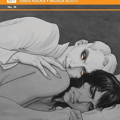
From opening the first page of the debut issue it was clear that “Black Magick” is about setting a tone in a grounded environment. Issue #14 continues this mission statement and writer Greg Rucka provides a great outlet for Nicola Scott’s artwork. The opening sequence is particularly stunning and makes strong use of the incredibly simple yet dynamic color palette of the issue. Scott pays close attention to details on the page and is able to establish a strong sense of movement. Rucka’s script for this issue relies on Scott to give the details of the encounter between Alex and the villain to make the situation appear unique. Without the vivid facial expressions or close attention to movement, this issue could potentially come off as generic.
Rucka’s scripts for this series have always carefully balanced a grounded yet mystical tone. This chapter introduces a few shades of melodrama surrounding protagonist Rowan’s love life. The melodrama excels because of the antagonists lurking in the background of the story. Also, there’s a sense of limited time here that adds to the drama. A wide range of events occur at four in the morning and they all happened to be layered around the same time. These little details add shades of color to an issue that could feel derivative or monotonous. Scott is really creative with the page layouts and colors in these scenes as well. There’s something fascinating to look at on each page of “Black Magick.”
The sequence between Laurent and Alex revealed a few new aspects about the characters but doesn’t quite keep the momentum of previous scenes going. The biggest misstep of the issue is arguably the cliffhanger. It is definitely admirable to see Rucka and Scott go for a really subtle last panel but I would have liked a twist with more consequence. This is a chapter in the middle of a storyline and I’m glad to see Rucka and Scott really pay attention to the relationship between story and art. This duo has an excellent working relationship and have produced wonderful comic books together prior to “Black Magick.” “Black Magick” #14 requires a sense of patience that is rewarded with a fantastical opening sequence. Rucka and Scott continue to weave a grounded, ominous narrative that promises a few big threats just on the horizon.
Final Verdict: 8.2 – “Black Magick” #14 is subtle and haunting.
Written by Joshua Williamson
Illustrated by Eddy Barrows
Colored by Adriano Lucas
Lettered by Steve Wands
Reviewed by Gregory Ellner
Joshua Williamson has been writing “The Flash” for roughly four years, and is closing in on his grand finale, a story that is as much one of the Flashes as it is a major connective element to Scott Snyder and James Tynion IV’s work in the entire ‘Metal’ overarching plot. As such, “Dark Nights: Death Metal: Speed Metal” #1 can easily act as a coda on the end of his run on “The Flash” that ends the very same week. Faced with the eldritch horror that is the Darkest Knight and the forces he has amassed to take down three different speedsters, Williamson’s story instead concentrates inward, toward what exactly makes the family what it is. The Flashes may bicker or argue, but at their core, they are still there for one another and work to keep moving forward, even if they have to push one person or another in the right direction along the way. In a mess of despair and crisis, the Flash family as a whole shows the hopeful light at the end of the long, dark tunnel, and the promise of a better tomorrow.
Continued belowEddy Barrows does a great job of showing the emotion in the various Flashes, from the frustration amongst them to their fear, joy, or general friendship. As is needed for people who draw Flash-centric comics, he is able to effectively portray the sheer speed of the various people, be they fully in motion, or in frozen time while still having been moving. This speed includes the Flashes, the Darkest Knight, and the latter’s minions, all shown in ways that accurately portray how dangerous they truly are. While the elements in motion are important, Barrows is also very good at taking in the (relatively) calmer moments, using those times to really focus in on facial expressions and detailed scenery for a sense of place where much of the story is moving so fast as to make any concentration on location be a wasted effort.
Adriano Lucas helps to further emphasize the dichotomy of light and dark, of hope and despair, that permeates the entirety of ‘Speed Metal,’ from the vibrant colors of people’s outfits to the darkness around them. Even when outside forces strike to change them, the overriding color schemes showcase how despite subtle changes to their environments, there is a core to the Flash family that cannot be taken away, one that becomes more evident the further into the page count ‘Speed Metal’ goes.
Final Verdict: 8.0 – Despite being part of a far larger story, ‘Speed Metal’ shows the heart in the development of the Flash family’s post-Rebirth status quo.

Written by George Mann
Illustrated by Joe Eisma
Colored by Michael Garland
Lettered by Hassan Otsmane-Elhaou
Reviewed by Jodi Odgers
Like the cogs in a masterwork machine, the opening issues of “Engineward” have been working together to create both an immersive world and a fascinating story. This third issue builds on the strong foundation laid in the first two issues and expands on the dichotomous existences of the ordinary folk (centred around Joss and Ichabod) and the Celestials.
Joss’ discovery at the end of the second issue drives the primary plot forward in this one. There is marvelous subtle characterization throughout, particularly in the exploration of the group dynamics between the ordinary folk, the humanization of Kreek the ghoulem, and the constant jostling for power within the Celestials. The vastly different worlds experienced by the ordinary people and the Celestials is underscored by the distinct palettes that Michael Garland uses in each environment. Eisma delivers a couple of well-executed montage pages and shows particular finesse with expressions, capturing complex emotions throughout the issue.This is supplemented by Otsmane-Elhaou’s use of coloured text and balloons to amplify the emotion expressed in speech. It makes so much sense to color an angry outburst red and resignation a pale blue, and it adds to the clarity of the moment without feeling gimmicky, which in the hands of a lesser letterer, it may have.
“Engineward” is still very much in its nascent stages, but issue #3 sucks the reader further into a new world of mysticism, machinery, and malice.
Final Verdict: 8.1 – “Engineward” may still be assembling its grand plot machine, but its construction is enchanting.

Written by Jason Aaron
Illustrated by R.M. Guera
Colored by Giulia Brusco
Lettered by Jared K. Fletcher
Reviewed by Jim Malakwen
The world depicted in “The Goddamned: The Virgin Brides” #3 is a harsh one. Set in the days before God unleashed a flood to destroy all life on earth, mankind is shown at its absolute worst. Even the earth suffers because of cruel people and their wickedness.
In this bleak setting, protagonists Jael and Sharri are two of many girls raised in a strict convent run by ruthless nuns. While sheltered from the dangers of the real world, the girls are raised under an environment of religious indoctrination and hard labor until they experience their first menstrual cycle. Little do they suspect that they are to be handed over to fallen angels in order to spawn a race of Nephilim. Upon discovery of this horrific reality, Sharri and Jael escape the convent and head out into the unknown world while being pursued by relentless female Nephilim hellbent on bringing them back to the convent.
Continued belowWriter Jason Aaron kicks the story into high gear in this instalment. Having acquired weapons in the previous issue, the girls make their way into the perilous thorns where venomous snakes lurk. While traversing this area, Jael gets bitten and Sharri encounters a talking serpent who offers to rescue her friend for a price.
As expected from the writer of “Thor” and “Conan,” the storytelling is well-paced and the characters are relatable. The cliffhanger will leave readers eager to find out what will happen to these two characters.
The artwork on “The Goddamned: The Virgin Brides” #3 is excellent. R.M. Guera, who previously worked with Aaron on “Scalped,” excels at drawing diverse landscapes and visceral action scenes. He is also adept at revealing intense emotion whenever he draws faces. His panel layouts are exquisite and keep your eye moving throughout the page. In addition, colorist Julia Brusco’s subdued hues perfectly complement Guera’s gritty illustrations.
Final Verdict: 8.5 – An excellent instalment in this unique series that expands the story’s scope and ends with an intriguing cliffhanger.

Written by Fabian Nicieza
Pencils by Ron Garney
Colored by Matt Milla
Lettered by Joe Sabino
Reviewed by Quinn Tassin
If there are two things you need to know about Juggernaut, they’re that he is a big dude and he’s prone to destroying things. “Juggernaut #1” is a comic that gets that that’s his main thing as a character and Fabian Nicieza seems to want Cain Marko to contend with that. The result is a pretty thin, but also fairly fun, comic. The best part of the issue is easily D-Cel, a girl who lives in housing that Juggernaut keeps destroying who also happens to have deceleration abilities. She’s funny and a great foil for Cain and seeing where she goes as a character should be excited. The rest of the issue gestures at a bigger story- namely that Jug lost his armor and got new armor at some point in the recent past. As far as mysteries go, it’s not the most intriguing thing but this is a light book and I can certainly accept that.
As for the art, Ron Garney and Matt Milla are a little bit all over the place. There’s never a point where the art is bad but it looks like a quick (good) sketch. Take Cain’s suiting up moment, for instance; the page layout is weird and while it’s perfectly legible, it also feels just a bit sloppy. Immediately after that, though, we get a couple of genuinely great, dynamic pages with the proper introduction of D-Cel. She and Juggernaut facing off is very fun and an extremely good matchup of powers. Clearly this is an art team with the potential for greatness. They’ve just gotta lean into it a little more.
Next time we see Juggernaut, he’s slated to fight the Hulk. Fun! Again, far from the most original, exciting material but it’ll probably be a solid, fun read.
Final Verdict: 7.0 – “Juggernaut #1” is a low-stress and a pretty good time and that’s that on that

Written by Jeff Lemire
Illustrated by Tonči Zonjić
Reviewed by Derek Uibelhoer
“Skulldigger and Skeleton Boy” #4 is a perfect addition to the world of superhero comics that is set in the past, but always manages to feel close to the present. Jeff Lemire continues to add more depth to the Spiral City he created in “Black Hammer” by exploring the past lives of alternate heroes and the forces who oppose them in this new series that is deftly drawn and thoughtfully brought to life with color by the talented Tonci Zonjic.
One of the most exciting parts about “Skulldigger and Skeleton Boy” is that it is a superhero story in which the heroes origins are still being invented! The only existing cannon is that of Lemire’s Spiral City, and so a brand new world is being created before our eyes–one that doesn’t have to hold punches, or fit some pre-existing mold–and Lemire is keeping us on the edge of our seats waiting to see just how far he will go to challenge his new heroes, and even more interestingly, his new villains. Grimm Jim has never felt more horrific and it is not just his sickly frame, but his twisted frame of mind that makes him so.
Continued belowThe art in “Skulldigger and Skeleton Boy” #4 is at the best it has been, and adds a level of charm to this super-series you just won’t see often on larger titles.Tonči Zonjić is working on both inks and colors here and his careful linework and selection of color really help to remind us just how playful the comics medium can be, even when the content might have a more serious tone. Zonjic switches between a handful of color schemes to help set a time and place in Spiral City as well as the overall tone of the narrative; while flashbacks are muted with faded blues, the present in presented in a full range of colors, and still a pool hall brawl shows Skulldigger and his sidekick drenched in flashy reds and greens. However, the few panels that resonate most in this issue are those reduced to monochrome to showcase Zonjic’s confident and bold inks.
In short, “Skulldigger and Skeleton Boy” is the sharpest look back on the world Lemire had previously set up with “Black Hammer” and is not to be mistaken as just a spin off of the original, but rather a brand new tale set within the confines of that reality. These characters have the heart we want, and are faced with a trauma that feels real to all of us, with or without powers.
Final Verdict: 9.0 – Lemire makes it feel as though Spiral City has been around just as long as Gotham, or any other super-city for that matter, by further rooting his characters in a setting that feels at once timeless and currently relevant, while Zonjic presents some of his most inventive colors to help emphasize the warm heart and chilly soul of this story.


