
There is a lot to cover on Wednesdays. We should know, as collectively, we read an insane amount of comics. Even with a large review staff, it’s hard to get to everything. With that in mind, we’re back with Wrapping Wednesday, where we look at some of the books we missed in what was another great week of comics.
Let’s get this party started.

Deadpool Kills the Marvel Universe Again #5
Written by Cullen Bunn
Illustrated by Dalibor Talajic and Goran Sudzuka
Colored by Miroslav Mrva
Lettered by VC’s Joe Sabino
Reviewed By Kate Kosturski
When we last left the Merc with a Mouth, he had been freed from his mind control by Red Skull and his cabal (thank you Gwenpool)…but instead of a road to redemption, Wade Wilson heads down a road to revenge. Time for some people to die, because when “it’s hard to figure out what is real — who you really are — so the only option is to cut the two halves apart and start over.” If you were looking for a glorious bloodfest from the man with nothing to lose to close this series, well, you’ve got it.
I love Deadpool best when his mouth is flapping off, and sadly this issue didn’t have much of that, save for a few well-timed jokes about Twitter and naked men. This attraction to the humor of Deadpool probably comes from my love of the movie, so such violence may be par for the course with the comic iteration (this was the first complete series of his that I have read). With that in mind, there was killing of Avengers and killing of jokes in equal measure in the previous four issues, so why resort to the Shakespearean trope of “everyone dies” here? Was Cullen Bunn just out of ideas? The end of the previous issue served a better cliffhanger — should have quit while you were ahead.
There’s also really nothing remarkable to say about art, coloring, or letters here; although, praise is to be given to Talajic and Sudzuka for excellent muscular detail and a Cthulhu-like monster early in the comic that had me twisting my head several times trying to figure out exactly what it was and how Deadpool was to defeat it. And with the amount of red on these pages, I imagine Miroslav Mrva would be happy never to see anything scarlet for a very, very, long time. Overall, this issue had a feel of being rushed to completion to set up the Marvel Legacy plotlines dropping this fall…and the Merc with a Mouth deserved better. Much, much, better.
Final Verdict: 4.5 Read it if you’re a completist type who feels a need to finish a series, but if you were on the fence on finishing…save your $3.99 for something else.

Generations: The Spiders #1
Written by Brian Michael Bendis
Illustrated by Ramon Perez
Colored by Msassyk
Lettered by VC’s Cory Petit
Reviewed by Matt Lune
Among the last of the “Generations” one-shots to be released, this issue, focusing on Miles Morales and Peter Parker, attempts a number of things and surprisingly achieves everything spectacularly well. Firstly, the intent of this whole series is to provide motivational clarity for the legacy characters moving forward: renewing and reinvigorating their purpose. Secondly, it aims to bring about an understanding between the two characters that couldn’t be achieved without these Cosmic-Cube-induced temporal shenanigans. Thirdly, it aims to fit so specifically into the continuity of Peter Parker’s life that it could be read between the panels of Stan Lee and Steve Ditko’s original (around #33 if memory serves). Again, it succeeds on all fronts, which is no small feat.
Slipping out of a Midtown High School bathroom and crashing (quite literally) into Parker’s life, Miles finds himself lost in a world that looks different, feels different, and even smells different (how exactly does Ditko era Spidey stories smell? Like old comics pages, one imagines). The whole issue would potentially not work as well if it weren’t for Ramon Perez’s skillful art, as not only does he manage to portray the significant emotional range that this script demands, but he’s able to do it in a style that instantly transports you back to that relatively short time where Ditko depicted the Wall-Crawler’s world.
Continued belowAfter an initial nine-panel grid, Perez opens the books up to a glorious double-page spread. Mimicking Miles as he opens up the door to the bathroom, the world expands to show off Midtown High, and it feels just as it did when Peter left it. There’s a cheeky reference to Spider-Man: Homecoming in a well-placed PSA poster, but otherwise the outfits, the hairstyles, and Msassyk’s colors all work together to transport you, the reader, as much as Miles. Throughout the issue, Perez uses panel structure superbly, using white borders to split a larger panel, directing your reading; sometimes emulating the page structure used in the era the book is set in. At other times, subverting that expectation in ways that emphasize the emotions of the characters (see a further double-page spread that depicts Miles looking out at the city skyline at night).
The conclusion of issue focuses on the aforementioned clarity experienced by Miles as he discusses Peter’s life with him. Usually, the Peter/Miles dynamic is one of mentor and student, whereas here that dynamic is removed, replaced with two relatively inexperienced teenagers sharing the emotional responsibility of their powers. Bendis has vast experience with both of these characters, so it’s no shock that his nuanced script conveys these two Spider-Men in such a strong way, but utilising the “Generations” mini-event in a way that not only develops Miles moving forward, but gives you a retroactive glimpse into just how difficult Parker had it in those early years results in a highly effective and essential Spider-Man issue.
Final Verdict:9.0 – A well scripted, emotional story supported by stunning art that captures the essence of early Ditko Spidey.
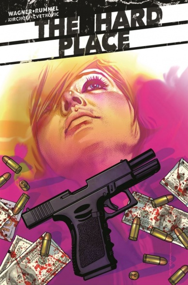
The Hard Place #2
Written by Doug Wagner
Illustrated by Nic Rummel
Colored by Charlie Kirchoff
Lettered by Frank Cvetkovic
Reviewed by John Schaidler
Sitting behind the wheel of a getaway vehicle, due to a set of circumstances that weren’t entirely his choice, protagonist A.J. Gurney (the best wheelman money can buy) asks himself a simple question: “An ex-con famous for helping rob banks. Did I really think that was gonna work out?”
To be honest, the emotionally conflicted ex-con who’s “trying to turn things around” is a pretty tired trope. Without some careful plotting and authentic character development, the whole thing can quickly become a lazy, formulaic cliché. Luckily, “Hard Place” #2 artfully walks a fine line, carefully balancing intense, high stakes action with enough psychological realism to hook the reader on two levels at once. There are bullets, blood, and car chases, but we care about the characters, too.
Right off the bat, Artist Charlie Kirchoff’s thick, angular linework tells us that this book is different. His inks feel stylized, yet spontaneous, almost like hastily rendered graffiti thrown up on a back alley wall before the cops drive by. Often, his backgrounds are very simple, with nothing more than a few minor details to set the scene, allowing us to focus our attention clearly on the characters and their actions. Interestingly, these characters are mainly composed of hard, unforgiving edges, occasionally bordered by motion lines and seemingly random flecks of thick black ink, especially in the opening panels. Effectively, it feels like new noir aesthetic – gritty and intense, but full of attitude and flair.
Charlie Kirchoff’s colors are equally stylish and adept. He constrains the color palette within various panels and pages, but it never feels dull or monochromatic. Even the flashback scenes, rendered in only red, black, and gray, feel rich and fully realized. To be sure, Kirchoff’s colors are moody and foreboding, but there’s an unexpected vibrancy, too, that drives the action forward.
In the end, however, it’s Doug Wagner’s wonderfully understated script that powers this installment and this series. On the very first page, he fearlessly jumps into the action, avoiding unnecessary exposition and overwrought dialogue that gets us up to speed. Throughout the first two chapters, in fact, Wagner has brilliantly balanced character development and plot, deftly setting the stage for what promises to be – literally – a very wild ride.
Final Verdict 8.2 “Hard Place” #2 stylishly avoids tired clichés while breathing unexpected life into the story of an ex-con trying to get his life back on track.
Continued below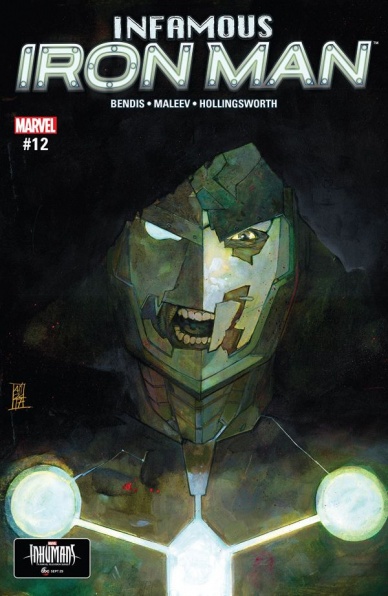
Infamous Iron Man #12
Written by Brian Michael Bendis
Illustrated by Alex Maleev
Colors by Matt Hollingsworth
Lettered by VC’s Clayton Cowles
Reviewed by Alexander Jones
I thought I knew exactly where “Infamous Iron Man” #12 was going and then towards the end of the penultimate issue, author Brian Michael Bendis pulled a fast one and changed the entire direction of the book. This new installment of the series puts things into perspective in a much more concrete manner and ends up being the best and last issue of the series, complete with all the intense stylistic flair and verve that made Bendis such a popular writer in the first place. Alex Maleev’s more dramatic pencils are more even fine-tuned for a couple of silly jokes which actually land even from the perspective of the script.
Maleev gets the chance to go wild in “Infamous Iron Man” #12, utilizing insane layouts and ambitious backgrounds laced with psychedelic vibes. With this art team usually focused on the mundane, everyday aspects of Doom, it’s great to see the artist go absolutely wild in the comic, evoking some of the tones from the original Steve Ditko and Stan Lee era of Doctor Strange. As with last issue, Maleev brings an unprecedented sense of scale that makes the stakes of the script feel even more dire, he frames panels beautifully, bringing in lots of ‘70s-esque tricks implemented in popular films of the era. This story is a strange blend of talking heads and high stakes action and Matt Hollingsworth adds little touches of purples and greens to symbolize Doom and Strange, but also to give the comic a stronger variety. The sun-kissed backgrounds and hues craft a distinctive look separating it from other Marvel titles. Thanks to Maleev, I feel “Infamous Iron Man” as a whole has a strongly defined art style.
Almost everything in this comic is great. Bendis actually tries out a couple of familiar tricks here which are almost mind-numbing, but toy with expectation and reader patience in a wonderfully sinister manner. There’s a sequence here which is going to make this title incredibly divisive and while it wore a little thin just in the sheer page count, I loved the ambition and plot reveals the sequence carried for the title. There’s quite a massive amount of plot revealed during the elongated scene. Unlike lots of other titles written by Bendis, the obsessions of this villain perfectly fit together and hit a strong emotional note towards the end. These plot threads were actually seeded for an extended amount of time and watching these moments disintegrate feel like they will shape Doom as a character.
While I did enjoy this comic a great deal, Doom’s alignment changes still seem only superficial and may never amount to a truly great solo story starring the Doom as hero. Even this issue’s contemplation of why the lead switched sides in the first place felt razor-thin and not a deep character decision fleshed out over the course of several years of stories. At the end of the day, the “Infamous Iron Man” is a great concept and I’m more than happy to see Bendis and Maleev finally get the story right before kissing the title off into the sunset.
Final Verdict: 8.0 – “Infamous Iron Man” #12 offers a smooth finish to a series-wide storyline and finally delivers on the promise of the strong idea at the core of the book.
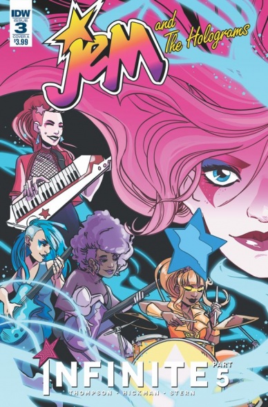
Jem and the Holograms: Infinite #3
Written by Kelly Thompson
Illustrated and lyric lettered by Jen Hickman
Coloured by Sarah Stern
Lettered by Shawn Lee
Reviewed by Frida Keränen
The ‘Infinite’ crossover keeps on rolling with Jem and the Holograms and the Misfits meeting up again. Let’s see how the team manages with the gigantic cast and big moments in this issue.
On the second page of the comic, there is a guest list of the 12 most important characters, but that’s not enough to keep track of them all. In addition to the two bands and their allies, there are even more side characters, not to mention two of the characters have their nearly-identical alternative universe counterparts running around with them. It can be a hard task to remember all the characters if you aren’t a long-time Jem reader, but most of them aren’t really relevant to the story of the issue, which is a relief to those who can’t keep track of them, but a bit of a messy waste plot-wise. The ones that are relevant get plenty of emotional and important moments for themselves, though.
Continued belowArtist Jen Hickman’s style is expressive and cute and the designs for Synergy and Silica are beautiful. Unfortunately, there isn’t that much attention to the scenery now that the look of the alternate reality has been established but Sarah Stern continues to nicely convey emotion with the choice of background colours. The layout works fine and the story flows at a rather quick pace which is suitable considering all the various things going on.
The big reveal about the mysterious voice behind the door is not made into a final page cliffhanger, but is instead in the middle of the issue, which is a good choice. That way writer Kelly Thompson reserves the ending for a more positive and inspiring event instead that leaves you wanting to read on just as much, if not even more, than the reveal of the mystery character. “Jem and the Holograms: Infinite” #3 proves that an issue can have a dramatic ending without it being a last-minute villain reveal, which feels like an obvious fact but many creators seem to have forgotten.
Final verdict: 6.5 The creative team picks up pace and nicely delivers a lot of big moments.

The Kamandi Challenge #9
Written by Tom King
Illustrated by Kevin Eastman and Freddie Williams II
Lettered by Clem Robins
Reviewed by Nicholas Palmieri
In the beginning, this issue of “Kamandi Challenge” seemed like another meaningless foray into Kamandi’s world, with uneven execution due to the creators approaching it more as a game than as a story. By the end, though, King, Eastman, and Williams successfully used the title’s formula to say something greater about it.
The entire issue feels like a Twilight Zone episode. As such, I don’t exactly want to give away the twists. So, suffice it to say that it concerns a small group of characters stuck in a strange place and forced to repetitively interact with something for an absurdly long time. King tries going into the despair each character feels with mixed results; his reliance on purposely repetitive dialogue definitely robs some moments of their potential impact. But with all of these moments cumulatively serving as a meta-commentary on the “Kamandi Challenge” itself, that less-than-effective individual execution regains its impact in the big picture.
Eastman and Williams use an ink and whiteout style with no additional colors, lending an additional bleakness to the issue. The lines are thick, concrete, and striking, and so too are the figures and environments. Every page has extra ink dots splashed onto it as if this dirty, gritty situation the characters are stuck in has started seeping into every aspect of their perception. Eastman, Williams, and King were clearly working together to make this story as effective as possible.
The best part of all of this? The creators use everything in the issue to serve a final, positive point. The despair and repetition is embedded throughout the entire issue, yet it’s ultimately used to praise Kirby and his work. There’s a real point to all this, and it won’t make you feel terrible when you put it down. For those with as little as a passing familiarity with “Kamandi Challenge,” I recommend checking out this unforgettable issue.
Final Verdict: 8.5 – What started as a repetitive standard issue of “The Kamandi Challenge” ended up as a striking, subversively positive meta-commentary on both this title and Kirby’s career.

The Mighty Thor #23
Written by Jason Aaron
Illustrated by Valerio Schiti
Colored by Rain Beredo
Lettered by VC’s Joe Sabino
Reviewed by Elias Rosner
“The Mighty Thor” has truly lived up to its title. Issue by issue, there has been a bombast and a feeling that we are witnessing events that should never be seen by mortals. Most of this has been rendered by Russel Dauterman, but recently another artist, Valerie Schiti, has stepped up to the plate. Not to dump on Dauterman, but there were times when I forgot we had an artistic change (they’re both just such strong artists).
Schiti breathes life into every panel, making the battle between the War Thor and Thor feel epic and supremely heavy. We also get glimpses into almost all the realms this week, each one feeling unique and each character having a distinctive design. But it is the smaller moments, the somber, softer scenes, that are the highlight of this issue. Schiti keeps the faces of the characters moving, allowing them to go from caring to peeved to sad, all without feeling like caricatures.
Continued belowThe same goes for Aaron’s writing. He is playing the long, long game and it feels like we are finally approaching some form of an end game. Like we have reached the prelude to the final tale in the story of Jane Foster, Thor. The opening page is darkness and thunder, opening onto a two-page spread of the Thors clashing, lightening separating them, while the captions invite us to remember the void and the creation of the realms.
From top to bottom, this is just another great issue, with dynamic battles, a character-motivated battle, and the tease of the future. I don’t want to talk too much about it (even though I already have), as it really is best experienced going in mostly cold. And lo, next month, we return to legacy numbering. Join us as “The Mighty Thor” turns #700.
Final Verdict: 8.9. A stellar issue of grand scale and grand set up. A title worthy of the hammer.
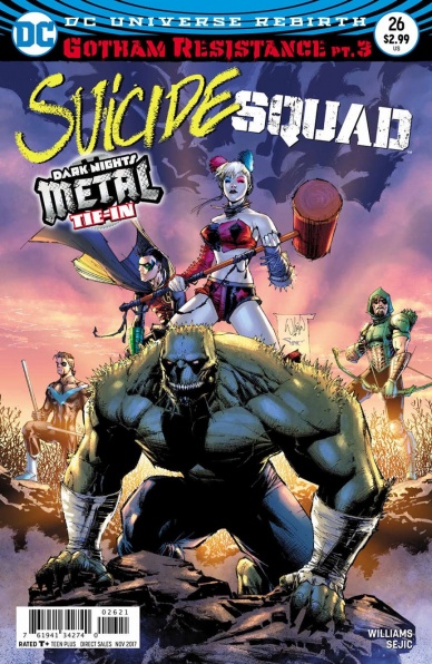
Suicide Squad #26
Written by Rob Williams
Illustrated and Colored by Stjepan Šejić
Lettered by Pat Brosseau
Reviewed by Gregory Ellner
Following from “Nightwing” #27, the third part of ‘Gotham Resistance’ continues its trend of “face a villain, then move along,” but Rob Williams gives his own spin on the structure due to prior developments.
By mixing together a rather evil interpretation of on-and-off rogue Poison Ivy with the more direct interference of the Dark Robin and his temporary minions, Williams allows the plethora of villains, including even a brief cameo from another “card” holder and his own troupe, to remain in the relative background while using poignant interactions to expand on the characterization of several of the heroes, especially Harley Quinn, Nightwing, and Robin.
For his art, Stjepan Šejić keeps his famously dynamic style, especially when it comes to giving faces emotional depth. A mixture of linework and an amalgam of different shades of green make Poison Ivy’s verdant attire seem all the more natural in comparison to the rougher textures of the other characters, whereas the various villains affiliated directly with the Dark Multiverse, including those who had been brainwashed, take on a positively demonic cast, with unnatural glows and haunting silhouettes, especially when it comes to those with supernatural blasting powers.
Very fast paced, perhaps a little too much, “Suicide Squad” #26 gives a very good showing of the characters involved and leaves readers wanting to find out what comes next in the crossover’s finale, “Green Arrow” #32.
Final Verdict: 7.0 – A fast-paced, dynamic tale that nonetheless provides sobering insight and development for some of the characters involved.

War Mother #2
Written by Fred Van Lente
Illustrated by Stephen Segovia and Roberto De La Torre
Colored by Andrew Dalhouse
Lettered by Dave Sharpe
Reviewed by Michael Mazzacane
“War Mother” continues with a tense issue as the titular Mother is held captive and her flock brave their ways through a hostile jungle. Artists Stephen Segovia and Roberto De La Torre do an excellent job visually echoing the frightened, lonely, emotional state of War Mother and FLACO. In previous issues, the War Mother and her sentient rifle child were always pictured together. Connected symbolically carrying for one another. Now they are separated. The artists isolate War Mother by bisecting her suspended body. FLACO is similarly cut apart, only ever shown via its digitized face. Removed from one another they seem lesser.
In the divide, however, is a nice visual representation of the overall motif of motherhood and its connection across the issue. Dave Sharpe’s letters subtly connect War Mother and FLACO, as their word balloons overflow their panels and unite one another despite the distance. Elsewhere that bond is felt as the former residents of the Grove make their way through the jungle. With the knowledge of each party’s actions driving one another.
Despite being a well-read Valiant fan, the 4001 era isn’t a space I’m particularly knowledgeable about. Fred Van Lente’s writing does a good job of communicating the thematics and echoing post-apocalyptic YA tropes that let “War Mother” stand on its own within the larger 4001 context. Just because the book hits some familiar beats doesn’t meant there aren’t some freighting surprises. No matter what the period or setting, Eyes Wide Shut masks with a dash of Victorian fashion is going to be creepy. Nothing good ever comes from their inclusion. And such is the case in “War Mother” where the Big Bad has decided to use that as its aesthetic. The anachronistic design adds a new layer tension of the issue. As War Mother searches for FLACO, she has a realization about her other children, emotionally straining things further. These new antagonists creep around the periphery of panels and give things a slasher vibe, compared to the earlier more monstrous tonality.
Final Verdict: 7.0 – “War Mother” continues to be a well-paced and executed book about the struggles of motherhood, responsibility, and duty.


