
There’s a lot to cover on Wednesdays. We should know, as collectively, we read an insane amount of comics. Even with a large review staff, it’s hard to get to everything. With that in mind, we’re back with Wrapping Wednesday, where we look at some of the books we missed in what was another great week of comics.
Let’s get this party started.

Written by Francis Bonnet, Bill Golliher, Dan Parent
Illustrated by Jeff Shultz, Bob Smith, Jon D’Agostino, Jim Amash, and Dan Parent
Colored by Glenn Whitmore
Lettered by Jack Morelli, Bill Yoshida
Reviewed by Reece Guida
Fall doesn’t start when the leaves change color. It begins when Halloween-themed stuff slowly takes over the shelves in stores. Some people usher in the new season with a pumpkin spice latte or a laptop screening of Beetlejuice. Others crack open “Archie Halloween Spectacular” and some cider.
“Archie Halloween Spectacular” is an anthology of four Halloween hijinks. While Archie’s stories take place in the standard Riverdale universe, Sabrina’s happens in Gravestone Heights 91313, where everyone but her is a Halloween-themed monster. (Well, except for Francine, but even then, there’s a panel where she’s devouring some “mixed bugs.”)
Switching between the two universes in “Archie Halloween Spectacular” is fun, and the creative team takes full advantage of the chance to be very, very campy — especially with the art. There is a character named Eye Da. Her face is a giant eyeball. When she cries, mascara gets all over her shirt. It’s great.
The scariest part of “Archie Halloween Spectacular” is that it reads fresh out of 1939. Both of Sabrina’s stories involve a girl going above and beyond to entrap her crush. And yes, Archie is an idiot, but at least he’s capable of designing a homemade werewolf mask. This stereotyped storytelling is a creative crutch, and it’s symptomatic of how each adventure is a bit mind-numbingly predictable.
Final Verdict: 7.0 – “Archie Halloween Spectacular” is a good-humored and timeless take on the chaos of Halloween, even though there are some pesky cobwebs on a few of the pages.

Written by Max Bemis
Illustrated by Matt Gaudio
Lettered by Taylor Esposito
Reviewed by Matthew Blair
The Black Terror was one of the more famous heroes to come out of the Golden Age of Comics during WW2. It was a time when comics were flooding the newsstands, superheroes were a dime a dozen, and the most complicated problem these heroes faced was trying to figure out how to punch more Nazis.
“Black Terror” #1 seeks to bring this old school hero into the more complicated society of the 1970s. This older, fatter, and nearsighted hero now goes by the name of Bob Benton and struggles with the mental fallout of all that action by taking copious amounts of Valium. Unfortunately for him—and fortunately for the readers—it’s a losing battle.
It’s a familiar idea that’s been done plenty of times, but an intriguing one. Writer Max Bemis does a very good job showing a reluctant hero who is trying everything he can to put his old life behind him, and while the drugs help a bit, the stress and prevalence of crime everywhere is driving him crazy. Unfortunately, Bemis decides to show this budding insanity through a persistent inner monologue that rambles on and on about nothing in particular and almost never stops. The sheer amount of text on each page is incredibly distracting and there’s very little opportunity to let the story breathe.
The artwork is pretty good. Artist Matt Gaudio excels in the details and tiny emotions of the characters. Also, the costume is faithful to the original source material which is good, because the old Black Terror has one of the most memorable costumes in the 1940s. There are some moments where the anatomy looks a bit off, and the artwork isn’t really given a chance to breathe due to the distracting amount of captions, but at the end of the day it’s a well-drawn comic that does an admirable job.
“Black Terror” #1 is a decent comic that does an admirable job reworking and updating a good old school comic book hero that deserves more attention. It just would have been nicer if he didn’t talk so much.
Continued belowFinal Verdict: 6.3 – While the excessive use of inner monologue is a drag, this is a solid comic about a fun piece of comic book history, especially if you’re a fan of the Golden Age of Comics.

Written by Ed Brisson
Illustrated by Rogê Antônio
Colored by Veronica Gandini
Lettered by Cory Petit
Reviewed by Gregory Ellner
With “Contagion” #1, Ed Brisson tries his hand at a weekly Marvel horror story. While somewhat scary on the surface, the result is a relatively by-the-numbers zombie apocalypse narrative. While the concentration on superheroes and supervillains makes it seem to attempt at staying fresh, the same has been done before and in more effective ways. The antagonist is luckily not just the eponymous contagion itself and is a distinct change from some other zombie story villains. Still, he is similar enough to some other villains in the Marvel universe itself that, with little, if any personality, it’s hard to care about what happens to him.
Rogê Antônio utilizes an appropriate style in the heat of the moment, the very lively nature of combat for the Fantastic Four translating very well through his pencils. Unfortunately, said style can come across as so lively that it undercuts any horror that could come across.
Veronica Gandini’s colors have a similar problem, being far too bright and happy, and not quite fitting the story told. No matter how the story tries to sell a rainbow mold zombie apocalypse threat, it’s hard to get around the fact that it’s still brightly colored mold-covered people.
Final Verdict: 6.0 – It’s the end of the world as we know it, and we feel slightly unimpressed.
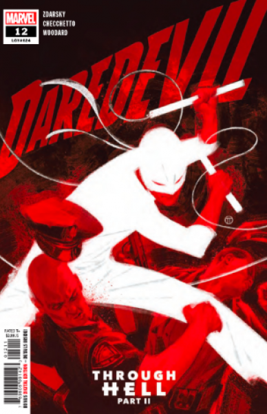
Written by Chip Zdarsky
Penciled by Marco Checchetto
Colored by Nolan Woodard
Lettered by Clayton Cowles
Reviewed by Tanveer Kalo
Matt Murdock fights back with the help of allies and Wilson Fisk learns the road to power is not what he expected. Readers see Matt having the resolve to finally move past his current state and embrace what he always was. The team mostly provides readers an action-packed issue with a clear path to what awaits Matt. His best friend and a past flame will do their part in making sure Murdock gets back on his feet. Zdarsky is setting the stage for some deep trouble with Fisk’s new elite acquaintances. Mayor Fisk can’t escape the past for his new ambitions. Zdarsky is readjusting Matt and Fisk to their true natures: Matt is a hero with a guilty Catholic heart and Fisk doesn’t take kindly to bullying.
Marco Checchetto, Nolan Woodard and Clayton Cowles continue to provide beautiful pages for each issue. Checchetto’s art captures the urban environment perfectly and provides grittiness to the intense combat scenes. The color choices and tones of Woodard compliments the art and words while delivering strong emotion. Cowles’s lettering is spot-on to enrich the story laid out by Zdarsky.
The team is delivering a memorable run for the Devil of Hell’s Kitchen that readers shouldn’t miss.
Final Verdict: 7.6 – Daredevil and Mayor Fisk are in for one hell of a ride to see what the future holds for them.
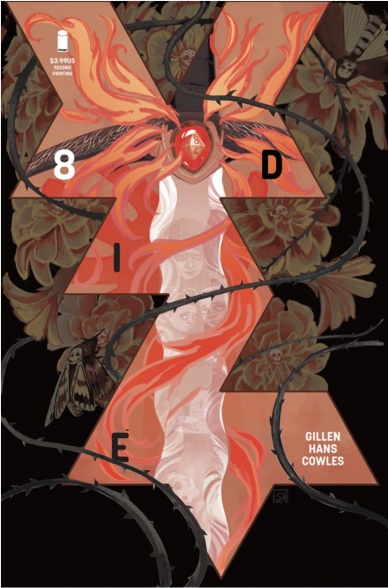
Written by Kieron Gillen
Illustrated by Stephanie Hans
Lettered by Clayton Cowles
Reviewed by Christa Harader
Second arcs are difficult, and so far “Die” has proven that out with some uneven storytelling and odd pacing. Issue #8 smooths the edges a bit, however, with more insight into Sol – as the “happiest” of the bunch in their adult forms, his powers and role in the party haven’t always made sense. Now, however, we know more, and Gillen hits the right poignant note.
Hans’s art is serviceable and melancholy, with nice watercolor washes to gentle the otherwise not-so-Neverland Ash and friends find themselves in. There’s still a problem with facial consistency, however. When it breaks down in battle or in the middle of an action scene, it’s more understandable given the impressionistic art style. In the midst of the peace of the first part of this issue, it’s a problem. Hans’s colors almost make up for it with a big burst of dazzling fire and some pastoral landscape palettes to add interest.
Continued belowCowles’s lettering continues to feel a touch too digital for Hans’s intricate backgrounds, but Cowles’s decision to go cleaner rather than ornate is probably a good one. Sol’s conversations with his weapon are delineated by a subtle font change and balloon styling, and the main font still suits the universe pretty well.
Overall, “Die” is still chugging along but it appears to be treading a bit of water. Splitting the party was a choice that could still play out well, but given the reveal, it’ll be interesting to see how the action plays out from here.
Final Verdict: 7.0 – “Die” #8 gives us a bit more of Sol’s development and nudges the plot along in a satisfactory manner.

Written by Dan Slott
Illustrated by Paco Medina with Bob Quinn
Lettered by VC’s Joe Caramagna
Colored by Jesus Aburtov
Reviewed by Michael Govan
For the most part, I have not enjoyed Dan Slott’s run on “Fantastic Four” so far. I think every series should try and do something different but for these explorers, these ‘imaginauts’, it’s even more important that they explore new territory. This run, however, seems to mostly be focused on nostalgia. It opened with every Fantastic Four member ever teaming up. Several issues have been about re-establishing the status quo now that the Richards family is back on Earth. When the heroes decided to complete the very first mission that left them so Fantastic, I figured it would be more of the same.
However, this is something new. The planet that the Fantastic Four were heading towards back in their secret mission not only has intelligent life but superheroes to boot. New characters, new colorful designs and all. They might be one-offs but thanks to the art team they’re enjoyable all the same and it’s fun to see them all in action.
Furthermore, the Fantastic Four get a very cold reception. This was my favorite part, the change in perspective. You and I both know that the FF are benevolent explorers but to the new heroes, the Unparalleled, they are hostile invaders. The thing is, without the dialogue of our heroes (that was a particularly nice touch and helped see things through the Unparalleled’s eyes), their actions do appear kind of hostile. At issues end, their mix-up is behind them but cracks are starting to show in this utopia and everything might not be as great as it seems. For quite possibly the first time in this run, something new is happening and I don’t know what’s coming next. That’s a good start, I think.
Final Verdict: 7.0 – The heroes (and this comic) are finally exploring new territory.

Written by Ed Brisson
Illustrated by Aaron Kuder and Juan Frigeri
Colored by Jason Keith
Lettered by VC’s Joe Caramagna
Reviewed by Beau Q.
WELCOME TO THE BLUE BLAZE OF GHOST RIDER’S HELL!
Johnny Blaze has gone “mad with power” in “Ghost Rider” #1 as the King of Hell stumbles back into Danny Ketch’s new life looking for some advice on how to rule eternal damnation. What follows is a Netflixian pilot light on engaging character work, and heavy on table-setting the first Ghost Rider solo series since 2016. Danny gets a bar, bartender, ex-wife, dead mom, and Johnny to work with. Johnny brings Mephisto and Lilith from Hell to complete the duo-lead narrative heavy on sin punishment and penance!
HELL, WHERE JOHNNY BLAZE, KING OF HELL, RULES LACKADAISICALLY!
In “Ghost Rider” #1, watch as Brisson wrings mirth out of the Ghosts Rider that feels wholly underwhelming, and aching to be respected as intense edgelord brooding. Kuder swings for the #inktober fences with his omniscient hatchwork, but holds the book back with bland character designs, tired stilted acting, and sacrificing page space for “big” moments that don’t stick the landing either. Johnny Blaze can be confused, at first, for Chris Samnee’s Matt Murdock circa 2011, which I’d hope isn’t the intention. While Keith knocks out fire, flames, putrid skintones, and jaundiced eyes perfectly well, the “Ghost Rider” color script is frighteningly light on nuanced color moods, instead opting for informative local colors and texture.
Continued belowNEXT STOP: THE HOT HOME OF GHOST RIDER, HELL!
To be fair, aiming for an October release really amps up favor for the Spirit of Vengeance– what with all the spooky happenings and adoration for EC-Comics-like horror titles– but little much else lands for “Ghost Rider” #1, which is a shame, because being a) King of Hell and b) a flaming dullahan should be RAD.
THANKS FOR VISITING HELL, HOME TO ONE GHOST RIDER!
Final Verdict: 6.5 – It is not rad.

Written by Grant Morrison
Illustrated by Liam Sharp
Colored by Steve Oliff
Lettered by Tom Orzechowski
Reviewed by Alexander Jones
From day one, “The Green Lantern” has operated as one of the most subversive superhero comics DC is currently publishing. The endgame of the title is finally here with issue #12. In the chapter, Jordan is chasing down Controller Mu and faces an epic battle with the physically imposing Qwa-Man. The issue follows-up on the encounter with a classic Green Lantern villain and a startling cliffhanger. Morrison accomplishes a lot in just one chapter closing out the first season of “The Green Lantern.”
Morrison has structured “The Green Lantern” in an incredibly creative manner, leaving the first couple chapters as self-contained installments that all bridge to a greater finale. It is fascinating to see Hal Jordan’s complicated relationship with the Blackstars fleshed our further. Morrison continues to bring in classic Green Lantern elements from previous continuity besides the Blackstars. Morrison’s script for the finale features the bombastic fight scenes and conflict readers want from a finale. The Guardians of Oa also play an important role in the issue. “The Green Lantern” #12 feels like the end of a season as opposed to a finale or done-in-one chapter.
Artist Liam Sharp continues his trend of drawing wild page structures and fight scenes. Sharp chooses unconventional structures for his layouts that kept me fascinated to read each page. Sharp extends a massive amount of detail to the fight scenes. Each time Jordan comes to blows with the Qwa-Man, there’s something interesting to look at on-panel. Sharp is great at depicting harsh fight scenes but his final pages on the cliffhanger bring out some of his very best work to the series. I was shocked at how chilling the final pages of “The Green Lantern” #12 were from an art perspective.
Final Verdict: 8.0 – “The Green Lantern” #12 refocuses the series to deliver a chilling final battle and cliffhanger.

Written by Cavan Scott
Illustrated by Francesco Francavilla &Megan Levens
Colored by Francesco Francavilla & Charlie Kirchoff
Lettered by AndWorld Design
Reviewed by Chris Egan
The anthology “Star Wars Adventures” series comes back for another Halloween season with “Return to Vader’s Castle.” Writer Cavan Scott dives right into the Tales From the Crypt/Creepshow style with one of Darth Vader’s minions in the creepy storytelling role. Having captured a helpless victim to tell a new haunting, the first story in the new series follows a lowly crew of scavengers looking for the next big score. What they come across is more dangerous and unpredictable than any of them could imagine.
Set during the Clone Wars, the scavengers come across the once mighty Darth Maul, now half a man, living alone in his dark madness, having become a local legend – a boogeyman. The story is fine, but within the shortened horror anthology framing, it gives us very little to be interested in or care about. Retreading over this time in Maul’s life, previously shown in the The Clone Wars, we don’t get anything new from this interaction, and for those who may have not watched that series, this leap forward in Maul’s life will be very confusing. The story overall is mildly creepy with an ending that plays very much life the aforementioned horror shows, but it is on the weaker side. Granted, this miniseries is aimed at a younger “Star Wars” audience, and some readers will sure get a kick out of it, but overall it is imbalanced. It can’t go too far into horror territory without being marketed to older readers, but it doesn’t do much that would satisfy most kids either. It feels stuck in an odd limbo.
Continued belowFrancavilla does a great job emulating the old horror comics that so many anthology shows were based on, but he only gets to shine on a few pages. His pencils and ink are beautifully spooky and his color work is magnificent as always. His talent for playing with bright colors and the blackest of shadows will never cease to amaze me. Levens’s work captures the animated series vibe the series mainly aims for and it works on that level, but there is nothing of note outside of her take on Maul and his unsettling Robo-spider body. Kirchoff’s colors do the job, but again, nothing of note. It tells the story but ends up being ultimately forgettable.
“Return to Vader’s Castle” #1 – The Horned Devil is an OK start to this series that will fill each issue with a story focusing on a baddie who has been directly affected by the path of Anakin Skywalker/Darth Vader. Along with the individual stories, this issue looks to be setting up an over-arching plot that will carry through until the very end. Hopefully, the stories in the subsequent issues will only rise in quality.
Final Verdict: 5.5 – By no means terrible, but if you’re looking for spooky stories set in the “Star Wars” galaxy, it has been done better elsewhere.
Written by Erik Burnham
Art by Dan Schoening
Colored by Luis Antonio Delgado
Lettered by Christa Miesner
Reviewed by Rasheda
The ghosts of Megatron, Starscream, and other Decepticons have a final battle with Optimus Prime and Ectronymous Diamatron. The Ghostbusters are involved in the battle, Ectronymous has been masquerading as their car, Ecto. When Megatron possesses Ecto’s body, The Ghostbusters and Prime have to choose between saving their friend or sacrificing him to save Earth.
This has been a big year for crossover comics. IDW Publishing has cornered the market on 80s cartoons and has done several crossovers within this genre. Erik Burnham has made the Transformers/Ghostbusters crossover believable with the ghost aspect of the story and the connection with Gozer. The dialogue of Peter, Ray, Egon, and Winston is spot on to the characters from the movies and the continuation of the cartoon, it’s pretty funny interactions between them and the Transformers (you can tell Prime is kind of over the situation.) Burnham keeps the story as straight as possible because it is a wild concept.
The art by Dan Schoening keeps in line with the original design of the Transformers, which is nice, reimagining the story is fine but we would like to see the original models of Transformers. The Ghostbusters are drawn very well, even though they were not prominent in this comic. The detailing was definitely spent on the characters, which does put the focus on the story. This brings us to the colors by Luis Antonio Delgado, you can tell that the color is computerized but it is done well. The scenery is gloomy, but the colors used for the ghosts and explosions are even brighter against it. Delgado’s colors add to the tension building and the happy ending. Also, we must give a shout out to Christa Miesner’s lettering,you have to enjoy the sound lettering and the opening credits.
Final Verdict: 6.9 – A fun stretch-of-the-imagination crossover for the person who was a child of the 1980s.

Written by: Kevin Panetta
Illustrated by: Kendall Goode & Serg Acuña
Colored by Serg Acuña & Dann Sánchez Chaves
Lettered by Jim Campbell
Reviewed by Joe Skonce
Professional wrestling features larger than life personalities (sometimes in elaborate and colorful costumes), episodic storytelling that rewards longtime fans without isolating new viewers, and action that looks intense while also being fun. Because of this, wrestling sometimes feels like a live-action Saturday morning cartoon designed to sell you toys. “Smackdown 20th Anniversary” #1 feels like an entry in a long-running Saturday morning cartoon, which I don’t think I would have been a fan of.
Like a Saturday morning cartoon, it is fast-paced and has some pretty effective humor, following Becky Lynch and other members of the current stable of superstars as they try not to get upstaged by superstars of the past. There are hairbrained schemes to infiltrate, intimidate, and ultimately fight their way into the limelight. Kevin Panetta writes a story that shows the importance of legacy, but with enough tongue in cheek irreverence to make it fun.
Continued belowThe thing that really invokes the feeling of a Saturday morning cartoon, though, is the artwork of “Smackdown 20th Anniversary” #1. Kendall Good and Serg Acuña’s art looks like they are working off of set head designs, making them look like caricatures or action figures. The designs are distinct enough that you can tell the different superstars apart from one another, but it also feels like they were designed so that a toy company could use one set mold as you walk down the WWE isle of Target.
That’s really the biggest problem with “Smackdown 20th Anniversary” #1, which is that it feels like a lengthy advertisement. Smackdown is moving to a new night and a new network, and the comic is there to build hype rather than telling a story on its own merits.
Final Verdict: 5.6 – A decent, if ultimately forgettable, comic that invokes the nostalgia of a Saturday morning cartoon.


