
There is a lot to cover on Wednesdays. We should know, as collectively, we read an insane amount of comics. Even with a large review staff, it’s hard to get to everything. With that in mind, we’re back with Wrapping Wednesday, where we look at some of the books we missed in what was another great week of comics.
Let’s get this party started.

Written by Ta-Nehisi Coates
Penciled by Leinil Francis Yu
Inked by Gerry Alanguilan
Colored by Sunny Gho
Lettered by VC’s Joe Caramagna
Reviewed by Alexander Jones
The sleepy, reserved take writer Ta-Nehisi Coates has contributed to “Captain America” started to pay off over the last issue. After past installments set up a paranoid Steve Rogers terrified of his immediate surroundings, it is great to see an issue more definitively show the character as an icon or a hero akin to Mark Waid and Chris Samnee’s most recent work with the hero.
The issue definitely carries a sense of catharsis as Steve’s paranoia shows that his suspicions were right all along. The entry carries lots of triumphant action moments and is a platform to show just how solid Leinil Francis Yu’s artwork is. Coates’s excellent deep-dive into the psyche of Captain Ameria really shines when a familiar character trades a couple blows with Captain America. This series thus far has never been able to find a tone that strikes the balance between humor, paranoia, and intrigue until this installment.
Yu’s art is able to carry a lot of the script here. Captain America faces lots of different villains and adversaries in the tale with only a few lines of prose per panel carrying the action. Yu’s vibrant, clear approach to the pencils is a great addition to the story. Yu’s work is sparse but the cold, dissonant aspects he and color artist Sunny Gho bring to the issue perfectly complement Coates’s more reserved script. This is also a much more polished approach that Yu is bringing to his pencils than readers may have seen during some of his other Marvel work.
Coates’s first couple entries were missing a sense of adventure and intrigue driving the plot forward. There were multiple installments of the title that ended with a cool cliffhanger that Coates didn’t immediately follow-up on. Thankfully, “Captain America” #4 takes his collected, grounded approach to the script and mixes it up with “Daredevil”-esque prose that captures what makes Steve Rogers interesting. The issue also carries a couple of revelations that will have fans of the character cheering with delight. I hope going forward each installment will carry this same level of fluid energy. Yu’s pencils continue to carry both the action and intrigue of some of the best superhero comics around.
Final Verdict: 8.0 – “Captain America” #4 carries fast, fluid fight scenes and the series’ best script to date.

Written by Christopher Sebela
Penciled by Ro Stein
Inked by Ted Brandt
Colored by Triona Farrell
Lettered by Cardinal Rae
Reviewed by Christa Harader
Audiences and creators alike are obsessed with dystopian futures these days, with mixed creative results.
“Crowded” posits that said dystopian future is, well. Now.
Issue 3 is another solid installment in the fast-paced series. Sebela wisely keeps the action going while expanding the world in bite-sized chunks (much like the media blitz these characters struggle to function in every day) that build to create a disturbing not-very-alternate reality in which everything – even libraries – are monetized for our consumption. My one gripe? Like Vita, I’m rapidly tiring of Charlie’s innocent act, but there’s enough going on outside of her as a focal point to keep me interested while I roll my eyes through her chirpy facade.
Also, that’s kinda the point.
I really dig the art style in this book. Stein, Brandt, and Farrell work seamlessly to balance the fun and the brutal. Dynamic action scenes are handled well, and whether I’m paging through a tense car chase or pausing on a panel to explore book carousels for rent, I’m fully on board. I also enjoy the butch/femme visual dynamic between Charlie and Vita, and how on-point Charlie’s Millennial fashion is. There’s something almost ghoulishly satisfying about watching her dodge would-be killers in a beanie and thigh-high stockings. Zeitgeist? Maybe. Engaging? Absolutely.
Continued belowRae has a huge job in this comic, and that’s making the balloons flow on page after page packed with diverse panel layouts. The typeface reads a little pinched in digital form, but Rae’s choice suits the claustrophobic, over-stimulating vibe of the whole book.
With new assassins on board and crowd-funded kill streams to tune into, it’s hard to say what’ll roll out next from Sebelda and team’s twisted imaginations. Whatever it is, it’s sure to be uncomfortably on point.
Final Verdict: 9.0 – Clever world-building? Check. Current trends in our cluttered digital culture? Check. “Crowded” #3 continues the book’s stand-out, unique charm.
Written by Tim Seeley, Magdalene Visaggio, Gary Dauberman, Michael Moreci, Vita Ayala, Bryan Hill, Kenny Porter, Dave Wielgosz, Gabriel Hardman, Corinna Bechko & James Tynion IV
Illustrated by Kyle Hotz, Minkyu Jung, Riccardo Federici, Felipe Watanabe, Jonas Trindade, Victor Ibanez, Dexter Soy, Riley Rossmo, Christian Duce, Gabriel Hardman, Mark Buckingham & Andrew Pepoy
Colored by FCO Plascencia, Jordie Bellaire, Sunny Gho, Romulo Fajardo Jr., Matthew Wilson, Veronica Gandini, Ivan Plascencia & Trish Mulvihill,
Lettered by Steve Wands, Josh Reed, Deron Bennett, Clayton Cowles, Carlos Mangual & Tom Napolitano,
Reviewed by Dexter Buschetelli
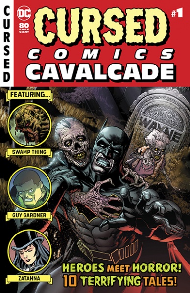
Halloween is the time for the macabre. It is a period where we engage in the things that are supposed to frighten us the most. Scary shows, murderous movies, yelp-worthy YouTube series, and craven comics dominate this time of year. It is, as such, no surprise that DC Comics (Detective Comics Comics, for the layman) would try and capitalize on this most morbid of months.
The “Cursed Comics Cavalcade” plays on anthology series of the past, leaning heavily into the EC Comics spooky imprint that included the likes of “The Vault of Horror,” “The Haunt of Fear,” and, most notably, “Tales from the Crypt.” This is, essentially, a house of horror with heroes, for all intents and purposes.
For an anthology horror to work though, it needs several moving parts to align. This book fails in that regard. There is no bookend to connect these stories, they are not frightening, and the attempt to insert capes into the horror genre often breaks the characterization of the established heroes.
The opening salvo, ‘The Spread,’ features Swamp Thing, arguably the best fit for this release. Despite an obvious fit and the gorgeous art of Kyle Hotz, this story falls flat on its face. It establishes the overarching theme of “the real monster is within us” but has little else to say, much like the rest of the book. It is disappointing to see an attempted throwback to the gruesome gaggle of stories that EC so deftly put out in the past fail so spectacularly.
This book features an all-star cast of creators but gives them little room to breathe. Installments like “Siren Song” offer interesting premises but feel like they are rushed to their climax due to the short length of pages they are given. For an 82 page book, this feels like a lot of fluff for something that should have more weight.
Even the Batman story ‘Gorehound,’ which seeks to offer commentary on horror tropes like the “Final Girl” feels lacking in depth. This seems like an idea that could have been fleshed out further but is cut short just as it is sinking its teeth in.
One would be hard pressed to say a bookend could have saved this, but the lack of a connective tissue in these stories only further hampers a collection of tales that are ultimately utterly toothless. We’ll have to wait for another Samhain season to see if :Detective Comics” can redeem itself, but for this year one would be far more frightened by “Squirrel Girl” than the “Cursed Comics Cavalcade”.
Final Verdict: 6.5 – I’d rather be watching Tales from the Hood.

Written by Stephanie Phillips
Illustrated by Maan House
Colored by Dee Cunniffe
Lettered by Troy Peteri
Reviewed by Elias Rosner
I’m not going to bury the lede, “Devil Within” #1 is a trite horror comic that peddles more in overused cliches than in actual horror or originality. The set-up is intriguing, a woman is plagued by a mysterious, malevolent being in her reflection and then everything starts going wrong for her. The only problem is that it’s executed in a sloppy and rushed fashion. Much of the comic feels like it was written with a horror checklist. Fiance doesn’t believe that anything is wrong, check. Mysteriously destroyed dishes and trashed house, check. Possibly fake information from her past that makes her fiance think she’s crazy, check. We move from cliche to cliche, not allowing any trope to linger for longer than a couple pages, and thereby being unable to get our bearing to be either scared or involved with the characters.
Continued belowThis isn’t helped by the art’s liberal use of shadows. Everything is covered in them, even during the daytime! Shadows obscure faces, Sam’s most prominently, but never for any good reason. It seems like it’s to induce a sense of dread like the character is hiding something or has ill intentions but it’s never the case and instead just makes the comic feel murky and dark and confuses the motivations of these very one dimensional characters. We don’t know these people yet! We’re thrown into their story without even a shred of background knowledge as to why we should care about them and what we are given on the page isn’t nearly enough to justify any sense of danger we have for these people.
The only saving grace, besides most of the art, is that by the end of the issue, it seems like we’re beginning to move into new territory. I get the distinct impression that the writer wasn’t certain how to begin this tale or how to get us to connect with these characters and was impatient to get to the meat of the story. I can understand that. It also means that this fails as a first issue.
Final Verdict: 3.0 – Overdone, rushed cliches pack much of this comic that reads more like the start to a particularly bad horror anthology tale than that of a stand-alone series.

Written by Alan Moore
Illustrated, Colored and Lettered by Eddie Campbell
Reviewed by Tom Shapira
Do we really need a colored version of “From Hell?” the conspiratorial take on the Jack the Ripper murders has long been one of the highest acclaimed comics of its era and the complete black and white collection from Top Shelf seems to be doing fine in print for over a decade now.
Reading the first ‘issue’, which collects the prologue and first two chapters of the original publication clocking at over fifty story pages in a handsome square-bound package, of this new serialization I am still unsure. And I suspect I wouldn’t be until the whole thing is complete and I’ll have the two versions side by side.
What I can be sure of is that “From Hell” is still “From Hell,” which is to say – the most impressive work either of the creators have been involved with and considering the bibliographies of the persons involved that is quite a bar to clear.
The main difference, so far, is that Campbell’s coloring brings a more romantic sense to setting: the black and white original offered us a cold and harsh word in which architecture was a crashing oppressive force overlooking human ants; here the people appear more alive, the city and nature not as bleak. Campbell claimed that recoloring was a chance for him to fix some artistic mistakes, but these tend to be of such minor nature that none but the artist and the most eagle-eyed of historians would notice. The main difference I experience here is stylistic, putting up the colors seems have put into sharper focus the horror roots of the serial, the bloodletting and operating scenes bring to mind something like old Hammer Horror films. I am quite curious to see how this would be reflected in later chapters when the violence reaches its zenith.
My usual take on various colorizations is extremely cynical, there seem to be a dozen bad ones for any decent job and even when the work itself is decent there is something disturbing to me about remaking history to fit the fashion of the presence, but here I sense the possibility of something greater.
Final verdict : 9.0 – A classic it was and classic it is – art, words, characters, themes and presentation all remain top notch. Whether “From Hell: Master Edition” can establish its own identity, separate enough from the original, remains to be seen.

Written by Sina Grace
Illustrated by Nathan Stockman
Colored by Federico Blee
Lettered by VC’s Joe Sabino
Reviewed by Gustavo S. Lodi
The “Iceman” series has a bit of a backstory, that of being canceled, just to return months later by the same creative team. Its success in the trade market prompted a revival, and the reason becomes clear from this issue. There is a lot to appreciate, even with its occasional problems.
Continued belowStockman is smart to rely on his strongest suits, but there are areas that could use some polish. Whenever Bobby, Emma Frost and the rest of the cast interact, his facial expressions are spot-on: readers need little to understand these character’s long history together other than the visuals. It is around page and panel design that the artist stumbles a bit. Some pages feel cluttered and what were clear attempts to make panels more dynamic, end up confusing in terms of what is happening where. It is a shame because Stockman delivers a couple of excellent pages, especially one that presents a big reveal and another set inside Bobby’s mindscape. It becomes apparent that the shortcomings are around consistency, rather than talent or ability to present great visuals.
Colors by Blee are noticeable when the story moves to the ethereal plane on Bobby’s mind. There, “Iceman” becomes a study on how to use an essential blue and white palette to convey depth and exciting creatures.
Grace’s plot and character development walk that thin line between organic exposition and ham-fisted themes but is far more balanced than previous entries. Bobby’s sexuality, his own history with prejudice with his parents are a part of him, but that is used in favor of the story. And while some nitpicks could be made about how the writer conveniently manages powers, those are very few and far between to be relevant in any way.
All in all, “Iceman” offers a lot to new and old fans of Bobby Drake, and readers of the first volume of this series should definitely head back for more. Stockman can certainly take inspiration from his better work to keep pushing the art level forward, and existing plot points show promise for the future.
Final Verdict: 6.9 – An interesting continuation of Bobby Drake’s story, “Iceman” #2 is a fun adventure, consistent with the characters and their rich backstory.
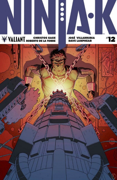
Written by Christos Gage
Illustrated by Roberto de la Torre
Colored by Jose Villarrubia
Letters by A Larger World Studios
Reviewed by Ken Godberson III
The “Ninja-K” series continues to fly under the radar as Christos Gage and the artist he’s teamed up with continue to craft a really good action book in its own corner of the Valiant Universe. In this issue, Colin continues his mission in a seemingly cured Chernobyl for his friend Gilad, the Eternal Warrior, who has become possessed by the ever reincarnating Dying One. This is a more action focused issue, with Colin infiltrating the Dying One’s lab and taking on some of the monstrosities, both human and not-so-human. It has a very brisk pace to it, but it does have one key flaw: overreliance on internal monologue. Now, don’t get me wrong: in some parts, it works, but a lot of the scenes, in particular when Colin confronts some of the villagers working for the Dying One, it comes off as redundant.
The real star of this issue is the artwork. Roberto de la Torre and Jose Villarrubia provided a great palate that works well for a super-spy story. They keep the book grounded, with a heavy use of inks for shadow with action scenes being brutal and bloody. It helps make the more less-than-normal goings-on, such as when the Dying One himself, look a bit more ethereal and creepy when it has the heavily grounded backdrops. One particular scene is when one of the supposed dead bodies in a pile of the Dying One’s failed experiments is still alive and Colin has to grant it peace. It’s vicious imagery, even if the scene is slightly marred by the aforementioned inner monologue.
Final Verdict: 7.0- “Ninja-K” continues on as one of Valiant’s sleeper hits with great artwork making up for some narrative flaws.
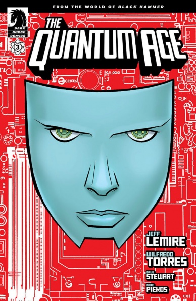
Written by Jeff Lemire
Illustrated by Wilfredo Torres
Lettered by Nate Piekos of Blambot™
Colored by Dave Stewart
Reviewed by Michael Govan
The “Black Hammer” universe is chock full of homages to preexisting superheroes. Barbalien, in both design and origin, is reminiscent of Martian Manhunter. Golden Gail is a twist on ‘Shazam!’ Instead of a child that transforms into a magically powerful adult, she is an adult that transforms into a magically powerful child. The heroes of “Quantum Age” appear to be a homage to DC Comics’ Legion of Super-Heroes. The Quantum League and Legion are both collectives of alien teens in the far-flung future. One might wonder if “Quantum Age” would be as good if the reader didn’t get the references. Aside from any homage, how does the book fare on its own? Fortunately, “Quantum Age” #3 is truly great.
Continued belowComic book readers have seen the broad strokes of this story before. Marvel’s Vision and DC’s Red Tornado are both robots who wanted to ‘become a real boy,’ so to speak. Jeff Lemire still tells Archive’s tale effectively. In a few pages, readers are taken through the rise and fall of Archive, his journey book-ended and brought full circle by conversations with ‘Mother.’ ‘Mother’ is not a standard, unfeeling robot either. She remains unseen until the very last page but Lemire’s dialogue gives her personality. ‘Mother’ is undermining, passive-aggressive and matronly to Archive all at once. The reveal of her identity on the final page boosts the issue (and the mini-series as a whole) to another level.
The art and colors are top-notch as well. Wilfredo Torres and Nate Piekos are fantastic visual storytellers in this issue. Take, for example, Archive’s two conversations with ‘Mother.’ The first time he comes before ‘Mother,’ his green and white outfit matches the cold, mechanical aesthetic of his surroundings. Archive stands self-assured and confident of his desires before ‘Mother.’ When the robot returns an outsider, he stands dejected. His bright gold and purple costume doesn’t match at all. Torres clearly etches pain and heartache in Archive’s expressions, closing in on his face for dramatic effect. The creative team is firing on all cylinders for “Quantum Age” #3.
Final Verdict: 8.0 – It’s Archive’s turn to effectively show that ‘Even an Android Can Cry’ in “Quantum Age” #3.
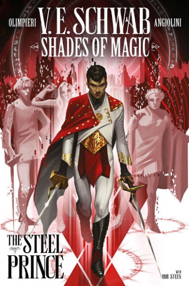
Written by V.E. Schwab
Illustrated by Andrea Olimpieri
Colored by Erica Eren Angiolini
Lettered by Rob Steen
Reviewed by Michael Mazzacane
“Shades of Magic: The Steel Prince” is the start of a prequel story to the larger Shades of Magic YA series of novels also written by Schwab. Which is normally the kind of starting point that would render it somewhat impenetrable to a layperson. The start of “The Steel Prince” is quite the opposite, an early splash page gives an effective exposition dump on the magical and multiversal nature before landing on the titular Prince Maxim Maresh. The first issue does a fine job of setting up Maresh’s character along with everything else one should hope for from a first issue. Schwab also doesn’t “overwrite” it with various narrations the way most people expect someone coming in from prose to do. They show real restraint and belief in the art teams ability to convey interiority.
Andrea Olimpieri has worked on the “Dishonored” books which is a pretty good point of reference for the “gaslamp” world of “Shades.” It isn’t quite whale-punk but it’s in that realm. Olimpieri’s opening double page spread that visually enhances Schwab’s scripting is a bit of an outlier for this issue. The rest of the book has this cramped feeling. Panels that would normally be only one, such as when Maxim catches a pickpocket, are split in two. Which is in the abstract a nice effect but didn’t visually enhance anything in context. Olimpieri’s use of tight perspective visually muddies the issues main action set piece. There are moments when the many panels are effective at highlighting small movements but overall fail on a macro level.
The sense of muddiness is some part due to Erica Angiolini’s color palette. It lacks depth when set against Olimpieri’s heavy dry brushed blacks encroach on everything. Making the sigils of magic a bright vibrant molten red makes them stand apart and read as supernatural, even for this world, but their vibrancy just serves to further the dull impression the palette makes overall.
Artistically “Steel Prince” is opaque in places, but the issue overall has a sound script and nicely dramatizes the character of Maxim Maresh. As a new reader to this series, it creates a clear impression of him and what the arc of “Prince” will entail. Fans of the larger book series will be easily sold, but it also works well enough for the uninitiated.
Final Verdict: 7.0 – As a comic “Shades of Magic: The Steel Prince” is a pretty good first issue, there are the artistical muddy spots but as a unit of storytelling does what needs to be done.
Continued below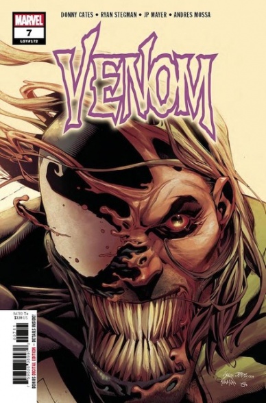
Written by Donny Cates
Illustrated by Iban Coello
Colored by Andres Mossa
Lettered by VC’s Clayton Cowles
Reviewed by Gregory Ellner
Following up directly from the end of the “Rex” arc, Donny Cates throws readers directly into the mix. Cates’s writing style for this arc is intentionally disorienting, driving readers to take on Eddie Brock’s confusion after what had happened to his symbiote during the battle with the Grendel. Using a surprising antagonist as an ominous, yet quasi-reliable expository device, Cates fills in the blanks in what had happened between the end of the prior issue and the beginning of this one. Amnesia is a key facet of this arc, after all, and the idea of an antagonist being our viewpoint into what really happened presents an interesting opportunity that is similar to, but distinct from, Knull’s own exposition several issues back.
Iban Coello’s artwork is distinct from that of Ryan Stegman. Whereas he focused on the eldritch nature of symbiotes, on their disturbingly malleable forms, Coello pays more attention to more solid structures, such as individual people, and minimizes the use of the symbiote itself, albeit with an in-story reason behind that. What is more interesting is the fact that the fantastical nature of the aforementioned antagonist is also downplayed, in favor of a more humanoid villain’s look.
Andres Mossa presents a far more varied color palette to “Venom” than Frank Martin before him. Instead of focusing on reds, yellows, and blacks, he uses more colors, including more blue and silver, adding more of a “world outside of the symbiote struggle” concept than the “Rex” arc had.
In general, “Venom” #7 is an interesting lead into the next arc and a refreshing change from the previous eldritch god-based conflict.
Final Verdict: 8.0- ‘The Abyss’ begins on a subdued, but interesting note, looking into more of an overall ominous and cerebral feeling than the high-flying action of the previous work.

Written by Carl Potts
Illustrated by Juanan Ramirez
Colored by Rachelle Rosenberg
Lettered by VC’s Travis Lanham
Reviewed by Chris Egan
Have you ever wanted to read a Spider-Man book in which you had no sympathy or emotional connection to Peter Parker? Readers have seen Peter make mistakes in his past. Especially early on, and under the influence of a certain black suit. In “What If? Punisher” #1, we get a Spider-Man who only cares about money and fame as soon as he gets his powers, a Spider-Man who does not learn from the mistake that led to Uncle Ben’s death, but rather continues to make one after the other. He creates a black/skull spider suit before anything bad even happens to him. He is corrupted by his power and his anger over Ben’s death creates a dark vigilante that is a poor version of both Spidey and the Punisher. The point of this issue is to give us a rushed re-cap of Peter’s early days as Spider-Man, or in this case ‘The Punishing Spider,’ in which he learns his greatest enemies’ weaknesses to murder them rather than subdue and capture them. An angry teenager with a gun is a poor excuse of a Marvel character.
‘What if’ stories have been used in comics for decades. They are fun outlets for creators to try something new with beloved characters and worlds. Some work, but this one definitely does not work beyond the concept stages. Everything about it goes against the grain. It is an uncomfortable read. Some fans will argue that it’s a different version of the character and criticizing it for being different is pointless, but it isn’t different enough to warrant such a drastic change in the character. With Frank Castle’s version of The Punisher, you may not agree with him or his methods, but his history and the final catalyst that set him on that path is far more understandable than what we get here. Potts’s writing is not poor, but it does feel incomplete. The bulk of the story is rehashed threads and dialogue with an unforgiving spin. A forcefully tacked on ending makes Peter even less of a hero while trying to bring about a more recognizable Punisher plot.
Ramirez and Rosenberg’s work is very good. It’s truly the highlight of the book. They fully realize this alternate Earth that almost feels like the Marvel universe we are used to. It looks like the world we know, except for that alternate suit that never tells of a man that is destined to be a hero. The illustrations are a great blend of classic Spider-Man touching on classic moments ranging from comics running from the 60s to the 80s. The work is really what keeps the book afloat. Rosenberg’s colors are gorgeous and while the style overall is radically different, it works as a callback to both John Romita Sr. and Alex Ross.
Final Verdict: 4.0 – A mashup of character histories that just doesn’t come together in the way it was planned. A solid art team saves this from being a total loss, but this will mostly appeal to readers looking to complete their “What If?” collection.


