
There’s a lot to cover on Wednesdays. We should know, as collectively, we read an insane amount of comics. Even with a large review staff, it’s hard to get to everything. With that in mind, we’re back with Wrapping Wednesday, where we look at some of the books we missed in what was another great week of comics.
Let’s get this party started.

Written by Donny Cates
Illustrated by Ryan Stegman, JP Mayer, and Jay Leisten
Colored by Frank Martin
Lettered by VC’s Clayton Cowles
Reviewed by Reece Guida
With just one issue away from the finale, “Absolute Carnage” #4 gives readers compelling character moments, dynamic action scenes, and highly organized lettering that helps define story beats. Everything is par for the course in this Marvel event.
Just like in issue #1 of “Absolute Carnage” where Eddie draws inspiration from pain during combat, his biggest character moments in #4 happen as he battles the entire Carnage horde. Cates is known for creating fundamentally broken characters like Eddie Brock and the anguish they harbor. In “Absolute Carnage” #4, he isn’t showing this; he’s telling us this. Poetic captions and word bubbles lose effect when they’re in nearly every single panel featuring Eddie.
The most poignant character moments for Eddie Brock come at the end of “Absolute Carnage” #4, which with transcripts from his inmate interview at Ryker’s Island. In this longer format, Cates explores Eddie’s psychology. Reading these records and seeing how exposed Eddie felt without his symbiote enriches all the pages before, where Eddie is “peeled out of [his] armor…defenseless.”
Through violent, fast-paced action balanced with expressive close-ups, Stegman’s art enhances the emotional side of the story. Mortal Kombat fans will love how the artist uses X-Ray style panels to show how deep Carnage’s bloody tendrils penetrate the flesh of a certain symbiote host. Since this is the climax of “Absolute Carnage,” the backgrounds in issue #4 are generally rubble, explosions, speed lines, or Carnage’s symbiote army. This makes for a chaotic reading experience that is intentionally disorienting, but it sometimes feels like the artists were just pressed for time.
Final Verdict: 6.8 – In “Absolute Carnage” #4 there is no respite from the terror, no moment of quiet. With so much noise, the spaces for contemplation are few and far between.

Written by Jim Zub
Illustrated by Lan Medina
Lettered by VC’s Joe Sabino
Colored by Marcio Menyz
Reviewed by Michael Govan
I wasn’t crazy about the whole ‘Agents of Wakanda’ thing from its conception. T’Challa running Wakanda’s version of S.H.I.E.L.D. should be a slam dunk and since I absolutely loved all that Jim Zub did on the gone too soon “Champions” title, I thought this series would bring me around but…I’m still not feeling it.
In all fairness, the artwork is solid throughout the book. Lan Medina draws great superhero action and visually, the whole issue looks fun. I don’t really have any complaints there. The story, on the other hand, is…well, a different story. In this issue, the team is forced to face their own fears, a trope that I usually love. It gives insight into the characters but I feel largely indifferent to what we’re shown. I liked Okoye’s part well enough, felt so-so about Fat Cobra (I truly think that character is better in small doses) and didn’t like Janet Van Dyne’s. She was a full-fledged Avenger, a founder at that. Why is she on the Avengers support staff? Also, she has things going on outside of being Hank’s wife or Tony’s girlfriend, right? That’s what the character keeps being reduced to though.
I also must have missed whatever’s going on with the Sentry. Apparently he merged with the Void in his last series. It doesn’t matter, it doesn’t make him any more interesting. There’s a Sentry vs. Thor fight here but it feels underwhelming. This team-up of very random characters just isn’t doing it for me.
Final Verdict: 5.5 – Remember “Black Panther & the Crew”? Now that was a good series.

Continued below
Written by Kelly Thompson
Illustrated by Carmen Carnero
Colored by Tamra Bonvillain
Lettered by VC’s Clinton Cowles
Reviewed by Quinn Tassin
Kelly Thompson’s run on this book has been awesome so far and “Captain Marvel #11” is no exception. This issue closes Thompson’s second major arc and she ends it with a bang. Captain Marvel facing off with her newest villain, Star, was absolutely thrilling and showed us exactly why Carol Danvers is such a beloved character. Even with her powers sapped, she’s tough, she’s got heart, and she never says die.
Carmen Carnero’s dynamic, expressive art, boosted by Tamra Bonvillain’s coloring, has been one of the best parts of this series so far and she makes sure her final issue of Captain Marvel count. Every punch, crash, and energy blast in the climactic Times Square fight has real weight to it. The image of Star hovering over our hero, mad with power, as the scene plays out on massive screens behind them is the stuff that great comics are made of.
What’s better than the fight that takes up most of the issue is how well the creative team sells the small moments. Carol talking to the little girl who tried to protect her; Hazmat and Carol’s heart to heart; Rhodey and Carol snuggling watching the news. Moments like these are what make Marvel Comics great and “Captain Marvel #11” should get any reader excited about the future of this run.
Final Verdict: 8.5 – Kelly Thompson continues to shine as she shows us what makes Captain Marvel such a great hero.
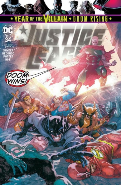
Written by Scott Snyder and James Tynion IV
Illustrated by Bruno Redondo and Howard Porter
Colored by Hi-Fi
Lettered by Tom Napolitano
Reviewed by Alexander Jones
DC’s ongoing “Justice League” series is committed to uniting the heroes and villains of the DC Universe together to battle each other. The stakes of the series have implications stretching across the Universe and I wouldn’t be surprised if the climax of the ‘Justice/Doom War’ storyline eclipses nearly all of the DC Universe. This entry has a focus stretching across different timelines and casts of characters. The timeline in the past features the triumphant return of The Justice Society of America. Writers James Tynion IV and Scott Snyder team several different generations of DC heroes together in one issue.
Artist Bruno Redondo is a great fit for the core series. Seeing Redondo depict the Justice Society and Justice League together in the same panel is a great representation of past and present. Redondo retains the costumes from the Justice Society. The heroes carry a stoic nature that makes them look different from the League. The tone of the series completely changes when the script flashes into the Metropolis of the future. Readers get to see characters from alternate futures team up with a few League members. Redondo spotlights the visual differences between the numerous teams with body language and visual design.
The story comes crashing back into the present when Howard Porter takes over the pencils of the issue. Porter shapes the core conflict of some story and brings Snyder and Tynion’s plot point to a surprising finish. The past couple of issues of the series have folded lots of members into the cast but haven’t quite reached any huge plot moments. Porter’s portion of the issue finally brings the story to the massive plot resolution readers were hoping for. Porter is great at drawing the big action between the different heroes. The last couple pages of the comic bring the wider DC Universe together and feature a peek at what is coming next in “Justice League” and a couple of other series.
“Justice League” #34 finally brings the focus back to the event thanks to dynamic pencils and a strong set of final pages. Porter and Redondo work surprisingly well in the context of one issue. The story does a better job building momentum to the next chapters of the script than the previous issue did.
Final Verdict: 8.0 – “Justice League” #34 is a focused yet wildly expressive entry into the ‘Justice/Doom War’ storyline.
Continued below
Written by Ollie Masters
Illustrated by Eoin Marron
Colored by Jordie Bellaire
Lettered by Hassan Otsmane-Elhaou
Reviewed by Beau Q.
Did you know 78s, the first disc format to store ye olde rock n’ roll, was obsolete by the ‘60s to make way for 33s and 45s that could play more music, last longer, and be stored easier? As music evolved, so too did the demands for playing it. So, as we take a gander at “Killer Groove” #5, please bear in mind that this is crime comics shoving their 45s and .45 down the proverbial throat of the crime genre, and squeezing.
Take a spin of “Killer Groove” #5 and you’ll find a trite plot tawdry with common noir hang-ups: alcoholic private eye, stoic hitman, mortality-based secrets/lies/omissions, drugs, revenge murder, dodgy bars, etc. Hell, looking a step further reveals that ill-fated trappings of a prestige tv finale: heavy and ambiguous pronoun use, introspective mercy killings, flash-forwards, and a short ramp to the exit. While poignancy is completely lost among the schlock, Masters and Marron provide ample reason to press on– to finish the set. This is a story meant to entertain and if nothing more, they have accomplished their goal in spades.
Not for nuthin’, Masters didn’t care for pacing the macro as much as pacing the single-issue experience. It is with a cognizant mind that Masters saw the month-long shelf appearances as enough time to pace out “Killer Groove”– its intent is monthly reading. Marron, on the other hand, saw “Killer Groove” #5 as a chance to play with crime finale expectancy. You expect an important character death, a final showdown, but what Marron delivers is two stellar 3-panel pages that drive by those expectations on their way to tying up loose ends. Master and Marron have arrived at this final destination, subtly pushing past the familiar Brubaker/Phillips tropes that cloud much of American crime comics. They know you know what’ll happen next, so they move past it and spend time building their own sound, their own look, and most importantly, their own book.
“Killer Groove” #5 is a Masters-class in getting you to read it even if it failed at getting you to care for its characters. The flawed edges of its nicotine-stained recording will remind you what the crime genre, at large, has to offer, even if you forget it– that crime comics as we know them are obsolete but continue to evolve.
Final Verdict: 7.8 – Killer, no filler.

Written by Eliot Rahal
Illustrated by Clara Meath
Colored by Mark Englert
Lettered by Taylor Esposito
Reviewed by Kobi Bordoley
“Midnight Vista” #2 fulfills the first issue’s promise: that this is a heartfelt, sci-fi horror comic not just about alien abduction, but familial alienation as well. That’s a lot to cover, but luckily for us, Eliot Rahal’s punchy dialogue and clear characterization drive the story forward and keep things tidy.
Rahal’s clever exposition does a lot of the heavy lifting. Early on in the issue Oliver, reappearing in town as a young adult after a seventeen-year disappearance, learns about what happened during his absence. To bridge this time gap, the detective leading Oliver’s case puts on an “Unsolved Mysteries” style video documentary of the disappearance for both of them to watch. The result is an emotional, short but meaty sequence that reveals the frayed web of characters at the center of the story and hints at the wider mysteries underpinning “Midnight Vista” #2. This kind of territory, where character realization and consequence clash with one another, is where Rahal really excels.
Clara Meath, the artist, and co-creator lends immense depth to the story, supplementing Rahal’s best moments with readable, concise yet stylized panels. Particularly impressive is her ability to capture shades of similar-yet-different emotions through a character’s eyes (which seem to be her specialty, made clear by the number of expressive character close-ups we get). In “Midnight Vista” #2, wide eyes don’t just read as fear, but as silent panic, restless trepidation, remorse, shame, and so much more.
Finally, a word about color. There’s something of an uncanny valley effect going on in “Midnight Vista” #2 when it comes to how things look, and it really adds another dimension of unsettledness to the world. For example, the color pink, often associated here with alien horror, is buoyant and beautiful, but just a shade away from blood and the violence it portends. Pink is playful, but in the context of the alien dissection laboratory, gleeful and sadistic. In a story so much about family, colorist Mark Englert’s womb-like palette is especially jarring. Subversive and lurid in the best way possible, the color schemes here are excellent, and in total, this is an excellent second issue to the series.
Continued belowFinal Verdict: 8.8 – “Midnight Vista” #2, aptly titled ‘The Mothership,’ brings us aboard an unsettling and beautiful sci-fi horror, family drama. Buckle up and beam me up; this is a story to watch.
Written by Kieron Gillen
Illustrated by Dan Mora
Colored by Tamra Bonvillain
Lettered by Ed Dukeshire
Reviewed by Gregory Ellner
“Once and Future” seems to be about, above all else, the power of story. In “Once and Future” #3, Kieron Gillen makes use of the changing narrative of the Arthurian myth to tell of just how much such a story’s changes can influence perception, including the likes of Galahad and Arthur in particular. The plotting is very educational while also being just as entertaining as previous installments, working together with the not-quite-normal Gran and newcomers to the hunt Duncan and Rose into a rather amusing story that is nonetheless terrifying at the same time.
Dan Mora’s artwork continues to impress, with thin lines working together into intricate imagery in the realms of both the fantastical and the mundane. On the part of the former, the likes of Arthur and his knights have a flow to their appearance, especially when mystical winds seem to fly up around them, which makes them seem ethereal even while their appearance remains utterly horrific and deep into the realm of the undead. On the part of the latter, the facial expressions are top-notch, with emotions from Gran’s irritation or amusement to Duncan’s fear and exasperation to Rose’s confusion and sympathy all given equal weight to a degree that helps them to seem all the more human.
Tamra Bonvillain’s colors are just as effective, with the sickening greens associated with Arthur clashing with the dark colors around in the night, all of which serves to further emphasize moments of increased light such as a flashlight shone into a dark area.
Final Verdict: 8.0 – As the night gathers, the knights also gather in yet another phenomenal installment to this Arthurian tale.
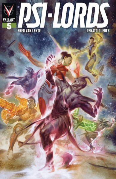
Written by Fred van Lente
Illustrated by Renato Guedes
Lettered by David Sharpe
Reviewed by Matthew Blair
“Psi Lords” #5 continues the story of four people who wake up in a strange alien prison with bizarre powers and no memory of who they are or how they got there. At this point they are very much aware of what they can do and how they feel for each other, but are becoming more and more involved in an increasingly complicated alien political structure…and there is some hidden threat that clearly wants them dead.
The writing on “Psi Lords” #5 is simple, yet effective. Writer Fred van Lente has been working with the title since the beginning and has a keen grasp of how each of the four protagonists behaves, how they feel about their powers, and how they feel about their situation and each other. Also, there are very clear hints at a much larger picture involving alien political structures and the main antagonist of the series has a solid motivation mixed in with a bit of fun dry humor and a very capable skill set.
The artwork of “Psi Lords” #5 has a very unique flair to it that probably isn’t going sit well with some readers. Artist Renato Guedes makes the book feel like a high production value mid to late 1990’s CGI project that is heavily detailed but has a few things about it that just seem a bit off. While the book does have an incredible amount of detail, great colorwork, and a firm determination to establish itself as unique. some of the faces, emotions, and postures seem a bit too wooden and strange and a lot of the shadows and abstract backgrounds can make the book confusing to follow at times.
“Psi Lords” #5 is a solid middle book in a great series by a great publisher. While the artwork can make things a bit confusing to follow at times, it delivers solid character work and a great antagonist that will be interesting to see in future issues.
Final Verdict: 8.1 – While the artwork seems a bit wooden and bizarre, the characters and world-building help shape something unique and interesting to follow.
Continued below
Written by Roy Thomas
Penciled by Alan Davis
Inked by Cam Smith
Colored by Chris Sotomayor
Lettered by VC’s Travis Lanham
Reviewed by Christa Harader
With Thomas at the helm, we get back to Conan’s comic roots in “Savage Sword of Conan” #10. This issue kicks off a new adventure in which Conan hires his sword to a wealthy noblewoman searching for her husband and a fabulous treasure deep in the mountains of Ghulistan. Along the way, Conan challenges a hill chieftain, things go awry and he’s left a little high and dry.
Not the first time, and certainly not the last.
Thomas sets up the issue well with a fight that demonstrates Conan’s prowess and craftiness. Here we see Conan the thief as well as the mercenary, and watching the Cimmerian sneak, beguile and reason his way through conflict – though mostly, just into it – is always a fun way to engage with Howard’s creation. We all know that he can kill monsters and gods if he has to, but it’s often the wiles of man that leave him a little adrift. Davis and Smith work decently together, though there’s some heavy shadowing that adds cartoonishness to what would otherwise be a pretty delicate and fine-lined version of the muscled barbarian. Facial details are sparse, but Conan’s got the hooded, burning eyes going for him in a few scenes. Sotomayor’s color palette is a little drab to fit the travel montages, though the first spread is all vintage Conan. Blue-tinged gamblers in the foreground set off the golden tavern light of the struggling combatants are a great contrast and a good reminder of newsprint that’s come before. Lanham’s lettering is on point, and if Thomas is a bit verbose in this issue it’s only because we haven’t reached our head-cutting quota yet.
“Savage Sword of Conan” is turning into a delightful anthology that does justice to its origins, and while this first installment is a little slower than the previous hacking and slacking of Zub and Zircher, it’s interesting enough to keep us reading for another hair-raising adventure.
Final Verdict: 7.0 – “Savage Sword of Conan” #10 demonstrates that Conan’s often better off with a sword in his hand than a clever word on his tongue.

Written by Matt Fraction
Illustrated by Steve Lieber
Colored by Nathan Fairbairn
Lettered by Clayton Cowles
Reviewed by Joe Skonce
Jimmy Olson has been on a lot of adventures in his day. Classically, these were told in short vignettes, fitting multiple stories into a single issue of comics. The medium eventually moved towards decompression, telling longer stories over multiple issues, but In “Superman’s Pal Jimmy Olsen” #4, Matt Fraction and Steve Lieber pay homage to those techniques. In this story, a man who is losing his grip on reality uses the heightened stories of the past in a way to create a comic that is retro in its aesthetic, but modern in its storytelling.
One of the best things about “Superman’s Pal Jimmy Olsen” #4 is how Matt Fraction uses that classic short vignette style to tell a complete and cohesive story. Olsen is explaining to Lois Lane why he’s living under a false name (Timmy Olsen, a real scamp pranking Gotham), and every time he tells a new part of the story, it jumps into a new vignette. The humor of these short segments of the comic comes from the narrator at the start, full of the bravado and enthusiasm of the silver age of comics. These short scenes also help to sell the fact that Jimmy is becoming an increasingly unreliable narrator, seeing conspiracies everywhere and falling further down the rabbit hole of his self described “Crazy Board.”
Lieber’s art also captures the look of classic comics. Early in “Superman’s Pal Jimmy Olsen” #4, Jimmy turns off the lights casting the scenes with Lois in shadow. Because of this, the colors of the vignettes become heightened and make them feel more artificial. In Jimmy’s world of dark shadows and conspiracies, the bright and vibrant colors of his memories make them feel that much more delusional. There’s also an incredible visual of Jimmy swinging around of the red string of his conspiracy board as he explains why Lex wants him dead. It is a fun way to navigate a lot of exposition and features some fun illustrations of historic photos and newspaper clippings that really takes advantage of the medium.
Continued belowOverall, it was an interesting take on Olsen to use his previous history as a light adventure comic to tell a darker story.
Final Verdict: 8.4 – Fraction and Company tell a convincing story of a man slowly losing grip on reality while capturing the art and tone of a silver age comic

Written by Jimmy Palmiotti & Amanda Conner
Art by Chad Hardin & Tom Derenick
Colored by Alex Sinclair & Jeremiah Skipper
Lettered by Travis Lanham
Reviewed by Rasheda
A group of alien bounty hunters has captured Wonder Woman’s group that includes an alien princess, Cheetah, and Steve. As the group tries to escape, they find out the reason for their capture and plans for their future destination. Not one to ever go quietly without a fight, Wonder Woman forms an uneasy alliance with Cheetah to escape from the bounty hunters.
First, you can tell this issue was split into two parts with two of everything; writer, art, colors. Jimmy Palmiotti’s writer for part seven explains everything that has happened up to this point for the group and why certain events are happening. It is a lot of dialogue between Diana and Steve with heavy explanation, which is good but I felt it cut Palmiotti’s idea short and part seven short. Amanda Conner takes most of the action writing in part eight and with fewer characters. She only focuses on the princess, Cheetah, and Diana, leaving the others out of the story completely. Conner tells the story from the ‘it’s time to show some action’ point of view. With both parts being equally compelling, it could have been split into two separate issues, instead of jammed into one.
Chad Hardin and Alex Sinclair are the first artists up to bat for part seven for the art and color. The art is very detail for this part, with heavy shadows and lines. They way Hardin and Sinclair collaborate, it almost looks like the characters have a glow to them. Hardin’s art is great, it’s clean and it’s nice to see the details in the facial expressions of the characters. Sinclair uses really bright colors, almost as symbolism to a light, trippy, space adventure, which this story is.
For part eight of this issue, Tom Derenick is on art and Jeremiah Skipper has the color duties. Derenick uses heavy shadows on his art, kind of taking away from his solid artwork. He is not consistent with character art, the face on Wonder Woman and Cheetah change throughout the panels, in those instances you can see the heavy lines. Skipper stays with the strong, bright colors that were used in the previous part, although it is a little dark since they are traveling in space. Together, both artist teams have a consistent flow in this issue.
Final Verdict: 6.7 – Action-packed and slightly uneven, Wonder Woman’s warrior status is just enough to keep you coming back for more.


