There’s a lot to cover on Wednesdays. We should know, as collectively, we read an insane amount of comics. Even with a large review staff, it’s hard to get to everything. With that in mind, we’re back with Wrapping Wednesday, where we look at some of the books we missed in what was another great week of comics.
Let’s get this party started.

Written by Greg Pak
Illustrated by Nico Leon
Lettered by VC’s Joe Sabino
Colored by Rachelle Rosenberg
Reviewed by Michael Govan
This modern version of the Agents of Atlas is a far cry from the original team. In all honesty, Jimmy Woo is the only common thread. Still, while Amadeus Cho’s crew doesn’t have a gorilla, they make for a pretty fun comic.
One of the strengths of this issue is the antagonist. Mike Nguyen isn’t quite on Lex Luthor’s level but he’s still intriguing. Nguyen and the powers that be behind the Portal City of Pan are a problem that can’t simply be solved by punching. They aren’t even outright evil at the moment, just greedy, same as any other corporation. They have a revolutionary idea in Pan, an idea that obviously means a lot to the people…so of course, they try to get rich off of it. The free trial is over and now it’s time to pay up.
It’s also interesting to see Amadeus struggle a bit in this issue. Brawn is one of Marvel’s best young superheroes and he always shines under the pen of his creator, Greg Pak. He’s a super-genius but can’t quite crack the problem before him and leading the Agents of Atlas isn’t coming as easy he might think. Even a simple kiss with teammate Luna Snow becomes a big to-do…
The entire team struggles a bit in this issue, to be honest. That’s another plus, watching this new team of heroes find their way. They aren’t as organized as, say, the Avengers. At the same time, it’s touching to see them become a family of sorts. Protecting Asia, they’ve found common ground, sharing similarities as different as they are. I mean, really different. Shang-Chi’s a grown man and Crescent can’t have hit puberty…but they’re equals. Artist Nico Leon does a solid job drawing fire-breathing serpents and epic superhero action but my favorite panel just shows that they all took their shoes off when entering the HQ. It’s a small moment but it means a lot. Even though it’s a mini-series, I’d like to see much more of these Agents of Atlas.
Final Verdict: 7.0 – The new Agents of Atlas are short on gorilla-men but big on heart.

Written by Jeff Lemire
Illustrated by Dustin Nguyen
Lettered by Steve Wands
Reviewed by Kobi Bordoley
If you woke up this morning in a daze, wondering if authoritarian space vampires were still hunting dissidents and rebels in the world of “Ascender,” know this: yes. Yes, they are. “Ascender” #6 sets off a new arc in the story, hitting familiar notes and staying within Jeff Lemire and Dustin Nguyen’s established comfort zone.
While Lemire sets the stakes high from the get-go (remember, we’re being pursued by space vampires), he still takes time for some quieter, contemplative moments that continue to establish the world of “Ascender” as the outcome of brutal conflict. The juxtaposition here between characters unpacking their war trauma and Nguyen’s watercolor style creates an aesthetic I’d almost call “haunted nostalgia.” There’s a wistfulness to this world, and it feels as if the scales are always tilted to the side of sadness, over beauty. It’s something special about “Ascender,” and I’d argue that Nguyen’s flowing, blended art style, while not for everyone, leads to moments of intense clarity not as easily reached by other comic art styles. Essentially, in a world portrayed by curving lines and often translucent color, moments when characters are sharply drawn in disgust or rage really stand out.
For similar reasons, Steve Wands’ crisp lettering gains so much by being paired with Nguyen’s art, and visa versa. For example, the font used in most speech bubbles curve ever so slightly to mirror the story’s art style. For reasons unknown to me but likely known by linguists/learned psychoanalysts, this makes reading “Ascender” feel effortless and quick, upping the pace of this already fluid story. Thoughtful, detailed onomatopoeia light up the page (pun intended considering the well-placed flamethrower in this issue) and contrast Nguyen’s art in a satisfying way as well, popping off the page and into our mind’s eye–or ear, in this case. “Ascender” is a well-oiled machine, and right now it’s firing on all cylinders.
Continued belowFinal Verdict: 8.0 – “Ascender #6” gallops forward, adeptly merging unique art, purposeful writing, and space opera themes to great effect.
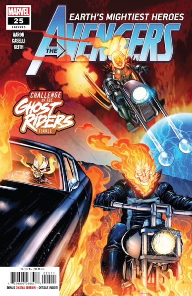
Written by Jason Aaron
Illustrated by Stefano Caselli
Colored by Jason Keith and Erick Arciniega
Lettered by VC’s Cory Petit
Reviewed by Alexander Jones
Marvel’s ongoing “Avengers” series has changed focus and directions countless times. Issue #25 is the conclusion to writer Jason Aaron and artist Stefano Caselli’s ‘Challenge of the Ghost Riders’ storyline. The issue sees three generations of Riders pitted against each other in a race that was started by the newest Rider, Robbie Reyes attempting to exercise his muscle car. Over the past year of “Avengers” stories, Aaron has been testing Reyes to see if he is worthy of being an Avenger. The newest chapter of the series (hopefully) draws a conclusion to that storyline and shows the comic book progression of Reyes over the last couple of years in continuity. The story draws attention to the team dynamics of the book and shows just how large Marvel’s Ghost Rider continuity has become over the past couple of years.
The “Avengers” title has never been completely serious in tone but the newest script for the issue attempts to cover a decompressed issue with a veneer of obvious humor. Thor’s jokes about drinking too much fall flat when he’s in the midst of an intense battle in Hell. Seeing Reyes confront his legacy is a dramatic and poignant way to make him worthy of becoming an Avenger. I only wish Aaron found a decent reason for the rest of the Avengers to populate the remaining pages. Captain Marvel and She-Hulk feel like they are in a different story than the Ghost Rider-centric heroes. That being said, It is incredibly refreshing to see Reyes finally succeed using the Spirit of Vengeance.
Stefano Caselli’s artwork retains the high production value readers are used to seeing from his contributions to Marvel. The action-oriented visuals are a good fit for Caselli’s bombastic visuals. The colors from Jason Keith and Erick Arciniega allow for the landscape of Hell to look awesome and punishing. Caselli would be an excellent fit for a Ghost Rider ongoing series thanks to dynamic and visuals and big facial expressions. Caselli makes each of the three Ghost Rider’s in the issue look completely different.
Final Verdict: 6.5 – “Avengers” #25 has good intentions and plotting but falters in execution and humor undercutting the emotional core premise.
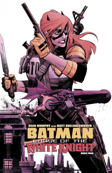
Written and Illustrated by Sean Murphy
Colored by Matt Hollingsworth
Lettered by AndWorld Design
Reviewed by Beau Q.
Here are the only events of matter in “Batman: Curse of the White Knight” #4: Barbara gets her bat-back bat-broken. Dr. Thompkins and Alfred met Jason Blood once. Harley had twins. That’s it. Everything else is necessary though plodding plotting to get to Barbara’s injury, as with every Bat story where Barbara can walk, post-Killing Joke DC. This eventuality sucks the complete life from the book and the reader.
Where Murphy and company could use “Batman: Curse of the White Knight” #4 to distend an emotional catharsis for our grief-stricken Barbara following her father’s death, Murphy focuses on scene-arrangement through thoroughly banal motivation. Of the surviving plot threads twisting through ‘Curse of the White Knight,’ Harley, a cornerstone of the ‘White Knight’ line, takes a backseat to Alfred white-knighting for Bruce and the Wayne family. The imagery that follows– a match cut between Bruce looking at Alfred’s sword, the Wayne family weapons, and Barbara picking out an AR-15 [sigh]– this foreshadows the upcoming Firefall sword fight finale between Azrael and Batman, but does nothing to draw poignancy from the scripted melodrama motivating these warriors to battle death.
With Gotham bathed in the Azrael rust-orange, Hollingsworth sweeps as much emotion through the fiery atmosphere of “Batman: Curse of the White Knight” #4 while staying true to the local colors present; namely, fire. Not to knock others for nuthin’, but a color palette set to fire is magnificently difficult to balance; see “Ghost Rider” #1. But Hollingsworth pinches the singular nerve running through Murphy’s sterile landscapes, and builds the undertones moving the plot, even if the script does not.
Continued belowLight on heart-stringing, heavy on exposition, “Batman: Curse of the White Knight” #4 suffers a fatal crack along its narrative spinal column, but the pain, which is yearned to be felt, ends up numbing. This is the mini-series’s halfway point, so maybe this is its creative and figurative low point.
Final Verdict: 7.0 – Barbara gets fridged. Again, again.

Written by Joshua Williamson
Illustrated by David Marquez
Colored by Alejandro Sanchez
Lettered by John J. Hill
Reviewed by Quinn Tassin
“Batman/Superman” #3 is a solid outing for Joshua Williamson. It’s fun seeing Supes going undercover, fighting the Joker toxin so it’s a shame that the concept lasts all of 3 pages before he gets found out. Still, though, seeing how easily The Batman Who Laughs is able to figure out our heroes’ plan and get under Superman’s skin speaks to how formidable of a foe he is.
“Batman/Superman” got David Marquez to sign an exclusive contract with DC and every panel shows how much passion he has for this book. His art is as good as it’s ever been here and his cinematic art exudes energy. He gets a strong assist from colorist Alejandro Sanchez, who’s bold coloring is a perfect fit for the artist. The duo does such a good job that “Batman/Superman #3” can almost be read without any text.
The whole sequence on the bridge in Gotham stands out more than anything else in the issue. Marquez’s art is thrilling and the plotting is fast-paced while still giving us the strongest character beats in “Batman/Superman” #3. Superman’s takedown of Gordon’s old Batman armor followed by Batman’s takedown of Gordon is some of the most satisfying action you’ll read in a comic. For those few pages, everything comes together and a good book briefly becomes a great one.
At the end of the issue, Batman and Superman get blindsided by an attack by the freshly evil Blue Beetle as the delightfully sinister Batman Who Laughs who makes “Batman always wins” a threat. As much as a blast as all of this is, it’s a bit hard to know exactly what Joshua Williamson is going for in “Batman/Superman.” It’s a fun conspiracy story, to be sure and it’s doing interesting character work with both of its title characters. Still, though, it would be nice to see some more thematic depth in the future.
Final Verdict: 7.7 – The Hobbs and Shaw of DC Comics just can’t win in “Batman/Superman” #3.
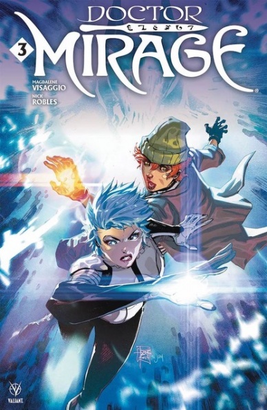
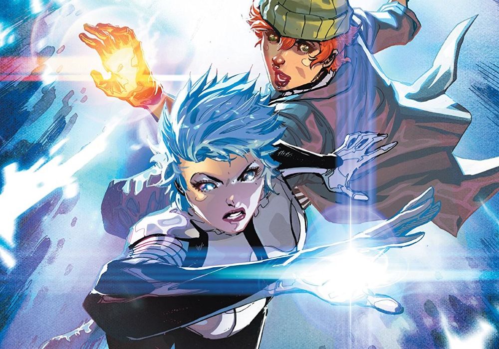
Written by Magdalene Visaggio
Illustrated by Nick Robles
Colored by Jordie Bellaire
Lettered by Dave Sharpe
Reviewed by Gregory Ellner
When it comes to new arrivals for the Valiant Universe, Magdalene Visaggio’s writing on “Doctor Mirage” #3 is very inviting. From the seriousness of the eponymous character to the relatively lively and amusing responses of her apparent partner Grace, there isn’t much left behind that will allow any readers to be lost in the shuffle. While fans of other comics might see elements of “Doctor Strange” or “Katana” in Visaggio’s tale, similar concepts come together to form a very different whole that makes use of its various parts to make sure nobody in the story feels tacked on or useless, simultaneously being very entertaining all the way through.
Nick Robles is a master of high-intensity psychedelic visuals, expertise he brings forth from the likes of “Euthanauts with great aplomb. The look of this hell is utterly bizarre, from warping landscapes around a building to suddenly more recognizable interiors, and Robles knows just how to play both in ways that can both disorient readers and help them to dive deeper into the story’s world at the same time, aided by the growing aggravation Grace and Doctor Mirage have for one another as shown in the subtle expressions on their faces.
Jordie Bellaire’s highly varied color palette helps to sell the ridiculous nature of the hell the cast find themselves in. Even the most (relatively) peaceful locations have beautiful coloration, from the eclectic decisions around the borderline Seussian castle exterior to the concentration on greens, blues, and purples shown during the calmer times inside said castle. Backgrounds are sometimes given a color wash to draw attention to the characters within but said decisions seem intentionally disorganized, with other colors bleeding into said single-hue pieces as if “splashed” from a paint can by accident. The overall effect seems to mimic Doctor Mirage’s own mentality and lack of experience with this particular part of the Deadside.
Continued belowFinal Verdict: 7.5 – Newcomers are welcome to take the psychedelic journey through the latest adventures of Doctor Mirage.

Written by Paul Allor
Illustrated by Chris Evenhuis
Colored by Brittany Peer
Lettered by Neil Uyetake
Reviewed by Chris Egan
After the loss of one of their own, the Joes are in mourning and emotional turmoil is sweeping through their ranks. Duke is dead, America has surrendered to Cobra, and nothing seems to be going right for the heroes. Writer Paul Allor keeps the stakes and emotions high while moving between the interpersonal relationships of the many characters in this follow up to the shocking premiere issue.
With this being a reboot of the classic characters Allor is really shaking things up. Major “GI Joe” characters like Duke and Snake Eyes are either dead or indefinitely taken out of the story. He is taking risks with a beloved franchise and it is paying off. While there are many characters throughout this issue, the real focus is on Scarlett and the new recruit Tiger. Scarlett is destroyed by Duke’s death and is burying herself in her work, and tends to be taking it out on Tiger. Heavy plotting aside, the twists are top-notch and the final page will have long-time fans shocked.
Evenhuis’s art is a delight, flat and even across the board, but moves with a flashy dynamic that lends itself to feeling like an animated series. Which, of course, is perfect for this world. Characters are uniquely designed, even if they aren’t realistically detailed. Peer’s colors are a fun energetic blast that puts some real-life into this issue, even if the bulk of the plot is nothing short of bleak.
The overall design and style of this new series do an interesting balancing act of fun and colorful for a younger audience while giving an emotional reverence for older fans. It’s a well-executed to reach a wide range of fans.
Final Verdict: 7.5 – “G.I. Joe” is delivering the goods with brooding storytelling and popcorn action.

Written by David Pepose
Illustrated by Gavin Guidry
Colored by Liz Kramer
Lettered by Ariana Maher
Reviewed by Reece Guida
In “Going to the Chapel” #2, the wedding day devolves into a half-baked hostage situation. The local police and Bad Elvis gang are equally ineffective at their jobs, which empowers Emily, the cold-footed bride, to take control, stall, and strategize about what the outcome of this wedding will be.
Nearly every character in “Going to the Chapel” #2 is a caricature of themselves. An influencer bridesmaid uses her second cell phone to communicate with the police; naturally, it doesn’t have phone service, so the hostages report from inside the chapel via Instagram. This is a refreshing use of technology in comics that you don’t often see.
Sometimes, the jokes are so relentless that you doubt the hostages are scared at all, which lowers the stakes of the story overall. At the same time, this consistent comedy makes all of the characters in “Going to the Chapel” #2 likable, regardless of their motives.
Writer David Pepose uses every panel in “Going to the Chapel” #2 as an opportunity to build character and the emotional story. He does the best work with his protagonist, Emily. Though she’s an archetypally duplicitous woman, Pepose portrays her in an empathetic way. For so long, Emily has gone with the flow; now, she’s finally taking control.
The visual humor in “Going to the Chapel” #2 is consistent in tone with the writing. One of the robbers looks exactly the same with his Elvis mask on as he does with his mask off. Plenty of facial expressions and panels are readymade memes.
Though there’s plenty of detail in body language, the backgrounds in “Going to the Chapel” #2 consistently lack detail. A palette of mostly yellow, pink, and purple flats, the background colors make the setting less specific but give the story an atmosphere. An advantage of this, however, is that the lettering pops against these unfinished backgrounds. When a stray bullet cracks a windshield, a “PAK” noise — written the same color as the shattered glass — seamlessly works with the movement in the panel.
Continued belowFinal Verdict: 8.0 – “Going to the Chapel” #2 is a marriage of Millennial madness and Shakespearean subversion, with exciting writing, current themes, and atmospheric art.

Written by Mike Mignola and Scott Allie
Penciled by Christopher Mitten
Colored by Brennan Wagner
Reviewed by Tanveer Kalo
The issue marked the end of Hellboy trying to find Liz and B.P.R.D’s investigations into what’s happening in a small town in New Hampshire. Saturn Returns provided a contained narrative through the 2 stories. However, the stories felt paced parallel to each other and didn’t quite merge. Narrative of the ghoul mystery in New Hampshire felt weak compared to Hellboy and Liz’s despite having equal time in the issue.
Mignola and Allie give readers the early dynamics of Hellboy and Liz’s relationship. Hellboy will do anything to save and protect Liz. On the other hand, readers understand where Liz was earlier in her life and what role Hellboy played.
Mitten and Wagner’s works are the best parts of the series. They capture the horror and suspense of the ghouls terrifyingly well. Wagner’s colors especially come through during the battles between law enforcement and the ghouls. Mitten’s art matches up with Mignola’s gritty and intense work.
One notable reflection from the series is the supporting cast had a larger role compared to other Hellboy and B.P.R.D titles. Since Hellboy
Overall, the series felt memorable for Hellboy and Liz’s adventures more so than the actual monster hunting. Yet, Saturn Returns is another nice story in exploring the past adventures of Hellboy and the B.P.R.D.
Final Verdict: 7.2 – Not quite the ending readers might expect, but a good read for Hellboy and B.P.R.D fans.

Written by Jon Tsuei
Penciled by Audrey Mok
Colored by Raúl Angulo
Lettered by Jim Campbell
Reviewed by Christa Harader
“Sera and the Royal Stars” #4 unmasks our villains and throws in a plot twist: not all of the stars are friendly to be freed, or Sera, or even each other. In fact, some of them are pretty pissed off. Tsuei and Mok add in some character details that matter in this issue, and we get some emotional development for Sera at last. Sera interacts with the ghost of her mother to face some of her fears, and we observe a cool pantheon blender in the Council of the Dead.
These details don’t do much to assuage the book’s problem with depth, however. Tsuei’s concepts are fantastic, but they’re mostly delivered at speed – characters appear, names are dropped and locations are visited so quickly they become shallow as they pile up, and Mok’s impressive design sense doesn’t get a chance to settle or linger before we’re whisked off to the next concept or plot point. We’re treated to a lot of dialogue with a looming threat in this issue, and that pause to try and flesh out the world may be ill-timed when we’ve had three issues prior to get some of this in. There are also inconsistent slips into modern humor beats that fight with the otherwise ornate tone of the dialogue, and those transitions feel clumsy rather than elegant or intentional. Angulo’s color palette is fun and complements Mok’s art pretty well, with occasional moments of muddiness or a few colors too many to sell the tension in the Council scene. Campbell’s lettering is clear and consistent on top of Mok’s detailed art, and the font choice doesn’t fight anything on the page.
Overall, “Sera and the Royal Stars” doesn’t suffer at all from a lack of imagination, and Tsuei, Mok, Angulo, and Campbell have the bones of an excellent story. However, we need to slow down long enough to savor the ingenuity and get to know Sera as a person.
Final Verdict: 6.0 – “Sera and the Royal Stars” #4 slows down to try to go deep, with mixed results.

Written by Christian Ward
Illustrated by Sami Kivelä
Colored by Christian Ward with Dee Cunniffe
Lettered by Hassan Otsmane-Elhaou
Continued below
Reviewed by Joe Skonce
While it might not be a universal truth, there is a good chance that if you add the word “wizard” to something you will take it from good to great or great to amazing. The addition of magic can enhance a world by making it feel whimsical and freeingäää or can enhance the darkness and terror of a situation, making magic a shorthand for the ruthless pursuit of power. “Tommy Gun Wizards” #3 is an issue where the art does a lot of the work in conveying the horror and power of magic, and the reader is rewarded for that.
Christian Ward does an incredibly effective job of keeping the tension high in “Tommy Gun Wizards” #3. As the pieces of the mystery of Capone’s “Lick” trade fall into place, the conspiracy unravels as to who is really in charge of Chicago. While the story is exciting, there is one aspect of “Tommy Gun Wizards” #3 that could be improved- you’ll long for dialogue that feels more… gangster. While it’s true that occasionally “dame” or “bozo” makes its way into the script, it would have been nice for more instances of ’20s language. Not only does this better establish the setting, but it also adds to the fun.
While the dialogue might have been improved by a better sense of time, the art of “Tommy Gun Wizards” #3 has the look and feel of a mobster movie. The art captures the dirty and stingy nature of the working-class areas of 1920s Chicago, while the scenes of Capone show the opulence of how the mob bosses lived. The meatpacking plant is especially good at this, full of bloody aprons and cramped narrow hallways. The outfits, too, capture the style of the prohibition era with suave three-piece suits and hats. It’s all very impressive, but where the art really turns the issue from good to great is the portrayal of magic.
Sami Kivelä does a fantastic job at making magic menacing in the world of “Tommy Gun Wizards” #3, best showcased when the Untouchables are chased by a herd of zombie bulls from a meatpacking plant. It’s visceral and disgusting, which really sells that in this world, magic is a dark and corrupting force. This is only enhanced by the coloring work of Ward and Dee Cunniffe. The magic takes on a nightmarish quality, otherworldly and horrifying. As a medium, comics are well suited to showcase the visual nature of magic. With Christopher Ward and Dee Cunniffe, they take those visuals to a whole new level.
Final Verdict: 8.7 – An exciting story that is elevated by the artistic team’s amazing depiction of dark magic.
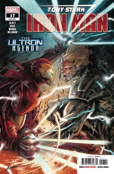
Written by Dan Slott and Christos Gage
Illustrated by Francesco Manna
Colored by Edgar Delgado
Lettered by VC’s Joe Caramagna
Reviewed by Matthew Blair
“Tony Stark: Iron Man” #17 finds Stark face to face with Marvel’s resident evil artificial intelligence: Ultron. The difference is that this time, Ultron is back as a twisted fusion of himself and his creator Hank Pym, and is determined to give humanity the same twisted upgrade.
Monsters are out to play in “Tony Stark: Iron Man” #17 and writers Dan Slott and Christos Gage are having a ball. Tony has found himself horrifically and painfully fused to his armor and has to battle the Ultron/Pym hybrid and the script does a great job of showing just how difficult it is for Tony to function and just how manically terrifying the Ultron Pym hybrid really is. While all of that is going on, the second part of the comic deals with the scientists desperately trying to fix the machine-human hybrids that Ultron already created, which include a talking cat and Tony’s long lost brother Arno Stark, who intends to develop the technology further in order to bring his parents back to life.
The artwork is good. Artist Francesco Manna and colorist Edgar Delgado do a great job delivering the highly exaggerated facial features and over the top action that is perfect for superhero comics, it’s just there’s a very real feeling that the art could have been so much more. For a comic book about a homicidal robot that is trying to forcibly combine humans and machines it doesn’t look or feel as grisly or as terrifying as it could be.
Continued belowGranted, fully embracing Cronenberg style body horror is probably not a good idea for a teen rated mainstream comic book, but it’s a bit disappointing to think about what could have been done with such a great idea.
“Tony Stark: Iron Man” #17 has a fantastic B-movie monster/mad scientist vibe filled with weird and twisted monsters and a maniacal super villain who has a refreshingly simple and unapologetically evil plan for world domination, and while the artwork does bring the story down a little bit, it is still a fun story to read.
Final Verdict: 8.3 – A vicious, brutal story that presents Tony Stark with one of his most difficult challenges yet. It’s just a little disappointing that the artwork didn’t fully embrace its body horror potential.
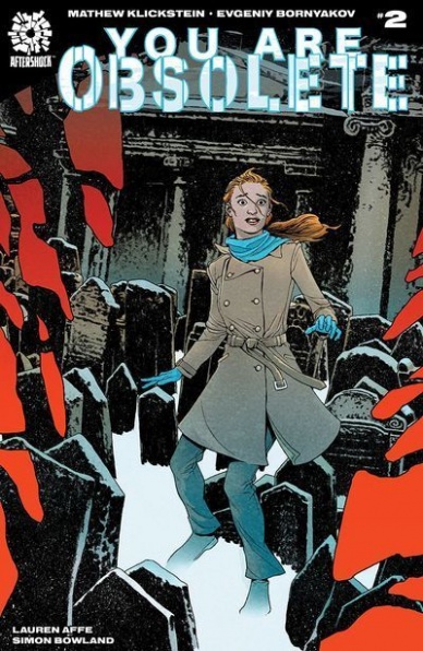
Written by Mathew Klickstein
Art by Evgeniy Bornyakov
Colored by Lauren Affe
Lettered by Simon Bowland
Reviewed by Rasheda
Lyla finds out the children on Muhu have almost complete control of the function and information around the island; what comes in and what goes out. She finds that they have been watching her and have specifically targeted her to report on their island. Along with a local, she delves deeper into what happened to the adult population.
This is a very intriguing story. The pace is slowly building, and you can feel the dread culminate with each page. Mathew Klickstein has written a drama that is slowly becoming a horror, frame by frame. The story is not new, you can tell Klickstein has taken a page from Stephen King’s ‘Children of the Corn’ or the movie, ‘Village of the Damned’; children can be creepy. The protagonist in the form of Lyla is a bit exaggerated; she drinks, she does drugs, she is promiscuous, all the signs of self-destructive behavior, does the story really need all of this in one character?
The subtle details in the art created by Evgeniy Bornyakov are appreciated in this issue. Every panel has great art and the care taken by Bornyakov to include as much detail without overemphasizing has a quiet beauty. Bornyakov takes the detail in the image in closeups as serious as panning out in the scenes. The fury in Lyla’s face, the empty looks on the children, even Martina’s cruel smile; all done beautifully. Along with the great art, Lauren Affe brings the cold, harsh landscape to life with the colors. It is like she has used the color blue as the undercoat of all the colors used, you get that raw, cold chill up your spine reading through this issue. You can feel it, especially in the graveyard scenes or the abandoned school scenes; Affe evokes the cold, the loneliness, the dread.
Final Verdict: 8.0 – A fantastic comic series, that plays into your paranoia fears of someone is always watching.


