
There is a lot to cover on Wednesdays. We should know, as collectively, we read an insane amount of comics. Even with a large review staff, it’s hard to get to everything. With that in mind, we’re back with Wrapping Wednesday, where we look at some of the books we missed in what was another great week of comics.
Let’s get this party started.

Written by Ryan Ferrier
Illustrated by Alejandro Aragon
Colored by Chris O’Halloran
Lettered by Ryan Ferrier
Reviewed by Tom Shapira
Well, this… I am not really sure what this is about. I get it in terms of what happens on the page, but not in any deeper terms – I don’t understand the subject of this series. It appears to be set in one of these post-apocalyptic futures (though the whole thing is rather hazily set), with gangs of roaming bikers in the badlands while the big cities are under the dictatorial thumb of some authorial cult; our hero is the often used man-of-few-words who wears a cool coat and cool shades and it pretty handy with his fists.
This issue has all these well-worn elements that we’ve seen in a thousand different stories but it never rises above them in any meaningful way. I can’t really tell you anything about the characters or the world that doesn’t seem cribbed in one way or another from better science fiction stories. It is possible that this will read better in collected form, it is certainly very lackadaisically paced, but this the version I’ve read and this is the only version I can judge. This series either need to pick up the pace or to create a more interesting world for these characters to inhabit.
On the positive side, Alejandro Aragon gives us some decent actions scene, though the choreography is a bit obscure, and it’s a nice-looking book overall – bringing to my mind the style of Sean Murphy. But all the nice visuals in the world won’t help in the service of a mediocre story.
Final verdict : 4.3 – this isn’t exactly Mad Max: Fury Road, probably closer to Thunderdome

Written by Mark Waid
Illustrated by Javier Pina
Lettered by VC’s Cory Petit
Colored by Brian Reba
Reviewed by Michael Govan
Doctor Strange’s adventures in space over the past five issues may have been interesting but they were never going to last long. It was only a matter of time before Earth’s Sorcerer Supreme would have to return to Earth. In true comic book fashion, the homecoming doesn’t go smoothly and unfortunately, neither does the story’s transition.
The last issue revealed that while Doctor Strange has been off-planet, there’s another Doctor Strange still on earth. This mystery is solved rather quickly and the imposter is revealed to be Casey Kinmont, a former supporting character of Strange. Mark Waid created Casey the last time he wrote a Doctor Strange title, “Strange” in 2010.
While Waid is certainly familiar with his own creation, readers most likely are not. Casey isn’t a fixture in Doctor Strange’s world like Wong, Clea or Dormammu. Apart from this run, she’s never appeared outside of the four issues of “Strange” eight years ago. Waid knows that readers may be ignorant of Casey and confused about this development so he devotes most of this issue to explaining everything. Clarification is necessary but it could have been done better here.
“Doctor Strange” #6 feels rushed. After the early reveal that Casey was pretending to be Strange, Stephen admits he doesn’t remember her. Two pages later, he (and by extension, the readers) are walked through everything. There is a lot of exposition and flashbacks packed in just twenty pages. After his memories of Casey are restored, he is rapidly walked through why he doesn’t remember her in the first place. He chose to remove all his memories Kinmont and the reason given seems particularly flimsy. It’s one rapid-fire explanation right after the other.
Javier Pina’s art and Brian Reber’s colors are a plus though. The book does look great. Pina draws facial expressions very well while Reber’s dark colors for Jundo and Boneflayer make them particularly cold and imposing. It helps but unfortunately can only do so much.
Continued belowFinal Verdict: 5.5 – “Doctor Strange” #6 is a rough homecoming for Stephen and a rough transition for readers.
Written by Julie Benson and Shawna Benson
Illustrated by Javier Fernandez
Colored by John Kalisz
Lettered by Deron Bennett
Reviewed by Michael Mazzacane
“Green Arrow” #45 is a tie into “Heroes In Crisis,” bringing with it the normal tie-in narrative speed bumps associated with this sort of thing. Ollie’s connection with Roy was primed at the start of the Benson Sisters run, so it doesn’t feel too out of place but is still a sudden disruption to their normally scheduled arc. As a tie-in, it’s actually pretty good and helps give “Heroes in Crisis” an emotional weight that wasn’t there in the first issue. If you were looking for a normal issue of “Green Arrow” this likely lands like getting shot by a boxing glove arrow in the gut. Technically the Benson’s do a good job writing one-page scenes that artist Javier Fernandez realizes in this surrealist trips down bad memory lane for Mr. Queen. His internal monologue also doesn’t read as overwhelming as previous issues. It’s the kind of issue that shows their growth as writers from where they started.
Javier Fernandez line work is expressive without feeling emotively cartoonish, which gave prior issues an upbeat vibe mixed with classic pop art styling. I wasn’t too sure how that style would come off when trying to represent the sorrow on Ollie’s face. It works, is the short answer. It isn’t that Oliver Queen’s eyes look sad, but how Fernandez uses them as the center point for the faces overall expression that ties everything together. Colorist John Kalisz deserves praise as well, taking what is essentially the normal palette and just dialing it back a few notches. The ability of the creative team to make this formally just another issue while acting as a link to something else helps this issue exist in both spaces at once.
Serialized storytelling is, theoretically, an additive process. How much of Ollie’s newfound commitment and drive carries through or feels stitched to the continuing ‘Citizen’ arc is yet to be seen. Given the circumstances, “Green Arrow” #45 makes the best out of a bad situation.
Final Verdict: 7.5 – “Green Arrow” #45 is about as good a tie-in as one could hope for, giving the metanarrative of “Heroes” more room and still feeling appropriate content in the pages of this series.

Written by Scott Snyder
Pencils & Inks by Jorge Jimenez
Colored by Alejandro Sanchez
Lettered by Tom Napolitano
Reviewed by Ken Godberson III
After eight issues of cosmic wonder and intrigue, of pieces moving on a board far beyond the scope of our understanding, Snyder, Jimenez et al decide to tone things down to have a breather issue. A breather issue that partially deals with Superman putting the Moon back together, piece by piece. Obviously that’s what a breather issue is in this series. Obviously, that’s a joke, the issue is really about the little moments between the various team members, Superman and Batman, Green Lantern and Flash, Wonder Woman, and Aquaman & Martian Manhunter and Hawkgirl.
Snyder has a great economy in this issue, transitioning between the variety of scenes happening within the Hall of Justice, but nothing feels rushed. We have Superman and Batman trying to deal with a problem of moon monsters in ways that speak to both their characters separately and individually. We have Flash and GL discussing the recent tweaks to the sciences behind their powers and how it eases the usually regimented John. Wonder Woman and Aquaman have a talk on their places in the world, as Aquaman notes that she hasn’t really set up her own quarters in the Hall yet. This conversation also helps set up the coming crossover with “Aquaman”. The conversation with Manhunter and Hawkgirl is also a bit more plot-centric, dealing with Hawkgirl’s connection to the Totality. As I said, it’s a lot, but it all feels balanced in this issue.
The art team gets to really thrive in the visual world building. Being an action-lite issue taking place at the Hall, we get to see it in less intense moments. As such, we get to see tourists exploring the public side of the Hall, visually showing a more trusting nature to this League. We also have, in my opinion, the best scene of the issue, a wonderful double-page spread of the hall’s cafeteria, showing a whole variety of heroes from each of the different League teams and more chatting and being friendly. It’s not often we get scenes like this and the art team does a wonderful job of selling the more down-to-earth nature some of these powerful beings can have now and again.
Continued belowFinal Verdict: 7.0- In the end, “Justice League #9” serves its purpose well, providing a more down to earth (for this series) story with some nice character beats.
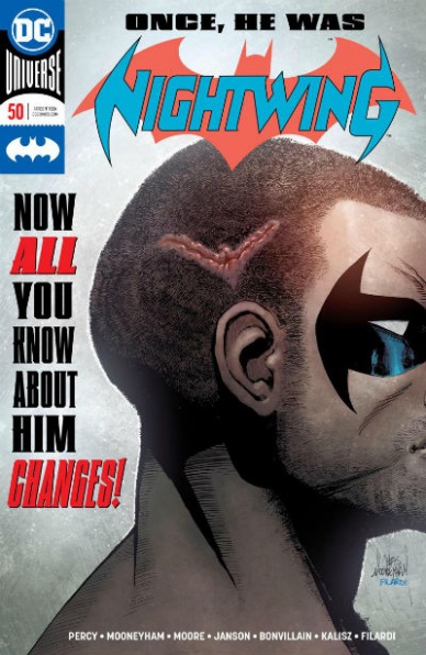
Written by Benjamin Percy
Penciled by Travis Moore and Chris Mooneyham
Inked by Klaus Janson
Colored by Tamra Bonvillain, Nick Filardi and John Kalisz
Lettered by Carlos M. Mangual
Reviewed by Gustavo S. Lodi
With its 50th anniversary issue, “Nightwing” deals with the events of “Batman” #55, the direct consequences to Dick Grayson and the new status quo for this series. And although that decision can be controversial if perceived to be done for shock value, this issue is a solid character study, with interesting new paths forward. Spoilers ahead for those who have not read that issue of “Batman.”
After being shot in the head, Grayson no longer remembers being Nightwing, his time with the Bat-family and even some of his core personal memories. This issue deals with how an individual goes about regaining a sense of normal, of recurring life, after such traumatic events.
Pencils by the team of Moore and Mooneyham take turns between present day and the past, where a young Robin deals with Scarecrow alongside Batman. It is a pairing that works, with the art being different enough to tell the moments apart, but not jarring to throw readers off the story. The highlight goes to Moore on the present, with a very detailed approach to settings and new characters, but wisely managing panel and page design not to have it cluttered. Over at Mooneyham, he channels aesthetics often found on the late ‘80s and early ‘90s “Batman” comics, which should take older readers back right into the mindset the story is set in.
Percy has his hands full to establish a lot on “Nightwing” 50 and the story benefits from the extra page count. Not only readers understand the state of mind of this new Grayson, but also the impact he has on his family, especially with the story beats set early in his career. The balance he brought to Batman, the moral and comic relief of that era… it is meant to be missed and it works.
As the main takeaway, “Nightwing” #50 opens an interesting new chapter on one of the comic’s longest standing characters, addressing his legacy and importance but moving forward.
Final Verdict: 7.5 – Prompting its audience to know what is coming next and how this new status quo will play out, “Nightwing” deserves your attention.

Written by Cavan Scott
Illustrated & Colored by Derek Charm & Chris Fenoglio
Lettered by Robbie Robbins
Reviewed by Chris Egan
IDW’s “Star Wars Adventures” series is a fun and charming anthology series spanning the various eras of the saga with stories for the younger fans to enjoy. The first issue kicks off a five-part weekly spinoff focusing on all-ages horror. Following a small Rebel crew whose ship runs into trouble and they are forced to land on a little-known backwater planet called Mustafar. As the crew, faced with the choice of remaining in the ship and slowly burning to death or seeking refuge in what can only be described as a frightening castle, decide to take their chances outside. Upon seeing the castle, the droid crew member, Crater recounts a tale that Chopper, of Star Wars: Rebels fame, once told him of spectral terror on the Ghost.
Cavan Scott (“Doctor Who”) weaves together two narratives, one of Captain Lina Graf and her band of rebels becoming stranded on Mustafar and debating on what to do next and of Kanan, Hera, and Chopper tracking a lost informant for the rebellion and becoming mixed up in a supernatural mystery. His writing covers all details in a way that nothing will be lost on the younger readers and is never too wordy that it breaks up the flow between it and the art. He gives a voice to the new characters while allowing the established characters to keep their own. He embraces the horror aspect of the story without making things too scary. It moves into something a bit more perilous than the darkest Scooby-Doo adventure. It works well with this series.
Continued belowLinking the two stories, we get two different artists covering the book with their own distinct styles; both unlike anything used on the Marvel “Star Wars” books. Derek Charm’s (“Unbeatable Squirrel Girl”) main arc illustrations and coloring set its tone by blending 1990s Pop Art with “Archie” and “Halo Jones.” No two colors blend or flow into each other. They all meet at a clear border. The work is like beautiful animation cels. Accompanying Charm is Chris Fenoglio (“Goosebumps: Monsters at Midnight”), who covers the Rebels era part of the story and does a great job of converting the animation style from the t.v. series to the page. While remaining faithful to the show, his work gives a look that is reminiscent of many other all-ages comics. His pencils and colors have a timeless Disney meets Warner Bros. look. It is nicely detailed, yet still keeps to a cartoon style that can be enjoyed, and admired by kids and adults, and everyone in between.
“Star Wars” is a franchise that rarely moves into the horror genre, but books like this show that it is possible for something quite enjoyable to come of it. While the scares could have run deeper in this, (prepubescent horror fans can handle more than we give them credit for) it is still a really fun, spooky adventure for anyone to read on their own or with kids, and just in time for Halloween. Francesco Francavilla’s great covers are worth the cover price alone.
Final Verdict: 6.5 – The decent premiere issue of this horror-lite anthology miniseries sets up an intriguing continuing story that is worthy of a pickup.

Written by Robert Kirkman
Illustrated by Charlie Adlard
Colored by Cliff Rathburn
Lettered by Rus Wooton
Reviewed by Gregory Ellner
At times, Robert Kirkman has taken a “slow burn” approach to “The Walking Dead,” slowly bringing out the conflicts to move the story forward into a grand arc. “The Walking Dead” #184 seems to be an instance of this slower approach, as he focuses on quieter character moments after the riot from the previous issue was quelled rather quickly. There are no deaths here at all (or even any of the actual “walking dead” that gave the series its name), though tensions do appear to be rising, and Rick Grimes’s group seems to be slowly breaking down in the face of the peace brought forth by the Commonwealth, even with how they are pushed down so often. Relationships develop, rivalries build, and everything seems to slowly be coming to a head… but not much actually happens, either. For newcomers, Kirkman’s writing may be too slow, too decompressed, but he is likely used to an established readership at this point, so there probably isn’t much to worry about.
As always, Charlie Adlard’s pencils and Cliff Rathburn’s gray tones work together to create an intricate, compelling whole in terms of a grayscale approach to the zombie apocalypse. Facial expressions are key, from Juanita Sanchez’s utter joy to Officer Mercer’s alternating calm, collected nature or serious, no-nonsense approach to violence in the Commonwealth, to Michonne’s battered yet stoic face on the stand in court. Rick Grimes’s calm disappointment contrasts well against Dwight’s rage in the closing scene, showcasing a further rift between them as well as demonstrating a way in which the hostile Dwight is not unlike Rick was several years before.
In all, while the art is interesting as always, and the character moments are good, “The Walking Dead” #184 is still pretty slow, all things considered.
Final Verdict: 7.0- Though lacking in any and all of the actual eponymous undead, “The Walking Dead” #184 seems to be heading in an interesting direction, albeit at a very slow pace.

Written by Gerry Conway
Illustrated by Diego Orlortegui
Inked by Walden Wong
Colored by Chris O’Halloran
Lettered by VC’s Travis Lanham
Reviewed by Eric Goebelbecker
“What-If” kicks off with ‘What If Flash Thompson Became Spider-Man?’ If this story seems vaguely familiar, it may be because 10 pages of “What-If” #7, cover dated February 1978, already explored it. Gerry Conway expands on the premise, and this time Flash gets a better costume and an improved ending. But the issue still ends up feeling like a shaggy dog story.
Continued belowThe story builds to a famous moment in early Spider-Man continuity, maybe the most revered for some fans. Conway has an interesting take on how things might be with Flash in the costume. But the tale feels rushed, not least it spends five of its 20 pages on a slugfest that does little to contribute to the plot.
While the fight with the Circus of Crime takes away from the story, it does an effective job of showing us how brutal Flash is as Spider-Man. Orlortegui starts the book with a view through Peter’s camera. The carnage, including the flying Gambonnos taking flight at the end of Flash’s fists, is hard-hitting and visceral. Being a “What-If” story, he’s also called on to reference Ditko’s original work, and he does an excellent job of quoting the original comics without merely copying. But somehow the climax falls flat, and it’s hard to tell if it’s due to the presentation or the lack of build-up.
Conway calls up a lot of classic Spider-Man continuity to fit this tale in, and it’s sure to please longtime fans. He also maintains consistent characterizations for the entire cast. Peter Parker still wants to do the right thing, especially for his aunt. Flash is the brash punk he was in High School. Even Uncle Ben is the same man that only appeared in a few panels back then. Unfortunately, the pacing makes a potentially memorable story feel hurried.
Final Verdict: 6.5 – “What-If” #1 has an interesting take on the Spider-Man mythos, but the execution falls short.


