
There’s a lot to cover on Wednesdays. We should know, as collectively, we read an insane amount of comics. Even with a large review staff, it’s hard to get to everything. With that in mind, we’re back with Wrapping Wednesday, where we look at some of the books we missed in what was another great week of comics.
Let’s get this party started.

A Righteous Thirst For Vengeance #1
Written by Rick Remender
Illustrated by André Lima Araújo
Colored by Chris O’Halloran
Lettered by Rus Wooton
Reviewed by Quinn Tassin
I have to admit that even after reading this debut issue, I have no clue what “A Righteous Thirst For Vengeance” #1 is actually about. It’s definitely very atmospheric and seems like something that will be interesting down the line. At the same time, it felt like the first 5 minutes of something that takes 10 minutes to really hook you. We know that there’s a murderer that the unnamed protagonist ran into at the store. We also know that said protagonist is the kind of person who gets off of a bus to kill a suffering, nearly-dead bird. Oh, and that he’s not a fan of sex traffickers. But what in the world is this about?
André Lima Araújo and Chris O’Halloran’s artwork is truly gorgeous and really make the whole issue work despite the plotting issues. Given the issue’s general silence (which is a welcome artistic decision), it was bound to live or die by Araújo and O’Halloran’s hand but they deliver. Araújo’s pencils bring a stunning level of detail to everything we see, from the rendering of Vancouver to the brutality of the crime scene at the end of the issue. The art is an exercise in tone and there’s a sense of sort of dread mixed with an acute understanding of the monotony of just being a person that wouldn’t exist without this art team. The whole issue feels like it’s building toward something and when we finally get to it, Araújo makes sure it’s something to behold. The murder scene really is horrifying not in what we see (how did those bottles make it INTO this couple’s skin?) and what we don’t (there is blood in places there shouldn’t be blood). That final sequence is made all the better by its incredible layouts. The quick shifts in focus between all the various horrible things that are happening, which are illustrated with great detail. Then there’s the realization that we’ve seen the killer and the rushed escape. The tension built there is incredible and then…the issue ends.
It’s a shame because it doesn’t feel like a cliffhanger so much as a misprint. As if this was a double-sized issue and someone forgot and only shipped out the first half. The art is good enough and the basic of what we saw are interesting enough that I’ll pick up the second issue but frankly, there’s very little here that’s substantively compelling.
Final Verdict: 6.0- A debut with a disappointingly thin plot and an abrupt ending is elevated by stunning art

Batman #114
Written by James Tynion IV
Illustrated by Jorge Jimenez
Colored by Tomeu Morey
Lettered by Clayton Cowles
Reviewed by Henry Finn
Yet again Gotham and it’s residents are being torn apart as “Batman” #114 starts to bring the current arc Fear State to a boil. Batman is public enemy number one and Scarecrow’s master plan bring a unique opportunity for new alliances. For instance Miracle Molly working together with Poison Ivy gives us an interesting take on her potential. Molly points out to Ivy that she has the power to bring down a whole city -which means she also could be the city’s greatest hero.
This is what writer James Tynion IV does best, put a new lens on classic setups. While he makes sure to pack the action in this issue, with a good 75% of the book involving panels with people punching each other, he slips in a philosophical musing that could or could not play out in the long run. Poison Ivy herself doesn’t seem to mind the idea so much and it makes you think that maybe the difference between a superhero and a villain is how they process their trauma.
Continued belowBeyond that introduction, Tynion put his full focus on the relationship between Peacekeeper 01 and Peacekeeper X. Both are patriots that believe wholeheartedly in their mission and it adds a layer of complexity to their struggle. Peacekeeper X even verbalized his admiration for his predecessor while attempting to murder him. While they might have a connection, in the end their function in the new order is violence. In this issue Batman is less of an active agent for change as he is a lens for us to examine the struggle between both misguided soldier. It feels the caped crusader is in the story simply because his name is on the title and there is a small opportunity missed to juxtapose his brand of vigilantism against theirs.
Artist Jorge Jimenez is stellar with so much attention to detail added to every panel that it made me linger on each page. For instance the first panel on the first page alone is densely packed with information. Miracle Molly is working on rebuilding her glider, which takes up the bulk of the frame -instead of making the background abstract or minimal in detail, Jimenez draws the individual leaves on the ground and trees behind her. He packs Poison Ivy’s lair with visual information to remind us we are in the environment of her making. And when we first see Poison Ivy, Jimenez draws her from a slightly lower angle to give her a feeling of heroism. This ties in well with Miracle Molly’s speech about Poison Ivy being potentially Gotham’s greatest hero.
Colorist Tomeu Morey makes sure to different the environments in this issue with his color palette and saturation levels varying wildly between Poison Ivy’s lair and the outside world. Tynion and Jimenez’s Gotham is dark and full of contrast, and yet a little more slick than previous renditions. The buildings feel more modern with clean sharp lines and a lot of glass on the exterior. Morey completes this look with a lot of glowing light sources and abstract colors that dot the background panel to panel.
Final Verdict: 7.5 – A fun issue that brings us action and a slight cliffhanger of an ending.
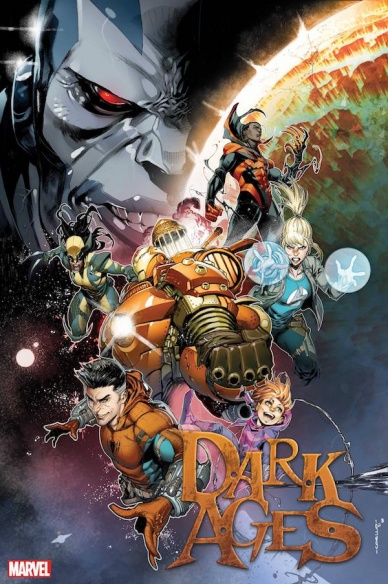
Dark Ages #2
Written by Tom Taylor
Illustrated by Iban Coello
Colored by Brian Reiber
Lettered by VC’s Joe Sabino
Reviewed by Alexander Manzo
“Dark Ages” #2 starts with a ton of exposition with Spider-Man as the narrator, which feels fitting to have a more known positive superhero’s perspective for a world that has no power and monsters in the night. Tom Taylor uses the psychics of the Marvel universe to help unite the people of the world by creating makeshift supercities rather than a more traditionally destroyed dystopian camp. Spider-Man even comments how it’s a decent place to raise a family compared to their former life in New York. The majority of the book is focused on world-building and establishing the norm for the reader. Taylor uses the third act to continue the story by introducing another classic villain, Apocalypse, and his ultimate goal of reawakening The Unmaker to have the power he possesses. Although it feels a little out of left field, his classic villain goal of maximum power feels like a good swing for this story that almost felt like the world may be better off without electricity or power. A thing that Taylor does well is his constant shifting of character points of view because ultimately, this story is about how the outage affects the world rather than one hero solely, so it helps to keep the reader guessing by who they’re going to see next.
Ivan Coello brings it all in this issue by sparing no detail on every page and panel. He gets to showcase various backgrounds, from the supercity in the forest to the Apocalypse’s self-indulgent (AKA a huge statue of himself) lab in Europe. Coello also does an excellent splash page when the monsters break the barrier and are met up by a team that has Wolverine and Blade. He uses smaller panels in the corner of the page to show them slicing the monsters down in action.
Brian Reiber also gets to showcase his colorist skills by finding plenty of details to shine in this issue. One that particularly stands out is when Captain America cuts the head off of a vampire in Tony Stark’s cave, and the reader gets to see the great contrast of colors with the black background. For a series called “Dark Ages,” Reiber does a good job of avoiding characters being lost to the darkness, such as Omega Red, whose suit outline is clearly visible during the night.
Continued belowFinal Verdict: 8.5 – If a reader were to jump into this series with this issue, very little would be lost, and it’s a fun issue overall with the various characters.

Monster Fun Halloween Spooktacular
Written by Cavan Scott, Alec Worley, Maura McHugh, Lizzie Boyle, Tom Paterson, Rocky Roads, Len O’Grady, Ned Hartley, Doug Graves, Robin Etherington, Chris Garbutt, Keith Richardson, Kek-K, Simon Furman, Matt Baxter, John Reppion, Lee Langford, Olivia Hicks, and Ned Heartley
Illustrated by John Lucas, Tiernan Trevallion, Rositsa Vangelova, Steve May, Abigail Bulmer, Tom Paterson, Tinbott, Len O’Grady, Juni Ba, Edward Whatley, David Follet, Chris Garbutt, Lew Stringer, Laurent LeFeurve, Matt Baxter, PJ Holden, Brett Parson, and Diansakhu Banton-Perry
Colored by Gary Caldwell, Tiernan Trevallion, Rositsa Vangelova, Steve May, Abigail Bulmer, Tom Paterson, Tinbott, Len O’Grady, Juni Ba, Edward Whatley, David Follet, Chris Garbutt, Lew Stringer, Laurent LeFeurve, Matt Baxter, PJ Holden, Brett Parson, Matt Soffee
Lettered by Amber Cee, Simon Magna, Kay Nines, Ferre Schutz, Osvaldo Sanchez, Bill Rubin, Chris P. Bacon, Malum Vero Ocult, Leila Jess, Pioro Dziob, David Follet, Chris Garbutt, Simon Bowland, Krieg Zauberer, Laurent LeFeurve, Matt Baxter, Taniwha Kaiawhina, Heather Millar, Oz, Squakeez
Reviewed by Brian Salvatore
While there is no such thing as a bad time for horror stories, the undisputed best time is October, in the lead up to Halloween. Similarly, there’s no bad time for all-ages comics, but if your kids, like mine, have the spooky bug right now, a comic like the “Monster Fun Halloween Spooktacular” should be right up their alley. And while there is something for them to dig into in this comic, it is not as obvious as a slam dunk as this comic should be.
Part of the issue here is that the book occupies that weird space between something that can be read devoid of context and something that requires some cursory knowledge ahead of time. In some ways “Monster Fun Halloween Spooktacular” reads like an issue of MAD Magazine, where there are jokes that won’t make sense unless you’ve got some context. For instance, there’s a whole story that is based around not only knowing who Solomon Grundy is, but also his rhyme scheme. And while MAD was a favorite for me as a young man, this issue seems targeted at kids younger than MAD‘s target demo, and so it seems like there are only two ways to really read this: either you’re too old for the comic, but get the joke, or too young for the joke, but enjoy the comic.
The issue has a ton of content – I mean, look at that list of creators – but a lot of this feels similar. There are a few strips drawn by Tom Paterson, and his Garbage Pail Kids-style art is either your thing or it isn’t. While there are a few standout strips (“Kid Kong,” “Martha’s Monster Makeup,” “The Leopard from Line Street”), the overall quality falls in that aforementioned zone of not being pure kid fun and not being clever enough for adult readers. Hopefully, by the time this series goes bi-monthly, some of these kinks have been worked out.
Final Verdict: 4.9 – There’s a lot here, but not a lot of great stuff.


