
There is a lot to cover on Wednesdays. We should know, as collectively, we read an insane amount of comics. Even with a large review staff, it’s hard to get to everything. With that in mind, we’re back with Wrapping Wednesday, where we look at some of the books we missed in what was another great week of comics.
Let’s get this party started.
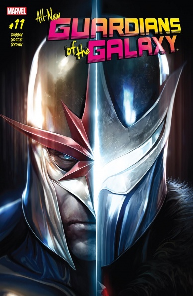
All-New Guardians of the Galaxy #11
Written by Gerry Duggan
Illustrated by Roland Boschi
Colored by Daniel Brown
Lettered by VC’s Cory Petit
Reviewed by Jake Hill
When Brian Bendis took over on “Guardians of the Galaxy” the comic skewed a lot closer to the movies, conveniently forgetting about the sprawling cast that Dan Abnett and Andy Lanning had so carefully built up. Gerry Duggan has largely focused on the movie Guardians (Star-Lord, Gamora, Drax, Rocket and Groot), but this latest issue picks up on a ton of long forgotten threads from Abnett and Lanning’s now classic run. Fans of the series will be delighted to see the return of Richard Rider and his brother, Robbie.
This issue completely skips over the core Guardians team as Richard looks for his brother, who has been missing since ‘The Thanos Imperative’ in 2010. It has been glossed over that the Nova Corps has been decimated, but this story dives right in to what happened, and it turns out to be connected to another forgotten thread, the Talons. Debuting in ‘War of Kings,’ the Talons are a secret order Shi’ar assassins.
Reintroducing these storylines serves two simultaneous purposes. First, it returns a feeling of scale to the Guardians comics. After so long dealing with the same characters and the same villains (how many times have the Guardians fought Nebula and Thanos and the Collector in the last three years of the comics?), expanded their rogue gallery and supporting cast reminds us that the galaxy is huge! There are more than a dozen characters running through the same conflicts again and again.
This issue also restores a sense of momentum to the ongoing story of the Guardians. Instead of a disposable tale where some anti-heroes fight some villains, “Guardians” #11 has real development. What happens to Robbie Rider is shocking, and by the end of the issue not only are the Talons reestablished as terrifying villains, there’s a new bad guy in the Galaxy who I can’t wait to see face our heroes.
It’s nice to give new readers a jumping on point, but if the ongoing popularity of “X-Men” and “Spider-Man” prove anything, it’s that drawing from years of continuity make comics feel significant, and the worlds feel lived in. Duggan does a fantastic job at reestablishing some forgotten characters, and showing how they’ve changed, rather than bringing them back as completely new entities that serve his story needs. Other Marvel writers should take note.
On top of that, the art team totally kills it. This is a dark issue of “Guardians,” and Roland Boschi has a noir style that would work for “Daredevil” or “Moon Knight,” but applied to dark corridors and dilapidated space stations. This is not the neon world of the movies, but something more akin to Ridley Scott. Locations look lived in, and characters show their wear and exhaustion. The realistic art style contrasts with the armored bird-people in a way that ups the tension.
I’m positive that more people are fans of the Guardians from the movies than the comics, but that doesn’t mean people want the same stories repeated over and over. Gerry Duggan and the team manage to use this issue to do something different from anything the Guardians have done in years. If you’re a lapsed old-time fan, this is the time to return. If you’re a new fan, this is another kind of story the Guardians can be used to tell.
Final Verdict: 8.5 – This is one of those issues that adds so much to the world, you can’t wait to keep reading.

The Archies #1
Written by Alex Segura and Matthew Rosenberg
Illustrated by Joe Eisma
Colored by Matt Herms
Lettered by Jack Morelli
Continued below
Reviewed by John Schaidler
After many months of hype, not to mention countless teasers and exclusive previews, it’s time to get this show on the road! Unfortunately, for much of the debut issue, “The Archies” #1 is stuck in neutral. Don’t get me wrong, it’s a solid outing on many levels with excellent artwork, snappy dialogue and tons of Easter eggs for music fans, but after two separate one-shots – including one in which The Archies meet the Ramones – it doesn’t exactly move the story forward or reveal any new information.
And it feels like we’re back to square one.
Nonetheless, this story actually picks up right where “The Archies One Shot” ended, with the band wrapping up their first gig. As the applause subsides and the band comes back down to earth, the obvious – and only – question that remains is, “What next?” And that simple enquiry (in this Riverdale universe, anyway) is more than enough to send mopey band leader Archie Andrews into a downward spiral of self-doubt and angst all over again.
I mean, didn’t we just go through this? I’m confused. Who is this issue for…? If you’ve read the previous one-shots and bought into the hype, the story surely feels pretty tepid. On the other hand, if you’re new to the idea of The Archies as a band, I doubt there’s enough drama or intrigue to rope you in, not to mention pretty scant character introductions, other than to the surprisingly navel-gazing Archie.
Fortunately, the artwork is great. The page layouts and panel work are brilliant, with excellent use of white space and a seamless visual flow that mixes lots full-page panels with intriguing montages and huge, flamboyant song lyrics. At the same time, illustrator Joe Eisma’s line work strikes the perfect balance between referencing the flagship series, “Archie,” and maintaining a look all its own. His thick, angular inks and the bandmates’ norm-core wardrobe give the book a decidedly contemporary flair, while occasional facial expressions tend to reference a more throwback look. The colors are outstanding, too, with a look that runs the gamut from desaturated pastels to more vibrant primary colors. Meanwhile, throughout the book, various concert posters and t-shirts namecheck a whole host of bands, inviting you to pore over every scenic element.
Personally, just like Alex Segura (who co-wrote the script with Matthew Rosenberg who is fresh off a brilliant run with “4 Kids Walk into a Bank”), my comic fandom always runs “parallel to an obsession with music.” I love everything about the idea of this series and I know it’s in damn good hands, but this lackluster start is a bit too anticlimactic. Sort of like buying the album on the day it’s released only to realize that Track 1 is the single you’ve already heard dozens of times before.
Final Verdict 7.0 Skip ahead to track two. The good stuff is coming, let’s get to it.
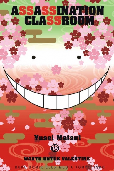
Assassination Classroom Vol. 18
Written, Illustrated, and Lettered by Yusei Matsui
Reviewed by Elias Rosner
I know, I know. We usually don’t do too much manga here (outside of Zach’s podcast) but I wanted to encroach on that territory a little here. Assassination Classroom has held a special place in my heart and, with this volume, wraps up the space arc, indulges in some more character side-filler, and enters into its final arc.
As that last description makes clear, this is very much a wrap-up and set up volume, plot wise, focusing instead on an unfortunately bland Valentine’s Day/career choice arc. The volume is funny, returning to some of the more light-hearted moments of earlier volumes, really capitalizing on Matsui’s cartoonish, exaggerated facial expressions and high use of creative slapstick. But having come off of the more serious paintball arc (which was the last in the series of more serious volumes), it feels like we’re dragging our feet a little, focusing on the ensemble instead of the looming plot.
There are rumblings in the background and we can feel the end drawing near but instead of focusing on that, Matsui focuses on Valentine’s Day shenanigans. At the same time though, these chapters give us a chance to decompress (much like the students) and it feels like a natural place to put it. There are a lot of good, funny, character driven moments in this volume due to this, like the chocolate knife and the individual chocolate giving scenes.
Continued belowMatsui is usually pretty good about mixing in humor and character arcs (though his more effective ones tend to be less funny) which is why the big problem here is that we’ve reached the point where almost everyone has had their arc. Sure, there are a few characters who’ve got a little more to go but for the most part, we’re done, so it’s mostly check-in and, as much as I hate to say this, a good portion of the cast are just unmemorable. Matsui’s art style, while being very clear and fluid (while also giving each panel a sense of speed, weight, and purpose), has the age-old problem of simple, similar characters. The anime alleviates some of this (due to color and voice acting) but, with a cast this large and an art style this simple, it was bound to happen.
Because of this, a lot of the comedy (and the slower, less plot based beats) feels like it goes on just a little bit too long. There are only so many times we can have Koro Sensei be a buffoon and then turning it around on his students before it gets tiresome, especially after we’ve learned the full extent of his backstory. Were these intervening moments just a bit shorter, I think this would have been a much stronger volume than it is now.
Final Verdict: 7.0. The calm before the storm and the (slightly too long) comedy break before the final arc.

Astonishing X-Men #4
Written by Charles Soule
Penciled by Carlos Pacheco
Inked by Rafael Fonteriz
Colored by Rain Beredo
Lettered by VC’s Clayton Cowles
Reviewed by Nicholas Palmieri
As a fairly new reader to the X-Men, “Astonishing X-Men” has been great at orienting me to the characters and the world. Unfortunately, all that orienting ends up dragging down the story.
Soule has a ton of pieces moving here, and, this being the fourth issue of a six-issue arc, every in-progress plot point gets inched ahead only the tiniest bit with no real beginnings, endings, or huge moments. Soule is great at getting readers up to speed, whether they’re new to the franchise or just need a bit of recap. The explanation of Xavier’s death and return, the explanation of who each of the almost dozen characters are and what they mean to each other — all of that is done skillfully and with ease. But so much time is spent reestablishing all of this that the plot suffers. The story wasn’t at a loss for interesting moments, so much as everything feels a little strapped for space.
Pacheco and team do a solid job on the art. I enjoyed how every scene had different panel layouts depending on which characters the scene focused on. That, more than anything, kept the scenes engaging for me. All of the scenes moved intuitively: at a certain point early on, I got completely engaged and stayed that way until the end of the issue. The dramatic scenes look more ordinary and intimate with plainer layouts, while the action scenes aren’t afraid to change panel size and wildly change perspective when needed. Each of the characters retains a distinct look as well, and they all clearly use their bodies in different ways. In short, “Astonishing X-Men”’s art team knows what they’re doing.
This certainly isn’t a bad issue. The art team provides effective superhero action art, and the story retains clarity despite dealing with many separate plot threads. That clarification comes at a price, though, and that price is space. Ultimately, that small amount of space to deal with a large amount of material left this issue feeling inconsequential.
Final Verdict: 6.0 – Too much stuff, not enough space. What we do get is decent, though.

Bane Conquest #6
Written by Chuck Dixon
lllustrated by Graham Nolan
Coloured by Gregory Wright
Lettered by Carlos M. Mangual
Reviewed by Frida Keränen
The duo of Chuck Dixon and Graham Nolan could be called experts on Bane, as they are the character’s creators. In 2017, they are reigning the Man Who Broke the Bat again, now delivering the sixth issue of “Bane Conquest,” which is the start of a new arc.
Continued belowThe opening scene shows Naja-Naja the Kobra leader’s immense power and influence, but is also pretty funny because the man’s so nonchalant about the car he’s driving being abducted into an airship. Otherwise, the issue is a rather grim ride with a strong action scene at the end. Dixon doesn’t show as much nuance in Bane’s personality as he has previously. There’s a bit of an unclear scene transition when Bane goes to fetch a man he imprisoned because it isn’t clear what the place is or how much time has gone by.
Nolan draws Bane as gigantic and threatening as ever, but doesn’t make him stand in stupid or unnatural bodybuilder poses. (But the nose hole in the mask’s new design still looks weird. It’s a very minor complain but just I can’t get over it.) Gregory Wright’s colouring fits Nolan’s artwork and together they manage to create a tone reminiscent of Bane’s early appearances, but on the other hand there could have been some more interesting colouring choices made.
Final Verdict: 5.5 – A classic feeling but also room for improvement.
Deathstroke #24
Written by Priest
Penciled by Diogenes Neves
Inked by Jason Paz and Trevor Scott
Colored by Jeromy Cox
Lettered by Willie Schubert
Reviewed by Devon Browning
The beauty that most readers have pointed out in regards to Priest’s Deathstroke run, is its absence of inner monologue. No longer can we peek inside the mind of Slade Wilson, which I would argue is the best way to read a story about him. However, in the newest addition of Deathstroke’s Defiance arc, it’s a breath of fresh air when we find ourselves in the very mind of Wally West II who has a lot to say about Slade and his new team. A little…too much, actually.
One by one, Wally West does what we’ve all wanted to do, and calls out every member of the team on his observations that are for the most part, hilarious. One wouldn’t think that they’d find themselves chuckling through most issues involving Deathstroke, The World’s Deadliest Assassin, but somehow Priest manages to continue on with a near perfect balance of complex story telling and humor. Not to mention constantly raising new questions with every one answered. And while he is consistent in shaping the journey of the characters now held in his hands, it wouldn’t amount to much without the visual journey conducted by Diogenes Neves, Jason Paz, Trevor Scott and Jeromy Cox.
Yet again, Neves proves that script is just as important as the panels in which he concocts some of comic’s greatest facial expressions that speak well for the issue’s cringe-worthy moments including Slade presenting to the team that Wally thinks Power Girl has an awesome booty. The constant face palming is both delightful and remarkable, but as always Jeromy Cox keeps an even tone through the very events page to page. The colors both complimentary and fitting to the members of the team and the mood that Deathstroke’s run now has which is amusingly…light.
In all honesty, Deathstroke embarrassing his kids and his new kids (Wally, Terra, Tanya), like any father would, it sounds absolutely great on paper but boy is it really brought to life when the art team works side by side with Priest in making yet another issue easily devoured. Yes, you heard that right by the way, that is generally the whole issue– Slade making his kids facepalm. And although there have been some moments where there is just a little fear as to where this new direction is going with such focuses on subplots that are extremely un-Deathstroke-y, an issue like this confirms that the run is worth sticking with when art that keeps your eyes glued to the page is combined with a story coming from the almighty Priest.
Readers can only hope that the creative team working on this very Deathstroke stays on board to keep the seamless momentum in providing the best series we’ve seen for our dear one-eyed assassin in far too long.
Final Verdict: 8.8 – With art that compliments the group of characters as well as Priest’s writing does, the biggest flaw that this series seems to have now is that it isn’t released every week!
Continued belowGreen Arrow #32
Written by Benjamin Percy and Joshua Williamson
Illustrated and Colored by Juan Ferreyra
Lettered by Deron Bennett
Reviewed by Gregory Ellner
Benjamin Percy and Joshua Williamson do a very good job of wrapping up the ‘Gotham Resistance’ crossover, showing the horrific nature of the denizens of the Dark Multiverse when faced with the eponymous group. Unfortunately, this comes at the expense of some of the promised villains of the piece, especially Bane, who does next to nothing, and Firefly, who is conspicuously absent altogether. Perhaps the latter can be excused, but the former leaves to question why he was even included in the issue in the first place. Still, Percy and Williamson do a good job of developing certain characters in the issue, especially Damian Wayne and Dick Grayson. In fact, the Green Arrow himself is given a more supporting role, allowing more characters to develop around him rather than having him be the central person for the ending of the group effort.
As ever, Juan Ferreyra’s artwork on “Green Arrow” #32 is stunning. The mix of color and linework works together in such a way that all of the lighting seems wholly natural, and the violence of combat is terrifying to behold, let alone the sheer monstrosity of the Dark Multiverse denizens such as the Dark Robin. His use of silhouettes, shadows, and brilliantly bright lights give the dueling feelings of despair and hope that come from the efforts to fight the Dark Multiverse.
As a culmination of the ‘Gotham Resistance’ crossover, “Green Arrow” #32 works very well. Unfortunately, this comes at the expense of some of the villains in the gauntlet of foes teased earlier, especially Bane and the seemingly forgotten Firefly.
Final Verdict: 7.0- Though it has some problems with using certain villains, “Green Arrow” #32 provides a well-drawn, rather well written finale to the ‘Gotham Resistance’ sidestory to ‘Dark Nights: Metal.’

Hawkeye #11
Written by Kelly Thompson
Illustrated by Leonardo Romero
Colors by Jordie Bellaire
Lettered by VC’s Joe Sabino
Reviewed by Alexander Jones
Writer Kelly Thompson has taken Kate Bishop’s life and successfully spun her out of the Matt Fraction/David Aja “Hawkeye” series and “Young Avengers” titles with ease in Bishop’s first solo ongoing series. While lots of titles at Marvel operate at a steady but slow pace, Thompson’s work on this book has managed to carve out integral pieces of continuity for the character which don’t make longer arcs feel like needless filler. In this particular storyline, Thompson has threaded together all the seeds of previous arcs and shown how they connect to each other.
“Hawkeye” #11 is filled with great narrative tricks which have become a hallmark of the series at this point. The non-linear storytelling device used in this comic brings the issue together full circle in an endearing manner. The book has a very important plot thread that goes unanswered in this arc but leaves a clear door open for further stories. The narrative continues the unique flavor of a serious story laced with a strong sense of young adult humor pushing the story forward. While this book is a joy to read overall, there is a massive plot point Thompson glosses over here. At times, the title can be seem too pleasant and surface level and exploring some darker themes that are teased with Bishop’s family in the main story would have resulted in a stronger issue overall.
Leonardo Romero is a criminally underappreciated talent who is producing awe-inspiring work in this title. Romero’s wide-open splash pages impress as much as the dynamic fight scenes that are all tied together with a modern sensibility through color artist Jordie Bellaire’s creative colors showing off Bishop’s Hawkeye like radar-sense in the middle of an insane fight scene. Romero innovates page layout with fight scenes focusing on chess pieces and broken bones–filling the pages of the book with creative panels. The title’s flashback sequences, letters and speed lines are all so seamlessly polished. With such a high level of quality it is remarkable how Romero is able to stay so close to a monthly deadline with this series. Seeing the purple hues of the flashback sequence juxtaposed with Bishop’s investigation is another way the title continues to pump noir-infused vibes into the book.
Continued below“Hawkeye” #11 is a very strong conclusion to the latest arc of the series. Even aside from some of the story beats closing too hastily and the lack of emotional resonance the final fight had, this book is still going in the right direction and closes out with a beat which will immediately drive readers to the next issue. Romero’s impeccable art continues to be the perfect companion to Thompson’s script for the title.
Final Verdict: 7.5 – “Hawkeye” #11 closes out the series latest arc with heart while opening up potential new stories for later issues.

Jessica Jones #13
Written by Brian Michael Bendis
Illustrated by Michael Gaydos
Colored by Matt Hollingsworth
Lettered by VC’s Clayton Cowles
Reviewed by Matt Lune
As “Jessica Jones” enters Marvel Legacy, the series plays on the whole concept of the publishing initiative and calls back to one of the more memorable stories involving the character, back when her series was simply titled “Alias.” The Purple Man proved so popular as the concluding story to that run, that it provided the backbone to the Netflix series, so his return is somewhat inevitable.
What’s less welcome is the idea of Jessica being so intrinsically linked to such an abusive part of her backstory. The character has evolved far beyond the Purple Man at this point, that it’s sort of like forcing Batgirl to relive her catastrophic run-in with the Joker in “The Killing Joke.” Nevertheless, the Purple Man is a significant threat to Jessica – he always has been, but the fact that she has a daughter now makes this issue feel tense in a sickly, claustrophobic way.
Bendis does a strong job of controlling that tension, using the entire issue to build up the powerful and overwhelming danger that Kilgrave poses, to the point where you genuinely feel that there is no escape from him. On a meta level that’s probably, unfortunately, true for Jessica Jones, but you feel it on a viscerally real level too, thanks to tight scripting.
There’s not been a bad issue of “Jessica Jones” so far, in terms of art, and there are several examples in almost every installment that show Michael Gaydos is pushing himself creatively. Here, it’s the three consecutive double-page spreads that open the issue, each a dense grid of faces drenched in Matt Hollingsworth’s purple hues. There are familiar characters in there like Luke Cage, Jessica Drew, even Steve Rogers, but this whole scene, paired with the narrative, is proving that the Purple Man could be everyone, therefore – to Jessica at least – everyone is the Purple Man.
The final page of the story proves that idea to be true in a particularly chilling way. A full-page panel with one sentence brings Jessica’s whole world crashing down around her, and when you’re removed from the issue it feels like a very classic superhero comic book ending (if with a modern twist,) but when you’ve invested time in reading the issue – not to mention if you’re a fan of the character enough to have followed her up to now – then the reveal is painful in a way that both releases the built-up tension of this issue, whilst raising the stakes for the next. Despite the fact that “Jessica Jones” shouldn’t be defined by this one abusive part of her life, there’s no denying how powerful the storylines can be.
Final Verdict: 8.1 – A chilling ending provides the heartbreaking release to a tense issue
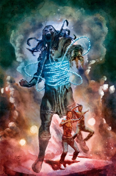
Shadowman/Rae Sremmurd #1
Written by Eliot Rahal
Illustrated by Renato Guedes
Colored by Renato Guedes
Lettered by Dave Lanphear
Reviewed by Michael Mazzacaen
Being more of a movie musical and EDM kind of person, I have no clue as to the accuracy of hip hop duo Rae Sremmurd representation in “Shadowman/Rae Sremmurd.” As a comic, however, “Shadowman/Rae Sremmurd” succeeds, and over delivers at points, at being a fun celebrity guest story in the vein of those old Scooby Doo episodes. Coming off “Rapture,” this is also nice little dip back into the weird side of Valiant as Shadowman is recruited by Dr. Mirage to help her track down the lost souls of brothers Swae Lee and Slim Jxmmi.
Continued belowEliot Rahal’s writing isn’t the star of this comic, that would be the guest stars and artist Renato Guedes, but just because it maybe the B-side doesn’t stop it from laying a solid foundation for the stars to sing on. Rahal weaves the folklore of blues legend Robert Johnson selling his soul to the Devil into a musical pastiche fitting the surrealist nature of Deadside. Shadowman and Mirage cross the river Styx on the boat of Charon the Ferryman, not of Greek myth but from the Led Zepplin cover. Rahl gives the book a sound structure and fits in character exposition in mostly elegant fashion. It isn’t showy, but without it, all there would be to say about this book is the usual: Renato Guedes art is fantastic.
With this and “Divinity” #0 artist Renato Guedes has drawn the two extremes of Valiant’s universe and per usual I’m left wanting more of it. His water colors and painterly style seem like the perfect medium to represent the surrealism and grotesque of Deadside. He blocks out large sections of the pages or specific panels in bursts of colors and uses those to balance the page as whole. This decision leads to some moments of action reading as less effective than normal, with the number of panels and overall lack of a big page size color play. But more often Guedes delivers pages of gray blue demons and other Deadside denizens (deadizens?) in chromal harmony as Rae Sremmurd preform emitting rich reds. Those are the kind of pages that make you want to take a few minutes and stare at.
Final Verdict: 7.5 – Renato Guedes art makes “Shadowman/Rae Sremmurd” over deliver on its overall sound construction.


