
There’s a lot to cover on Wednesdays. We should know, as collectively, we read an insane amount of comics. Even with a large review staff, it’s hard to get to everything. With that in mind, we’re back with Wrapping Wednesday, where we look at some of the books we missed in what was another great week of comics.
Let’s get this party started.
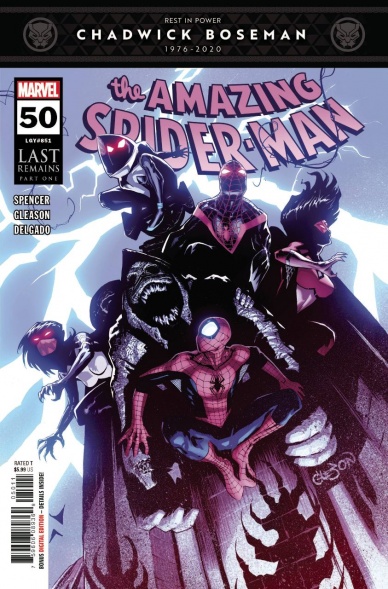
Written by Nick Spencer
Pencils by Pat Gleason
Colored by Edgar Delgado
Lettered by Joe Carmagna
Reviewed by Quinn Tassin
So this is what we’ve been building up to? Over the last 49 issues of Nick Spencer’s run on “The Amazing Spider-Man,” there’s been some really good material but far more foot-dragging than is really appropriate. So, 50 issues in we finally find out who Kindred is and it’s…Harry Osborn. This isn’t an offensive twist by any means, nor is it even a deal-breaker; there’s room for this to be a good twist depending on how the story develops. It is disappointing, though, based on where Harry was the last time we saw him. The disappointing nature of the issue isn’t all on the shoulders of that twist, though. “The Amazing Spider-Man #50” is longer than the average comic but while a lot of things happen, it feels like there’s very little actual progress made. We get a bloated Sin-Eater/Kindred sequence and a bloated Spider-Man/Doctor Strange sequence and some decent material somewhere between all that. The Norman Osborn content is better than you’d expect- infused with some real pathos and genuinely interested to read. It just doesn’t all justify itself.
Art is the easy high point of the issue. Patrick Gleason is one of those artists whose style is absolutely perfect for a Spider-Man comic and that first 12-panel grid of Peter absolutely failing at web-slinging is wonderful. Gleason is also notably good at tone; the scary stuff is scary (especially Kindred and the corrupted spider-heroes), the funny stuff looks funny, and everything generally feels just as it should. Edgar Delgado’s colors are generally solid, if unremarkable. There are a couple of moments where Delgado’s work doesn’t quite do what it’s supposed to, particularly in his presentation of the Spider-Family (his Spider-Gwen needs real work) but it’s not so bad as to mess with the flow of the issue.
“The Amazing Spider-Man #50” is a disappointing comic on multiple fronts. It fails to make the beginning of the end of the major arc of Spencer’s run feel exciting and it doesn’t work notably well as in issue in its own right either. Spencer is a generally talented writer meaning that this isn’t unreadable stuff but it’s not something that’s worth going out of your way for either. It’s just kind of there.
Final Verdict: 6.0 – “The Amazing Spider-Man #50” is a competently written but ultimately disappointing landmark issue in Nick Spencer’s take on our favorite web-slinger.

Written by Jason Aaron
Illustrated by Javier Garrón
Colored by Jason Keith
Lettered by VC’s Cory Petit
Reviewed by Joe Skonce
If there’s one thing Jason Aaron knows how to do, it’s creating over the top and memorable superhero moments. From having the Thor’s of three timelines go to fight the God Butcher, Hulk having to do battle with himself in ‘Stay Angry,’ or anything that happened in ‘War of the Realms,’ he always delivers on explosive cinematic action sequences. The ending of ‘The Age of Khonshu’ is no exception, giving Javier Garrón the chance to create some truly engaging visuals. Overall, “Avengers” #37 is a fine ending to a fine adventure, but with some triumphant moments in the climax.
“Avengers” #37 largely focuses on some dynamic action setpieces, but Jason Aaron continues to do a good job of writing fun punchy dialogue for the team. A challenge with the Avengers is combining characters of different genres and making them feel like a well-oiled machine, Aaron continues to rise to this challenge. But the real meat of the issue is how Aaron handles the narration of Moon Knight. While Spector is the antagonist of the arc, it’s not necessarily because he’s evil. Moon Knight is trying to keep the world safe, but struggling with the best means to protect others. He’s always struggled with his place in the world and his sanity, and it’s interesting to watch him struggle with yet another cosmic force trying to pull the strings.
Continued belowWhile the script is good, it’s the visuals that make “Avengers” #37 stand out. ‘The Age of Khonshu’ begins with Moon Knight stealing the powers of different heroes for Khonshu to wield, in “Avengers” #37, Black Panther takes them back. Javier Garrón’s art throughout the book is good, the action is easy to follow, the designs of New Thebes give interesting backgrounds for the fighting to take place, but it pales in comparison to his group shots and character mashups. We’re given a glimpse of Jennifer Walters, The Iron Hulk, and Blade, the Sorceror Supreme. The only criticism is that it would have been cool to see each of the Avengers wielding a power that wasn’t their own and to see more of these characters in action. As it stands, though, it was an exciting panel that made the whole issue feel like a fulfilling conclusion to the arc. Jason Aaron can write a big finish and this was no exception.
Final Verdict: 7.5 – “Avengers” #37 is a satisfying ending to a middling arc, but with some impressive superheroic visuals adding to some of the intense fun.

Written by Bryan Hill
Illustrated by Marcio Takara
Lettered by Clayton Cowles
Colored by Veronica Gandini
Reviewed by Michael Govan
“Batman and the Outsiders” has been one of my favorite ongoing comics. For one thing, I’ve greatly enjoyed Dexter Soy’s dynamic, action-packed artwork. In this issue, we’re treated to a bit of a change as Marcio Takara’s art brings us home. It’s not a downgrade by any means though, don’t worry. I enjoy the distinct looks and expressions he gives the characters. Each hero is unique and full of personality. Shiva is dark and alluring as she schemes. Black Lightning is reserved and mature while Duke is friendly and youthful. Katana can be surprisingly playful while Bruce can be surprisingly warm. (On a side note, Black Lightning using Wonder Woman’s magic lasso to conduct electricity is an inspired power combo.)
There have been other overall pluses in the series too. I really appreciated its strong characterization, an engaging plot that moved fast or burned slow at all the right times…for my money, this book has had it all over the past seventeen issues and I would have loved it if it could go on for seventeen more.
Alas, all good things must come to an end…I think. The thing is, while this version of Outsiders is done and this is the last issue, Hill doesn’t give readers that perfect, neat storybook ending. Instead, he rejects that and leaves things a lot more open-ended. On the horizon, there are questions but more importantly, possibilities. No endings, just new beginnings.
It’s understandable if you DID want that perfectly neat ending. A place for everything and everything in its place. Even Bruce (not Batman, Hill does amazing work distinguishing the two halves) wants that ending. He gives Sofia the perfect dream home, celebrates with his family, pretends to be happy. He doesn’t really get it though. On the other hand, Black Lightning embraces that he has to embrace the future, whatever shape that may take.
This series also ends on a much quieter note than you might expect. There’s practically no superhero action but it’s still very engaging. The stakes are personal and honestly, they always have been. With all the superheroic brawls you might not have given it much thought but for the entire series, Bruce/Batman wants to save one person: Sofia. It’s a very human side to the Caped Crusader. In the end, for all his struggles…did he save her? Bruce doesn’t really know. Like I said, very open-ended…but fitting too? It started with Sofia and it ‘ends’ with Sofia…I guess we’ll have to look to the future for our answer.
Final Verdict: 8.0 – Life goes on man, that’s one thing about it…
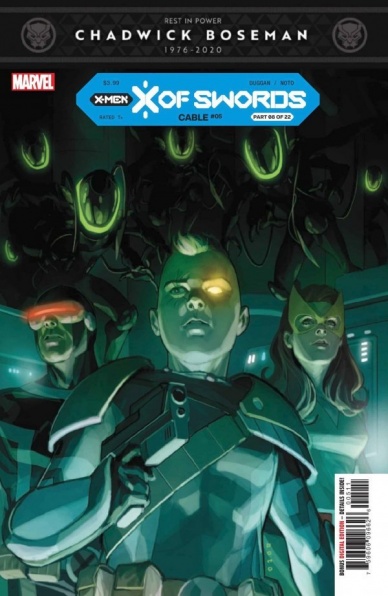
Written by Gerry Duggan
Penciled by Phil Noto
Inked by Phil Noto
Colored by Phil Noto
Lettered by Vc’s Joe Sabino
Reviewed by Jason Karlson
While the rest of the X titles are tying neatly into the ongoing mega event, X of Swords, Cable does it even smoother than most with the now young mutant having set off to explore his place as a now younger mutant in an emerging society, rather than a future that has left him constantly struggling to just survive. Finding the sword serves a greater purpose going into the gladiatorial contest to come but also on a more character-driven level to signify his new course in life with cable declaring “Big guns were the old guy’s thing, I always wanted a big &$£$ sword!”
Continued belowIn this issue, the Summers family investigate a possible alien incursion on the eerily empty and powered down S.W.O.R.D station. From the moment they arrive the issue takes on the feel of a classic Doctor Who episode with the trio trying to piece together the details of what happened on the station. While it accumulates into the grand X-Men tradition of high octane, alien battling action the thing that shines through this issue and has won me over the series as a whole is that Duggan is giving readers a deeper look into the relationship with Cable’s now age-appropriate parents, Jean and Cyclops. All parties appear to have thrown themselves into the roles and the chance to form a more conventional (ish) family unit. Jean and Cyclops support and guide their son, and despite what you might have first expected with a “teen cable” book with him rebelling against his parents, Cable actively seeks advice and support from the pair. Another issue in a series that has me genuinely excited for a character I cared very little for in the past.
Noto continues with the vibrant, clean, and youthful art here that ties in perfectly with the story being told with his Cable and is strikingly different from any style previously used for the character. The standout of this issue has to be his depiction of the new alien menace invading the station, pulling back from the main action and giving us a look at the overwhelming scale of what the Summers family is facing as well as Cyclops’ eye blasts which he infuses with power visually despite them being something we have seen a thousand times before.
Final Verdict: With Cable’s fifth issue Duggan and Noto deliver a satisfying issue focusing on the title character’s new leash of life as well as adding intrigue for the ongoing X of Swords events. As with the series as a whole, this issue surprised and entertained me as much for the fresh character dynamics as it did for the explosive action.
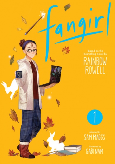
Created by Rainbow Rowell
Adapted by Sam Maggs
Illustrated by Gabi Nam
Reviewed by Kerry Erlanger
Adaptations can be tricky, but Sam Maggs and Gabi Nam really knock this one out of the park. “Fangirl” was tailor-made for manga with its awkward college drama of falling in love with one foot in the real world and one foot in fandom. Maggs and Nam manage to bring something new to Rainbow Rowell’s bestselling novel, making it enjoyable not just for those who’ve read “Fangirl,” but for those who aren’t familiar with the story at all. Nam’s art especially stands out — gorgeous and delicate, it conveys all the emotions of Rowell’s unspoken words. The nuances of the characters’ personalities are captured well, even if not all of them look exactly how you had imagined them in your mind. With Nam’s illustrative aid, Maggs is able to strike a balance between Rowell’s lengthy novel (written for National Novel Writing Month at netting at 445 pages) and the shorthand dialogue-reliant format required of the manga. Together they move the plot along while still remaining true to the original story. Interspersed scenes from “Simon Snow” and Cath’s fanfiction add dynamism to the manga that the original novel didn’t quite capture.
Our one critique is that the tension between cooler, older roommate Reagan and nerdy, introverted Cath could have been built better. Their confrontation over Cath’s eating habits and consequential cease-fire into friendship feel a little out of the left field. Ultimately, though, it’s inconsequential to the enjoyment and understanding of the story.
Final Verdict: 8.5 – “Fangirl” is a faithful adaptation that manages to feel brand new, which simultaneously makes it an enjoyable read for both old and new fans alike.

Written by Zeb Wells
Illustrated by Carmen Carnero
Colored by David Curiel
Lettered by VC’s Ariana Maher
Reviewed by Jim Malakwen
Following the previous issue’s action-packed episode, “Hellions” #5 is a fun chapter that lays the groundwork for an engaging story. After a great opening scene in which Empath is resurrected, writer Zeb Wells does a fine job of showcasing the character’s detestable nature. He has no memory of how he died and this immediately creates a sense of anticipation for the conflict to come with Greycrow when Empath discovers that Greycrow killed him.
Continued belowLater, during a meeting at The Quiet Council, Mr. Sinister suggests that The Hellions conduct a covert operation against Arakko. However, due to his tendency to rub fellow council members the wrong way, Mr. Sinister is forced to join the team in this perilous mission.
Meanwhile, The Hellions are briefed on their impending mission and react to Empath’s resurrection with disappointment. Furthermore, the stakes are raised when they discover that if anyone dies during the mission, the resurrection will be unlikely.
As soon as Empath rejoins the team, Mr. Sinister takes control and leads them into a portal. Upon their arrival at Avalon, Empath’s treacherous nature reveals itself when he suddenly turns on Greycrow. It will be interesting to see the character dynamics between these two individuals in the issues to come.
While this issue didn’t have any major set pieces, it was engaging from beginning to end. Wells has a knack for humorous dialogue and makes each character compelling. Artist Carmen Carnero continues to showcase her exceptional talent. Her panel layouts are interesting and varied. Also, colorist David Curiel does a phenomenal job of using mostly saturated warm colors to bring the visuals to life.
Final Verdict: 8.2 – A delightful installment with great artwork and one of the finest X-Books on the stands.

Written by Zac Thompson
Illustrated by Jen Hickman
Lettered by Simon Bowland
Reviewed by Christa Harader
“Lonely Receiver” #2 details Caitrin’s less-than-stellar reaction to her ethereal break-up and her attempts to get her partner back. While the concepts in this book are intriguing and it goes for the classic cyberpunk trope of dropping us in mid-stream, there’s not enough grounding detail to avoid serious confusion. And there is a lot of text to get through.
Most of this is down to Thompson’s dense scripting, which could be halved without sinking the intentional overwhelm or mystery at play. The healer scene, in particular, is clustered with dialogue, and the healer’s story could be much shorter so we focus on Hickman’s neon femme-punk art. In future tech landscapes, we want to see more than we want to read, and “Lonely Receiver” forces an intense reading experience. Bowland does what letterers do and places balloons and boxes well, but there’s just too much to manage.
“Lonely Receiver” is a cerebral book, and a little bit of over-writing, in this case, does suit. Caitrin’s existence is claustrophobic and increasingly surreal, and she is someone who would reason out her grief in detail. However, comics also rely on a balance between text and art, and disrupting that balance is a difficult thing to pull off despite best intentions. We often need less than we think to evoke overwhelm in a reader, and slimming down the script here would do wonders for the story and let Hickman’s style really shine.
Final Verdict: 6.5 – “Lonely Receiver” #2 writes itself into a corner with a dialogue-heavy script.

Written by Tom King
Illustrated by Jorge Fornés
Colored by Dave Stewart
Reviewed by Derek Uibelhoer
Tom King and Jorge Fornés share with us yet another look into the “Watchmen” universe with “Rorschach” #1, their new 12 issue maxi-series from DC’s Black Label, and though there is clear respect and for the original series present here, the new team isn’t afraid to change things up and tell a tale entirely their own.
Tom King takes us 35 years past the events of “Watchmen”, and into a future that mirrors our own present, complete with a waning public trust in authoritative systems, and growing political divisions that border on extremism. King peppers small conversations between coroners and cops with meta statements about the “Watchmen” universe and allusions to our own country’s polarization to smartly move along the first issue exposition and capture the rising tension of a torn middle class. The retrospective timeline of “Rorschach” #1 also helps create an interesting pace for this detective yarn, keeping the reader piecing together a picture of the past while taking in the whole of this new present.
Jorge Fornés and Dave Stewart make it easy for us to take in the new view in “Rorschach” #1, presenting us with a very realized picture of L.A. that shares equal sensibilities with Raymond Chandler’s Philip Marlowe and Ridley Scott’s Blade Runner, where palm trees, tail lights, trench coats, payphones, and dirigible advertising airships all collide. Sunsets down the strip never felt heavier than when washed over with Stewart’s muted pinks. And though Fornés uses a fluid line that bleeds in and out of thick and thin to create more expressive figures and evocative action sequences, he keeps the paneling very rigid here inconsistency with the original work, frequently breaking the nine-panel grid — perhaps more than Gibbons did — to tasteful effect.
Continued belowAll said, “Rorschach” #1 is a very welcome new addition to the “Watchmen” canon, and while it is still early to tell where this piece will fit into the larger picture, it is evident that King and the team are taking this project very seriously, and that alone makes this book something worth reading, even without the world it comes attached to.
Final Verdict: 8.8 – Tom King homages pulp fiction and film noir to deliver a script steeped in reverence for the original that adds a new take on the world of “Watchmen” without taking anything away from it. Jorge Fornés and Dave Stewart step up to fill some big shoes and put together one of the tightest paneled, deftly drawn comics on the shelves this week.
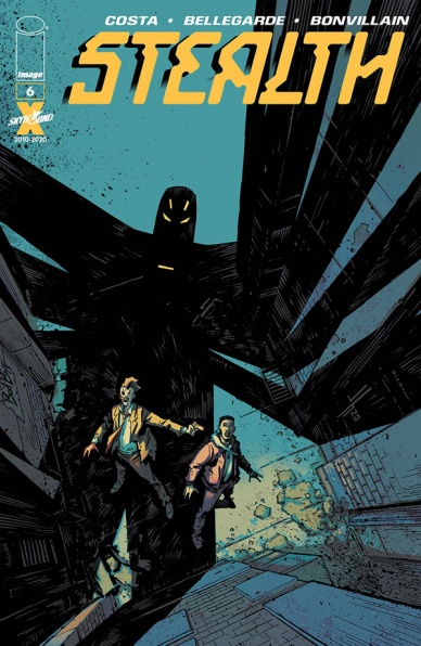
Written by Mike Costa
Illustrated by Nate Bellegarde
Colored by Tamra Bonvillain
Lettered by Sal Cipriano
Reviewed by Luke Cornelius
With the final issue of “Stealth,” Mike Costa throws the audience a curveball; time travel. Throughout the series, we’ve seen Tony bear witness to the deterioration of his father’s sense of time and in this issue it’s revealed that the Stealth suit has been connecting Tony’s father’s mind to the past and the present, leaving him to appear to be suffering from dementia or Alzheimer’s. On the first readthrough, the full explanation of how the suit came to be and what it was intended for is a bit confusing, in part due to it being a very unexpected twist, but also because of the inherent complexities of time travel. A second readthrough added clarity.
Despite its unexpected twist threatening to overcomplicate things, Costa’s script brings the series to a satisfying conclusion by resolving the conflict between Stealth and the Death Hand, as well as giving a strong legacy to Stealth for Tony to build upon, although not in the way you might have predicted.
On the visual side of the book, Bellegarde, Bonvillain, and Cipriano combine for a great final offering by keeping this issue in the same style as the rest of the series. While many superhero finales would have fight scenes showcased in their entirety on a multitude of splash pages, each moment in the book feels suitably grounded within Bellegarde’s panels. There are only two splash pages in “Stealth” #6; one to give us a literal window into the future of Detroit and another which showcases various fragments of Tony’s father’s memories. They both stick to the series’ core principles of society and humanity.
Bonvillain’s coloring follows a similar trajectory, with the palette occupying realms of realism, with only the electric blue sparks flickering from Stealth’s suit giving a hint of superheroism before the memory overload page unleashes a hallucinatory combination of pink, green, red, and blue.
Cipriano’s lettering adds the finishing layer to the comic and remains unobtrusive, subtly guiding the reader. There’s an almost unnoticeable “Blam!” in one panel which supports the grounded feel of the book but also demonstrates the lack of importance of the victim to the perpetrator.
Overall, with “Stealth” #6, Costa’s script provides an unexpected twist but ensures that enough answers are given, and conclusions are reached to make the finale satisfying, whilst Bellegarde, Bonvillain, and Cipriano combine to provide great visuals.
Final Verdict: 8.3 – “Stealth” #6 provides a satisfying conclusion to a superhero series that has strived to subvert expectations.

Written by Eliot Rahal
Illustrated by Emily Pearson
Colored by Fred C. Stresing
Lettered by Crank!
Reviewed by Matthew Blair
It’s the early 1940’s. War is raging all around the world, although the United States has yet to get directly involved, and vampires are on the loose robbing blood banks Bonnie and Clyde style and having the time of their lives, and while the FBI is starting to close in on this merry little gang of bloodsuckers, history seems to have different plans for our main characters.
“Vain” #1 is written by Eliot Rahal, a well established comic book writer with a solid foundation in superhero and horror books. Rahal does a very good job of introducing the cast of characters and making the reader want to root for them. Everyone involved has a well-defined set of desires, wants, and a solid moral compass. Even the vampires themselves seem intent on only killing people who deserve it. Unfortunately, while the story is good and the characters are well written, it’s all stuff we’ve seen before. Vampires with code aren’t all that new, and everything you can find in “Vain” #1 is something you can find in other comics.
Continued belowEmily Pearson’s artwork in “Vain” #1, coupled with Fred Stressing’s colors, combine to create a very unique and one of a kind art style that gives the book a sort of indie art deco vibe. The costumes look gorgeous, the settings appear to be period accurate, and there are some nice gory moments. Sadly, the characters look and feel incredibly stiff and wooden, there are some moments where the poses and anatomy look jarring and off, and there is very little emotional resonance in the character’s faces. It’s not completely awful, but the art is definitely an acquired taste.
“Vain” #1 is a good introduction to a cast of characters and a scenario that we’ve seen played out a thousand times before, and while the book hits all the important beats necessary to tell a good story, it doesn’t do a whole lot to distance itself from the pack and make it a must-read.
Final Verdict: 6.3 – It’s an intriguing, yet an all-too-familiar idea that is hampered by artwork that tries a bit too hard to be something unique.
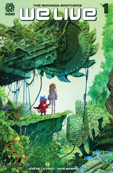
Written by Inaki Miranda and Roy Miranda
Illustrated by Inaki Miranda
Colored by Eva De La Cruz
Lettered by Dave Sharpe
Reviewed by Kobi Bordoley
“We Live” #1 is a completely new series, but it’s already looking like a win for AfterShock Comics. At first glance, the story may seem clunky, or like a creator’s passion project that looks a bit too ambitious. Instead, “We Live” #1 is lean with a clean narrative, despite the large scale worldbuilding at play.
And what world is it? The short answer: Earth, the year 2084. The long answer: Earth, the year 2084, after climate catastrophe, tectonic reckonings, world wars, and ecosystem-wide genetic mutations have decimated 90% of the planet’s population. On top of that, an alien race of unknown origin just sent a notice: in five days, the planet’s next and truly unsurvivable extinction event will begin. Humanity’s only salvation is that 5,000 children, marked for safety by bracelets found in air-dropped pods around the world, will be beamed to who-knows-where once the extinction event begins — as long as they’ve made it to one of nine beacons in time. From those children, humanity will propagate itself once more. What could possibly go wrong?
Everything plus the kitchen sink premise might seem like a doozy. While the start of “We Live” #1 is exposition-heavy, the writing is just so good that it doesn’t matter. The information about our battered Earth doesn’t come off as lazy or half-baked, but as poetic, full of tragedy and hope. This sense of imminent collapse paired with desperate hope tracks throughout “We Live” #1. Most prominently, it appears in the masterful characterization of Hototo and Tala, our youthful protagonists. They give what could otherwise have been a run of the mill apocalypse story a beating, constant heart. On top of that, the art in “We Live” #1 is immense. There’s a hodgepodge of aesthetics in the story that somehow come together. The lack of immediate cohesion feels intentional and goes a long way in visualizing a civilization pulled together by whatever scraps it can find. Things don’t fit together but end up fitting just right. Believe us, you just have to read it to see.
“We Live” #1 is the full package. Great worldbuilding, provocative characters, immense art, and full colors. Throw this on your pull list now, because there’s a high chance this story will be the talk of the town in no time.
Final Verdict:9.0 – “We Live” #1 makes the most of its dramatic premise, delivering a story full of action, emotion, and unfettered creativity. This is an undisputed work of art.


