
There is a lot to cover on Wednesdays. We should know, as collectively, we read an insane amount of comics. Even with a large review staff, it’s hard to get to everything. With that in mind, we’re back with Wrapping Wednesday, where we look at some of the books we missed in what was another great week of comics.
Let’s get this party started.
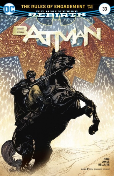
Batman #33
Written by Tom King
Illustrated by Joelle Jones
Coloured by Jordie Bellaire
Lettered by Clayton Cowles
Reviewed by Frida Keränen
This issue is the start for a new arc for Tom King’s “Batman,” and thus there isn’t too much going on yet. In the first five pages the creative team only really establishes the setting and mood, and that’s a bit too many pages dedicated for showing desert landscapes and reminding that yes, Batman and Catwoman love each other. The scenes at Wayne Manor bring some much needed humour and emotion to the story with King using some more light-hearted dialogue while Batman and Catwoman’s journey grows more tense and dangerous.
The artist for this issue is Joelle Jones, who does an excellent job in giving a different look to the series. Various textures and locations are conveyed well, the layouts are well balanced despite the slow pace and the characters look great. Bruce’s kids have funny expressions, Selina looks gorgeous and playful while Talia looks regal. A slight problem with the character work is that Damian is drawn looking much taller and thinner than in any other current series, and that combined with the pale skin colour and hair style he could be mistaken for the absent Tim Drake. Jones proves to manage slow storytelling well and I look forward to seeing her draw more fast-paced scenes.
Colourist Jordie Bellaire has brought in various tones of orange, brown and yellow that are a stark contrast to the mood of the previous arc and look vibrant instead of muddy. Actually the whole issue has a very different feeling to it, which is also partly thanks to the extraordinary circumstances of the story. A few years ago a scene like Damian Wayne crying because his father is getting married to Catwoman would have seemed extremely unlikely, but here we are.
Final Verdict: 7.0 – A slow start with beautiful illustrations for some interesting times for the Bat crowd.

Batwoman #8
Written by Marguerite Bennett
Illustrated by Fernando Blanco
Colored by John Rauch
Lettered by Deron Bennett
Reviewed by Gregory Ellner
As the battle against the Many Arms of Death continues, Marguerite Bennett delves into some segments of Katherine Kane’s psyche, her uncertainties and fears, in no small part aided by the focus on the Scarecrow as the arc’s apparent main antagonist.
However, the primary draw of this issue is its art. Fernando Blanco crafts a distinctive style for the fear-induced illusions. Panel structure includes overlap, with several large panels “stitched” together by several smaller ones. Furthermore, the imagery of the toxin-infused Batwoman atop a skeletal horse is made even more disturbing when put alongside an image of Katherine Kane out of costume with a rifle, showcasing her fractured mental state under the fear-inducing chemical’s influence, not to mention the overall imagery of skeletons around her interspersed with roses to craft a rather macabre motif that tellingly reverts to a more traditional structure and less bizarre images when the hallucinations are not occurring, though scenes such as Dr. Crane’s goings-on in his laboratory give some disturbing treats like a “zoom” on a variety of infamous diseases.
John Rauch definitely pulls his weight with the coloring, adding a lot to even the already well-organized and drawn imagery. Using similar coloration, he manages to integrate the images of roses and those of weaponry, to connect the skeletons to blood. Much like Blanco, Rauch’s colors revert to less strange combinations out of the drug trip, with cold, unforgiving grays taking up the majority of those images to contrast from the psychedelic alternative.
Though perhaps not particularly unique in terms of storytelling, the artwork of “Batwoman” #8 continues to shine.
Final Verdict: 6.0 – Well-drawn, but perhaps a bit by-the-numbers in narrative execution.
Continued below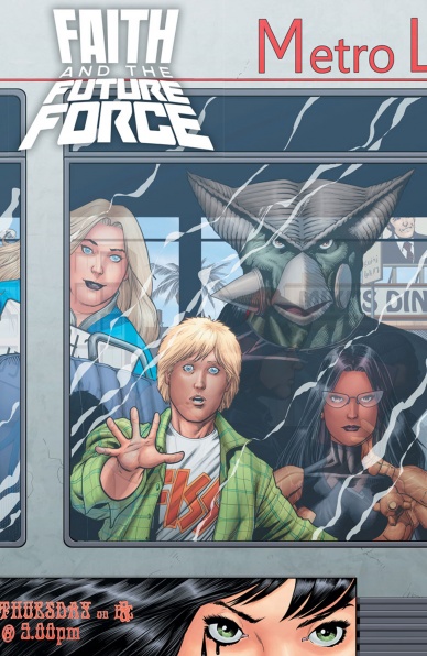
Faith and the Future Force #4
Written by Jody Houser
Illustrated by Cary Nord and Brian Thies
Colored by Ulises Arreola
Lettered by Dave Sharpe
Reviewed By Kate Kosturski
Valiant’s latest Faith Herbert miniseries concludes with some advice from Tina Turner: We don’t need another hero. Rather than head to the Thunderdome for Mad Max, Faith and company travel to early 21st century Los Angeles and find Faith’s nemesis Chris Chriswell, still textbook dudebro but now just a struggling actor. They convince Chris that their fight against the Toaster Cybermen is really just a movie that they are producing (and they’re Method Producers, hence the superhero garb) and they need his acting skills to finish the plot before the plot finishes reality. With a little bit of bad guy reverse psychology, the Toaster Cybermen are defeated and time and space is back to as it should be.
It’s a wise decision to make this a miniseries rather than an ongoing one; the time travel depictions were wearing thin for me around issue #3 and I couldn’t see it going too much longer without me losing interest. It was good for this issue to focus on only Faith, Neela, and Chris — previous issues just had too many people. Praise is due to Cary Nord and Brian Thies for creating a truly macabre alien world with metal box villain robots — though with all the Doctor Who in-jokes throughout the series, I was disappointed not to find a single Cyberman joke. Dave Sharpe’s letters are also on par; he portrays Chris’s evil laugh with the perfect sinister tone and you can hear the monotone robot in the text from the Toaster Cybermen.
The charm of Faith Herbert is that of the charm of Gwenpool — the mix of superhero action with the breaking of the fourth wall with a wink and a smile. Using a time travel plot just didn’t work here.
Final Verdict: 5.2 – Kudos for knowing “when to hold ‘em and when to fold ‘em” (to quote country legend Kenny Rogers), because this really could not go on much longer.
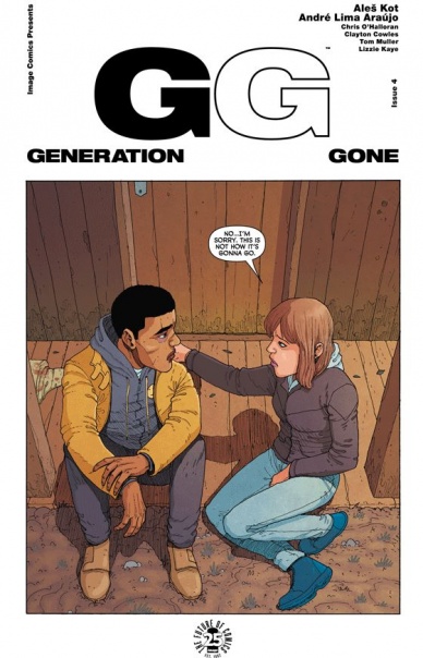
Generation Gone #4
Written by Ales Kot
Illustrated by Andre Lima Araujo
Colored by Chris O’Halloran
Lettered by Clayton Cowles
Reviewed by Matt Lune
“Generation Gone” is anything but slow. There’s a density to not only the plot but the action within this series that feels like we’ve read through at least 10 issues at this point, as opposed to the four we’ve been given. There’s also a real sense in this issue that the stakes are forever being raised, and you’re barely given time to breathe from one set piece before moving on to the next. If that feels like a negative, it’s very much not: Kot is intentionally building a pressure cooker of a situation, that is metaphorically – and literally, if the main antagonist gets his way – almost certainly going to explode.
This series employs the structural trick of making the cover the first panel of the story, meaning that there’s hardly any drop in pace from issue to issue. As such, “Generation Gone” #4 picks up mere seconds after #3 – still in the same scene, still in the same conversation, in fact. The lives of these three teenagers have been turned upside down, and their personal circumstances changed so drastically. By changing so much so quickly, however, we’re actually getting to see their true personalities shine. Nick is angry at the world and out for revenge; Baldwin wants to be this good person, but his “nice guy” persona comes to the forefront here in an ugly, selfish way; Elena is the only one that’s still the kind and caring person she’s always been, struggling to control the uncontrollable.
Kot ramps up the action in a very visceral way in this issue. Nick is on a mission, and it states right in the text that he’s less than 10 minutes away from his goal, adding a race against time to proceedings, which further ups the ante. Araujo’s panels are large and often encompass the whole page, leading to a much faster read that emphasizes the big moments, of which there are plenty. O’Halloran’s wonderfully bold color palette is pushed to its extremes here and there, often drenching the backgrounds of some panels in order to focus our attention on nothing but the emotions on display. Near the end of the issue, one particularly violent act – a full splash page, no less – paints the characters in cold blue tones that not only contrast against the excess of bright red blood but tell us this is a cold, merciless act with no return for the character committing it.
Continued below“Generation Gone,” like the central cast themselves, feels like a book that’s destined to burn brightly for a short time rather than fade away, and while that would feel like a shame, the unpredictable energy that pace gives off allows for a thrilling, gripping ride while it lasts. It may not be around forever, but the flame is burning bright.
Final Verdict: 8.7 – A graphic and frenetic issue, filled with the release of tension this series has been building, while constantly raising the stakes.

Genius: Cartel #3
Written by Marc Bernardin & Adam Freeman
Illustrated by Rosi Kampe
Colored by Brad Simpson
Lettered by Troy Peteri
Reviewed by Michael Mazzacane
“Genius: Cartel” is a pulpy series, but that extremity is modulated by smart design work from the art team that pushes the series towards being an effective thriller and narrative and not just an exercise in exploitation. I like it when films that feature multiple languages don’t always supply subtitles for the viewer. That’s how it is in real life, and depending on the circumstance can raise tensions better than any amount of Hitchcockian editing. Writers Marc Bernardin and Adam Freeman and letter Tro Peteri replicate this by rarely showing dialog balloons. As the various women Destiny Ajaye is trying to save react to sudden gunfire, it isn’t in English, but with their own languages including an Asian one. This diversity of tongues serves to highlight the universal fright on their eyes as Rosi Kampe fits in as many shocked eyes as possible. As Destiny tries to take stock and figure out who can help defend the flock, this lingual disconnect helps to raise the tension, the isolation, and enormity of task that lay before her. In that disconnect there is a certain othering/pure plot device quality for the various women, but the recognition of that difference also shows their humanity.
Brad Simpson has setup the color pallet of the series in a way that depending on the page certain key colors are highlighted (generally reds or earth tones). But to get those highlights Simpson also generally plays around in a pastel like range, which gives things a somewhat paradoxical lightness considering the subject matter. He changes that up, however, on the page where a woman chooses to take her own life. The tones used are more realistic in context and much darker. Ajaye’s reactionary panels as at the bottom are awash in crimson – the blacks help give it a slight blood red quality. It’s a twist that fits within the overall mode of the series, but still a shocking and stark reminder that sells the moment.
These two qualities help build a human heart on the pulpy foundation of this series. That heart helps give Bernardin and Freeman’s power rock anthem-esque writing a real beat. This isn’t so much exploitation, but wish fulfillment. “Genius: Cartel” is coming together like a good Starz series. It’s a little lurid, but that posture is cover for something a bit deeper and better executed than appearances would suggest.
Final Verdict: 7.5 – As Destiny’s real mission is revealed to audiences and her, the series begins to move beyond a more diverse exercise in secret power structures and Deep State antics.

Made Men #2
Written by Paul Tobin
Illustrated by Arjuna Susini
Colored by Gonzalo Duarte
Lettered by Saida Temofonte
Reviewed by Nicholas Palmieri
For the second issue in a new series, this installment of “Made Men” feels a lot like a first issue. This odd choice does make sense in the context of the story Tobin and Duarte want to tell: last issue detailed the original crew’s demise, and this one details the new crew’s birth. But that doesn’t save it from having the problems of being the second introductory issue in a row.
While mostly successful from a craft standpoint, this installment of “Made Men” suffers from too much introduction and not enough forward momentum. We meet every member of the new crew one by one, learning about how they came to be and who they are now. Tobin gives everyone a memorable moment which Duarte makes visually memorable, like the grisly image of lion-headed Leo ripping out someone’s throat or the comedic image of the manic, two-minded Gemini confusing restaurant patrons while ordering lunch. I’m enjoying these new characters, even if they have only a tangential relation to those in the previous issue.
Continued belowBeyond that, we get a nice bit of narrative movement in the form of a resurrection, which was set up in the first issue, plus some set-up for a simmering revenge plot. Ultimately, though, that’s all the story elements end up doing: simmering. We have an idea of what could potentially happen in future issues, we just have no idea how it will happen or where these characters will go next. Everything has been set up, and now we have to wait for the next issue to find out exactly which pieces will start to move.
I do enjoy what Tobin and Duarte are setting up. As a single issue, we get some memorable moments and a host of new information, even if none of it points towards anything in particular. I have faith in the creative team to build this series into something great. It’s just clear that they’re still in building mode.
Final Verdict: 7.5 – More fun introductions, with only a small indication of how the series will progress now that those are done. The future looks bright, even if this opening arc will probably read much better in trade.

The Mighty Thor #700
Written by Jason Aaron
Illustrated by Walter Simonson, Russell Dauterman, Daniel Acuña, James Harren, Becky Cloonan, Das Pastoras, Chris Burnham, Andrew MacLean, Jill Thompson, Mike Del Mundo, and Olvier Coipel
Colored by Matthew Wilson, Daniel Acuña, Dave Stewart, Das Pastoras, Ive Svorcina, Jill Thompson, and Mike Del Mundo
Lettered by VC’s Joe Sabino
Reviewed by Elias Rosner
A mighty issue, filled with Asgardian levels of talent, all here to pay tribute to the seven hundredth issue of Marvel’s favorite thunderous hero. To try to review this issue in such a short space was probably a bad idea but I’m going to attempt it anyway! Onwards!
The biggest point of praise I have to give is that, despite the wide range of artists and artistic styles on display here, it all feels cohesive. Each story thread has its own artist but it isn’t merely a collection of unconnected stories that are presented one after the other like an annual. Instead, they are all layered together, with the Russel Dauterman led thread acting as the frame for which we view the rest (in a fairly literal way).
This is a celebration of the past, the present, and most importantly, the future of this title and its characters. After having read this issue, I now want a Thor series drawn by every one of these artists. Imagine, a Becky Cloonan-led Young Thor and Loki title, a Mike Del Mundo Thor travelogue or a James Harren War Thor title; I’d buy the heck out of any one of those.
To touch on each artist here would be madness so I will instead talk about Aaron’s scripting. He knocks it out of the park, balancing the lighthearted nature of the Throg story, with the realm-spanning wonder and gravitas of the main Odison thread, with the heroic yet somber fight between Jennifer Walters and Thor as well as the terrifying return of a villain teased a few issues back.
Aaron and the artists balance the need for this issue to be celebratory and standalone (the first page harkening back to classic Thor & Throg) with the need for it to act as the start of a new arc, continuing the story from before (the fallout of the War Thor & Odinson’s fight) and setting up the many threads that will come after (terrifying villain, far future events). Aaron’s Thor epic (at 60+ issues, and with the content of those issues, I think that’s a fair statement) enters a new chapter in the best, and most worthy, way.
Final Verdict: 9.0 – A celebratory issue overflowing with talent that doesn’t lose sight of the past while forging ahead into new territory. Plus, Throg, Frog of Thunder battles the Rats of Queens. ‘Nuff said.

The Realm #2
Written and Illustrated by Seth M. Peck and Jeremy Haun
Colored by Nick Filardi
Lettered by Thomas Mauer
Comic book fans and critics can be an ornery lot. When creators take time to methodically build their worlds and populate them with believable, well rounded characters, we often complain that not enough happens. On the other hand, when pages are crammed with action, moving from one high energy scene to the next, we tend to bemoan the fact that there’s not enough character development. Striking the right balance between driving the story forward and simultaneously creating memorable characters who live in a rich, detailed world is not an easy task.
Continued belowThe debut issue of “The Realm” featured plenty of action and bloodshed and introduced several intriguing characters who are fighting for survival in a wonderfully rendered “post-apocalyptic wasteland meets Middle Earth” world. One installment into the series, the stage was beautifully set and the story was in motion. You could almost feel the tension rising. This could really be big.
Unfortunately, the key word above is almost. The one thing lacking was tension and in the second issue that doesn’t change. The stakes just don’t feel very high.
On a purely technical level “The Realm” #2 excels, but at the same time it basically reads like an extended director’s cut of the previous issue – chapter 1, part 2. We meet two more new characters (three, if you count the guy who appears out of nowhere in the cliffhanger), check in on a couple of others (who at this point we can only assume will be much more important later) and take a longer, more detailed look at the ruined landscape (still populated by orcs and goblins, as previously established).
Compositionally, this book is stellar. Panels and page layouts are strikingly well crafted and efficient. In fact, even as the illustrators juggle multiple characters and shifting points of view, the story flows seamlessly from one scene to the next, with an excellent blend of panoramas and close-ups. Similarly, the colors – though a bit too conservative, perhaps – are well suited to the book’s realistic style, helping to keep the visual aesthetic simultaneously grounded in both the mundane and fantastical.
At the end of the day, “The Realm” is bursting with intrigue and fresh ideas and the technical execution is exceptional. I want to love this book – and someday I very well might – but as an ornery fan and critic, I need it to make me care a whole lot more than I do thus far.
Final Verdict 7.1 – It sure feels like this book will be great, but we still haven’t gotten there yet. Time to crank up the tension and make us care.

Titans #16
Written by Dan Abnett
Penciled by Brett Booth
Inked by Norm Rapmund
Colored by Andrew Dalhouse
Lettered by Josh Reed
Reviewed by Devon Browning
When you’re just starting to believe that the universe has finally decided to give Wally West a break, especially after developing a heart problem due to the events of “The Lazarus Contract”, it neglects to throw the speedster a bone when the titan dies from that very condition. No spoiler alert needed, as the cover of this issue– though beautifully done by the power team of Brett Booth, Norm Rapmund, and Andrew Dalhouse– says it all. That being said, for the Titan’s series both future solicitations and issue covers seem to backfire when it comes to seemingly powerful moments that happen in current comics. I found that Wally’s death was less impactful than Abnett had surely created it to be, simply from DC’s own marketing strategy and their clear inability to protect a series’ story through other series.
Because of this it’s a relief that Wally’s death, though clearly prominent in each and every page of this issue, isn’t the main focus of this Titan’s addition. Since the crossover event with “Deathstroke”, “Teen Titans”, and the “Titans” themselves, the team of heroes have been walking on eggshells and fighting a faceless enemy. The term ‘traitor’ had been thrown around often, and for a while it felt as if we had been strung along by Abnett when every team member was in question. This issue puts to rest the questioning now of ‘who’ rather than ‘why’. Wally is dead and it is for no reason –explained by Psimon who’s interest is simply to make the team suffer. A concept appreciated when it comes to life by Booth who can visually tell a story unlike anybody else.
From staggering panels, detailed smoke, power, and light, and the dynamic poses of each and every titan, Booth carries this issue with fluid movement and a journey of moments that align effortlessly with the story being told. The suffering Psimon is bent on forcing the Titan’s to endure is seen clearly through the agonizing poses and twists of facial features Booth creates. Wally West II coming into the picture is undoubtedly a solid example of this, both by his reaction to finding Wally dead, as well as the Titans having an all out war in the wake of it. There are moments as well where the color in the pages seems to dull and bleed away from any vibrance –a most fitting tone that Dalhouse goes with when in those moments the life and color of the heroes’ lives are being drained of just that.
Continued belowThe issue is action-packed and there isn’t a moment when your eyes aren’t glued to the page. There’s never a page where dialogue or art dominate one another, and what this issue gives the readers above all is the aching for the next issue. It leaves off with enough questions answered to be satisfied only for now, but only creates more that will soak in the minds of the fandom until the next chapter.
Final Verdict: 8.7 – The art team on this issue is nearly unmatchable, and with Dan Abnett’s seamless string of events that tie together all subplots that have been brewing from the beginning of the run, this issue is an absolute must-read.
Transformers: Lost Light #10
Written by James Roberts
Illustrated by Jack Lawrence
Colored by Joana Lafuente
Lettered by Tom B. Long
Reviewed by Alexander Jones
“Transformers: More than Meets the Eye” ended on a massive cliffhanger and for several months readers have been patiently waiting to see just where the heck the titular Lost Light was in the first place. The answer provides a really sinister look into a group of robots who shed their morals in favor of a backhanded revenge scheme that fuels the new status quo aboard the Lost Light. Now that the Transformers Civil War is over and James Roberts has blurred the line between Autobot and Decepticon to the point where readers are going to have a tough time trying to figure out who is good and who isn’t despite the indication of a symbol on the chest–who said a toyline can’t have a little ambiguity?
As this series continues to progress, I think readers have started to get used to the rhythm and tone of the book–which is to say that this issue has almost no pure battling whatsoever but is more focused on a characterization and the intensely dramatic undertone of what happened and why it happened with Getaway’s crew. These shades of characterization give the story more weight and at least in this issue, Roberts doesn’t drag many of these moments along. Scenes with robots interacting have an awful, pessimistic edge unmatched by the feeling I’ve gotten from any IDW series since the original volume of “G.I. Joe: Cobra.” Right when the book hits a significant emotional high, Roberts cuts the issue short and offers a nonlinear storytelling technique that punctuates the emotion here perfectly.
This issue requires a lot of expression, subtlety, and emotion which is exactly where Jack Lawrence delivers on with some of his work on the title contained in this issue. The artist’s pencils in the comic are more streamlined when compared to previous issues, which works in this book’s favor. This comic is very grim and some of the previous issues’ pencils from Lawrence in the past may not have suited the book in the right manner. There are quite a few robots on-panel and the fact that Lawrence can delineate from each character in any given panel is nothing less than a miracle. I was rarely confused about who was who thanks to the strong detail and work provided from the full art team in the book.
I wasn’t expecting the pace of “Transformers: Lost Light” #10 to be so slow, ominous and tense–but this commitment to firm characterization and sinister storytelling has made this issue of the series the best yet. When the inevitable collision course between Getaway and Rodimus erupts I can’t wait to see what Roberts and the full creative team do.
Final Verdict: 9.0 – “Transformers: Lost Light” #10 is a devastating portrait into the aftershocks of PTSD.


