
There is a lot to cover on Wednesdays. We should know, as collectively, we read an insane amount of comics. Even with a large review staff, it’s hard to get to everything. With that in mind, we’re back with Wrapping Wednesday, where we look at some of the books we missed in what was another great week of comics.
Let’s get this party started.

Batman #10
Written by Tom King
Illustrated by Mikel Janin
Reviewed by Brian Salvatore
Let’s get this out of the way: this is the best issue of Tom King’s “Batman” run thus far, not counting to ‘Night of the Monster Men’ crossover issues, co-written by Steve Orlando. That’s not exactly high praise, as the rest of the run has been incredibly poor, but it shows that this issue has some promise not seen thus far in the series.
A big part of that is that Mikel Janin is a great storyteller,, and one that gels really well with King. Janin hits the beats that King lays out for him in a way that David Finch just couldn’t accomplish when he was on the book. Janin’s work, as always, grabs the reader by the head and forces them to take notice. His work is clean and perfectly drafted, with consistently well laid our pages, giving the reader a clear path through King’s, sometimes, loopy story.
The biggest problem with the book is that it is still starring King’s Batman, who is as close to a robot as he has ever been portrayed. His Bruce is a sharp detective but a flat character, showing no thought process at all, and taking a character that, even at his best, can be borderline unsympathetic, and turning him into a full fledged prick. Throughout this issue, he barks orders, withholds information, and generally is insufferable, and not in a fun way.
Spoiler warning:
This issue features the first hint of the Legion of Super-Heroes since the “DC Universe Rebirth” #1 special and, it isn’t much – we see a Legionnaire locked up in Arkham, trying to make their presence known. That one, three panel sequence, induced the most enjoyment I’ve felt for a King-scripted issue since ‘Rebirth’ began, and it really isn’t anything. And if that’s not a damning statement about this book, I don’t know what is.
Final Verdict: 5.3 – It’s slightly better, folks.

Civil War II: Kingpin #4
Written by Matthew Rosenberg
Illustrated by Ricardo Lopez Ortiz
Reviewed by Alice W. Castle
The thing about superhero comics is that there are no heroes without criminals. There is no law without crime. There would be no one to save without someone to create danger. In four issues, Matthew Rosenberg and Ricardo Lopez Ortiz have made us witness to the rise and fall of Wilson Fisk’s new criminal empire is stark, brutal detail. This final issue sees many of the threads tie together as Fisk begins to rebuild from the destruction wrought by the Punisher in the previous issue.
It would be easy to compare this comic to The Wire or Breaking Bad, but they are the closest touchstones in terms of its unflinching look at the violence of a criminal empire. Ricardo Lopez Ortiz is at his best here, his rough and scratchy pencils crafting a New York that is as dour as rain-soaked concrete. This is not the bright and shining, hyperreal world you usually see in Marvel comics even though it rubs shoulders with Spider-Man. Ortiz’s artwork is raw, it is destructive. There’s nothing pretty about this world or the people who inhabit it. They are constructed from harsh lines that build features out of rough geometry. They are seedy and laid bare by the no-frills linework of Ortiz.
That uncomfortable raw reality of Ortiz’s linework is brought to life by the colours from Mat Lopez. While there are flashes of deep, violent reds and oranges that punctuate the darkness of this issue, much of it is brought to life through cool colours. There’s a desaturation of blues and greys that makes red backgrounds that accompany the violence of the issue all the more shocking and sudden. The violence of this issue is measured, much like the man it chronicles. There is no gratuity here. The violence shocks in how unflinchingly real it is portrayed. This is not the fantasy violence we’re accustomed to seeing in superhero books, but inhabits the world of crime dramas.
Continued belowWhile this fourth issue is more of a bridge from this miniseries to the Kingpin ongoing series that is coming next year, it still closes in such a way to make this one of the most must-read comics from Marvel this year. Rosenberg, Ortiz and Lopez have chronicled a chapter in the life of a man surrounded by brutality and violence in such a way to make him feels captivating and mesmerising even at his most despicable.
Final Verdict: 8.9 – It takes a true creative talent to make you root for the bad guy and this series does just that. The only downside is having to wait until next year for more.

Death of X #2
Written by Charles Soule & Jeff Lemire
Illustrated by Aaron Kuder
Review by Ken Godberson III
“Death of X #2” benefits over its preceding issue by not being a $5 recap page, but does that mean it’s good? Ehhhhhhh, it’s okay. We continue the tale of the Very Bad Thing that Cyclops did during the time skip between “Secret Wars” and “Prelude to the Oh-God-How-Did-You-Manage-To-Make-A-Worse Civil War” time and we are beginning to see what that Bad Thing was. Maybe. I say “maybe” because Soule and Lemire are beginning to paint some doubts as to Cyclops’ mental state or whether it is actually him at all. It does a decent job of keeping readers on their toes as to when the axe is going to fall, little tidbits that make us question what we’re reading. Now, assuming this is Cyclops, I’m going to ignite the ire of many of fan and say what he does here fits in well with the character arc he has gone through from like “Messiah Complex” to now. Since then, he’s had to assume everything is against him and his team and act accordingly and that takes a toll until the inevitable slip up. And it’s a big one.
Most of other characters here feel like they are within character as well. Both Storm and Medusa do well enough as the more level-headed leaders of their respective nations as they try to get ahead of their inevitable crisis looming in Madrid. Now, when I say most, there is one in particular that confused me. Now, keep in mind that I have no childhood nostalgia for X-Men and most of my knowledge comes from the last ten years, but there’s a scene where Magik is talking to her brother and is coming to a realization that Cyclops is going to far and that this won’t end well. It’s a fine scene… but it’s coming from Illyana Rasputin of all people.
Aaron Kuder is assisted by three inkers and two colorists on this book, which made me worry when I saw all those names but my worries were unfounded. This is not an optimistic book like “Action Comics” and the art manages to convey that despite some of the more bright scenes. The worry, fear, caution and anger is etched into the faces of every person on both sides of this conflict as well as wonderful landscape depictions that really sell the somberness that this event is enshrouded in. They also join the group of artists that draw Medusa’s hair wonderfully, truly making it feel alive and even utilizing it in some clever ways as background. One last little thing: I am so glad to see Storm in her pre-”Extraordinary X-Men” outfit. It’s just a better and the patterns on it don’t make think of the surface of a soccer ball.
So, if I think everything is crafted well enough, then what’s the problem? Well, just the premise, really. Like I said, I’m not one of those “Waaaagh, they’re killing the X-Men because Movie Rights!” people. Really, I just see the situation with the Terrigen Mist as “Second Verse, Same As the First” with this franchise, which is something to be annoyed at in and of itself. With the “Ressurxion” announcements, it seems that the X-Men are not going away so it’s really just the endurance test to get past this era that, frankly, devalues both of these franchises.
Final Verdict: 6.0- It could be worse. Put that quote on your paperback, Marvel!
Continued below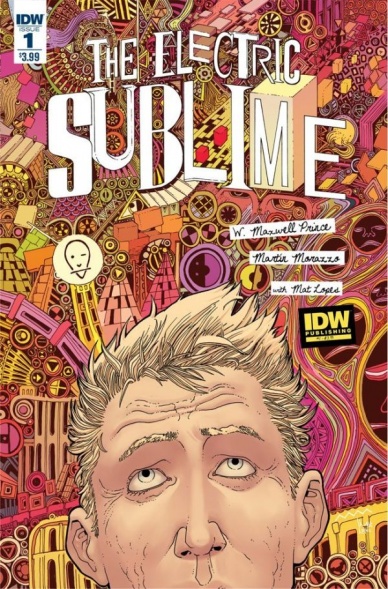
The Electric Sublime #1
Written by W. Maxwell Prince
Illustrated by Martin Morazzo
Reviewed by Stephenson Ardern-Sodje
Art imitates life imitating art and… well… It all gets rather muddling. But Prince and Morazzo manage to make “The Electric Sublime” #1 at least as fun as it is confusing. If not, perhaps moreso.
If the set-up to Prince and Morazzo’s first issue feels vaguely familiar, it could be because Vertigo’s “Art Ops” by Shawn Simon and Mike Allred played a similar caper with the Mona Lisa in its debut in 2015. Both books deal with the blurring of artistic/realistic lines, and both books offer up a shady paramilitary group who are the sole protectors of the wonderfully weird world of art to keep the peace.
And that’s not all. “The Electric Sublime” #1 definitely has a slew of influences, and it wears them on its sleeve. A major one is the pairing of no-nonsense Bureau of Artistic Integrity Director Margot Breslin and the unconventional guesting artist/detective Art Brut, that echoes Joan/Sherlock’s pairing in TV’s Elementary (as well as every other variant on the brilliant but uncontrollable savant and their long-suffering handler trope). Prince’s characterisation feels a little more archetypal than lived in just yet, but there’s more than enough wit and well balanced artistic references to help his procedural clip along at a pace.
Morazzo’s mixed-media artwork feels suitably zany to fully realise the many-layered world that he and Prince are attempting to create. His style for the ‘real world’ feels distinctly continental, with a finish that feels similar to Jean Giraud’s work, with subtly exaggerated facial features that lead solid comedy to the interplay between Brut’s manic expressions and Breslin’s stern gazes. But its his flexible approach to the multiple forms of artistic expression that make this book feel like its got a handle on its patchwork aesthetic from the very first page. There’s a playfulness to the imagery, even when it’s dealing with relatively serious material, that definitely means I’ll be back for more.
Final Verdict: 6.1 – A relatively by-the-numbers effort for a first issue, but it establishes a world that definitely feels pregnant with potential. I’ll be hanging on to see where the first arc ends up.

Faith #4
Written by Jody Houser
Illustrated by Pere Perez, Marguerite Sauvage and Andrew Dalhouse
Reviewed by Jess Camacho
“Faith” #4 marks the end of this storyline. At the con, Faith, her double and Archer team up to help save the day and while it’s enjoyable, it’s a little simple. Setting a story at a con was a great idea for a single issue but I do think it kind of distracted things away from the way the first two issues opened. Houser’s writing is so perfect for this character. She gives her great vitality and really allows her to be a different kind of superhero but there’s still something missing from this ongoing. It’s hard to put my finger on it but there’s some kind of urgency missing from the story. I’m not ready to give up on this (cause the character means something personal to me) but I want to see the story of Faith get bigger.
Perez and Sauvage continue to do really great work on their individual pages. I love Perez’ knack for action and I appreciate how he draws Faith’s proportions. Sauvage’s pages are spread out much better in this issue and she continues to bring a really fun fantasy element to this series that falls perfectly in line with the character. I’m really impressed with Dalhouse’s colors because he does so much in making “Faith” feel like a very different Valiant book. The bright colors and sense of fun he brings really takes “Faith” to a more approachable level.
Final Verdict: 6.8 – A fine issue but Faith has seen more compelling arcs.

Ninety Nine Righteous Men
Written and Illustrated by K.M. Claude
Reviewed by Matthew Garcia
Father Daniel has a buried past. Long ago he was involved in an affair with another priest, Father Adam, and the resulting scandal nearly tore apart their small Southern parish. Father Adam went away and Father Daniel continued with his life. Except now Adam’s back, coincidentally coinciding with a choir boy named Caleb becoming co-opeted by a demon. It doesn’t help that Daniel is a bit smitten with Caleb, and as his possession takes control of more and more of his body, things start getting more heated and intense.
Continued below“Ninety Nine Righteous Men” is an effective and engaging horror comic. K. M. Claude uses some luscious brush strokes and casual toning to create an unsettling and unnerving atmosphere. Like “The Exorcist,” it’s the type of possession story that leans heavily on Catholic imagery and doctrine to develop its chills. It also gradually becomes more and more difficult to turn away from the further the story goes. I’m sure it was aggravating beyond all measure to read this in its original webcomic form.
Though it’s billed as an “erotic horror” comic, there’s little about the sex that’s enticing or lustful. All the boys are pretty, yes, but the sex is carnal and terrifying. There’s also a dreamlike tone to it, with Claude providing this flowing, dizzying scenes.
For the most part, he shows a strong control over the pacing of the scene. There are some clever transitions, especially moving from set to set. However, a few times Claude skips too much, or relies too heavily on that space-between-the-gutter theory. This is most evident in the possession, which happens suddenly, abruptly, and at odds with the rest of the action in the book.
K. M. Claude nevertheless accomplishes some great work with “Ninety Nine Righteous Men”. Focused, unnerving, and wonderfully illustrated, it’s a strong little horror comic, just the perfect thing for the season.
Final Verdict: 7.5 – Sing thee body horror.

Pathfinder: Worldscape #1
Written by Erik Mona
Illustrated by Jonathan Lau
Reviewed by Robbie Pleasant
Have you ever been in the middle of a tabletop campaign where the DM suddenly started introducing all these characters from outside works? Turn that into a comic and you more or less have “Pathfinder: Worldscape,” which takes the iconic “Pathfinder” characters and throws them into a world with Red Sonja, Tarzan, and John Carter of Mars.
This is Dynamit’s big crossover event of the year, and considering they don’t have a shared universe, everyone is getting booted over to the Worldscape, where they can fight each other to their heart’s content. However, as it is at its core a “Pathfinder” story, the focus is on the characters who have been the core of the previous “Pathfinder” comics (the “iconic” characters used for all its media, representing the various races and classes of the RPG). This allows the audience to learn about this strange new world they’ve been flung into with the characters, learning as they would, and not knowing when other familiar characters will enter the scene. Those who, like me, are only vaguely familiar with the sources they’re crossing over with may find themselves wondering “Is this character from anything?” but the story still manages to work everything in well enough that no one will be lost if they don’t recognize a character from, say, the “John Carter” series.
Story-wise, it’s about what you’d expect from a crossover bringing in elements from multiple worlds. It’s not exactly the most original of concepts – getting sent to a bloodthirsty world where the heroes have to fight to the death (and may or may not kill), which serves as the catalyst to make them meet. However, the strong characterizations and good moments of dialogue help carry the story and get readers more invested. The artwork assists this greatly, with very clear designs and solid action. Some of the shots, such as Red Sonja’s entrance, are framed to provide excellent dramatic effect, and the fight scenes flow very well.
While previous “Pathfinder” comics have occasionally stumbled under the weight of their own complex character designs, and made the panels cluttered as a result, this one strikes a perfect balance of showing off all the characters, action, and environment and maintaining a clarity in the images. It makes the comic much more enjoyable to read.
And of course, players of the “Pathfinder” tabletop RPG will appreciate the bonus encounter map the comic includes. If you’ve ever wanted to include Red Sonja in your campaign but couldn’t find the stats for her, this is the place to look.
Final Verdict: 7.2 – Well-paced, well-drawn, and entertaining, albeit feeling a little uninspired at times. Has the makings of a fun little crossover, particularly for “Pathfinder” players.


