There’s a lot to cover on Wednesdays. We should know, as collectively, we read an insane amount of comics. Even with a large review staff, it’s hard to get to everything. With that in mind, we’re back with Wrapping Wednesday, where we look at some of the books we missed in what was another great week of comics.
Let’s get this party started.

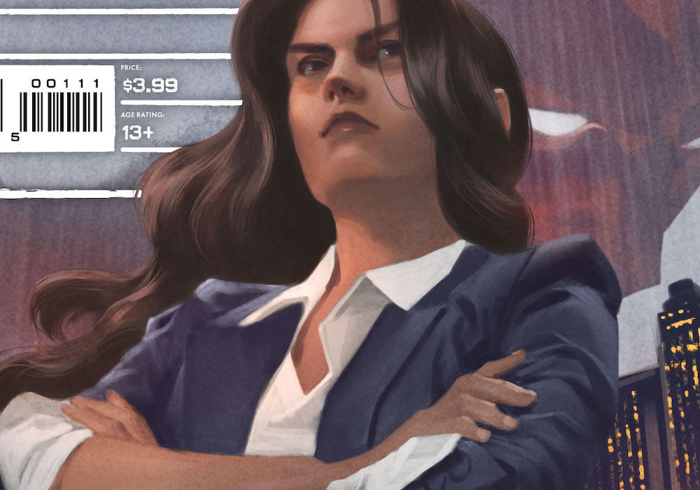
Captain America: Symbol of Truth #6
Written by Tochi Onyebuchi
Illustrated by IG Guara
Colored by Jesus Aburtov
Lettered by Joe Caramagna
Reviewed by Quinn Tassin
“Captain America: Symbol of Truth” #6 is a perfectly fine comic. It’s well-paced with clear stakes and characterization. The team does strong work at quickly getting readers invested in Mohannda’s turmoil and in Sam’s skepticism toward the Prime Minister. The attack on the UN and ensuing chase makes for a solidly exciting sequence. Taken on the whole, this is a solid formula for a contemporary Captain America comic starring Sam Wilson. You have some genuine political discussion, some good airborne action, and a bit of a personal touch. Better yet, when you tell such a simple story – that of preventing (or failing to prevent) an assassination attempt on a Prime Minister trying to deliver reparations among a slew of other progressive goals – is very easy to latch onto.
At the same time, there’s a certain punch that “Captain America: Symbol of Truth” #6 is missing. It’s a decent issue but almost everything about it feels a bit too surface level to be meaningful. Maybe it’s that while Mohannda is easy to understand and care about, it’s not a place we have any history with and therefore it’s harder to feel deeply about it even if we care. Maybe it’s that we’re just hearing about issues we should care about and dictation is rarely as effective as exposure. Maybe it’s that Sam and Falcon get relatively thin characterization in this issue outside of being a little gruff, making this tragedy hard to fully feel. In all likelihood, it’s all of the above. Competent writing is good and solid formulas are a nice thing to have. But ultimately, even though this issue works, it’s missing the depth to make it great.
The artwork, like the writing, is decent on a basic level but lacks the qualities that would make it great. Take the opening third of the issue for instance. As the Prime Minister gives her speech and Sam watches, characters are generally well-rendered and the layouts are perfectly readable; at the same time, things are more than a little bit static throughout. Plus, some of the decisions around framing are straight up bizarre. Why does the Prime Minister get a full page of the issue for one very short paragraph of her speech where we also barely see any of the room she’s in. For the sake of a longer, important portion of the speech, a full page would make sense, as would a full page to communicate the scale of the room she’s speaking in and sheer number of diplomats she has to convince to give her money. Instead, it’s an awkward image. That issue persists through her and Sam’s conversation which is filled with barren backgrounds and extremely repetitive glares by Sam. The chase sequence is more effective, properly injecting the issue with a rush of energy and a sense of urgency. The moment before the explosion that kills the Prime Minister is especially effective, creating a sense of calm that makes that twist more effective.
Ultimately, this is a decent read. There’s certainly a comfort in stories that aren’t trying to blow your mind all the time and “Captain America: Symbol of Truth” #6 is certainly entertaining. Still, there are ways to make formulaic stories feel a little more interesting and it’d be nice to see this creative team spend more time trying to find that angle.
Final Verdict: 6.6 – A perfectly readable, fun comic but not all that much more than that.

GCPD: The Blue Wall #1
Written by John Ridley
Illustrated by Stefano Raffaele
Colored by Brad Anderson
Lettered by Ariana Maher
Continued below
Reviewed by Gregory Ellner
In an era of increased visibility of police misconduct (to put it extremely lightly), “GCPD: The Blue Wall” #1 is very much a product of its time. John Ridley pulls no punches, bringing up subjects like publicly visible assault, racial profiling, and officers who shoot first, rather than as a last resort. The idea of the Gotham City Police Department being as much under scrutiny as real life police organizations is both very topical and, on some level, not even remotely surprising given their reputation for corruption on other levels. The only real change is the idea that the focus is on targets who are much more in line with real life, rather than the usual fare of Gotham City. L
There are references to the likes of Joker and Two-Face (the latter being especially important to Commissioner Montoya), but most of Ridley’s focus is down to Earth. Our protagonist rookies take up various police positions from parole to beat cops and more, all with a plot that could almost be transferred wholesale to another city (barring those references).
Stefano Raffaele’s artwork is highly detailed, but not to the point of photorealism. The effect allows readers to distance themselves from the highly charged subject matter while not downplaying it either. Important subjects, from a gun to a general close-up of a facial expression, are very clearly in focus, with perspective helping to give a sense of terror or otherwise just suspense to certain scenes, and a feeling of warmth to others, even if the characters in those scenes are criminals on parole.
Brad Anderson’s colors on “GCPD: The Blue Wall” #1 are a lot brighter than the usual Gotham fare, emphasizing how the efforts of the Gotham police are often in broad daylight as much as in the shadow of night. However, those colors are also glaring at times such as in a nightclub or even during a chase scene, drawing a lot if attention toward the fact that things may be physically brighter some of the time, but light does not necessarily mean happy or even relaxed.
Final Verdict: 7.0- A more mundane approach to Gotham City policing is very much welcome.

Midnight Sons #2
Written by Ethan Sacks
Illustrated by Luigi Zagaria
Colored by Antonio Fabela
Lettered by VC’s Joe Sabino
Reviewed by Alexander Manzo
The majority of the issue is the Midnight Sons team (Wolverine, Magik, Blade, Spirit Rider, & Nico Minoru) fighting off Dr. Doom, who is punch first, ask question later kind of antagonist. However, once the fight ends and the dust settles, it feels like a high school shoving match because Doom gets pushed off by Sorcerer Supreme Clea, and the team gets sent to a different realm. Ethan Sacks had to close off the action sequence he’d started in the first issue, but it took up too much of the issue that could have given more about the witch storyline. It’s unfortunate, but the reader is only provided a handful of pages that offer a glimpse into the bigger story arc with a scene of young Agatha Harkness and her coven attempting to work with the demon lord, Valtorr. The lack of pages does help build Agatha up into an untrusty ally for young Zoe Laveau because the reader has yet to find out if she is helping the young mystic to stop the apocalypse or perhaps revenge for a fallen witch from her past. The split between the M.S. team and Zoe brings some irony to the story, given that they are trying to protect her, and now they couldn’t be more separate from her.
With two stories starting to emerge from this series, Luigi Zagaria presents two different sceneries for this issue, with the M.S. team fighting Dr. Doom inside the academy and Agatha and Zoe inside an old building in Transnia. It feels more dungeon-like due to the solo window and the unknown size of the room, so it almost just feels like an empty concrete room. The magic battle sequences are fluid and clean so that the reader isn’t disoriented and gets to enjoy as each member gets a shot at Doom. There is a small question of how big the academy is for this battle, but since it’s magic, it’s fair to assume it’s larger than expected on the outside. A little hint of Zagaria’s imagination is in the final panel of the issue when the team is in another realm filled with a post-apocalyptic sci-fi-like atmosphere.
Final Verdict: 6.8 – A lot of action without substantial substance makes for a lackluster issue in what started as a fire-hot new series.


