
There’s a lot to cover on Wednesdays. We should know, as collectively, we read an insane amount of comics. Even with a large review staff, it’s hard to get to everything. With that in mind, we’re back with Wrapping Wednesday, where we look at some of the books we missed in what was another great week of comics.
Let’s get this party started.

Eat the Rich #3
Written by Sarah Gailey
Illustrated by Pius Bak
Colored by Roman Titov
Lettered by Cardinal Rae
Reviewed by Quinn Tassin
With “Eat the Rich” #3, we get the most confident, well paced issue yet of a series that had been interesting but very messy before now. It’s been clear the whole time that this is a comic about what it costs to succeed- really succeed- in a capitalist society but here, that theme starts to actually gel with the story being told. See, there’s been a difficult tension where the vibes of Crestfall Bluffs were so clearly off and the practice of murdering and eating retiring staff so horrifying that it was hard to see how, exactly, this could ever be worth it.
It’s not worth it, of course, but in this issue, we finally see the allure of this community. Sure, there was the nanny explaining that the help knows they’ll die last issue but that explained why desperate people would enter a suboptimal agreement. In “Eat the Rich” #3, we finally see how easy it is for Joey to fall into the routine of going to fancy parties and wearing fancy clothes and drinking fancy drinks and force yourself to forget the really bad thing that she’s doing (read: eating people) to assimilate. Once she takes her first bite of human and it doesn’t even taste bad, Joey is lost. She’s not enjoying it but she’s accepted the fact that she has to give up her moral code to live a lavish lifestyle and fit in with the crowd that can help her be successful. Then there’s Astor’s mom who was once in Joey’s position but sees herself as a positive force because she helped write up the contract that warns the people that actually make Crestfall Bluffs run what’s going to happen to them. It’s a glimpse at what Joey may become.
Pius Bak and Roman Titov are an excellent art team to complement this story. Bak’s pencils are simple but evocative and he does particularly well when it comes to character design and facial expressions. We know who everyone is and more importantly what everyone is like, just by looking at them. And their faces feel recognizable. Bak puts a lot of work into making expressions look real, not cartoonish. Astor is a big, buff, preppy dude but he looks at Joey in a way that softens him. His mom is glamorous and charming but there’s something under her expression that you can’t trust. Titov’s colors imbue whatever feeling the moment demands. The sequence of Joey finding her place is awash with so much warmth you practically want to climb inside the images. Once she snaps back at her second cannibalism party (not the official name), everything is cold again. The most interesting moments are when Joey’s inner monologue comes into play in giant letters displayed by Cardinal Rae that add a level of weight to the already great work that Bak and Titov do communicating where she’s at.
There’s no going back- literally. In a delicious (see what I did there?) twist, people who start eating human meat apparently can’t eat anything else and survive. Sarah Gailey has done top notch work moving the story of “Eat the Rich” forward with this issue. All of a sudden, she’s taken it from something that was intriguing but tonally all over the place to fully formed and engaging. The setting feels more real and so do the characters. Crestfall Bluffs is a place I’m looking forward to revisiting.
Final Verdict: 8.0- “Eat the Rich” takes a big step up in its excellent third issue.

Gun Honey #2
Written By Charles Ardai
Illustrated By Ang Hor Kheng
Colored By Asifur Rahman
Continued below
Lettered By David Leach
Reviewed By Henry Finn
Guns, naked women, double-crosses, and psycho killers.. all in a day’s work for Joanna Tan. “Gun Honey” is an ode to hard crime pulp novels, with a modern twist, with writer Charles Ardai bringing us an Asian-American female lead, which is a relatively new archetype for the genre. Issue #2 turns up the stakes for our hero in multiple ways that are both entertaining, and expected.
Ardai devotes a few pages to expanding her backstory and creating sympathy for a morally ambiguous character. While in the first issue we witnessed her being separated from her family emotionally by her father, in this issue we learn that he may have been watching out for her in his own way, as she is sent on an errand only to come home to a fire-bombed house with her brothers dead. This creates sympathy for her in a simplistic and typical manner, and the question still remains to be seen what nuances to her motivation are developed as the series continues.
There is one puzzling part of the book where Tan seduces another Asian woman and drugs her after sex (which makes her not a monster somehow) to steal her identity in order to bust into a prison she is supposed to plant a gun within. The question I have, is this simply a lazy form of storytelling to assume all you have to do is pick a similar looking Asian-girl and cut your hair to fool all your coworkers, or is this an internal bias towards treating Asian women as interchangeable and lacking identity. I don’t know the answer to that but either way it gets her in the prison to set up the twist at the end.
Artist Ang Hor Kheng brings a classic style artwork to the series more influenced by the 1970s pulp magazines than modern day illustration. His lines are simple and scratchy, choosing to create shadows and render contrast with straight line hatching rather than allowing the colorist to create the shadows and contrast. His figures are somewhat loose and some of his proportions are questionable, but in the end his art services the type of story well.
Colorist Asifur Rahman follows suit by filling the panels with flat colors and minimal textures. This works for the style of illustration presented, as anything more complex would overpower Kheng’s linework. There are moments where he flexes his skills a little, like creating abstract patterns of reflection in the floor of an office, but these panels are few and far between.
Final Verdict: 6.5 – A hard crime story that will please fans of the genre, but perhaps not a shining example of modern-day storytelling.
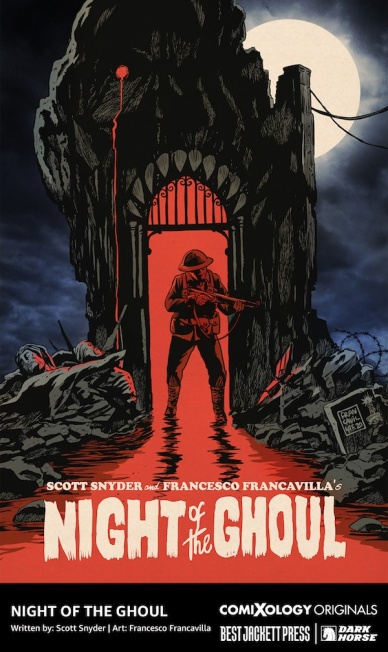
Night of the Ghoul
Written by Scott Snyder
Illustrated & Colored by Francesco Francavilla
Lettered by Andworld Design
Reviewed by Alexander Manzo
Scott Snyder’s original horror story starts with a man whose obsession leads him to an unknown place that puts him in far more danger than the reward ever was. Forest Inman finally finds the man who created a horror movie that was believed to have been destroyed in 1946. Snyder bounces between the present storyline and bits of the film with soldiers similar to Inman that go into battle with one objective in mind only to find out that there is an unknown danger hunting them. The monsters in the creator’s film turn out to be real, and all of the nurses and doctors “taking care” of him were the ones holding him hostage, and Inman has found his way into this trap.
This first issue feels like the first twenty minutes of a horror film where the monster isn’t shown on film yet, but the audience is already on the edge of their seats, deciding whether to keep staring at the silver screen or find something to hide behind. This was also a good change of pace to Snyder’s usual world-building stories and feels much more self-contained and focused.
While Snyder’s script is excellent for building tension, without the art by Francesco Francavilla, it would not be able to give it the creepy vibe that takes it to a different level. One of the key things that bring it to the horror genre is that the creator that Iman comes to visit has skin that looks like it is melting off of him. There are also a few close shots of the creator that emphasize his eyes and breathing mask that remind the reader of the psychotic look of Hector Salamanca from Breaking Bad.
Continued belowFrancavilla’s color choices also help create an old-school horror movie vibe with the choice to use limited colors. He primarily uses black with lots of greys during the main storyline and yellow and red during a conversation with Inman and the creator to build tension and emphasize the danger in their conversation. There’s also a vintage look during the panels that feature the “destroyed” film that certainly helps the reader know the difference between the current timeline and the movie.
Final Verdict: – 8.5 If you’ve been looking for an original horror comic during this Spooktober, than this is one worth checking out.

Nubia and the Amazons #1
Written by Stephanie Williams and Vita Ayala
Penciled by Alitha Martinez
Inked by Mark Morales
Colored by Emilio Lopez
Lettered by Becca Carey
Reviewed by Alexander Jones
Nubia has a long history with Wonder Woman spanning decades. DC recently brought Nubia back for their ‘Future State’ crossover in “Future State: Immortal Wonder Woman.” Nubia’s triumphant return to DC was even celebrated at DC with a new 6-issue mini-series! Nubia emerges from The Well of Souls to return to Themyscira. Stephanie Williams and Vita Ayala are both working on the story with Williams credited as the scriptwriter with Alitha Martinez as the interior artist. Unfortunately, “Nubia and the Amazons” #1 is an average debut issue that introduces an important piece of mythology to DC Comics. “Nubia and the Amazons” #1 will likely be imperative to the upcoming “Trial of the Amazons” crossover event. DC definitely has the right idea with this creative team and property but the execution of the issue itself leaves a little something to be desired. It is frustrating just how little characterization is provided to Nubia in the debut issue.
Martinez’s art is great with characters and expressions. The moments where Martinez incorporates more complicated panel techniques and adds more movement on the page are the most impressive panels artistically. Some of Martinez’s faces blend together which gives the issue a slightly bland feeling in certain instances. The traditional page layouts hold the art back from greatness. The final scene would have carried so much more impact if it was depicted with a more careful sense of design and layout. The last panel in particular is a puzzling way to end the debut. Martinez appears to be on the right track with pages that have more panels and detail. The opening scenes with Hippolyta and the other Amazons have a great visual direction.
The setup of the debut issue is fascinating. Nubia returns from death to join her fellow Amazons. Nubia even seems to remember some fuzzy details about her adventures with Wonder Woman decades ago. However, “Nubia and the Amazons” #1 becomes less focused in the second half of the issue. Nubia as Queen welcomes a new group of Amazons to Themysceria. Nubia trains with this new group of warriors until readers get to the extremely abrupt ending teasing the future of the story. Williams and Ayala do not turn in a focused script. Readers barely getting to know Nubia and Williams immediately introduces lots of other characters into the mix. “Nubia and the Amazons” #1 even seems dedicated to teasing future stories without making the most of the current storyline.
Final Verdict: 6.0 – “Nubia and the Amazons” #1 is an important but bland reintroduction to Nubia and the current Themyscarian power structure.
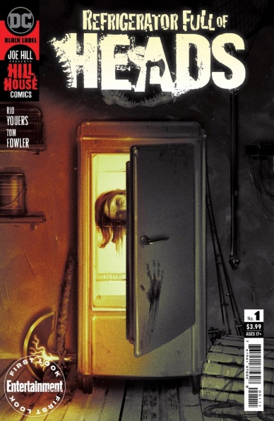
Refrigerator Full of Heads #1
Written by Rio Youers
Illustrated by Tom Fowler
Colored by Bill Crabtree
Lettered by Andworld Design
Reviewed by Ryan Fitzmartin
A violent, supernatural home invasion opens the debut issue of “Refrigerator Full of Heads” #1, which hits the ground running. The latest grisly affair from DC’s Hill House imprint is jam packed with action and blood from start to finish, racing forward at a breakneck pace. Rio Youers’ story contains bikers, robbers, axes, and sharks, hardly slows for even one page to catch its breath. While far from boring, the pace is perhaps a tad too aggressive to allow the reader a chance to understand the plot or get to know the characters. By the end of the first issue there’s little sense of who the two leads, Cal and Arlene are or what they’re doing. What is clear is that they’re in deep danger, which should provide enough of a hook for readers to pick up “Refrigerator Full of Heads” #2.
Continued belowThroughout the first issue, characters are constantly screaming, yelling, or crying out in pain, so it’s good that artist Tom Fowler has a strong handle on facial expressions. His facial work is almost somewhat exaggerated, which works for a heightened comic like this. The comic’s plethora of decapitations, stabbings, and shotgun blasts to the face are also nicely illustrated in lurid detail. Bill Crabtree’s vibrant color palette adds strong emphasis to the action. Crabtree is quite skilled at coloring a wide variety of shades of blood, which is important because “Refrigerator Full of Heads” #1 contains buckets of it.
Readers intrigued by the exceptional title looking for a violent and nasty comic won’t be disappointed with the carnage within the pages of “Refrigerator Full of Heads” #1. While the story and characters leave something to be desired, as a first issue it provides sufficient thrills.
Final Verdict: 7.4 – A thoroughly bloody first issue, favoring action over story or characters.


