
There is a lot to cover on Wednesdays. We should know, as collectively, we read an insane amount of comics. Even with a large review staff, it’s hard to get to everything. With that in mind, we’re back with Wrapping Wednesday, where we look at some of the books we missed in what was another great week of comics.
Let’s get this party started.
Written by Brian Michael Bendis
Penciled by Ryan Sook
Inked by Wade Von Grawbadger
Colored by Brad Anderson
Lettered by Josh Reed
Reviewed by Alexander Jones
Getting a journalism-focused perspective of Clark Kent’s endeavors is a smart approach to “Action Comics” few creators have utilized. Thankfully, Brian Michael Bendis has subverted the trend with the new installment of “Action Comics” #1004 and his Superman work. The title takes advantage of Kent’s day job to dole out new revelations regarding his personal life and also resolves a key plot thread that has been instrumental to the series since the “Man of Steel” mini-series.
The emotional core of the title comes from the exchange between Lois Lane and Clark Kent. The dialogue between the pair is doled out in the speedy Bendis pace. The melodrama in past issues is recontextualized and explained here in a different light. Lane and Kent feel like they have actual chemistry and are two people that love each other who are in an interesting relationship. It is good to see that Bendis isn’t focused on action in this issue. Bendis takes the time to explore the relationships between the cast members of the series letting the emotional sequences lead to important new revelations in the story.
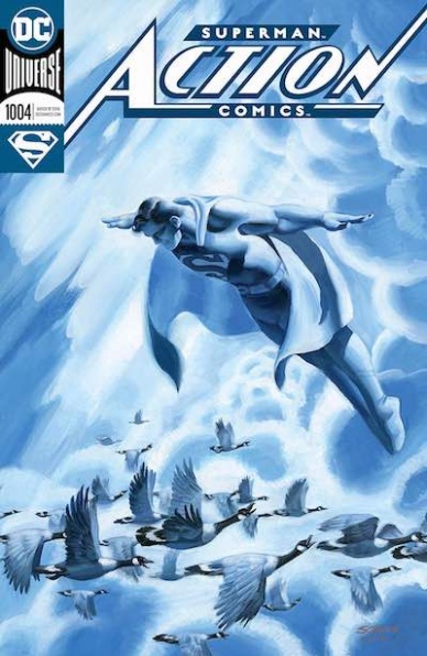
Ryan Sook’s grounded, polished approach to the issue makes Bendis’s script look even better. Sook’s nuanced approach to the body language between Kent and Lane depicts a couple who are deeply in love. The issue is littered with great moments like a beautiful kiss between Kent and Lane and a panel bleed with tons of paper adding more context to a busy office environment. The final pages in the issue are stunningly beautiful and look even better thanks to the ambitious direction Sook approached the work with. There are multiple splash pages that are perfectly executed on to capture story beats with emotion.
“Action Comics” #1004 is the best installment of the series-to-date and gives a greater context to the feats Bendis has accomplished in his Superman run so far. The issue’s Ryan Sook interiors are the cherry on top of this impressive title. Few Superman comics have been able to depict a more honest interpretation of Clark and Lois’s relationship.
Final Verdict: 8.5 – “Action Comics” #1004 boasts an honest interpretation of Lois and Clark’s relationship and beautiful illustration work.
Written by Chad Bowers, Chris Sims & Benito Cereno
Illustrated by Eoin Marron & Sam Lotfi
Colored by Chris O’Halloran & Dee Cunniffe
Lettered by Taylor Esposito
Reviewed by Chris Egan
This year Dynamite Comics has decided to grace us with a 30 page “Army of Darkness” Halloween Special. It is surprising that this hasn’t been done in the past as a horror-comedy franchise as popular as The Evil Dead/Army of Darkness would be great for a Halloween tie-in many years over. We get two stories included in this issue, both are fun and perfectly suited for the season.
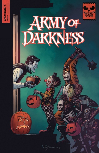
The first story, ‘Scared Shipless’ written by Chad Bowers and Chris Sims, involves Ash wandering into a ghost tour in Charleston, SC and getting involved in a pirate curse involving Blackbeard and the crew of the Queen Anne’s Revenge. It’s a fun g-g-g-ghost pirate story with Ash being just as cocky and pig-headed as ever. Seeing him go up against a famous pirate like Blackbeard is enjoyable, but the story itself isn’t anything too memorable. A few simple twists and plot that breaks some of the franchise’s own rules has Ash jumping into action a little too late, making the story feel oddly weighted. He’s been at this for quite some time now and it feels like he is watching everything unfold before donning the chainsaw and boomstick. He isn’t exactly known for pacing himself or thinking things through. Eoin Marron and Chris O’Halloran come together to give us a great pulpy comic look. Marron’s pencils are “A.o.D.” and O’Halloran’s colors have a playful exploitation horror vibe. He makes some great choices in palette changes based on the events unfolding. Their combined strengths elevate the story making it just a bit stronger than it would have been without them.
Continued belowClosing out the book is a quick, 8-page story, ‘Cemetery Man.’ When a group of teens breaks into the local cemetery with all manner of witchcraft and voodoo items, they unwittingly unleash a few deadites. Thankfully Ashley J. Williams is around to assist. A cute story set on Halloween that does capture the spirit of the night, or at least what we’ve come to think of it as since the 1970s. Lotfi’s illustrations are wonderfully detailed with Cunniffe’s colors making for a gorgeous horror short that would feel right at home with “Afterlife with Archie” or “The Chilling Adventures of Sabrina.” Though those books pull some inspiration from films like Evil Dead II so I guess it’s all one big love-fest. Their work captures the tone of “The Evil Dead” and longtime fans will rejoice. Quick and fun, this story works better tonally as a spin-off than its predecessor. While Ash is not the focus of this story, it does work quite well. He’s treated like a mythical hero, showing up in the lives of these unsuspecting kids at just the right time to save them from certain doom, well some of them.
Final Verdict: 5.5 – An enjoyable Halloween Special that will keep die-hard fans of the franchise turning pages, but it isn’t as good as we would hope.

Written by James Tynion IV & Sam Johns
Illustrated by Rian Sygh, Savanna Gancheau, Shan Murphy & Abby Howard
Colored by Walter Baiamonte, Gancheau & Murphy
Lettered by Jim Campbell & Howard
Reviewed by Ken Godberson III
For Halloween, Team Backstagers have joined up again with a couple other creators to put out a little anthology composing of one full-sized story by the original creative team of Tynion, Sygh, Baiamonte & Campbell alongside three mini-stories.
The main story focuses around the two stage managers, Jamie and Tim and asks the question: If the theater is magically weird most of the time, what’s it like on Halloween night, when everyone is forbidden from being in it? They are joined by the innocent Sasha, who has become the breakout star of this series as the three investigate a creature that haunts the stage area. In going with the more optimistic tone of this series, there is more to it than meets the eye and the end feels so perfectly “Sasha” in his desire for everyone to be happy. Sygh and Baiamonte’s artwork continues to improve and refine. They get to have a little fun with a variety of costumes for the cast, such as Beckett’s cardboard robot costume, while also switching to the cartoonishly creepy creature in this story. All in all, if you are a fan of “Backstagers,” then this light little story will help keep you going.
The three mini-stories were all nice little bonuses that told the tales of meeting your deadlines (“Greased Lightning”), remembering the importance of your stage tech (“Fright Lights”) and being honest (“Fright of the Living Tool Rats”). However, I think the biggest takeaway was being able to see these characters in different art styles than the normal team. Gancheau, Murphy, and Howard all have a bit rougher (not in skill level) styles, but they all work to have a similar tone fitting of the series. Murphy’s work on “Fright Lights” is perhaps the standout, whose sharper, more jagged style and more muted color palette really sell Johns’ tale of always walking towards the light.
Final Verdict: 7.0 – A nice, fluffy little anthology for fans of “Backstagers” to enjoy for the holiday.
Written by Scott Peterson
Illustrated by Kelley Jones
Colored by Michelle Madsen
Lettered by Rob Leigh
Reviewed by Elias Rosner
“Batman: Kings of Fear” is not a particularly original series. It mines ideas that have been explored many times since Peterson and Jones have last worked with the Bat, with an aesthetic to match. Yet, unlike many other nostalgia trips or visits via older creators, (sorry “Deadman,”) “Kings of Fear” #3 offers a highly focused take on Batman and the Scarecrow that reminds us why so many people love these characters. The ethos of this mini is to provide us with an adventure from Batman’s canon, to do what the main “Batman” title and comment on that title’s mission of “analyzing what makes Batman, Batman.”
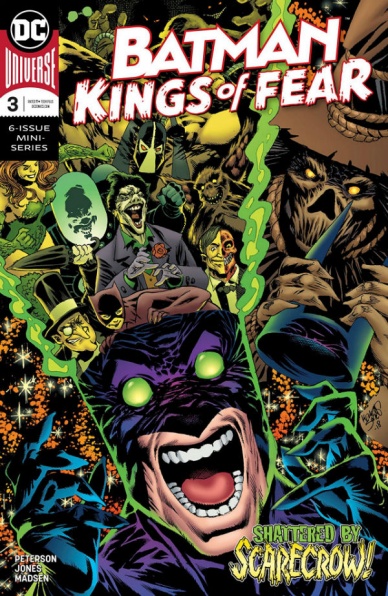
Continued belowThe “Kings of Fear” creative team do this by using Scarecrow as the modern audience proxy. He is snarky but not in an overly annoying way and constantly questions Batman’s sanity, through overt means, like referencing the fear gas, and through his questioning of why Batman spends his nights scaring and helping common folks instead of beating on his costumed villains. Jones portrays this gorgeously, helping to sell the fear Batman instills in others.
Jones’ ar is impressionistic instead of realistic, which helps to sell the idea that Batman is akin to a living Gargoyle, reading to rain destruction upon those who seek to do evil from the shadows, acting as a warning to all. Yet we know the surliness is an act, or at least partially one. You can see it in the way Jones draws Batman’s face when he helps the girl back to her house. Batman is no longer imposing, even though he is still large, and he makes every accommodation to help this girl, to not be the scary gargoyle.
In addition to this, the city of Gotham feels alive in all it’s dingy glory, fully realized under his pen. However, there are many moments when Jones’ style works against him. Faces get distended and when characters aren’t posing, they can feel a bit lifeless. Additionally, there are times when it takes a little while to figure out what is going on in a panel, mostly due to his choice to present hallucinations in conjunction with reality. It’s easy to breeze past but for those who are already not on board with Jones’ style, and not drawn in by the simple story, this might put them off “Kings of Fear” fully. For me, the enjoyment of a simple story with gothic art and a Batman who feels like a hero is enough.
Final Verdict: 7.0 – “Batman: King of Fear” #3 is good fun, with dark, soulful art, providing a nice counterpoint to the main “Batman” title.

Written by Daniel Kibblesmith
Illustrated by Ricardo López Ortiz
Lettered by VC’s Joe Sabino
Colored by Felipe Sobreiro
Reviewed by Michael Govan
It’s that time of year again. Not the holidays, but the annual ‘Deadpool Vs.’ mini. Since 2014, Marvel has rolled out at least one each year. This time around the Merc with a mouth goes up against Black Panther. Why? Both characters are at the peak of their popularity, their respective films were smashing successes. It certainly makes business sense. The in-universe reason? The dispute revolves around vibranium (It’s almost always vibranium). Deadpool is a co-star, so the comic is a comedy. Marvel has drafted Daniel Kibblesmith, who wrote the similarly comedic “Quantum and Woody”, to bring the laughs.
It’s tricky to say for sure if he succeeds or not. The comic is full of jokes but humor is largely subjective. What some find hilarious falls flat for others. Speaking personally, only one or two jokes drew a chuckle. It is just the first issue though, my reaction to the jokes could be wildly different the deeper we get into the story. What is more concerning is the plot. Deadpool gets meta and acknowledges that superhero vs. superhero stories tend to follow a predictable formula. However, lampshading that the story is about to follow the same formulaic beats does not make the story any less formulaic.
The art is a good fit for the mini-series. Ortiz has a more comedic style, drawing people with exaggerated proportions and adding cartoon effects (for example, swirly eyes to signal dizziness or the anime angry red veins on the forehead). His art also puts a large focus on the movement and action, capturing the chaos that Deadpool is known for. However, that is not enough to wildly improve the comic. The superhero vs. superhero formula feels stale and since the next issue teases ‘a big fight’, it seems the series will just go down the checklist.
Final Verdict: 5.0 – Comic book readers can basically guess how the conflict will play out without picking it up.

Written by Cullen Bunn
Continued below
Illustrated by Mark Torres
Colored by Mark Torres
Lettered by Simon Bowland
Reviewed by Gustavo S. Lodi
The very first page of “Cold Spots” #3 sets its mood and hints at the broader storyline. And it does so with just one line of internal monologue. It says a lot about how Bunn and Torres are collaborating on this series to see script and art become invisible within one another.
Readers not familiar with the first two issues should be able to pick up the story relatively unscathed, as character dialogue and the overall situation is clear to newcomers. The overall atmosphere of a horror story where the heroes and villains are not so clearly defined, while confined to one single setting, adds to the sense of claustrophobia the plot is aiming for.
Torres’s art is particularly noteworthy on two occasions. First, as he explores the haunted mansion Dan and his family are found in. One particular sequence early on “Cold Spots” #3 takes the lead character and readers through corridors, staircases and painting-filled halls. It very effectively portrays the picture of a real space, filled with dread and mystery. Second, whenever the series’s ghouls materialize, the deforming effect on characters and on the panel design itself truly makes it mesmerizing to look at.
Bunn manages to establish a firm balance between horror and family drama, by having such an unreliable protagonist in Dan. Readers will have a hard time bonding with him, which is most surely par for the course. Looking at how a man like him can still do good, apparently against immoral benefactors to his daughter will likely lead to a stronger tale of perseverance as the series progresses.
Towards the end of the issue, Bunn pulls a major surprise on his audience, in a sequence of events that culminate on a plot twist propelling the next issue forward. It is quite a spectacle that fans of The Lord of the Rings will automatically be drawn to.
All in all, the third issue of “Cold Spots” continues to deliver a very interesting mystery, wrapped in a complete art package that is very aligned with the mood and themes the script is calling for.
Final Verdict: 8.2 – Cryptic mystery, an unreliable protagonist and a moody art style make “Cold Spots” a compelling and engaging story.
Written by Matthew Rosenberg
Illustrated by Szymon Kudranski
Colored by Antonio Fabela
Lettered by Cory Petit
Reviewed by Gregory Ellner
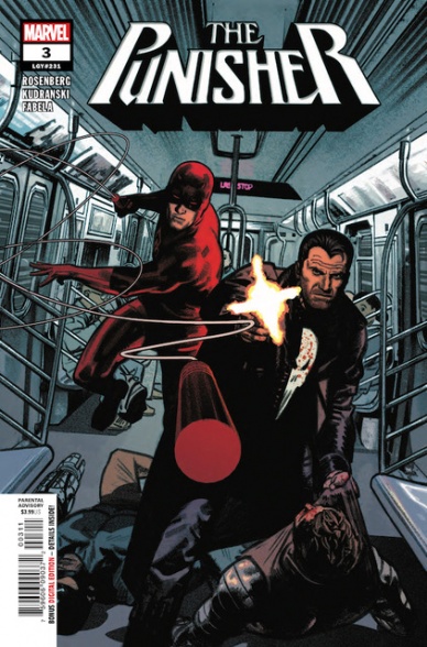
In “The Punisher” #3, unlike in previous issues of the ‘World War Frank’ arc, Matthew Rosenberg’s change to focus on Frank Castle’s perspective instead of those who are hunting him down shifts focus away from the virtual monster movie atmosphere that permeated those stories to instead be a more traditional comic book team-up story, or as close as the Punisher really gets in any case. While the focus on his lethal tactics for dealing with villains does show how much the world at large hates him, the fact that he’s facing the undead ninjas of the Hand kind of puts a damper on that on some level.
Rosenberg isn’t above including some comedic moments at times, like commenting on New Yorkers’ annoyance regarding problems with the subway system, which carries over well between real life and fiction. However, the humor does not detract from Castle’s traditionally brutal stoicism.
Carrying over from previous issues, Szymon Kudranski is excellent at illustrating Frank Castle’s fighting style and works it seamlessly with that of Daredevil. By utilizing specific angles, including a view from outside of the 7 Train looking in, or a similar angle from the side to see an oncoming train, the bloody messes created by the Punisher are put on display while simultaneously using discretion in when to show the exact impacts of said murders.
Antonio Fabela continues to be a perfect choice for the artwork on this series, giving “The Punisher” #3 a pseudo-noir feel befitting the eponymous vigilante while also including enough variation in the colors to make it feel at home with other characters like Matt Murdock or former agents of the defunct S.H.I.E.L.D.
Continued belowFinal Verdict: 7.0- While the focus on the Punisher himself does take a little bit away from the uniqueness of the series as a borderline horror, Matthew Rosenberg works together seamlessly with Szymon Kudranski and Antonio Fabela to continue the excellent storytelling on ‘World War Frank.’

Written by Donny Cates
Illustrated by Lisandro Estherren
Colored by Dee Cunniffe
Lettered by Joe Sabino
Reviewed by Christa Harader
Well, it’s about darn-tootin’ time I caught up on “Redneck”, and something deep within my queer soul must’ve known because #16 continues Cates’ alarming trend of letting the Bowmans be happy for a minute with Greg coming out to JV and JV being completely fine with it.
Like a lot of people are, believe it or not.
As a queer person (I hate that phrase, but there it is) I’m a little sick of the tortured coming-out narrative, and hats off to Cates for subverting what we’d all expect, especially from a group of vampires from Texas. Coming-out stories and queer pain are often fetishized for straight audiences, but Cates gets the balance right here. It feels natural, gives us some insight into Greg and softens JV’s edges. Add that to the satisfying addition of Gabriel (“Evil”) taking out a couple of prison Nazis and Bartlett finally having something to be happy about, and you’ve got a comic issue that, in concept and execution, is exactly the balm we need after such an explosive arc.
Satisfying though Landry’s death was. And it was really satisfying.
As usual, Estherren’s art delights. The scratchy line gives the book space to be sinister and humorous in equal measure, and it’s always a pleasure to read a book about vampires that’s not done up like a Victorian set piece. I’m on board with the Parliament, both in its existence as world-building and in satirizing the genre, and I like Estherren’s styling with that crew especially. Cunniffe’s work is exceptional and adds to the drama and heart of these characters. It’s a hard thing to keep a book that’s as dark and shadowy as “Redneck” visually interesting, and Cunniffe’s palette is varied and seamlessly blended. Sabino’s letters are great, with the hand-drawn balloons mirroring Estherren’s style and the choice of typeface not just suiting but complementing a book with a large and varied cast of characters who talk. A lot. Fine work from everyone here.
Like most of you, I’m not convinced Grandpa is dead, and with two issues of introspection and character-building under our belt, I’m a little, uh, nervous for what’s to come. Cates and team have proven that they’re not afraid to kill their cast, though I’d argue that each death is earned, and with Perry’s mind in tatters … there’s a lot of bad stuff on the horizon.
I’m completely hooked for the ride.
Final Verdict: 9.5 – Another near-flawless installment in the “Redneck” storyline, issue 16 proves that coming out doesn’t have to be a thing – and neither does prison murder, casual sex or getting back together with your long-estranged ex. It takes all kinds to make a world.

Written by Cavan Scott
Illustrated by Derek Charm, Robert Hack
Colored by Derek Charm, Charlie Kirchoff
Lettered by Robbie Robbins
Reviewed by Tom Shapira
I didn’t read the previous issues of this miniseries, but seeing as how each one is meant as a delivery mechanism for a spooktacular (do imagine lightning strikes and bats flying by as you read this sentence) new horror short it didn’t feel particularly necessary.
I will say that I got the gist of it rather fast: there’s a rebel crew stuck in, where else, Darth Vader’s castle and as they go through various trials and tribulations they tell each other short stories that meant to be a bit scary for the audience (and being that this is the children-aimed “Star Wars Adventures” line this truly is the mildest of mild creeps) and deliver an important lesson for the characters themselves. This seems to have rather missed its mark.
The story-within-a-story here is very well illustrated by Robert Hack, who did similarly well-regarded work in turning the naïve to the terrifying in Chilling Adventures of Sabrina, and concerns a group of Wookies trying to discover who has been kidnapping young members of their tribe; there’s a twist here that’s rather easy to spot but that’s not the problem – I just don’t really get what point that story was trying to make. It does the classic EC Comics thing in which the villain suffers an ironic punishment but I never got why he did what he did, nor what message are the droids hearing and what the story is meant to glean from it. The protagonists don’t win by tricking the big monster, they just turn against something else – so size definitely does matter!
The framing sequence is surprisingly effectively-drawn by Derek Charm, whose bright and cartoonish design actually add a degree of tension when the titular dark lord steps on the plate. He takes rather well to horror.
Final verdict : 5.0 – the art’s good and the story is a breezy enough read, but this wouldn’t give the chills even for a seven-year-old, nor will it teach them any aspiring lessons.


