
There’s a lot to cover on Wednesdays. We should know, as collectively, we read an insane amount of comics. Even with a large review staff, it’s hard to get to everything. With that in mind, we’re back with Wrapping Wednesday, where we look at some of the books we missed in what was another great week of comics.
Let’s get this party started.

Written by Jeff Lemire
Illustrated by Mike Deodato Jr.
Colored by Frank Martin
Lettered by Steve Wands
Reviewed by Gregory Ellner
From just reading “Berserker Unbound” #4, it is clear that Jeff Lemire is not telling a happy story. The tale of the Mongrel King and his 21st-century companion is one of an attempt to go home, but it is also one of futility nonetheless. When all else is gone, when a classic barbarian is left without his home, all he can rely upon is the brutality of his combat in the face of sorcerous powers. However, even with the well-plotted fight scene, it is readily apparent that Lemire’s story emphasizes how utterly pointless the exercise can be in the grand scheme of things. While a thing of awe, “Berserker Unbound” is also not afraid of showing, through minimal dialogue and multiple silent pages, the utter hopelessness of the lone roaming warrior king, even with a modern civilian to help him.
Mike Deodato Jr.’s artwork is absolutely phenomenal. Every swing of a sword or blast of arcane power is shown in visceral detail, the sprays of blood and removal of limbs not even slightly shying away from the horrifying nature of sword and sorcery combat in the modern-day.
Frank Martin brings his “Venom” coloring expertise to the fore, using dark palettes intermingled with splashes of red blood and nauseating or beautiful magical power depending upon the situation. Together, the effect is utterly magnetic, tying together the illustrations and the writing into a cohesive picture of a hopeless yet fascinating world.
Final Verdict: 8.0 – Beautifully illustrated and colored while depressingly written, “Berserker Unbound” is not for the faint of heart.
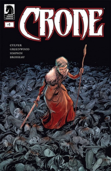
Written by Dennis Culver
Illustrated by Stephen Greenwood
Colored by Brad Simpson
Lettered by Pat Brosseau
Reviewed by Matthew Blair
The sword and sorcery genre is a long-time hallmark of comics and other forms of so-called cheap entertainment. It’s not quite as famous as superheroes, but thanks to Robert E. Howard’s ‘Conan the Barbarian’ stories they are a proud part of the early days of the pulp precursor of comics.
“Crone” #1 asks the question: what happens to the barbarian warrior after they finish their quest and have to be called back to a life of violence and pain?
Writer Dennis Culver is certainly not reinventing the wheel here by asking this particular question in this particular genre. You could easily replace the main character with a modern special forces soldier or a cop who is definitely retired and is definitely not coming back to the force for one last mission but decides to do it anyway as a favor for an old friend. Thankfully, Culver delivers a solid script that has some great character development that makes the reader care about its characters and lays the foundation for an intriguing story filled with death, violence, and pasts filled with ghosts and poor decisions.
As for the art of “Crone” #1, Stephen Greenwood does a great job recreating the familiar aesthetic of the genre. The female heroes are dressed in the skimpiest of armor, the villain looks like he was pulled straight off a heavy metal album cover, and the whole book has a sort of Scandinavian Viking feel that looks like a world where only the strong survive. Short of a few very niggling issues—there is a cross on a grave that looks very out of place—it’s a book that demands artwork that is big, bloody, and emotional and Greenwood absolutely delivers.
“Crone” #1 doesn’t try to reinvent the wheel when it comes to the sword and sorcery genre, but it does do a great job at crafting a familiar story with familiar beats that almost any fantasy fan from ‘Conan’ to Dungeons and Dragons will enjoy.
Continued belowFinal Verdict: 8.4 – It’s all familiar material, but it’s worth revisiting due to a fine level of polish and talent.

Written by Jim Zub
Illustrated by Max Dunbar, Nelson Daniel, Netho Diaz, & Dean Kotz
Colored by John-Paul Bove, Nelson Daniel, Thiago Ribeiro, & Stefani Rennee
Lettered by Neil Uyetake
Reviewed by Joe Skonce
We are currently living in a Golden Age of the tabletop role-playing game. What at one time was considered one of the nerdiest hobbies has recently experienced a surge of popularity thanks to celebrity endorsements and new media, like podcasts and live streams. The interesting thing about adapting Dungeons and Dragons into a more conventional medium like a comic book is that there is a risk of something being lost in translation. Dungeons and Dragons is a collaborative storytelling game. What makes it memorable is the unique and chaotic energy that arises when a group of people works together to solve a problem. In “Dungeons and Dragons: Legends of Baldur’s Gate” #1, Jim Zub does an admirable job of capturing the feeling of sitting around the table with your character sheets and half-eaten bags of chips, as you and your friends go on an epic quest.
“Legends of Baldur’s Gate” #1 is a massive comic and rather than telling one longer narrative, Zub chooses to tell four vignettes of the misadventures of the legendary heroes of the Forgotten Realms. The decision to split the issue into four smaller stories is not only smart but also a lot of fun. Every section we see the growing friendships, abilities, and cohesion of the party, which also feels very natural to playing a game of D&D. As the issue progresses, Zub sells the idea that these characters have become legends. Zub also has a gift of capturing dialogue that is high fantasy but with enough modern phrases that you can imagine who is playing each one of these characters.
The art team, too, does a great job of capturing the nature of a game of D&D. Each section has a different artistic team, but all the art styles work well with one another. The creature designs are all top-notch, larger than life, menacing, and feeling like a worthy threat. The backgrounds of all the panels, also, sell the busy and bustling nature of a D&D city. This is especially true in the sequence with the demon knight; the pub has buzzing energy from the patrons. It makes the world feel alive. These heroes are a part of a bigger story rather than the only people that exist. At the end of the day, that’s what any good D&D story should feel like, a group of friends in a much larger world.
Final Verdict: 8.8 – Jim Zub captures the unique energy of playing a tabletop RPG and at the end of the day, that’s what you want from a Dungeons and Dragons comic.
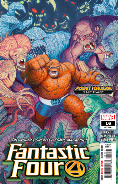
Written by Dan Slott
Penciled by Sean Izaakse
Colored by Marico Menvz
Reviewed by Tanveer Kalo
This series continues to be the best of what Marvel is all about the creative team. The team makes Marvel’s First Family feel enjoyable and grounded again except not in this issue since they are in a different world.
The issue provides some inspiring and comical moments from Ben Grimm’s speech to a group of monsters to Johnny Storm’s interaction with Sky. To some readers, the Thing’s speech and Johnny’s scenes might feel something Stan Lee might try to convey in his writing on the Fantastic Four.
Under Dan Slott, the series feels accessible to anyone and fun for longtime fans. Slott’s strong narration makes the panels pace easily for readers and his love for the characters is evident in every line of dialogue.
Sean Izaakse’s line art and Marico Menvz’s colors are breath-taking. Izaakse perfectly captures the emotion and narration that Slott wants to convey to readers through the facial expressions of The Thing during the action sequences to the flaming 4 in the sky. Menvz’s colors bring life to the issue and series. Without Menvz the book wouldn’t be the beauty it is. Izaakse and Menvz’s work shines most in the tender scenes of the Fantastic Four coming to each other’s aid. Their collaboration with Slott’s script is a marvelous match.
Continued belowFinal Verdict: 7.6 – An enjoyable issue that reminds readers why Marvel’s First Family is fantastic.

Written & Illustrated by Matt Wagner
Colored by Brennan Wagner
Lettered by Dave Lanphear
Reviewed by Christa Harader
“Grendel: Devil’s Odyssey” #2 sees Grendel Prime attempt to make positive contact with the Gyk, a native race that worships water, a potentially corrupt godhead. They’re not exactly positive about their first contact situation.
Matt Wagner doubles down on some classic hard sci-fi, complete with creature anatomy, cultural practices, and hierarchies in this issue. It’s a welcome deep dive given the strangeness and solitude of Prime’s journey, and it functions as a Swift-ian glimpse into the sheer imagination and weirdness that makes up much of the “Grendel” universe. We’re also treated to some insight into how much Prime has to learn, and Prime’s weird innocence and lack of experience even after all of the bloodshed and drama of the past.
Brennan Wagner’s color palette continues to be on point, with tight gradients and darker hues toward the climax of the book that set off Matt Wagner’s controlled line. Backgrounds bleed away when we get into anatomy, but the desert hues of this alien world vibrate with the greens, blues, and purples of the creatures, conflicts and focal objects. Lanphear’s lettering is well done, and Wagner leaves plenty of space for the AI-AI banter.
Folks who were expecting a lot of action in this issue might be disappointed, but “Grendel” has never been content to deliver what we expect. The Wagners and Lanphear go for world-building and parable-style storytelling instead, and it works.
Final Verdict: 8.0 – “Grendel: Devil’s Odyssey” #2 is a lesson in intergalactic colonialism, with plenty of weird, well-paced detail to entertain.

Written by Ethan Sacks
Illustrated by Robert Gill
Lettered by VC’s Joe Caramagna
Colored by Rachelle Rosenberg
Reviewed by Michael Govan
I am not looking forward to the apocalypse. Even if you somehow miraculously survive that first major cataclysm, things still somehow manage to get worse and worse. In the ‘Old Man’ universe, Spartax was destroyed, the Guardians died, Earth’s heroes were defeated and the villains took over…and now Galactus is coming to eat everybody. I have to say, the final pages of this book do a great job setting up the big finale. Galactus and the Shi’ar Empire/Universal Church of Truth showing up on Earth’s doorstep sure seem pretty final. How will Old Man Quill defeat this threat? Okay, okay, we know it’s probably going to be time travel…but I guess we’ll just have to wait and see.
While I am hooked for the next issue, this comic felt somewhat disjointed. I enjoyed the violent battle between Viv Vision’s resistance and Doom’s forces. The artwork really sells the dystopian battle and Viv’s badly damaged head is still a very striking visual. I liked when Quill returned and was confronted with Gladiator, the Shi’ar’s death by Ultimate Nullifier was a great page as well.
The time travel bits throughout the comic were…so-so. Time travel can either be interesting, confusing or boring and in this issue, it’s definitely leaning towards the latter. Not only that but it drags on for very long. It doesn’t do this book any favors. At the same time though, I’m eager to time-travel to the final issue to see how the story all wraps up.
Final Verdict: 6.0 – In this corner, we have the Devourer of Worlds with the might of the Shi’ar Empire! In this corner we have…well, we’ve got Quill. Just the one guy. If you can get off-planet, I’d go for it.

Written by Jeff Loveness
Illustrated by Lisandro Estherren
Colored by Patricio Delpeche
Lettered by Steve Wands
Reviewed by Rasheda
Keiner arrives to investigate the mysterious deaths in the bunker; people seem to be possessed and then kill themselves. Dr. Sattler also questions what the hallucinations people are seeing before killing themselves. Are they ghosts of people who have died there? Or is it just their subconscious thoughts that are haunting them? No matter what the answer ends up being, no one is safe.
Continued belowJeff Loveness has written a very somber and mysterious story. The dialogue is also mostly the inner thoughts of the main doctor. Loveness knows how to draw you in and make you wonder what is going on. Short, curt thoughts for the doctor so he doesn’t betray his these when he speaks as to what he feels is going one. The uneasy half-truths he gives the inspector are empty words, which is human behavior when you do not want to tell your true feelings. Loveness gives your fear in the way these characters take action with what is going on around them. Little is said, but Loveness gives you a lot to think about.
The art created by Lisandro Estherren is simple, with loose lines. Estherren’s work looks incomplete, which kind of goes with the story, something is missing but you are given just enough to be satisfied. There is not much crispness in the art, giving an abstract feel like Picasso. Estherren is almost letting you really concentrate on the story by not distracting with a lot of details, which is quite nice with this heavy content. Patricio Delpeche’s color palette is a mood change dream. Most of this issue is colored creates a nightmarish feel, the dread builds with the color change; lighter, brighter blues and purples for past events being remembered, warm oranges and reds to represent present time and where most of the dialogue takes place, and darker blues, greens and reds for the deadly conclusions of the issue. Delpeche really knew what to do to visually build the dread.
Steve Wands’ lettering is part of the art with the different colors in the dialogue and inner thought – you read to yourself in different voices. It is quite engaging.
Final Verdict: 7.0 – Thought-provoking, creepy, psychological read that plays out slow and steady.
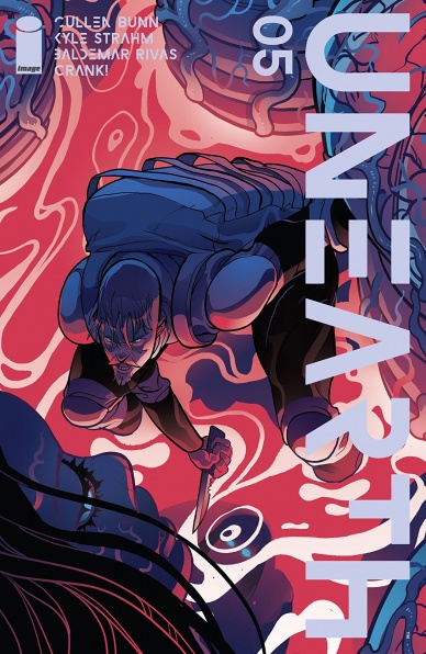
Written by Cullen Bunn and Kyle Strahm
Illustrated by Baldemar Rivas
Lettered by Crank!
Reviewed by Kobi Bordoley
“Unearth” #5 has everything you’d expect from the climax of a horror/sci-fi comic arc. There are Revelations with a capital “R,” face-offs with ineffable cosmic baddies, mad dashes through spooky corridors, and plot turning explosions. While these moments are certainly grotesque and satisfying, “Unearth” #5 suffers insofar that its whole does not equal its constituent parts.
The pacing of “Unearth” #5 is most to blame for this. While Bunn and Strahm deliver powerful setpieces, we don’t get to linger on them for long enough, and the constant ping-ponging between points of view further adds to the confusion. There are some softer moments in the story, but these feel like detours on the way to the main event–and in some ways, they literally are, in the instances of characters running past each other and offering quip-like eulogies of fallen comrades. While I suppose this adds to an overall sense of urgency, the pace of the story is so consistently dialed to 11 that those moments of calamity fail to stick. Pacing aside, the writing team pens some delicious dialogue beats, mostly related to the previously mentioned Revelations and some great “It’s not X…it’s Y” knowledge drops.
While the story of “Unearth” often lacks decisive punch, the art in this issue works overtime. We’ve seen in prior installments that the horror festering in “Unearth” lives somewhere in the Venn diagram of Alien, Annihilation, and HP Lovecraft, and artist Baldemar Rivas throws these meaty artistic touchstones into a blender. The resulting cocktail is gruesome, creepy, and downright delectable. I’ll let the eldritch brain monster speak for itself (which it does, don’t worry.) Perhaps the thesis regarding “Unearth” is the following: if you’re looking for a twisted, body-horror romp, pick this up as soon as possible, just know that the characterization and overall story lags behind.
Final Verdict: 6.8 – “Unearth” #5 delivers alien, horror visuals in spades, and everything else in a lower, but still acceptable suit.

Written by Benjamin Percy
Illustrated by Joshua Cassara
Colored by Dean White
Lettered by Joe Carmagna
Reviewed by Quinn Tassin
Benjamin Percy has an incredible speaking voice- it’s booming a gruff and makes you lean in, ready to soak up everything he has to say. Percy writes a lot like he speaks, and that’s a very good thing. In “X-Force #1” he delivers a strong, gritty, fun debut for a series that’s sure to get even stronger in the coming months.
Continued belowUnlike some of the other books in Dawn of X, “X-Force” isn’t fully formed in its first issue. We don’t actually get to see Krakoa’s CIA because it doesn’t exist yet. Instead, we get to see something a little messier, but a lot more interesting. We open with Domino undercover with some Court of Owls-looking cabal ready to deal with the new Krakoan reality. She quickly gets found out but we’re left to wonder what her fate will be.
The rest of the issue is largely spent on Krakoa, where things are going pretty well…in most people’s eyes, that is. “When you’re safe, you’re soft” says Wolverine to Beast early in the issue. It’s a hell of a thesis statement (if an on-the-nose one) for a comic that spends the next 20 pages proving to us how much danger there is in this brave new world.
Joshua Cassara’s art and Dean White’s colors imbue ”X-Force #1” with a tense atmosphere that few teams could match. From the first page, it’s clear that a storm is coming. When it finally lands, the action is explosive and horrifying. The weight of the mutant massacre at the hands of mysterious trespassers is great and the art team conveys that weight handily.
That massacre, heartbreaking as it is, is also incredible. Percy sells the desperation of the cast, particularly the island’s security system, Black Tom Cassidy, incredibly well. As Wolverine, Jean Grey, and Beast move to take out the intruders, they realize that Professor X is unguarded. They reach him just as he’s shot, and the issue ends with the shock and pain of what will be Krakoa’s security force. “X-Force #1” is incredibly promising and we should all be excited to see the story Ben Percy is telling unfold.
Final Verdict: 8.5 – “X-Force #1” is an atmospheric, pulse-pounding debut for Krakoa’s deadliest team.


