
There’s a lot to cover on Wednesdays. We should know, as collectively, we read an insane amount of comics. Even with a large review staff, it’s hard to get to everything. With that in mind, we’re back with Wrapping Wednesday, where we look at some of the books we missed in what was another great week of comics.
Let’s get this party started.

Written by: Jim Zub
Illustrated by: Lan Medina
Colored by: Marcio Menyz with Federico Blee
Lettered by: VC’s Joe Sabino
Reviewed by: Joe Skonce
One of the initial things that drew me to “Black Panther and the Agents of Wakanda” was the absolutely wild team that Jim Zub and his team created for the series. It’s a team-up that prominently features some of Marvel’s more bizarre characters like Broo, Gorilla Man, and Fat Cobra (who also happen to be some of my favorite characters.) Jim Zub takes advantage of this strange lineup by writing a story that is punchy and balances the right level of humor and heart. Some of the best parts of the “Black Panther and the Agents of Wakanda” #3 were when Broo and Gorilla Man just hanging out in space. If only the adventure matched.
In Zub’s defense, the mystery on the moon is effective. The team isn’t making footprints, the rocks feel more like organic material. The reveal that the moon has become a giant plant monster is well-executed. Zub just adds one piece to many. It’s a shame to see them go back to “heroes trapped in dream sequences” so soon, considering that they just beat villains that trapped them in nightmare states. It seems like this was designed to heighten the mystery of losing communication with the space team. It would have been just as easy to say that the plant monster can block communication. At least Broo’s fantasy was cute.
That being said, Lan Medina’s art is very good. There are a lot of fun panels in the issue, like the closeup of Broo with the moon reflected in his tiny glasses. You can feel the excitement in Broo’s face, which is especially impressive considering that the Brood are not the most expressive of aliens. But where the art really excels is the vine monster. Once revealed, the vines are always somewhere in the panel, and illustrated to look like they are always moving. It’s unsettling. It’s effective. It really showcases the threat the team is facing. There is also another page near the end where the moon looks like Ego the Living Planet, which might be a hint of where the story is going. Either way, Medina’s art is impressive and makes “Black Panther and the Agents of Wakanda” #3 a visually engaging comic.
Final Verdict: 6.2 – Zub’s dialogue and Medina’s art are quite good, it just feels like the adventure is too much of a retread from the last adventure.

Written by Tom Peyer and Mark Russell
Illustrated by Greg Scott and Peter Snejbjerg
Colored by Lee Loughridge
Lettered by Rob Steen
Reviewed by Rasheda
Edgar Allan Poe’s The Conqueror Worm
Professor Long’s granddaughter introduces her fiance to the professor as he is experimenting with his worm project. But, instead of him celebrating, he is consumed by his experiment. What his granddaughter hopes to be a happy occasion, turns into a full-blown attack on humankind.
This story is based on Poe’s poem of the same name. Tom Peyer’s portrayal of the professor almost takes the form of the poem’s narration; he sees mankind as nothing but worm food, a lost cause. The character is crazed and does a self-destructive deed, only to be saved by a person to whom the professor thought was doomed. Poe brought us a dismal outcome, Peyer gives us hope at the end.
Greg Scott and Lee Loughridge give us frenzied imagery to go with the chaotic story. Scott’s art is almost surreal, they look like he had models but then the expressions become over-exaggerated. The colors provided by Loughridge transition with the tone of the story; cool when things are smooth and warm when there are danger and panic.
Continued belowThe Leprechaun King
A tongue in cheek story of the crown of the king of the leprechauns and what man and creature will do to obtain the crown and harness its powers.
Mark Russell’s story reads like an Irish folktale about a legendary leprechaun battle, but during the read, you have to stop and think this all sounds familiar. Not giving away too many details, it is clever in its telling and makes sense. Russell drops the clues and hints and at the end, you get an ‘aha’ moment when you realized what had just happened.
The art by Peter Snejbjergis straight down the middle. It fits the narrative, dropping the clues to match with the wit of Russell’s writing. There are visual clues to the tongue in cheek story, like the pub sign, the jewels on the crown, even the background characters. Giving any more information will give away the story, you have to read and see to believe.
Final Verdict: 7.0 – Poe is always a good read, pairing it with imagery just makes sense.
Written by Jeremy Whitley
Illustrated by Alti Firmansyah
Colored by Triona Farrell
Lettered by VC’s Joe Caramagna
Reviewed by Matthew Blair
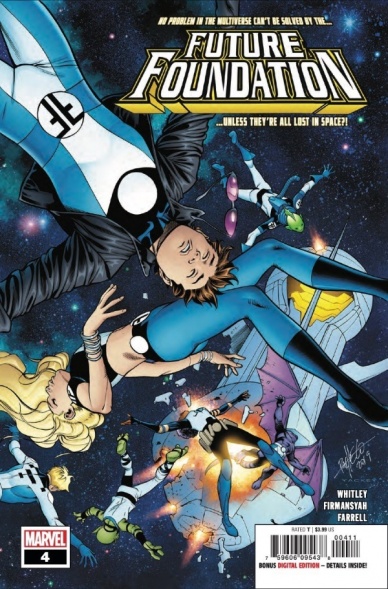
Out of all the ideas and new stories presented in 2019, ‘Future Foundation’ is probably the most interesting and forward-thinking idea that I’ve seen produced by the big two in a long time. The series follows a collection of the Marvel Universe’s smartest children as they go on adventures across the Multiverse to fix problems that people on Earth can’t even think of.
“Future Foundation” #4 shows the team trying to fight off a cruel alien warlord and its cronies that they accidentally freed from prison.
Writer Jeremy Whitley has crafted a fun, engaging story that is a very good read for younger readers, despite the fact that the cover shows what looks like a group of child corpses floating in the cold void of space. “Future Foundation” #4 doesn’t waste a whole lot of time with character development and introductions, and instead opts to be action-heavy as the bad guys attempt to take over the good guy’s ship, and Whitley does a great job of ensuring that the action is clear to follow and that each character has an important role to play and gets to use their powers to help fend off the bad guys. It’s a great example of how a comic book series can retain reader attention after it’s done with introducing and developing its characters.
Like the writing, the artwork specializes in clarity and action. Artist Alti Fimansyah does a great job of making the action clear to follow and understand and walking a very fine line between action that respects the reader’s taste and overly gratuitous violence. It’s not anything incredibly special or mind-blowing, but it is perfectly serviceable and does a great job communicating the story to the reader.
While a complete newbie like myself would have been better served going back and reading the previous issues in order to fully understand what’s going on, “Future Foundation” #4 does a great job providing a clear, easy to understand, and highly engaging story for readers of all ages to enjoy.
Final Verdict: 8.5 – A great comic book series starring newer, younger heroes for newer, younger readers.

Written by Robert Venditti
Penciled by Pat Olliffe
Inked by Tom Palmer
Colored by Jeremiah Shipper
Lettered by Starkings and Comicraft
Reviewed by Tanveer Kalo
This Year of the Villian tie-in issue provides an examination of Carter Hall’s emotional state and place in the world(s).
In this issue, Earth-3’s Sky Tyrant, the evil Hawkman reflects Hall’s embrace of his darkest rage. Their interactions challenge Carter to confront his emotions while attempting to save Midway City from Sky Tyrant. Venditti gives readers this exploration with ease and enough space for the story to breath. A the same time, Venditti might be wanting readers to think about Hawkman’s sins from his past lives. If He continued down those paths and didn’t realize what he had done, could he end up as Sky Tyrant?
Continued belowThe art team, especially Pat Olliffe’s pencils fully capture the aerial combat and ambiance of a sky filled terror. The team sinks readers in with their color choices, detailed pencils, and inks. Under this team, each character on every page feels meaningful from the terrified expression of civilians to Sky Tyrant’s imposing presence over Midway City. Each member of the art team works well with Venditti’s vision for the book.
At the end of the issue, a familiar face from Hawkman’s past is show and readers will wonder what role the character has to play on his road to redemption.
Final Verdict: 7.4 – A good Year of the Villain tie-in for Hawkman fans with a surprisingly familiar face at the end.

Written by Tim Seeley & Sarah Beattie
Illustrated by Rebekah Isaacs
Colored by Kurt Michael Russell
Lettered by Crank!
Reviewed by Christa Harader
“Money Shot” #2 picks up right where we left off: knee-deep in trouble, and a lot of it. The crew’s been captured by aliens and forced to fight in a warlord’s arena for survival, while flashbacks fill in some of the more humorous – and not so humorous – gaps leading up to their current predicament.
Seeley and Beattie hit a good balance of content and humor, and “Money Shot” is shaping up to be a pretty good book. There’s far too much dialogue in this issue, rife as it is with world-building terms, concepts, and parlance, but the crew each have distinct personalities and the emotional ties and strain between all of them feel both feasible and earned. Isaacs’s art is bubbly and imaginative, with good strong colors by Russell to help flesh out the dusty arena, moody lab, and dramatic audience scenes. The lettering is good – Crank goes with broad, squat balloons with minimal leading between lines and an even, readable font for the main dialogue. The aliens have a different font to help add a little flavor, but it doesn’t err on the side of ornate.
Overall, “Money Shot” is a fun book with a bit more depth than you’d expect. Issue #2 loses the thread a bit with some robust storytelling, but sifting through the details doesn’t detract too much from the reading experience.
Final Verdict: 7.5 – “Money Shot” #2 aims to entertain and does it well, with just a bit of density along the way.

Written by Vita Ayala
Illustrated by Marcelo Ferreira
Colored by Dono Sánchez-Almara
Lettered by Clayton Cowles
Reviewed by Gregory Ellner
As written by Vita Ayala, the tale of Michael Morbius is more of a horror story than a tragic fall. However, this is not necessarily a bad thing by any measure. By focusing primarily on how villains react to the living vampire, “Morbius” #1 shows the way in which a vampire’s monstrosity can influence the world around him, creating a very justified fear that can lead to hunts against his kind.
The decision to focus the narration on the works of Aristotle seems like an odd one on Ayala’s part, as while it brings up the essential point of what it means to be human, it is simultaneously a bit pretentious and distracting from the main story. That said, the impression, if meant to be at least in part from the point of view of Morbius himself, might be intentional, in which case it is pulled off very well, though hopefully not continuing in too heavy-handed a manner in the future.
By utilizing blurry images and only minimal focus on our eponymous character himself, Marcelo Ferreira enhances the feeling of tension and distress, made all the scarier by the aforementioned villain perspective on the attack. It isn’t enough to make readers truly feel sorry for the antagonist of the issue, but possibly to dread the horrific actions themselves and fully sell the idea of a hunting creature of the night. Use of close-ups on new, mysterious figures also helps to keep within the villain’s angle of someone with a lack of much knowledge regarding this situation, concentrating in on specific elements like a coat, an eye, or a mouth, giving an overall sense of mystery on top of the previously mentioned dread.
Continued belowDono Sánchez-Almara uses color marvelously. The dark color palettes and adherence to deep shadows or a blurred appearance aid the artwork’s focus on the mystery, the horror, and the reader’s own thrill at seeing the living vampire in action from an alternative point of view. By having the bright colors of the villain shine so well at certain points that they seem to create a general feeling of the light being safe for cartoonish villains, but the dark being better for amoral monsters.
Final Verdict: 7.75 – With mystery and an interesting point of view, “Morbius” #1 brings this scientific vampire to life.
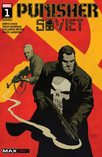
Written by Garth Ennis
Illustrated by Jacen Burrows
Lettered by Rob Steen
Colored by Nolan Woodard
Reviewed by Michael Govan
I was wary of going into “Punisher: Soviet” #1. For one thing, Frank Castle is…let’s say, an acquired taste. The character can be pretty boring. On the other side of the coin, he can be excessively brutal. With Garth Ennis on writing, I definitely thought we were going in the latter direction. Have you read “The Boys”? Different strokes for different folks but I can’t even stomach that book.
“Punisher: Soviet” is a solid opening issue though. Burrows’s pencils fit the grounded noir feel that this comic is going for and again, there’s nothing too gory. The comic is simple, clearly painting the stakes and the intriguing conflict. I feel like this isn’t the first time that Frank has had a copycat/fan but I’m interested in what this new guy’s deal is.
The man himself hits all the right beats this issue. Only a guy like Frank could appreciate the efficiency of a murder scene. He’s fun in some moments, intentionally or not. His plan to take out several mobsters all at once was a pretty cool feat. When a mobster sees his logo and curses in defeat, it’s pretty hilarious. Punisher can be truly chilling in some moments too. When he threatens to force a mobster’s family to listen to his torture, that was legitimately unnerving. It’s rare that I’m looking forward to more Punisher but the first issue does a good job of hooking readers, leaving them curious about what comes next.
Final Verdict: 7.5 – Rocky Balboa had his turn going up against Russia, now its Frank’s.

Written by Jason Aaron and Dennis Hallum
Illustrated by Stephen Green
Colored by Rico Renzi
Lettered by Jared K. Fletcher
Gil Starx has had a very bad day: hogtied, dragged through the desert of an alien planet, wrenched from his son, destitute and lonely; it’s really the whole 9 yards and then some. But honestly, this is where “Sea of Stars” #5 shines brightest amidst the relative mediocrity found in the rest of the issue. The first few pages hit all the right notes, each panel relaying the harrowing details of the protagonist and his inner turmoil as he struggles with pity and regret. It’s powerful stuff, and it’s only really in high caliber comics where I lean back, turn away from the page, and utter a somber damn, I felt that.
And then what happens? Unfortunately, nothing too spectacular or exceedingly original, in terms of emotional output or narrative. “Sea of Stars” #5 sees Gil and his son Kadyn reconnect on the previously revealed planet of the Zzazteks, with a much larger focus on Kaydn’s romp through the alien civilization and the consequences of his presence there. It’s more than just worldbuilding because we know something sinister is afoot–but in this case, it feels a bit overwritten. Kaydn is young and naive, but often feels written in a way that crosses the line from dramatic irony to feeling like we’re too in on the conceit. For example, there are a few too many “Hey, why’s everyone looking at me funny?” and “Oh, where are my friends?” moments when Kaydn’s innocence is dialed up to 11. Much more could be accomplished with less pathos.
Green’s art, complemented by Renzi’s coloring, looks lavish as usual. The issue here is that the world they’re building feels tired. The color palette, filled with teals and sandy grays, is appealing, but the pseudo-Incan world of the Zzazteks feels too on the nose. Believe me, we’re all for sacrificial ziggurats and prophecy wielding shamans, but with storytellers of this caliber and a universe as expansive as the one promised in “Sea of Stars,” we’d like a bit more.
Continued belowThis review started with the sentiment of “relative mediocrity,” which was intentional. “Sea of Stars” #5 isn’t a dud by a long stretch but feels less than it is because we expect so much more. Real beauty and narrative clarity do exist in the series–and in this issue–if not at an even pace. As the series continues, hopefully, moments of brilliance become the norm.
Final Verdict: 7.3 – “Sea of Stars” can hit heavy, but still struggles with consistency.
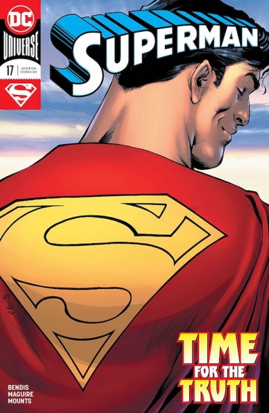
Written by Brian Michael Bendis
Illustrated by Kevin Maguire
Colored by Paul Mounts
Lettered by Dave Sharpe
Reviewed by Alexander Jones
“Superman” has shifted directions wildly since the initial series launched in July of 2018. Author Brian Michael Bendis is preparing (yet again) for another huge status quo change in the new issue of the title. Bendis utilized “Superman” #17 as a bridge between stories to launch the next incarnation of the title. With so much chaos surrounding Clark Kent’s immediate family, it can be difficult to get truly invested in the series to determine where Bendis is going to shape the narrative next. In terms of the core Superman title, Bendis is often at odds with himself, finding difficulty in focusing behind his main ideas to tell a linear story.
With Jonathan Kent and The Legion of Superheroes finally out of the way, it’s time for Superman to take his next steps. In many ways, “Superman” #17 feels like an issue of “Action Comics.” The title has a lot to say about the nature of investigative journalism and does a solid job expanding on the relationship between Clark and Lois within the story. The last leg of the title hones in on an intergalactic focus for the property that drastically changes the narrative. At times, the issue can feel disjointed in telling one singular story with so many elements going on at once. The script even attempts to fold the current events of “Justice League” into the title. During the last couple of issues of the story, Bendis was dealing directly with his son’s new journey. Now Clark is focusing on a different revelation entirely. Future issues could always tie these loose threads together, but there are so many stray threads and no connective tissue tying them together aside from the fact that they all involve Superman.
Bendis utilizes his script to capture huge character moments. It is refreshing to see Bendis push the scripts towards big emotion because Kevin Maguire creates expressive and potent emotion in his facial features. Superman’s exchange with Kara Zor-El is one of the highlights of the issue. The splash page opening up the issue shows just why Maguire’s pencils are perfectly suited to the book. The serious yet jovial expression on Superman’s face is punctuated beautifully by the aliens he is punching. Bendis pairs Maguire’s distinct pencils with a witty script that simply demands attention. Tense moments between Lois and Clark also land on their feet with lots of emotion captured by Maguire. Bendis is having trouble telling a coherent, focused story in “Superman” #17 but Maguire’s pencils almost make the issue seem focused.
Final Verdict: 6.5 – “Superman” #17 builds on the foundation of past ideas in the series while exploring every aspect that makes Superman truly great.
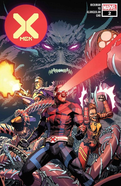
Written by Jonathan Hickman
Illustrated by Lenil Francis You
Colored by Sunny Gho
Lettered by Clayton Cowles
Reviewed by Quinn Tassin
There are plenty of great stories about fathers and their children out there.“X-Men #2” is probably the only one you’ll ever read about a recently resurrected father taking his time-displaced son and daughter, who are from different timelines, on a mission to figure out what’s drawing their new mutant utopia island-nation to a different island.
Page one of “X-Men #2,” we get al all-timer Cyclops line: “You two wanna help your old man beat up some monsters?” It’s a stellar premise for a self-contained family trip story about Krakoa’s Captain Commander taking Cable and Rachel Grey (who we should all refuse to call Prestige because it’s a bad codename) to explore this mysterious other island.
Continued belowOnce they get there, we’re welcomed to a setting as lush and imaginative as we could hope from a second living island. The Summers-Grey family moves through otherworldly jungle terrain, beating up monsters. Soon, it becomes clear that they’re on Arrako, Krakoa’s second half introduced last summer. After a brief, fun mix up with a newly introduced Summoner of Arrako (with ties to Apocalypse) the two islands rejoin each other and Cyclops gives his kids the classic Vines and the Trees talk. Hickman has a great sense of each of these character’s voices and it’s a blast to read light family banter, especially when the characters involved are so frequently put into overly serious stories.
The only place where this issue falters at all is in the art. To be clear, Lenil Francis Yu’s pencils are as good as ever and Sunny Gho’s coloring is strong; they illustrate Arrako wonderfully and the action sequences are great. At the same time, it’s oddly unfeeling. In a story as fun as “X-Men #2,” we should be getting more expressive, vibrant art than we got.
In “X-Men #2,” Hickman’s core strength as a writer is on display- he gives us a self-contained adventure that doubles as a puzzle piece. Where does this piece fit into the greater Hickman “X-Men” puzzle? We don’t know. What is the puzzle even shaped like? Who cares?! The beauty of Hickman is that he gives us smart, fun, small stories that add up to deliver genius, mind-blowing, massive finales. More stories like this one are more than welcome to this reviewer.
Final Verdict: 8.8 – The Hickman Lampoon’s Family Vacation is a fun, intriguing entry in the new X-Men canon


