
There’s a lot to cover on Wednesdays. We should know, as collectively, we read an insane amount of comics. Even with a large review staff, it’s hard to get to everything. With that in mind, we’re back with Wrapping Wednesday, where we look at some of the books we missed in what was another great week of comics.
Let’s get this party started.

Written by Leah Williams
Illustrated by Carlos Gómez
Colored by Carlos Lopez
Lettered by Joe Carmagna
Reviewed by Quinn Tassin
Ahhh, da moviesh. Sometimes we love them, sometimes we hate them, sometimes we read about fake ones in comic books starring Mary Jane Watson.
“The Amazing Mary Jane #2” is a solid outing for the odd couple of Mary Jane and Myst- excuse me- Cage McKnight. After their movie suddenly runs out of money, they run around Southern California to get funding which brings us a fun montage of rejections from LA to Burbank to West Covina. Eventually, the pair realizes that the only way they can make the movie is for Cage to take on an auteur persona.
The pair hits yet another snag when they get back to set and the star quits to take a better paying role elsewhere. And so, Cage becomes a double-threat when Mary Jane convinces him to star in his own movie. The issue ends with a sudden attack by the Savage Six, led by the Vulture and, uh, that’s it. Pulled funding, rejection montage, auteur time, self-casting, sneak attack.
The Carloses Gómez and Lopez do…fine work this issue. It’s not that there are any glaring issues with the artwork in “Amazing Mary Jane” so much as it is that there isn’t anything special going on. The artwork is decent, communicates what it needs to, and fits the tone of the book well enough. There are also no pages or even panels that stick out as specifically strong. When reading a comic book that reads like a sitcom arc, it would be nice to have more dynamic, interesting artwork to keep things interesting.
So there ya have it folks, “The Amazing Mary Jane #2,” an issue that plays like a decent movie you see in mid-July but forget about by early August. Leah Williams is a star but her writing this issue just isn’t as good as it was in the debut of the book or anything else she’s writing right now. Hopefully Williams can find legs in this book next issue because otherwise, we could be looking at a box-office flop.
Final Verdict: 7.0 – “The Amazing Mary Jane #2” isn’t quite certified fresh but it’s worth a look if you’re interested.
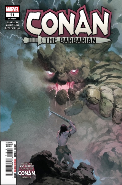
Written by Jason Aaron
Illustrated by Mahmud Asrar
Colored by Matthew Wilson
Lettered by Travis Lanham
Reviewed by Christa Harader
“Conan the Barbarian” #11 sees Conan face the most impressive foe he’s yet to face in his long history.
It just so happens to be a god.
Aaron and Asrar have put together a tense, well-paced Conan epic that’s loaded with pulp goodness and serious storytelling, and this issue’s a welcome underworld interlude after the recap of issue #10. Asrar gets to draw Conan at all different ages and keeps the steely blue eyes and imposing physique constant, even when he’s a child. Wilson’s colors are beautiful, with some extra watercolor-style finesse on Crom to add just enough detail to pick him out of the sky, but not enough to make him utterly comprehensible. Lanham’s font continues to work well for the series, and those burnished bronze narrative boxes unspool the story in steady measure.
We’re set up for a pretty epic conclusion to this excellent run, and the stakes are cosmic in scale. Tracking Conan through his various adventures is at once a clever nod to Howard’s serial storytelling techniques and a good way to take the measure of the barbarian in all of his guises: thief, King, mercenary, savior and criminal. Above all, it’s entertaining as hell, and what more can we ask of a comic?
Final Verdict: 8.5 – “Conan the Barbarian” #11 goes where no Conan story has dared go before, with great results.
Continued below
Written by Gerard Way, Scott and Sidiri Allie
Illustrated by Tommy Lee Edwards
Lettered by John Workman
Reviewed by Alexander Jones
“The Umbrella Academy” is full of lively characters including talking chimpanzees and child superheroes. However, few villains have left as strong an impact on the series as time-traveling assassins Hazel and Cha Cha. Writer Gerard Way is returning to the property with a script co-written by former Dark Horse Editor-In-Chief Scott Allie based on an idea from Sidiri Allie. Hazel and Cha Cha both have lively personalities that carry over into this oversized one-shot special themed around the Holidays. Christmas is largely an afterthought within the issue but getting any sort of Christmas-themed cheer in the context of “The Umbrella Academy” is an extremely subversive idea.
Artist Tommy Lee Edwards is a perfect choice for this take on the property. Way and Allie’s script calls for a couple of moments in an office setting that Edwards art is suited for. The grounded office environment establishes the setting for the issue and captures the expressions of Hazel and Cha Cha and their masks with vigor. When Hazel and Cha Cha inevitably break the rules and harness destruction, Edwards art is appropriately gritty and interesting to watch. While the vast majority of Edwards art direction is great, his art has a stiff quality that doesn’t allow for the storytelling to shine through in certain moments. Characters barely look like they are moving between the panels in certain moments.
Way and Allie’s script is irreverent and gets caught up in the minutiae of time at the detriment of the title. Hazel and Cha Cha come up with some great side conversations and one-liners, but the plot and direction of the issue leave room for improvement. There is plenty of room for the creators to expand on these side-characters even further in future issues. I would have liked to explore the politics within the office environment even further than the time allotted by Way and Allie. The interplay between Hazel and Cha Cha and interaction with their environment is the main draw to the issue. Way and Allie find room to crack a few jokes about the office and include a few moments of insane violence which is essential to this property.
Final Verdict: 7.3 – Hazel and Cha Cha fans are finally getting their due with a solid Holiday special in “Hazel and Cha Cha Save Christmas: Tales from the Umbrella Academy” #1!

Written by Gerry Duggan
Illustrated by Matteo Lolli
Colored by Federico Blee
Lettered by VC’s Cory Petit
Reviewed by Joe Skonce
Combining pirates and superheroes is a formula for success. Both feature larger than life characters and personalities, elaborate costumes, and call showcase how both can be heroic, roguish, or some combination of the two. “Marauders” #2 showcases just how well the two genres complement one another. Telling a story that is adventurous and fun, but embracing the moral gray of the pirate life.
One of the most masterful things about “Marauders” #2 is Gerry Duggan’s script. It is the perfect blend of exposition and political intrigue but with plenty of swashing buckles and rip-roaring adventures on the high sea to keep it fun. The majority of the Marauders adventures in the issue is set up by a framing narrative of Emma Frost and Sebastian Shaw discussing the terms of their new partnership. The dialogue feels like watching two chess masters in a heated match, anticipating the other’s move and responding in kind. Where it gets impressive is the tension. You can feel the intensity rise as they move from (somewhat) playful banter to intense conversations about power dynamics and the role of their little enterprise. It’s riveting.
But of course, the real fun of the issue comes from the Marauders themselves. The banter during the fight sequence is, simply put, fun. Each member of the team gets one moment to shine. In every case, it represents their character perfectly. Storm is the steady hand, trying hard to honor her vow to not kill. Pyro is the wild dog on a tight leash. Iceman is a supportive confidant, an ideal right-hand man. Finally, Kate is equal parts lovable rogue and idealist. It’s still early in the series, but it’s exciting to watch her trying to do good even if it means being a little bit bad.
Continued belowThe dialogue of “Marauders” #2 is great. The art by Matteo Lolli is wonderful. One of the highlights of the issue is when Captain Kate takes the suggestion of one of Batroc’s goons to “dance.” Lolli’s art is incredibly fluid, capturing Kate’s grace and how she uses that skill in relationship with her phasing powers. Lolli also does a great job of capturing the emotions of Shaw and Frost. Frost is always presented as cool and collected, ready to drop the hammer at the end of the issue. Shaw is angry and aggressive, betraying his lack of control in the situation. The art enhances the already great dialogue, making this a comic worth checking out.
Final Verdict: 9.4 – If you’re looking for the right balance of high adventure and political intrigue, look no farther than “Marauders.”

Written by David Hine and Brian Haberlin
Illustrated by Brian Haberlin
Colored by Geirrod Van Dyke
Lettered by Francis Takenaga
Reviewed by Matthew Blair
Magical realism is a fairly popular subgenre of fantasy nowadays, and “The Marked” #2 provides its own unique twist on the form by taking the reader to a magical world where secret societies wield powerful magic that is tied to the tattoos they put on their body.
Unfortunately, this society is small in number…and the United States military has begun to realize who they are and what they can do.
What’s amazing about “The Marked” #2 that while it’s the second issue in the series, it’s easy to follow for first time readers. Writers David Hine and Brian Haberlin present the rules, stakes and the consequences of the world in a way that is clear and relatively easy to understand. With that being said, it’s not all just mindless exposition. Each of the characters have a fair bit of development that is well laid out and there is a well planned feeling of dread that the relationship between the main character and the military is headed down a very dark path.
As for the artwork in “The Marked” #2, it’s definitely unique. Brian Haberlin provides the artwork and when it’s coupled with Geirrod Van Dyke’s colors it creates a look that kind of feels like an early 2000’s video game that opted for a cell shaded look. It’s definitely unique and makes the tattoos and magic look really good. Unfortunately, it also makes the faces look like their a little too deep into the uncanny valley, which means a lot of the characters look a bit wooden and unnatural. It’s not a deal breaker for the comic, just something to get used to.
“The Marked” #2 transports the reader to a cool and interesting world filled with a unique and fun version of magic that a lot of readers should like. On top of that, it’s well written and has an interesting art style that let’s some gorgeous tattoo designs and fun magic spells shine.
Final Verdict: 8.5 – Come for the tattoos, wait to get used to the unique and initially jarring artwork, stay for the great story and characters.

Written by Andrea Fort and Michael Christopher Heron
Illustrated by Sam Beck
Colored by Ellie Wright
Lettered by Andworld Design
Reviewed by Linda H. Codega
A clever comic that introduces moral dilemmas and action in equal turn, “The Necromancer’s Map” #4 is a cute Dungeons and Dragons-inspired sidequest into magic and medieval fantasy worldbuilding. The assassins, bards, and bickering siblings make for fully-realized personalities, and the strange team of Bethany, Ellisar, and Jonas work together to create a roster of characters we want to root for.
The art in this issue is exceptionally polished, stylized with queues that are easy to pick up on, helping to create a coherent visual language. We know that the bards carry lutes, magicians carry books, and anyone with an ounce of fighting ability wears pauldrons. The colors are bright without being overwhelming, and the palate is very cool, giving us classic Shakespearean-writing-medieval quest vibes.
If there’s anything negative to say about “The Necromancer’s Map” #4 it’s that the structure doesn’t allow for any kind of recap of the characters or their quest. What they want is easy to find out, but it takes about half the issue before we realize what’s going on. The conflicts seem easily resolved, but the foreshadowing is exciting, and definitely makes me want to read more.
Continued belowFinal Verdict: 8.0 – Perfect for any fan of medieval fantasy adventure, “The Necromancer’s Map” #4 delivers inclusive action and endearing illustrations without talking down to the audience.

Written by Tim Daniel and Michael Moreci
Illustrated by Joshua Hixson
Colored by Jordan Boyd
Lettered by Jim Campbell
Reviewed by Kobi Bordoley
“The Plot” #3 is many things: insidious, elegiac, cold but never distant, and so much more. We’ve reviewed “The Plot” #1 and “The Plot” #2 already at Multiversity, so this isn’t news to us. In this installment, “The Plot” stays the course, and in this issue the art really takes over, providing a masterclass in the form.
How do you accomplish horror in sequential art? Apart from a full page splash after a page turn, there’s no real way to do a jump scare, and without a soundtrack, there are much fewer ways to pull the audience’s attention. I don’t have the answers to this, but luckily Hixson and colorist Boyd have some ideas. To start, the colors here evoke a general pallor that makes every scene look a little sickly, and every character a little beleaguered. This may sound unappealing, but it’s the opposite–instead the faded color scheme creates an atmosphere of un-health where who’s living and who’s dead in each scene always feels in question. In a ghost story that plays with unreality, this is paramount. Simply put, in the world of “The Plot” even the brightest day looks like night, and every panel looks as if it could hold twice as much shadow as it does light.
Hixson’s way of drawing character expressions is also on point. So far in “The Plot,” it’s unclear whether the monsters, ghouls, and ghastly forces scrabbling at the walls are more than just omens portending a darker power. Hixson perfectly captures this ambivalent energy, and most spectral interlopers in “The Plot” look confused, agonized, and distressed more than they do evil or contemptful. The effect here is pointed: in response to these unanswering ghosts, we as readers ask ourselves “Why? What do you mean?” with increasing urgency. This kind of horror, where the fear is in the not knowing and anticipation, is especially satisfying.
“The Plot” #3 is worth your time. Apart from the stellar story, the art and tone alone offer a dark, serious take on family terror. Take a break from whatever else you’re reading, and come play in the shadows.
Final Verdict: 8.8 – The Plot delivers horror that’s both slow-burning and unrelenting, harmoniously and never at odds with itself. This is what haunting should look like.

Written by James Tynion IV
Illustrated by Werther Dell’Edera
Colored by Miquel Muerto
Lettered by Andworld Design
Reviewed by Rasheda
The sheriff suspects Erica is the reason children have gone missing or have been found dead. James is a survivor of the latest massacre, of few people in the town are planning on getting some answers from him and Erica.
Like the famous SCP Foundation(a fictional organization that contains dangerous creatures), James Tynion’s story is the stuff of nightmares. Children are innocent, Tynion has taken that instinct for society to protect its most vulnerable and created a nightmare scenario. The hero is just as strange as the monster itself, leaving the reader wondering if they should be trusted. Tynion is building the mystery with each panel, in this issue, there are more questions than answers. This issue is short on context and any further explanation, let’s hope Tynion clears up the mystery or at least expands on the idea in the next issues.
Werther Dell’Edera’s illustration is uneven, disproportionate and off; this may be on purpose because of the subject manner of the story. The characters are drawn like you would see them in a dream state; large eyes, not much detail in the surroundings, the characters seem to change each to you look at them. Miquel Muerto’s colors lend to the nightmarish landscape, they are muted and dark giving you a hopeless feeling. There are some panels that seem to be bright, but it is mostly in the transition to another dark scene.
Continued belowFinal Verdict: 6.5 – As the third book in the series, it is Something Is Killing The Children should be building more steam instead of adding to the nightmare.
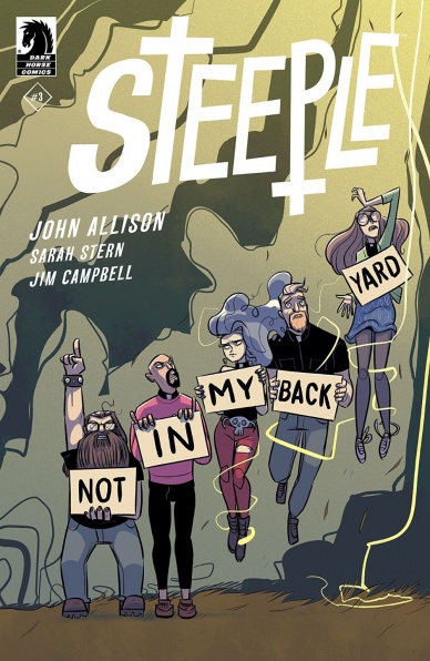
Written and Illustrated by John Allison
Colored by Sarah Stern
Lettered by Jim Campbell
Reviewed by Christopher Lewis
John Allison’s new issue of “Steeple” is a breath of fresh air. His quirky English humor, interesting use of acronyms, and simple art allows the reader to not take the narrative too seriously. Honestly, this is why I am comfortable with the main characters being two women who are priests in training from polar opposite faiths…the Church of England and the Church of Satan. When I first started reading the issue I was worried the religious aspects would overshadow the story, however, this couldn’t be farther from the truth. Allison writes these two characters as young individuals trying to become friends in disregard of their differences, which gives them naïveté that makes you fall in love with them.
I would be remiss to not bring up the secondary characters, Magnus Tom and Reverend Penrose, who wear their faith on their sleeves, are set in their ways, and end up being more comic relief than tangible people. These characters are the real NIMBY’s of the story as they want to stop a wind farm from being turned on in their town. For you layman’s NIMBY refers to “not in my back yard,” and is one example of the interesting acronyms used in the story.
Allison’s art is simple and gives a lighthearted atmosphere to the story, which meshes well with the narrative. In classic Allision fashion he at times uses exaggerated gestures in panels to emphasize and make light of emotion, which are a welcome delight.
Final Verdict: 9.0 – “Steeple” #3 is fun, quirky, and a great read. I can’t speak highly enough about this book. Try it and soon after you will be adding it to your pull list.
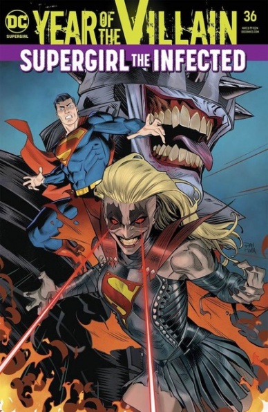
Written by Marc Andreyko
Illustrated by Eduardo Pansica
Colored by Chris Sotomayor
Lettered by Tom Napolitano
Reviewed by Gregory Ellner
With “Supergirl” #36, Marc Andreyko has the tricky task of continuing to tell his story while balancing the workings of two different (but connected) tie-ins. On the one hand, he has to work with the continued machinations of Brainiac-1 during the Year of the Villain, and on the other hand, he needs to integrate the plot toward the “Batman/Superman” Secret Six storyline that this one branches out of. Unfortunately, the plot of ‘Who’s Laughing Now?’ requires reading “Batman/Superman” #4 to understand the full picture of what is really going on, and the continuity of the narrative collapses once one does so. Events don’t quite make a lot of sense once they branch out in two different directions, and while they would work on an individual basis of one story versus the other, together they never quite mesh and appear irreconcilable. It may not be the fault of Andreyko, but the coming end to his run isn’t doing itself any favors in this regard.
On the other hand, Eduardo Pansica continues to perform top-notch character work. Readers can feel Kara’s rage and Krypto’s sorrow, amongst other emotional impacts. The use of motion lines help to showcase just how fast our heroine can move, and intricate detail on close-ups help to show both emotion and utter agony with regards to the pain of an utterly unnatural transformation. The utter malice shown by the villains (new and old) of the plot is a thing to behold under Pansica’s pencils, providing fear in spite amongst the audience in spite of how deserving the targets may be of retribution.
Chris Sotomayor’s colors cast a duality of impacts. When faced with un-corrupted beings, the palette is bright and hopeful, giving the impression of a possibility for hope at the end of the day. However, once corruption sets in, those hues and tones turn darker and more malicious, turning hope to terror as a new villain rises from a fallen hero.
Final Verdict: 6.5 – Despite the artwork and colors lifting up the story, “Supergirl” suffers from extreme logical inconsistencies toward the story it is attempting to tie into, breaking immersion in the process.


