There’s a lot to cover on Wednesdays. We should know, as collectively, we read an insane amount of comics. Even with a large review staff, it’s hard to get to everything. With that in mind, we’re back with Wrapping Wednesday, where we look at some of the books we missed in what was another great week of comics.
Let’s get this party started.

Written by Tim Seeley
Illustrated by Corin Howell
Colored by Mark Englert
Lettered by Carlos Mangual
Reviewed by Christa Harader
“Dark Red” #8 has Chip spending some quality time in a sewer, Evie getting in just slightly over her head and a whole lotta vampy drama. But then, that’s par for the course, right?
I wasn’t sold on the expansion of the critter universe when Seeley and Howell introduced the weres in this arc, but they’re turning into a nice counterpoint to the polished and dramatic world of the vampires. The team’s surprising us: Chip’s de-powered for the first time, he’s making friends with a vampire hunter and even the matriarch figure’s got more at play than we’d expect. Englert’s colors continue to complement Howell’s line, and Mangual’s lettering is a step up from the previous volume with less padding and more economy.
There are no clear villains in “Dark Red” – except for Nazis, of course – and the book continues to entertain while taking a stab at a new story direction. Chip’s back in the big city and learning that his estimation of it’s woefully uneducated, and that’s a nice counterpoint to the narrative built and interrogated in the first volume. Seeley and Howell are telling a subtler story here than we’d expect without sacrificing any of the throat ripping or skull crushing violence that make the comic so much fun. So far, that balance continues to pay off.
Final Verdict: 7.5 – “Dark Red” #8 entertains and deepens the mystery of some big city drama with good storytelling and visuals.

Written by G Willow Wilson
Illustrated by Christian Ward
Colored by Christian Ward
Lettered by Sal Cipriano
Reviewed by Jhoan Suriel
“Invisible Kingdom #7” introduces new characters, more tension between Grix and the newfound band of salvagers, and more action. Continuing off where the last issue left off, the Sundog crew makes unlikely alliances in “Invisible Kingdom #7.” In the process, Wilson creates some interesting character relationships between Captain Grix and Captain Turo. One can sense the two are at opposite ends of ideals even though it’s clear the latter has the upper hand. We also get some development between Grix and Vess thanks to Captain Turo. While the key big bad remains to be Lux, it’s nice to Wilson do some additional worldbuilding by introducing the Riveters into the mix.
Christian Ward continues to do some excellent and inventive panels in “Invisible Kingdom #7”. The panels are diverse and varied such as a few circular panels which keep readers engaged. One of the best panels in this issue has silhouettes of two characters with a splash of blue to indicate a dramatic moment. And if you’ve been enjoying space-faring comics, Ward, and letterer, Sal Cipriano continue to do some fun and high-octane action pages in this issue. I quite enjoyed the way the letters seamlessly blend together to emphasis a dramatic crash in a pivotal moment.
All in all, “Invisible Kingdom #7” successfully delivers on multiple fronts including tight-pacing and character development. The Robin Hood-like Riveters create some fascinating drama in this issue and Ward’s art continues to remain solid.
Final Verdict: 8.8 – “Invisible Kingdom #7” teases some new developments between the Sundog crew and the Riveters while Ward’s art continues to find new ways to engage readers.
Written by Phillip Kennedy Johnson
Illustrated by Riccardo Federici
Colored by Sunny Gho
Lettered by Tom Napolitano
Reviewed by Gregory Ellner
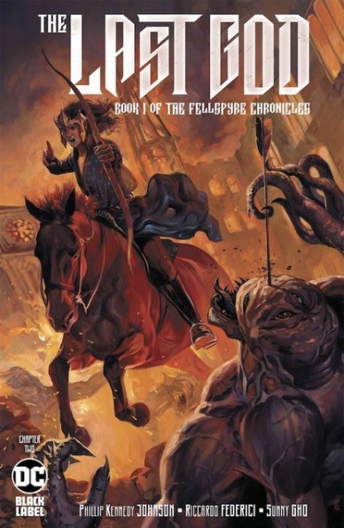
With “The Last God” #2, Phillip Kennedy Johnson is setting up an utterly fascinating story to bring us through the first “book” of ‘The Fellspire Chronicles.’ The horrifying tale of a king’s fall to an otherworldly infection would fit right at home in many classic fantasy plots about necromancy, but Johnson manages to ramp up the tension and increase the most disturbing elements of the uncanny by a fairly large margin.
Continued belowThe plotting of the story is split between combat against a seemingly implacable foe and an examination of certain elements of the queen’s backstory. By using this dual narrative, Johnson is able to keep the terror high on the one hand while showing a quieter, calmer story on the other. Perhaps too much time is spent on combat to the exclusion of much in the way of characterization, but hopefully the further reveal of how the kingdom came to be somewhat makes up for that imbalance in the eyes of less satisfied readers.
As is common of his work, Riccardo Federici’s artistry feels as though it would almost be at home in a museum. Soft lines help to showcase the sheer humanity of the majority of characters, as well as contrast against the eldritch nature of their foe. On the whole, the illustrations both draw readers into the world of ‘The Fellspire Chronicles’ and causes that same audience to recoil in disgust as the artwork worms into a type of horror from which it is difficult to look away, a beautiful portrayal of those who would be called abominations.
Sunny Gho’s colors are muted and dark, befitting the story’s dark fantasy genre. All of the scenes in the dead of night have an appropriately sobering color palette, making brighter moments, such as combat amongst the destructive fires of an entire city, seem both revelatory and tense. The overall use of lighting is perfect, going a long way in helping to set the mood of this fantastic saga.
Final Verdict: 8.0 – Eldritch horrors and uncomfortable truths come together in a thoroughly engrossing second chapter to “The Last God.”

Written by Jonathan Hickman
Illustrated by Rod Reis
Lettered by VC’s Travis Lanham
Reviewed by Alexander Jones
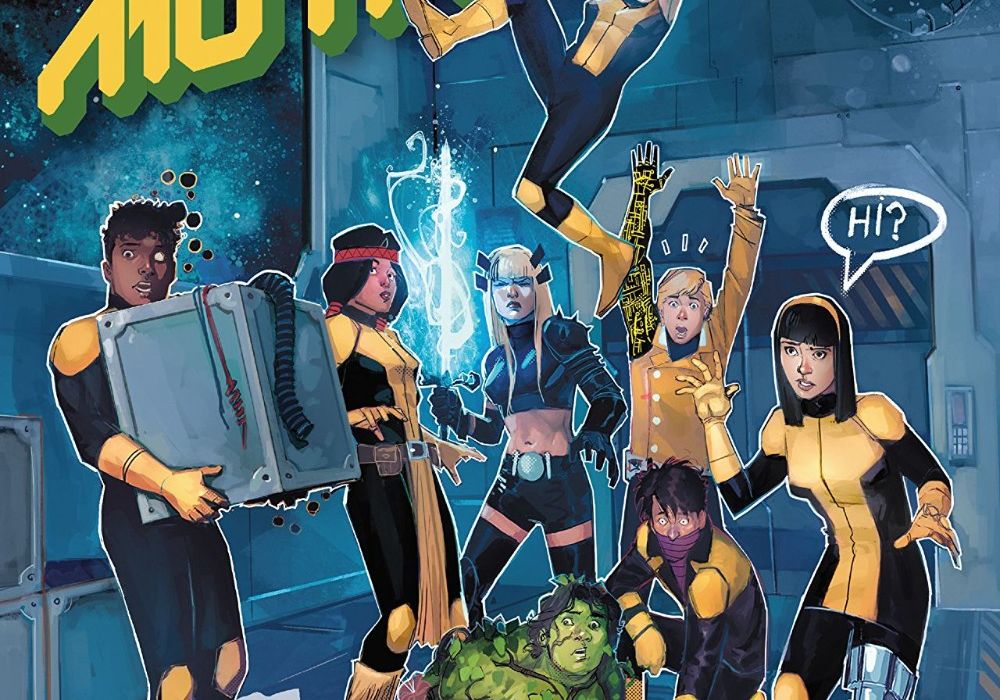
The new X-Men line of comics appeared to be a serious, science fiction approach to the property. Curiously, author Jonathan Hickman applied a much different style of writing to the first chapter of “New Mutants.” It was refreshing to see Hickman acknowledge that X-Men comics can encompass a much different tone within the same breath as the other series. Also, getting a new title with a huge publishing push behind it with the legendary New Mutants cast of characters is nothing to scoff at. However, “New Mutants” #2 ends up outshining the rest of the titles in the line, bringing about what is arguably the highest quality title in the ‘Dawn of X’ line of comics.
After so many years of sharing a publishing history together, the New Mutants are comfortable with each other and their team dynamic. Hickman pulls on their familial relationships but also brings these heroes in incredibly odd situations within the confines of outer space. Seeing the heroes wander their way through a prison in deep space at the beginning of the issue is only the beginning of the fun to be had in “New Mutants” #2. It is shocking to see just how rapidly Hickman can change his tone from the dour nature of “X-Men” to the tongue-in-cheek approach of “New Mutants.” This issue is filled with hilarious jokes and interesting new settings for the heroes. Hickman dives deep into some of the inner workings of the Shi’Ar empire referencing some of his past works for Marvel to tell interesting new stories.
Artist Rod Reis is an excellent choice for the issue. The only real caveat from Reis is that his pencils can be a little static and don’t convey as much emotion as I would like. Reis is still able to capture expressions to let each cast member in the issue standout. Reis lays out his pages in a manner that matches Hickman’s jovial scripting. Cast members are striking interesting poses on the page together and I enjoy how nearly every page in the issue is laid out. Reis is a good artist for comedy which this book is mostly centered around.
Jonathan Hickman’s legacy in Big Two comics includes both his weighty, dramatic take on “Fantastic Four” and his more silly approach to the “FF.” I’m thrilled to see the trend of having two sister titles with different tones continue on the X-Men comics with “New Mutants” and “X-Men.” In the ‘Dawn of X’ comic books, the “New Mutants” is the most fun readers are currently being offered.
Continued belowFinal Verdict: 8.7 – “New Mutants” #2 is irreverent, intergalactic bliss.

Written by Bryan Hill
Illustrated by Raffaele Ienco
Lettered by Troy Peteri
Reviewed by Kobi Bordoley
Created by Matt Hawkins, “Postal: Deliverance” takes place in the world of “Postal,” and specifically in the hamlet of “Eden,” the town where hardened criminals have come to reform themselves, find redemption, scheme, and most of all, survive. It’s a world full of small town politics and large scale violence. “Postal: Deliverance” #5 continues the story, adding some murderous, True Detective and “Nail Biter” adjacent flair. Bryan Hill pens a complex narrative, but from an organizational standpoint, “Postal: Deliverance” #5 doesn’t fully come together.
To Hill’s credit, there are a lot of threads to weave in the narrative, and to his extra-credit, he does this well: throughout the issue, there are moments of duality when two sets of characters have similar conversations or arguments surrounding the same themes, but with different results and different stakes. These parallelisms entrench the themes of “Postal: Deliverance,” and show how people here struggle with the same problems — a desire for stability, forgiveness — but fight their battles differently. This is great character building, and its commendable.
Raffaele Ienco’s (“Batman: Sins of the Father”) hyper-realistic art style is objectively strong, but the over-detailed nature of his figures overcrowd the story, and everyone appears too in focus. This is a contrast to Issac Goodheart’s art, which inhabited the original run of the “Postal” series, and was more veiled and furtive. Hill’s story, which involves so much subterfuge and subdued emotion, is not served well by Ienco’s drawing — sometimes less is more.
Specifically, there are moments in the story when a character’s dialogue is matched by a facial reaction that seems to carry many emotions at once, but in this cacophony of emotion, carries no discernable feeling at all. In general, character interaction here feels either over or under exaggerated, and while Ienco’s renderings are infallible from a technical perspective, it feels as if he doesn’t yet have a strong hold on Hill’s characters or the timbre of their movements. Written another way, the characters in “Postal: Deliverance” #5 look less like humans, and more like their Sims alter-egos, jagged movements, buffering and all.
“Postal: Deliverance” #5 will likely please fans who are already on board with the miniseries, and this installment does have a lot to offer in terms of story progression. Unfortunately, the art doesn’t match the tone or style of the story.
Final Verdict: 6.7 – “Postal: Deliverance” #5 reads like how pushing two non-joining puzzle pieces together feels: we know there’s something here, but by goodness, it is not totally coming together.

Written by: David Andry
Illustrated by: Alejandro Aragon
Colored by: Jason Wordie
Lettered by: Deron Bennett
Reviewed by: Christopher Lewis
There is something overly ominous about “Resonant” that is difficult to explain. The obvious is that the story takes place in a dystopian future, but it is more than that. There is a hopelessness within each of the three storylines, which is presented differently through the perspectives of the separated family members. Paxton, the father, is losing faith that he will ever see his family again. Tyrone has been accepted by religious zealots and seems happy away from his family, however, there is something not right about the situation. Finally Becca is afraid she will not be able to take care of remaining kids without the others. Separated, this family is lost without each other.
The highlight of the “Resonant” is the beginning battle scene. It is a whirlwind of violence, and the art and staging gives a feeling of slow motion in the midst of intense action. Almost as if the reader is in the battle scene itself. This is done in two ways. First, Alejandro Aragon uses long black and while vertical lines in each panel to simulate rain. This coupled with Jason Wordie’s choppy coloring accentuates the tension and movement. Second, multiple panels are set up with the same staging and present small changes that are critical to the battle. For example in one panel Paxton is looking at a guy running to kill him, and in the next there is a random spear through the head of the adversary and now Paxton’s attention has moved to other action. This gives an effect of slowing down the battle scene. All of these effects together create one hell of a battle experience.
Continued belowFinal Verdict: 8.0 – “Resonant #5” is book worth picking up, at a minimum for the fantastic battle scene art.
Written by Clay McLeod Chapman
Illustrated by Chris Mooneyham
Colored by Rain Beredo
Lettered by VC’s Cory Petit
Reviewed by Matthew Blair
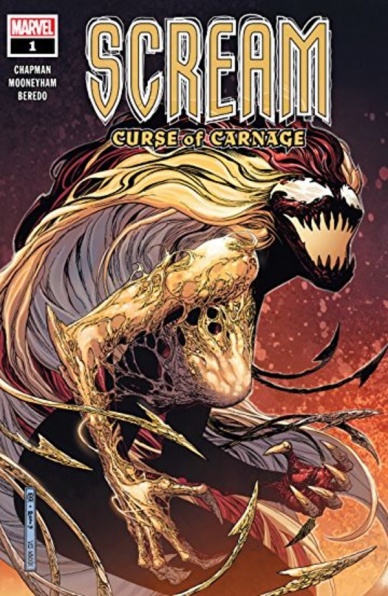
Venom is a character that has been experiencing something of a popular revival nowadays, and if Venom gets to be popular than that means that some of the ugliest and vilest creatures that have slithered out of the Marvel Universe get to make a comeback as well. Venom’s darker cousin, the psychotic serial killer known as Carnage, is making a roaring comeback, and people are going to suffer.
The writing in “Scream: Curse of Carnage” #1 offers some fantastic ideas and moments, but does fall apart a little bit when under close scrutiny. Writer Clay McLeod Chapman lays the foundation for some great ideas with themes of family, abandonment, and giving in to your worst demons that make for a great Spiderman/symbiote story and creates a character that is easy to root for and sympathize with. It’s just sometimes the pacing feels a bit sluggish and the different storylines and internal monologue feel meandering and awkward.
The artwork on “Scream: Curse of Carnage” #1 is perfect for the story and manages to combine a sort of Lovecraftian horror vibe with the darkest, sleaziest, most desperate settings and people you can find in any city. Artist Chris Mooneyham has the perfect style for a story like this, drawing people and settings that are realistic enough to be believable while rough enough to lend weight to the rough feel of the characters while colorist Rain Beredo gives the book an almost excessively grey and depressing color palate punctuated by the bright reds and orange of a new symbiote ripping and tearing through the underworld of New York. It’s a great style for this kind of book.
“Scream: Curse of Carnage” #1 is a solid debut title for a spin off, and while it does feel a bit too long and there are moments where the script feels a bit awkward, it’s filled with a ton of great gore, violence, and deep thematic material that have a lot of great potential.
Final Verdict: 8.4 – A little sluggish and drawn out in places, but offset by some great horror artwork and thematic material perfect for a Venom book.

Written by Geoff Johns
Illustrated by Scott Kolins
Colored by Michael Atiyeh
Lettered by Rob Leigh
Reviewed by Quinn Tassin
Reading a Geoff Johns comic these days, can be summarized in a Tyra Banks quote: “We were rooting for you! We were all rooting for you!” His work on “Shazam!” has been decent- at times great- but an inconsistent release schedule paired with a frankly mediocre story has made it hard for this book’s heart to shine through.
“SHAZAM! #8” is a fine comic. The escape from the Darklands, the Sivanna/Black Adam team up, and the attack on Billy’s father all inherently bring plenty dramatic tension. At the same time, none of those things gets enough focus to feel genuinely impactful. Its emblematic of what’s wrong with this whole arc: there are too many threads, all paced poorly, none evoking the emotions that they should.
Dale Eaglesham’s pencils are sorely missed in “SHAZAM! #8.” Scott Kolins technically does his job this issue but his style just doesn’t fit for a book like this. None of the big moments of the issue land with the weight that they need to and a lot of that lies in the flatness of his images. Just look at Billy’s dad’s big moment joining the Marvel Family at the end of the issue; it should be bold image- breathtaking, exciting, and shocking all at once. Instead, we get an emotionless sketch.
Geoff Johns has the chops to write a great “SHAZAM!” book. We saw that way back in the New 52 days and earlier this year in the big screen adaptation. For some reason, he’s writing what feels like a filler arc instead. He has a great sense of Billy and the whole family but he needs to focus that a whole lot more before this book meets its potential.
Continued belowFinal Verdict: 6.0 – An overstuffed story gets by on heart but not much else in “SHAZAM! #8.”

Written by Kirsten Beyer & Mike Johnson
Illustrated by Angel Hernandez
Colored by Joana Lafuente
Lettered by Neil Uyetake
Reviewed by Joe Skonce
One of the major questions that I ask myself when reading a comic based on a television show or movie is “would this work in the original format?” Did the author capture the tone? Do the characters feel authentic? Would the issue work if it was randomly inserted into the show being adapted? In “Picard: Countdown” #1, the creative team succeeded at all of these questions, telling a story that feels worthy of Jean Luc Picard’s talents.
Unlike its predecessor, Star Trek: The Next Generation explored deeper ethical questions of how the Federation worked and the diplomatic solutions that were used to keep it together. Picard is more introspective and academic. His talents lay in negotiation, resolving situations with speeches that reflected the values and ideals of the Federation. In “Picard: Countdown” #1 Kirsten Beyer and Mike Johnson do an impressive job of capturing all the nuances of Picard as a character. While Picard comes off a stoic or cold, he does have a subtle and wry sense of humor. His Admiral logs also reflect the more emotional side of Picard. Their other characters are also wonderful. Picard’s new first officer Luitenant Commander Raffi Musiker is a good foil for Picard. She is fun-loving and has a disregard for formality, but is an expert of Romulans. She has Picard’s trust.
The main conflict is also classic Next Generation. The ethical conundrum of the issue revolves around how both organizations, the Romulan Empire and the Federation, value life. The Federation is aiding in evacuations of threatened colony worlds, tasked to save those living on the planets. The Romulans, however, have not been disclosing the number of native populations on these worlds. To them, saving native species is as foolish as saving the trees or rocks of a planet. Saving “citizens” vs saving everyone is a debate you would expect to find on The Next Generation.
The dialogue and conflict feel like The Next Generation, but Angel Hernandez does a great job of blending different eras of Trek designs. The bridge of Picard’s starship feels more inspired by the new ships of Star Trek: Discovery. It is sleek and streamlined, but also dark and cold. The Romulan Planet, too, is an exercise in contrast. The buildings are what we recognize from what little we’ve seen of the Romulans. They are utilitarian, stark white, and full of secret passageways and confusing architecture. However, outside the building, it is lush, green, and full of agriculture. Like many of the best episodes of Star Trek , the idyllic planet hides the eventual darkness and conflict of the situation. It works well and enhances the already strong writing. “Picard: Countdown” #1 feels like a lost episode, one that comes from the stronger seasons.
Final Verdict: 8.7 – “Picard: Countdown” #1 showcases a script and art that reflects the strengths of both Picard and Star Trek: The Next Generation.


