
There is a lot to cover on Wednesdays. We should know, as collectively, we read an insane amount of comics. Even with a large review staff, it’s hard to get to everything. With that in mind, we’re back with Wrapping Wednesday, where we look at some of the books we missed in what was another great week of comics.
Let’s get this party started.
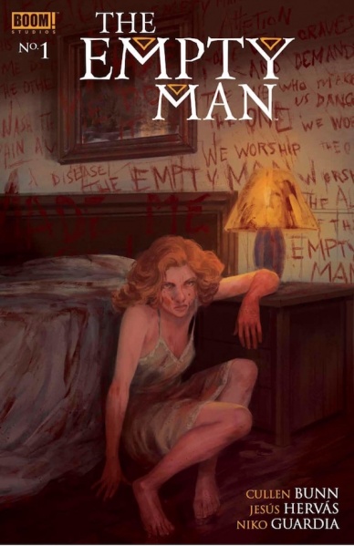
Written by Cullen Bunn
Illustrated by Jesús Hervás
Colored by Niko Guardia
Lettered by Ed Dukeshire
Reviewed by Christa Harader
“Empty Man” sets up a contagion narrative aiming for psychological heights, buoyed by splatter horror. Unfortunately, issue #1 doesn’t build enough to support its sociological aims. With narration overload and structural tension between art and page layouts, the horror hits don’t really land.
The comic opens with a decent four-panel page, but two plain narration boxes per panel override everything. Bunn could halve them, or even let Hervás’s art set the tone. This ominous portent points to a larger problem: Bunn’s writing over the art and the doubling doesn’t do much to set up a compelling comic.
There’s also an immediate POV problem. If Melissa is narrating, why is the first splash over her husband’s shoulder? If he hadn’t spoken already it might work, but there’s dialogue between him and his daughter before he goes upstairs. The shock’s muddled as a result. My entire focus should be on the reveal, not split between admiration and confusion.
The art is competent but fights with the layouts. Guardia’s subdued watercolors enhance Hervás’s impressionistic line, but the regimented panels don’t support looseness. White gutters stand out in sharp contrast to visible brush and marker strokes, and one page ends with a centered two-panel strip floating in unused space. And when it’s daytime, which should crystallize the horror narrative’s nightmare as it crosses the threshold between phantasmagoria and sunlit reality? Everything washes together, and Hervás’s inks seem overbearing.
Dukeshire’s work is serviceable but doesn’t lend the book a unique style. Less padding in the narration boxes would enhance claustrophobia without sacrificing readability. There’s a slight difference between the narration typeface and character dialogue, but there’s no differentiation between audio (news reports) and speech. When all three happen on one page, there’s nothing the art can do to compete.
Sadly, “Empty Man” #1 fails in execution. Dialing the narration back and letting the art and color take over the page would do wonders for this book. As it stands, there’s nothing unique enough going on to justify the structural issues or encourage me to keep reading.
Final Verdict: 5.0 – “Empty Man” #1 talks too much and fails to build enough tension or sustain the dire mood a good horror concept needs to succeed.

Written by Ryan O’Sullivan
Illustrated by Andrea Mutti
Colored by Vladimir Popov
Lettered by Andworld Design
Reviewed by Elias Rosner
The unreliable, unlikeable narrator is a staple of literary fiction — although a professor I had would argue all narrators are reliable, they’re just not always truthful. From Holden Caulfield to Patrick Bateman, it haunts the genre, allowing O’Sullivan to poke fun at and use this archetype to provide a unique protagonist for a medium that is defined as much by contrast as it is by unity. “Fearscape” #2 takes the meta-critique of the first issue and dials it back, allowing the story to unfold with minimal interference from Henry Henry but still giving us enough of his pretension and recasting of events so as to not let us forget that he is still in control of the narrative.
Mutti’s artwork & Popov’s colors are a fantastic compliment to O’Sullivan’s dialogue. The environments are full but subdued, hidden behind smoke and fog; the people have their faces covered or hidden in shadow for much of the comic, hiding their intents from us and producing an air of mystery and tension. It all evokes an older period in comics, just as Henry attempts to evoke an older time in “literature.” By the end of the issue, not much more is learned, but that is by design. Henry is obfuscating much of the story while the glimpses into the conversations with the Muse & the Hero with a Thousand Faces, whose design is clever and wonderful, serve to provide just enough context so as not to lose us but not enough so as to be an unnecessary exposition dump.
Continued belowThis does mean that much of the middle of the comic, from the meeting with the first fear to the leaving of the fearscape, is rendered confusing. We are taken along for the ride with minimal context and, as has been well established, Henry’s narration offers very little useful information. It fits the world of the comic but makes for a rougher reading experience than is preferred. By the end, however, the mysteries are intriguing enough, and Henry is skeevy enough, that the desire to find out where this is going far outweighs any of the confusion.
Final Verdict: 8.0 – A fantastic follow-up to a stunning debut that is perhaps a bit too obtuse for its own good. It is also a comic wherein the word obtuse would be simultaneously praised, used and ridiculed and it is all the better for it.

Written by John Alison
Illustrated by Max Sarin
Colored by Whitney Cogar
Lettered by Jim Campbell
Reviewed by Tom Shapira
My philosophy re Giant Days is that every issue is the best one – until the next one comes out. Issue #44 fails to disappoint, building upon the plots and emotional development of the last several years and offering the readers a madcap Valentine (sorry, “Valambrine”) adventure. Esther is so sad at being alone during the holiday that she is desperate enough to believe anybody new could be the one, including a mysterious billionaire who seems to offer anything a gal could want. The rise and fall of their relations serve as the backbone of this issue and it’s probably as cartoony as the series has ever gotten, Esther literally floats for a moment, passing through in a mad-dash that almost made me dread the series was going for ‘it was all a dream ending.’
It’s the kind of thing that is bound to fail but the excellent cartooning of Max Sarin somehow made the impossible work. We’re with Esther when she’s at her lowest, then at her highest and then somewhere in between: from the exaggerated actions (good god that parachute scene) to the comedic wild-takes, Sarin can make it all work. The rest of the art team is likewise firing on all cylinders, love these vibrant Whitney Cogar colors in the opening scene and how they are contrasted with the mood of the characters; and Jim Campbell just might be the best letterer of his generation.
With all of that going on you could forgive Allison if he had to push the other characters to the background but somehow he still finds room in the issue for significant sub-plots for Daisy, who continues to slowly develop her ability to stand up to others, and to showcase the charming working relationship between McGraw and Susan. In a serialized medium that is so geared for melodrama, it’s nice to see a romance that just works on a long-term basis and doesn’t diminish the characters in any way.
Final verdict: 9.2 – as good as any issue of Giant Days, which is to say – damn near-perfect.

Written by Al Ewing
Penciled by Joe Bennett
Inked by Ruy José
Colored by Paul Mounts
Lettered by VC’s Cory Petit
Reviewed by Gustavo S. Lodi
When Al Ewing and Joe Bennett set out to transform the Hulk series into a horror book set within superhero comic tropes, there was some trepidation if it could be effectively pulled out. After all, the Hulk is such a cornerstone of Marvel mythos, a founding Avenger that, despite his monstrous origins, most of his history is set on the fantastic realm of superhuman feats. With that said, while all issues preceding this one proved this fear to be unfounded, it is on issue 8 of “The Immortal Hulk” that the horror, suspenseful tones of the series are firmly set in stone.
First of all, Joe Bennett is flexing his horrific imagery muscles as rarely seen before. There are some visuals on this issue, especially around one transformation sequence and the consequences it has to those around it, that is as creepy as they come. Even better than that, these moments to do not come as any form of gratuitous nature, rather blending into the deeply disturbing themes the scrip is going for. The same can be said about character expression and monster design, all slightly skewed into the anatomically incorrect, but firmly set within the confines of what is feasible on this series.
Continued belowIt is on Ewing’s scrip that “The Immortal Hulk” shines the most. The writer is tapping into the far consequences of the key premises he had set earlier in this series. What is immortality? With what consequences is that gift (or curse?) bestowed upon a once mortal individual? And should society leave that condition alone or fight against it?
With former allies and new rival alike fighting to reach a winning answer and position on these questions, the Hulk simply acts as a conscious force of nature, as if a hurricane had gained intelligence and will. It moves freely, unwilling to compromise on his values or power. However, the nature of those powers and where that will lead him… that remains the core terrifying question that “The Immortal Hulk” is slowly addressing.
Final Verdict: 8.5 – A powerful, instigating script, paired with visuals that are horrifying and mesmerizing at the same time, “The Immortal Hulk” is some of Marvel’s current best.
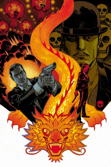
Written by Greg Pak
Illustrated by Marc Laming
Colored by Triona Farrel
Lettered by Ariana Maher
Reviewed by Ken Godberson III
So, if you were to tell me a bromantic action comic starring James Bond and a very different interpretation of Oddjob would end up being one of the better recent Bond comics… it honestly wouldn’t surprise me. Greg Pak has a knack of taking older and problematic concepts and breathing new leases of life into them and that continues here. If we’re being honest, this may be called “James Bond” but it’s Oddjob that feels the main character more with Bond serving as a foil to him. While this issue is all about setting up the series and reads a bit slow, it depicts Oddjob as a suave, confident, debonair, but equally as efficient as his original counterpart with a bit more mirth in him serving as a counterbalance to this Bond’s more reservedness.
While Pak provides a nice narrative foundation, it’s Laming and Farrel that shine here. Everything is so smooth and pretty but it isn’t afraid to show a bit of grit in the fight scenes. Laming goes for a very Sterling Archer depiction of Bond (and yes I know Archer’s a satire of Bond, but seriously look at him!) and his Oddjob, like Pak’s script, creates a young, dashing and all to confident man but each expression shows just the slight hint of the gears moving in Oddjob’s mind as he moves. Farrel’s uses some really interesting color choices. She manages to make green feel like a neo-noir color in her depictions of the nightlife in Singapore, especially in the beginning. The palate adds a texture to everything that really kicks in when Laming’s work goes from sleek to gritty in fight scenes.
Final Verdict: 7.9 – With a reinvention of a classic Bond villain, Pak, Laming et. al. start strong with this new series.

Written by Adrianne Palicki and Eric Palicki
Illustrated by Ari Syahrazad
Colored by Jean-Paul Csuka
Lettered by Jim Campbell
Reviewed by Gregory Ellner
Adrianne Palicki may be more famous amongst comic book fans for her performance as Bobbi Morse on Agents of S.H.I.E.L.D., but with the first volume of “No Angel,” she and her brother Eric Palicki prove themselves to be excellent writers of comic books in their own right. The tale of Hannah Gregory and the Elioud is definitely supernatural, steeped in the Biblical lore of angels and demons, but is just down-to-earth enough to make it palatable. For all of its high concepts, the story is still grounded in people with real emotions, in the real stakes of combat and investigation, and doesn’t shy away from the fact that events such as a teenager plotting to kill an assailant are not healthy for anyone involved. Certain elements, like a hollow bone structure, even give hints of certain abilities long before they are ever truly shown, relying on a sharp reader to really grasp their implications beforehand.
Ari Syhrazad’s artwork tends toward dark shadows and very expressive faces, taking on a modern-day “noir” appearance in its “new, weird west” tale. The intricacies of the art are sometimes lost in the daylight hours of some events in the plot but are nonetheless well handled, especially in close-ups.
Continued belowJean-Paul Csuka’s colors really rule the day of the art, with dark shades to show the placement of light sources as commonplace as sunlight, as well as different color schemes for different forms of light, including a candle or a streetlamp. The use of orange and yellow color schemes for people in contrast to the blue-green of the fading light of day helps to add to the noir feeling.
The Palickis, Syahrazad, and Csuka definitely have a winner on their hands, one that will hopefully continue going forward through Black Mask Studios.
Final Verdict: 8.0 – By a skillful use of a human touch to supernatural elements, “No Angel” guides readers into its modern day “weird west” tale with a noir overlay.

Written by Jonathan Maberry
Illustrated by Drew Moss
Colored by Jay Fotos
Lettered by Robbie Robbins
Reviewed by Chris Egan
In the last twenty years we have had far more than our share of zombie apocalypse stories, mainly due to George Romero returning in the early 00s to make sequels to his original Dead trilogy, and the huge successes of “The Walking Dead,” 28 Days Later, and Shaun of the Dead. Countless other zombie stories have led to an over-saturation of the horror sub-genre and it can be hard to find something new that is worth anyone’s time. At this point, most horror fans turn and run when a new tale of the cannibalistic undead is thrown their way. But like the featured creatures, these stories are hard to kill.
Before Romero passed away in 2017 he was planning to return with a new and final film, entitled Road of the Dead, which he co-wrote with director Matt Birman. It is rumored that the film will still eventually be made, but until then, IDW is releasing this, a three-issue prequel miniseries. While an enjoyable read, ‘Highway to Hell’ #1 is little more than a re-hash of the varied social commentary from Romero’s previous six films and is surprisingly similar to both “The Walking Dead” comic and t.v. series. Written by Jonathan Mayberry (V-Wars), he seems to be channeling story beats from that property, of which Romero himself was famously not a fan. Even the art by Drew Moss (Copperhead) is quite reminiscent of Tony Moore’s.
Maberry kicks off the mini-series which begins to feel a bit like Mad Max and Zombieland. Picking up six years after Land of the Dead, this new story deals with civilization well after the rise of the dead, a possible cure, and this chapter’s heroes battling legions of human enemies. It never feels far off from nearly every other zombie story. Likable main characters carry this premiere issue more than anything the plot tries to say. Nicely executed action and gore definitely help the issue move along as well. While his art does feel like that other zombie comic, Moss’s illustrations are great and beautifully detailed. Jay Fotos’s (’68) color work is excellent as well. Layered and fully realized. Really takes the book up a notch or two.
Final Verdict: 6.0 – An O.K. continuation of Romero’s Dead universe that is a bit more over-the-top than the movies, but does not fully dig the franchise out of the rut the last few films left it in.

Written by Delilah S. Dawson
Illustrated by Matias Basla
Lettered by Jim Campbell
Colored by Rebecca Nalty
Reviewed by Michael Govan
Some stories are told again and again. This holiday season, you’ll probably see more versions of A Christmas Carol than you can shake a jingle bell at. Lewis Carroll’s Alice’s Adventures in Wonderland is another work that is often revisited. Disney’s version may be the most famous, but many others have visited the well and put their own twist on it. “Sparrowhawk” is a superb comic, clearly inspired by Alice while being its own distinct thing, a hard feat to pull off.
Our heroine, Artemisia, had to kill to survive last issue and this issue ramps up the action as she goes further and further down the rabbit hole. Delilah S. Dawson perfectly captures the young woman’s strength and determined nature, making her a compelling character. Dawson also gives readers a sense of Artemisia’s internal struggle. She is trying to be as peaceful as possible, not wanting to be a colonizer enforcing her will like her father before her. However, in the ultra-violent realm, she has to take up her sword and fight. Her gradual physical transformation is matched by her gradual mental transformation as well.
Continued belowThe art is also stellar. Matias Basla makes “Sparrowhawk” as crazy as it should be. The setting feels magical and wild, an untamed land with rampaging beasts, goblins and snakes covered from end to end with eyes. Every panel is great and I went through several times just to appreciate the art. Rebecca Nalty’s colors are definitely worthy of note and praise as well. The pages are vibrant from start to finish. My personal favorite touch is the purple, pink and orange clouds…this book leaves readers eager to see what the next issue will look like, as well as where Artemisia’s story goes.
Final Verdict: 8.0 – The wonderland in “Sparrowhawk” is absolutely killer…figuratively and literally.
Written by James Roberts
Penciled by Jack Lawrence
Colored by Joana Lafuente
Lettered by Tom B. Long
Reviewed by Alexander Jones
“Transformers Lost Light” #25 is the end of an era for IDW and the conclusion of a multi-year and title spanning story. The plot has a lot of baggage and emotional material to resolve before the series comes to a conclusion with this final issue. While the title does not feature a bombastic sci-fi plot, as usual, the script has a hefty amount of emotional material to sort through after the resolution of the main plot from the previous issue.
Roberts attempts to resolve the plot for every major cast member on the Lost Light with impressive results. Roberts conveys how the Transformers are humans as the issue continues to pull couples together and keep the core cast of characters in place form an emotional standpoint. The title also establishes how the cast members have such a strong bond with each other. This particular issue does a great job hitting character beats with Megatron in particular who has lost faith in himself and is dealing with a fascinating sense of sadness and grief after trying to reform for his past deeds. The relationship scene with material for Cyclonus and Tailgate is another emotionally resonant final burst. The issue even features a happy ending for Whirl.
Illustrator Jack Lawrence’s art is profound in the title. Lawrence has done an excellent job defining this final era of “Transformers Lost Light.” His art is more developed and expressive than ever before. In an issue focused on winding down the huge cast, Lawrence gets tons of small details right. Lawrence has always had a knack for making facial expressions and movement fluid, but the Transformers require more detail and finesse than the average title.
“Transformers Lost Light” #25 can deliver a tone that is slightly too saccharin towards the end of the issue. The issue focuses a lot on love and character relationships that elicit a bit too much melodrama. However, the personalities and dialogue Roberts carries for each cast member is extremely creative. The final emotional plot beat and most of the content does a great job paying off the title. Lawrence’s excellent art and the potent final script is a fitting ending to an excellent series.
Final Verdict: 7.2 – “Transformers Lost Light” #25 is a strong finale to a fan-favorite Transformers title packed with great character beats and resolutions to old plot threads.


