
There is a lot to cover on Wednesdays. We should know, as collectively, we read an insane amount of comics. Even with a large review staff, it’s hard to get to everything. With that in mind, we’re back with Wrapping Wednesday, where we look at some of the books we missed in what was another great week of comics.
Let’s get this party started.

Batman #35
Written by Tom King
Illustrated by Joëlle Jones
Colored by Jordie Bellaire
Lettered by Clayton Cowles
Reviewed by Matt Sadowski
The ‘Rules of Engagement’ arc ends here with part three, as Bat and Cat end their romp in the desert country of Kadym. Writer Tom King continues his deep dive into the Dark Knight’s psychology by way of those closest to him, while posing an oxymoronic question that would puzzle even the Riddler. Can a broken man so enshrouded in darkness truly accept another person into his life? Can Batman be happy?
Tom King’s script pits two of Batman’s greatest love interests to a swordfight to the death. It’s as much a clash of swords as it is verbal sparring. King makes the case that Selina Kyle is the only one for Bruce. She reveals her feline insight into Bruce’s unique psychosis and openly decries him as a stupid man she stupidly loves. “I’ll always be second to a child’s idiotic fantasy,” Selina admits over the blade of her sword. These lines of dialogue cut to the heart of the Batman mythos while revealing the limits of Batman’s relationships to those in his dark orbit. Selina’s insight and acceptance of Bruce’s harrowing faults ultimately wins out over Talia al Ghul’s naïve belief of Bruce as her only equal in the world.
From the first clang of swords on the opening splash page, Joëlle Jones deftly renders Selina’s ‘Duel with the Demon’s Daughter’ with cinematic flair. The action choreography flows from panel to panel across spiral stone staircases and crumbling domiciles. It’s crisp, clean, and clear—even as the fight becomes a shadow play on the walls behind Talia’s dismayed captive. Colorist Jordie Bellaire, transitioning from the sepia tones and bloody reds of parts one and two, injects this issue with cool blues and grays as night has finally fallen on the desert. So it’s with greater impact when Batman and Catwoman emerge victorious from a stone archway, awash in warm lantern light, a serene glow dissipating Batman’s darkness.
The 800th issue of “Batman” concludes on one of the most hopeful notes in recent memory. Damian asks his father if he’s happy. After a shocked expression and a glance at Selina, Batman responds, “I’m getting there.”
Final Verdict: 8.5 – Batman takes a backseat to an epic showdown between his ex and his betrothed as DC celebrates this 800th issue hinting at a more optimistic outlook for the Dark Knight.
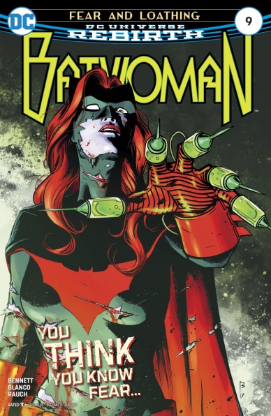
Batwoman #9
Written by Marguerite Bennet
Illustrated by Fernando Blanco
Colored by John Rauch
Lettered by Deron Bennett
Reviewed by Michael Mazzacane
Remember when this book first started, and everyone was excited at the promise of Kate Kane’s hidden past mixed with some super spy sensibilities? That was just three or four months ago, and now the book has currently transformed itself into psychedelic trip that sees writer Marguerite Bennett and art team of Fernando Blanco(illustration) and John Rauch(colors) chasing the dragon between sincere and ironic. The issue is entitled ‘Stay High’ after all.
Issue nine’s ability to straddle the line between sincere, bald faced, characterization and not fall into banal irony comes from Blanco and Rauch’s page designs. While not a strict hard and fast rule, the issue can be divided between two distinct modes. There is the straightforward page design with lots of box paneling, such as the extended conversation about Daddy Issues™ between Kate and Colony Prime. While the Wonderland environment is a bit coo coo for coco puffs, the presentation isn’t. Rauch doesn’t let things get too normal by texturing things in a slight screentone. That perceived normalcy is completely lost in the issues other mode which is pure, classic, surrealism. Blanco hits a couple beautiful spreads in these sequences as Kate takes ownership of her fears. Symbolically these pages are more unhinged, but they’re generally, still contained by off kilter panels. The decision to still use panels certainly helps with readability but more importantly it uses the panel as a unit to measure the normalcy in these moments, as well as accentuating the various actions therein.
Continued belowComics are a very open but contained medium. There’s a certain bluntness that is brought about by the constraints of the page. In writing dialog that leads to an earnest brevity. David Mamet might not be a good comic book writer. That brevity leads to things being if not obvious, blunt. But in an issue, that’s filled with surrealism, bold statements about the Greek roots of ‘psychedelic’ works. I rather read something that states its intentions with conviction than not say them at all. Sure, things are a little crazy, but Kate Kane always had a disarming wit about her. When things are tense any hint of levity instantly lightens the mood. Showing a bit of wit also creates equal space for the earnest recognition of darker elements. “I’m not defined by my scars. Darkness was always a part of my story.” On its own sounds so pretentious, but in the context of this issue as they chase after Scarecrow, it plays like a rousing speech. Shakespeare on St. Crispin Day maybe not, but when mixed with Blanco and Rauch’s imagery it’s perfect for comics.
Final Verdict: – 8.0 – “Batwoman” aimed high and stays high as Bennet and Co. use the psychedelic excuse to further examine all aspects of Kate Kane and find out what she may become.

Brilliant Trash #1
Written by Tim Seeley
Illustrated by Priscilla Petraites
Colored by Marco Lesko
Lettered by Marshall Dillon
Reviewed by Elias Rosner
Have you ever read something and, even though you didn’t quite understand it, you were intrigued enough to keep reading? That’s how I felt reading the first issue of “Brilliant Trash.” It’s got a lot of moving parts and tries to do a lot of world building very, very quickly while also introducing us to a bunch of new characters. Seeley chooses to front-load us with more questions than answers which I think was the wrong way to handle this first issue.
Sometimes this works, acting as a teaser and making people want to continue reading, but it’s a decision that runs the risk of frustrating readers so they drop the title before it ever really gets going. I almost felt that way here and part of it had to do with the art. Petraites demonstrates a remarkable cinematic approach to this comic and knows when to let important events lurk in the background, making sure to draw just enough attention to it so that it’s noticeable but not obvious.
But Petraites’s people all have a plastic, flat feel to them, like a mannequin that’s been dressed up. It works for Lady Lastword because her face is supposed to look that way but our main character(?), Capricorn Hale, ends up looking like she doesn’t care about anything, like she has no real reactions. Everyone’s eyes seem dead and it made it tough to get through the story, which truly is interesting.
This is a sci-fi tale that takes a cue from our current state of technology and builds out from there but without a lot of the in-your-face “technology is bad, the internet is evil, we all suck” mantra that a lot of “topical,” “gritty,”sci-fi likes to do. It feels like the real world, grunge and all, but chooses to tell a story in it instead of about it. But, as I said before, trying to focus on any one character or plot thread in this first issue is an effort in futility. He has us keep track of at least three major characters, their relationship to each other and the major plot points as well as developing a new world and it’s too much, too soon.
Seeley would have benefitted from either an enlarged page count or a smaller cast to start (or at least choosing one character to follow the whole time).
Final Verdict: 6.7. I am intrigued enough to continue but this feels like the first half of a pilot episode instead of the first issue.
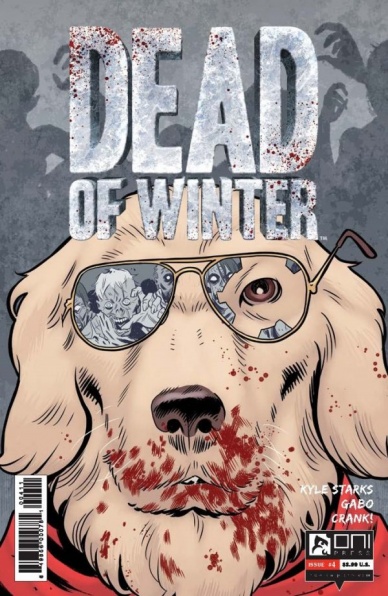
Dead of Winter #4
Written by Kyle Starks
Illustrated and Colored by Gabriel “Gabo” Bautista
Lettered by Crank!
Reviewed By Kate Kosturski
Good boy, Sparky. The comic based on Plaid Hat Games’ zombie board game reaches its final act. After the siege at the mall that spanned the previous issue, Bad Santa Forest, Carla, Sparky, and Gabriel decide to do the right thing and rescue Ruckus from the police station. While Ruckus has earned the nickname of “white trash MacGyver” it’s really the rest of the team that earns their DIY cred — well, mostly Sparky, who steals the show with some well-timed bites, a rescue or two…and is that a dog driving a car? For a moment, things get quite violent with law enforcement, and our superhero dog is knock, knock, knocking on heaven’s door…but this is Sparky, Wonder Hero Dog, so you know the day will be saved, somehow.
Continued belowI am surprised that this is the final issue. There is a rich world in the source board game, and to stop the narrative here does the creative team at Plaid Hat an injustice. Perhaps the intention with this short 4-issue run is to introduce readers to the board game. If that is the case, then Kyle Starks has done his job properly (though with the feel of a 4 issue advertisement). Gabo Bautista has studied his source extensively, as Bad Santa Forest Plum and Sparky resemble their tabletop counterparts quite accurately, and shows some anime influence in his hand for the other human actors. Crank! Introduces some of the game lettering in the final pages: the red pentagons with skulls signifying injury, and the blue snowflake pentagon from Forest signifying cold. As I have played the game, I liked these touches, but wonder if those who have not could say the same.
Was this nothing more than a serialized advertisement for a board game? With this conclusion, it’s hard to disagree. And that leaves a bad taste in my mouth.
Final Verdict: 4.7 – Stopping the plot abruptly here does disrespect to the game creator and the reader. Both parties deserved better.

Doctor Strange #381
Written by Donny Cates
Illustrated by Gabriel Hernandez Walta
Colored by Jordie Bellaire
Lettered by VC’s Cory Petit
Reviewed by Nicholas Palmieri
One of the smoothest reads I’ve experienced in a while, “Doctor Strange” uses four unrelated scenes to build a quirky, unique world while filling us in on a backstory that anybody could latch onto. Most importantly to make this happen, there’s a nice balance of the ordinary and the absurd from all creators in each scene.
Starting from the first page, we have an ordinary building floating in midair as an ordinary man goes on to calmly talk about his haunted eyeballs. Walta and Bellaire use completely ordinary visuals to depict this moment, letting the environment commingle on the page with Cates’s strange dialogue and the fact that the otherwise normal building is floating. Bellaire chooses a main color scheme for each scene and sticks to it no matter where the scene progresses, whether it’s the ordinary morning-time color of that mystically-tinged opening scene or the magically red-pink scene in a mystic bar where the attendees simply have conversations. In a single issue, these creators have already defined their take on “Doctor Strange” by this odd, intriguing mixture.
Walta’s pages show a remarkable design sense that display the collaboration between creators. On one page, we have a similar panel with two characters repeated, but the first panel has multiple word balloons above the characters’ heads while the second has only one word balloon over the left character’s head. In the first panel, the character on the right is starting to pull something out of her messenger bag, only letting it reach up to the balloons above her. In the second panel, in place of those extra word balloons, we realize that she’s pulling a full-size ladder out of her physics-defying bag and up beyond the top of the page, breaking past the word balloon boundary that we thought was established the first panel. This small moment took considerable planning from everybody, from the amount of words Cates chose to use in each panel to the way Petit lettered it to Walta’s choice of panel composition. Note that this was just the most striking moment to me — these creative, collaborative moments are all over these pages.
The enchanting quality of “Doctor Strange” and the technical skill of the creators mean it feels almost silly to comment on this small sliver of story. It’s a smooth, enjoyable read, the characters are well defined, I immediately understood everything that was going on, and I think there are some great places things could go from here. As an introduction to this character and this storyline, you can’t go wrong with what Cates gives us. But mix in the incredible visuals by Walta, Bellaire, and Petit, along with the fascinating mix of the ordinary and fantastical achievable only through synchronous collaboration, and you have something truly wonderful.
Continued belowFinal Verdict: 9.0 – This could be the start of something special.
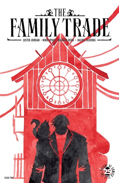
The Family Trade #2
Written by Justin Jordan and Nikki Ryan
Illustrated and Colored by Morgan Beem
Lettered by Rachel Deering
Reviewed by Reed Hinckley-Barnes
In this second issue of “The Family Trade” Justin Jordan and Nikki Ryan pick up exactly where the first issue left off, with Jessa stuck under the carriage of Berghardt, about to fight her way to freedom. At only two issues in, the story is already a bit hard to follow. Jordan and Ryan expect the reader to recognize characters and their relationships without any reintroduction. There is a twist at the end of the issue that completely falls flat because I couldn’t remember who a character was supposed to be. When Jordan and Ryan do provide answers about the world, it only comes as part of the issue’s backmatter.
The main attraction of “The Family Trade,” though, is Morgan Beem’s art. Her pencils have a loose quality that lends themselves to her pastel watercolors. The art has a calming, and slightly otherworldly feel, that helps create the book’s oceanpunk universe. The abstract backgrounds, the interesting facial expressions that she gives her characters, all work toward a very specific world and aesthetic.
If there is a problem with the art, it comes in the action sequences. Here, Beem’s abstract backgrounds can make it difficult to follow the character placement and movement from panel to panel. In the quieter moments, where there isn’t frantic movement, you want to take the time and just soak in the beautiful pastels. Even in the most detailed environments, Beem’s art is still a bit abstract, which can be disappointing. If it was a bit more concrete it might be able to fill in some of the gaps in the world and story that Jordan and Ryan aren’t giving us.
However, if you’re willing to accept a bit of looseness to the world building and some lackluster plotting, there is a decent amount to like about “The Family Trade.” Jessa is a strong, female protagonist, and Beem does a good job of portraying her as a woman without her being sexualized. There is a segment toward the end of the issue where Jessa has to infiltrate the Berghardt’s mansion that is equal parts fun and tense. As a light, airy adventure, “The Family Trade” works pretty well.
Final Verdict: 6.5 – While the art is beautiful, if you go into “The Family Trade” expecting anything other than a light bit of intrigue and adventure, you’re bound to be a bit disappointed.
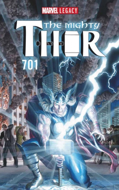
The Mighty Thor #701
Written by Jason Aaron
Illustrated by James Harren
Colored by Dave Stewart
Lettered by VC’s Joe Sabino
Reviewed by Alexander Jones
Despite “The Mighty Thor” #700 taking off with a huge premise and fight sequence centered around The Mangog, this follow-up shifts the scope of the book quite dramatically. Guest artist James Harren drastically changes the tone of the entry when series protagonist Jane Foster is missing in action. Some of the consequences from the previous installments were a little murky and centering the tale around The War Thor is a bold choice for Aaron at this stage of the narrative.
While the purely bombastic action-packed narration and visuals of the comic where engaging, I found myself less interested in this entry than I have felt about past installments. The title loses the overall sense of pleasantness Foster and previous series artist Russell Dauterman bring to the story. However as the issue continued, Aaron and Harron refuse to let up the pace causing the plot to hit an extremely climactic towards the end of the installment. The War Thor returns in the narrative to do battle against The Mangog, a classic Jack Kirby villain who makes his presence known within this story.
While Aaron’s narration can be excessive, this book is made all the more powerful by Harron’s intense art loading the series with an unmistakable level of intensity. The action sequences in the title reach peaks which Aaron’s work on “The Mighty Thor” has never hit before but Harron doesn’t quite deliver on some of the spectacles he’s thrown towards titles like “Rumble” with huge, awe-inspiring splash pages. One page in the issue early on inspires teases that level of ambition with The Mangog throwing The War Thor on the floor. Stewart’s colors are particularly vibrant, drawing a wide range
Continued belowNarrowing the scope of “The Mighty Thor” towards a singular battle is an interesting idea, but something about the overt prose and long, dreary fight in the issue lost my attention until the climax of the issue. For a series so steeped in greatness, I’m not sure where this particular chapter fits in the grand scope of the book and I hope Aaron and Dauterman can start piecing the book’s tapestry together in the next batch of issues. This story still has plenty of big, exciting action to captivate readers laced with some beautiful art.
Final Verdict: 7.5 – “The Mighty Thor” #701 mixes up the formula with big action that doesn’t quite capitalize on the series’ consistent level of sustained greatness.

Minky Woodcock: The Girl Who Handcuffed Houdini #1
Written, Illustrated and Colored by Cynthia Von Buhler
Lettered by Simon Bowland
Reviewed by John Schaidler
The often contentious friendship between Sherlock Holmes’s creator Sir Arthur Conan Doyle and world renown escape artist Harry Houdini is both well documented and rich with possibility for further exploration. In short, Doyle was mesmerized by all things paranormal, a beguiled and willing believer in fairies, ghosts and psychics. Houdini, on the other hand, was a staunch and unrelenting skeptic, even taking time away from his hugely popular magic act to travel the country speaking out against “vultures who pray on the bereaved.”
Intriguingly, in the opening pages of “Minky Woodcock: The Girl Who Handcuffed Houdini,” we see the eponymous protagonist still grappling with the loss of her mother – quite unexpectedly, it seems – years after the woman’s death. Notwithstanding that, more than anything else Minky wants to follow in her father’s footsteps and become a detective.
Sadly, whether by design or sheer obliviousness, her father Benedick has a completely different idea. Irrespective of his daughter’s wishes, the elder Woodcock has chosen his male offspring Bennie to be his business partner and heir apparent, despite that son’s affection for speakeasies and “hoofing,” as well as a clear disdain for all things work related. Not entirely cut out of the business, Minky is left to handle the agency’s mundane secretarial duties, an injustice that cuts her deeply. Naturally, when Conan Doyle appears with an assignment for Minky’s father who happens to be away on safari, Minky jumps at the chance and takes the job, finally setting story in motion.
It all may sound convoluted, but writer-illustrator Cynthia Von Buhler (a multi-disciplinary artist known for everything from children’s book illustrations to music to her immersive theatrical productions) weaves the disparate threads together nicely, dropping many titillating clues about potential story lines along the way. Indeed, her previous experience as a playwright shows as she deftly intertwines naturalistic dialogue that reveals key character traits while also divulging important pieces of exposition. It’s not entirely seamless, but largely effective, hooking the reader in while also moving the narrative forward.
Visually, the piece begins with a definite nod to Golden Age comic aesthetics. The retro looking colors, off-white panel borders, subtle half-tone textures and desaturated blacks all combine to help create the feeling that you’re holding an actual vintage book. Even the characters’ expressions and framing have a decidedly throwback feel. Things are a little too formal sometimes, but in a weird sort way that’s also part of the charm. Unfortunately, as the book progresses, the off-white border panels give way to black and the book gets physically darker and darker until the backgrounds all mush together, becoming monotonous and indistinct. The foreground colors are nice, but the power of page layouts gets lost in a sea of similar color values.
Ultimately, this issue is packed with numerous potential plot lines and well imagined historical figures. It’s also refreshing to see the central narrative re-centered on a strong, independent female lead. It takes a bit of work to get there, but once we do, the narrative is rife with rich possibilities.
Final Verdict 8.1 With a Golden Age aesthetic and well balanced, effective writing, Minky makes her presence known.

Super Sons #10
Written by Peter J. Tomasi
Penciled by José Luís
Inked by Scott Hanna
Colored by Hi-Fi
Continued below
Lettered by Rob Leigh
Reviewed by Gustavo S. Lodi
There is a levity to “Super Sons” that instantly appeals to readers. Not that the adventures of Jon and Damian are shallow, but rather how the core characters react to fantastic situations. The scripts by Peter J. Tomasi are aware that, despite the crazy situations the boys go through, they are first and foremost kids (teen, if you ask Damian), so the lenses of the story tilt in that direction. There is a sense of being in awe that, often, is lost in more adult series where cynicism is confused with matureness.
‘One Fine Day’ (a told-in-one story that is a great jumping-on point) is not an exception. The issue centers on the dynamics between Jon and Damian, but also with their famous parents. A highlight of this issue are the reactions of Bruce and Clark to the behaviour of their friend’s son: Clark is shocked by some of the things that Damian says, while Bruce seems to look at Jon and wonder how his own son would be like had he been raised more… conventionally.
The art by José Luís is competent, if not stellar. There is an almost cartoony style to it that, while not exaggerated, can sometimes seems off anatomically. This is more observable on the boys; many artists struggle to portray kids, failing to show that they are not miniature adults with skewed proportions. One sees that here on the size of Jon’s and Damian’s heads; it’s not something that takes you off the story, but shows where they appear side-by-side with Bruce and Clark. Additionally, there are two pages on an Intermezzo where Luís clearly tried to emulate another artist’s style (for story purposes) where he clearly succeeded.
The sense of optimism shines further towards the end when Jon and Damian realize an important change will happen to their adventures dynamics. It will be interesting to see how this will clash with the upcoming arc, which seems to incorporate darker elements.
Final Verdict: 8.0 – “Super Sons” #10 reinforces the series approach to young adventures by telling a personal story of sons and fathers. While the art can be uneven, it should not stop readers for trying this book.

Voltron: Legendary Defender vol. 2 #4
Written by Tim Hedrick & Mitch Iverson
Illustrated by Rubine
Coloured by Beni Lobel
Lettered by AndWorld Design
Reviewed by Frida Keränen
The paladins of Voltron and the alien race they’re helping come to the end of their journey to find new living grounds, but their problems don’t end here. Unfortunately this issue has got its own share of problems too.
The quality of storytelling is uneven: in some parts it works fine but in others it feels a bit off. The battle scene is the worst part because it’s hard to understand what’s happening at all. Tim Hedrick and Mitch Iverson continue with the biblical references in the story and make them even stronger than before with plagues of locusts, which feels kind of weird for this franchise. The jokes often miss their mark but there are a couple of funny moments.
Rubine’s artwork is nice and clear except for the facial expressions, which often don’t match at all with what the characters are saying. The emotions of the characters aren’t conveyed very smoothly because of this. Beni Lobel has made the issue very colourful and the space and sky backgrounds look beautiful.
Despite these faults the issue can’t be called anything close to a catastrophe because there is nothing to complain about in Beni Lobel and AndWorld Design’s work and story and artwork do have some redeeming qualities. The moments between Hunk and Lance are sweet and the castle ship and Voltron are drawn in a detailed manner. This isn’t enough to lift the issue up, though.
Final Verdict: 5.0 – Flawed in some way in every aspect except for the colouring and lettering.


