
There’s a lot to cover on Wednesdays. We should know, as collectively, we read an insane amount of comics. Even with a large review staff, it’s hard to get to everything. With that in mind, we’re back with Wrapping Wednesday, where we look at some of the books we missed in what was another great week of comics.
Let’s get this party started.

Written by Steve Orlando
Illustrated by Davide Tinto
Colored by Francesca Carotenuto
Lettered by Fabio Amelia
Reviewed by Quinn Tassin
My goodness “Commanders in Crisis #2” is a lame book. Maybe there’s a more delicate, intelligent way to put it but it’s a simple truth, plain to see on every single page. The whole thing feels like a free comic you’d pick up from a random table at a con and 0% like a Steve Orlando book from Image. The multiversal, presidential premise is just as silly as ever but the book itself takes itself far too seriously for that silliness to feel intentional. The main conflict, in which the concept of empathy was somehow killed is too ridiculously on the nose to work. The same goes for the whole American Individuality Act, which is neither far-fetched nor realistic enough to land. As for the characters- they definitely all exist, but not only do they feel flat, none of them even make an impression.
Davide Tinto and Francesca Carotenuto do serviceable work on the art, though there’s a fair bit to be desired. Tinto’s pencils are decent- certainly visually entertaining enough that it’ll keep readers engaged. Generally, though, it skews toward static imagery. That whole opening sequence on Earth-J, for instance, lacks any sense of urgency from a visual standpoint (or a scripting one, to be fair). Amelia’s colors certainly don’t help; they’re certainly bright but they also look amateurish.
So yeah, that’s “Commanders in Crisis #2.” It’s boring and fails to make any type of impact. Orlando has a lot of raw talent and this book has a certain degree of promise. If it gets better, I’ll be thrilled. For now, though, it sucks.
Final Verdict: 4.5- “Commanders in Crisis #2” is a lot of things but mostly it’s one thing and that thing… is bad

Written by Rafer Roberts
Illustrated by Mike Norton
Colored by Marissa Louise
Lettered by Crank!
Reviewed by Ryan Fitzmartin
Rafer Roberts concludes another arc of interdimensional talking con man-dog comic “Grumble” in a suitably strange but surprisingly emotional way. Grumble contains wacky and wild delights, but also more poignancy than one would expect from a comic this goofy. The story effectively closes the door on one arc, while tantalizingly setting up another.
Series protagonist Eddie is a lovable jerk, who in this issue manages to let his lovable side outshine the jerk side. We see him in both his miserable human form and his current dog body. Eddie’s made many mistakes, and it’s not easy for his friends to trust him. When Roberts gives us a look at his past, it’s easy to see why. Yet despite his flaws, Roberts makes him a good protagonist, one who is easy to root for.
It doesn’t hurt that Mike Norton draws Eddie as one of the most adorable anthropomorphic in a modern comic. Eddie’s face is expressive and emotional for a dog. Marissa Louise’s rich colors emphasize him as the most normal thing in every stranger world. The interdimensional colors are bright and vivid without being overwhelming. Like any good art, it efficiently sets the tone for “Grumble: Memphis and Beyond”, and that tone is warm. “Grumble” succeeds on many levels, but more importantly, it leaves one wanting more. The next chapter in the story is sure to be exciting indeed.
Final Verdict: 8.6 – Rafer Robert’s Grumble is quality humor with an extra dose of real heart.

Written by Al Ewing
Illustrated by Joe Bennett
Colored by Paul Mounts and Matt Milla
Lettered by Cory Petit
Reviewed by Gregory Ellner
“Immortal Hulk” has always been a horror book, albeit in different ways. Sometimes it is a villain’s story, sometimes it is body horror, sometimes other things entirely. However, it is a rare thing when Al Ewing manages to break all of those rules at once, instead of pulling the multiple personalities down another passage: a bit more along the lines of comedy, with some drama. The presentation of the current antagonists of the arc is somewhat serious… but the way in which the Hulk(s) handle it, particularly Joe Fixit, breaks straight into humor, using the aforementioned body horror to punctuate the events, but the dialogue amongst the people being rather humanizing on one hand, and outright hilarious in another. The use of comedy is all the more potent with the title of the issue coupled with the image shown, which alludes to a visual gag used sometimes in media.
Continued belowJoe Bennett is, as ever, on top of his game. The imagery of the Hulk’s transformations is utterly horrifying, filled with guts and gore, with distended organs and sagging flesh. Perspectives are used to help add to the terror, but the majority of the disgust and creepiness comes from the physical appearance of the various transformations and how they are physically presented. An exception can be made for the latest new gamma mutate form, which while disturbing, is drawn in such a way that it comes across as almost humorously ridiculous.
Paul Mounts and Matt Milla work together to help craft the variable lighting of the book, using dark shades of green for various Hulks along with other brighter ones depending upon the situation. Gun muzzle flashes, the darker blue of a dimly lit room, the glow of radioactivity, and more, all are used expertly, with a decided emphasis on darker scenes and heavier shadows than many other books would use in order to emphasize the aforementioned glow.
Final Verdict: 7.0– Though not quite a comedy, this horror book does show a sizable amount of humor.

Written by Kieron Gillen
Illustrated by Dan Mora
Colored by Tamra Bonvillain
Lettered by Ed Dukeshire
Reviewed by Jodi Odgers
“Once and Future” #13 marks the beginning of the series’ third arc with the charming combination of myth, charm, and character that the series has been known for since its inception.
The issue begins with a magpie-filled omen, before briefly refreshing the characters, informing the reader about what they have been doing since the events of issue 12 (mostly identifying and conquering various legendary beasts). What could have been a much grimmer, darker book from another creative team is instead infused with a light bubbling of wit, helping to make the murky world of interweaving stories and tales more accessible.
Throughout the run of “Once and Future” so far, the creators’ sheer joy at creating the book has shone through almost every page. Gillen is clearly loving playing in the sandbox of British mythology. Mora is reveling in drawing the fantastical scenarios that Gillen envisions. Bonvillain fills each page with vibrancy. Dukeshire rises to every new font, style, or even language that the story requires with evident enthusiasm. The events of the book may not always be filled with levity, but they are always delivered with passion from all involved.
The hook for “Once and Future” #13 may not be as dramatic as that of the first arc, but the unique tone of the series and investment from the creators make it an easy recommendation for those already enamored by Duncan, Rose, and Bridgette, or anyone looking for a sharp series dripping with lore, humor, and eye-catching artwork.
Final Verdict: 8.3 – A strong start to the newest arc of “Once and Future”, brimming with everything the series has done well up to this point.
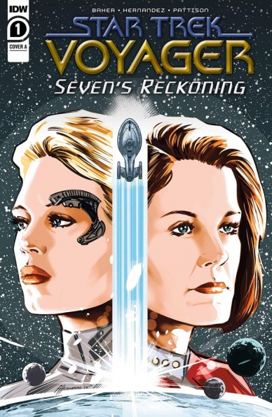
Written by Dave Baker
Illustrated by Angel Hernandez
Colored by Ronda Pattison
Lettered by Neil Uyetake
Reviewed by Elias Rosner
Other than a scattering of episodes and a movie or two, I have seen very little Star Trek broadly and even less Voyager specifically. Perhaps that makes me the wrong audience for this book. Perhaps it makes me the perfect audience! Whatever the case may be, here we are, with a Star Trek comic that doesn’t do much to welcome newcomers into the intricacies of the Voyager crew but instead creates a narrative that doesn’t require it.
The broad strokes of the background are established in the dialog and narration. Some of it is integrated well, like when Captain Janeway empathizes with the other lost ship on its way home. Others are clunkier, like the repetition of being lost in Delta Quadrant in dialog right after getting that information from the narration on the previous page. It kinda works but could have been excised and the scene would read a lot smoother.
The characters fare much better, with their personalities shining through the dialog, and damn if there aren’t a bunch of great one-liners. That split page delivery of the cheek-bone line? I was cackling for a good minute. That said, the art does a disservice to the comic. It’s flat and static, which works for Tuvok and Seven of Nine, two “emotionless” characters, but makes everyone else look bored throughout the entire comic. Pattison does a solid job on the coloring, though the shading on the faces does nothing to dissuade them from looking like Madam Tussaud mannequins.
Continued belowThe other odd quirk is that there is a disconnect between the first and second half of the comic as if this used to be a 5-issue series and one had to go. Seven of Nine is, ostensibly, the focal character of this mini if the opening page and the subtitle are to be believed, but she isn’t really present in that first half. Tuvok, and to a lesser extent Janeway, get much of the focus at the start. This is a strange choice but not one I’m necessarily opposed to.
The pacing, however, completely changes when the focus shifts. The first half is slow and careful, while the second half pushes onwards relentlessly, jumping from scene to scene and introducing question after question without a clear sense of time. I noticed this most on the third to last page where the first five panels all depict different days (hours?) and the last five are in the same few minutes. It’s clear that this is happening but it remains at odds with the rest of the issue.
All that said, while I may have found bits of the second half confusing, I am intrigued enough to want to know more and to see why the series is called “Seven’s Reckoning.” Voyager fans’ mileage may vary.
Final Verdict: 6.8 – Static art and pacing tensions hold back an otherwise good introductory piece to the Voyager universe. A worthy read for the jokes at least.

Written by Robbie Thompson
Illustrated by Javi Fernandez
Colored Marcelo Maiolo
Lettered by Rob Leigh
Reviewed by Alexander Jones
For the past couple of months DC’s newest incarnation of “Teen Titans” has had a sense of finality. Due to the disappearance of team leader Damian Wayne and huge recent developments in relationships, the title is in a major state of transition. I was looking to see writer Robbie Thompson give the title a sense of resolution while circling back to the main themes that Adam Glass and Bernard Chang first brought to their run. Joystick is hardly the most exciting villain but Thompson and artist Javi Fernandez use his villainous schemes to advance the relationships and heroic nature of the characters. There’s a sense that the team has gone through so much and still emotionally distraught. With only a couple of members still left in the ranks, Thompson realistically is able to make the cliffhanger a triumphant resolution for the title as a whole.
Javi Fernandez lends a solid sense of art to the issue that isn’t as precise as I would like it to be at certain times. There’s a great level of energy on each page thanks to stirring compositions and exaggerated expressions. Fernandez plays off the visuals Bernard Chang established for these characters and Marcelo Maiolo keeps the colors consistent no matter who is drawing this series. The last page is one of the best in the issue and features a stirring, exciting depiction of epic Teen Titans cast members that shouldn’t be missed. The script is so grounded that even new readers could start here if they are interested in seeing the end of the series. With wonderful page compositions and interesting expressions, Fernandez only misses the mark on character anatomy.
Thompson’s characterization of the supporting cast plays off on threads seeded since the start of rebirth. I enjoyed that there are ramifications to Damian’s actions in particular that are teased really well in this script. The relationship between underdog characters like Crush and Roundhouse are very believable. The way Wallace is disconnected from the greater DC Universe is hinted at and used effectively here. Wallace is disconnected from The Flash family of characters but feels like an essential piece of the Teen Titans. Thompson even shows how Wallace can be a bleaker character depending on what context he is utilized in. After considering the issue as a whole I feel like Thompson has been planning those emotional next steps and saving them for this particular issue. Fernandez’s artistic contributions match the tone of the script really well. “Teen Titans” #47 is an emotionally potent finale.
Final Verdict: 7.9 – “Teen Titans” #47 is a hopeful finale to a bleak series that was never afraid to explore the dark nature of teenage DC heroes.


