
There is a lot to cover on Wednesdays. We should know, as collectively, we read an insane amount of comics. Even with a large review staff, it’s hard to get to everything. With that in mind, we’re back with Wrapping Wednesday, where we look at some of the books we missed in what was another great week of comics.
Let’s get this party started.

Written by Ales Kot
Illustrated by Piotr Kowalski
Colored by Brad Simpson
Lettered by Aditya Bidikar
Reviewed by Ken Godberson III
The first arc of “Bloodborne” put a great emphasis on the Hunters of Yharnam, but as we near the ending of the second arc, I feel like this book has definitely made a bigger stride by focusing on characters outside of that order. By focusing on the Healing Church cleric Clement and scholar Alfredius and a “smaller” story dealing with the citizens of this doomed city allows Kot, Kowalski, Simpson, and Bidikar to explore themes to a deeper degree as we lead up to the arc’s ending.
Clement and Alfredius come from worlds of faith and rationale, but as things in the city begin to fall apart, so too are their fundamental belief structures. Alfredius’s desire to find a cure for the Ashen Blood only intensifies when it begins to strike closer to home, whereas Clement’s continued disillusionment with the Healing Church is quickly dropping him into a pit of despair. Credit has to be given to letterer Aditya Bidikar with this issue: His way of placement of Clement and Alfredius’s narrations -in the form of journal entries- puts this deterioration on display as the narratives flow with one another. Normally, it does annoy me when a bunch of page space is dedicated to a mass of text, but it works better here because of the branching and rejoining dual narratives.
Kowalski and Simpson have been great on this book and improve with every issue. This is an issue devoid of any of the eldritch and supernatural elements of Bloodborne, but it double downs on the more human elements. Everyone in this book just looks so… tired. From the Church clerics to the victims of the disease, to our protagonists, everyone visually carries a weariness to them. That weariness also manifests itself in the cityscape itself. One standout scene is a full-page spread of Alfredius and Clement walking over a bridge, buildings in the background showing the age and wear, the clouds hang thick with melancholy. It’s a well-executed scene of miserableness.
“Bloodborne” continues to be a sleeper hit series of this year. Kot shows a clear admiration for the source material and combined with Kowalski, Simpson, and Bidikar injects a great deal of pathos without ever feeling out of place or straight up trite additions to the games’ universe. We gear up for the end of this arc with an issue of misery, but that’s what makes it great.
Final Verdict: 8.3 – Focusing more on the human element, the team continues to craft one of the more underrated books on the shelf.
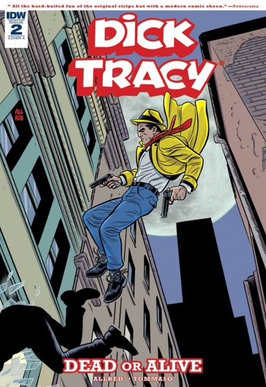
Written by Lee and Michael Allred
Penciled by Rich Tommaso
Inked Michael Allred
Colored by Laura Allred
Lettered by Shawn Lee
Reviewed by Tom Shapira
Man but this story is packed tight! I thought the first issue was in a bit of a rush in order to create the set-up, but it turns this just how this mini-series rolls. Dick Tracy brought his enemies to the brink of ruin in the first issue only to see a nefarious conspiracy rise against him in this one (alongside the introduction of some classic Dick Tracy characters to the cast); I got to say – I like it. this breakneck plotting really makes you feel you get your money’s worth as a reader.
This speed-run of a story is ably assisted by some spectacular art. I have to admit I had a somewhat distant relationship with previous tribute shows by Rich Tommaso, be they his neo-noir Dry County or the classic adventure strip settings of “Spy Seal,” I could always appreciate the obvious talent, but lost in the act of tribute was a proper sense of character. Here his cartoonish design manages to both bring to mind some ideal version of Dick Tracy, not so much a particular era of the strip as a combined sense of them while retaining his own identifiable edge. Tommaso can keep up with the plot, balancing the humor of this over-the-top world with the straight edge Tracy without making a mockery of the latter. All of this is gorgeously painted by Laura Allred (but I am being redundant).
Continued belowI came looking for a distraction and found one of the best mini-series of the year; I am genuinely curious to see where the creative team is going with this.
Final verdict : 8.6 – calling all readers, calling all readers! You do not want to miss this one.
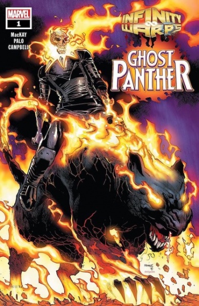
Written by Jed MacKay
Illustrated by Jefte Palo
Colored by Jim Campbell
Lettered by Joe Sabino
Reviewed by Gregory Ellner
With Ghost Rider and Black Panther amalgamated in the wake of certain events of “Infinity Wars” proper, Jed MacKay has had the unenviable task of trying to make a unique story out of the two distinct mythologies that merge into a cohesive whole. To that end, he mostly succeeds, combining two different mystically based heroes into a single whole that takes elements from both of them in the process of making something new, albeit with some awkwardness in hammering two characters together for the supporting cast. Then again, given the nature of the amalgams, perhaps awkward, haphazard, ill-thought-out mergers make sense.
Jefte Palo’s artwork, on the other hand, is a bit too rough, too imprecise to work well for this story. Of particular note is the fact that, with exception of Zarathos, everyone else’s eyes are completely obscured by their own brows, to the point that everyone looks as though they were physically blind. The rough cuts may have worked well for some series, but on the whole, it just makes everyone, especially the ostensibly human villains, seem to be too gangly or too muscular to be believed.
Jim Campbell does his best to add to the art with a desert-like color scheme in Wakanda, along with some brighter blues to balance out the oranges and browns, but the overall effect still seems to make Zarathos, a genuinely inhuman being along the left-hand paths of mysticism, appear to be the most relatable in terms of overall appearance. The colors on Zarathos, utilizing a glow in the eye sockets and a combination of yellow and brown on the rest of the skull itself, make it out to be more overall relatable, more capable of being viewed as a complete being, than the actual human beings that are drawn in far too much shadow, too heavy shading, to be seen normally or in any way that could truly make up for the bizarre illustration.
Final Verdict: 6.0 – Even the decent story provided by Jed MacKay cannot make up for the disjointed, bizarre artwork and colors in this first tale of the Ghost Panther.
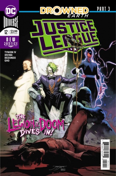
Written by James Tynions IV
Illustrated by Frazer Irving & Bruno Redondo
Colored by Frazer Irving & Sunny Gho
Lettered by Tom Napolitano
Reviewed by Gustavo S. Lodi
As ‘Drowned Earth’ nears its conclusion, “Justice League” #12 focuses on the villains of the piece which, this time around, is not exclusive to the Legion of Doom, but also to the broader themes of xenophobia and trauma that have been explored during the story. And while that is appreciated, the sections illustrated by Frazer Irving are the true highlight of the issue.
Irving and Redondo took turns on “Justice League” #12, with Redondo crafting the normal dimension, while Irving is dedicated to the nether realm Aquaman, Wonder Woman, and Poseidon are in. They are a marvel to look at. Irving’s painted art is perfect for this section, with its skewed proportions, distortions, and a color scheme that simply screams surreal. It is haunting, complex and layered.
Redondo, if not remarkable, is also very effective, using more traditional layouts to deliver strong action sequences, particularly when Batman faces off against the invading Legion of Doom to the Hall of Justice. It seems like a Saturday morning cartoon – in just the right ways.
Tynion takes over the writing duties from Scott Snyder on this piece, but their constant collaboration makes it feel seamless. This is very much the same story from start to finish of ‘Drowned Earth.’ The best aspects of the script remain to be the areas where villains and the reasons for their villainy are presented, especially on Black Manta’s hatred and the sins of the past committed by Poseidon. It plays to the old adage that no one is a villain of their own story and it really works. It disappoints on the excessive usage of MacGuffins, i.e. the mystical objects all are pursuing: while established on past issues, here they feel little more than plot elements to move the cast forward, with little consequence of their own.
Continued belowAn exciting event as a whole, the penultimate part of ‘Drowned Earth’ fares better when focused on its cast and reasons for evil. With gorgeous art on a big portion of the issue, certainly, a book to recommend.
Final Verdict: 7.3 – Despite some meanderings around its objects of power, “Justice League” #12 relies on insightful villain moments and truly outstanding art for its biggest credits

Written by James Tynion IV
Illustrated by Daniel Sampere
Lettered by Rob Leigh
Colored by Adriano Lucas
Reviewed by Michael Govan
This issue marks a transition for “Justice League Dark”, kicking off a new arc following the big ‘Witching Hour’ crossover event. While it may be premature to say, it seems this new arc could shape up to be stronger than ‘Witching Hour’. That crossover repeated a trend seen across ‘magic’ titles, with the stakes always being super-high and apocalyptic. So often it seems that all of the magic is dying or being destroyed. Over at Marvel, Jason Aaron’s run on “Doctor Strange” kicked off with all magic in danger and when Mark Waid got the reins, something was wrong with the magic again. On the other hand, this issue has action balanced out with quieter character moments. While the prose-style of writing in ‘Witching Hour’ could go on a bit long, it is used to great effect in this issue. The story is connected to previous events while also clearly moving forward in a new direction.
Tynion’s character work on “Detective Comics” made it a great read and the same is true here. It rings true that Wonder Woman would stop to console the traumatized Traci 13, even when they have a world to save. Kirk Langstrom is incredibly amusing as the team’s ‘outsider’, taking in the world of magic with fresh eyes and scientific curiosity. Detective Chimp has always been one of DC’s more outlandish characters but Tynion writes a very compelling Bobo, haunted by the past.
The art is great this issue. Daniel Sampere is very proficient at drawing facial expressions. Nightmaster is a very obscure character and his funeral would not feel so genuinely somber if the art didn’t sell it so well. On the other end of the spectrum, Sampere also sells the sheer delight that Man-Bat takes in all the weirdness of magic. The action sequences are also engaging. Constantine and Swamp Thing teaming up to fight Nabu is fun to see and Wonder Woman charging a dragon head-on is another stand-out moment. Here’s hoping that this new arc continues to go on strong.
Final Verdict: 7.5 – Things are improving in the magic corner of the DC Universe.

Written by Dan Watters
Illustrated by Sebastián & Max Fiumara
Lettered by Steve Wands
Colored by Dave McCaig
Reviewed by Christa Harader
Everyone’s favorite ginger’s back, and this time … he’s actually ginger!
Rebooting the Sandman Universe is no small feat, and tackling the mercurial Morningstar is an even greater challenge. Watters & company seem more than up to it, however, and “Lucifer” #2 draws us deeper down a well of madness in some delightful ways.
Lucifer’s always been a jerk, but in this reboot, he’s suffering. And I mean really suffering. Oh sure, he’s jammed in a bucket by pantomime demons in issue #1, but we’re talking Greek levels of suffering here. Because of the true nature of suffering for the most beautiful of God’s angels? Foolishness.
Watters is one of those writers who I can only assume had (and has) a rich intake of media. The Poe send-up in this issue is great, mashed up as it is with the actual Plague, and Decker’s hallucinations are rendered beautifully both in concept and in the Fiumara brothers’ excellent art. Mazikeen is a pile of nightmare meat and Caliban is less troll-like and more hewn from stone, which is a nice take. Panel structure doesn’t vary much from standard shape and size, but the team utilizes several different kinds of layouts well enough. And, the over-used 9-panel grid doesn’t show up as much as I’d feared.
Continued belowMcCaig uses a decent gradient of colors with some nice contrast pops on each page to keep things visually interesting. Wands does justice to the classic Lucifer typeface and tracks us nicely through multiple narrative threads and speakers on each page thanks largely to color variation in the balloons and typefaces. Of special note are Caliban’s antiquated serif font and jagged balloon style and Decker’s drunken ramblings at the end of the issue.
“Lucifer” #2 is a refreshing dip into turbulent psychological waters. There’s a lot going on in this comic, and not all of it is easily explainable. Lucifer’ll be damned if he doesn’t stop digging for the truth, though, and in the meantime, we’re in for a delightful ride.
Final Verdict: 8.0 – “Lucifer” #2 resolves the bizarre confusion of issue #1 nicely while maintaining the mad, unsettling and nightmarish vibe that befits a new story of everyone’s favorite Light-bringer.

Written by Matthew Rosenberg and Donny Cates
Illustrated by Niko Henrichon
Lettered by VC’s Cory Petit
Reviewed by Alexander Jones
The return of “Marvel Knights” is exploring a new status quo where popular characters from the previous publishing line have lost their memories. While the setup is an idea that lots of media including properties from Marvel have tried before, the odd approach to the script and art has made the getting-the-band back together issues memorable. This issue switches the creative team over with a different artist and penciller including writer Matthew Rosenberg and artist Niko Henrichon.
Rosenberg’s approach to the script is a pitch-perfect continuation of the odd characterization that Cates imbued the previous chapter with. Matthew Murdock is still paranoid, overreacting to his surroundings in a manner that is almost cartoonish. Bruce Banner and Frank Castle have a violent, playful demeanor making it electrifying to watch them both on the page. The script introduces a couple more players into the “Marvel Knights” saga, drawing a distinctive, yet familiar characterization to each protagonist.
Niko Henrichon’s pencils capture the magical world of Marvel Knights even better than previous series artist Travel Foreman. Henrichon’s more precise pencils illustrate that the creators behind Marvel Knights have a vision for the project. Action scenes have an impressive visceral energy and great page composition. An early sequence of talking head pages with Banner and Castle show the characters holding their emotions on their sleeve before violence erupts between the duo. Even though the title is only two issues in and has carried two different pencilers already, “Marvel Knights” has a clear visual language with innovative, fresh artistic talent from The House of Ideas.
With odd characterization and imaginative art, “Marvel Knights” continue to keep readers guessing. The title is still establishing the status quo and world of the new title but has such an expressive feel in both the script and artwork. Fortunately, the final pages of the title tease the comic is going be picking up the plot in subsequent issues. Even with a different creative team behind the writing and art for the story, the story is still focused and devoted to the initial vision behind the first script.
Final Verdict: 7.2 – “Marvel Knights” #2 is a paranoid exploration into the gritty underbelly of Marvel’s street-level heroes.

Written by V.J. & Justin Boyd
Illustrated by Clay McCormack
Colored by Mike Spicer
Lettered by Shawn DePasquale
Reviewed by Chris Egan
Forty years in the future an elderly Chris Dundee tells a story of crime, terror, and lost love. Getting pulled into a crazed plot of occult murders, shotgun-wielding priests, and the criminal underworld. Brothers V.J. and Justin Boyd (“Ghost Cop”) bring their talent for noir-ish doings to “Night Moves.” The first issue of this five-part miniseries goes into over-drive quickly introducing the main players and hinting at terror. The Boyds’ writing is quick, yet full of detail. Unfortunately, some of those details, especially at the beginning of the issue, have little to do with the overall story. They balance giving just enough exposition to move the story along without giving away too much. The mystery is unsettling and promises dark days ahead.
Continued belowClay McCormack’s (“Heavy Metal”) art is fast and loose but captures the modern pulp tale that is unfolding. With the plot being set in the present day rather than forty years ago gives the series an interesting mixture of style. McCormack’s pencils are like a hard-boiled 1970s. His talent is on the page but doesn’t completely work for a modern setting. Mike Spicer’s (“Shirtless Bearfighter”) colors are dark and imposing. His work matches the grittiness of the story. The entire creative team does a great job, but there is a sense of mixed emotions and styles that stops the book from soaring. That being said it is still a good comic that deserves some attention and could really go to the next level in coming issues.
“Night Moves” #1 is a decently disturbing tale of suspense and murder. It is nothing terribly new or different but does its job working as a horror-noir thriller.
Final Verdict: 6.5 – An interesting dark mystery that hints at some supernatural horror ahead.

Written by Christofer Emgård
Illustrated and Colored by Tomás Aira
Lettered by Mauro Mantella
Reviewed by Elias Rosner
War is often a source of horror. It is the distillation of our most terrifying impulses and a test of how many compromises we can make and still remain, in the eyes of those around us, human; it is not often that we succeed in that endeavor. “The Whispering Dark” #2 channels this fear through its focal character and her faith, showing us how the world around her morphs and shifts to reflect her newly eroding moral center.
At its most effective, “The Whispering Dark” #2 is evocative of the subtle, supernatural paranoia of the French horror-war film Neither Heaven, Nor Earth. Aira’s artwork & coloring grounds us in the stark but lush forests and tundras of Russia, crafting a claustrophobic feel despite the wide-open expanses of land. By keeping the gutters and borders small and black and utilizing close-ups, pulling back only when large amounts of information have to be conveyed in one panel, the tension is brought to a fever pitch, with very little room for release, asking the readers to wonder how much of what we’re seeing is true and how much is a result of the sleep deprivation, drugs, and the oddly-missing radiation.
If issue #1 was all set-up, meandering a bit for a story that’s selling itself as supernatural horror, issue #2 alleviates that fear not by providing evidence of strange goings-on but by showing us, through clever panel composition, meditative narration and a grow sense of unease, that the whispers of war might not be a metaphor. It’s a slow burn horror with pacing that suits what will be the trade and the singles so far, which is truly rare for a mini-series as grounded as this one.
Final Verdict: 9.0 – Emgård, Aira and Mantella are crafting something special here, with a main character that who’s narration can’t quite be trusted, beautifully rendered artwork, and a story that plays on paranoia in a way that few modern comics do effectively.


