There’s a lot to cover on Wednesdays. We should know, as collectively, we read an insane amount of comics. Even with a large review staff, it’s hard to get to everything. With that in mind, we’re back with Wrapping Wednesday, where we look at some of the books we missed in what was another great week of comics.
Let’s get this party started.

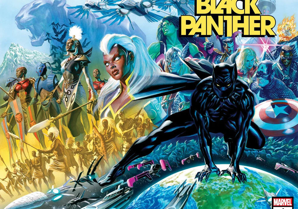
Black Panther #1
Written by John Ridley
Illustrated by Juann Cabal
Colored by Federico Blee
Lettered and Designed by Joe Sabino
Reviewed by Quinn Tassin
“Black Panther” #1 is full of great premises. T’Challa’s attention being split between the Avengers and Wakanda and its impact on the people around him brings up questions that are often vaguely addressed but infrequently explored. T’Challa being at least somewhat untrustworthy is well-trodded ground but this is a guy with a whole lot of secrets so there’s plenty to be mined from that truth. Making the shift from being true ruler of a nation to a figurehead that advises the democratic leader? Oh my god is that full of potential for great stories. And to top it all off we’ve got a core story reminiscent of a great spy thriller. And yet, I feel nothing.
New scribe John Ridley is a good writer and he certainly picks up on some of the most interesting threads from Ta-Nehisi Coates’s run and brings a much stronger sense of momentum to the table. At the same time, the issue feels emotionally hollow. There’s very little work being done to make the story being told here feel important in an emotional sense even if it is intellectually engaging. It’s clear that T’Challa feels spread thin, defensive, and is having a hard time with change but it’s far too difficult to connect with those feelings. Maybe it’s a side effect of a character who often plays things close to the vest but the emotional grounding just isn’t there.
The art, by Juann Cabal and Federico Blee, is oddly reflective of the writing- technically solid but missing that hard to define quality that makes you really feel. Everything in the issue is competently put together- layouts are easy to follow and keep the pacing strong. The way that Cabal captures his characters is genuinely great- grounding them in very normal human proportions and movements without making anything feel less super. Environments are rendered with care and a surprising level of detail. Blee’s colors are bright and imbue the issue with a sense of energy. Somehow, though, it feels like you’re viewing objectively impressive things through the eye of someone more jaded than you. You see that people are feeling things, that explosions are happening, that punches are being thrown and flips being flipped but it all feels one step too far away from the reader.
“Black Panther” #1 lays a strong foundation. Ridley clearly has some great thoughts to explore through this comic and he’s got a rock solid art team. Hopefully, it can warm up, even just a few degrees, and this can be a really strong comic book.
Final Verdict: 7.0- A whole lot of strong themes fail to land an emotional punch in “Black Panther” #1

Grrl Scouts: Stone Ghost #1
Written, illustrated, colored, and lettered by Jim Mahfood
Reviewed by Henry Finn
“Grrl Scouts: Stone Ghost” #1 is a return to Writer & Illustrator Jim Mahfood’s creator-owned GRRL SCOUTS universe. Because his illustrations are so gonzo and interesting, sometimes Mahfood’s writing can get less attention from reviewers. I find that underneath the delightfully original imagery in this issue, we are presented with what feels like a story influenced by Mahfood’s personal life. His views on love, heartbreak, and comic books are on full display.
This is apparent from the very first line in the book when our lead character Dio says ‘You know, Gordi.. it’s not so much the heartbreak I can’t handle. It’s what comes after that. This numbness.’ This is a sensation anyone who has lost a loved one can understand intimately. And we find out that she lost her partner to cancer in a two-page spread which felt like the comic book version of the animated film Up‘s opening scene. Right away Mahfood the writer is telling us to pay attention, that this story is NOT about the action, it’s about the journey of closure and acceptance in the loss of a loved one.
Continued belowTo compliment his writing, he deftly uses textures not just to visually stimulate us, but to create moods and emotions. For instance, during the two-page spread explaining the tragic love story, Mahfood the illustrator uses a sketchy style paired with a legal paper background. This creates a sense that we are looking not just into someone’s past, but their heart. The way that the textures work together, it creates a meta sense of understanding into the emotions of Dio. She’s telling us the story that she scribbled in her heart and we are getting a peek into her personal journal more than a polished version of the story.
He employs many of his stylistic techniques in every page, which lead up to an explosive ending that I don’t want to spoil here. Emotionally and visually, everything is left on the page, so to speak.
Final Verdict: 8.2 – A story of loss wrapped in a zany caper tale featuring gangsters and much more.

Gunslinger Spawn #2
Written by Todd McFarlane
Illustrated by Brett Booth
Inked by Adelso Corona
Colored by Andrew Dalhouse
Lettered by Tom Orzechowski
Reviewed by Gregory Ellner
Todd McFarlane may be the creator of the “Spawn” franchise, but his work on “Gunslinger Spawn” #2 is, at best, exceptionally fast-paced. At worst, or perhaps more fairly, it jumps from beat to beat with such speed that, for incoming readers, it can be confusing to the point of being something that they do not care about one way or the other. Concepts like the Bartletts or angels or Spawn are thrown around without any time to take a breath, and the narration, which is mainly used to just repeat what readers can clearly see, is overall redundant to the degree of pointlessness. Further, the tone of “Gunslinger Spawn” #2 is… eclectic, to say the least. It jumps from horror to action to comedy to tragedy, with scarcely a moment to catch one’s breath. Sometimes, this works, such as in the heat of combat. Others, it does not, as in the closing moments of the story.
Thankfully, Brett Booth’s illustrations work together with Adelso Corona’s inks to help examine exactly how brutal the Gunslinger is, from bloody violence to his actions when his face is still not visible due to the nature of his powers. They make for an excellent look at various facial expressions in times of distress, from anger to fear and more.
Meanwhile, Andrew Dalhouse pulls the artwork into sharp focus with his colors, which emphasize the darkness and savagery of combat even when it involves angels. The darkness of the Gunslinger’s shadow cannot hold back the hostile light of his angelic enemies, nor can it de-emphasize the more mundane nature of some of the supporting characters either.
Final Verdict: 6.0– Despite engaging artwork, the script and pacing of “Gunslinger Spawn” #2 leave much to be desired.

Hulk #1
Written by Donny Cates
Illustrated by Ryan Ottley
Colored by Frank Martin
Lettered by VC’s Cory Petit
Reviewed by Alexander Manzo
Donny Cates takes the reins for this new run for the Incredible Hulk. From the cover, he presents the question, “What if the Hulk exists….to protect us from Banner?” Flipping the script on what the typical idea is that Hulk comes to protect Banner from dangerous situations. The concept of the Hulk versus the world isn’t new, and he’s faced off in fights against other superheroes. However, the difference that Cates brings to the world is that Banner drives the Hulk to do these things.
According to Dr. Strange’s when he tells the other superheroes about what they will be facing is that he’s combined his intellect and some hardcore magic to turn the Hulk into a starship. Another interesting tidbit that Cates does is that there are narration boxes throughout the issue that are unclear initially on the person behind until it’s revealed to be Strange. Cates comes out swinging with this kind of story that has the reader questioning if Banner is the antagonist for this new series.
Ryan Ottley’s illustrations for this issue help bring the larger-than-life physicality of Hulk with two battles happening simultaneously. The readers get to see the Hulk battle an army of tanks and fighter jets sent by Banner inside of his head. Then, in reality, he is using that anger fuel to go against Tony Stark and his multiple hulk buster suits. Ottley doesn’t go bloody when Hulk is destroying the soldiers in his mind, but there is a gnarly moment in reality when Hulk is forced to remove his forearm to get free. In the book’s final pages, the reader also gets to see Ottley’s excellent perspective skills when Hulk is in front of the celestial suit looking like a small child.
Frank Martin’s coloring is perfect for the atmosphere of this book. From the very beginning, his use of red during the scenes with Bruce Banner initially gives this fear to the reader that he may be in a dangerous situation, only to be revealed later he’s the one in charge and causing the danger. Martin also helps the reader pause the tense situation by switching to Dr. Strange’s scene with the others by using a brighter color palette.
Final Verdict: 8.5 – A great start by the whole creative team that puts Banner in the driver seat of this new Hulk story.


