
There is a lot to cover on Wednesdays. We should know, as collectively, we read an insane amount of comics. Even with a large review staff, it’s hard to get to everything. With that in mind, we’re back with Wrapping Wednesday, where we look at some of the books we missed in what was another great week of comics.
Let’s get this party started.

Written by Brian Michael Bendis
Illustrated by Ryan Sook
Lettered by Josh Reed
Colored by Brad Anderson
Reviewed by Michael Govan
During his lengthy tenure at Marvel, Bendis wrote comics of all sorts. However, the street-level aspects of that world seemed to hold a special place in his heart. His run on Daredevil earned him acclaim, as did “Alias” with Jessica Jones. Even when he wrote Avengers, he couldn’t resist bringing characters like Luke Cage with him.
Now at DC, “Action Comics” had Bendis back in his element. The “Superman” title proper has more epic action but Action has operated on a smaller scale. The more grounded comic puts an emphasis on Metropolis and its people, as well as the Daily Planet. Bendis writes all of this very well and the ‘Invisible Mafia’ he has developed is an intriguing concept. Crooks have to hide from Batman, sure, but to hide from a Kryptonian, you’ve got to take things to another level. There’s a guy who’s only job is to keep track of Superman’s whereabouts. Often Metropolis has been portrayed as the perfect city to contrast how crappy Gotham can be. All of this fleshes out Metropolis, makes it a more interesting, lived-in place.
This issue reveals the identity of the mysterious Red Cloud and, well, it isn’t all that surprising. If you’ve followed along with the comic, it’s probably your first guess. Still, it will be pretty interesting to see how Red Cloud and her mafia moves forward now that she knows she can hold her own with the Man of Steel.
The art is just great, Ryan Sook draws the interior as well as the cover. The opening scene, with the Question (a welcome guest star) taking on mobsters, is a stand-out moment. The shadowy bar is colored with purple and turquoise, making the violent action oddly beautiful. “Action Comics” #1005 is another welcome addition to Bendis’s tenure on Superman.
Final Verdict: 8.0 – Bendis is great exploring the streets of Metropolis.

Written by Brian Augustyn & Mark Waid
Illustrated by Peter Krause
Colored by Kelly Fitzpatrick
Lettered by Jack Morelli
Reviewed by Elias Rosner
As retro as regular “Archie” tends to be, the WWII setting feels off for the characters. Three issues in and there still hasn’t been a reason given for why this story must be told. All the characters feel like shadows of themselves, reduced to trailer shots from a variety of classic WWII & 50s era WWII films. There is no substance to the drama, no thoughtful execution or inversion of the tropes. There are, however, glimmers of self-awareness and an evolution of the genre.
Archie’s father embodies traditional masculinity but it is framed in a way to show how wrong he is and how oblivious he is to his wife’s suffering. A desire to not fight isn’t portrayed as cowardice nor is it hidden behind a fake veneer of unshakeable patriotism. The soldiers aren’t all super gung-ho and there is an air of sadness surrounding the war. That’s not normal for WWII pieces. However, the pay off for all these events is either non-existent or, in the case of the parents’ fighting, resolved in a rushed and disappointing manner.
The artwork is serviceable, with full environments and moody posing, but the faces are hard to make out. Archie’s face often looks too small for his head and the inking around his face often appears smudged. At one point, Reggie looks more like Jack Kirby than Reggie, breaking the immersion totally. In fact, when he was first introduced, it’s almost impossible to know who is the person Archie is supposed to recognize and when we learn it’s Reggie Mantle, I still didn’t recognize him as Reggie.
Continued belowThankfully, the coloring is a real bright spot, rendering the world clearly and making it come alive while the lettering is thin and unobtrusive, helping the world blend into the world instead of standing out, which for a narrative as grounded as this is, that’s a necessity.
Final Verdict: 5.2 – A serviceable issue that does nothing really new but has enough good ideas to give it a cursory glance. At least it’s not just a rose-colored nostalgia trip.

Written by Kat Howard
Illustrated by Tom Fowler
Lettered by Todd Klein
Colored by Jordan Boyd
Reviewed by Christa Harader
When Constantine, The Phantom Stranger, Doctor Occult and Mr. E are your initiators into DC’s cosmic timeline, you’re not messing around. “Books of Magic” plunges Tim into very immediate physical danger, with consequences in store for his rash pursuit of his mother. And then there’s the posh and mysterious Dr. Rose to consider. Is she a friend, or foe? Magic seems more remote this time around, but as Tim breaches barriers in issue #2, there’s no doubt it’s real, and not entirely friendly.
I appreciate Howard’s close attention to Tim’s POV. His mystical journey is relegated to a few pages to catch us up before we join present Tim, frustrated, as he tries to harness his power.
Fowler’s angular style allows some distance from the seriousness and sadness of Tim’s world. Tim’s alone, with a mother who’s disappeared and a father whose grief is an insurmountable barrier between them. The original series boasted some very fine pencil and watercolor art, but Fowler’s take is a nice update. I especially enjoy Tim’s adolescent face in all its hawkish, boyish and weary wonder.
A very creative gory splash earns its shock value with Boyd’s careful attention to light sources and nighttime blood, and the palette is subtle but varied and themed nicely. Night scenes are bathed in warm light, while the harsh blue and greens of estate living and institutional schooling make everyone seem like they’re embalmed. A lot of care went to creating melancholy wonder in this book, and it shows.
Klein lettered Gaiman’s original series and doesn’t disappoint here, with nice sound effects that break the regimented panel style. The main typeface doesn’t sacrifice real estate to create its clinical tone. It’s perfect for the book and blends seamlessly.
Overall, issue #2 continues the momentum of the first issue without leaving Tim in immediate mortal peril – instead, his issue-end turmoil seems more moral, and we’re treated to just a hint of foresight that will no doubt catapult Tim into terra incognita – and even more peril.
Final Verdict: 8.0 – “Books of Magic” #2 doesn’t drop the momentum of the first issue, with more on Tim’s struggle with his powers and the curiously dark world that awaits him.
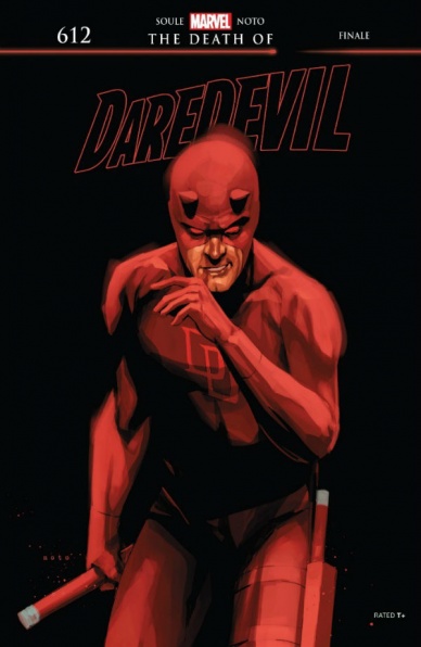
Written by Charles Soule
Illustrated by Phil Noto
Colored by Phil Noto
Lettered by VC’s Clayton Cowles
Reviewed by Gustavo S. Lodi
“Daredevil” #612 marks the end to Charles Soule’s run on the blind defender of Hell’s Kitchen. The tribulations of Matt Murdock, now living in a context where his arch-nemesis, the Kingpin of Crime, is mayor of New York City, comes to a head. This issue is quite special, in more ways than one, so full Spoilers ahead to make this review possible.
Perhaps more than the writer, Phil Noto (drawings and colors) is responsible for a lot of what makes this final entry work. His choice of style, color palette, and even panel diagrams hint early on that maybe not everything is what it seems. And while some indications of the true nature of this last arc had been suggested before, this is where it all stands revealed. Noto excels at showing figures that are not fully defined or rendered, situations that feel just a hair out of place. Even character’s facial expressions and details in the sparkles of one’s eyes come together to deliver a coherent whole.
Soule waves goodbye writing a love letter to what may be Daredevil’s landmark attribute, even more than knowing no fear: his stubbornness. This is a man who will not give up, who is truly unafraid of losing, unafraid of fighting a battle that can never be won. The entirety of “Daredevil” #612 shows Murdock what it would be to win: to decidedly strike a victory in the face of evil. And despite taking that away at issue’s end, it hands him a renewed mission: he can always do more. He can always fight one more time.
Continued belowAs much as a closing cap to his run, Soule finishes his story like few writers do when leaving a character: by handing a blank canvas to the creative team following him. Sure, there are plot points that can be picked up on, but they are no longer a requirement. This is a generous storyteller, treating characters, audience, and peer respectfully.
Final Verdict: 8.5 – An ending to be celebrated, both by the quality of this last issue and by the doors it keeps open going forward, “Daredevil” #612 celebrates the losses and victories of Matt Murdock and how both of them push the hero forward.
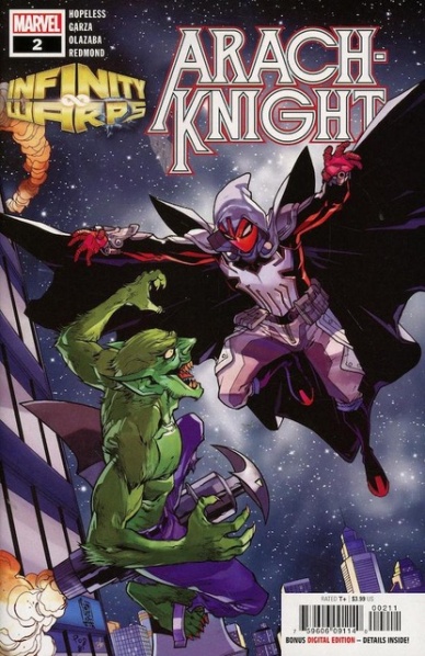
Written by Dennis Hopeless
Illustrated by Alé Garza
Colored by Ruth Redmond
Lettered by Clayton Cowles
Reviewed by Gregory Ellner
Unlike some of the “Infinity Warps” mashups, the Spider-Man/Moon Knight mixture expanded upon by Dennis Hopeless is slow enough, yet detailed enough, to hold its own as a miniseries, as shown in depth with “Infinity Wars: Arachknight” #2. By merging the aspects of the Green Goblin with those of classic lycanthropy tales, Hopeless creates a distinctly different kind of story for our hero.
The only real issue is how Hopeless seems to rely pretty heavily on the “broken” aspects of the Moon Knight mythos, with Peter Parker’s dissociative identity disorder manifesting as a merger between that and schizophrenia in a manner that seems to make “Arachknight is crazy” the main thesis to bring in from the Moon Knight side of things, rather than anything more complex than that.
Alé Garza’s artwork is very dynamic, with an emphasis on fast motion and varied facial expressions both. The former is most evident in fight scenes, but the latter is seen throughout “Infinity Wars: Arachknight” #2 in Peter Parker’s different personalities, with eyes and mouth especially changing significantly depending on if a superhero, a “homicidal narcissist,” or one of the other two personalities is at the fore at any particular moment.
Owing to the fact that the story takes place in the nighttime, Ruth Redmond’s colors are of a relatively dark focus, with gradients of orange and red shifting into dark blues as the color of the streetlights down below fade into the night sky shining down from above. The colors are distinct enough that things like Parker’s relatively “innocent” brown eyes, the red-and-white costume, and the vibrant green of the Goblin-by-Night all are that much more distinct. The blurry, relatively muted colors of Harry Russell’s flashback are recognizable immediately thereafter to keep them separate as well.
Together, the story of the Arachknight, while relatively simple and not without its flaws, still is interesting enough to hold its own as a Spider-Man story, though perhaps not as a Moon Knight one.
Final Verdict: 7.0- Interesting storytelling and intricate artwork merge with well-lain colors to make an intriguing story of the Spider-Man/Moon Knight merger for “Infinity Wars.”

Written by Joshua Williamson
Illustrated by Philippe Briones
Colored by Jeremy Cox
Lettered by Deron Bennett
Reviewed by Alexander Jones
DC’s sci-fi oriented team-up title returns this week within “Justice League Odyssey” #3. The script for this issue is heavily focused on building the team together as a unit. Now that writer Joshua Williamson is done introducing the concepts and ideas behind the issue, it is refreshing to finally see this group of characters function together as a unit. This installment is particularly dense and covers a lot of ground, spending a lot of time establishing relationships between pairs of characters and advancing plot threads readers have seen in past issues.
This installment features art from Philippe Briones. While Briones is a radical departure from the previous artist Stjepan Šejić, Briones lends a more conventional art style to the issue which can be easier to follow. While it is delightful to see such a different take on the art for the title, the inconsistent pencils from Briones can be a letdown. Some panels are incredibly detailed and gorgeous while others come off as rushed or unfinished. Sometimes there are pages within the issue where one panel is gorgeous and the others are less detailed and look like a different artist drew them. The majority of the issue is a solid reading experience that adds lots of detail to the artwork and sci-fi setting of the comic.
Continued below“Justice League Odyssey” #3 is a title loaded with subplots that intersect in a fairly organic manner in the issue. While the title is mainly centered around the core team of heroes, the issue brings in outside aliens and offers a couple teases at what Darkseid is up to. This entry of the title still feels like it is leading up to a larger story involving Darkseid. “Justice League Odyssey” is off to a solid start and now that readers are past the introductory phase of the story, writer Williamson can start to explore the greater themes and ideas that brought the heroes together in the first place. Even though the series is still gearing up towards a bigger story-arc, the newest chapter fleshes out the team and teases big moments for future issues.
Final Verdict: 6.7 – Despite inconsistent artwork, “Justice League Odyssey” #3 briskly establishes relationships between the cast members of the team and a new conflict.

Written by S.M. Vidaurri, Sina Grace, Michael Dialynas
Illustrated by Sarah Webb, Boya Sun, Michael Dialynas
Colored by Laura Langston, Boya Sun, Michael Dialynas
Lettered by Jim Campbell
Cover Illustrated & Colored by Rebekah Isaacs, Dan Jackson
Reviewed by Chris Egan
There has been a resurgence of popularity in some of the most beloved Henson Company fantasy films of the 80s. In both comics and film, we have gotten and will be getting spin-offs and sequels to movies like Labyrinth and The Dark Crystal. Jumping on that wave is Archaia Comics, who have made more than one “Labyrinth” comic. Their newest effort is an anthology issue housing three stories that center on some of the most popular side characters from the original movie.
The first story, ‘The Eternal Tournament’ written by S.M. Vidaurri with art by Sarah Webb and Laura Langston focuses on Sir Didymus. Showing a tournament set up by the Goblin King in which the winner is given a key role in serving the King. Some interesting twists in this decently written story make it the best of the three with kid-friendly adventure and peril. It all ties into how they eventually meet Sarah in the film. Webb’s illustrations take on a manga style that is different than what we typically get with stories set in a Henson universe, but it works well. Langston’s vivid colors are great too, nailing the storybook aesthetic.
‘En Guard’ gives us a peek into how Hoggle met the Goblin King and started working for him within the Labyrinth. It’s set many years in the past, so be prepared to be unsettled by the sight of a young, non-wrinkled Hoggle. Boya Sun’s artwork is decent and also captures a storybook vibe, but it just doesn’t work as well within the walls of “Labyrinth.” The colors are bright but fall flat and the illustrations waiver between just detailed enough and not at all. Bowie’s Goblin King deserves better representation. A cute story, but definitely the weakest (and shortest) of the three.
‘NO!’ follows a lesser known goblin ‘named’ No. As he makes his way through his daily tasks in a life that doesn’t quite fit who he is, he learns of a new way to spend his time and ultimately changes his life. With humor and quirkiness, Dialynas makes a nice little story about changing your station in life based on your instincts and talents. However, since No is a goblin, it is recommended we don’t follow in his exact footsteps when finding our path in life.
Not to be outdone, Jim Campbell does the lettering on all three stories and does a great job changing up his style to accommodate each story and the characters who are speaking. He also does great title cards. Nails it straight through. Labyrinth fans will get a kick out of this anthology. It is cute and funny at times but doesn’t always stick the landing. Fun for fans of the property and works as an all-ages spin-off for parents to read to their kids or for anyone looking to read to their inner child.
Final Verdict: 6.0 – “Labyrinth: Under the Spell” really is an enjoyable addition to the Labyrinth universe, but is aimed at readers who are a huge fan of the film to begin with.
Continued below
Written and illustrated by Sophie Campbell
Colored by Brittany Peer
Lettered by Shawn Lee
Reviewed by Tom Shapira
I am very much behind on the sprawling saga that is the current TMNT series, which is not only eight years old at this point but also has an ungodly amount of spin-offs, of which this (a series of longer one-shots focusing each on a different turtle) is one. You would think that jumping in the middle would be a disaster, but the quality control of that line proves to be ridiculously high – and so I find myself tempted, after this one issue, to just buy the whole thing.
Even if the plot of this issue would’ve been complete nonsense (it is not) I would’ve probably liked it anyway because it is drawn by Sophie Campbell: One of the best artist of her generation. Her mastery of lush backgrounds and lovely character designs, it’s just mind-blowing how much nobility and grace she inserts into anything she draws (even something as initially bizarre as humanoid turtles), is showcased in the battle scene that is the meat of this issue. It’s kinetic, well-choreographed, shows good use of environments and builds to a suitable climax.
But Campbell shows herself to be just a good of a writer as she is an artist – the fight is just a moving part in a more elaborate character study as Leonardo tries to find his place in an uncertain world, in which allies become possible enemies and old enemies must be dealt with in ways other than force. The end of this one-shot is just such a lovely moment, what starts off as a story of revenge turns into a story of brotherhood, which really makes you appreciate how soberly this series takes its protagonists.
Final verdict : 8.5 – Sophie Campbell shows everybody how to get things done.


