
There’s a lot to cover on Wednesdays. We should know, as collectively, we read an insane amount of comics. Even with a large review staff, it’s hard to get to everything. With that in mind, we’re back with Wrapping Wednesday, where we look at some of the books we missed in what was another great week of comics.
Let’s get this party started.
Written by Nick Spencer
Illustrated by Oscar Bazaldua
Lettered by VC’s Joe Caramagna
Colored by Steve Firchow
Reviewed by Michael Govan
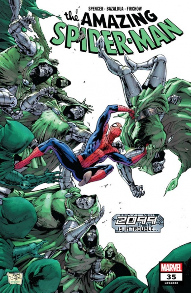
I started losing interest in Nick Spencer’s “Amazing Spider-Man” run back around when Kraven was hunting animal-themed villains for sport. It just wasn’t doing it for me…but it’s Spider-Man so I keep coming back. I keep waiting for things to turn around or for something to click for me but that’s not happening.
Artist Patrick Gleason’s work on the title has improved the book from a visual standpoint at least. “Amazing Spider-Man” #35 however is pencilled by Oscar Bazaldua. While the action scenes can feel kinetic and dynamic, the artwork lacks detail. In the panels with various heroes fighting Doombots, some facial features are missing altogether. There’s a panel of Spidey and Terea where Peter is without webs or even the spider that’s supposed to be on his chest.
This issue features an army of Doombots, spies, a war brewing between nations and a glimpse into the multiverse/future. All very interesting ideas that all feel disjointed and fall flat in this issue. Maybe it’s because the comic is juggling a lot at once so no aspect has enough time to shine. I would be down for a spy-thriller Spidey story, it could be fun seeing him go toe to toe with Doctor Doom but again, there’s a bunch going on at the same time.
Maybe it makes sense if you’ve been following the entire ‘2099’ crossover event they’ve got going on at Marvel. I haven’t followed that issue for issue, maybe that’s why there’s such a disconnect on my end. Another problem is that Chameleon and Teresa Parker are basically the main characters in this issue as well, which is just fine if you like them. Personally, I don’t much care for either. Chameleon, I’m mostly indifferent too but I dread when Teresa shows up. ‘Peter has a secret sister’ was just a bit too much to swallow. Another demerit on an already so-so Spidey title.
Final Verdict: 5.0 – A lot of interesting bits are boring when mixed all together. Oh what a tangled web we weave…

Written by Christos Gage
Penciled by Diego Olortegui
Inked by Juan Vlasco, Cam Smith and Scott Hanna
Colored by Erick Arciniega
Lettered by VC’s Travis Lanham
Reviewed by Alexander Jones
It is worth commending how “Annihilation – Scourge: Fantastic Four” #1 is committed to honoring the legacy of Fantastic Four and serving continuity. The issue is a particularly good study of Johnny Storm’s past with references to his familial relationships across The Marvel Universe. “Annihilation – Scourge: Fantastic Four” #1 eases readers into the elements of the new Annihilation saga while weaving in plot threads with continuity. The story is a light read that should satisfy longtime fans of the property. However, at a certain point, the story feels beholden to what came before instead of blazing a trail forward for superhero comics. I’m incredibly disappointed to not see writer Christos Gage take more chances with the story. Diego Olortegui pencils aren’t quite as refined as I’d like and the multiple inkers on the issue also sends a conflicting message to readers.
Penciler Diego Olortegui’s interiors have potential but aren’t quite up to the Marvel standard just yet. Olortegui’s pencils are on the right track but lack some of the key details and polish to stand among the other more seasoned artists at the publisher. Some of the splash pages and layouts from Olortegui show a lot of potential and make me excited to see what he can deliver in the future. The mundane scenes with unpolished anatomy and facial expressions are still dragging “Annihilation – Scourge: Fantastic Four” #1 down from an artistic standpoint. Sue Storm looks significantly younger than Reed and blends in with Valeria to the point where it can be hard to discern who is who.
Continued belowA major problem with the issue is also how the book is structured. From a pacing standpoint, the script builds up the conflict without crafting a clear resolution. It is also disappointing to see how Gage sets up the heroes and villains for a big fight consisting of them taunting at each other for several pages. Gage introduces a lot of comic book cliches without some of the personality or plot details to make readers able to look past them. While there elements of fun to be had in “Annihilation – Scourge: Fantastic Four” #1, Diego Olortegui and Christos Gage’s script and artwork fall short of the standard set by the original “Annihilation” series. The title does a great job implementing elements from past continuity and the intergalactic conflict but the series forgets to say anything new about Marvel.
Final Verdict: 5.9 – “Annihilation – Scourge: Fantastic Four” #1 is a forgettable Annihilation one-shot that serves its purpose by bringing the Fantastic Four into the cosmic story.
Written by Gerry Duggan
Illustrated by John McCrea
Colored by Mike Spicer
Lettered by Joe Sabino
Reviewed by Christa Harader
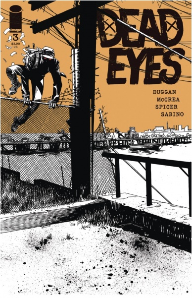
“Dead Eyes” #3 sees our intrepid anti-hero make a payment on his wife’s hospital bill, jam a scalpel into someone’s eye, save Wheels and stumble upon a very interesting opportunity.
Duggan’s character writing is a large part of what makes “Dead Eyes” so compelling, both when it first came out and now, with new content added. He’s a character with a peculiar conscience and a burning drive to save the only person who’s really important in his life, and that kind of flawed hero makes for very interesting storytelling. Duggan knows how to pace out an issue, and McCrea’s art measures it even further. Dialogue’s not necessarily spare, but it’s well-placed and complements McCrea’s work instead of duplicating, or even overriding it. Spicer’s palette is the perfect urban winter dismal, with reedy light sources and darkness that constantly creeps in around the edges. Sabino’s lettering is concise and clear, with good narrative box styling for Dead Eyes and some excellent sound effects.
Overall, “Dead Eyes” is a great book that balances its gritty crime sensibility with black-hole-level dark humor. Duggan, McCrea and the team do excellent work, and this one’s not to be missed. Third issues are hard to pull off, and the team does that and sets up even more tension and action to come.
Final Verdict: 8.0 – “Dead Eyes” #3 continues our adventure with some inventive violence and a lead on Dead Eyes’s biggest score yet.

Written by Rick Remender
Illustrated by Bengal
Lettered by Rus Wooton
Reviewed by Christopher Lewis
The cover of “Death or Glory #7” makes the teenage boy in me excited. There is a girl smoking a cigarette in a bar with booze, guns, and vibrant lights in the background. Everything I thought I wanted at that age. It is fair to say that this cover has nothing to do with the story, however it does establish a surreal feeling that continues past the cover and into the body of the book.
Overall Bengal’s art is the highlight of this entire issue. Each page is visually stunning and pops due to a color technique he uses that presents colors with bright auras, like neon lights. Another interesting aspect of Bengal’s art is he picks an anchor color for each page, applies varying hues and shades of the anchor to the page, and then changes the anchor color in the following scene. While changing color schemes between scenes is not atypical, it is typically done with the intent of creating color language, which doesn’t seem to be happening here as the color changes appear to be random. This coupled with the neon lighting effect, propagates the surreal feeling noted when looking at the cover.
The main narrative of “Death or Glory #7” is essentially a staging issue moving the main story forward toward a climax at the end of the book. There is not much character development, just the motions of Glory’s group trying to get into Mexico unscathed. However, based on how Rick Rememder ended the story, it is obvious that the next issue is going to have a lot of action.
Continued belowFinal Verdict: 7.0 – “Death or Glory #7” is a fine book worthy of checking out, at a minimum just to check out Bengal’s art.
Written by Christopher Cantwell
Illustrated by Salvador Larroca
Colored by Guru-eFX
Lettered by VC’s Cory Petit
Reviewed by Joe Skonce
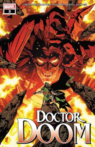
Doctor Doom is one of those characters that works. He came onto the scene fully realized, a tyrant who was also a genius-level scientist (oh and also a wizard, don’t forget that he’s a wizard!) While mostly known for his evil schemes, Doom also remains nuanced. He’s a ruthless leader, sure, but has also given a better life for his own Romani people. He’s even worked with his enemies to do good in the world (though it’s often out of arrogance of his own self-superiority.) Doctor Doom will always work at his most simplistic level. But if you add some nuance to the character, that’s when it gets really special. In “Doctor Doom” #3, Christopher Cantwell writes a Doom that pays homage to classic stories but is memorable in his own right.
In “Doctor Doom” #3, we see distinct sides to Doom. He is ruthless and arrogant, but there is also a level of vulnerability and sadness. The majority of the issue is in Hell, allowing Cantwell the opportunity to showcase both of these sides. His interactions with Mephisto show a man who is not only unafraid to face the Devil but to literally punch him in the face. But his interactions with Valeria show how haunted he is by his past to be the best. The issue begins with a flash-forward, or maybe even a fantasy, of a reformed von Doom, the savior of humanity. The rest of the issue shows the lengths he’s willing to take for something that might not be more than foolish hope.
Christopher Cantwell does an excellent job writing Doctor Doom, but Salvador Larroca’s art proves to be a great collaboration for the comic. One of the most powerful panels of the comic comes when Doom is talking to Valeria. Throughout the page, Doom’s eyes are hidden by shadow or have an unnatural light to them, but one panel is incredibly close to his face. She is issuing a final challenge to Doom, give up his quest to save the world and embrace her love. His eyes are haunted and broken. The rest of the art, too, is spectacular. The images of hell look like old metal album covers, full of fire, skulls, and jagged edges. His action plays with page layout, showcasing a fight in silhouettes that run through the page, suggestion action beyond what the panels are displaying. Even his dialogue scenes are dynamic, playing with space and perspectives. It’s all very impressive and worthy of the good Doctor.
Final Verdict: 8.7 – A strong entry into the continued evolution of one of Marvel’s best characters, showing a haunted man behind all of the arrogance and bravado.

Written by Collin Kelly and Jackson Lanzing
Illustrated by Carlo Barberi
Colored by Protobunker
Lettered by Tom Napolitano
Reviewed by Gregory Ellner
The “gen:LOCK” limited series is, at its core, a continuation taking place after the first season of Rooster Teeth’s animated series. With “gen:LOCK” #2, Jackson Lanzing and Collin Kelly drive the mecha series into territory that is both new for fans of the series and both simple and accessible to allow an easy way in for readers who are new to the characters and story arc. Certain elements are changed, primarily in regards to the use (and disuse) of verbal profanity, but none of it has a serious negative impact on the story itself, and can be overlooked in the vein of a larger reading audience.
In terms of the writing itself, Lanzing and Kelly manage to effectively mix action and comedy on top of delving into the further mature themes of the eight episode season, effectively using the myriad voices of the gen:LOCK team on top of utilization of new, albeit relatively simple characters such as General Anno. A large part of the fun is in how the writers play these different personalities off of one another, creating a sense of not only teamwork, but also a kind of family amongst the heroes.
Continued belowCarlo Barberi’s artwork is highly animated, fitting right in with the action heavy world of “gen:LOCK.” The thick lines on some faces help to showcase the humanity of our heroes, while the thinner ones on the antagonist of “gen:LOCK” #2 reduce what little warmth could have hypothetically been gained. Anno’s thinner linework contrasts against less overtly villainous characters’ greater similarity to the gen:LOCK in terms of line thickness, showing Barberi’s mastery of tone.
Meanwhile Protobunker’s coloring is very lively, but may rely too heavily on gradients, and not enough on sharp switches in color. All of the characters seem too smooth, as if they were fresh into training instead of being hardened soldiers. In making for an overuse of gradient techniques, Protobunker makes it that much harder to identify with the group as actual people instead of perfect statues who just happen to move and talk.
Final Verdict: 6.75 – The artwork and writing are fairly well done, but too-perfect representation of people through the coloring techniques hold back “gen:LOCK” #2 a significant amount.
Written by Greg Rucka
Illustrated by Mike Perkins
Colored by Gabe Eltaeb
Lettered by Simon Bowland
Reviewed by Quinn Tassin
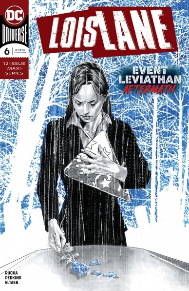
Lois Lane is human. On one level, it’s painfully obvious but it’s also easy to forget all the same. Lois is often portrayed as smart and courageous and strong and independent and unflappable; she’s everything we all want to be on our best days except always. So what happens when the best human, the human every human wants to be, the human Superman wants to be, experiences loss? Greck Rucka answers that question to stellar results in “Lois Lane #6.”
This series, up to this point, has benefitted from a mix of Greg Rucka’s penchant for writing dynamic female characters and a character as relevant to the current moment in American politics and culture as any superhero is. This issue, though… this issue takes things to another level. Because sometimes a dad dies, and sometimes his daughter, no matter how famously strong is, breaks.
“Lois Lan #8” deals with the fallout of “Event Leviathan,” specifically what a grieving Lois Lane looks like. At the funeral, it looks like stoicism and introspection. In Arlington Cemetery, Lois sits with Clark and Jon, people give her condolences, cannons fire, an army band plays, and she remembers what it was like to be Sam Lane’s daughter. She remembers fighting about staying out late; she remembers fighting about Superman; she remembers fighting about A.R.G.U.S.. Then she refuses to accept a flag in his honor which means she fights with her sister.
Mike Perkins and Gabe Eltaeb bring a stellar sense of tone and emotion to the whole issue. Every memory Lois has of Sam feels tragic. Every frame of the funeral bleeds sadness. It’s not clean art or bright colors but there’s nothing clean or bright about “Lois Lane #8.”
The last few pages bring us the worst (best?) part of the whole issue. Lois has her most important memory- the fight she finally won. After Lois reveals that Clark is Superman, Sam realizes that if it’s important to his daughter, he can be okay with the Man of Steel. Lois finally cries and Clark holds her and the issue ends. It’s grounded and real and emotional. It’s a far cry from the conspiracy story we’ve been following but it’s one of the best comics you’ll read this year.
Final Verdict: 9.0 – A beautiful issue of “Lois Lane” shows us what happens when the strongest character in DC grieves.
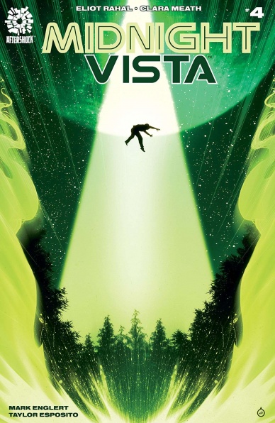
Written by Eliot Rahal
Illustrated by Clara Meath
Colored by Mark Englert
Lettered by Taylor Esposito
Reviewed by Kobi Bordoley
“Midnight Vista” #4 expands the scope of Oliver’s journey, seamlessly adding new colors, lettering styles, and plot elements to the story. Until now, our perspective has mostly been in New Mexico and an unnamed, unknown alien ship (location? dimension?). While the ship remains somewhere out of reach, the rest of the story has moved on to Los Angeles and The Children of the Stars Wellness center — yes, your Thetan levels should have upticked after reading that.
Continued belowRahal’s writing does not disappoint, and his plotting and characterization hold strong after the initial rising action in “Midnight Vista” 1-3. Oliver, the wide-eyed, naive but reasonably paranoid protagonist, maintains his unique voice of wariness and hopefulness as he faces new challenges and old traumas. Esposito needs some praise for his lettering in this issue, as the handwriting font used for Oliver’s journal narrations go far in capturing his youthful energy. Most potent, however, are Oliver’s interactions with his captors on the alien ship, shown in flashback and which make up a solid portion of “Midnight Vista” #4.
These extraterrestrial vignettes in “Midnight Vista” #4 accomplish so much. To start, the design here is impeccable. Panel edges ebb and flow, bending away from the usual rigidity of square, retangular, or angular panels. Sometimes panels open and close in a surprising way, filling pages with moments that are loosely organized but still fully understandable. Format fits narrative perfectly here, as the uneven, slanted panel lines heighten the feeling of alien-ness inherent in the setting.
Mark Englert’s colors also do wonders in terms of setting a tone. While the first few issues of the series used frantic reds and pinks in the moment of Oliver’s abduction, those colors have been replaced or supplemented for starker blues and turquoises now that the alien scenes are more placid. The colder color palette still feels uncanny, but more evocative of Olver’s prolonged loneliness away from Earth.
“Midnight Vista” #4 gets the job done from a story, art, and colors perspective. We didn’t even get a chance to cover the humor, but it’s in here too. Here’s to hoping momentum sticks as it enters the second half and end of it’s first arc.
Final Verdict: 8.3 – This UFO abduction story hasn’t lost its shine, and goes beyond the tropes to deliver something fresh and sharply told.

Written by Walter Simonson, Tom DeFalco, Kathyrn Immonen
Illustrated by Mike Hawthorne, Tom DeFalco, Ron Frenz, Tom Reilly
Inked by Sal Buscema, Keith Williams
Colored by Tamra Bonvillain, Rachelle Rosenberg, Chris O’Halloran
Lettered by John Workman, VC’s Clayton Cowles
Reviewed by Matthew Blair
To celebrate Marvel’s 80th anniversary, the company has been releasing anthologies based around some of its biggest characters created by some of its most famous and prominent talent. “Thor the Worthy” #1 is Thor’s anthology, or more specifically an anthology about the people who have been deemed worthy to wield the power of Thor but who are not the actual son of Odin.
“Thor the Worthy” #1 is a collection of three short stories about Beta Ray Bill, Eric Masterson aka Thunderstrike, and Jane Foster’s Lady Thor. There’s a huge collection of talent on display and the stories cross such a massive period of time that the book itself is difficult to review in such a short space. The stories have a little something for every Thor fan, from the crazy blend of space aliens and fantasy with Beta Ray Bill, to the over the top 90’s action of Thunderstrike, and the introspective identity crisis of Lady Thor. Simonson, DeFalco, and Immonen are all great writers and the stories are great little character pieces for the comics that defined each writer’s run on the Thor comics.
The artwork on each of the “Thor the Worthy” #1 stories joins the writing in helping create a sort of time capsule for Thor through the decades. Mike Hawthorne does a good job of juxtaposing a pastoral fantasy scene with magic van style fantasy illustration and Tom Reilly has some great action with Sif and Lady Thor, but they are modern artists with modern sensibilities and as a result, the stories do kind of look the same. Out of all three of the stories, the one with Thunderstrike is probably the most unique, with DeFalco and Frenz adopting the classic, over the top 90’s style of hyper stylized poses and big guns with tremendous gusto.
“Thor the Worthy” #1 is a fun little time capsule into some of the more esoteric and weird characters that have been introduced into the Thor mythology who are all united under the theme of what makes each of them worthy. It’s a thoughtful and well put together anthology that is a worthy addition to the collection of anyone who is a Thor fan.
Final Verdict: 8.7- A fantastic book for Thor fans and a great tribute to over eighty years of stories and characters that would have never worked anywhere else.


