There’s a lot to cover on Wednesdays. We should know, as collectively, we read an insane amount of comics. Even with a large review staff, it’s hard to get to everything. With that in mind, we’re back with Wrapping Wednesday, where we look at some of the books we missed in what was another great week of comics.
Let’s get this party started.
Written by Jeremy Barlow
Illustrated by Doug Wheatley
Colored by Rain Beredo
Lettered by Michael Heisler
Reviewed by Chris Egan
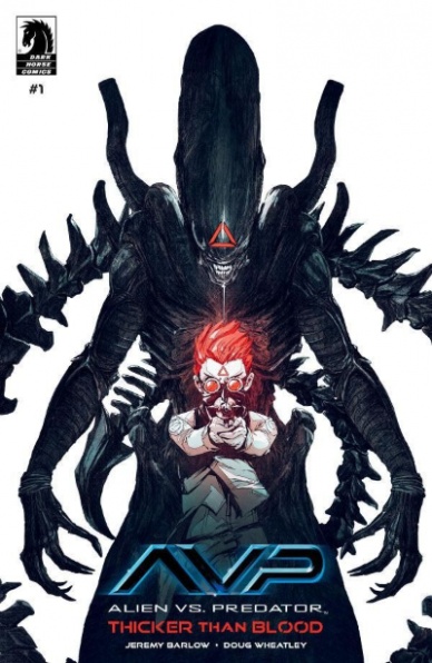
Jeremy Barlow’s first foray into the Alien/Predator universe is a refreshing one. There are no marines or super-soldiers, no smugglers, or inmates fighting for their lives in a derelict ship or backwater planet. We rarely see the well-off or elite in these franchises and if we do, it’s in an extremely minor capacity, but in ‘Thicker Than Blood’ #1, the action kicks off on a cruise liner, making its way through the galaxy with rich families on a luxury vacation.
This premiere issue is more Predator, than Alien oriented and it was definitely the way to go in this instance. Barlow’s story makes the Predator not only quite scary again, but we get one who is taking out civilians instead of burly, gun-toting mercenaries who can normally take care of themselves without question. It is great to see a Predator as a full-on monster again. It isn’t the hero of the story, and it isn’t some pseudo-partner battling xenomorphs alongside a human protagonist, as seen in the first Alien vs Predator flick. This is a run-for-you-life plot with disgusting set pieces sprinkled throughout. And the final reveal is a worthy payoff.
Like Barlow’s script, Doug Wheatley’s pencils are also a new take on these comics. A new setting, and a new type of cannon fodder means, a whole new way of looking at AvP artwork. Clean and open, his illustrations fully capture the everyday blended with the horrific in a way that is rarely, or never seen in these franchises. His details and characterizations are well done and truly beautiful to look at. Paired with Rain Beredo’s gorgeous and bright color work, nothing is left to the imagination. We get every detail, whether mundane or bloody as hell, his palette perfectly shifts to truly express what is on the page and what the story is trying to convey.
Brutal and gory, this first arc follows a couple of kids as they make their way through the ship to escape the horrible fate of those around them. Thinking there is no way something worse than this monstrous hunter is aboard, they have no idea what terrors lie ahead. This is a great start to a whole new type of storytelling in this shared universe and one of the better “Alien vs Predator” comics to come out in some time.
Final Verdict: 8.0 – Another scathing criticism of luxury cruise vacations.
Written by Angelo DeCesare and Dan Parent
Illustrated by Pat & Tim Kennedy and Bill Golliher
Colored by Bob Smith
Lettered by Jack Morelli
Reviewed by Quinn Tassin
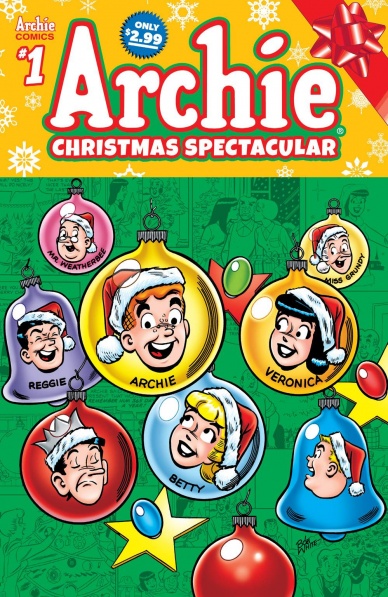
Some people complain about comics not being escapist enough for their taste. Well boy howdy they should be happy that the “Archie Christmas Spectacular” exists. This book tells four short stories about Christmas in the town of Riverdale and the results bring us varying degrees of Archie, Christmas, and spectacular.
Angelo DeCesare tells two simple stories. In the first, Mr. Weatherbee kills the Archie, Betty, Veronica, and Jughead’s Christmas spirit at school to try teaching them a lesson about being responsible. Then on the way home from school, Archie finds and inflatable Santa which promptly floats away and follows Weatherbee’s car which makes him think he’s being haunted for his aforementioned sin. To repent, he takes drastic action taking a job as a mall Santa. Archie? Check. Christmas? Check. Spectacular? Sure.
The second is more banal and once again nice and classic. Betty and Veronica get too competitive in a cookie baking contest. Veronica has a professional chef to bake her cookies. Betty bakes a cake. Jughead likes eating all of it. Nice! Classic! Archie? Not much. Christmas? Technically. Spectacular? Not so much.
Continued belowDan Parent’s two stories are- and I cannot stress this enough- deeply weird. In the first, Archie agrees to take a fairy named Sugarplum to the Holiday Dance after he gets blown off by Betty and Veronica. Then at the dance, Noelle, Santa’s daughter shows up because Archie invited her last year. Once the ladies find out about his split loyalties, they make him stand in a pile of snow and pelt him with snowballs. This is absolute insanity. Archie? Check. Christmas? Check. Spectacular? Oh yeah.
Parent’s second tale follows Santa after his sleigh breaks down on top of the Lodges’ house. Santa gets invited for dinner then gets caught up singing carols and doesn’t want to go back to delivering presents. On the one day a year, he has a job. It’s weird, folks! Archie? Check. Christmas? Canceled apparently. Spectacular? Absolutely.
How does one review this more? The art is consistent, classic, calming Archie Comics art all issue long. The character voices all sound right. But look- “Archie Christmas Spectacular” is a weird comic.
Final Verdict: 8.0 – “Archie Christmas Spectacular” lives up to the title, just not in the ways you think.
Written by Bryan Edward Hill
Illustrated by Dexter Soy
Lettered by Clayton Cowles
Colored by Veronica Gandini
Reviewed by Michael Govan
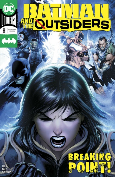
I have to say that I really enjoyed this issue. In the past few issues, it felt like the story was slow to start but now it’s firing on all cylinders. Bryan Edward Hill and Dexter Soy make sure that this comic is a great showcase for every character. Al Ghul is a genuinely intimidating threat, his presence felt even when the villain is off the page. You can see it in the way that he has hurt the Outsiders and left them trying to pick up the pieces, how he’s affected Sofia so severely. When he speaks, each word is purposeful and chilling. In the final pages, the Demon’s Head makes yet another devastating move against the team. He’s trying to shatter them completely and you have to wonder if he’ll actually be successful.
Duke Thomas and Cassandra Cain have formed a close bond as well. They’re both in a vulnerable place but lean on each other for support, which is refreshing to see. On the other side of the coin, Batman is still reeling from the drama unfolding in his own comic and is retreating farther into himself. The character is no stranger to tragedy but still Hill makes you feel for Bruce when another one is heaped onto him. His warming to Black Lightning sadly foreshadows the end and makes those final pages all the more impactful.
The star of the comic though is Black Lightning, without a doubt. Batman may get top billing but Jeff is the one that has been putting in all the work. He’s looking after the younger members of the team and consoling Batman at the same time. He’s a great leader, mentor and friend. Dexter Soy also gives the character a memorable feat, allowing him to flex his power and destroy an entire airplane to keep it from crashing into Gotham. It’s cinematic and undeniably epic. Those pages warrant revisiting and boldly demand your attention. This title is doing the same.
Final Verdict: 7.5 – “Batman and the Outsiders” are charged up in this latest issue.

Written by: Steve Niles
Illustrated by: Gyula Németh
Lettered by: Nate Piekos of Blambot
Reviewed by: Christopher Lewis
It has been five years since the last time a Criminal Macabre story has been published. This new installment is a four-issue mini-series with art from newcomer Gyula Németh.
The first issue of “Criminal Macabre: The Big Bleed Out” is a flashback story. Mo’Lock finds Cal McDonald disheveled, and then Cal recants what happened to him. The story is narrated through Cal’s internal monologue, which has a cadence like a quintessential classic 1920’s pulp detective story. Honestly, the overall narrative feels like a trope that has been told too many times before where the investigator goes for the wrong “dame.”
Continued belowNémeth’s artwork works for “Criminal Macabre: The Big Bleed Out.” He does a great job on the woman and Cal’s facial expressions showing their want for each other. Nate Piekos’s coloring establishes a simple color language breaking up each scene with a different primary color palette. Outside are yellows, inside Cal’s house and underground are blue, and vampires are red. This is an area I wish Peikos would have stepped up as moving outside of primary colors could have given the story more complexity.
Final Verdict: 5.5 – “Criminal Macabre: The Big Bleed Out #1” is a lackluster beginning to a new mini-series.

Written by Matt Kindt
Art, Colors, and Letters by David Rubin
Reviewed by Kobi Bordoley
“Ether: The Disappearance of Violet Bell” #4 continues Boone Dias and his companion’s journey through shifting worlds that resemble something between Dragon Ball Z’s endless sandbox landscapes and Jean Giroud’s weird, gritty and surreal architecture. (Yes, this is a wide gulf stylistically, and how Kindt and Rubin pull it off is beyond me–but hey, it works and I’m just calling it how I see it.) “Ether” #4 is a dynamic, penultimate issue in the soon closing miniseries — but is not without a few story pacing issues.
To me, dynamism in comics is best described as when Different Things happen in Quick Succession, and the outcome is an Aesthetic Variety that Works. In the context of “Ether,” it means that the mixture of panel design, lettering, and color, while constantly changing, consistently kicks ass. The opening action sequence involves full-page splashes split vertically into thirds, adding a sense of scale and height that evokes danger and movement. While this is happening, in-sets within the panel highlight key visual moments. Soon after, the action dies down but we’re thrust into a flashback that still feels on pace with what’s come before, which is made possible by Rubin’s total mastery of the page and layout. Here, characters jump between panels as if the boundaries between them are cracks in a sidewalk. The art in “Ether” is zippy, fresh, and bolstered by the funkiest greens and a dash of chartreuse. It’s an all-in play on the sci-fi schlock that really glues things together.
Clearly, when the art and design lead the story, things work well. Unfortunately, when the action comes to a standstill, things really feel still. This isn’t to say the narrative is particularly weak, just that when a world is as rich as the one in “Ether,” and a miniseries is only five issues long, why stay in place too long? For example, a lot of narration happens while all the characters stand in place, for just a few panels too long while the setting remains unchanged. Only here does the issue seem to drag or feel uncharacteristically stagnant.
Regardless, “Ether: The Disappearance of Violet Bell” #4 is a solid issue, covering necessary plot points while dropping some expertly executed action. If the story lags at times, it’s only because everything else hits so hard. If you’ve gone this far into Kindt and Rubin’s world, what happens here will meet your expectations and whet your appetite for what comes next.
Final Verdict: 7.8 – “Ether: The Disappearance of Violet Bell” #4 has ozone energy. It’s electric, kinetic, and pulsing with life.

Written by Robert Venditti
Penciled by Pat Olliffe
Inked by Tom Palmer
Colored by Jeremiah Shipper
Lettered by Starkings and Comicraft
Reviewed by Tanveer Kalo
This issue marked the debut of Hawkwoman in the series and a deeper exploration of the Sky Tyrant. Both aspects provide strong tension for the Carter Hall and move the plot to new heights.
Hawkwoman makes her debut in this issue and it’s everything Hawkfans want. From her action scenes against the Sky Tyrant to Carter Hall’s narration on the importance of their relationship. The creative team sets the stage for Hawkwoman’s role in bringing Cater back.
This issue further explored the mindset of the Sky Tyrant. His fear of dying is the reason behind all of his actions as Carter explained. The Sky Tyrant kills to live forever. Ultimately, the quest for immortality or eternity drives the Sky Tyrant insane. On the other hand, Carter tries to repay the debut of killing billions as Ktar the Destroyer by saving people. Venditti’s dialogue between Carter and the Sky Tyrant acts as one person talking to himself and two people talking. It provides a unique perspective on Hawkman as a whole and his mental/emotional state.
Continued belowThe creative team continues to give readers, especially Hawkfans everything they love about the character. Under Venditti’s helm classic and new elements of Hawkman are thoroughly enjoyable.
Final Verdict: 7.8 – Hawkwoman’s appearance and the Sky Tyrant’s plans are just what readers need to pick this issue up.
Written by Paul Tobin
Illustrated by Arjuna Susini
Colored by Vittorio Astone
Lettered by Saida Temofonte
Reviewed by Christa Harader
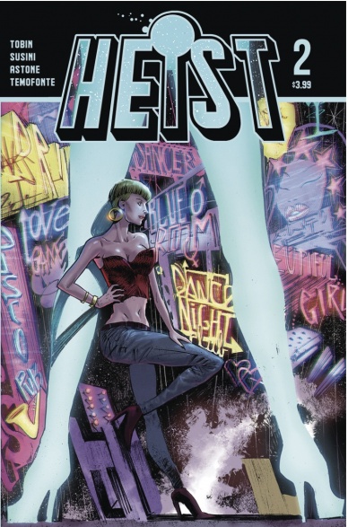
“Heist” #2 build out some of the promised weirdness from issue #1, to good effect. Tobin lets the story meander a little, and in a second issue it makes more sense to establish shifting POVs and trip in between locations now that we’re a little more settled. Still, there’s something about “Heist” that feels unformed or rushed, and a lot of that has to do with Susini’s line. There’s more joy in this issue, and Susini peppers the world with great background characters and concepts, but there’s a lack of control that does not feel intentional. And, the cartooning adds a silly edge that, although amusing in itself, doesn’t necessarily work with the deadly serious tone of the previous issue.
Astone’s colors work, though we’re not treated to the sumptuous washes and gradients he’s capable of within Susini’s crowded backgrounds. Instead, Astone picks pops here and there – a piece of clothing, a wall, a flash of neon on the street – to get at the nighttime grit of the seediest planet imaginable. Temofonte has a packed script to contend with, again, but does well in the narrative box styling and placement. Tobin’s dialogue is dialed back here, so there’s less pressure on Temofonte to make it all work.
Overall, “Heist” #2 adds a delightful edge of lunacy to the too-serious first issue. Tobin and Susini are trying out a lot of things with a looseness that nets a few laughs, but the narrative still feels chaotic and unformed. We’ll have to wait and see if we land when we need to land amidst the buzz.
Final Verdict: 6.5 – “Heist” #2 lets the reins slip a little for more Euro-style weirdness, but lacks a center to fully grip its audience.
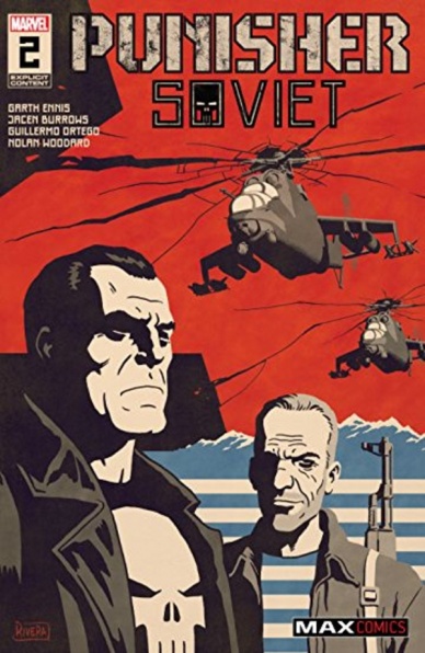
Written by Garth Ennis
Illustrated by Jacen Burrow
Inked by Guillermo Ortego
Colored by Noland Woodard
Lettered by Rob Steen
Reviewed by Matthew Blair
“Punisher Soviet” #2 is something of a return to form for Marvel’s favorite mass-murdering vigilante, as evidenced by the return of long-time Punisher writer and fan-favorite Garth Ennis. The twist this time is that Frank has what looks like an ally and friend named Valery Steponovich in his quest for violent justice, and Valery is basically a Russian version of himself.
“Punisher Soviet” #2 opens with a hyper-violent shoot out in a bar and then quickly transitions into Valery’s origin story. It’s a well laid out comic and Valery is an interesting character that mirrors Frank in so many ways, the difference is that Valery cut his teeth in Afghanistan while Frank went to Vietnam. Ennis injects the story with a great combination of ultra-violence, black humor, and a rugged sense of pessimism that defined his run on the Punisher back in the 2004 ‘Punisher Max’ series and presents the reader with solid, well-written characters that almost have no right to be in such a violent book.
Jacen Burrow’s artwork on “Punisher Soviet” #2 looks deceptively simple at first glance but works well for the story. Sure, the comic delivers all the necessary blood and gore that is expected from a modern Punisher comic, but the simple line and focus on the characters at the expense of the background allows the characters to pop and deliver a lot of great subtle emotion that really gives a sense of their personal thoughts and feelings. It actually lets the reader feel like Frank has actual emotions behind his near-permanent scowl, which isn’t an easy task to accomplish.
“Punisher Soviet” #2 is a return to the small, brutal, and nasty world of violent crime and mass murder that is perfect for the character. It’s an intriguing story with characters that are surprisingly nuanced and a simple art style that allows for great emotional moments next to some incredibly violent imagery.
Continued belowFinal Verdict: 8.8 – Long time Punisher fans will love this return to form for their favorite mass-murdering vigilante.

Written by Patrick Kindlon
Art by Stefano Simone
Lettered by Hassan Otsmane-Elhaou
Reviewed by Rasheda
Provo has come up with a brilliant new product to merchandise and plans to present to the shareholders of his company. Nussbaum is caught off guard by the people living underground, which turns into a fight to live. Two of Caucasus plan to leave the company, with some resourceful information.
The third in this series is playing out almost like Dante’s Inferno, maybe that is why it is titled ‘Religious Experience’. Patrick Kindlon is taking the three different stories and portraying like a different circle in Hell. You have Greed, with Provo wanting to capitalize on a subject that is heinous and in some eyes, blasphemous. Greed can also explain the two employees wanting to venture out on their own away from the Caucasus. Kindlon does not expand on this story, which makes you wonder why it even was put in this chapter. The fight had bay Nussbaum plays center-stage to this installment and can be represented by Wrath/Violence. Kindlon sees Nussbaum as the hero, so he gives him a lot of dialogue that goes a little overboard.
The art by Stefano Simone is dreamlike with color tones that fit the mood of each action. Simone’s use of red lends to the anger with Nussbaum, cool purple for the cavalier attitude Provo has and the cool blue for the two employees ready to bail. The way Simone illustrates the character is loose, almost in the form of sketching movements. The imagery is nice, but for some reason gets messy, not sure if that is a sort of mind trick to convey chaos. Speaking of chaos, Hassan Otsmane-Elhaou’s lettering is great, however, some of the speech bubbles were created and feels like Otsmane-Elhaou had to fit all of the talks within. In some panels, it is bunched and crammed, which makes it hard to read at times.
This issue doesn’t make me want to go out and get the series in my pull box but I am curious to see how it continues.
Final Verdict: 6.0 – Random panels and chaotic story, maybe we should wait for a liquidation sale to buy the series.

Written by Simon Spurrier
Illustrated by Caspar Wijngaard
Colored by Lee Loughridge
Lettered by Joe Caramagna
Reviewed by Gregory Ellner
Sooner or later, the story of Doctor Chelli Lona Aphra had to end. Technically speaking, that time has not yet come (what with her getting another ongoing from #1 next year), but nonetheless, the time between A New Hope and The Empire Strikes Back was still going to have its limitations. Where does Simon Spurrier leave our rogue archaeologist, our tech criminal?
With a return to basics. Aphra has never been one to learn from her errors on a long-term basis, and while she has some new tricks to get out of this latest bout of trouble, it is, as ever, relatively by the skin of her teeth. Unfortunately, this is accomplished through some seemingly out-of-nowhere plot development just to wrap up some loose ends, but short of just finishing her off and being done with it, the final chapter of ‘A Rogue’s End’ would have needed this kind of writing due to previous work.
Making up for the less-than-stellar plotting is Caspar Wijngaard’s artwork. The menace of Darth Vader and the relative helplessness of Aphra both are played up significantly, from her playful smirks or sorrowful expressions to his use of body language to show his progressively unleashed utter fury. Wijngaard’s lack of pupils for Aphra may be a bit difficult to see beyond given she is the primary organic face visible throughout, but the dynamic style of everything else helps to render that decision a relative nonissue.
Lee Loughridge’s colors emphasize the blood-red of photo-cellular eyes such as those on Vader’s mask or the circuits of Aphra’s companions, increasing the air of foreboding they already portray with their black metallic bodies. Furthermore, holding the crimson up against the other reds of a horrifying past provides a distinct contrast against the simpler browns and whites around Aphra herself and the cool colors of the cavern in which they find themselves. In so doing, Loughridge shows how unnatural the mechanical elements of the story truly are in the face of the nature around them.
Continued belowFinal Verdict: 6.75 – The story of the pre-Empire adventures of Doctor Aphra may rely upon shock over clever revelations, but the artwork and colors make up for it.

Written by Brian Michael Bendis
Penciled by Ivan Reis
Inked by Joe Prado
Colored by Alex Sinclair
Lettered by Dave Sharpe
Reviewed by Kenneth Laster
The mad lads did it! They revealed Superman’s identity and…it was done pretty well. Brian Michael Bendis, Ivan Reis, Joe Prado, Alex Sinclair, and Dave Sharpe provide a monumental but soft-spoken moment in “Superman” #18 which promises to be a major change in the status quo.
Bendis’s tendency towards a casual tone is “Superman” #18’s biggest strength. The issue is bookended by the press conference where the big reveal is announced but the main bulk of the issue is Clark coming to this decision and confiding in those closest to him. Then the issue concludes with a really strong speech about the decision in front of the world.
“Superman” #18 is a very quiet issue and I think Bendis’s decision on that makes this reveal even stronger. In the past, secret identities have always been revealed through a malicious force with bombastic headlines but Bendis puts the agency in Clark’s hands. Secret identities are a tried and true staple of the superhero genre and they are going somewhat by the wayside which is sad, but in a brief conversation with Adam Strange and in the press conference Bendis makes the case that Superman, as he is right now, and as a representative of truth doesn’t necessarily need to maintain that secret. He’s carved out the life he wanted to live and he’s proud of it. “Superman” #18 assures us that Clark Kent is still important by having Superman say, “My life as Clark Kent is something I’m deeply proud of” and that this reveal is not erasing that but sharing it. Bendis is known for his reliance on words and dialogue but in “Superman” #18 he uses the right ones and sticks the landing.
Reis, Prado, Sinclair, and Sharpe do excellent work to pull off “Superman” #18. Reis and Prado really sell the sincerity in this issue through exceptional acting through the characters. The two do so well at capturing a vulnerability on Superman’s face that empathizes the weight of his actions. The strongest page in the book by far is Clark’s revelation to Perry White. There are six vertical panels that depict a wordless conversation and Clark revealing the “S” to Perry. In the final three panels, Reis and Prado are able to do so much with so little. The gesture of Perry’s hand-sell the shock and the breath knocked out of him. Perry’s reaching out to Clark gives off a sense of amazement, and the final hug between the two give off a familial acceptance that is extremely resonant.
“Superman” #18’s strength is that it takes its time with what it’s trying to do. Most big moments focus on the how and the wow factor, but “Superman” #18 gives the reasons why this move makes sense and puts the agency in the character’s hands. There will be new stories that come from this, but it doesn’t come off as a gimmick. If this is to be the new status quo for Superman, then “Superman” #18 has earned it whether we like it or not.
Final Verdict: 8.9 – “Superman” #18 had the huge task of changing the status quo of an 81-year-old character and managed to pull it off.

Written by Scott Snyder and Charles Soule
Illustrated by Giuseppe Camuncoli and Daniele Orlandini
Colored by Matt Wilson
Lettered by CRANK!
Reviewed by Joe Skonce
“Undiscovered Country” #2 feels very much like a spiritual successor to Lost. It’s a comic that features a large ensemble cast of characters; characters isolated from the rest of the world with no real means of escaping their fate. It’s also a comic that takes full advantage of the flashback, slowly revealing information to us about the cast of characters. As we learn more about the situation, we are also learning about the motivations (and secrets) of our band of heroes. It’s an incredibly effective way to tell a story and build mystery, not only about your post-apocalyptic America but about your team as well. In “Undiscovered Country” #2, Snyder and Soule begin to expand their intriguing world and begin to show us just who this team of explorers really is.
Continued belowThe major theme of “Undiscovered Country” #2 is trust. There was an awkward and uneasy trust in “Undiscovered Country” #1, when the mission was still simple. But as issue two progresses, we begin to see the facade of civility dwindle away. While Charlotte, the team doctor, is motivated by helping people and Ace, the historian, is motivated by learning about America, the real meat of the issue lies in Daniel. Through flashbacks, we learn that Daniel was approached independently by both of the politicians on the crew, showing that the alliance is not as trusting as it originally seems. Snyder and Soule do a good job of slowly revealing the information to us, while also giving away the ending in the very first page. Daniel is no stranger to the double-cross.
While the writing feels inspired by Lost, the art of “Undiscovered Country” #2 is very much presenting an American aesthetic of Mad Max. This is especially true of the design of the “Destiny Man” and his lair. “Destiny Man’s” mobile fortress’ first level is a Wal-Mart for cryin’ out loud! How much more American can you get? Giuseppe Camuncoli and Daniele Orlandini’s design of the Destiny Man is cool, but also haunting. Who is behind that mask? Another impressive piece of illustration is “The Wall.” The page does a lot of heavy lifting, showcasing the horror of the “Destiny Man’s” punishment to those who defy him. The art of “Undiscovered Country” #2 has so much history and character that it really helps to sell the mystery of what happened to America.
Final Verdict: 8.9. Snyder and Soule do a great job of baiting the hook in “Undiscovered Country” #2. Combine that with a Mad Max America, and you have a special book on your hands.


