
There’s a lot to cover on Wednesdays. We should know, as collectively, we read an insane amount of comics. Even with a large review staff, it’s hard to get to everything. With that in mind, we’re back with Wrapping Wednesday, where we look at some of the books we missed in what was another great week of comics.
Let’s get this party started.

Written by Nick Spencer
Illustrated by Gerardo Sandoval and Ze Carlos
Additional Inks by Victor Nava
Colored by Morry Hollowell, Brian Reber and Andrew Crossley
Lettered by VC’s Joe Caramagna
Reviewed by Alexander Jones
Nick Spencer, Gerardo Sandoval and Ze Carlos attempt to tie all the loose threads of the 2099 one-shots together for a big finale. “2099 Omega” #1 features multiple inkers, pencilers, and colorists and struggles to stay focused on an artistic and scripting standpoint. Spencer’s script strives to get the same nuance from the “Spider-Man 2099” #1 one-shot but isn’t able to tell a story with the same emotional stakes from that issue.
Spencer resumes his story about Miguel’s battle with addiction but the rushed artistic direction ends up hurting the serious subject matter in the issue. Marvel’s editorial influence on the issue appears to dictate a large portion of the story. Thankfully, despite the lack of a strong emotional connection at the start of the issue, Spencer’s narrative is able to strike a fist-bump worthy double-page for the last story pages. Spencer almost seems mandated to include the threads from other books and accommodate multiple pencilers. The quality in “Spider-Man 2099” #1 showed that Spencer had a solid handle on the new approach he brought to Miguel. The creative team in this issue appears to be more focused on getting to the next steps in the plot as opposed to telling a quality story.
Artist Gerardo Sandoval feels particularly ill-suited for the issue. The story is looking to capture a nuanced tone and show some of the similarities between the dystopian outlook of 2099 and our present day. Sandoval’s simplistic, over-exaggerated characters clash with the incredibly serious tone Spencer is trying to convey with the script. The pencils look strikingly different depending on the colorists, inker and line-artist that is contributing to the book. Instead of finding a cohesive balance between the art direction, “2099 Omega” #1 depicts an issue that is struggling to tell a story with artistic continuity. Artist Ze Carlos excels in some pages but falters in others.
“2099 Omega” #1 would have been a decent finale to a mini-series but as a one-shot that has to abruptly cap off Marvel’s 2099 one-shots, the issue has a difficult time bringing the story to an end. While artist Ze Carlos contributes solid pencils, the multiple inkers and colorists leave behind a mediocre art direction for the title.
Final Verdict: 4.9 – “2099 Omega” #1 is a disappointing way to follow-up the previous work with Marvel’s 2099 one-shots but still captures a few important plot moments.

Written by Eliot Rahal
Illustrated by John Bivens
Colored by Jerrie & Monahan
Lettered by Taylor Esposito
Reviewed by Christa Harader
“Cult Classic Creature Feature” #3 sees a town incursion, an ill-timed love story and a lot of fun neon gore all smash together for a wild third issue. Rahal keeps the pulp hits coming page after page, and while there’s an argument to be made for pacing, there’s an equal argument that the book’s fun and it mirrors those old-school anthology tales in its rough edges.
Bivens goes for a loose, expressive line and stacks panels in ways that sometimes appear confusing. The claustrophobia and terror of the book come through, however, and the overall effect is a positive one. Jerrie & Monahan’s colors are a dream, and they’re also what make this comic really sing. The palette bleeds off our television screen into our psyche with good attention to light sources and a velvet acid effect. Esposito has some superlative sound effects at play, and the dialogue ticks along nicely thanks to his usual blend of skill and precision.
Continued belowOverall, “Cult Classic Creature Feature” #3 is a fun jolt of adrenaline to the system that’s not afraid to go for real emotion at the same time. Rahal and the team have some rougher edges that they could smooth out, but the book’s more than readable and entertaining.
Final Verdict: 7.5 – “Cult Classic Creature Feature” #3 entertains as the wrigglers slowly make their way into even more brains than before.

Written by Jeff Lemire
Illustrated by Phil Hester and Eric Gapstur
Colored by Ryan Cody
Lettered by Steve Wands
Reviewed by Kobi Bordoley
“Family Tree” #2 sets deep roots, expanding on the premise laid out in the first issue while revealing only what’s necessary. In fact, the biggest reveal so far might be how little the fractured family at the center of the story knows about their own, titular history. You know those clickbait science articles about how the largest living creature in the world is actually some thousand-acre mushroom colony? Only me? Anyways, that’s how I see “Family Tree” right now: some foliage on the surface, with something deeper, more interlaced and incredibly grand beneath.
Let it be known that the artistic trio of Phil Hester, Eric Gapstur, and Ryan Cody do some damn fine foliage. Soon after “Family Tree” #2 starts, we’re treated to a full-page splash that, while potentially straightforward in nature (two characters in a room, one in a bed) is effortlessly designed and aesthetically rendered. The color palette here, full dusty lilacs, browns, and black and white tones, is a drab-but-make-it-aesthetic kind of motel way that reeks of sorrow and despair. Hester and Gapstur illustrate the tree people (yes, tree people) in “Family Tree” with an emotional depth that shouldn’t be possible. Making a gnarled, bark person fit seamlessly in frame is no easy feat, and the art team does a superb job of showing the tree people’s humanity, as opposed to merely using them as set pieces. Turns out there are a lot of ways to chop wood.
From a writing standpoint, Lemire hits all the right beats in “Family Tree” #2. Second issues are tricky because they’re usually less high octane than a first issue and without the closure of mini opening arcs found in third issues. Nevertheless, Lemire pulls the narrative forward, the focus mostly on Loretta and her father Judd with some harrowing flashbacks. These things together give the sense that there are bigger powers at play, and with a comic titled “Family Tree” it’s hard to imagine things won’t branch out from here in unexpected but expertly presented ways. The hype is still here, and this comic is dripping with finesse.
Final Verdict: 8.6. The plot thickens, the bark hardens, and things get weirder

Written by Mark Waid
Penciled and Colored by Javier Rodríguez
Inked by Álvaro López
Lettered by VC’s Joe Caramanga
Reviewed by Kenneth Laster
“History of the Marvel Universe” #6 brings the last seven years of comics continuity in its mythological fold and aims to look towards the future in this conclusion to a story that attempts to cover all the story. It’s hard to say what this book does successfully without being extremely well read in Marvel history prior to this but one objective fact is that Javier Rodríguez and Álvaro López artwork makes “History of the Marvel Universe” #6 something to pay attention to.
Mark Waid has a difficult task with the script for this series. Attempting to succinctly sum up major events as though they were apart of a grand tapestry, all while existing alongside Rodriguez’s excellent storytelling layouts. Unfortunately Waid’s narration through Galactus is quite stale, which is perfectly fine because it’s not necessarily the focus. Waid’s largest contribution to “History of the Marvel Universe” #6 seems to be the structure and decisions on what gets told and what doesn’t. The various alternate futures of the Marvel Universe are somewhat condensed into one, with the possible deniability of Galactus’s “recollection” acting as a possible explanation for their simultaneous existence.
The structure of “History of the Marvel Universe” centers around Galactus telling the story of the universe to Franklin Richards before the universe dies and in closing that framing story, I think Waid is the most successful. The passing of Galactus’s helmet and with it the memories of the Universe of Marvels is well done as Franklin sees his family with a tear in his eye was a very good moment along with Galactus telling him with this “great power there must also come great responsibility.” With the final pages, Waid gives enough sentimentality for all of the past five issues.
Continued belowThe real star of “History of the Marvel Universe” #6 is Javier Rodríguez and Álvaro López who go nuts on every page. Rodriguez’s impressive page layouts make stories like Fear Itself seem like fascinating tapestries to unravel. Rodríguez plays with framing in such an interesting way as well, such as the panel of Steve Rogers and Sam Wilson reflected in the iconic shield of Captain America that works as an abstraction as well as a literal reflection which is so incredibly smart. Rodriguez’s sense of scale adds such majesty that creates a sense that stories that just began earlier this year are historical moments in a grand design of the Marvel Universe which is such an amazing feat.
Whether you consider yourself a certified Marvel historian, Javier Rodríguez’s artwork makes “History of the Marvel Universe” #6 a highly recommended book along with the rest of the series. Comics are often dismissed as something people could skip the words and just look at the pictures and you should definitely “read” the book but…these are some pretty pictures.
Final Verdict: 7.5 – “History of the Marvel Universe” #6 is a gorgeous book that makes up for lacking narration of the last few years of Marvel.

Written by Greg Rucka
Illustrated by Leandro Fernández
Colors by Daniela Miwa
Lettered by Jodi Wynne
Reviewed by Christopher Lewis
It has been two and a half years since the last time an Old Guard story was published, and it is good to see the entire creative team back together. The first issue of “Old Guard: Force Multiplied” is a setting the stage sort of issue. Greg Rucka starts the issue with a flashback of a battle from one of the immortal’s (Andy’s) past, which transitions easily into a present day fight scene. The reason for the fight is not clear, but based on how the issue ends the background will come out over the next few issues and it will be the impetus of the mini-series.
Fernandez’s line art is very simple and unique. There is very little detail, but he captures the emotion of the characters well, especially that of Andy’s ferociousness in the flashback scene. Miwa’s colors breathe life into each page showing most as solid colors and sometimes layering them to give depth. The key to Miwa’s art form is her use of white and light colors to highlight aspects of scenery, characters’ face, hair, clothing, etc. In one fantastic scene there is a partial profile of Nile catching car keys and the background around her is all white. The white bleeds into the perimeter of the character, erasing the defined outline, making it look like the sun is directly behind her and as if the reader is being blinded.
Final Verdict: 7.0 – An Action packed issue with that set the stage for the miniseries.

Written by Geoff Johns
Illustrated by Marco Santucci, Scott Collins, and Dale Eaglesham
Colored by Michael Atiyeh
Lettered by Rob Leigh
Reviewed by Joe Skonce
I’ve always been fond of found families. There’s something magical about a character who is isolated from the rest of the world finding a network that loves and supports them. This is the true magic of “Shazam!” Not the wizard who gave Billy his powers. Not the magical worlds Billy is tasked with protecting. It is the realization that he is more powerful with his adopted brothers and sisters. But what if that connection is challenged? In “Shazam!” #9, Geoff Johns puts this question at the forefront, putting into conflict the notion of family by blood vs. family you choose.
Billy has to make a choice about who to share his powers with. Whoever he chooses, the other family is cut off. It’s a tough choice for a child reconnecting with his birth parent. Do you work to form the bond that they abandoned? Where the issue really works is watching how the different characters deal with the conflict. Billy’s dad tells him to choose his brothers and sisters, apologetic for abandoning his son, but happy to see who he’s become. Freddy doesn’t want to lose his powers. Darla is supportive, knowing that Billy still loves them, but also knowing that if their roles were reversed she would choose her parents. All of the characterization is really good. The arguments are believable and tension works.
Continued below“Shazam” #9 is also unapologetically weird, putting our heroes in the Wozederlands, a mashup of The Wizard of Oz and Alice in Wonderland. The art team of Marco Santucci, Scott Collins, and Dale Eaglesham clearly are having fun with the book. When we get to Wozenderlands, they are doing their best to replicate the illustrations of W.W. Denslow and Sir John Tenniel. This also makes the champions stand out and feel foreign. They might be defenders of the realm, but they are very much not of the world, which makes the realm feel distinct. The lighting of the issue is also well done. As Billy hears the arguments of his family the scene gets progressively darker, showing the difficult choice that Billy has to make. It works really well. Finally, and probably the best panel of the issue puts Billy at a literal crossroads, his dad on one path, his brothers and sisters on another. Is it heavy-handed? Sure, but it works! It was a great visual shorthand of the difficult choice at hand.
Final Verdict: 8.6 “Shazam!” #9 is a comic with a fun artistic design that puts a difficult choice at the forefront. Geoff Johns does a good job of making that choice have some serious weight.
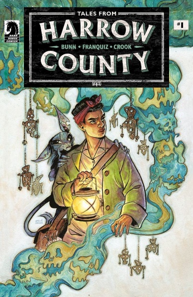
Written by Cullen Bunn
Illustrated by Naomi Franquiz
Lettered by Tyler Crook
Reviewed by Matthew Blair
It’s been ten years since the events of the original “Harrow County” series came to a close. Life has moved on, important people have grown and developed, and things have returned to some semblance of normalcy. However, just because the great evil has been vanquished doesn’t mean magic has gone away, and human tragedy has a strange way of paving the way for something nasty.
“Tales from Harrow County: Death’s Choir” #1 sees creators Cullen Bunn and Tyler Crook make a grand return to the series they built and Bunn’s script doesn’t miss a step. This time the main character is Bernice, the young black girl who served an important supporting role in the main series. She’s grown up and developed into a capable magician and member of the community with her own personality and secrets that should be fun to watch develop. On top of that, the comic adds an interesting and heart-breaking bit of the larger world as many of the town’s young men have gone to war, and many of them aren’t coming home. It’s a setting filled with fantastic potential for drama and dark stories, and then the haints start showing up and killing people.
While the artwork for the original “Harrow County” series was provided by Tyler Crook, “Tales from Harrow County: Death’s Choir” #1 hands art duties over to artist Naomi Franquiz. What’s interesting is that while Franquiz seems to draw things with a slightly softer feel than Crook, Franquiz’s art could easily be mistaken for a spitting image of Crook’s style and feel for the book. What’s especially enjoyable is that the comic continues the “Harrow County” tradition of beautiful coloring work, opting to retain the original book’s watercolor style color scheme, which creates an atmosphere that can be beautiful one instant and terrifying the next.
“Harrow County” was a wonderful series that was brought to a satisfying conclusion, so the idea that the series needs more stories might seem a bit unnecessary for a lot of people. Thankfully, the creative team on this book know how to tell these kinds of stories incredibly well, and “Tales from Harrow County: Death’s Choir” #1 promises exciting new stories, new ideas, and new terrors.
Final Verdict: 9.0 – “Harrow County” is back y’all, and it’s going to be fun!

Written and Illustrated by Daniel Warren Johnson
Colored by Mike Spicer
Lettered by Rus Wooten
Reviewed by Quinn Tassin
Daniel Warren Johnson blew up this year with the superlative “Murder Falcon”; “Wonder Woman: Dead Earth” is his first time on a Big Two title and it certainly does not disappoint. He pulls double duty on the issue and does more than deliver on both fronts. His writing is inventive and insightful and his art is as beautiful as it is dynamic. Rus Wooten’s lettering deserves major props here, too. A lot of the time, the beauty in lettering is what you don’t notice but with Wooten on board, you can’t help but admire each and every word you read.
Continued belowJohnson drops us into a world that’s been destroyed by a nuclear holocaust. What remains is somewhere between Mad Max and Game of Thrones. A group of scavengers, led by a girl named Dee, is doing their scavenging thing in a cave (which we later find out is the Batcave) when they get attacked by a haedra. In the midst of the scramble to escape, the group breaks a containment unit, releasing Wonder Woman. She’s weak but she’s able to fight off the creature. Diana’s utter dismay at seeing craters where Gotham City used to be is heartbreaking but she resolves to join the group, traveling with them to Camp New Hope, one of Earth’s last cities.
After a slow, set-up heavy first half of the issue, Daniel Warren Johnson kicks things into high gear. Dee betrays Diana, delivering her to the ruler of Camp New Hope to be his bride. After she fights back, they both get locked up but Diana, being Diana, forgives Dee purely out of her love of humans. The issue reaches transcendent levels when Diana gets sent into a stadium for a gladiator fight against a deformed Cheetah, who the years haven’t treated well. It culminates in a surprise attack on the city by a ton of haedra, who Wonder Woman fights off with her bare hands to much fanfare. Even when she gets the chance to kill the leader of Camp New Hope, she doesn’t. Because that’s not justice.
Good lord is “Wonder Woman: Dead Earth #1” a good comic book. The world-building is smart and fascinating, the character work is wonderful, and the plot is edge-of-your-seat, pumping your fist level engaging. If the rest of the series keeps this up, we’re going to have a classic on our hands.
Final Verdict: 9.0- Love conquers all in the intriguing, thrilling “Wonder Woman: Dead Earth #1”
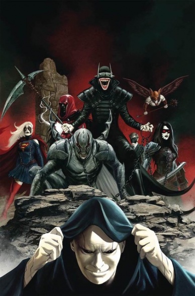
Written by James Tynion IV
Illustrated by Steve Epting
Colored by Nick Filardi
Lettered by Travis Lanham
Reviewed by Gregory Ellner
Having worked with Scott Snyder on the nearly forty-issue “Justice League” run, James Tynion IV has shown that he knows what he is doing when it comes to the multiversal conflict with Perpetua between Justice and Doom. Throw the events of “Batman/Superman” into the mix, and the stage is set for a fascinating conflux of forces. Drawing from the likes of “Forever Evil” alongside the aforementioned two series, Tynion blends action and horror with a tinge of unforeseen black comedy as he forges ahead into stories to come.
Even with the theoretically tired and overdone plot of “villains versus villains” as the main selling point, Tynion’s writing is enough to leave fans not bored, but excited for the conflict and unsure of which side they want more to win in the end, even as it primarily takes the perspective of Apex Lex Luthor himself.
Granted, Tynion provides spoilers for the likes of “Batman/Superman” and “Justice League,” but the revelations are not too surprising on the whole. When they are, the information comes from a fundamentally unreliable source such as Luthor or Perpetua.
Steve Epting proves himself to be the perfect artist for the coming conflict. While the story is at times action packed, every moment of violence is expertly rendered in a way that makes readers want to know what comes next blow by blow. Epting utilizes intense shadows, emphasizing the evil-versus-evil nature of the work and creating an overall feeling of dread and interest in the audience in the process. Meanwhile, the intense gazes and close-ups on various characters each help to sell a variety of emotions. From Luthor’s stoicism and eventual rage to two of the guests’ terror to the Secret Six’s sadism, everything comes across very well through body language and faces even if one were to exclude the dialogue.
Nick Filardi acts as a wordless commentator of a war of colors, from his use of the classic purple and green for Lex Luthor and his most immediate forces to the overall use of black and red for the forces of the Dark Multiverse. There are exceptions to these two, especially when it comes to a visit to one of the myriad Earths and the Godhead, but the distinctions still seem to hold weight well enough to help discern one side of the conflict from the other in more detail.
Final Verdict: 8.0– These are two evil leagues of evil that you should be watching, so beware.


