There is a lot to cover on Wednesdays. We should know, as collectively, we read an insane amount of comics. Even with a large review staff, it’s hard to get to everything. With that in mind, we’re back with Wrapping Wednesday, where we look at some of the books we missed in what was another great week of comics.
Let’s get this party started.

Written by Jeff Parker and Michael Moreci
Penciled by Dan Parent
Inked by J. Bone
Colored by Kelly Fitzpatrick
Lettered by Jack Morelli
Reviewed by Elias Rosner
While the concept is sound and the experience thus far has been tonally appropriate for both “Batman” and “Archie,” “Archie Meets Batman ‘66” #5 keeps the comic in a holding pattern, making for a fairly forgettable penultimate chapter. The charm of seeing these two similar universes meet wears off when you have to spend an entire issue resolving plot-threads instead of moving the story farther.
This is the putting pieces into place issue, leading up to the climax in issue #6 but it didn’t need to take as many pages as it did. It isn’t interesting to spend multiple panels showing Jughead got his hat onto the light for the gag at the end of issue #4. Moreover, while the gag of him being revitalized by burgers is a classic, the constant commenting on things from one universe by the other, such as Robin & Batgirl wondering if that would work for them and Betty saying it only works for Jug, doesn’t add anything more than a small chuckle.
There are a few moments where the script works, such as Joker complaining about how he shouldn’t need to babysit his deathtraps, but on the whole, it lacks the fun of previous issues. Parent & Bone and Fitzpatrick’s artwork is still spot on for the style, evoking the 4-color, simple figure work of “Archie Comics Digests.” It helps sell the zaniness of the world even when the script lets it down.
Final Verdict: 6.0 – A serviceable issue that is really all set-up for the final issue, making me wonder why the series couldn’t have been 5-issues instead of 6.

Written by Tom King
Illustrated by Mikel Janin & Jorge Fornes
Colored by Jordie Bellaire
Lettered by Clayton Cowles
Reviewed by Gustavo S. Lodi
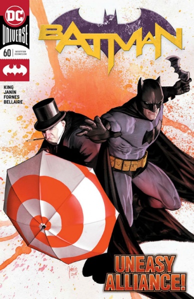
Fans of the “Batman” series under Tom King and the team will sometimes say that the writer takes his time, by relying on theme repetition and parallel narrative structures to move the plot forward. And while that is true at times, it all leads up to moments like issue 60, a dramatic, strong highlight of the run so far.
The choice to divide artistic duties across Janin and Fornes is inspired. Fornes focuses on Batman’s tribulations throughout Gotham City, as the masked crusader gradually descends into anxiety and desperation, as well as on Gordon’s growing disgust with these tactics. His style, gritty and detailed, adds to the feeling of dread and of moral codes gone bad the script calls for. The blend with a more traditional, 50s-esque character models and poses fits like a glove.
Janin, on the other hand, lends his style to the debate Alfred and Penguin are having over at the bat cave, as well as the big climactic reveal at issue’s end. It is a far more intimate setting the series’ audience has grown to know Janin for, but the artist succeeds nonetheless. The expression on both men’s faces, their past traumas, sadness, and heart desires and concerns are excellent.
King’s script is the true highlight of “Batman” #60, though. This is surely the culmination of issues of plot development and character moments. Readers can clearly see how these events have been paved for a long time, so when they do, their realization feels absolutely natural and never imposed. More than that, they feel that they are, unto themselves, also leading up to even larger stakes and reveals… which that last page, that will remain unspoiled, can certainly attest to.
All in all, this issue is another highlight of a very strong run, fully justifying slower, more methodical past entries, given its sheer execution on a character, plot, and artist level.
Continued belowFinal Verdict: 8.3 – “Batman” #60 is an example that when this series fully works, it works tremendously, on any desirable level, leaving readers anticipating as to what is coming next.

Written by Jim Zub, Chris Hastings, Sina Grace, and Cullen Bunn
Illustrated by Scott Koblish, Kev Walker, Chris Sprouse, and Garry Brown
Colored by Matt Yackey, David Curiel, Ruth Redmond, and Lee Loughridge
Lettered by Cory Petit
Reviewed by Gregory Ellner
With “Foreverbrush Man,” Jim Zub concentrates on rhyming to such a degree that the monologue goes beyond merely interesting and straight into comedy, setting the entire issue off on a good note. Scott Koblish crafts a bizarre look for Foreverbrush Man himself that leans heavily on the Eternity side of things. The effect of this merger is that there is extreme detail on the interior to Foreverbrush Man’s body, but no focus at all on any background. The intense detail on a universe within the being’s body is also present in Matt Yackey’s colors, which leave the background a stark white while focusing on the dark blues, oranges, blacks, purples, and more to represent a universe at large in a humanoid body.
With “Kamala Kang,” Chris Hastings tells a relatively standard, but still interesting time-bending story that feels like it could be the start of a new tale if it ever were given the chance to move forward into its own series (though it more than likely will not). Kev Walker’s overlapping paneling helps to showcase how Kamala’s work with time travel is dangerous or confusing for outsiders, and otherwise utilizes a relatively cartoonish style with thick lines to give an overall seemingly happier atmosphere for the story. David Curiel colors use dark purple, blue, and green on Kamala in contrast to the more natural colors of the world around her, and even that is played in deliberate contrast against the sepia-esque browns and grays of the early twentieth century.
In “Punisher Pack,” Sina Grace tells a disturbing story of the rise of a gang of child soldiers with superpowers, a dark take on the “kids go out to be heroes” idea. Unfortunately, Grace’s well-done writing is hindered by Chris Sprouse’s artwork, which shows a lack of attention to the difference between the face of a child and the face of an adult to the point that the eponymous Punisher Pack looks like young Frank Castles regardless of their age or at times their gender. Of course, this may have been the intent, but the entire appearance ends up not looking right as a result, even with Ruth Redmond’s good use of harsh bright colors in combat when contrasted against depressing shadows in the night.
Cullen Bunn’s “Diamond Patch” feels like it would do well with multiple readings, given he seems to tell multiple different stories in different points in time in parallel in an interesting yet confusing stylistic choice. Garry Brown’s artwork shows a good use of perspective, especially when it comes to parallelism across different scenes in tandem with the parallel structure of the stories themselves. Lee Loughridge’s soft browns and whites act in contrast against forest green or deep blue to give a very rounded color scheme, making splashes of red from violence, especially those of blood, all the more effective with how dried or wet blood is portrayed in keeping with the “glamorous gangster” style.
Final Verdict: 7.0- “Infinity Wars: Infinity Warps” #2 has its ups and downs, but on the whole seems to be a pretty good look at a variety of the Infinity Wars mash-ups.

Written by James Tynion IV
Illustrated by Guillem March
Colored by Arif Prianto
Lettered by Tom Napolitano
Reviewed by Ken Godberson III
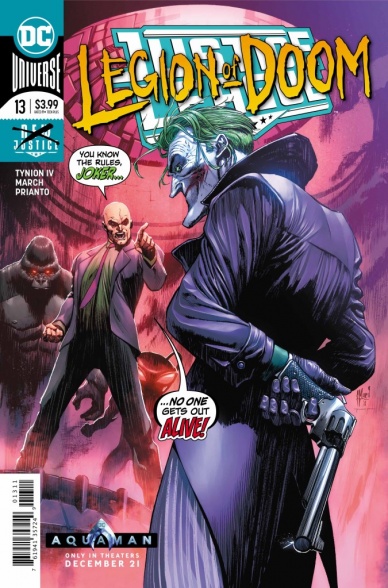
“Justice League” #13 a.k.a. “Legion of Doom” #3 a.k.a. “The Batman Who Laughs” #0.
See the problem here a bit?
In between bigger arcs, James Tynion IV has taken over for an issue to give some insight into the background of this latest incarnation of the Legion of Doom while also giving hints and teases for what is to come. Nowhere is that format more prevalent than here dealing with the team-up and subsequent fallout between Joker and the rest of the Legion, in particular, Lex Luthor. On top of that, it also deals with The Batman Who Laughs, who is spinning off into his own series this coming Wednesday. And if I’m being perfectly honest: the issue comes off as a bit bland. It doesn’t really introduce anything particularly deep into the machinations of the Legion or Joker and Lex’s relationship, doesn’t really do much to hype up The Batman Who Laughs series and the massive amount of talking in this issue, despite March and Prianto’s detailed action scenes, makes it feel cramped with also feeling hollow.
Continued belowI’ll give credit to the art team: there incredibly detailed, yet also fluid style actually makes for a really good Joker. March has always had a knack just on the right side of over-the-top character expressions and they work in the Joker’s conveying of both maniacal laughter and grim ruthlessness. Prianto’s colors make a lot of March’s details Pop, making for vivid explosions and eerily sick Joker Gas attacks. All in all, it’s an art team that helps elevate a script that felt very lacking.
Final Verdict: 6.0- A good art team doesn’t fully hide a story that had more of a goal of setting up another series that delivering much of substance.

Written by Various
Illustrated by Various
Lettered by VC’s Travis Lanham
Colored by Various
Reviewed by Michael Govan
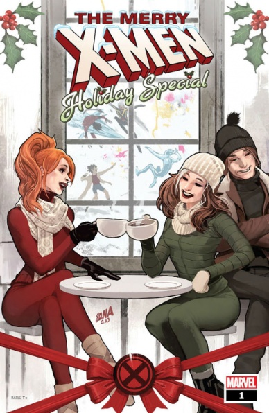
There. Are. So. Many. Mutants. For the “Merry X-Men Holiday Special”, Marvel has invited a legion of writers and artists to contribute and, of course, they all have their favorites. In this issue, there are twenty-five stories, one for each day of December leading up to Christmas. The only ongoing plot is Jubilee and her baby Shogo fighting to survive Arcade’s new Murdermall. This comic is tricky. All work is subjective, everyone having different opinions. So many stories just means even more opinions. Personally, there were maybe four or five standout stories. Each is only about one page. I wish some had more room to breathe. I think some were largely forgettable. It felt like watching several trailers for actual films back to back. Some might not be the easiest to follow. There are plenty of X-Men fans but readers may be confused if they haven’t kept tabs on this mutant or that one. Kitty Pryde mentions running for President? Has that been a thing for long? Captain Britain has a daughter? She can talk? Hope Summers is still around?
The idea of a different story for each day leading up to Christmas, putting a spotlight on the many different X-Men is a good one. There is probably something in this issue for every X-Men fan. However, the execution could be a bit better. Still, it is always nice to see mutants merry instead of melancholy and taking it easy. They’ll be right back to protecting a world that fears and hates them by New Years.
Final Verdict: 6.5 – Many mutants (some good, some bad) means many stories (some good, some bad).

Written by Matt Groom
Illustrated by Eduardo Ferigato
Colored by Marcelo Costa
Lettered by A Larger World Studio’s Troy Peteri
Reviewed by Tom Shapira
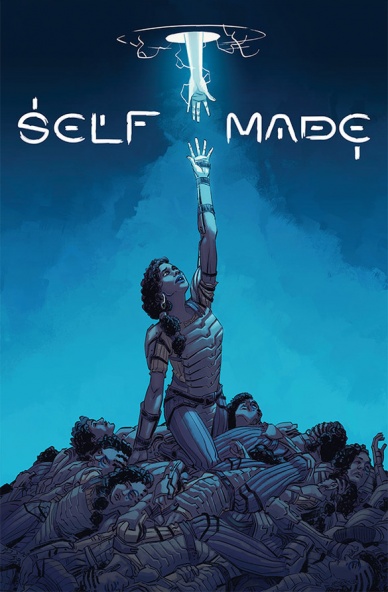
“Self / Made” #1 starts as such a generic fantasy comic-book, an evil army, wizards, knights, a quest etc. that the reader has little to do but count down the time for the shocking revelation that would turn everything that we see on its head. Writer Matt Groom isn’t really subtle in his effort to show that something is wrong with quest (the dashing prince is an utter bastard who obviously hides something, the supporting peasant-soldier is the actual wise one in the group); when the actual twist comes I can’t say I was terribly shocked, but it does provide a potential for an interesting story. The problem of this comic-book that we don’t get an interesting story – we get an intentionally generic story.
This structure, which we see in many-a-number-one issues these days, means is that we waste time and money on something false, something rather dull. If you have an interesting premise why not jump into it? why is shocking the reader so desirable when you can engage them instead?
The meat of the comics offers some decent art from Eduardo Ferigato and Marcelo Costa, they do well aping the scenery that graced the covers of old D&D adventure books and gives much-needed notice for facial expressions (it’s obvious none of the protagonists really like on another). I can’t really judge their work for ill because they are given so little to do; compression of events is very much an issue: the quest takes our heroes through a desert – but I have little knowledge of large was it or how distant from their origin point.
Continued belowThe series might as well ramp-up with issue #2, but it better do so quickly.
Final Verdict: 4.3 – While the actual artistic craft is in there, as well as future potential, this issue simply fails to excite.

Written by Pat Shand
Illustrated by Emily Pearson
Lettered by Jim Campbell
Reviewed by Christa Harader
“Snap Flash Hustle” #1 follows Haley Mori through the not-so-lucrative world of Instagram modeling and into the decidedly dangerous world of drug deals and modern organized crime. Money’s tight, social metrics are down and Haley’s personal life is up in the air as well with a recent, uncomfortable shift to polyamory. It’s all very trendy, from the debt to the coffee shops to the muted panic that permeates the issue.
However, it works, largely thanks to Pearson’s beautiful art. That’s not to downplay what Shand brings to the table, because there’s subtlety in this first issue if you know where to look. Haley and her husband have a lovely dynamic, especially when Haley explains why she doesn’t want Pauline going on her photo shoots. But Pearson’s gentle line and warm colors create an inviting mood that softens Shand’s harder narrative edges, especially when Haley’s being held by her ankles off the side of a building. The juxtaposition works, as does Pearson’s careful attention to facial expressions and character design.
I’m a little disappointed by Campbell’s lettering, in that the crisp word balloons and relatively standard typeface fight with Pearson’s softer art. Hand-drawn or penciled balloons take time to produce, but with the amount of exposition delivered in this issue (Coral’s surprisingly chatty for an enigmatic drug mogul), there’s too much visual tension.
Overall, the book has promise, with a few neat visual insets and an overall style I enjoyed. I’m curious to see how weird the book gets, and how Haley will change over time with her newfound income source.
Final Verdict: 7.5 – “Snap Flash Hustle” #1 is a neat take on the broke Millennial situation, with enough heart and promise to lift it above its minor technical flaws.

Written by Matthew Rosenberg, Kelly Thompson, and Ed Brisson
Illustrated by Pere Pérez
Colored by Rachelle Rosenberg
Lettered by VC’s Joe Caramagna
Reviewed by Alexander Jones
Instead of paring down the cast and focus on one central figure, “Uncanny X-Men” has opted to include nearly every mutant in the X-Men franchise. With so much continuity and such a large team of heroes, authors Matthew Rosenberg, Kelly Thompson, and Ed Brisson have a huge responsibility on their shoulders in guiding the X-Men forward. This week artist Pere Pérez contributes pencils to the interiors of the issue.
The script reintroduces readers to the Four Horseman of the Apocalypse and Nate Grey. While the title has a great sense of energy and light script, the pacing and characterization are both off in the issue. The script has a hard time focusing on one group of characters and staying coherent. The script has a tendency to focus on relationships between the supporting players at the detriment of the pacing. The title also jumps from one really quick plot to the next without enough exploration into the previous one. The script features a contrived ‘who do you trust’ plot thread that immediately comes off as hokey. The last couple pages in the story also feel rushed and do not carry the dramatic tension that the comic is trying to elicit from the reader.
Pere Pérez’s art is improving. Pérez imbues the title with more detail fluid linework than we have seen from his previous efforts. While Pérez is improving as a creator, the faces for each individual and larger details in the book are lacking. A sequence with Legion shows off a different type of face from Perez which is a great change of pace, but the detail was minimalistic and boring to look at despite some of the additional lines on the figure. The backgrounds in the story are also extremely sparse and don’t include as much as they should keep readers interested in the title. The interior catches the larger details well and features a few solid page layouts. Pérez’s art has never been more streamlined and easy to follow.
Continued belowIf you overlook the contrived plotting and greater details, “Uncanny X-Men” #4 is an enjoyable summer blockbuster type of story. The lack of coherence in the script and convenient plots make the title come off poorly. Pérez’s art is not perfect but shows the artist is improving and still likely has a lot of potential to deliver great interior work in the very near future.
Final Verdict: 5.5 – If you overlook minimal artistic detail and convenient plotting, “Uncanny X-Men” #4 is a solid, high-stakes issue.

Written by Shaun Simon
Illustrated by Conor Nolan
Colored by Meg Casey
Lettered by Mike Fiorentino
Reviewed by Chris Egan
The first issue of Boom Studios’s “Wizard Beach” is one of the bigger surprises of 2018. A cleverly written hero’s journey that finds a young wizard named Hexley Daggert searching for his estranged Uncle Salazar who will supposedly restore magic back to the wizards. It is a delightfully light and refreshing adventure story. Everything about this premiere issue screams Summer, from the beach setting to the colors to even Uncle Sally’s hippie/Dead Head characterization, and it is the right book to help close out the year and give a little pick-me-up during cold weather season. For being so light and funny it packs in quite a bit of world-building, and for being only 24 pages, is broken into three short chapters. Shaun Simon creates an interesting fantasy world where magical beings and regular people co-exist but are not exactly keen on each other.
Nolan’s illustrations make for densely packed and wonderfully detailed panels. He gives the entire issue years worth of history in a short amount of time. His character design is one part “The Hobbit,” one part “Harry Potter,” with a dash of “David the Gnome.” Whimsical and cute, these characters really pop against cluttered rooms that are teeming with large books and magical gear or city street packed with non-magical humans. Meg Casey’s colors are a highlight. Her work sets the mood of the book and is a key ingredient in what made this issue such a pleasant surprise. Their combined work pulls you in from page one and is so much more than one would expect from this series.
If the rest of the series is anything like this first issue, then “Wizard Beach” is a mini-series to look out for. It won’t be for everyone, but if you are a fan of humorous fantasy, it is definitely something different and enjoyable to add to your pull list.
Final Verdict: 7.5 – Lots of fun world building and magic adventure for fans of all ages. Like its young hero, this is one mini-series that has great potential to prove great worth.


