
There’s a lot to cover on Wednesdays. We should know, as collectively, we read an insane amount of comics. Even with a large review staff, it’s hard to get to everything. With that in mind, we’re back with Wrapping Wednesday, where we look at some of the books we missed in what was another great week of comics.
Let’s get this party started.
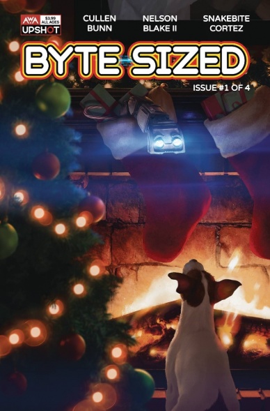
Byte-Sized #1
Written by Cullen Bunn
Illustrated By Nelson Blake II
Colored by Snakebite Cortez
Lettered by Sal Cipriano
Reviewed by Matthew Blair
The comic book industry appears to be undergoing a shift from the more violent and extreme stories of the ’90s and reverting back to creating stories for much younger audiences. In my opinion? It’s a great move that gets younger readers interested in comics and gets them reading, which is always a good thing.
However, not all comics for young people are created equal, and it’s not an easy market to write for, which is a problem on full display in “Byte-Sized” #1.
The script for “Byte-Sized” #1 comes from writer Cullen Bunn, who seems to be on a mission to break away from his wheelhouse of Southern horror and write every comic under the sun. Bunn does a good job of toning down his horror talents for a younger audience, offering a story that has family/creature dynamics of children’s movies like E.T or imitators like Stranger Things. The story does have very good characters, the children feel and talk like children and the creatures are certainly interesting, and the first issue of this four issue series does a very good job of building tension and a sense of dread. However, the whole story feels very decompressed and the first issue doesn’t give us a chance to see how these two elements will mesh, opting to end on a very frustrating and kind of annoying cliffhanger.
The artwork for “Byte-Sized” #1 is provided by penciler Nelson Blake II and colorist Snakebite Cortez and is probably the weakest part of the book. The art is certainly competent, there’s a clear sense of what is going on and how the character’s feel, but the pencils and colors come together in a weird way that makes the whole book look and feel a bit cheap and stiff. The sad thing is, this book is not a fair assessment of either artist. Looking at Blake and Cortez’s work separately shows that they are good artists, it’s just that they either don’t seem to mesh well or have a difficult time adapting their art for a younger audience.
“Byte-Sized” #1 is a book with a lot of potential, but seems to be let down by a creative team that seems to have trouble adapting to the needs and demands of an audience that they aren’t used to writing for.
Final Verdict: 6.5 – A fairly competent imitation of classic ’80s children’s movies that is brought down by slow pacing and an artistic team that would probably be happier doing something else.
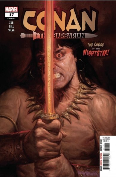
Conan the Barbarian #17
Written by Jim Zub
Illustrated by Robert Gill
Colored by Israel Silva
Lettered by VC’s Travis Lanham
Reviewed by Christa Harader
I can’t really express how happy I am that we’ve had regular “Conan” books again, and the pleasure I get from dipping in and out to see what’s up with our scowling panther-like hero is significant. “Conan the Barbarian” #17 sees a bit of Moorcock brought to Howard as Conan struggles against the might of an unholy, hungry weapon. Zub’s choice of a magical or possessed blade is a smart one – if there’s one thing that confounds and angers the sensate Cimmerian, it’s magic, and it’s also one of his only weaknesses on record.
Gill draws Conan with appropriate girth and a bit more youth in his rounded features. He’s not yet the trials-etched King, but he’s also not the grim-browed youth Asrar depicted in Aaron’s earliest tales. Silva’s work is good, though that fiery sword is a trial at times against different backgrounds and Silva has to get creative with the orange and yellow hues to make it stand out. Lanham’s font is classic, stylish and readable, as mentioned numerous times before, but Lanham’s also good at placement when it comes to the necessary narration in “Conan.”
Continued belowOverall, “Conan the Barbarian” #17 sees Conan at a disadvantage against this soul-sucking weapon. It’s always interesting to put the barbarian in situations beyond his ken and see how he’ll react, and Zub taking on this aspect will no doubt make for an interesting story. Gill, Silva and Lanham put in good work for a solid comic overall.
Final Verdict: 7.5 – “Conan the Barbarian” #17 is a good intro to this particular arc, with a magic sword that will, likely, give our muscled mate a run for his money.
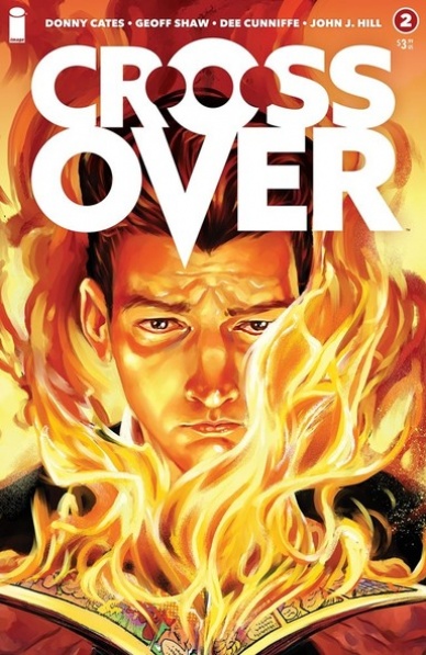
Crossover #2
Written by Donny Cates
Illustrated by Geoff Shaw
Colored by Dee Cunniffe
Lettered by John J. Hill
Reviewed by Quinn Tassin
I want to love “Crossover #2” so so badly. This issue, like the first, has a basically interesting core narrative. The mystery box that Donny Cates is setting up is actively interesting. We’ve got a mysterious comic book character who can see the future and what seems to be a kryptonite bullet based on last week’s last page reveal. That aspect of all of this is genuinely intriguing. I want to know what needs to be done when Ryan gets to the dome. I sort of want to know more about the love story that’s allegedly at the center of the whole thing. But then there’s the camps.
See, the existence of concentration camps holding civilian comic book characters was simply a bridge too far for me. Last issue had the hate signs against comic book fans that played on actual anti-gay slogans in a way that managed to be offensive enough to undercut the narrative. But camps really bring it to a thematic breaking point (which is honestly impressive given that we’re on the second issue). Donny Cates is doing this weird fun house mirror version of Ernest Cline’s schtick, creating a universe in which his very blatant self insert is among the most oppressed and who will clearly prove to people at some point that the reason they’re hated and feared is actually what makes them strong. That’s an allegory that works great with mutants over at Marvel but it absolutely collapses when the allegorical group is comic book fans. Maybe if he’d kept it to basic bigotry it would’ve been a type of offensive that would be noteworthy but not deal-breaking. But these are concentration camps! And this doesn’t even cover the comic book writer serial murders which are at least ridiculous enough in theory to not be actively offensive but absolutely plays into the gratuitous self insertion of it all.
Geoff Shaw and Dee Cunniffe do wonderful work on the art in this comic. They bring a clean, grounded look to the endeavor that perfectly portrays the comic book version of the real world. Moments of calm, confusion, and everything in between are illustrated with a certain realism that’s genuinely wonderful to find in comics when it’s done right. Whether it’s Ellie drinking beer or Ryan’s confusion at who Ellie even is, these small moments are what make the comic feel worth reading at all. The juxtaposition between the “real” characters and comic book characters, too, is more subtle that it may seem, offering an odd tonal consistency despite its jarring style. Much love to the excellent art team.
“Crossover #2” is an intriguing comic book with great art and an absurd point of view that serves some baffling choices. To be honest, I’ll likely keep reading it because of the genuine curiosity about the greater machinations at work here. I’m curious how long the good mystery can overpower the bad themes, though.
Final Verdict: 5.4- “Crossover #2” is a deeply interesting mystery that makes some genuinely appalling narrative decisions
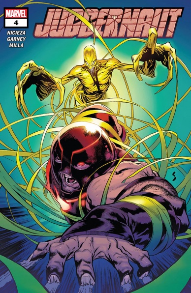
Juggernaut #4
Written by Fabian Nicieza
Illustrated by Ron Garney
Colored by Matt Milla
Lettered by VC’s Joe Sabino
Reviewed by Luke Cornelius
“Juggernaut” #4 is the penultimate issue in the series and delivers an entertaining read, even if it is somewhat extraneous to the overall plot. We open with Juggernaut diving out of a helicopter, on the trail of the individuals who mind-controlled Quicksand in issue #3. Bursting through the ground and into an underground bunker, we quickly discover that Arnim Zola is the mastermind. His exchanges with Cain about the acquisition and manipulation of power work well to highlight the change in Cain’s behavior, with this being the point at which Nicieza includes the final flashback to Cain’s journey to regain his powers. Nicieza combines Cain’s liberation from Cyttorak with his escape from Zola’s confinement to smoothly blend the flashback into the larger issue.
Continued belowGarney’s artwork is solid throughout, with Juggernaut’s literal entanglement with Zola’s plastic android, Primus, giving the comic some fun visuals. Garney opts for black gutters throughout the issue which makes the underground scenes feel more enclosed, in addition to highlighting Milla’s colorwork. The colors in “Juggernaut” have perhaps never been as vibrant as they are here, with the lime green/yellow of Primus’ plastic body giving a very unnatural, manufactured look to the villain. The subtle glow that emanates from Juggernaut’s armor also looks great as he explores the bunker.
It is only in the closing pages that the issue falters. D-Cel lashes out at Arnim Zola but is very quickly talked down by Cain and then Zola confesses he is only a prisoner of The Dungeon, rather than the true mastermind behind the pursuit of D-Cel. The moments read too quickly, as though the comic’s page count suddenly ran out and it makes both moments feel underwhelming. Moreover, Zola not being the mastermind didn’t feel like an intended twist as his motivations for trying to capture D-Cel seemed genuine, with nothing to suggest his lack of authority prior to his confession. It also makes the issue feel extraneous to the overall plot. These problems don’t affect the fun that the issue provides, even on a second read, but it does give “Juggernaut” #4 a lackluster finish that cools its audience ahead of the series finale.
Final Verdict: 7.0 – “Juggernaut” #4 is a mostly enjoyable, though somewhat extraneous, penultimate issue.
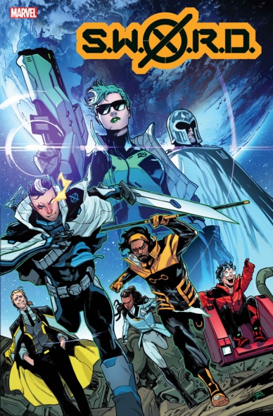
S.W.O.R.D. #1
Written by Al Ewing
Illustrated by Valerio Schiti
Lettered by VC’s Ariana Maher
Colored by Marte Gracia
Reviewed by Michael Govan
“While you slept, the world changed.”
Whether you love the new direction Marvel’s mutants are headed in or it’s just too alien for you, one thing that “House of X” #1 wanted to make abundantly clear was that things would be different. It’s a new world, a new era, there’s been a paradigm shift. Nothing will be the same.
In that some vein, “S.W.O.R.D.” #1 wants you to know that there’s been a paradigm shift. Krakoa’s already next-level but now they’re somehow kicking it up a notch. It communicates it so effectively right at the very start. Introductory quote pages are a staple for X-comics now but here the standard white backdrop is replaced with a shot of space. It’s such a simple, beautiful shot too, showing the sun shining on Earth and the vastness of space.
“This is what comes next.”
I had chills before I had even seen a character. Each page only builds on that excitement too. There’s a great shot of S.W.O.R.D.’s space station. Ewing takes full advantage of the data pages to give us a color-coded organizational chart and Brand’s ‘captain’s log’ a la Star Trek. Speaking of Star Trek, not only are they boldly going where no man’s gone before but each department has their own matching uniforms. It’s so great, guys. I could gush about it for hours, I really could.
In this first issue, Ewing holds our hand as we step into this new world. Abigail Brand gives Magneto, and by extension the reader, a tour of the space station, introducing us to the cast. Ewing has picked some very familiar faces (teen Cable) and some deep cuts as well (I’ve never even heard of Peeper). It’s an interesting mix of characters to be sure.
There’s space politics, different philosophies regarding Krakoa, a mutant power combo you have to read to believe, rich conversation…never once does it feel boring. The characters are fully realized. The artwork is fantastic. Schiti has designed some amazing looks for everyone. The new space outfits are futuristic, chic and practical all at the same time. The faces are expressive, full of personality and fit the characters well. Every shot of space is a sight to behold. The mission at the end is breathtaking, S.W.O.R.D. is stepping into the unknown and it definitely feels like it.
What did they get? Where did they go? Where is the story going to go? I have theories, ideas and questions…but no complaints.
Final Verdict: 10.0 – S.W.O.R.D. reigns supreme.


