
There is a lot to cover on Wednesdays. We should know, as collectively, we read an insane amount of comics. Even with a large review staff, it’s hard to get to everything. With that in mind, we’re back with Wrapping Wednesday, where we look at some of the books we missed in what was another great week of comics.
Let’s get this party started.

”Arclight” #3
Written by Brandon Graham
Illustrated by Marian Churchland
Reviewed by Matthew Garcia
It’s somewhat difficult to separate “Arclight” #3 from its “8House” origins. If you remember, Brandon Graham and Marian Churchland launched an interconnected fantasy series last year that unfortunately fell in on itself. “Arclight” #3 ushers in its return, as a sort of standalone series. The story picks up right where the last issue left off (I had to go back and reread everything, it’s been such a long time since “Arclight” #2): Arclight and his lady are separated, dealing with death priests, a regal air force, and all manner of body-swapping.
The plot kicks into higher gear in this issue, with Graham and Churchland delivering a lot more expositional moments and clarifying some of the motivations. That being said, this never gets in the way of the book’s most striking feature: Churchland’s costumes and designs. A lot of her backgrounds are more evokes than fully fleshed out, giving the entire book a more dream-like aesthetic. But it’s the costumes, from the smart uniforms to the flowing robes to the sweeping gowns, that catch your eye. To call them fabulous would be an understatement.
The book still references much of the interconnected world (something about various houses? a war with each other?), but it does stand on a strength of its own. “Arclight” #3 seems to be an attack on the binary, an exploration of conformity and identity, and those themes carry the material past its shared universe setting. It’s a slow, more deliberate burn, it’s the kind of book you linger with rather than tear through.
Final Verdict: 7.5 – Evocative artwork and clearly defined themes allow this book to stand on its own.

Aquaman #12
Written by Dan Abnett
Illustrated by Phillipe Briones
Reviewed by Brian Salvatore
“Aquaman” is finally living up to all the implications of having a king of a sovereign nation at its core: he’s a diplomat, he’s commander in chief, he’s the public face of Atlantis. And, as we’ve seen throughout the series thus far, he has to put up with not only the responsibilities of his homeland, but also those of people pretending to represent his country.
Dan Abnett has built a truly dense, but totally penetrable, mythology over the book’s first 6 months, allowing the reader to feel the stunning amount of pressure on Arthur in all corners of his life. The book feels claustrophobic at times, regardless of which of the three regular artists are on pencils. Abnett has worked very hard to make Arthur not just the brooding monarch of the Geoff Johns run, but give him a bit more personality. That pays off in spades for an issue like this one, where we are forced to see him as that monarch. He doesn’t come off as a blowhard or an asshole, but because we’ve had a steady build up of his character, we don’t see ego – we see deserved pressure and leadership.
Briones – the main artist on the series (no matter what DC says – he’s illustrated 5/12 of the issues) – continues to do solid work here. He embraces the technical side of Atlantis, giving extreme detail to every warship and command center, and gives the inhabitants of those scenes a seriousness and intensity to match. Briones does best in an issue that is packed with action, and so this is a nice fit for him. His character work is sometimes cartoonishly expressive, with every person who is angry being TEETH CLENCHED EYES POPPING angry, but it works within this context.
Final Verdict: 7.2 – A strong start to ‘The Deluge’ arc.
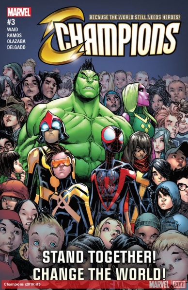
Champions #3
Written by Mark Waid
Illustrated by Humberto Ramos
Reviewed by Robbie Pleasant
“Champions” continues to be a case of “be careful what you wish for.” A team focusing on younger heroes, who are carrying on the legacies of other beloved heroes? Yes please. And I certainly can’t object to their choices, bringing together characters from some of my favorite comics – Nova, Ms. Marvel, and even Amadeus Cho. By all means, this should be a recipe for success, and yet… It’s not.
Perhaps the drawback comes from the characterizations. Nova (Sam Alexander) keeps coming across as a jerk, Cho as a pompous arse, and Cyclops and Miles are mostly just there. While Ms. Marvel tries her best to keep the team focused, doing so gets her stuck in the “team mom” role to little success. I can’t say anything about Viv’s characterization, because I’m woefully behind on “Vision,” but she’s not exactly winning me over from this. (And if anyone ever asks if you want to see a Hulk making out with a female Vision, the answer should be “No,” though at least it nips that in the bud early on.)
That said, there are still praises the comic deserves. The concept of the issue tackles real-world issues, particularly involving unrest in the Mideast, and makes the focus more on empowering the people who live there and are fighting for their lives, freedom, and education, rather than having the heroes swoop in, save the day, then leave. The artwork from Humberto Ramos is excellent, with great action and emotion in every character. Though I do pity him for having to draw the Hulk/Synthezoid make out session twice. Some of the scenes look excellent in action, impact, and framing, especially when things get intense. So what issues I take with the writing are somewhat counteracted by the art.
The comic means well, and is trying to do something inspiring and different, but it needs to improve its character work before it can succeed.
Final Verdict: 5.3 – it’s well-intentioned, and looks great, but that only counts so much when it makes otherwise great characters into frustrating ones.
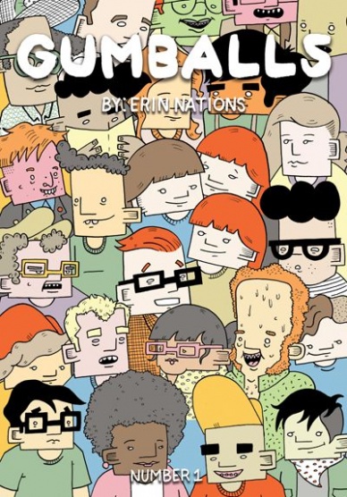
Gumballs #1
Written & Illustrated by Erin Nations
Review by Vince Ostrowski
We can’t talk about “Gumballs” without first talking about Erin Nations, a tremendously talented artist whose greatest talent is perhaps his ability to document and present his innermost self and the challenges of life in a matter-of-fact way that inspires both empathy and interest. Sometimes Nation’s approach to art is purposefully clinical: a visual timetable of his transition (some of which can be seen in this great IPF profile: http://the-ipf.com/2016/08/16/erin-nations-transgender-cartoonist/), other times its leveled with situational and referential humor. But no matter the style of delivery he’s choosing to use at any given moment, it’s all captivating and quite moving, indeed. “Gumballs” #1 covers that entire spectrum.
“Gumballs” is split up into a variety of vignettes (presented for their variety as the titular “gumballs” in a gumball machine), few lasting longer than a page, that run the gamut from struggles with social anxiety, to various anecdotes from his transition, even down to detailed documentation of what Nations (assuming most of this is autobiographical) may have done or eaten on a given day. Nations never holds back when discussing how clinical depression can be devastating or social anxieties can hamper even the most mundane activities. The most daring aspect of “Gumballs” is that he never once embellishes or over-dramatizes any of it: this is anxiety and this is what it can do to you, period. And yet, without the embellishment, it’s even more touching knowing that it’s real. Nation’s visual representations of body issues, nervous tics, and every day activities are presented with a stylized cartooning rather than going for realism – this is a boon to the humor of the book, but Nations also inspires empathy with the visual matter-of-factness with which massive psychological concepts are distilled down to a well-designed page or two. One page that sticks out, in particular, is a funny page where Nations documents the things that scared him as a child: this includes an incredible depiction of Max Headroom, among other things. Erin, I’m right there with you.
Continued belowFinal Verdict: 9.0 – Erin Nation’s “Gumballs” #1 lays bare a lot of serious, complicated stuff and presents it with a frankness and humor that really moved me to my core. This is someone’s life on the page. To give this particular work a number grade seems trite, but we’ll just slap a 9 on there and call it good. Read it.

Nightwing #10
Written by Tim Seeley
Illustrated by Marcus To
Review by Ken Godberson III
First Dick Grayson was Back in Blue. Now he’s back in the town that he originally made a name for himself, Bludhaven. I have said that I had some reservations about Dick returning to this town, most of those having to do with it potentially feeling too much like a back track. That being said, while my concerns have not fully disappeared, Seely does enough here to provide interest. He goes heavy on Dick wanting to get away from the greyer aspects he’s been trucking with lately, like Spyral and Raptor, and get back to a simple black-and-white that Bludhaven had. But it’s not so simple, and never was. There are also some little funny moments like Dick trying to lay low and blow off steam for a night by getting back into old hobbies and such that got ignored because of non-stop crime fighting. It’s a nice scene.
The main draw for me though was having Marcus To returning after so long and drawing a Bat Book. The first time I saw To’s clean and smooth artwork was from the ever awesome “Red Robin” series before “Flashpoint” got that series cancelled. Here, he continues that work, a standout being the aforementioned montage of Grayson trying to chill at his apartment for one night and getting more and more restless. If I have one thing to criticize, it’s the colorwork. I like Chris Sotomayor and for the most part he does well here, infusing the kind of dark glitz and glamor Bludhaven does have as the mask over it’s sinisterness. No, the criticism I have is how he colors Dick himself. He colors Dick really pale in this issue. Like, really pale. Like, “I’ve seen Kate Kane colored darker”-pale. It’s really unsettling and did take me out of a scene every now and again.
Final Verdict: 7.2- Seeley, To and Sotomayor are setting up the intriguing next step in Dick Grayson’s life.

Shade the Changing Girl #3
Written by Cecil Castellucci
Illustrated by Marley Zarcone
Reviewed by Zach Wilkerson
So far, “Shade the Changing Girl” has been a slow burn as we are introduced to both Loma’s Metan homeworld and the mysteries surrounding her human host, Megan. It’s been an exhilarating, trippy ride, but one that one that could potentially lose readers due to it obtusity. With issue #3, however, both sides of this tale begin to gain traction. On Meta, we spend more time with Loma’s would be boyfriend Lepuck, as the plot surrounding the stolen M-Vest cements itself as a core part of the book. On earth, Loma’s meta-meditation grants insight into Megan’s life prior to her accident. These scenes lend clarity to the conflicting and unsettling viewpoints of the diverse cast orbiting Megan. In most “possession” stories the possessor is cast as the aggressor, the source of conflict. It seems this may not be the case for Shade. Megan, the girl and what she represents to the extended cast, hangs ominously over the story. The idea that Megan maybe the villain of this story is an interesting one, with metaphyscial consequences for Loma Shade.
The use of poetry, particularly the fictional works of Rac Shade, acts as the the thematic backbone for this issue. Thought provoking and engaging, the “poem for every feeling” fits in perfectly for a story that ultimately rests on the emotional throes of adolescence. Likewise, the visual poetry of Marley Zarcone and Kelly Fitzpatrick adds another level of texture to the abstract storytelling. The madness of the M-Vest drifts inconspicuously from page to page. The team’s ability to carry the reader across multiple planes of existence and consciousness in the span of a few panels is impressive, to say the least.
Continued belowAs is becoming a staple for the Young Animal line, this issue’s back-up feature is also a delight. In this case, we have Tini Howard and Sanya Anwar presenting a short Dial H for Hero. The minimalist story uses only four letters to tell a nuanced tale of romance, loss, and the true nature of heroism. After the critical success of DC’s last take on “Dial H,” the idea of the concept finding a new home with Young Animal is quite intriguing.
Final Verdict: 8.4 – With this third issue, “Shade the Changing Girl” finds firm footing, from which it may rise out of the shadow of the flagship “Doom Patrol” to become the preeminent Young Animal title.
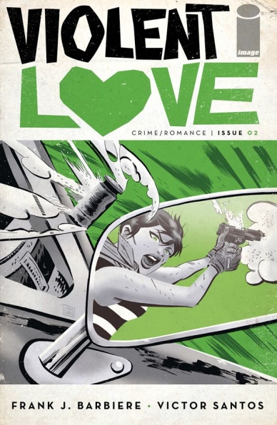
Violent Love #2
Written by Frank J. Barbiere
Illustrated by Victor Santos
Reviewed by Alice W. Castle
If the first issue of “Violent Love” focused mostly on the violence then the second issue is all about love. Well, the twisted, manipulative sense of hot, sweaty sex in seedy motels that passes for love in crime noir stories. Barbiere and Santos follow up their stunning debut issue with a sophomore effort that slows things down a bit, focuses on Daisy’s need for revenge against Johnny Nails and gives us an idea of how this series is going to draw out its drama.
Despite being introduced to Rock Bradley and knowing the importance he will come to play in the story, this is still very much Daisy Jane’s reign of terror through the 70s. Focusing on smaller dialogue scenes and less scenes of graphic torture, this issue is much more psychological. Daisy is still dealing with the trauma from last issue and Victor Santos does a fantastic job of showing how that overwhelms her with pages that are just packed full of small, cut-in panels to showcase details of the scene as well as flashbacks to the pain.
Santos draws even more from classic noir stories in this issue with stunning pages that capture the isolation of desert and a gorgeous “Sin City”-esque page that frames Daisy in the monochrome highlights of light streaming through blinds of a motel room window. Every page of this comic is a frame-worthy work of art that is elevated even more by Barbiere’s tense script and tight dialogue. Even though this is only the second issue, “Violent Love” is packed with the same white knuckle tension that takes most comics years to build towards. This is two masters of their class doing what they do best, proving that first issue was anything but a fluke.
Final Verdict: 8.8 – I don’t know how they did it, but this issue was just as great as the last. Keep ’em coming.

Wonder Woman ’77 Meets the Bionic Woman #1
Written by Andy Mangels
Illustrated by Judit Tondora, Michael Bartolo and Stuart Chaifetz
Reviewed by Jess Camacho
DC has found a lot of success in the last few years with the reintroduction of classic television versions of their characters. “Batman ’66” no longer as a full series but it constantly finds itself in lots of crossovers and now that’s where we are with “Wonder Woman ’77”. As a kid, I spent a lot of time with my dad watching TV and since he came of age in the 70’s, I’ve seen both series crossing over here. “Wonder Woman ’77 Meets the Bionic Woman” #1 finds both characters teaming up to stop an evil group called CASTRA from stealing deadly weapons. The script is exactly what you’d expect. It’s action heavy with a lot of telling instead of showing and contains enough of the double identity levity that you’d expect from the Wonder Woman series. Mangels gives readers enough back story for each character but this is still very much something only an established fan will really enjoy. Diana and Jaime are written very well and it becomes really clear why this crossover was a no brainer.
Tondora’s pencils are not what you’d usually see in a Dynamite book and that’s exactly why I liked it so much. It doesn’t feel too serious but it doesn’t take on too much of a cartoon quality. The characters are all visibly happy most of the time and there’s a true heroism that comes through when Jaime and Diana are in action. The biggest issue with the pencils are the proportions. Sometimes they can be a bit off but not in a distracting enough manner. The coloring team of Bartolo and Chaifetz have done their homework and make this issue feel like the 1970’s. The colors are bright and bold and end up providing a lighter tone than I was expecting.
Final Verdict: 6.9 – A solid but not stellar debut that fans of both television shows will enjoy.


