
There is a lot to cover on Wednesdays. We should know, as collectively, we read an insane amount of comics. Even with a large review staff, it’s hard to get to everything. With that in mind, we’re back with Wrapping Wednesday, where we look at some of the books we missed in what was another great week of comics.
Let’s get this party started.

A&A: The Adventures of Archer and Armstrong #12
Written by Rafer Roberts
Illustrated by Mike Norton
Reviewed by Jake Hill
“Man,” Armstrong says about halfway through this issue to a talking Russian bear/scientist, “I have completely lost track of what is going on here.” He’s not the only one, though that isn’t necessarily a bad thing in a book as zany as “Archer and Armstrong.” It makes for a solid, if slightly messy, chapter in the ongoing buddy comedy.
In a nutshell: Archer has body-swapped with Gub-Gub, a strange, lumpy clone of Armstrong. The duo have gone to Armstrong’s estranged wife Andromeda for help. In their way stands an alliance of the evil Wall Street cult the 1%, allied with evil communist super scientists. That’s about par for the course for these two, but the insanity sort of spins out of control for Roberts. He even added a disclaimer for the issue that he’s pulling out all the stops because this is the finale. It’s an admirable goal, but perhaps the issue could have done with a few less stops.
Still, it all comes together nicely at the end with a flurry of twists. There are betrayals, reveals, magic, mayhem, sharks, alcohol, and a cameo from Faith Herbert. In hindsight, maybe the grand conclusion was just as scattershot as the buildup, but somewhere in the mess of it all, the issue manages to find some satisfying emotional beats.
Artist Mike Norton does a workmanlike job. Panels are simple, action is easy to follow (no small feat in a story as crazy as this). His crowds are distinct, his backgrounds are vibrant, but there’s something slightly off about his style. His figures look a bit exaggerated and misshapen. Gub-Gub is supposed to be the freakish clone of Armstrong; when they both look like a kid kneaded them out of play-dough, something has gone wrong. Still, he draws magic and explosions with enthusiasm, and his style works for a comedic adventure story.
Comedy is another place where the issue only sort of delivers. There isn’t a single moment that made me laugh out loud (or LOL as I think the kids are calling it). The issue operates at a low level of funny the whole way through; zombie soldiers are driven berserk with a formaldehyde/bath salts formula, and Armstrong punches a bear. Gub-Gub borrows Archer’s powers, and the usual descriptive boxes are replaced with a Pokemon-like recitation of his name (Gub gub gub gub, gub gub!). It says a lot about this series that the titular characters beating up a sentient bear is run-of-the-mill, but it’s something we’ve seen before.
Final Verdict: 6.8 – A completely overblown mess of insanity that nonetheless has a strange emotional resonance.

Assassin’s Creed: Uprising #1
Written by Dan Watters and Alex Paknadel
Illustrated by José Holder
Reviewed by Gregory Ellner
Interesting for the “Assassin’s Creed” franchise, this issue takes place entirely within the present day, focused exclusively on moving forward the modern plot line. This development alone is sure to upset certain readers, but it definitely shows that the primary focus of this series is on what is happening in the early 21st century, rather than what happened to ancestors centuries in the past. As a whole, this issue gives primary attention to the overall mythos of the Assassin-Templar War and its modern efforts, rather than delving into any particular historical period. This decision to avoid using the historical portion of the war helps the writing itself, as it allows Dan Watters and Alex Paknadel to give more attention to the modern day characters to both reintroduce and develop them, enabling a quickened, lively pace that engenders the beginning of a thoroughly engrossing narrative.
Continued belowWatters and Paknadel introduce nearly every character in this issue succinctly with a caption box, listing their name, affiliation, nationality, and a random fact about them. The completely different tones of the two sides are emphasized in how each character is introduced, which succeeds in pulling double-duty to get new readers up to speed on the franchise with minimal interruptions in the plot. The freedom-loving Assassin Brotherhood has a humorous bent to their trivia pieces, while Templar Order are much more serious and plot-focused, indicating their adherence to order above all else. Despite the anxiety of the Assassins’ predicament in finding a way to stop the Phoenix Project, their part of the story is relatively lighthearted, showcasing the kindness and camaraderie in the Brotherhood. On the other hand, the stiff, mission-oriented nature of the Templars and their mutual distrust of almost anyone paints a far darker story, in spite of their organization being in charge of the project and facing minimal setbacks, if any. The story of the Black Cross is almost nerve-wracking, as the Templar internal affairs agent is not known to be active in that capacity any but one person, giving the impression that he could be discovered at any moment even as he goes about his stealthy business.
José Holder’s artwork is very dynamic. People’s faces are easily identified up close, but when the image is a wider shot than a single person, they become somewhat harder to discern. This type of imagery works very well, as it shows a more dynamic, camera-like focus on scenes. Fight scenes blur, and calm conversations are crisper. The introduction of a mysterious boy with heterochromia, featuring a seemingly dead blue right eye and a pitiless black left one, gives an extremely disturbing close-up of his face, with emphasis on his unusual eyes and deadened yet hostile expression. This focus allows the dual reaction of a reader being distressed at his appearance, and is also added in such a way that Holder pays tribute to the fans of the video games, who may identify the identity, or at least the nature of the boy by his eyes and words alone. The focus of the “crime scene” (the Assassin mission from the beginning of the issue) gives the panel structure equal attention to Berg and to the evidence that he is discussing, allowing the reader to piece together what happened to some degree as he does the same while also following his movements around the area. In all, the art is expressive, but also lets the reader piece together the story in ways that the writing alone may not be capable.
Final Verdict: 8.0 – Excellent primer for the “Assassin’s Creed” franchise’s various factions, while delving deeper into the modern-day mythos.

The Fall and Rise of Captain Atom #2
Written by Cary Bates and Greg Wesiman
Illustrated by Will Conrad
Reviewed by Mike Mazzacane
In the premier issue of “The Fall and Rise of Captain Atom” the title character was shown to be disoriented, almost dissociative, as his physical makeup spasms about and threatens destructions. This sense of disorientation is transferred from lead character to the reader as the creative team works to subvert the surface level cohesion between words and pictures in ‘Past Imperfect’ on the back of a domineering monologue by Nate Adams. Issue #2 is a sprawling issue that finds Nate adjusting to life in the late 1990’s with entire months or years transgressing in between panels. The sprawling timeline of the narrative makes the use of Adams monologue as an anchoring point, make a lot of sense. It’s only as the blurred nature of this monologue – it’s one part traditional one part narrative creation by Adams – is revealed that the anxiety begins to creep into the reader.
If the trustworthiness of Adams words breed anxiety, the art by Will Conrad and colorist Ivan Nunes is a counterbalance. It is firm, presenting the character as surefooted and happy with his new life in the past. With years passing in this issue, a breakdown in the traditional grid panel layout occurs with page layouts often feature panels overlapping one another. Time is compressed too brief but powerful signifier moments of time with no gutter in between, just the next image. It creates a sense of immediacy an almost Doctor Manhattan-like depiction of past-present-future as occurring all at once. The overlapping, ever expanding, sense the art gives off is itself another indicator of the unconscious disorienting tension running through the book. The art depicts time as uncontainable, meaning any sort of cohesive sense the monologue boxes create, acting as guides for the reader, is inherently less then stable.
Continued belowWith its methodical construction meant to elicit tension in the reader, the fact the book is still so linear feels like a shortcoming. The art envelopes the page but it’s always presented to be read in a linear fashion, and often in a left to right trajectory. The page as a unit can be used for much more, as is the case with ‘Pax Americana’ which could be read backwards and forwards and still work. That issue used the comic as a medium for storytelling much more effectively than this issue.
For its part the story ‘Past Imperfect’ tells is a surprisingly effective one as Adams finds a new life in the past. Eventually marrying a nurse, Takara Sato, and continuing to live up to the heroic ideas Capes theoretically represent working as a rescue pilot. Even the traditional time travel questions the issue allude to are mostly interesting, if a little undercooked. On the surface, everything about this issue looks fine, idyllic, and dreamlike. Reading it however threatens to transform the book into a nightmare. The nightmare that is created isn’t monstrous however, it is an expected one. As in a matter of pages, it’s all ripped away from Nate and his “Quantum Leap”-esque journey continues anew.
Final Verdict: 6.5 ‘Past Imperfect’ aims for a dense, methodically, produced product that never quite achieves the heights it desires even as it tells a solid story.

”The Flintstones” #8
Written by Mark Russell
Illustrated by Steve Pugh
Reviewed by Kent Falkenberg
DC’s resident cave-bros, Fred and Barney, take a backseat to Wilma’s past, Pebble’s classroom, and war-mongering mayor, as “The Flintstones” #8 takes aim at gender roles, modern economics, government spending, celebrity endorsements, etc.
Steve Pugh’s art is deceptively smooth. Door frames, walls, clothes, even the people themselves, have a rocky, ragged paleolithic look, but their hard edges have been worn away just enough to look believably lived in. And Mark Russell’s writing gives Pugh ample opportunity to play in Bedrock (giant sloth baggage handlers at the airport, armored dinosaurs on the highway, and more).
The muted, washed out color palette during the flashbacks effectively implies those weren’t exactly the halcyon days of Wilma’s youth – so it’s no real surprise when Russell plays out the logic that a newly established farming community would lead to increased trade would lead to Wilma’s father selling her to a neighbor for a pair of goats.
More vibrant tones return to delineate the present, where Pebbles gets a scathing earfl the economics of the leisure class, and Clod shutters a children’s hospital to pay for his war against the lizard people. The use of bright colors, along with Pugh’s knack for amusing character design, helps soften what could otherwise be some pretty dark subject matter this issue.
Altogether, it’s a clever mix of prehistoric silliness and well refined satire. I laughed pretty hard at Pugh’s visuals – Fred’s trouble with the dishwasher – and cringed at how ominously accurate Russel’s take-downs sounded – “We spend millions on children’s health, and yet they just keep getting sick. Meanwhile, the lizard people run amok, laughing at us.”
How much you enjoy the book will really depend on how much mileage you get from either. Not everything works, but the book is so rapid fire in sight gags, wordplay and social commentary that when something misses (the Scare-O-Dactyl on Wilma’s farm) it’s not too long before something hits again (it definitely pays to upgrade from the tail section on Slothwest Airlines).
Final Verdict: 7.5 – I laughed, hard, but humor’s pretty subjective. Either way, based on the sheer volume high- and low-brow jokes, it’s hard not to applaud the effort.

“Green Lanterns” #16
Written by Sam Humphries
Illustrated by Neil Edwards
Reviewed by Tyler J Brown
I have to admit, what originally attracted me to this issue was the gorgeous cover by James Harren. Batman riding on a glowing green bat monster, surrounded by more with the two Green Lanterns in tow? Sold! Unfortunately, after reading through, I had to admit that the interior of this comic didn’t match the promise of the cover.
Continued belowAfter picking up this issue and gawking at Harren’s cover, I couldn’t help but be dissapointed in the interior art. Don’t get me wrong, there’s nothing inherently wrong with Neil Edwards’ pencils. It’s just that the “house style” of DC Comics’ art leaves me kind of bored, to be perfectly honest. There were also a lot of blank backgrounds in panels when characters were arguing or fighting which reminded me of anime. Details were sacrificed for bursts of color and lines. My main issue with this book art-wise was the coloring by Blond. You’d think that a if a book was traveling to Gotham City, the colors would be darker and less saturated to create the hopeless atmosphere that Gotham usually gives off. However, the colors in this issue were as bright as ever, making the scenes in Gotham feel like daytime instead of night.
Although this issue had a fun idea, I couldn’t help but get caught up in a couple of arguments involving Simon, Batman, and Commissioner Gordon. The instances follow one another in succession and all revolve around Simon carrying a gun in case his ring loses charge (which has happened before). Gordon asks Simon why he carries the gun and mentions that he should have an open carry license for it. What? The guy who lets multiple vigilantes run around Gotham is suddenly concerned about open-carry gun licensing on a superhero? This opened a can of worms in my mind wondering how Gordon could think a superhero would even apply for a license without revealing their secret identity. The argument that follows has to do with Batman not being okay with Simon carrying a gun…just because he’s now in Gotham, I think? Considering Batman is on the Justice League with Simon, you’d have to figure he knew that he carried a gun. It doesn’t make sense that Batman would only have a problem with it once Simon crosses the border into Gotham City.
Part one of this story, ‘Darkest Knights,’ by Sam Humphries has a fun setup. Green Lanterns Simon Baz and Jessica Cruz are called to Gotham City by Batman because people are starting to commit violent crimes- all while saying they’re scared of Batman. Is it Scarecrow? The Sinestro Corps? Well, the answer turns out to be a bit of both. What still catches me is the weird design choice of the New 52/Rebirth Scarecrow. I turned to the final page, saw a man in a scarecrow mask and a green jumpsuit, and thought I was reading a comic starring Marvel Comics’ own Ghost Rider. The only thing distinguishing the two is the Sinestro Corps logo painted onto Scarecrow’s chest.
Final Verdict: 5.0- Although this issue presents some interesting ideas, it gets too mired down in other ideas that are seemingly not thought through all the way.

Josie and the Pussycats #4
Written by Marguerite Bennett and Cameron Deordio
Illustrated by Audrey Mok
Reviewed by Nicholas Palmieri
A modern trend for comedy is to derive jokes from a self-awareness of the storytelling patterns and situations in a genre. It’s a technique that, I think, only works sometimes, when used sparingly. It’s all over “Josie and the Pussycats,” but at least there’s enough other jokes and escapist fun in this issue to keep from a meta overload.
This issue finds the Pussycats touring Rome, working on their image, pursuing romance, and stopping a few heists along the way. The Rome setting is used well, as Mok’s textured stone drawings and climbing foliage provide a romantic setting for Josie and Alan’s dates. The juxtaposition between the way she draws the studio sets and the actual city also help the plot point about the band’s image, even as the world outside is much greater and grander.
As for the comedy, Bennett sticks little jokes in almost every panel. The problem with this, for me, is that all of the dialogue takes on a similar feeling where everybody is too clever and the individual characters’ voices aren’t as clear. Yes, Melody remains the more ditzy one, and yes, Valerie is still the level-headed one, but outside of major character moments or plot points, a lot of the dialogue is not character-specific. Anybody could have made the joke about Chekhov’s gun — in fact, the first time the joke is set up, it’s done in a random caption box. During the fight scene, when a character is off-panel but their word balloon is shown, I usually wasn’t completely sure who said it.
Continued belowHowever, that also points to the rapid-fire nature of the jokes and their ability to make a bunch of fun noise. And that, really, is what the comic ends up being. The story is well-plotted, the art represents the tone of the story well, and some characters do grow and change. It’s nothing grand, and it’s not trying to say anything particularly important, but it’s a fun way to spend a half-hour.
Final Verdict: 6.9 – A fun, if insignificant, piece of escapist entertainment.
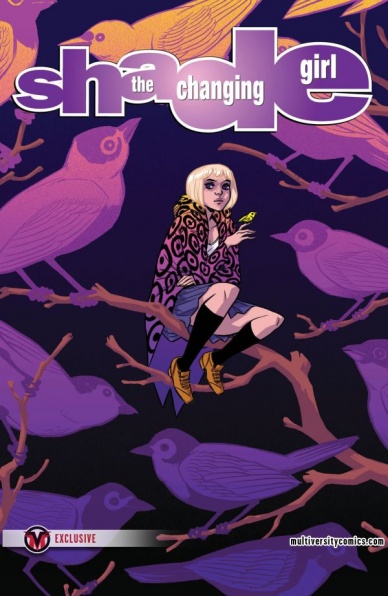
Shade, The Changing Girl #5
Written by Cecil Castellucci
Illustrated by Marley Zarcone
Reviewed by Rowan Grover
Loma Shade’s origin story of sorts comes to a climax here in issue #5. Castellucci excels in showing Shade’s eventual descent into madness while giving her character the air of a regular teenage girl. This works particularly well due to the unique relationship she has with each of her supporting cast. Shade, or Megan’s old boyfriend continues to try to get close to her again, while Shade brushes him off with coldly with the intent of having him merely as an emotional tool. However, Shade feels closest with her new friends, the odd pair of River and Teacup. It’s these plot points that make “Shade, The Changing Girl” the ultimate outsider empowerment comic. Castellucci writes Shade and her friends as characters that operate quite comfortably out of conformity and it lends to the series’ originality.
The story brings in a big plot twist this issue involving the return of Megan’s spirit, giving this series more drive and purpose than it initially had. Castellucci interrupts the plot with snippets of Megan’s spirit floating around aimlessly during the issue that works well at reintroducing her rogue-ish, bully character. The segments are expertly plotted, really upping the psychedelic aspect of this series to help it stand on its own amongst the Young Animal titles. Adding what’s essentially another character to the already large cast might be a risky move, but Castellucci works at it subtly enough that it doesn’t feel unnatural, and works seamlessly with the rest of the script.
Zarcone is given more of a chance than ever to draw some mind-expanding psychedelic sequences, and it’s a real payoff. Her clean, regulated aesthetic changes smoothly from depicting everyday life, to how Shade sees the world around her, and the deep space setting of the planet Meta. Here, each setting feels like a natural progression from the previous one, rather than a scene change, which makes for engaging story telling. The scene in which Shade and her friends visit the zoo subtly shifts to the planet Meta by the next page that it’s not immediately obvious at first, but feels rewarding and clever.
The sequences depicting Megan’s aimlessly floating spirit is where the art really shines though. It works as a solid throwback to the absurd, weirdly detailed art of the 90’s Vertigo series, yet blended with modern storytelling styles such as no narrating or internal monologue that it’s not alienating. One of my favourite pages in the story is Shade in her original form swimming in a current of vibrant, twisting rainbow colours. It’s not overly busy or detailed, revelling in its simplicity to depict Shade being stuck literally and emotionally.
Kelly Fitzpatrick’s colors have always been a big feature of this series, but like Zarcone’s art, the bar is significantly raids in this issue. A sequence involving Shade and her old boyfriend uses colourful spotted backgrounds evocative of Lichtenstein 50’s pop art. It makes the reading and pacing more enjoyable and evenly paced, presenting us with something that feels nostalgic but unique in this particular setting. My only issue is that during the real world scenes, the flat colors can feel a little placid and ordinary, especially during the zoo setting, but it does create a good juxtaposition of our reality against Shade’s psychedelic reality.
Final Verdict: 8.5 – Arguably the best of the Young Animal line up, Castellucci and co. bring their opening storyline to a soaring climax.

“Superman” #16
Written by Peter J. Tomasi, Patrick Gleason
Illustrated by Tony S. Daniel & Clay Mann
Continued below
Reviewed by Matt Lune
When the current political climate is as controversial, divisive and downright terrifying as it currently is, you can be forgiven for letting it influence how you read your favorite comic books. At least that’s how it feels reading ‘Multiplicity: Conclusion,’ where Superman – in fact, all the Supermen – face off against a being called Prophecy, whose whole deal is about being the saviour of the universe and achieving that by committing the complete genocide of a specific group of people. If that feels like a bit of a stretch, then Superman’s speech about half way through the issue feels pointedly, purposefully worded so as to speak to those currently losing hope in the real world. His quiet, confident call for solidarity, equality and strength in the face of adversity is the very reason why he is the Superman that we need right now, and Tomasi and Gleason know it.
This issue easily has fifty main heroes, most of which are multiple versions of the same character or alternate versions of others, so it would be understandable if they all started to look samey. Instead, Daniel and Mann display a competence with the form and are able to bring a diverse cast of characters to the table with ease. There are story elements that call back to moments throughout DC continuity, more obviously “Crisis on Infinite Earths” and “Multiversity,” and one panel in particular reflects that history nicely, being a direct homage to one of the more famous moments in “Crisis.” The art throughout is as epic as the story requires, with grand, dramatic double page spreads and mostly widescreen panels to reflect that cinematic scale.
Similarly, the coloring and lettering are noticeably well done. Many people have noted how DC’s Rebirth line is actively steering away from it’s darker, more serious side, and that’s reflected in the palette of this issue. After all, this is a story about a multiverse of heroes in brightly colored costumes using the power of music to defeat a fifty foot devourer of Supermen, so it seems only right that every page explodes with color. Similarly, the lettering captures bombastic sound effects seamlessly, and almost every character has their own style of speech bubble which helps distinguish them, including carrying over the trick of colored fonts used in “New Super Man” to indicate characters speaking another language, a technique much less intrusive for the reader than the guillemets or angle quotes usually used.
Overall the art may be a bit too much of the house style for some, but with an issue that weaves itself so thoroughly throughout DC continuity and history, that only serves the story. Interestingly however, the final page deviates from the style used in the rest of the issue. A deeper color palette, more feathered inking technique and more intricate pencilling elevates the importance of the single image, really capturing the darker mood of the twist ending.
For a storyline so deeply entrenched in DC Comics lore, this has been a surprisingly approachable read, and this issue alone, in any other circumstance, would have been an epic crossover Event for the company. Instead it’s merely the conclusion of a three part story and is a great example of the quality of the Superman books being published right now.
Final Verdict: 7.5 – A quintessential Superhero comic that still manages to squeeze in some timely, inspiring words of hope in between the multiversal madness.

The Unstoppable Wasp #2
Written by Jeremy Whitley
Illustrated by Elsa Charretier
Reviewed by Alexander Jones
The first issue of “The Unstoppable Wasp” could barely contain Nadia Pym’s delightful personality and the follow-up continues to deliver on that front. Jeremy Whitley and Elsa Charretier return to deliver Pym’s irrefutable charm while focusing in on the science behind the Marvel Universe.
With the first issue of the comic so littered with exposition, it was hard to tell exactly how this series would operate on a monthly basis. Thankfully, an intersection between science and social issues make this comic stand out for the right reasons. Surprisingly enough, Whitley is actually taking this opportunity to touch on some of the background from “All-New, All-Different Avengers” showing that this is not a new character, but one very much tied to the shared Universe at large.
Continued belowCharretier’s pencils continue to her position as one of the best new talents in comics. Her pencils are innovative and loaded with detail. Whenever she gets the chance to draw open-ended environments, the artist always includes a little bit of extra detail that makes the comic interesting. Her facial expressions are incredibly detailed as well, from one glance at a panel, you can tell what a character is thinking. The opening sequence establishes the tone of the issue and story without any characters present in the frame. One particular scene, where Pym stretches the cord of her land-line as far as can be pulled is a great way to depict her bubbly personality.
Surprisingly, this issue seems to be interested in awakening an aspect of the Marvel Universe not present before. Whitley seems to see Pym as a Doctor Strange-style hero, able to awaken the scientific corner of the Universe. Much like the first issue, Whitley doesn’t forget to include a big fight sequence in the middle of lots of exposition varying up the pacing of the comic. Whitley also makes sure to add some emotion into the proceedings of the story as well, with Pym facing the demons of her past. Due to the character’s ties to her disturbed, estranged father, this series could be heading towards a dark confrontation with her dad.
Pym’s interactions with the Marvel Universe at large remain sweet, as supporting Marvel heroes always seem skeptical of her at first, but charmed by her naive demeanor. Surprisingly, this issue even has a bringing the band back together focus that adds an energy Pym dialogue and conversation. At times, solo Marvel series can meander too much for my liking, but the hero seems driven to do some big things in the book.
Charretier and Whitley continue to infuse “The Unstoppable Wasp” with a delightful energy that carries a script covered in exposition to feel light as air. The issues’ dedication to continuity and the greater Marvel Universe only make the comic all the more impressive.
Final Verdict: 8.0 – The Unstoppable Wasp doesn’t skip a beat in a second issue loaded with sleek visuals and undeniable charm.


