
There is a lot to cover on Wednesdays. We should know, as collectively, we read an insane amount of comics. Even with a large review staff, it’s hard to get to everything. With that in mind, we’re back with Wrapping Wednesday, where we look at some of the books we missed in what was another great week of comics.
Let’s get this party started.

Astro City #41
Written by Kurt Busiek
Illustrated by Brent Anderson
Reviewed by Rowan Grover
Celebrating 100 issues, Busiek’s “Astro City” remains to be the superhero gift that keeps on giving. With issue #41 (If you’re confused, this is issue #41 of the current series, but #100 of the brand overall), Busiek explores the namesake of his series and setting, Astro City, named after the Astro-Naut. As with any good Busiek comic, the POV is from an all-too human bystander named Joseph Greenwald, who’s as classically written as they come. A well-meaning man with ambitions and dreams, Greenwald breaks the mould by also being aware of the gravity of his times, the Great Depression, making it a little less cheesy and more believable.
But the real star here is the Astro-Naut Roy Virgil, a pulp sci-fi throwback hero who’s more complicated than his outward appearance suggests. Busiek writes him with a hard working but infectiously positive personality, having Roy flash his comforting smile when times look tough. My personal favourite example of this is after Greenwald described when Virgil lost his alien lover, he still retains his sheer positivity, shown as he looks back at the camera the next panel with a knowing smile. Later on in the issue, we see Virgil become distracted and filled with hesitation for doing his job, as he allegedly witnesses another alien race alike humans, who were aggressive and warlike upon reaching the stars. He doesn’t want the same to happen to humans, giving him a degree of complexity as he considers the ethical thing to do. Busiek pens this well, having him become flustered from his initial discovery from the alien race, the Mrevani, and having his character become more reclusive from this point on.
Brent Anderson has been the cornerstone of Busiek’s “Astro City” since its inception, having the artistic skill to be able to beautifully render the inner workings of Busiek’s mind. Issue #41 is no exception. Busiek really gives Anderson a chance to shine here, with a huge diversity of genres that seamlessly blend together in execution. We have a dark, no-holds barred sci-fi scene as Virgil confronts the Mrevani and other intergalactic civilizations. Anderson gives these scenes the smoothness of modern superhero comics, yet retains the classical sensibilities of his predecessors, like Neal Adams. This is most obvious in the Mrevani invasion, where citizens are depicted gripped in terror, yet the whole scene has an Avengers movie level of polish.
Anderson also has a great sense of scale to replicate Greenwald’s awe in the reader. He renders this best in the scene where Greenwald first discovers Virgil’s moon base. We get an immediate shift from 1940’s aesthetic to balls-to-the-wall modern deep space all in one page. But the real treat is how Greenwald went from being a normal sized person walking across a hallway, to the size of an ant taking in the grandeur of Virgil’s space station. It’s here that it becomes obvious Anderson has a mastery over blending and depicting multiple genre and artistic styles into one seamless sequential scene. This is supported by Pete Pantazis’ colours, who is able to accurately depict 1940’s America and high-concept scifi without resorting to the restrictive four colour palette. He instead opts for a more cinematic approach, but with great vibrancy: it’s this that separates “Astro City” from the rest of the grim and gritty superhero comics trying to be realistic.
Final Verdict: 9.2 – “Astro City” is as consistently innovative as it’s been since the beginning, and the Busiek/Anderson team show no signs of slowing down.
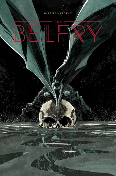
The Belfry
Written and illustrated by Gabriel Hardman
Review by Matt Lune
There’s something satisfying yet equally unnerving about a horror one-shot. Like a short novella or a single episode of ‘The Twilight Zone,’ “The Belfry” delivers a full story within one issue and gives you, if not closure then a thrilling nugget of fear before you perhaps attempt to sleep for the night (if so, good luck.) The very nature of the done-in-one formula however, means that Hardman has to squeeze a complete story between the covers, leading to a story that hurtles along at a lightning fast pace which only adds to the unease of the story, dropping you straight into the action and not stopping until the final page.
Continued belowThe plot of “The Belfry”, concerning survivors of a plane crash hunted by winged humanoids in a dark forest, is one that could be ripped straight from the RKO films of the 1940s mentioned by Hardman as influencing his love of horror. It’s also one perfectly suited to the one-shot format, due to it being so urgent and almost happening in real time. The pacing of the story is kept tight, with barely a chance to breathe, and Hardman’s narrative is laser-focused, leaving no room for wasted words.
The deeply creepy premise is enhanced exponentially by the scratchy, visceral line work. This is art as movement, as raw emotion, and as such Hardman fills each page with harsh lines, exaggerated monsters and terrified screams that tear out of the panels. There’s body-horror from page one that only gets worse as the true nature of the creatures becomes clear, and this is all recreated on the page like someone sketching out their nightmares from memory: it’s not quite right but that only makes it scarier. Likewise the camera angle of certain panels is off, be it just tilted or from an awkward point of view, making you almost want to crane your neck or just move closer to the page to see just what is happening, engaging you with the work in a way that some other horror creators can only dream of.
The panel structure is also jagged and claustrophobic, like they’re being clawed out of the page, shrinking at moments to increase the pace, and opening up to full pages when the horror hits a peak. This is a dark book, not just in the subject matter but in the colour palette, and as such the tones are almost black and white, further adding to the feel of an old movie. More than that, the darkness obscures the action, often making it difficult to know what’s going on, a move entirely intentional on Hardman’s part. All of this, as well as the messy line work and invasive lettering, only serves to enhance the deeply unsettling atmosphere and draw you deeper into the madness.
Overall this is a highly effective, instantly engaging one-shot that drags you, albeit briefly, into a dark and terrifying world. A must for horror fans.
Final verdict: 8.4 – A fun, scary thrill ride providing real moments of horror through truly visceral imagery.
Detective Comics #951
Written by James Tynion IV
Art by Christian Duce Fernandez
Reviewed by Jake Hill
Probably the most overused “Batman” menace is the every-villain-at-once attack. You know the kind I’m talking about, it happens in “Hush,” in “Knightfall,” and in all of the Arkham games. Still, you have to give “Detective Comics” #951 credit for a fresh take on the concept that elevates a promising Bat-villain, Lady Shiva, to new heights.
By the end of the issue we have Batman framed for murder, an army of ninjas, a Joker venom attack, and a mind-controlled army of innocent Gothamites, all of which are threats we’ve seen before. Nevertheless, James Tynion IV does a great job at threading those different conflicts and connecting them to the Colony, the villains of his first arc. The story feels less like throwing random problems at the Bat-family and more like the middle chapter of a much larger story. That’s cool. I was skeptical at first at the idea of making Jacob Kane a villain, but he’s become a much more fascinating and ambiguous figure because of it.
Lady Shiva herself only appears in this issue briefly, but she’s used extremely effectively. For years we’ve been told that Shiva is the most skilled fighter in the DC universe. This issue takes her from occasional Kung Fu badassery to full on, R’as al Ghul levels of supervillainy. This is a fantastic idea. The Batman rogues gallery could use some freshening up, and her connection to characters such as Nightwing, Batwoman, and Orphan position her to be utterly unqiue.
Christian Duce Fernandez usually does a workmanlike job on various Bat-titles, but he acquits himself admirably here. A lot of credit needs to be given to the design of the characters. Batman’s current costume is fantastic, and even when you put the Dark Knight in a typical pose (on a rooftop, cape billowing), the purple lining and yellow outlines really make the costume pop in a way that makes Batman believably both a Dark Knight and a Caped Crusader. The other characters too are all wearing the best costumes of their careers.
Continued belowWhen the current team finally assembles in the city square, they look great. Batman, Batwoman, Orphan, Azrael, Batwing, and Clayface are drawn in dramatic motion. Each character moves uniquely. Batwing looks heavy, like Iron Man, and Orphan is coiled and ready to brutally wreck bad guys. Duce Fernandez is evolving as an artist, and his mastery of body language is some next level stuff.
Final Verdict: 8.0 – “Detective Comics” is consistently one of the best team superhero books on the stands, and is reinventing the Bat universe in the most exciting of ways.

Divinity III: Stalinverse #3
Written by Matt Kindt
Illustrated by Trevor Hairsine
Reviewed by Michael Mazzacane
With its Soviet Russia alt-history “Divinity III” has taken a pulpier bent to representing conscious ideological practice. But with the revelations surrounding Kazmir, the third cosmonaut, writer Matt Kindt and artist Trevor Hairsine have created a metaphor for a more contemporaneous understanding ideology. Transformed by the Unknown into an incorporeal parasite, Kazmir unites the conscious and unconscious understanding of ideological function. Consciously it is found in propaganda like the sci-fi pulp stories he read as a child and the other bits State messaging (ex. that creepy Putin poster) strewn throughout the Stallinverse. The Stallinverse is a cartooned vision of the hypodermic needle model, where all messaging is immediately understood perfectly and not contested. That conscious recognition however undermines its effectiveness, which was explored in the events of “Divinity II”. It’s Kazmir and his ethereal state, his ability to enter the sub/unconscious of humanity that gets to the effectiveness of ideological reproduction and acceptance. When mixed with Myshka’s powers he transformed his ideology into the an all-encompassing aspect of the lived experience, organizing reality through that prism. By naturalizing his infection with a sense of history and cultural practice no one bates an eye at that they are living in the Matrix.
As the penultimate installment, there is no conclusive statement offered merely rising action and further questioning. The art team dose a good job of creating the sense of a frenetic pace. The art in the panels themselves is often in the middle of movement, augmented by flowing ink lines of Ryan Winn and Alisson Rodrigues. Their ink gives everything a cohesive body but not a solid static one, the lines revealing just the right amount of detail. It also doesn’t get in the way of David Baron’s light color pallet. That sense of energy created by the art work is modulated by the paneling, with Hairsine primarily using horizontal paneling to create an easy vertical reading flow. There is a particularly nice page that uses this smooth flow to replicate a dolly out as Abram Adams is slowly revealed in the foreground with growing mayhem and explosions in the background, two plans of action smashed together. This organization builds that sense of everything is inevitably coming to some kind of conclusion.
Final Verdict 7.5 – If you’ve gone this far you’ll finish the rather enjoyable ride.

Infamous Iron Man #5
Written by Brian Michael Bendis
Illustrated by Alex Maleev and Matt Hollingsworth
Reviewed by Gregory Ellner
Although the idea of “Infamous Iron Man” as a concept is very interesting, its execution leaves something to be desired, a problem that is very evident in this issue.
The story’s inclusion of Maria Hill, still identified as the Director of S.H.I.E.L.D., is very bizarre for a storyline that would be at a point when she is still under investigation for prior actions, but the main issue with her involvement is her sheer lack of knowledge. As leader of the premier spy organization on Earth, it seems incredibly unlikely that she would not know the family history of as prominent a public figure as Victor von Doom, both as from his time as a supervillain and his presence as a head of state. Her treatment as such paints her not merely as megalomaniacal, trigger happy, or criminally negligent, as she often is seen in other stories, but outright ignorant of material with which she should in the very least be familiar.
Brian Michael Bendis is well known for his mimicry of the dialogue style of David Mamet, with quick bursts of dialogue and drawn out questions. At times, such as when dealing with teenaged characters or certain coworkers, such a style can easily work, but it does not fit with his portrayal of Hill. The aforementioned ignorance seems to only be in place to allow Benjamin Grimm to remind the readers of what happened to Cynthia von Doom, Victor’s mother, but this excuse alone does not account for the fact that it requires the equivalent to the director of the CIA to not know some relatively basic information about a known, albeit momentarily quieted, threat to the world. For an “infamous” Iron Man, Doom doesn’t seem to be well known to those who should know better.
Continued belowAlex Maleev and Matt Hollingsworth are very good at portraying a magical duel between two master sorcerers, with the lights of their spells showing their unnatural nature against the more muted natural world. Furthermore, their method of showing the Iron Man armor, both inside and out, also emphasizes how it doesn’t quite fit into the rest of the world, with its glowing blue lights and holograms as compared against its user and his compatriots.
Final Verdict: 6.5- Some interesting plot developments and good artwork at the expense of character consistency.
Revolutionaries #2
Written by John Barber
Illustrated by Fico Ossio
Reviewed by Alexander Jones
The “Revolutionaries” are still keeping on keeping on as the newly formed team of heroes banded together to save Earth from the villains of several Hasbro Universe properties. Writer John Barber seems to enjoy some the strangest aspects about the heroes making up the team. Thus far, the writer has devoted lots of focus to the issue of identity as it pertains to hero Blackrock, who just found that he isn’t the man he thought was, but a Transformer from Cybertron. Even though Barber has characters larger than life in this issue, he makes sure to focus on the more human aspects of these characters.
Barber spends a really nice chunk of this issue digging in the headspace of the new Action Man, but he doesn’t devote quite enough space to fit everything he has to say about the characters in one issue. Unfortunately, this issue is overwritten, as Barber crowds the page with dialogue that is paced with unique patterns that can distract the reader. With current comics, less is usually more and Barber makes the mistake of giving us too much information from Action Man in these adventurous opening pages when all the author needed us to do is check in on what his motivations and goals were.
Ossio returns to deliver the goods in this issue. The artist seems to be up for whatever challenge Barber throws at him, whether it’s Transformers turning into humans or high octane, bombastic action sequences. Ossio’s refined pencil style have been the greatest asset to not only “Revolution,” but “Revolutionaries” as well. Ossio’s intense level of detail and polish is worth celebrating. The artist is great at choosing the right moment to frame any given panel while still devoting some of the work to clarity and storytelling. The panel layouts that he chooses in the issue complement the story well and break up some of the pacing here nicely.
Barber seems to be having lots of fun with a wild assortment of characters, but the author seems to have forgotten a strong plot to tie the issue together. In addition to spending little time introducing readers to the cast, Barber brings the Micronauts further into the story with little return on the investment. These characters feel so far detached from what is going on with the main team that it hard to get in invested in anyone here.
In some pages, Barber gets too hung up on some character beats that we saw last issue. While having the author explore certain character beats is interesting, he doesn’t take the time to really discover what these traits mean to the individual heroes. At some point, the series may be better served digging into the individual characters making up the team of this issue in their own solo stories. Lots of these heroes are new to the Hasbro Universe and need more context.
Barber’s messy script is filled with too many things that we saw last issue making this comic a snore to read through. While Ossio’s artwork is truly beautiful, I also wonder if the artist is challenging himself enough with the material he’s given in these pages. After coming off of an event, the sky’s the limit in terms of the things this artist can pull off. Still, the art is so refined in this story that the comic is a pleasure to browse–this comic would definitely benefit from a lighter scripting approach and some more focus on individual characters.
Final Verdict: 7.0 – Barber’s messy “Revolutionaries” #2 script is a still a breeze to read with slick Ossio’s visuals.
Continued below
She Wolf #6
Written & Illustrated by Rich Tommaso
Reviewed by Kent Falkenberg
Wow… This goes down fast – I’m talking shots of whiskey, hair-of-the-dog fast. And that’s including the 5-page “Creepy”-esque backup that caps the issue off like a grey-washed chaser about grave robbery, mad science, and cannibals. There’s nothing wrong with fast, though – as long as the issue delivers. And really, “She Wolf” #6 delivers exactly the gnashing I’ve been expecting since I first heard Rich Tommaso was going to rut in a den of werewolves.
The lodestone here is a lengthy and vicious scrap between the sister she-wolves. The litheness of Gabby and Lizzie’s beastly forms warp and contort across panels: their bodies wrap and coil around each other in a serpentine thrash. Don’t get me wrong, they’re still bloody werewolves as they claw and scratch and bite and tear. But there’s something else too, something vaguely reptilian.
As an aesthetic, it’s unexpected enough to lend quite nicely to the surreal aspect of the book, while also helping set it apart from the reams of similar fiction that’s out there. Ultimately, Gabby and a friend are able to exercise the demon Aamon out of Lizzie. And when seen in this (un)natural form, Aamon has a distinct lizard quality to him. So the look Tomasso’s creates is really conducive to his take on the creatures as products of possession rather than just of full moons and wolf bites.
As usual, the juxtaposition of Tomasso’s flat cartooning plays so well against how demonic a tale there is spewing forth from it. He blocks out the minefield of severed hands and limbs that Lizzie leaves strewn across a yard in such a classic style, that had it been available at the time, you could imagine this story as the type of four-color broadsheet a young Aleister Crowley would have read on his parlour floor on Sunday mornings.
Gabby is brought back for the first time this arc, and the sparse design to both sisters’ introductions draws a clever through line to connect them. Both just appear as stark silhouettes against the deepening blues of dusk in separate double-page splashes that seem like near copies of one another. Slouched as they are against a trash can and smoking outside the same convenience store, they’re imbued with a such a similar attitude that even if you slept on the first arc, it’s clear they are related in some way.
Normally, Tommaso’s tight control over the letters, lines, colors, and words keeps everything working in lockstep. However, there’s a conversation between Gabby and two jean-jacketed heshers that misfires. Panel progression moves left to right as usual, but the two bangers dialog wants to be read right-to-left. Since Tommaso handles the word balloons himself, it seems this is intentional. But it’s unclear what effect he intends. If he wants to keep the atmosphere off-kilter, then I guess it kind of works. Unfortunately, there’s a fine line between off-kilter that keeps you on your toes and off-kilter that just trips you up. And this conversation is more a stumbling point than anything else.
It’s a small hurdle, though. Overall, “She Wolf” #6 delivers a unique take on the frenzied, furious blood lust of werewolves. And that’s really where it counts.
Final Verdict: 7.5 – Tommaso just rips through this issue while setting up his end game.
Wonder Woman #17
Written by Greg Rucka
Illustrated by Liam Sharpe
Reviewed by Nicholas Palmieri
Greg Rucka is a master of the slow burn, which means two things: 1) This story in this comic is one large piece in a larger puzzle, but 2) despite that, there is still a definite sense of forward progression. We only progress each of the plot points the slightest bit, but each in a way that contains action and develops character. By the end of the issue, you do feel like you’ve accomplished something major, which is the key to keeping people interested with a slow burn in a serialized medium. Combine that with the well-constructed dialogue and you have, while only a tiny piece in the larger puzzle, a book that is nonetheless a great read.
Continued belowMaking this issue truly notable, however, is artist Liam Sharpe. His layouts always impress me: we can go from a ten-panel grid where nothing feels cramped or awkward, into four simple, striking panels, into a multi-faceted full-page spread where dozens of small details guide your eye through the image. Each layout was clearly carefully discussed with Rucka to maximize storytelling potential in a collaboration so smooth that it’s hard to tell where one creator’s contribution ends and the other’s begins. Colorist Laura Martin also deserves a note for establishing each scene’s tone, whether that’s with the muted blues in depressed Themyscira, the gray, beige, and white in the asylum, or the grayish-yellow fog that covers the suspenseful scenes of Steve, Etta, and Ferdinand hiding from gunfire while out on the streets.
With a creative team this in tune with each other, I’m happily along for whatever ride they want to take us on.
Final Verdict: 7.9 – Though better when looked at in context of the overall story, all elements of this comic work together so well that even this small piece shines.


