
There is a lot to cover on Wednesdays. We should know, as collectively, we read an insane amount of comics. Even with a large review staff, it’s hard to get to everything. With that in mind, we’re back with Wrapping Wednesday, where we look at some of the books we missed in what was another great week of comics.
Let’s get this party started.

All-Star Batman #8
Written by Scott Snyder
Penciled by Giuseppi Camuncoli
Inked by Mark Morales
Colored by Dean White
Lettered by Steve Wands
Reviewed by Gregory Ellner
Scott Snyder’s focus in on a wider variety of villains from the Batman rogues gallery continues with a fascinating, mind-bending visit to Jervis Tetch, the Mad Hatter. Through his writing, Scott Snyder invites the reader to question everything Batman has encountered, along with drawing interesting parallels between the Batman mythos and that of Alice in Wonderland. Snyder’s second-person narrative helps the reader to more easily get into the mind of Batman, as if the writer were talking to the readers themselves.
The way in which Steve Wands’ lettering distinguishes one speaker from another further aids the immersion, as Batman’s use of both upper and lowercase letters seems more stable than the shaking, erratic, all-capitals lettering of the words of Jervis Tetch. In fact, the increased use of Tetch’s lettering style as the issue goes on shows the deterioration of a sense of reality, as irrationality seemingly takes over the narrative itself. Even the plaement of the words, whether in narration boxes, amongst a costume, partially hidden behind scenery, or not held in any restraining margin at all, enhances the sense of disorientation. While the Mad Hatter can get into Batman’s head in this issue, the words help to get into the reader’s head as well.
Giuseppi Camuncoli’s artwork meshes perfectly with the aforementioned lettering schemes. As the story goes on, the human Mad Hatter morphs, with him seemingly becoming some kind of demonic monster that wants to destroy Batman’s mind. His artwork, his combination of surreal imagery from the Mad Hatter and more realistic imagery when the Hatter is not in control helps to show a sense of who is in charge at any given moment, on top of deeply unsettling images such as the Mad Hatter taking a bite out of Batman’s brain as he nearly loses his mind completely.
In the backup story, we see a look in on the conflicted Duke Thomas, a.k.a. Lark, as he wrestles with a case involving the Riddler. While the story does make good use of panel work and many different colored panels to showcase Duke’s indecisiveness, the placement of panels and pages, which does not seem to be sequential, is rather disorienting, making reading the story straight and figuring out which panel comes after which be very difficult to tell.
Final Verdict: 8.0- Very interesting take on Mad Hatter, but with a very confusingly organized backup story.

Archie #18
Written by Mark Waid
Illustrated and Colored by Pete Woods
Lettered by Jack Morelli
Reviewed by Alexander Jones
I never thought “Archie” played straight would be able to sustain an enjoyable long-running series, but Mark Waid and Pete Woods continue to prove me wrong in the series’ 18th issue. This is a remarkable chapter in a series that contains just enough subtlety to not fall into the soap opera camp, yet still have enough elements of drama to keep the attention of the average reader. I can’t stress enough how impressive it is that Waid and Woods are able to continue to illicit this specific tone with Archie–the book has a laid back but melancholy disposition that takes readers seriously but has a more casual personality. Each issue of the series can be pulled straight off the rack but the installments fit together nicely in a serialized medium.
“Archie” continues to add just enough little bits of information beneath the surface to sustain reader interest. Waid’s scenes clearly have a point in this issue but the writer never seems too concerned to beat readers over the head with what exactly Archie and Veronica are actually thinking about. He even hides some of Betty’s true feelings beneath the surface of the narrative and while these elements of the comic aren’t new to “Archie” or teen high school dramas, Waid executes these sequences in a manner that seems effortless.
Continued belowIf I was worried about anything in this comic going forward, it’s that I really hope Waid is able to give these characters a sense of progression. This incarnation of Archie would not make sense if the high school years lasted even more than one or two more actual years of this series publication. I would also like to see this comic tackle something a big heavier or do something a bit more radical with the core base of characters in the distant future.
Woods’ pencils are a great match for previous artists on the series. His sleek, proficient art lends the book a nice modern quality. There’s a ton of personality permeating throughout these pages but the art here isn’t quite perfect. There are a couple blemishes that are disheartening in the piece as the backgrounds of the series leave something to be desired. Some of the figures not on the forefront aren’t given that much attention. I almost feel like Woods might have been rushed with some details not quite as well fleshed out as others.
There’s a lot to like about this issue but it doesn’t quite deviate from past issues or take on any matters on that could be classified as big or ambitious. Yet the writing and art are of such a high quality that this issue fits nicely with the others. Waid doesn’t talk down to his audience, catering this book truly towards all ages of readers. Woods’ pencils may be missing some detail but most everything on the page contains high production value. “Archie” continues to evoke a poignant but laid-back tone while exploring new aspects of these characters.
Final Verdict: 8.0: Waid and Woods continue to craft a series that is truly for all-ages in the newest issue of “Archie”.
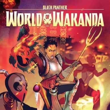
Black Panther: World of Wakanda #5
Written by Roxane Gay
Penciled by Alitha Martinez
Inked by Roberto Poggi
Colored by Rachelle Rosenberg
Lettered by Joe Sabino
Reviewed by Nicholas Palmieri
I want to love this comic. Conceptually, it’s great: show what happened to the Midnight Angels before their appearance in Ta-Nehisi Coates’s “Black Panther.” In terms of diversity, it’s exactly what comics need more of: queer women of color taking an active role in their own story. Despite this, I found myself frequently bored with the issue.
A lot of this likely has to do with the fact that Gay is still new to the medium. This shows in her lack of conveying information visually. Aside from the action sequences, and even including those, most of the issue contains talking heads repeating plot elements to each other with overwrought dialogue. The characters often repeat themselves and generally use far more words than are necessary. When talking, it’s rare that any of the characters actually do anything, which means that visually uninteresting panels fill the book. The art team does their best to salvage this, but there are only so many visual perspectives you can create out of the situations Gay has written.
On a technical level, though, the artists of “Black Panther: World of Wakanda” bring the script to life nicely. Martinez crafts some dynamic action sequences when she gets the chance, picking poses which imply both the motion beforehand and the motion to come. Her sparse thin lines make use of the characters’ whole bodies in the action and dialogue-heavy scenes, and Poggi’s smooth thin inks complement them well. The main drawbacks to the art, the repetitive visuals in some scenes, lie more in what Gay gave the artists than in their execution of it.
With Gay’s name, this series has the potential to bring in non-comics readers. With the concept, it’s bringing in some much-needed diversity. The art team even does some great work with what they have. But Gay still needs to learn more about comics before her work in the medium will become worthwhile. As it stands, this comic feels like wasted potential.
Final Verdict: 5.5 – Great concept, but the not-so-great writing drags down the issue and takes the artists down with it. Here’s hoping Gay will learn more about comics before writing another one.
Continued below
The Deep #3
Written by Tom Taylor
Illustrated and Colored by James Brouwer
Lettered by Wolfgang Bylsma
Reviewed by Jake Hill
When you think Tom Taylor do you think “Injustice” or “All-New Wolverine?” Maybe “Superior Iron Man?” Whatever you’re favorite work by Taylor is, it’s probably full of murder, evisceration, and more murder. Taylor isn’t just limited to violent superhero fare. In fact, his original graphic novel “The Deep: Here Be Dragons,” predates all of that work. Boom Studios picked up “The Deep” for their all-ages imprint Kaboom, and is releasing it as a miniseries.
The adventures of the Nekton family doesn’t re-write the rules of adventure, but it’s the kind of story I can’t get nearly enough of. A family of adventures has been done from “Fantastic Four” to The Incredibles to Gravity Falls, but every new iteration of the familiar premise comes with its own wrinkles.
Antaeus and Fontaine Nekton, their parents Will and Kaiko, and their pet fish Jeffrey, live a life of danger and exploration on a cool submarine. This issue puts the family through all sorts of aquatic danger as their craft is damaged by a gigantic sea creature. It’s simple stuff, and the pictures and words reflect that. Brouwer draws his panels a bit bigger than I’m used to, making the illustrations easy to follow. There’s the occasional six-panel grid, but most of the issue is made up of three and even two panels.
The small number of panels and the relative darkness of the deep-sea setting made me think I’d breeze through the issue in just a couple of minutes, but it actually took as much time to read as comparatively dense Big Two superhero books. Brouwer draws the Nekton family gritting teeth and grimacing through their deadly escape, and even though each figure was made of only a few lines, something about them was more expressive than the sum of their parts.
Taylor steps back and lets his artist do most of the heavy lifting, which isn’t to say that the book is underwritten. He just doesn’t exposit what can be expressed in art, and this is an action heavy issue. The Nektons spend most of their time arguing, like families do. The issue’s best moment comes from the tried and true “we only have one diving suit” situation. Put a family made up of interesting characters in that dilemma and the story can’t help but be interesting.
Nothing in “The Deep” is going to surprise you, and sometimes that’s fine. Tropes exist for a reason, and a talented creative team can bring together familiar elements in a satisfying way. “What if Superman were evil?” is one of the most overdone premises in all of comics, but with wit and talent Taylor made “Injustice” a blast to read. His work here is similar; familiar ideas that manage to be engaging.
Final Verdict: 7.0 – A by-the-numbers all-ages adventure, elevated by its earnest creators.
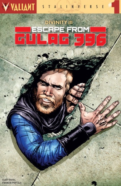
Divinity III: Escape From Gulag 396 #1
Written by Eliot Rahal
Illustrated by Francis Portela
Colored by Andrew Dalhouse
Lettered by Dave Sharpe
Reviewed by Mike Mazzacane
Immediately, “Divinity III: Escape From Gulag 396” evokes popular notions of prison and escape with a cover paying homage to Don Siegel’s 1979 film Escape from Alcatraz. When mixed with the adventuring nature of previous Archer and Armstrong stories it’s clear what the book is trying to evoke: high action and planning to get out of Gulag 396. Judging a book by its cover is never a good idea. Writer Eliot Rahal subverts cover story, telling a more sedate story of spirituality and connection.
Thus far Divinity III and the various tie-ins have been playing at typical Elseworld storytelling. Rendering the dystopian Soviet run future as a cartoon to play off understood Valiant character beats. “Gulag” subverts expectation and gestures toward a more human tale featuring the Soviet state, in particular the official state position of atheism and those who refuse to conform. Francis Portela and colorist Dave Sharpe use the minimal action sequences in this issue to build a world of violent consequence and domination not the absurdist, slightly comedic, type that pervades Valiant. Their depiction of this consequence gives these alt-characters a feeling of age.
Continued belowTasked with coercing an unruly inmate into line, Obadiah Archer finds himself between a harsh warden and his beliefs. While comics are a visual medium, I’ve always been a bit of an odd ball and preferred lots of talking as opposed to more dynamic action. Which is odd, considering the strain showing two people in conversation via pictures can be; just having several pages of quasi-shot reverse shot style paneling isn’t very engaging. Portela’s decision to use the prison walls as a means to make a natural panel border between Archer and Armstrong, followed by Sharpe’s color coding (red for Archer, blue for Armstrong) create a dynamic and clearly legible page. The use of contrast, of action and color, in the big double page spread as Archer gives a “Big Speech” about the audacity of hope is one of the most effecting pages I‘ve read in months. While colored in a darker pallet, Portela has a real knack for showing the pained weariness of Armstrong.
Elseworld stories are always about using turning audience expectation and understanding on itself. Previous Divinity III one shots have used that understanding to replicate actions, but Archer and Armstrong has never really been about action. It’s about an Odd Couple like friendship and that’s what we get here. It reaffirms the core, multiversal constants, of Archer and Armstrong while telling a story unlike any in this miniseries.
Final Verdict: 8.0 – Even in a cartoon dystopia Archer and Armstrong stay true to themselves

Kill or Be Killed #7
Written by Ed Brubaker
Illustrated and Lettered by Sean Phillips
Colored by Elizabeth Breitweiser
Reviewed by Paul Lai
Brubaker, Phillips, and Breitweiser have honed their collaborative craft into a comics institution of pulpiness. Throughout “Fatale,” “Criminal,” and “The Fade Out,” their storytelling has remained reliably taut, artful, intriguing, and in the best ways, tawdry. And as their vigilante yarn “Kill or Be Killed” stretches into its second arc, these storytellers can trade on their earned credibility to gear-shift pace and perspective with a jolt.
Thus far, the first four-issue arc plunged us into the dark psychology of grad student Dylan, whose “rescue” by a demon (?!?) from a suicide attempt gets billed with an obligation to commit murder once a month. Hence, “Kill or Be Killed.” The supernatural elements of that plot may have been off-putting to noir purists who need no literal demons to unmask the horrors of the human heart. But a transfixing story promises if you can swallow that premise, especially with the door left open to the question of whether the demon made Dylan or Dylan made the demon.
The third issue of the second arc of “Kill or Be Killed” shifts the spotlight away from Dylan to Kira, a character who nearly slipped into cliché in the first arc. That was before it became clear from a sliver of backstory that she was much more than a femme fatale or pixie dreamgirl, but instead a kind of fractured witness, a cracked mirror to Dylan’s somewhat warped worldview. This seventh chapter, entitled “What Kira Saw,” starts piecing those cracks together through a photo album tour through Kira’s family history juxtaposed with a visit to her therapist. In Brubaker, Phillips, and Breitweiser’s seamless and propulsive psychological style, seeing what Kira sees, we check off all three boxes of the benefits of a perspective shift. First, Kira’s past actions and drives make much more sense. Second, we see the present with altered lenses as we re-encounter Dylan through her eyes. And third, the story’s future gains new momentum by the compelling logic of what she’ll have to do next.
That impending sense of the next domino falling is what keeps the Brubaker, Phillips, and Breitweiser brew so absorbing. And they show again they can pull off a seeming diversion into a side character’s backstory without letting up on the tension. When you can get into a side character’s great-great-granduncle Philo’s death and her step-sister’s judgey chats without taking the pedal off of a serial vigilante murderer story, you know you’ve mastered something. That something, in this case, is the patient command of rhythms of character development and interaction. Such planning keeps even the serialized ritual of a monthly shotgun blast tipsy with all its explosive tension and surprise.
Continued belowBrubaker knows when to be terse and when to be talky. Breitweiser’s colors release cool and hot, contrast and complementarity, to keep Kira adrift in the world but centered in Dylan’s madness. And Phillips accomplishes what he always does, making everything real and pretty like a posed photograph, but every flicker of a facial nerve a dead giveaway that things are terribly amiss under the surface, soon to burst.
If you need to catch up on “Kill or Be Killed,” my advice: judge this book by its trade collections, but keep up to enjoy its monthly slow burn. These creators do pace and perspective as well as anybody.
Final Verdict: 7.6 — Takes a character detour that still ratchets things up. Textbook tension building.
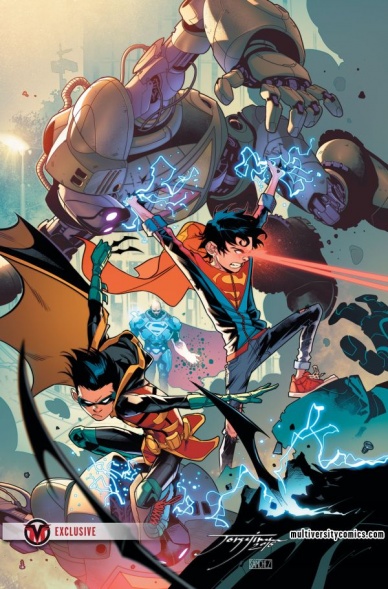
Super Sons #2
Written by Peter J. Tomasi
Penciled by Jorge Jimenez
Colored by Alejandro Sanchez
Lettered by Rob Leigh
Reviewed by Kent Falkenberg
I’m not sure there will be a more unsettling sequence in a mainstream DC book this month than the prologue to “Super Sons” #2. Jorge Jimenez captures a disquieting balance of wide-eyed innocence and sheer terror on the face of a little girl hiding as her brother stalks the rest of their family. There’s a disturbing malevolence underpinning the art – the heavy inks on the boy’s arm as he holds an iron in front of his cowering mother just ooze murderous intent. Though we never see the overt violence, what Pete Tomasi and Jimenez give us almost hits worse. We see the little girl’s tears seeping from her hand-covered eyes, as letterer Rob Leigh plants the jagged, “KRAKK,” of the lethal blow on her forehead with all the implied savagery of that blow we never see land on her mother.
It’s chilling.
It’s a testament to how strong Tomasi’s writing is in “Super Sons” #2 that the prologue never feels at odds with the playful comic-bookery on display the rest of the way. Rather, it helps raise the stakes for the series. So for all the verbal sparring between Jon Kent and Damian Wayne – and it’s that repartee that’s the true highlight of the issue – there is an authentic severity surrounding the case that is both deadly serious and a little out of their league.
Because for all their powers and training and superior intelligence, these super sons are just that. Children. And they look and act and sound like children, in spite of their fantastic abilities. Jimenez draws a smear of chocolate on Jonathan’s face and an unwrapped candy bar in his hand as he scrolls through weeks of security footage in seconds. When the two characters talk about the Amazo virus infecting the family from the prologue, Tomasi ensures Damian gets the edge in a my-dad-is-better-than-your-dad way (“My father said everyone lost their powers when it was cured”… “My father says your dad is not a details person.”). They jab and bicker and cooperate and blow up at each other. It’s a fantastic dynamic that borders on brotherly.
Even when “Super Sons” trades that buddy cop banter for superheroics, the creators never hide the adolescence of their leads. While Jon might be powerful enough to finish off Lex Luthor in their fight, he’s drawn just lanky and uncoordinated enough to really be able to deliver that knockout punch. Jimenez focuses instead on his round eyes, tousled hair and eager smile as Jon tries to talk his way out of trouble. Success ultimately hinges on Damien outsmarting the new Superman of Metropolis – since overpowering obviously isn’t an option and sliding through his legs in a particularly kinetic panel.
Actually, I can’t say that; they’re all pretty kinetic. The art and colors and story just pop. There’s youthful energy and real emotion splashed over every page, while still providing subtle counterpoints for the darker and the lighter sides of children with superpowers. “Super Sons” #2 soars.
Final Verdict: 8.0 – Two issues in and only getting stronger.

Star Trek: Deviations #1
Written by Donny Cates
Illustrated by Josh Hood
Colored by Jason Lewis
Lettered by AndWorld Design
Continued below
Reviewed by Matt Lune
If you woke up this morning wondering “What if the Next Generation crew lived in Mad Max times though?” then wonder no more, as IDW’s annual alternate reality event ‘Deviations’ casts its ‘Elseworlds’-esque gaze upon Picard and the gang. That’s the elevator pitch anyway, the explanation for these proceedings – the deviation from history that this story spins from – is that it wasn’t the Vulcans that made first contact with Earth back in 2063 but the Romulans. I’m not exactly sure why that simple change would then lead to Will Riker looking like Snake Plisskin raging across an apocalyptic wasteland with the rest of the Enterprise crew in a glorified dune buggy; if anything, ruling over a world of what they perceive to be lesser beings with the iron fist of an occupying force seems like more of a Cardassian thing, but Romulans are certainly more iconic in Trek lore. In fact, this whole story feels a lot darker than the Next Generation crew are used to, which is a consequence of the nature of the tale being told for sure, but the tone feels like it would be more at home with the Deep Space Nine crew. Certainly, Kira Nerys would look badass with the cyborg arm that Deanna Troi is wielding here.
Writer Donny Cates admits himself in the backmatter that the story took on a deeper meaning and was heavily influenced by the current political climate, and that’s perhaps why “Star Trek: Deviations” loses the edge of fun that you’d expect from a book with a Mad Max Will Riker, but that’s not to say this isn’t enjoyable. You have to just accept the central conceit as the necessary set up that it is (an issue with a lot of alternate reality stories) but once you do, the plot hurtles along at warp speed as the crew race to free a mysterious prisoner from a Romulan internment camp. The artwork is suitably detailed and does a fine job of matching the likenesses of the cast without taking you out of any given moment, and Hood has a lot of fun creating post-apocalyptic versions of the characters. The pacing and panel structure leads you swiftly through an action-packed plot, and the set pieces are effectively realised, making this feel like one of the bigger budget episodes of the show. The final page reveal asks a few too many questions to feel anything other than confusing, which does detract slightly from the impact but sets up a future sequel nicely if one were ever to surface.
The Star Trek franchise is no stranger to alternate reality takes, and while this is a darker tale than perhaps the TV shows ever dared, it’s always interesting to mess with the immaculate utopia that the Federation tends to occupy. There’s not quite enough explanation as to how the world ended up this way to make this a clean one-shot (which has the benefit of making you want more, although that may not be intentional) and it doesn’t quite capture the adventure of the premise, but overall this is a fun take that thrusts familiar characters into a truly alien environment.
Final verdict: 6.8 – This may not be the ‘Days of Future Past’ for the Next Generation crew, but it’s still an enjoyable deviation from the standard Trek tale. “Star Trek: Deviations” #1


