
There is a lot to cover on Wednesdays. We should know, as collectively, we read an insane amount of comics. Even with a large review staff, it’s hard to get to everything. With that in mind, we’re back with Wrapping Wednesday, where we look at some of the books we missed in what was another great week of comics.
Let’s get this party started.
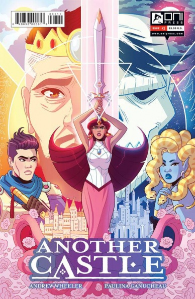
Another Castle #1
Written by Andrew Wheeler
Illustrated by Paulina Ganucheau
Reviewed by Matthew Garcia
“Another Castle” #1 has a number of great elements. There’s the high fantasy setting, the no-nonsense princess, the series of over-the-top events that seem like they’ll keep you engaged and invested the whole way through. Yet when Andrew Wheeler and Paulina Ganucheau put it all together, the end result doesn’t feel at all fully formed. It wants to be a sendup of princess tropes, one of those books that takes these conventional elements of damsels in castles and girls waiting on a prince, and turn them on its head, but thanks to some weak narrative drive, the book never becomes much of anything.
Paulina Ganucheau’s artwork is one of the stronger elements. Her figures are distinct and fun, and the character expression vary and do well to convey the mood. She gets a lot of mileage out of the evil lord dude’s design, and it’s one of a few moments where the book felt like it had life. The compositions sometimes come off overblown and awkward. She makes attempts to let the images control reading flow, often by bursting an object out of the panel, but the staging of the next panel doesn’t always fit and it feels weird and counter-intuitive. Her illustrations are wonderful, but her sequentials haven’t quite hit the same note yet.
Of course, the awkward letters don’t help matters. Jenny Vy Tran shoves bubbles and boxes wherever they’ll fit, including over characters doing important things. The most egregious example comes when Misty reaches for the sword, which we have to look past a narrative box. It might not be all Vy Tran, but a lack of consideration on Ganucheau of balloon placement, but it’s one of those things that immediately takes you out of the story.
The script, at its best moments, limps along. So much happens in this issue but none of it has a chance to develop. “Another Castle” #1 reads like an illustrated wiki-article about “Another Castle” #1. Wheeler provides pages and pages of exposition, as characters talk blatantly about the problems of the kingdom and the other characters’ personalities. And they wax on and on about how Misty isn’t your typical princess, though she really ought to behave like one. Their voices are almost indistinguishable from each other, so the reading feels clinical and informational.
Wheeler also fails to generate any tension or momentum as Misty simply moves from place to place, and so even a dragon attack plays boringly. It most resembles the sort of network pitch pilots you see pop up online every once in a while, meant to give a preview of what the story’s going to be like rather than having actually anything to do with the story.
We need more books like “Another Castle”, books that push against conventions and try to broaden the comic book medium, both in terms of audience and genre. Books that have a strong message and disregard of the status quo. Unfortunately, we just don’t see any of that in “Another Castle” #1.
Final Verdict: 4.3 – Nice illustrations for a boring story.
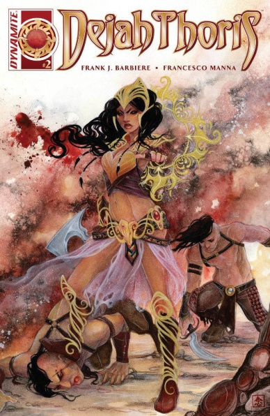
Dejah Thoris #2
Written by Frank Barbiere
Illustrated by Francesco Manna & Morgan Hickman
Reviewed by Jess Camacho
I was pretty into the first issue of the newly relaunched “Dejah Thoris” and that doesn’t really change with this issue. “Dejah Thoris” #2 moves the plot along a bit more but Frank Barbiere is still playing the bigger secrets close to the chest. That’s actually what helps make this so much more accessible to people unfamiliar with the character. The story is really a fish out of water tale as Dejah has to learn how to adapt to completely new things. She’s being deconstructed and it’s easy to get invested in her story since we’re basically watching her be built up again.
Continued belowFrancesco Manna’s art is hitting that right place in fantasy that’s sexy but not at all distracting. Manna’s line work is very clean and the new costume design for Dejah hasn’t made her lose anything important. Manna, if anything, makes it far more believable that she could fight in this and his cloaked version of her works very well to hide her in plain sight. I really like how Hickman’s colors change in the fight scenes. Manna highlights the specific moves of Dejah Thoris and Hickman nails the contrast in her Princess upbringing and the grunginess of the soldiers.
Final Verdict: 7.0 – “Dejah Thoris” is building up to something great and I’m fully on board with it.
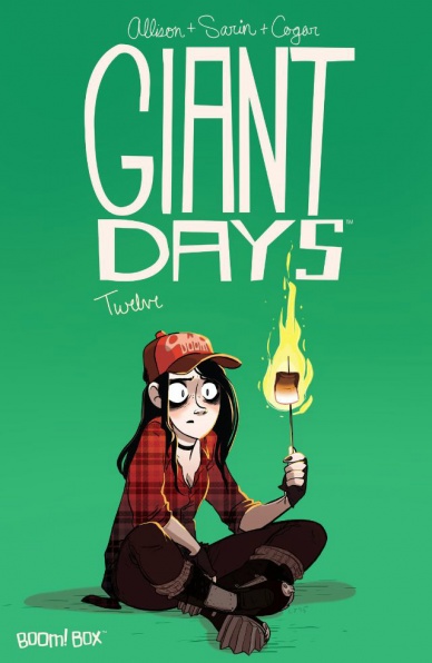
Giant Days #12
Written by John Allison
Illustrated by Max Sarin
Reviewed by Michelle White
Once a mini-series, then a 12-issue series, and now a full-blown ongoing, it’s clear “Giant Days” has staying power. Centring on a group of friends negotiating their first year of university, this ebullient Boom! Box title has done a beautiful job developing its characters and putting them in ever more hilarious/awkward situations.
This arc-ending issue has an emotional focus, putting a spotlight on Susan’s recent breakup. But the trick with “Giant Days” is that it never takes itself too seriously; even when heavier topics come up, they’re treated with a well-chosen smidge of levity. In this case, portraying Susan’s ex as a repentant spectre does the trick pretty neatly. Rounding out the issue, the banter between the three girls as they tackle the challenges of a camping trip is as light and crisp as always.
Visually, “Giant Days” remains conventional but engaging. Max Sarin’s broad cartooning style keeps the girls’ contrasting personalities at the forefront, but gets across enough nuance that they still surprise us. The scene between Susan and Spectre!McGraw is particularly well thought out, with compositions that underscore the unreality of the situation without lessening the emotional payoff. All the while, Whitney Cogar’s colours keep things candy-bright.
Of course, if you want a cerebral challenge or big themes, “Giant Days” probably won’t cut it. But it’s fun, colourful, sweet, real, clever, and charmingly British. Following these ladies’ academic careers is starting to look like a solid life choice.
Final Verdict: 8.5 – An energetic title that charms and delights.
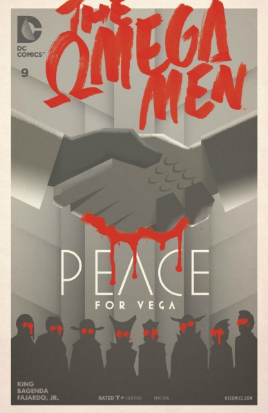
Omega Men #9
Written by Tom King
Illustrated by Barnaby Bagenda
Review by Ken Godberson III
You know those creators that say they want to do a “mature” story taking place in either DC or Marvel? You know how 9 out of 10 times, those “mature stories” are just an excess of violence, swearing or demeaning women… you know, more so usual? “The Omega Men” is an example of mature storytelling in the DC Universe done right. This is one of the most morally grey books I have seen there ever. It makes it difficult to talk about, honestly, because really giving any of the plot points away would be massive spoilers and I don’t want to spoil anything. This book simultaneously is a space opera, an examination of morality during peace and war times and also manages to utilize the Lantern Color Spectrum in one of the best ways since its introduction.
And it is all accomplished because Tom King’s characters move the plot forward, instead of the plot moving characters forward, like so many other Big 2 books. The big stand outs in this issue are Doc and our closest thing to a protagonist, Kyle Rayner. Between the last issue and this, King has made Doc into an immensely tragic character and the developments here just intensify that. As for Kyle, well, provided that this book doesn’t go completely to shit in the last three issues, this may be the greatest Kyle Rayner story we’ve ever had. And King shows that legacy characters aren’t interchangeable because Hal Jordan couldn’t function in this story.
Just like the tone, character and style of the story and character are so unique right now at the Big 2, so too are Barnaby Bagenda’s pencils and the color work of Ramulo Fajarado Jr. There’s a softness to this art that really does juxtapose the harsh truths in the story, yet it doesn’t take away. Destruction is treated with the same care as a delegate trying to tell a poor joke. And while my heart hurts [intentionally] at the somber depictions here, I could not help but let out a fist pump at how awesome Bagenda and Fajarado make the last page (Kyle’s my Green Lantern. Let me have this.)
And I have to give special nod to the series cover artist, Trevor Hutchison. The same dichotomy between peace and war, the desire of the “powerful” and “weak” from the story is shown in full force with depicting the so-called “peace” in the Vega System. It’s a simple, but effective image.
Final Verdict: 9.6- One of DC’s best decisions was to let this book run its course. If you want original, unique voices then you need to get this book.


