
There is a lot to cover on Wednesdays. We should know, as collectively, we read an insane amount of comics. Even with a large review staff, it’s hard to get to everything. With that in mind, we’re back with Wrapping Wednesday, where we look at some of the books we missed in what was another great week of comics.
Let’s get this party started.

Batman #20
Written by Tom King
Illustrated by David Finch
Inked by Danny Miki and Trevor Scott
Colored by Jordie Bellaire
Lettered by Deron Bennett
Review by Matt Lune
Tom King’s deconstruction and reconstruction of Batman reaches a crescendo of sorts in this final part of the ‘I Am Bane’ storyline, and through the voice of a mysterious narrator, we’re taken back through all the events of King’s run up until this point. From the plane crash in issue 1 up through to Bane’s vengeance-fuelled return to Gotham, this issue really drives home the concept of King’s grander narrative. If the ‘I Am…’ story titles weren’t explicit enough, this is a total rejuvenation of the entire concept of what it means to be Batman. A rebirth of his ideal, if you will.
In between the flashbacks, we witness the brutal, inevitable conclusion to Bane’s return, and it’s exactly as violent as you imagine. It’s a good thing the fight is framed by the recaps though, as on its own the fight itself is fairly standard and almost anticlimactic. However, King always manages to squeeze the most emotional drama out of any situation using almost nothing but text boxes (see also his fantastic run on Marvel’s “Vision”) so the emotional weight is in the narration that surrounds the titans as they clash. The identity of the narrator is revealed near the end of the book and while it’s a surprising choice it fits with the message of the issue, and provides both Bruce Wayne and Batman the chance to contextualise the purpose of everything up to this point, as well as provide the momentum needed to carry on moving forward past this first act.
David Finch’s art has really never been better as it has been throughout this run. His style has definitely been divisive in the past (see ‘Avengers Disassembled’) and sometimes tonally wrong (see his more recent run on “Wonder Woman”) but here his gritty exaggeration and visceral detail suits what should be an ugly, blood-soaked brawl. This is a battle of wills, to the death, between two similarly minded, disturbingly dedicated individuals that live theirs lives surrounded by violence. Rather than give us the illusion of a battle between gods, this is a dirty scrap between very real, very breakable men and as such Finch shows us every grisly detail.
The pacing is almost done in real time, with barely any momentum lost between panels. That choice tightens the choreography and enhances the realism of the fight, and allows for some cool moments where Finch can really drive home the effectiveness of Finch’s dialogue. An example is early on where Batman berates Bane for his cliched platitudes, a page dedicated to showing nothing but Batman slowly rising up after being knocked down, each panel a small shift as he describes all the times in his life where his death has been predicted, the page ending with him back on his feet, fists raised, and three words in a balloon: “I’m still here”.
There’s depth to what King and Finch are conveying, but this issue captures the essence of what King has achieved so far in his run, and that is this deceptively complex balance between rich, character-driven plots and bold, badass fun.
Final verdict: 7.0 – A violent clash with some classic Batman moments, framed by strong character exploration. A satisfying conclusion to King’s first act.

Captain America: Steve Rogers #15
Written by Nick Spencer
Illustrated by Javier Pina and Andres Guinaldo
Colored by Rachelle Rosenberg
Lettered by VC’s Joe Caramagna
Reviewed by Alexander Jones
Steve Rogers is now an agent of Hydra, but still a mortal enemy of the Red Skull. “Captain America: Steve Rogers” #15 dives deep into the battle between the pair. If there’s anything that ties this volume of Captain America together, it certainly would be Spencer’s penchant for Rogers explaining “what really happened” in his own words. This series seems to be self aware with just the right amount of parody stemming from Steve’s own words and the secondary characters cracking the occasional joke here and there. The tone of this series tows the line so nicely between being one of the bleakest books in all of Marvel that’s still allowed to cash in on some humor here and there.
Continued belowWhile the main story has always been enjoyable in it’s own right, Spencer’s methodical attention to detail in the flashback scenes are greatly appreciated. The writer has been taking his time with the stories, inverting some of the things readers thought they knew about Rogers. These scenes bleed into the main story in a fascinating way that that makes readers analyze the relationship between Rogers and the Skull in all-new manner. This issue in particular feels like a nice payoff that fans have been waiting for as the pacing of this volume of Captain America might have been dragging its heels too long to get to the “Secret Empire.”
Javier Pina and Andres Guinaldo continue to deliver on the high bar that this story has set for artistic contributions. Pina and Guinaldo’s simplistic but streamlined work is greatly appreciated, as the book has a kinetic sense of movement while still looking easy on the eyes. The sense of dread exuding from this comic is perfectly captured by tense facial expressions and a restrained color palette from Rachelle Rosenberg. There are some middle parts of the issue that get a little too bogged down with ugly, pronounced lines, that look a little bit like Guinaldo’s work, but they don’t detract from the issue as a whole.
Captain America has become public enemy number one and behind closed doors Rogers has been doing a couple of not incredibly nice things. The fact that the expanded Marvel Universe is largely clueless has elicited an incredible amount of tension from the comic. In a time where fewer and fewer comics have been focused on serialized storylines, Captain America: Steve Rogers has continued to tell a huge bombastic tale that feels like it is only going to keep getting bigger over the next few months. As long as Spencer keeps his cool and focus as the story gets wilder and bigger in scope, “Captain America: Steve Rogers” could continue to scratch my itch for a wild, perverse story held within the gates of the Marvel Universe.
Final Verdict: 8.0: “Captain America: Steve Rogers” #15 is an essential piece in Secret Empire that pays off a huge plot thread of the series and features stunning work from Guinaldo, Pina and Spencer.

Extremity #2
Written and Illustrated by Daniel Warren Johnson
Colored by Mike Spicer
Lettered by Rus Wooton
Reviewed by Kent Falkenberg
The more I read of this series, the more I’m impressed with how multi-layered the title is. It might seem odd to fixate on this, when Daniel Warren Johnson’s kinetic linework – weathered, yet delicate; harsh, yet beautiful – is so rich in detail and motion that you can smell the cold sweat and hot blood on people’s faces. You can feel the biting wind and grit of sand against your teeth, feel ground give way as characters tread upon the finely detailed debris and detritus that’s littered everywhere. But bear with me, because that one word is a perfect summation for everything Johnson does here.
Extremity.
So, the first issue kind of focused on the obvious meaning. Thea lost a hand and she took one in kind; clever, clever. But what started there, and what “Extremity” #2 expands on is an examination of extreme violence and its effect on the perpetrators and victims of those acts. Rightly or wrongly, the Roto live violent lives now – a fact reinforced by Johnson and Mike Spicer’s clever design of them with a swatch of red over their left eyes. Not just a way to differentiate them from the green-eyed Paznina, this look makes it seem as though their faces are perpetually stained in blood.
Johnson seems to be setting up a contrast of Thea and her brother Rollo. “Why didn’t you spill our enemies blood?” she asks him early on. And before the answer can come back simplistically as he’s just a weak pacifist, Johnson provides a bloody-mess, splattering panel of the siblings and their father, Jerome, defending themselves with blade and fist against a herd of razor-toothed beasts stampeding towards them from the wilderlands of the Ancient Dark. Although, since this is partly a study on the after-effects of savagery, the fact shouldn’t be lost on anyone that the panel is capped with Jerome explicitly screaming ,“We lose everything,” as the family is violently bathed in more red.
Continued belowBut what “Extremity” #2 does best is pull back the lens to reveal the full extents of this world – and the Roto’s place at the very outermost reaches of it. In a way, the multi-layering of the title is reflected in the setting itself, the Rising Plains. This place Johnson has created is layer upon layer of levitating rockscapes, scaling from the Ancient Dark at the bottom to Edom Castle at the top. Earlier in the issue, as Rollo bonds with the newly reactivated Shiloh (a “small god”, whether that means robot, cyborg, or something else is left for later issues), they sit on the hard ground and look up at the multitude of craggy tiers that float one atop another, stretching up towards a starry sky.
“Extremity” #2 opens and closes with the power of Queen Nim: brute-force and cruelty at the open, palatial pageantry at the close. It’s quite effective in setting up her, the Paznina and her house, Edom Castle, as the locus of power in this universe. By comparison, Jerome, Thea, and the rest of their clan have literally been scattered to the extremities, They salvage and scavenge these fringes for an existence that only lets them climb to the middle islands if they’re lucky.
This issue is sublime. Mike Spicer’s earthy tones ground the Roto in gritty realism, while pink and purple hues embolden the fantastic in beasts and sky. Johnson’s art captures some specific essence of motion in every panel, from the sheer momentum of the marauding behemoth on the cover to the awkward control of a pencil in Thea’s left hand. There’s a whole new world and caste system being scratched into life. The stakes rise, and we fall to the bottom with the Roto to forage for truths in the murky depths of violence begat from violence.
Final Verdict: 8.0 – Picking up steam and not looking back. This feels like the start of something big.

The Flintstones #10
Written by Mark Russell
Illustrated by Steve Pugh
Colored by Chris Chuckry
Lettered by Dave Sharpe
Reviewed by Nicholas Palmieri
Writer Mark Russell juggles three separate plotlines in this issue of “The Flintstones.” All three had their merits, but only two fully worked for me.
The main plot about Bedrock’s new mayor, Clod the Destroyer, worked best. Russell successfully lampooned post-election populist regrets here by also mocking trigger-happy war tactics. In creating absurd extremes, like drone strikes against a native people who stole a fern, he makes his point without appearing preachy. Over in an unrelated plotline, Russell found gold in fully examining the original cartoon’s use of animals as appliances. Since each of the appliances has been personified and developed over the past few issues, we feel for the group when one of them is misused and callously thrown in a trash can. It’s a horrifying moment, and one that subversively provokes thought for modern readers in our throw-away society.
Not working quite so well was the, once again mostly unrelated, plot about movies coming to the town. I did enjoy the comments about art, the realistic examination of film theory, and Werner Herzrock’s constant philosophizing. Ultimately, though, there didn’t seem to be much of a point to it aside from providing a convenient solution to the Clod plotline in the book’s final pages.
Chuckry uses a mostly bright color palette to preserve the look of the cartoon, which makes the more shocking moments, like the character deaths in this issue, feel all the more unsettlingly satirical. On the illustration side, Pugh draws expressive faces and bodies, and he fills his panels with bold details. But his “Flintstones” work reads less like sequential art and more like a collection of stand-alone images put together on a page. Likely a mix of Russell’s writing and his art, there’s something oddly segmented about the visual storytelling from panel to panel.
In all, even when certain scenes don’t work quite to the level they could, Russell brings the unexpected laughs and the social commentary. There’s also something about his and Pugh’s sequential storytelling that doesn’t fully connect with me. Nonetheless, I appreciate the risks this book takes and am looking forward to the final two issues.
Continued belowFinal Verdict: 7.5 – Not everything works as well as it could, but the parts that do work hit hard. Regardless of its downfalls, “The Flintstones” is a rare beast. Give it a shot while you still can.
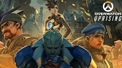
Overwatch: Uprising
Written by Michael Chu
Illustrated by Gray Shuko
Reviewed by Jake Hill
“Overwatch” has been a franchise that’s doled out it’s lore in tiny servings, which has done wonders for it’s fandom. There’s no shortage of fanfic, theories, art, cosplay, and everything else you would expect from a long established property. The newest comic, “Overwatch: Uprising,” does a lot to codify the setting in a way that no other piece of “Overwatch” media, whether comics, animated short, or the video game itself, has managed to do.
“Uprising” is a prequel to the game, taking place in the latter days of the team before they were officially disbanded. Unlike previous “Overwatch” comics, it doesn’t skimp on the characters, and features most of the main cast in one way or another. It’s not a very action-heavy story, taking place before a big battle, but if you enjoy the designs and characters of the Blizzard franchise, you get to see them bounce off each other in fun ways.
Basically, there’s something bad going on in London, and the Overwatch team is not legally allowed to operate there. The issue follows Soldier 76 a.k.a. Jack Morrison as he talks to the other members of the team about whether or not he should break the law. Chu’s 76 is the same gruff curmudgeon he is in the game, but his Gabriel Reyes (who will one day be known as Reaper) steals the show. Reyes is drawn with a constant smirk, quipping at his teammates, but obviously hiding something sinister. His reaction to 76 discovering that he has his own secret agents (a cameo from Jesse McCree) is to laugh it off.
Shuko’s art is serviceable and matches the game’s style nicely. His costume designs are cool, particularly his designs for a young Genji and Tracer, the latter of whom is just starting her first week on the team. He also debuts a matching blue Overwatch team uniform, worn by Reinhardt, Torbjorn, Mercy, and Tracer as they get ready to go fight some bad guys. As cool as his designs are, his background characters don’t have faces, including a few panels of 76 walking down a long hallway.
The art is enhanced by some nifty motion comics effects. Nothing is fully animated, but panels fade in and out cinematically, and it’s clear that the art was built around that gimmick. One page in particular starts as a photograph and pulls back, layer by layer, until you can see it in the hands of 76, who’s only half listening to Tracer, lost in his memories. It’s a neat effect, but unfortunately it draws more attention to the less detailed panels instead of distracting from them, giving the art a somewhat inconsistent quality.
As fun as a lot of them have been, this is the first “Overwatch” comic to feel essential. By showing the team on a typical day (as typical as a team of enhanced super soldiers ever gets), it helps explain what the Overwatch team was like, and how they operated. Blizzard has created a cast of fairly typical characters, but every project like this gives the world of “Overwatch” an extra dimension.
Final Verdict: 6.8 – The best “Overwatch” comic yet, held back by some inconsistent art. It definitely exceeded my expectations for what an in-house video game tie-in comic can be!
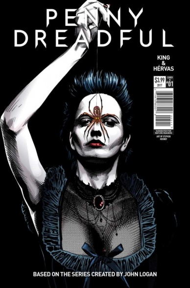
Penny Dreadful: The Awakening #1
Written by Chris King
Illustrated by Jesús Hervás
Colored by Jason Wordie
Reviewed by Gregory Ellner
“Penny Dreadful: The Awakening” can leave a fan of the television series torn. Chris King’s story is a concise continuation of the show’s plot, picking up some time after the series finale, with a new antagonist that still fits well into the established mythology of the plot thus far. Many favorite characters, in particular the surviving defenders of London from the series finale, have their stories once again wrapped up in this danger, which goes in directions that would be difficult in live action television.
Continued belowThat said, there exists a prominent problem. The comic is just that: a continuation. It does not leave much room for people to enter into the series, with only the vaguest, most cursory attention paid to such elements as certain characters’ connections. It gives blatant spoilers about the television show, rather than just continuing onward or telling another plot of its own that would not spoil for possible viewers.
However, the artwork is, at times, a saving grace where issues of being locked out of the story may cause it to falter. Jesús Jervás brings the characters to life in a vibrancy befitting the nature of the story, with rough penciling easily showing the characters’ emotions well. The Wolf Man’s transformation is gruesome and terrifying as it should be, while his human form is shrouded in darkness shortly before, befitting his despair over his “blessing.” Jason Wordie’s colors also showcase a vibrant brutality, especially evident in the splashes of red that accompany extreme violence, in particular murder or the rise of a demonic being.
Final Verdict: 7.0- An intriguing continuation of the supernatural gothic drama famous in Penny Dreadful for fans, but lacks significant information for newcomers to the series.

Star Wars: Rogue One Adaptation #1
Written by Jody Houser
Illustrated by Emilio Laiso & Oscar Bazaldua
Colorred by Rachelle Rosenberg
Lettered by Clayton Cowles
Reviewed by Michael Mazzacane
The novelization of movies always has a special place for me, they were among the first books I’d really read. Regarding Star Wars, they also hold a novel place as well; the novelization of Return of the Jedi was the first text to mention Mustafar, the crucible that would form Darth Vader. Often based on older versions of script, these adaptations allow for more little moments and a different perspective on already narrated events.
After the cold open, the first act of Rogue One is a bit of a rough go. The editors largely discard the calm wipes of the original trilogy, resulting in abrupt transitions from scenes based around little flourishes of character that you wish were a bit longer. This abruptness is replicated by the turn of the page, in transition these jumps are slightly more understandable if still crunchy. We get 3 separate signifiers for time/place in the first 6 pages. Other than the first one, none get a worthwhile establishing panel. The reader is just thrown into scene. It’s these kinds of moments that make me question the usage of reader knowledge to short hand your way through narrative construction.
In a physically restricted medium like comics, the most interesting aspect is seeing how writer Jody Houser and artists Emilio Laiso and Oscar Bazaldua go about re-presenting these moments. Their first page is a beautiful synthesis of the long tracking shots and slow elevation of tension from the cold open. Rachelle Rosenberg uses the setting sun as an excuse to bathe everything in a warm orange tone creating a sense of continuity. The overall column layout for the lettering, using Galen’s monologue to Jyn as a book end, also adds to the page flow. Their rendition of Cassian’s deadlier Han Solo introduction is similarly familiar, yet different. The tense sequence is packed with more panels, emphasizing every action. How they show is “Han Shot First” mentality is more violent than the film. In the film, we never see him pull the trigger. In the comic, Emilio and Oscar show us nothing but that trigger being pulled and the bodies on the floor because of that action.
There are some nice slightly extended or new sequences. Bodhi, who in the film is underdeveloped due to the various reshoots and cuts, gets to show something like an emotive range as he bumbles towards a meet Saw Gerrera. They expand on what Jyn means when she speaks about Saw to the Rebellion. These little moments are just that, nice moments of texture but nothing earth shattering. The latter example is a nice example of comics as a medium to be efficiently non-linear. Overall, I can’t help but feel like I’m seeing a version of events that were already told in a more engaging and fulfilling way.
Final Verdict: 6.0 – There is nothing egregiously bad about this comic, but there isn’t anything that argues for its existence either.


