
There is a lot to cover on Wednesdays. We should know, as collectively, we read an insane amount of comics. Even with a large review staff, it’s hard to get to everything. With that in mind, we’re back with Wrapping Wednesday, where we look at some of the books we missed in what was another great week of comics.
Let’s get this party started.
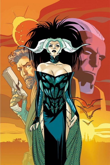
“Empress” #1
Written by Mark Millar
Illustrated by Stuart Immonen
Reviewed by Stephenson Ardern-Sodje
The Millarverse gets all “Star Wars” on us with the first issue of a sprawling space saga that takes place in the hidden gaps in Earth’s history between dinosaurs and cavemen. Aka a long time ago, in a galaxy a lot closer to home.
Millar’s slick, streamlined storytelling style is on full display in “Empress” #1 as the book jumps straight into the bustle of highly advanced humanoid life on Earth 65 million years ago. Millar manages to create a convincing mash-up of the old and the new, offering up space-age technology and gladiatorial combat astride t-rexs in the opening few pages, but thankfully he doesn’t seem too concerned with fully fleshed-out world building just yet. Much like Vaughan and Staples’ monolithic sci-fi series, “Saga”, Millar’s new book is driven by an exciting mixture of charismatic characters and explosions. Lots of explosions. As we follow Emporia’s – the aforementioned Empress – daring escape from her tyrannical husband we get a breathless look at the world (and the off-world) that Millar will presumably revisit in more depth as the series goes on. Most of our focus, however, is drawn to Emporia and her family. Millar’s conversations feel natural and rooted in an as-yet-un-revealed personal history that gives this high-concept space opera a strong human core.
Throughout the book Immonen provides an amazing artistic presence that feels at once laser focussed and impressively detail orientated. Flipping seamlessly from cinematic crowd sequences to super-close up insert panels, “Empress” #1 is free to barrel forward from the very first page while simultaneously offering subtle visual structures that nod to a more unique backdrop waiting to be explored. Immonen’s character design is stunning, with eye-catching main characters and a host of secondary characters who feel like they’ve been pulled from Gaultier’s The Fifth Element concept art. Immonen is on top form from the get-go here, and with a visual playground that offers toys as diverse as interstellar jumpships and pterodactyls to smush together at will, I’m really excited to see what he offers up month after month. But, as with Millar’s writing, the thing that keeps Immonen’s disparate sources from falling apart is the more subtle, humanising element. His strength when it comes to showing muted, believable facial emotion adds further weight to Millar’s conversations and feels like it’s begging for ambiguous motivations that fans can spend their time in between issues agonising over.
Millar and Immonen are clearly pulling from a range of genres, from ’60s Sci-Fi to classic swords-and-sandal epics, and the result is a book that revels in its own absurdity. The unique time-frame and truly imaginative backdrop offer up an expansive palette for the creative team to draw from, and the heart at the centre of the book is strong enough to anchor all that weirdness in some semblance of reality. This is a first issue that manages to set up a whole new universe without ever taking its foot off the gas, and if Millar’s back-matter promise that ‘this ride goes up to eleven very quickly’ is anything to go by, it’s only going to get weirder. I can’t wait.
Final Verdict: 9.0 – The Millarverse joins the space race with a massive maiden voyage.
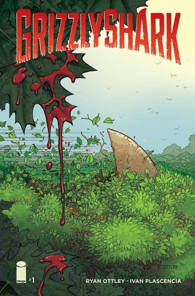
Grizzly Shark #1
Written and illustrated by Ryan Ottley
Reviewed by Michelle White
In case this title didn’t tip you off, this is one gory comic, laying out a bloody tale of hungry sharks in the depths of the forest. And if you can’t handle sharks in the forest – they’re there, just because – maybe this comic isn’t for you. It’s silly as hell, containing a solid running gag about dismemberment and even a touch of period humour.
Continued belowWhat keeps “Grizzly Shark” grounded in all its loopiness is the pacing, which is solid, interspersing the gore with zany bits of dialogue that constantly seem on the verge of dissolving into grunts. The cast of this comic is one motley – and not terribly articulate – bunch, and their encounters with each other provide most of the humour.
“Grizzly Shark” isn’t lovely to look at, but it’s not like anybody expected it to be. Ottley’s characters are broad caricatures nailed down with precise strokes. His messy hand-lettering fits the mood, scratched into unevenly shaped speech bubbles.
Not too much is demanded of Ivan Plascencia on the colouring front, but it has some neato moments despite the limited subject matter – a pink sunset offset by a spray of blood being one of them.
All told, if the title “Grizzly Shark” sparked something in you, you’ll probably enjoy the comic itself. It’s not particularly memorable, but it gets the job done, hitting notes both grisly and sharky.
Final Verdict: 6.0 – A limited but enjoyable lowbrow adventure.
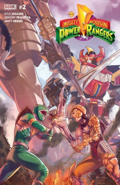
Mighty Morphin Power Rangers #2
Written by Kyle Higgins & Steve Orlando
Illustrated by Hendry Prasetya & Corin Howell
Review by Ken Godberson III
Here’s the thing about Power Rangers. For all the emotional scenes it could have, it always felt very tied to its structure. So it was interesting to me that the aspect of this comic I noticed the most is how it goes against such structure. Instead of over-the-top monsters destroying the city, we have Rita Repulsa playing a quieter, longer game. There is more of a focus on character interactions and what is going on inside these kids’ heads than Kalishplosions. But just because it’s taking a different route doesn’t mean there isn’t some cheesy moments and some decent action, they are just second to some of the quieter moments, and all the stronger for it.
If you’re looking for a tone more akin to the show, then the backup starring the real heroes of Power Rangers, Bulk and Skull, is where you’re going to find it. We follow their plan to look like heroes involving a captured Puddy Patrolman. Howell’s artwork is a bit more expressive than Prasetya on the main story, which helps sell the comedy and the downright goofiness of the situation.
Final Verdict: 6.9 – An interesting take on the original Power Rangers with a great deal of potential.
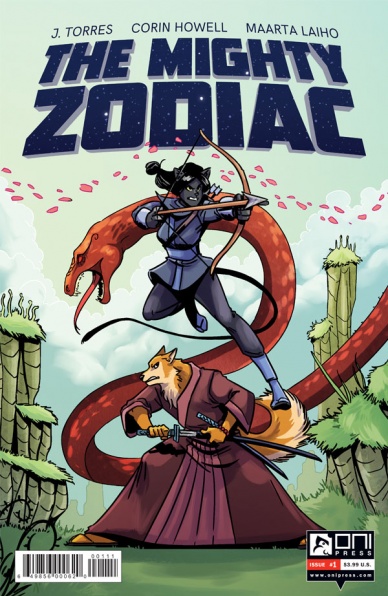
The Mighty Zodiac #1
Written by J. Torres
Illustrated by Corin Howell
Reviewed by Alice W. Castle
The thing about writing a comic positing the signs of the Chinese Zodiac as a band of heroic adventurers means you’ve inherently got a cast of at least twelve characters. That’s… unwieldy, to say the least, and it shows in this first issue as J. Torres’ writing jumps from location to location to location to try and set up both the plot and all of these characters, barely given enough space in a twenty-something page comic to develop any of them beyond broad archetypes. There’s a lot going on here and barely enough space for any of it to breathe as the comic jumps from plot point to plot point without rest until the final page.
While there’s a lot going on and not really enough room for any of it to breathe, a lot of what is going on is interesting. There’s a lot of promise here for what’s to come being a pretty interesting all-ages adventure comic filtered through mythology, but this first issue is so jam packed with plot it’s hard to get a sense of what the story is actually like.
The art, meanwhile, is not Corin Howell’s best. Her style is very simple here in order to capture a more over-the-top, cartoonish feeling, but something about the linework feels almost rudimentary at times. It’s disappointing because her storytelling and her sense of storytelling and action are still in check, but the linework just doesn’t feel up to par with some of Howell’s previous work.
Final Verdict: 4.9 – This could definitely be turned around with subsequent issues, but I think this issue was fighting a losing battle from the beginning.
Continued below
Steven Universe: Too Cool for School
Written by Ian Jones-Quartey & Jeremy Sorese
Illustrated by Asia Kendrick-Horton & Rachel Dukes and Leigh Luna
Reviewed by Matthew Garcia
The thing we have to remember about licensed comics is that creators always have some higher authority to answer to. A writer or artist on a spin-off project might have a deep love and understanding of the characters, but if the network executives or producers of the show or editors have the power to steer the story to fit whatever they need (mostly, marketability). I think Jeremy Sorese loves Steven Universe and the Crystal Gems, and his care for them comes through in the new original graphic novel, “Steven Universe: Too Cool for School”, but at the same time it feels he’s more willing to play it safe with his scripts than push the envelope. The first Steven Universe OGN is cute and fun. The extended page count lets Sorese and his team of artists flesh out the story, add some bigger and more relatable stakes, and deliver some fun action sequences. But, the whole thing feels inconsequential. Like a passing lark.
Even though he’s constantly traveling through space and preparing to fight the Gem homeworld, Steven remains a 14-year-old boy. Seeing his friend, Connie, prep to go to school, makes him want to go as well. So he starts this sort of trial period. Which of course goes horribly awry.
The story is fast paced and breezy. Kendrick-Horton and Dukes use a lot of big images with simple environments and setups, all designed to keep you flipping through this thing all the faster. Steven Universe has a lot of its origins in manga, and that feel comes up prominently in this book. It zips by so fast it’s sometimes like the characters are actually animated. One of the most exciting things about the kaboom! and Cartoon Network relationship has been that the artists have been able to lend some of their own style and personalities to the model designs, and that helps this from coming off like a mass-produced add-on.
It does go on too long, however, and the book feels like it should have wrapped up about 20 pages before its end. The scenes with the principal drag on so long it’s like we’re actually in the principal’s office. The school setting will definitely be relatable for its younger readers. Even if “Steven Universe: Too Cool for School” doesn’t do much, if it helps a single kid navigate their world, then I think it’s a success.
Final Verdict: 6.5 – Cute, but fleeting.


