
There is a lot to cover on Wednesdays. We should know, as collectively, we read an insane amount of comics. Even with a large review staff, it’s hard to get to everything. With that in mind, we’re back with Wrapping Wednesday, where we look at some of the books we missed in what was another great week of comics.
Let’s get this party started.

C.O.W.L. #10
Written by Kyle Higgins & Alec Siegel
Illustrated by Rod Reis
Reviewed by Matt Dodge
The streets of Chicago feel like a potential warzone, as long as the heroes of C.O.W.L. remain on strike. Union leader Warner is now forced to deal with the fallout after on his own turned scab and recused a kidnapped alderman. While it seems that Warner can spin this in his favor, it soon becomes clear that he is playing both sides so deeply that the slightest error could bring down the entire organization, and threaten the city itself.
With the recent announcement that “C.O.W.L.” will be wrapping up its run with issue number #11 next month, readers probably expected this installment to wrap up the tension and action in order to lead to a spectacular conclusion. Scribes Kyle Higgins and Alec Siegel, however, have done everything they could to set this series up for a more cerebral take on superheroes. The tension has reached a boiling point, but it is due to the characters, their development and actions, opposed to the looming threat of a super powered showdown. That total could still happen, but at this point I’m far more interested in the personal confrontation between Warner and Detective Frost and the information she has uncovered than any potential fisticuffs.
Rod Reis’ art has undergone an interesting transition over the course of the series. It is still as ethereal and enigmatic as ever, but the image has become consistently more grounded. This mirrors one of the major themes of the book, namely removing the gleam and prestige from these heroes. As the Chicago public, and the readers, become more and more disillusioned with the heroes of C.O.W.L., their world becomes less suggested and more grim and stark. While earlier, the use of their powers seemed strong enough to bend the reality of their world, now it seems like they are stuck in the back alleys just like everyone else.
The creative team of Higgins, Siegel and Reis has done such excellent work on “C.O.W.L.” that the announcement of the imminent conclusion comes as a real shock. This issue features a great deal of plot and character development, which places a huge amount of emotional anxiety on the events of next month’s finale.
Final Verdict: 8.0 – This team has created a dense and complicated world filled with complex characters in only 10 installments, and if this installment is any indication there will soon be huge ramifications for both.

Darth Vader #5
Written by Kieron Gillen
Illustrated by Salvadro Larroca
Review by Alice W. Castle
“Darth Vader” #5 was a strange reading experience. I’m not entirely sure I can put it into words, but since I kind of have to as part of this review I might as well try. Objectively, I have no complaints about this issue. Kieron Gillen’s writing is as solid as ever and is definitely up to par with the other writers working on Marvel’s Star Wars books. Tasked with wrangling a protagonist out of a character whose verbal and physical mannerisms could charitably be descried as ‘stoic’, Gillen has smartly introduced a number of other, much more charismatic characters to bounce off Vader and introduce a bit of witty banter to the issue, even if it is one-sided.
Add on top of that art by Salvador Larroca who seems to be completely in his element here. The focus on sci-fi architecture with its metallic hallways and and spaceship cockpits means that Larroca’s is being put to its best use while still feeling recognisably Star Wars at all times. While I still have personal issues with how Larroca draws the face of human characters, the fact that there really aren’t many in this issue is another reason it feels like his art is being to put to great use here.
Continued belowAnd yet… something about this issue isn’t clicking with me. There’s no spark here like I have with the other Star Wars books. For a book dedicated to one of the most fascinating characters in the entire galaxy, this issue seems to care less about Vader and more about the introduction of his replacements. What leaves me with is a book that is structurally sound and objectively good, but with a void of a protagonist and without engagement in the protagonist, I can’t really engage in the story around him.
Final Verdict: 5.8 – A book that has all the elements of greatness, but can’t quite decide what to do with its main character.

Howard the Duck #3
Written by Chip Zdarsky
Illustrated by Joe Quinones
Reviewed by Jess Camacho
Waugh! It’s not easy being a humanoid duck person on Earth. After escaping The Collector’s prison he was mugged by Aunt May. Now he’s having a bit of an existential crisis because his private eye career is going terribly and got beat up by an old lady. “Howard the Duck” has a story and that’s incredibly important but the real draw here is the comedy. Chip Zdarsky is hilarious and doesn’t settle for one kind of joke. He has a knack for keeping this series absolutely ridiculous but also making Howard relatable as a character. The scene with Howard going undercover as an actual Earth duck is easily the funniest thing to happen in a comic book all year. Zdarsky is committed to absurdity and this series is going to continue being fun.
Artist Joe Quinones is clearly having the same kind of fun I as a reader am because he is really nailing it on art. The characters have solid facial expressions and his rendering of Howard is perfect. He too is committing to making us laugh and since comic books are a visual medium, he has to the jokes justice. The scene with Howard acting like an Earth duck comes to mind again because he just gets the deadpan stares right and he jumps to Howard being outraged so easily. I can’t get enough of “Howard the Duck” and issue three is easily the best in this young series so far.
Final Verdict:: 8.8 – “Howard the Duck” is quickly becoming the funniest funny book in the business.

“Mythic” #1
Written by Phil Hestor
Illustrated by John McCrea
Reviewed by Matt Garcia
We’re deluding ourselves with science; magic is the real way the world works. At least that’s Hestor and McCrea’s thesis for their new Image series, “Mythic.” The story follows a secret team of people trying to return balance to magical entities, bearing loads of elements from “The Invisibles” and “FBP,” without ever really being as memorable as either of those.
It’s very vertical book, as if McCrea wants you to know there’s so much we don’t understand stretching above us. His monsters and designs are cool — big and toothy — and you can tell he had tons of fun designing them, but his staging and blocking for the rest of the book comes off as sort of bland. Not that much is happening on the story level. This issue serves mostly to introduce the world, and the book ends right about when it’s getting interesting, without any real satisfying resolution in what we’ve been given. I bet it will read and flow a lot better when more of them have come out, but as it stands now, it’s an easy book to shrug off.
Final Verdict: 5.8 – A fun spin on the current “Science is the new rock-n-roll” trend, but without doing much else, it’s ultimately not that memorable.

RunLoveKill #2
Written by Jon Tsuei & Eric Canete
Illustrated by Eric Canete & Leonardo Olea
Reviewed by Stephenson Ardern-Sodje
The first few pages of “RunLoveKill” issue one really barrel along with a force. Canete’s dynamic, almost cell-shaded art gripped me from the first panel, and Rain, the series’ sleek protagonist, looks breath-taking whenever she’s in motion. Issue two ups the ante even further, with a futuristic club scene that feels like it’s been pulled straight from the grimy, neon-drenched back-alleys of Blade Runner’s L.A. Olea’s colours pop, sparkle, and shine throughout this issue and he really adds a level of opiated vibrancy to the whole proceedings.
Continued belowThis issue allows for an almost ambient level of panel decompression which does two very separate things as far as the reading experience is concerned. Firstly, it allows for Canete to further display his ability to breathe life into a believable, lived in future-city, albeit one that feels perhaps too non-descript for serious fans of cyberpunk, and secondly, it slows the pace of the comic book down to a crawl.
Which brings me onto the less impressive side of “RunLoveKill”’s sophomore instalment, the story. Rain’s character still feels largely unformed and unremarkable, and the world of Pyrat, while beautiful, doesn’t do much to distinguish itself from the myriad other near-future dystopias that the sci-fi scene is littered with. The shadowy paramilitary forces of ‘The Origami’ could be cut and pasted from any number of sources and this second issue does little to further the narrative, even though writers Tsuei and Canete are now a quarter of their way through their projected run. That being said, I am enjoying “RunLoveKill” so far, even if I feel that it’s not bringing anything excitingly new to the genre. The art does more than enough to ensure that I’ll be checking it out for issue three and I’m hoping that, given the visceral cliffhanger that issue two fades out on, we’ll be seeing a lot more of Canete’s kinetic art at play as the story ramps up.
Final Verdict: 6.4 – A slick, sexy, switch your brain off kind of comic. Here’s hoping some substance crops up in the next few issues to go along with all that style.

Marvel Secret Wars Superhero Activity Book Facsimile Edition
Reviewed by Brian Salvatore
Marvel has put together this collection of old coloring books and stickers sets – some of which I actually owned in the ’80s – and released it to coincide with the new version of “Secret Wars” currently hitting the stands. For someone who, quite literally, colored these pages, this was a really fun trip down memory lane to hold in my hands.
However, I’m not really sure who the audience is for this product. Personally, my daughter is too young for something like this, but maybe this is for folks of my generation to do with their kids? I don’t see too many young kids picking up a $25 book, nor do I see too many adults picking it up and putting it on the shelf.
I mean, I love Spider-Man as much as the next dude, but I only have so many places to put stickers that society will deem acceptable. So, while this was a lot of fun to page through (and, not gonna lie, one of my guitars now has a Kang sticker on it), I have a hard time recommending it to anyone other than an enthusiastic fan looking to spend time with a young person in their life.
Final Verdict: 5.0 – A perfect gift for a very specific situation.

Southern Cross #3
Written by Becky Cloonan
Illustrated by Andy Belanger
Reviewed by Keith Dooley
Since issue one, “Southern Cross” has skillfully regaled us with the mystery of a young woman named Braith who has been searching for her missing sister. Writer Becky Cloonan continues in the third issue, with the assistance of artist Andy Belanger and colorist Lee Loughridge, to create a claustrophobic tale set on a transport space ship named the Southern Cross. Braith is a woman focused on deducing the fate of her sister while experiencing strange occurrences on a ship that appears to be bursting at the seams with supernatural shenanigans. Despite not knowing the origin of this driven detective, Cloonan gives us enticing hints. Braith is resourceful, strong, and fearless as well as gaining our empathy for the fear and horror that she expresses on her journey through this haunted ship.
Having never been exposed to Andy Belanger’s art before this series, he quickly impressed me with the expressiveness and detail he brings to “Southern Cross”. In this issue, Belanger’s style easily combines realistic and fantastical traits. When Braith experiences something terrifying at issue’s end, it becomes that much more awe-inspiring because of Belanger’s apparent devotion to this book and creating a unique world that, despite its sci-fi bent, has so much more going on in it.
Continued belowLee Loughridge warrants immense accolades for his complex colors. That complexity is evident because his muted color palette is still able to vibrantly bring the dark and dank corners of the Southern Cross to life. When Braith and the ship’s captain search Braith’s disheveled room, the unexpected purple and pink hues still retain an ominous glow that is pregnant with hidden agendas and dastardly motivations.
“Southern Cross” is a book that must be read carefully. It appears deceptively simple but, as this issue proves, utilizes characters and events as clues to a mystery. Braith and the reader have become invested in discovering the fate of a woman as, issue by issue, the creative team insinuates their storytelling talents into our brains.
Final Verdict: 8.5 – “Southern Cross” is a thrilling book that is slowly and successfully building (based on the revelations and subterfuge of all three issues) to a terrifying and shocking conclusion.
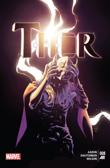
Thor #8
Written by Jason Aaron
Illustrated by Russell Dauterman
Reviewed by James Johnston
Ever since Whoopi Goldberg broke the news on The View last year, the question on everyone’s mind has been “Who is the new Thor?” And in “Thor” #8, the popular heroine’s finally unmasked. And with this revelation comes a whole realm of possibility for where Asgard could go next.
On the whole, the new “Thor” has been thriving a bit more on its potential than its execution. The story’s a bit more clumsier compared to “God of Thunder.” And that trend continues in “Thor” #8 where Thor fights off the Destroyer, piloted by Cul from “Fear Itself.” This is meant to drive Thor into a situation where she’ll reveal her identity and, like Odinson’s desperate plans, the whole scenario feels real rushed. That may be due in part to the upcoming “Secret Wars” but it still sort of just leads to the series’s big mystery kind of ending.
That’s not to say the fight with Culstroyer is any disappointing. Dauterman brings in most of Marvel’s female cast to take down the Destroyer in a compelling fight scene, brought to an end by the political dynamics of the Asgardian Royal Family. It’s hard to tell whether the series’s remaining focus on the old Thor is beneficial to the series or not, as everything with Odin has seemed to make the new Thor a passive participant in her own series, which is weird considering how she’s the most interesting part. Her reveal sets off an interesting take on Thor that harkens back to the old days of Donald Blake in a new way that hasn’t been seen before. It’s still not clear what’s going on past “Secret Wars” with this title, but if Aaron and Dauterman can focus more on Jane Foster (oh, you knew it was by now) and let her star in her own series, maybe it’ll be as focused as “God of Thunder” was.
Final Verdict: 7.2 – Jane Foster is a worthy successor to the throne of thunder, but can’t share the spotlight with the Odinson if Marvel wants this series to be as good as past “Thor” titles.


