
There is a lot to cover on Wednesdays. We should know, as collectively, we read an insane amount of comics. Even with a large review staff, it’s hard to get to everything. With that in mind, we’re back with Wrapping Wednesday, where we look at some of the books we missed in what was another great week of comics.
Let’s get this party started.

Coda #2
Written by Simon Spurrier
Illustrated and Colored by Matías Bergara
Coloring Assists by Michael Doig
Lettered by Jim Campbell
Reviewed by Elias Rosner
“Coda” #2 continues its shake-up of the usual fantasy format, throwing the protagonists into a location where he has very little agency. There’s no doubt by now that this will be a beautiful book. Bergara and Doig’s coloring is fantastic, in both sense of the word, heightening the already grand and mystical nature of the world. They’re vibrant but cool colors, softening the majesty of the world without losing the fantasy. It’s not a soft world, though. Bergara’s lines are jagged, taking advantage of hard edges on creatures, characters, and locations to sharpen the world, showing the danger contained within.
It’s also nice to see a fantasy protagonist who is capable of failing hard. Last issue, all we saw were his successes and a lot of world building. “Coda” #2 continues the latter while instead showing us how badly his discovery of the living Ylf screwed him over. Most of this issue is spent with him avoiding attacks while confused and then learning how many times he’s been tricked, in this issue and last.
The sidetracking from the city is a bit of a letdown but by skipping through his capture and execution and then his stay of execution, we avoid another set of boring and well-trod fantasy plots. “Coda” is anything but well-trod and for that, I’m grateful. There’s a playfulness to the cynicism and a wonder to the mundane that keeps me coming back for more.
Final Verdict: 7.9. “Coda” #2 expands the cast and complicates the narrative in ways that feel fresh and bringing our protagonist further from his goals in the best of ways.

Detective Comics #982
Written by Michael Moreci
Illustrated by Sebastian Fiumara
Colored by Dave Stewart
Lettered by Clem Robins
Reviewed by Gregory Ellner
Much like his work on “Nightwing” #43, Michael Moreci seamlessly works his way into the mythos of the Batfamily. Using elements from “Batman Eternal” alongside the post-Rebirth take on the Batman, he draws out a story that takes in a sizable amount of the mythos at its core, teaching a lesson through the cowled view of the Dark Knight himself and his family while simultaneously giving a fun, disturbing look at a one-shot appearance for Deacon Joseph Blackfire. While it seems to be a tale of horror, and in fact, it could be seen to be one, in a distilled version of “Batman: The Cult” with more of a supernatural bent to it, the entire tale leads into one with hope at its emotional center instead.
Sebastian Fiumara’s artwork expertly mixes the supernatural and the natural, the disturbing and the hopeful. From close-ups to certain people’s faces with unsightly veins stretching out, to a look at the faceless hordes of the cult itself, the magic of their religious fervor is played up. However, the main point of interest is instead the focus on the shadows and the light. The use of lighting, from a dark shadow across the faces of the possessed to the darkness in the faceless hoods, there is a decided contrast against the light, including the famous Bat-signal and the light of day. Most striking is the face of some members of the cult when they remove their hoods, the haunted, terrified expression in their eyes showing them to be as much the victims as their supposed sacrifice.
Dave Stewart does a very good job with the coloring. Bright oranges help showcase the glaring, yet reassuring light of the Bat-signal, while the same oranges can also be a part of the ghostly, unearthly powers at work. Furthermore, dark browns work against dark blues when contrasting the cult against Batman himself.
Continued belowIn all, this issue is a good interlude between the runs of James Tynion IV and Bryan Edward Hill, and should not be missed.
Final Verdict: 8.0- Combining creepy atmosphere with great pacing, “The Cursing of Gotham City” is a fantastic one-shot comic.

Ducktales #9
Written by Joey Cavalieri (Story A) and Steve Behling & Alessandro Ferrari (Story B)
Illustrated by Gianfranco Florio (Story A) and Ciro Cangialosi & Cristina Stella (Story B)
Colored by Giuseppe Fontana
Lettered by Tom B. Long
Reviewed by Gustavo S. Lodi
To say that “Ducktales” is an adaptation of the most recent animation by Disney is a bit of a disservice. Sure, it does borrow from the same core cartoon style and plot, but it captures a wider range of stories and characters.
This issue offers two stories, both centered on the themes of family and on discussing how much more important things one might take for granted are versus big adventures and treasure.
‘The Risk McDuck Refused’ by Cavalieri and Florio sees the titular uncle make a trip to the old days of the gold rush. Florio delivers some very strong character and setting design: one moment readers are in a scientific lab and then on snow-covered plains of the old west. Pay close attention to how he chose to portray a young McDuck, adding just enough different traits to make him distinct from Donald and yet familiar. Cavalieri is able to tell a full tale in 10 pages, with a poignant conclusion to the themes introduced in the beginning with all characters having specific voices and dialogue choices.
‘The Frightful Family Fishing Trip’ by Behling, Ferrari, Cangialosi, and Stella is weaker in terms of pacing, but still an interesting story. Here, the creative team discusses the themes of uniqueness, of accepting that a strange family can be a happy family regardless. While drawings are beautiful, there are some odd choices of using full whites and empty spaces on a certain page, leaving the art somewhat cluttered on occasion. The highlights are the conversations between McDuck and Donald, leaning just a tad on exposition to deliver the message, but succeeding for the most part by mixing those exchanges in the middle of the action.
Fontana on colors cannot be forgotten. Lightning, palette, even a sense of 3D depth all come together to make this truly look like animation cells taken straight for an animated offering.
Final Verdict: 7.5 – “Ducktales” #9 takes the core from the animated show and makes it its own by having just the right interpretation of these characters and adventures, with beautiful art and positive messages.

The Flash #48
Written by Joshua Williamson
Illustrated by Howard Porter
Colored by Hi-Fi
Lettered by Steve Wands
Reviewed by Alexander Jones
Out of every character in DC’s Rolodex of heroes, few have lost as much to continuity as Wally West. Before the days of The New 52 and the return of Barry Allen, the hero was the marquee Flash of the DC Universe, a title he held for a considerable portion of the time. With the proper return of Barry Allen, DC reverted back to continuity held decades ago. “The Flash” #48 brings back the publishing history with a vengeance thanks to the promise from the previous issue given to Wally West from the Reverse-Flash where he promises to give Wally hi old life back. While the idea is absolutely captivating ‘Flash War’ continues to alienate readers and only serve DC’s most dedicated comic book readers have been indulging in these properties for decades as plenty recent comics readers likely only know Wally West from the beginning of “DC Universe Rebirth” #1.
From a technical standpoint, the issue is a complete success. Artist Howard Porter does an excellent job with the material. The creator is very rarely given more lighthearted work to focus but the first portion of the issue gives him younger figures and a bittersweet moment showing a side of Porter readers rarely explore. The contrast of the next page which returns to the hyper-detailed and darker side of the pencils is a much different and familiar tone which Porter juxtaposes incredibly well. Porter does a wonderful job referencing past stories within the DC Universe while making sure the dramatic tension between Barry and Wally is here and palpable in this issue. The tension on Wally’s face when he starts to realize the scope of the situation is incredibly well-drawn.
Continued below“The Flash” #48 is brimming with all kinds of easter eggs and shoutouts to past stories but thanks to the climactic ending, this isn’t just an installment navel-gazing in the past. The finale of the story carries a strong, dramatic tension which will allow for the ‘Flash War’ arc to become one of the definitive high points for Joshua Williamson and Howard Porter’s work with the character. While trying to read this without an extensive knowledge of DC history would most likely intrigue readers, this is made for the fans who know the ins and outs of The Flash franchise and want DC to bring the series towards a new direction.
Final Verdict: 8.3 – “The Flash” #48 is a heartfelt next chapter into the ‘Flash War’ storyline with a powerful finale.

Hal Jordan and the Green Lantern Corps #46
Written by Robert Vendetti
Illustrated by Clayton Henry
Colored by Pete Pantazis
Lettered by Dave Sharpe
Reviewed by Jacob Robert Nuckolls
The Darkstars are coming and they have a new ally – Guy Gardner. In this issue, Vendetti and company double down on threats toward the Green Lantern Corps by having one of their own taken over by the Darkstars armor.
Vendetti’s impressively juggles every plot thread by hitting every beat necessary to demonstrate to us the growing threat the Green Lantern Corps faces. Much of this book feels like the end of the second act in a film: the Lanterns are refused aid by multiple groups (or offered the wrong kind of aid in Hal’s case), Guy begins to succumb to the influence of the strange Darkstar armor, and another Lantern’s memory is seemingly erased after accidentally
setting one of the most powerful super villains on a bloody mission. All but one Green Lantern’s mission goes awry. Despite this, the book does not leave us without hope and without shining character moments. In particular, John Stewart shines in his interaction with Zod. Their conversation highlights some of the core principles of the Green Lantern Corp as a constructive, justice-based group.
Henry’s artwork can come across as a little flat at times. However, the panel in which Hammod gives Hal a vision of him “fulfilling his wish” provides some of the best imagery in the book. Where Henry really shines is in his treatment of superior versus inferior characters: god-like figures towering over other figures. He often uses this to demonstrate power structures such as Zod and John towering over the slaves of Jekuul. And Pantazis’ use of orange, black, blue, and green demonstrates this contrast extremely well: the dark and light colors illustrating the differences Vendetti’s dialogue brings out in the same scene.
Final Verdict: 7.0 – Despite some flat artwork, “Hal Jordan and the Green Lantern Corp #46” makes up for it by successfully mounting the tension of the Darkstar threat and providing the reader with several excellent character moments that demonstrate the core beliefs of the core and the individual characters we have come to love.

The Magic Order #1
Written by Mark Millar
Illustrated by Olivier Coipel
Colored by Dave Stewart
Lettered by Peter Doherty
Reviewed by Alea Perez
What we know: Leonard Moonstone and his three children are members of an order where magic has been passed down from generation to generation in order to protect regular humans from now unseen monsters. We also know someone extremely powerful is working to take the inner circle of magicians out. Millar et al even go so far as to show most of their hand as to who is partially responsible, though there’s still plenty of mystery surrounding who is figuratively pulling the trigger. What we don’t know: why anyone would be interested in the outcome of
doing such a thing or what they stand to gain.
In leading readers to questions before answers can begin to emerge, Millar excels in his storytelling. With periodic touches of dry humor, he works exposition into the matter-of-fact dialogue, giving characters introductions that set the tone for their narratives and a hint of how they may have started on the paths they’re on. The Moonstones don’t live charmed lives, and it would appear none of the other magicians do, either.
Continued belowCoipel’s linework is solid, if not scratchy in places, providing a gritty feel to the story, and his use of strategic focal points is masterful. In particular, the dehumanization of an unwitting young killer by obscuring his face until after he has committed murder perfectly illustrates the lack of presence the child had in the moment. The child is a puppet to something bigger than himself, something hiding behind a mask, unwilling to show his/her own face. The child’s actions are all the more gruesome and disturbing for being forced upon his youth and innocence.
Similarly, Stewart’s coloring skillfully cements the story’s dark current, with shadows permeating nearly every panel and giving light to the otherwise dreary coloring only when the focus shifts to those unaware or detached from a life of magic. Being the first issue, many leads are packed into “The Magic Order” #1 and many of the questions raised in this mystery-meets-fantasy ultimately go without answers for now.
Final Verdict: 8.5 – Although “The Magic Order” #1 serves largely as an introduction to the characters, and to a slightly lesser degree the world, it sets the reader up for an engrossing, fantastical whodunit.

Marvel Rising: Alpha #1
Written by Devin Grayson
Illustrated by Georges Duarte
Colored by Rachelle Rosenberg
Lettered by VC’s Clayton Cowles
Reviewed by Tom Baker
“Ms. Marvel” and “The Unbeatable Squirrel Girl” were the two books that got me back into superhero comics after an extended period away. Each offered a fresh take on staid tropes and cliches; the former by putting a totally new kind of character we hadn’t seen before through the familiar teen hero ringer, the latter with its willingness to poke affectionate fun at some of the more peculiar corners of the Marvel Universe. Bringing the stars of those two series together in the awkwardly-named “Marvel Rising Alpha” #1 should, therefore, have been a slam dunk. But you’re smart enough to recognize this intro structure and recognize that I was, in fact, disappointed.
Writer Devin Grayson’s characterisation leans heavily on rote archetypes — we’re introduced to Doreen Green’s games programming class through the eyes of Inhuman student Ember Quade, who “is a total loser, except online,” a stock character whose hoariness is betrayed by the teenage girl’s unironic use of decades-old gamer slang like “pwned” — and awkward attempts to incorporate elements from the headline heroes’s solo books. Squirrel Girl propositioning adolescent Kamala Khan to write a fanfic about her was probably intended as a fun callback to gags established by Ryan North and G. Willow Wilson, but it just comes off as creepy.
Things improve when the plot properly kicks into gear, with Ember’s Inhuman powers revealed to be an ability to create real-life projections of computer game characters, forcing Ms. Marvel and Squirrel Girl to team up and defend the school from the hammer-wielding Nusty McSmasher. The way Georges Duarte illustrates Doreen’s shock at the appearance of her own game character IRL is priceless, and his gestural, stylised way of drawing comes into its own amidst the pixelated chaos and Kamala’s stretching abilities. Where Grayson’s written wisecracks rarely land, Duarte and colorist Rachelle Rosenberg pull off some neat visual jokes, including Squirrel Girl dodging a recycling bin thrown by an angry digital ape which riffs on Mario leaping over green shells.
The issue ends on an interesting note, with Ember deciding to embrace her outsider status and become a fully-fledged supervillain (with a costume that resembles an alt outfit for Overwatch character Mercy), a heel turn which has resonances with the way fringe geek groups have been radicalised online in recent years. Most exciting, I think, is that the next part of this story will be handed over to North and Wilson to write…
Final Verdict: 6.0 – Narrative and character cliches elevated by some engaging, inventive art

Marvel Two-In-One Annual #1
Written by Chip Zdarsky
Illustrated by Declan Shalvey
Colored by Jordie Bellaire
Reviewed by Eric Goebelbecker
“Marvel Two In One Annual” #1 opens with a flashback into Victor Von Doom’s childhood in Latveria, and it closes with a conversation between members of a newly formed Council of Reeds about how all Dooms must die. Chip Zdarsky’s decision to bookend this tale with these two sequences makes it clear that while this issue might say ‘The Thing and The Infamous Iron Man’ on the cover, it’s very much a story about Victor Von Doom.
Continued belowGrimm and Doom follow a secret passage in a Castle Doom in one universe or another and walk in on that world’s Doom standing over the remains of Reed Richards. Despite Grimm’s immediate attack, there’s little shock in that scene. We’ve done a lot of universe-hopping throughout this book’s eight issues and have seen many permutations of living and dead team members. Zdarsky adds the impact on the next beat, when “our” Doom confronts the other and asks him how his victory feels. The response is “Doom feels nothing. There was… momentary satisfaction and yet—” The scene serves provides us with an insight into Doom and why he is traveling with Ben and “the young Storm.”
Doom doesn’t just speak; he makes proclamations, many of them about Doom. While he is doing this he is posing; a clenched fist, a pointed finger, a leveled staff. Shalvey’s pencils lend Doom a visual language. He has clenched teeth when he finds that the “arrogant fools” have started a new Council of Reeds but looks on calmly as he watches himself kill… his other self.
Reed Richards is an important part of this tale, and his body language helps tell the story too. The Reed that speaks to Victor shows his confidence by remaining seated for much of their encounter, after quipping “Oh Victor, I’ve missed you.” Later, he places a filial hand on Doom’s shoulder in a move that helps convey the depth of their encounter. Another Reed remains standing during the discussion though, often behind Victor as if waiting for something. It is this Reed that later closes the story with “Our goal here is no more Dooms.”
The hope we might have gained from Doom’s early display of self-awareness is diminished, however, when Zdarsky reminds us of who Doom is. He resolves his encounter with his counterpart by killing him: But here again, he gives what might otherwise be another meaningless Marvel death weight by the dialogue that comes after it. Doom is outraged when Reed questions the killing, while Reed’s hopes for Doom are crushed.
Final Verdict: 8.0 – “Marvel Two In One Annual” #1 is an unsettling story that adds to the tension and mystery around Ben Grimm’s search for his teammates.

Mister Miracle #9
Written by Tom King
Illustrated by Mitch Gerads
Colored by Mitch Gerads
Lettered by Clayton Cowles
Reviewed by Alan Buxbaum
“Mister Miracle” #9 continues to deliver what its fans are looking for: serious story-telling with a backdrop of comedy and death. The King-Gerads duo at this point feels as if one person is writing the issue. This is largely due to what feels like one person completing the others’ sentences; whether its a line that is said that is immediately complimented by an image or vice-versa, these two guys are always on the same page (sorry, couldn’t help that one).
One of the best things about King’s writing is his ability to take an idea/event and center a section of an issue around it. At first, I always wonder how this will tie back to the story, but it inevitably adds to it in more ways than the eye can see. An example of this is at the beginning of the issue with the opening page focusing on fire and brimstone; and what are the first dramatic words out of Scott Free’s mouth? “Is there a restroom?”. King and Gerads then turn this uncharacteristic scene of Scott and Kanto peeing together into a theme during the issue. After reading it a second time, I realized how much this sort of thing actually DOES have to do with the issue: for all intents and purposes, while hundreds of troops are dying on both sides of this war, the negotiating teams may as well be taking a collective piss. King’s message here is that they would essentially be making the same amount of progress.
My favorite Gerads panels have to be of Barda and Scott while drinking Bonewine. This is a perfect example of Gerads completing King’s sentence. The look on Scott’s face as he asks Barda, “Is that bonewine?”, and her response, “Maaaybe”, is complemented so well by the duck-face like an expression on Barda’s face. It’s perfect! In one fell swoop, it gives personality to both Scott and Barda while giving us some needed relief from the tension of the negotiating room. Just another reason to add to the long list of why I love this series so much.
Continued belowMy favorite quote of this issue has to be Scott Free’s as he’s standing up to Kaliback: “Kaliback, brother. When will you finally learn? I’m not some New Genesis Toddler….I’m Granny-raised. And I don’t waste time on the dead.” This scene was the climax of the issue. It amazes me how much energy King/Gerads can get from a scene that isn’t based on a fight. This is a theme throughout this series, as the most climactic points really haven’t been about the fighting. This is a huge reason I feel that this series stands out from the rest.
Final Verdict: 8.5 – “Mister Miracle” #9 continues to give fans what they expect and have to come to love about the series: thought-provoking, funny, and serious story-telling with some killer art. If you’ve been following this series, you’ll be happy to know that its well on its way to what we can all hope is an amazing ending.

Monstress #17
Written by Marjorie Liu
Illustrated and Colored by Sana Takeda
Lettered by Rus Wooton
Reviewed by Michael Mazzacane
“Monstress” writer Marjorie Liu previewed issue #17 by wondering if it counted as a “gore-fest.” The first page features a shark person ripping the head off a human person. Subsequent pages feature various people getting: shot, stabbed, run through by eldritch horror tentacles, and climaxes in someone getting their face ripped clean off like they are the gosh darn Joker. “Monstress” #17 is indeed very violent and gory in detail, and yet, the idea of it being a “gore-fest” never really crossed my mind. That phrase carries with it connotations of cheap horror films like Hostile or Saw, art that revels in the frank, low budget, viscera of the dissected human body. For starters, Sana Takeda’s art is anything but low budget. There is an elegance to the way they mix colors and create a surprising amount of motion with the various tentacle-esque things and fluids(?) that spray across page and panel. These objects become in-universe speed/focus lines! That sense of motion minimizes the sort of revelatory flair associated with torture porn. The pained expressions and screams on the faces of the issues various victims are frankly presented, but that seems more a recognition that this is a violent business.
While all this is going on, Liu also manages to fit in moments of humor, awkward and dark it may be. How else can you take Ren dragging Kippa by the hand and shouting “Run for your Fucking Life!” to the rest of their refugee train? Ren is just very loudly externalizing what everyone and the reader is thinking. That mixed with the doe-eyed Kippa being dragged along is a great release from the horrors of the previous pages. That sort of juxtaposition between gore and normally understood “cute” things runs throughout the background of the issue. There is this dog, that is the fluffy ideal of dog memes, that is wandering around this carnage. Liu and Takeda juxtapose that dog’s cute action with the gore around it and it’s hilarious greatness. One second someone is getting their face torn off another the dog found a bone … still attached to its finger.
These elements act as release valves from the overwhelming violence of this issue. It is extremely violent, in a way and with a density that this series hasn’t really had. It is going down, there is no way to hide that. But it doesn’t revel in it.
Final Verdict: 7.5 – Excellent art and dark humor help “Monstress” #17 not feel like an overwrought gore-fest.

Robocop: Citizens Arrest #3
Written by Brian Wood
Illustrated by Jorge Cohelo
Colored by Doug Garbark
Lettered by Ed Dukeshire
Reviewed by Chris Egan
Issue #3 of the ‘Citizens Arrest’ arc continues the “Robocop” tradition of heavy-handed social commentary and political dialogue wrapped in satire. The interesting thing about this series is that satire and serious discussion walk hand in hand, neither one pulling out ahead of the other. This is not necessarily one of the book’s strengths, but it is different if nothing else. Wood understands the character and the world he inhabits but is still taking a lot of the story too seriously, a mistake that the film sequels made as well. This issue finally starts to move the story into a faster-paced direction, throwing Murphy back into the action fans crave and letting up a little bit on the drawn-out political and corporate talk.
Continued belowJorge Cohelo’s illustrations seem to jump styles frame to frame depending on the action involved. He populates his neat and clear environments with abstract caricatures of human beings giving them a more autonomous look and movement than even Robocop himself. His work captures everything from stiff talking heads to high-speed battles Garbark’s colors pop off the page and are a perfect pairing for bringing this 1980’s property into a 21st-century story. They pop and soak into the page. They give life to the action sequences that are simply beautiful and urge the reader to keep flipping the pages. It is reminiscent of older anime shows like Speed Racer. The style works great here and it will hopefully be continued in subsequent issues.
Final Verdict: 7.5 Adding some more fun to this current “Robocop” adventure, the satire and mad action work much better than most of the heavy, dark dramatic elements.
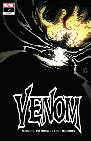
Venom #2
Written by Donny Cates
Penciled by Ryan Stegman
Inked by JP Mayer
Colored by Frank Martin
Lettered by VC’s Clayton Cowles
Reviewed by Matt Sadowski
“Beneath the black…who is Eddie Brock?” Donny Cates sets out to answer this question in “Venom” #2, or at least provide new readers with a brief summary of Eddie’s past with the symbiote. As a peripheral fan of Venom, it’s an appreciated summation of his life from tragic childhood to tragic adulthood and villain to hero. Rex Strickland’s beginning narration functions as a stand-in for Cates’s own curiosity about Eddie, which stylistically depicts the creator’s process of tackling an established character. The reminiscences don’t end with Eddie, however. Strickland’s own past with the symbiote is uncovered and with it, the symbiote’s origins are hinted at with a positively Lovecraftian cosmic horror vibe. Marvel’s recent forays into horror have been a welcome return to form for not only “Venom,” but “The Immortal Hulk” as well. The “Venom” team is on their way to crafting a memorable run for the character by embracing Venom’s past.
The art team’s combined efforts craft an oily black issue, dark with shadow and malevolence. Eddie Brock’s memories unfold like a repressed nightmare, beautifully bleak and blurred. Ryan Stegman and JP Mayer draw fascinating angles of the symbiote from within Eddie’s dying body. The alien plasma floats alongside red blood cells coils around broken bones to pull them together and restarts Eddie’s heart. But the colors of Frank Martin truly capture the all-important funereal tone of “Venom,” vital to the success of this particular run. Grimy grays and beige round out the all-encompassing vacuum of black. Speaking of tone, it’ll be interesting to see Spider-Man’s depiction in a darker tale after Cates’s humorous take on the web-slinger in “Doctor Strange” #390.
Final Verdict: 7.8 – A gloomy trip through Eddie Brock’s past jumpstarts “Venom” #2, a welcome return to the horror elements of the symbiote’s early outings.


