
There is a lot to cover on Wednesdays. We should know, as collectively, we read an insane amount of comics. Even with a large review staff, it’s hard to get to everything. With that in mind, we’re back with Wrapping Wednesday, where we look at some of the books we missed in what was another great week of comics.
Let’s get this party started.
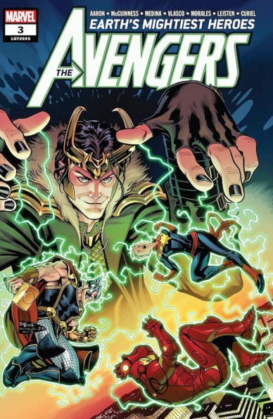
Avengers #3
Written by Jason Aaron
Art by Ed McGuinness and Paco Medina
Colored by David Curiel
Reviewed by Eric Goebelbecker
‘Where Space Gods Go To Die’ is a fast-paced story. Heroes fight giant insects on the West Coast and then head miles underground to fight some more. One hero is whisked to the center of the sun, and two others storm Odin’s throne room in Old Asgard. Dead Celestials litter the countryside while their murderers are very much alive, on the attack, and appear to be unstoppable.
But Ghost Rider accepts Hulk’s inexplicable decision to head underground in between two panels. After Captain America whisks himself to the heart of the sun in an attempt to stop the Celestials, the rest of the heroes bicker over whether or not they’re calling themselves the Avengers. Captain America wakes up in the heart of the sun and… throws his shield at Loki. Doctor Strange, miles underground and surrounded by giant bugs, fits two wisecracks into a single panel. Loki tells us that “global extinction” is on the way, but there’s nary a wrecked building or a civilian in need of saving in sight.
Somehow, despite swarms of giant insects and a pitched battle against a platoon of Celestials… this book feels like it lacks any real stakes.
McGuinness and Medina serve up pin-up worthy panels and scenes. Many pages have full spreads that act as compelling backgrounds for inset panels. Cars, flames, and Hulks cross borders and add depth to the action. On one page, in a bit of clever storytelling, an inset “zoom” panel shows us Cap’s shield striking a full page spread of a Celestial.
But six pages before the end the action screeches to a halt and the don’t-call-us-Avengers pose on a rooftop in neat little groups with arms crossed or hands on hips as if waiting for the team photographer. A whirlwind battle that spanned half of a solar system needs four pages for the heroes to decide what they’ll do next.
Final Verdict: 6.0 – “Avengers” #3 is an average story that might seem less uneven and more effective as part of a collection.

Batman #49
Written by Tom King
Illustrated by Mikel Janin
Colored by June Chung
Lettered by Clayton Cowles
Reviewed by Jacob Robert Nuckolls
Between the all the recent Batman-themed news and newly-announced Joker films, it can be easy to feel bored by these characters. But if you’ve been feeling Bat-fatigue, Tom King and company might just change your mind. Wrapping up the two-part “Best Man” story, King and Janin provide an intimate portrait between the two closest “friends” Batman has: The Joker, his “best man,” and his soon-to-be-bride Selina Kyle. Batman #48 and #49 make a strange prelude to the wedding mainly because they choose a more character-focused conversation-based approach over a plot-driven one.
While this may deter some fans, others will undoubtedly find it fascinating. The reader is a fly on the wall as the Joker and Catwoman literally fight over who can “save” Batman. King paints a gripping portrait of Joker at his best – a force of nature, an agent of chaos – and gives Selina a chance to make her case to the Joker (and to the readers) why she is a good fit as Batman’s bride. They fight, reminisce, trade philosophies, and tell jokes. It serves as a perfect example of why we love these characters.
Despite the characters lack of physical movement (they are lying on the ground for most of the book), Janis layers King’s script with enough emotional progress to make us feel like the story is moving forward. He finds ways to illustrate time in a distinctly visual way: from blood pools acting as ticking clock to subtle shifts in expression as reactions to delicate movements of every character – panel after panel – as they seek to gain the upper hand. Truly these kinds of character-focused books must be some of the most difficult to draw – Janis excels at it. Likewise, Chung’s coloring makes the story pop. From setting a recognizably “Gotham”-style atmosphere to providing the fight scenes with exceptional dimension, she helps the book’s aesthetic stand head and shoulders above the rest.
Continued belowFinal Verdict: 9.5 – Between Janis’ dynamic, character-focused artwork, Chung’s popping color, and King’s contemplative script, this book is a must-read for long-time readers and newcomers alike. The “Best Man” arc is a perfect two-part bottle episode to remind us why we love these characters.

Black Hammer: Age of Doom #3
Written by Jeff Lemire
Illustrated by Dean Ormston
Colored by Dave Stewart
Lettered by Todd Klein
Reviewed by Chris Egan
Anything short of a full conversation discussing ‘Age of Doom’ #3’s merits will not do it justice. That statement alone should be enough to get anyone who didn’t pick up the issue this past Wednesday to do so now. Jeff Lemire’s love letter to superheroes made some big moves this week. For the last few years, the series as a whole has only gradually given us a taste of the bigger picture. The occasional breadcrumb slowly dropped as we became enamored with the mystery. And you will hear no complaints about this from the fans. It is expertly done. Twists and reveals are abundant without getting close to giving away everything, gifting readers with an incredibly satisfying chapter.
Lemire’s superb writing is amplified even further when paired with the art team of Ormston, Stewart, and Klein. Everything from superhero action to small setting details to understated facial expressions is crafted in such a way that only a genius like Dean Ormston could create. Even the most subtle changes to Ormston’s character designs, Stewart’s colors and Klein’s letters give an individual life and aura to each of the new worlds we are presented with while maintaining the signature “Black Hammer” atmosphere. It is mind-blowing jumping between the small rural town we have become so accustomed to, to this new multiverse that makes some clear callbacks to different Vertigo publications. Though a superhero series, it never travels far from the world of horror and this issue is no different. At its lightest, it is mildly creepy; its darkest, downright unsettling. It never stops working, no matter which steps it lands on.
This is a monumental juncture for the series with some key turning points that reveal what this book is capable of. This issue is more action based than usual, in the sense that the character’s actions define the narrative, not their internal monologue. Once again, “Black Hammer” ‘Age of Doom’ is one of the best character studies currently going. It will remind you why you fell in love with the medium in the first place.
Final Verdict: 9.5 One of the greatest moments in the entire run of “Black Hammer.” A powerful (and fun) issue for anyone that loves comics books.
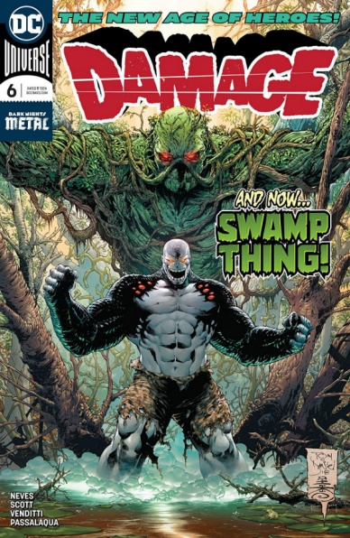
Damage #6
Written by Robert Venditti
Illustrated by Didgen Neves
Colored by Allen Passalaqua
Lettered by Tom Napolitano
Reviewed by Alan Buxbaum
“Damage” #6 is a series that focuses on other superheroes just as much (if not more) than what the series’ title might suggest. I was hoping that this inaugural story would pick up and start to carve out a fresh perspective on a character like Damage. But alas, Venditti’s great track record is not rubbing off on this series.
The biggest issue with “Damage” is that each issue depends on various heroes to keep interest. I understand that the creative team is trying to draw in fans of other characters in, but its a cheap way to go. I would respect this new series way more if Venditti and Neves came up with a totally different take on what someone with Ethan Avery’s problems would be going through. The problem with what they’re doing is that there is no substance on a larger level. It’s obvious that the plot (which hasn’t progressed since issue #1) is based around Ethan finding out what the purpose of his creation was for. We have this same problem when it comes to character development, for we have seen no changes in Ethan/Damage since the beginning. In fact, most of Ethan and Damage’s conversations consist of the same thing every time: Damage wanting to destroy things while Ethan begs for him to stop. Hooray for Ethan finally telling Damage to go crazy this issue! I’m sure we’ll be back to the regular dynamic by next issue (note the dryness of tone which unfortunately cannot be rendered by text).
Continued belowAll of that being said, I didn’t hate reading this issue (or this series, for that matter). It’s fun to see Damage let loose on Gorilla Grodd, or for Poison Ivy to team up with Damage. But there’s no substance; these are just battles that were written and drawn solely to show you how much of a badass Damage is. And DC sure is showing us just how strong he is; it was great to see him take down a whole army of super-gorillas! I’m assuming next issue will bring another powerful character so that we can see how Damage fairs against them.
The art is OK, but a bit too boxy for my taste. Neves doesn’t do a bad job, its just he doesn’t inspire many positive feelings either. There are a few cool shots (like the double page portrait in the beginning), but all in all, I didn’t have many opinions on it.
Final Verdict: 4.8 – While you may be angry that you wasted your time reading “Damage” #6, you certainly won’t be happy that you didn’t pick up a different comic. Fans who are rooting for this series to pick up should expect more of the same.

Flavor #2
Written by Joseph Keatinge
Illustrated by Wook Jin Clark
Colored by Tamra Bonvillain
Lettered by Ariana Maher
Reviewed by Alea Perez
Readers are treated to a world in which food is the ultimate possession and cooking the most prized skill a person can have in this character-rich and exploratory story. Disappointingly, we don’t get any further information as to what lies beyond The Bowl or what would force the guards to be complicit to it, but Keatinge and Clark seem to be steadily building up to a reveal of The Bowl’s secrets. Where issue #1 provides sweeping views and wide shots of the town with a hint of the horror beyond its walls, issue #2 provides a more intimate exploration of the setting in terms of the city, the esteemed culinary school, and the protagonists.
Xoo’s desperation to help her wheelchair-ridden parents is put on display but it doesn’t get in the way of her having some fun in the process. Xoo continues to be depicted with playful, emotive expressions, particularly as she communicates with her four-legged companion Buster, who is equally expressive in his opposition to her. New characters Anant and his father Lord Kaur are introduced, bringing some diversity to an otherwise homogenously white crowd, and we get the barest of glimpses into Uncle Geof’s past (plus a hint that he is somehow of greater importance than was initially let on), but the humor of the series takes a back seat in this issue to uncertainty.
Because this story is heavily character-focused, many of the panels zero in on them, providing minimal background details in most of issue #2. Earthy tones, heavy on olive green and rusty oranges, infuse this story, helping to ground and normalize the setting. There may be something supernatural here but as far as the characters are aware, nothing is out of the ordinary. It’s not until Xoo leaves for the black market that a new color palette appears, bringing with it a selection of cool purples, teals, and fuchsias that give the world a slightly more fantastical feel, but only in the sense that Xoo is breaking out of her comfort zone. Scenery set in the black market itself zoom’s the story back out somewhat and reintroduces the energetic chaos of a rowdy crowd, the reemergence of the vibrant and warm earth tones, and a hint at excitement to come. Back matter includes an intriguing article on how flavors work by culinary consultant Ali Bouzari.
Final Verdict: 7.2 – Not just for foodies, “Flavor” #2 will pique the interest of those looking for a playful fantasy mashup of Lucy Knisley’s Relish, Natalie Riess’ Space Battle Lunchtime, and Attack on Titan.

Justice League #2
Written by Scott Snyder
Illustrated by Jorge Jimenez
Colored by Alejandro Sanchez
Lettered by Tom Napolitano
Reviewed by Gustavo S. Lodi
Perhaps the best way to describe “Justice League” #2 is to compare it with the proverbial unstoppable force. There is so much going on, so many concepts jockeying for attention that it could become unwieldy in the hands of a less able creative team. Snyder and Jimenez nail it though, with just small caveats.
Continued belowAt its heart, this series is about Doom versus Justice, Lex Luthor versus Martian Manhunter. That confrontation anchors this issue and, by structuring it on that manner, the many new concepts feel connected and, even if not fully grasping them at first, readers should feel they belong to a larger plot.
Largely due to this intensity, Jimenez has a lot to work with and he delivers in spades. New cosmic forces, giant alien heads, subatomic ships: all greatly designed. Character moments are just as beautiful: pay attention to the facial expressions of Kendra and Barry and when John refutes Batman. Panel layouts also factor efficiently into the narrative: there are plenty when the story is quickly developing, only opening up for big action moments. Colors by Sanchez are as intense. Every page seems to explode with energy as the artist adds unique signatures to several new forces.
It is Snyder’s script that really shapes the issue, though. The focus is largely on Lex and his cohorts, with the nuances of their motivation aptly conveyed on dialogue and action. On the heroes side of the equation, the most interesting exchange lies with Batman and John Stewart: it is interesting to see Batman attempt to console anyone from being traumatized.
If there is a qualm on this issue is on how Snyder chooses to highlight the Flash. His posture, attitude, and conversation seem disconnected with how Barry Allen is usually portrayed, with little of the calm and forensic scientist to be seen. It is almost as if he reads as a strange combination of Barry and Wally West, which may take longtime fans from the story.
Final Verdict : 7.5 – An exciting issue, with a burst of new concepts and creative energy, nicely designed and captured by the artist team. The script is a strong one, only needing to focus on specific characterization to hit even higher notes.

New Challengers #2
Written by Scott Snyder and Aaron Gillespie
Illustrated by Andy Kubert
Colored by Brad Anderson
Lettered by Deron Bennett
Reviewed by Gregory Ellner
Writing with an idea of overall mystery in mind, Scott Snyder and Aaron Gillespie spend their time with another of their Challengers, acting as a focus issue on Moses Barber, one member of the team. Much as the one before focused in on Trina Alvarez, this one helps us to see what makes Barber tick, including his obsessions and expertise. Much like Alvarez was written as part of a monster movie, Barber is instead part of a conspiracy thriller, giving readers an idea of how the disparate members of this team will each have their own possible genre to deal with, along with the occasional cameo from the wider DC Universe.
Andy Kubert is very good with dynamic artwork, including such scenarios as a fight scene with a gigantic crustacean just as well as a quiet time on a train car or out in the streets. In an odd way, this dynamic artwork both works with the action-based nature of the series and against it, as the slow-yet-tense nature of Barber’s backstory doesn’t really lend itself well to such dynamism, to the point of quiet moments feeling a bit unnatural.
Brad Anderson’s coloring helps, with the deep aqua coloring of the ocean and the blackness of the deep seeming natural overall, and the similar color palette for the peoples around a certain famous underwater kingdom helps to showcase how different they are from the others’ uses of darker greens, yellows, purples, and oranges.
In all, the series has a pretty fun story arc, but perhaps the artwork itself isn’t very well suited at times to some of the changes in genre.
Final Verdict: 7.0- A weird and fun book, “New Challengers” #2 keeps up the series mystery going thus far.
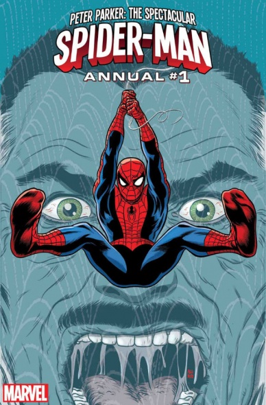
Peter Parker: The Spectacular Spider-Man Annual #1
Written by Chip Zdarsky
Illustrated by Michael Allred
Penciled by Chris Bachalo
Inked by Jamie Mendoza, Victor Olazaba, Wayne Faucher, Livesay and Tim Townsend
Colors by Laura Allred and Chris Bachalo
Lettered by VC’s Travis Lanham
Reviewed by Alexander Jones
Peter Parker and his relationship with J. Jonah Jameson is fascinating given some recent developments from author Chip Zdarsky who is taking the familiar Spider-Man supporting cast member and putting him in an entirely new direction. Jameson is now an integral addition to the cast and whenever he is missing from the pages Zdarsky’s eclectic run on the wall-crawler, his work becomes less interesting. Fortunately, “Peter Parker: The Spectacular Spider-Man Annual” #1 takes readers on a trip down Jameson lane.
Continued belowFor years of content, Jameson and Spider-Man have been caught in a similar loop of rehashing familiar plots and ideas, but Zdarsky has made Jameson an important part of the cast who is directly involved in some of the villain shenanigans in the past couple issues of the series. Getting a Spider-Man who is full of quips and jokes with a title placing an emphasis on humor is a really creative direction for a Spider-Man series that is going to make Zdarsky earn an important place among the large swath of Spider-Man writers.
Michael Allred’s art in this issue is incredible. The creator does a great job of playing with some of the elements in the script. He makes sure to add extra details and make each character interesting. Allred pairs with Zdarsky like peanut butter and chocolate with lots of wonderful expressions and little details that really bring out the extra moments of humor in the story as a whole.
Unfortunately, Mike Drucker and Chris Bachalo’s Spider-Man story does not carry the same level of quality with the art and story feeling derivative compared to some of the work from “The Amazing Spider-Man” writer Dan Slott and being bland as well. Bachalo’s art has a disappointing production value and his loose artistic sense is not up to par with his usual creative artistic blend of face-melting intensity. This lackluster meditation on death is undercut by jokes that leave a lot to be desired. Bachalo’s art seems to mesh fairly well with Drucker’s nonsensical script but the finished work is sorely lacking for me.
“Peter Parker: The Spectacular Spider-Man Annual” #1 has a fantastic lead feature and a skippable back-up story. Hopefully, Zdarsky will venture further into his creative look at classic Spider-Man heroes.
Final Verdict: 8.3 – “Peter Parker: The Spectacular Spider-Man Annual” #1 carries an innovative and hilarious main feature worth the price of admission.
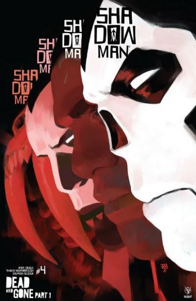
Shadowman #4
Written by Andy Diggle
Illustrated by Shawn Martinbrough and Stephen Segovia
Colored by Jose Villarrubia
Lettered by Simon Bowland
Reviewed by Michael Mazzacane
As Jack Boniface falls through the infinite abyss and sees through the eyes of his ancestors, “Shadowman” begins an arc that has obvious potential for surrealism and other styles of art. The opening page is an evocative image of Jack’s life flashing before his eyes as he crashes through them like they’re panes of glass. Which is why the subsequent pages by Shawn Martinbrough and Stephen Segovia are a bit of a letdown. There isn’t anything immediately wrong with their pages or writer Andy Diggle’s script, there just isn’t that much imagination in how this story is presented. As Jack finds himself looking through eyes and past of Maxim Boniface, the Shadowman during the 1940’s.
This lack of imagination comes from how steady all the pages and imagery is. Page designs are what I’d call standard exercises in rules of threes and quarters. These macro page decisions lead to everything have a very easy vertical flow to them, which you could argue is a means of replicating the state Jack finds himself in. The panels themselves have a still quality, emotions seem frozen in time. There isn’t a sense of terror or motion to anything even as crowds are supposedly mind-controlled into a rage. I assume this a byproduct of the heavy blacks used to ink and the use of black for gutter space. These qualities contradict the initial emotions of the opening page if Jack is just a passenger shouldn’t things feel more unnerving? There isn’t much of that feeling in Diggle’s scripting in the form of Jack’s narration. For a character defined by his anxieties and feeling of helplessness, his narration seems oddly cool with the weird magic he is experiencing.
The best page in the issue is a splash, it’s just an image of Maxim playing saxophone into the NYC night outside his apartment. Unlike other images in this issue, the building and world seem to be fading or coming out of a nothingness. It beautifully fits the tranquil emotion that Jack is trying to zero in on and understand. And with the turn of a page, it is lost.
Continued belowOverall the idea of exploring a 40s set Shadowman is a good one. How the creative team is telling this story is well done, there just isn’t much flash. The material it is dealing with makes me hope for more issues during this period later on. This desire to see more isn’t born of teased potential but of the unfulfilled kind.
Final Verdict: 6.5 – “Shadowman” #4 isn’t bad enough to be bad or good enough to be good, frustratingly in between for a series and premise with so much potential.

Skyward #3
Written by Joe Henderson
Illustrated by Lee Garbett
Colored by Antonio Fabela
Lettered by Simon Bowland
Reviewed by Reed Hinckley-Barnes
“Skyward” #3 continues what has been one of the most fun new Image series in a while. In the third issue, the series continues to explore the implications of its premise, what if gravity had one day just stopped. Paralleling first issue’s opening, “Skyward” #3 opens with a flashback to the moment gravity disappeared, but this time from the point of view of Roger Barrow, the partner of the main characters father. In a wordless sequence, we see a man floating passed the window of a skyscraper, as Roger Barrows slowly floats off his feet, safe in his apartment, serene. This sequence basically tells you all you need to know about Barrows because as this issue quickly shows, he is a pretty nasty dude.
In fact, he is almost comically bad, a broad sketch of what you might think of when you hear the words “evil capitalist.” But, considering how much fun “Skyward” #3 is, it’s forgivable that its characters aren’t especially fleshed out. This is a story that seems much more focused on the building of a world and having an exciting adventure than it is a story about taking a deep dive into a character’s psyche, and on both those fronts, “Skyward” #3 is more than successful.
There are plenty of little details that are sprinkled in Lee Garbett’s art about how this world is different than ours. Whenever Willa is in panel, her hair floats freely in the air, a constant reminder that gravity is not a factor in this world. The action sequence that takes up the bulk of this issue, with Willa trying to escape from Barrow’s henchmen, is fun and fast-paced, making good use of the lack of gravity to create an interesting chase sequence. Garbett’s art is energetic and makes “Skyward” #3 another fast-paced, exciting issue.
Final Verdict: 7.5 – “Skyward” continues to be a thrilling series, though the characters seem a bit underdeveloped.


