
There is a lot to cover on Wednesdays. We should know, as collectively, we read an insane amount of comics. Even with a large review staff, it’s hard to get to everything. With that in mind, we’re back with Wrapping Wednesday, where we look at some of the books we missed in what was another great week of comics.
Let’s get this party started.

Aquaman #1
Written by Dan Abnett
Illustrated by Brad Walker
Reviewed by Brian Salvatore
There’s probably a long article inside of me somewhere about how Geoff Johns championing Aquaman was the worst thing for the character in the New 52, but this isn’t the place for that. But that is an important place to start, because the Aquaman of this incarnation of “Aquaman” has almost nothing to do with what we’ve seen over the past five years, and that’s a good thing.
For starters, in this issue, there is zero brooding. That is incredibly important; Arthur has been recast as this gruff, quiet dude, and it simply doesn’t work. He’s conflicted, sure, but he’s also royalty and a superhero. Dan Abnett captures this perfectly in the first proper issue of the series, giving Arthur depth without using him grimacing while looking at the sea as the only way to express said depth.
This issue also isn’t boring, something greatly helped by Brad Walker, which breaks it out of the mold that Aquaman comics have been trapped in for some time now. Sure, there’s all the elements of what has historically been dull: Atlantean politics, somewhat forced supporting cast introductions, etc, but Walker and Abnett use those tropes as a launching pad for a comic that feels urgent and fun.
Walker does a great job at blending the world of the ocean and the world of the surface; Aquaman’s costume looks scalier than it has, perhaps, ever, and truly looks like something that would’ve been created at the bottom of the sea. The food spread he draws for the banquet looks foreign, yet appetizing. Even the features of the Atlantean characters all are slightly different than their surface-based counterparts. Walker is establishing a real visual culture for Atlantis that doesn’t just mean crowns and spears.
But it is his storytelling that really makes this issue pop. Arthur and Mera look truly in love when alone, and he gives them incredible political false smiles (with real joy behind them) when at the embassy. And the way he constructs the big action piece at the end of the issue feels frenetic and a bit scary, just as a terrorist attack would feel if you were there. This is the most an “Aquaman” issue has made me care about the characters inside in over a decade, and is a great start to the new series.
Final Verdict: 8.3 – A strong case to pick up this series twice a month.

Life with Kevin #1
Written by Dan Parent
Illustrated by Dan Parent and J. Bone
Reviewed by Matthew Garcia
Unlike the rest of the Riverdale gang, Kevin Keller isn’t getting a hard reboot. It might be because he doesn’t have over a half-century worth of history to deal with or because his story doesn’t exactly lend itself to the chilling or horrific or macabre. What’s true, though, is that Dan Parent has another “Kevin Keller” series for us, this one set in the near future, after Kevin’s graduated college, decided to become a journalist, and now attempts to make a life for himself in New York City.
What makes Kevin so, I dunno, important, is how normal he is here. He’s a gay guy in an age where less and less kids identify as strictly straight; where our presence is better known and better respected; where major landmarks in our history have been designated as national monuments. It’s no longer cool or revelatory to out random characters. You’re not being hip or cutting edge by having a gay character as a background player, who’ll probably get killed off somewhere in the second act. We want to be included, in all our shapes, sizes, and personalities, and “Life with Kevin” #1. Okay, it still feels like the mainstream comics scene tends to cast all gay guys as a bunch of twinks. Certainly Parent and J. Bone draw a crazy attractive Kevin (who’s what? a twunk?), but I think his characterization and personality speak more toward his progressivism.
Continued belowBeing gay isn’t a huge or revolutionary thing for him in “Life with Kevin” #1. It’s not something that completely and totally defines his character, while at the same time it remains integral to his identity. In a way, that’s sort of revolutionary in and of itself. Kevin’s focused and determined, making the best out of his situations, and dealing with his problems to the best of his abilities. He floods his apartment, he misses home, and he tries to figure out how to balance time for his old friends while trying to make a bunch of new ones. Yes, there’s a super cute guy he flirts with, but the part of this scene that spoke truest to me was when he wonders if the other kid’s even gay to begin with, and starts asking these pointed questions, fishing for clues.
All this helps “Life with Kevin” #1 truly connect. Parent structures this more as a new adult story: Kevin’s drive isn’t out to get all the boys, but rather to find his place in the world, doing something he’s interested in. It’s told animatedly and delightfully, with a frantic pace and a blue tone that allows J. Bone’s ink-lines to breathe and bring to life Parent’s expressions and compositions. And, you know, maybe too much happens in this first issue, and sometimes some of the situations feel too easily resolved, but the humor and dynamism more than compensate for it.
Final Verdict: 8.0 – Pride 2016!
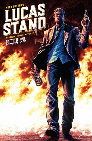
Lucas Stand #1
Written by Kurt Sutter & Caitlin Kitteridge
Illustrated by Jesus Hervas
Reviewed by Alice W. Castle
If there’s one thing I know about Kurt Sutter, it’s that he loves writing anti-heroes. However, for my tastes, those have rarely been the kind of anti-heroes I’ve been able to enjoy. Sutter tends to populate his work with some of the most vile, despicable human beings with things like “good guys” and “bad guys” being replaced with “people the story is about” and “the people that those people tend to kill and/or hurt”. Teaming with writer Caitlin Kitteridge, I was hoping that would be toned down here, but somehow the opposite happened.
Lucas Stand is not a nice person. Hell, the entire first third takes the character from the most generic, angry, blond white guy protagonist I’ve seen in comics in a long time to a truly disgusting person who was dove straight past the moral event horizon not even halfway through his first issue. The comic then, for some reason, tries to tell you that the story’s actually about redeeming Lucas (something largely impossible in my eyes by that point) by turning into Wolfenstein. Because the only way to make him seem likeable to contrast him with Nazis, I guess.
There’s so much I want to unpack here because there’s at least three issues worth of content crammed into 25 pages here and barely any of it makes sense, but I simply don’t have the space. The story sets off running as hard as it can in what seems to be an attempt to keep up a pace so frantic that it never has to explain anything. It’s exhausting and left me more on a note of “What the fuck did I just read?” than “I can’t wait to know what happens next!”
I can at least say that the artwork by Jesus Hervas and colourist Adam Metcalfe works more than the story does and the scratchy pencils from Hervas nail the dirty noir tone in the beginning of the book. Sadly, most of the last half of the book somehow involves nothing but characters standing around talking and jumping around to various locations without enough time to get a sense of place. It’s disorientating to say the least and does a complete disservice to the fantastic art Hervas and Metcalfe put together for the opening of the issue.
Final Verdict: 4.1 – I’m morbidly curious about where this comic could go after introducing Nazis in the first issue, but it’s not because of the quality of storytelling, I can assure you of that.
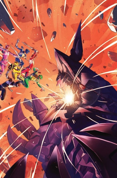
”Mighty Morphin’ Power Rangers” #4
Continued below
Written by Kyle Higgins
Illustrated by Hendry Prasetya
Reviewed by Robbie Pleasant
The past few issues of the “Power Rangers” comic have worked to bring the early 90’s characters and plot into a more modern setting, while exploring character in a way that the old TV show never had a chance to do. Most of it has been focused on Tommy Oliver’s attempts to move past his time as Rita’s evil servant and properly integrate with the team, but we get to see new dynamics aside from “we’re all morally upright teenagers with network-approved attitudes,” which has been rather refreshing. There’s a real conflict within the team, something that cannot be resolved by fighting monsters together and learning an important lesson about teamwork, and it’s been developing nicely throughout previous issues before coming to a climax here.
Of course, the comic continues to show us just how epic giant robots can be when not held within the restraints of adapting Japanese “Super Sentai” footage. The first half of the issue is dedicated to zord battles, and while the show would often skip straight to the Megazord transformation, the comic gives us some nice moments with the Triceratops Zord using new weapons, the Mastodon Zord tanking its foes, and the Pterodactyl Zord pulling some aerial maneuvers. The shark monsters (yes, plural, rather than Rita’s usual M.O. of “one monster at a time, then complain when it loses”) are quite nice as far as giant monsters to.
The giant monsters and robots are where Hendry Prasetya’s art can really shine. While the human characters are a little lackluster, the robots and monsters are fantastic. The way they’re set up, dwarfing the cityscape in the background, shadowed by the darkness of the night, give them a real presence and power. The action scenes are fast and powerful, providing great pacing and impact. Near the end, the comic introduces a new villain with a fantastic design, made all the more menacing by the smoke and wreckage behind it.
The issue concludes with another episode of “The Ongoing Adventures of Bulk & Skull,” written by Steve Orlando and illustrated by Corin Howell. It’s far more cartoony, both in art and story, but it’s a cute breather after the excitement of the main issue, albeit a bit of a jarring tonal shift. Still, Bulk and Skull were their best in the show when they were trying to actually do something heroic (character development that was rare for its time), and the comic shows their early attempts at looking like heroes, so it was at least amusing. (“Looking like” being very different from “acting like,” of course.)
Final Verdict: 8.8 -The improved characters, continually escalating conflict, and proper use of the giant robots allows the comic to grow and shine in ways that the show never could. The action does things that suit actors never did, there’s more depth to the team both as individuals and as a group, and the explosions actually mean something aside from dramatic effect. A thoroughly entertaining issue.

“Ultimates” #8
Written by Al Ewing
Illustrated by Kenneth Rocafort
Reviewed by Stephenson Ardern-Sodje
“Ultimates” #8 ties into Marvel’s latest monster crossover, “Civil War II” and offers us some insight into just what happened on that fateful mission that threw a schism between Iron Man and Captain Marvel.
I’m still majorly unsold on the concept behind “Civil War II”. It feels like the kind of crossover that is motivated more by publication requirements than a truly visionary storyline in my opinion, but it’s happening, and the inciting incident, Thanos’ sudden appearance on Earth, gets much more fully fleshed out in the latest issue of Al Ewing’s superb sci-fi book. Planting itself firmly on the side of Carol Danvers and the prediction of future crimes, this book jumps back in time to the formation of the Ultimates – a superteam of epic proportions “that looks like a damn Benetton ad” – and takes the time to add a very real weight to Carol Danvers’ cosmic fears for Earth. Ewing’s traditionally tricky dialogue is on full display here as multiple certified ‘geniuses’ match wits in an issue that, while low on action, feels like the beginning of a surprisingly political thriller.
Continued belowI’ve been singing Rocafort’s praises since this series started, and this issue marks sees him working his spacey magic on a more terrestrial storyline. Taking cues from David Marquez’ work in the main “Civil War II” book, NuHuman Ulysses is instantly recognisable, as are a host of other Inhumans and members of A-Force who show up to help out in the battle against Thanos. Rocafort’s fractured panelling style fits in perfectly with the back-and-forth, heavily narrated script, and the whole book has a purposefully shaky feel to it that makes the fight in this issue feel surprisingly warlike. Rocafort manages to keep this cosmic fight from spiralling out into silliness, and reliving the damage done to the Ultimates team from this angle makes Thanos’ punches feel as though they carry even more weight.
Final Verdict: 7.6 – If this issue is any indication, it’ll be the more rooted tie-in books that keep me interested in Marvel’s latest cosmic super-slugfest.

X-Men: Worst X-Man Ever #5
Written by Max Bemis
Illustrated by Michael Walsh
Reviewed by Liam Budd
Max Bemis and Michael Walsh’s peculiar little X-Men miniseries comes to an end, with our “hero” Bailey all grown up, the time has come for him to take a stand. At the end of the last issue, fellow student ‘Riches’ killed Professor X by turning his tongue gold, jump ahead a few years and society has crumbled with Bailey now somewhere in his forties feeling unsatisfied and still very much a loser. This issue attempts to tie up what was at first an interesting story and to place a full stop on the book’s supposedly ironic look into the reality of the X-Men franchise and superhero comic books as a whole. However, by the end of the issue it feels like Bemis has failed on both counts. The story doesn’t provide any satisfying conclusion; interesting characters like Rags and Miranda are visited upon only briefly while the final scene is not only far too predictable but also too rushed. Artist Michael Walsh does an admirable job of trying to pace the story the best he can, his panel arrangements give the impression that “Worst X-Men Ever” #5 is a more accomplished book than it actually is. I would like to see Walsh get to work on a less cynical, more established title in future, his fun and joyful designs and savvy eye for character quirks could do a lot of good for a book where he could be given the space and freedom.
At best, this book was an affectionate, sideways look at the X-Men franchise; at worst, an angry petulant attack on a series that has enough problems of its own. Especially with this issue the predominant impression was of something being kicked while it’s down. The humour, while inventive, always felt misplaced and somewhat spiteful however long time fans of the X-Men will enjoy the ‘Worst X-Men Table Ever’ segment that brings back longtime X-embarrassments like Maggot and Skin. I appreciate what Bemis has tried to do with this book, he clearly knows his history and can recognise the more ridiculous elements of superhero books. It just so happened that in an attempt to subvert and ridicule it all, he lost sight of his own story and the things that bring us back to these characters time and time again.
Final Verdict: 4.5 – An unfortunate end to a miniseries that began with the best intentions. What this issue lacks in subtlety makes up with fantastic artwork.


