
There is a lot to cover on Wednesdays. We should know, as collectively, we read an insane amount of comics. Even with a large review staff, it’s hard to get to everything. With that in mind, we’re back with Wrapping Wednesday, where we look at some of the books we missed in what was another great week of comics.
Let’s get this party started.

Action Comics #957
Written by Dan Jurgens
Illustrated by Patrick Zircher
Reviewed by Brian Salvatore
With ‘Rebirth,’ both “Action Comics” and “Detective Comics” have broadened their horizons a bit. While “Detective” has become a team book, “Action” has become a landing spot for a seemingly endless string of Super-related ideas. What if Lex Luthor became Superman? What happens when the pre-“Flashpoint” Superman outed himself after years of hiding? Oh, and how does his family feel about it? What if another Clark Kent shows up? Oh, and why not throw Doomsday into the mix, too? Oh hey, why not make Maggie Sawyer part of it, too? And the Daily Planet staff!
Does that sound like a lot? Because it is – there’s a whole lot in this issue. Some of it works, much of it doesn’t. What does work, throughout the entire issue is Patrick Zircher’s artwork. Zircher is as consistent as just about anyone in DC’s stable of artists, which is especially impressive here, as he has to draw a ton of different things in this issue. From a farm to a bank heist to an aerial super-battle to a newsroom, Zircher’s quality never dips. But where he especially shines his in the Lex Luthor sequences; his new Superman armor is the perfect mix between the classic Superman suit and the Lex Luthor Superfriends armor. Zircher strikes a tone with it that is both confident and maybe a little overwhelmed. Lex knows what he’s doing, but he’s not exactly sure how to be Superman just yet – but he plays the role well.
Dan Jurgens really stuffs this issue with as many ideas as he can fit in, and I can’t help but think that if he edited himself just a bit, he would be far, far better off. The Lex stuff and the Superman joining the public spotlight would be more than enough for this issue. All the stuff on the periphery could be saved for future issues, and the issue would have both read better than it did, and saved a lot of interesting stuff for the future. What usually happens with issues like this is that it is setting up a big arc that, over a few months, will answer all the questions posed here: who’s the other Clark? What is Lex really up to?
And while I’m legitimately interested in those questions, I hope that the path to getting the answers is a less cluttered and, perhaps, a little more artful than what we read here.
Final Verdict: 6.8 – A solid, if overdone, introduction to the new Superman status quo.

Aquaman: Rebirth
Written by Dan Abnett
Illustrated by Oscar Jimenez
Reviewed by Robbie Pleasant
It seems every time a new writer takes on Aquaman, they must remind us that A. he is awesome, and B. he does not talk to fish. Some handle it better than others, although Dan Abnett certainly manages the former expertly. It’s one thing to talk about how tough Aquaman is, it’s another to show it, and single-handedly taking down at Atlantean terror cell, including several aquatic monsters, is a fine way to do it.
Of course, it wouldn’t be nearly as well done without the expert artwork that Oscar Jimenez brings to the book. The sea creatures are huge and monstrous, and the action panels large and explosive. The use of foam and bubbles to indicate underwater action adds effects nicely, while every impact drawn has meaning and force behind it.
Between all the action, though, we do get some nice character moments between Arthur and Mera. It serves as a great reintroduction to both sides of Aquaman – the Atlantean royalty, and the human trying to connect to the surface world, while highlighting the Arthur/Mera relationship.
Continued belowAs for the latter point, Abnett fits it in well enough, showing how he can sense and connect with sea creatures while interspersing the battle scene with panels of random people joking about his powers. The narration connects the points well enough, and while typically I’m not one for overuse of narration, the reveal of who the narrator is and why he’s talking makes it a little more acceptable.
Final Verdict: 8.2 – a good jumping on point for anyone who wants to get into the “Aquaman” comics, as it’s meant to be, with good action and character moments.

Darth Vader #21
Written By Kieron Gillen
Illustrated by Salvador Larocca
Reviewed by Liam Budd
Now this is the Darth Vader we all love and fear. In this issue, Kieron Gillen gives us what we’ve been waiting for and launches Vader on the warpath now he’s finally been given permission to take down the traitorous, mad scientist: Doctor Cylo. Don’t get me wrong, I’ve absolutely loved Gillen’s take on the iconic villain. Bringing such a menacing, all-powerful antagonist such as Vader down a peg or two has been such a clever and fresh take; Vader is perhaps one of the most exposed villains in all pop culture, it’s a tough job for a writer to approach him from a new angle. Yet Gillen has more than proven himself capable of the job, he has slowly and methodically teased Vader’s rise back to the top. That’s what makes this issue so rewarding. It is basically a greatest hits of Vaderisms, he cuts through crowds as if they weren’t there, he shows off his mastery as a pilot and his dialogue is exceedingly dry. You can almost feel him smirk as he orders the execution of a poor subordinate. I certainly wouldn’t be surprised if the alternate title for this issue was ‘How Vader Got His Groove Back’.
On the page however, Darth Vader doesn’t look any more impressive than usual. Though to be fair, there isn’t much you can do that let’s Vader physically show off, at least without redesigning his entire costume and which artist is brave enough to do that? So Salvador Larroca has made everything else bigger. By upping the ante and widening the scope, the ease Vader overcomes his foes is in itself the impressive feat. By opening up his panels, space appears bigger and vastly more intimidating, two thirds of an early page is taken up by a single panel, itself filled with an epic looking Star Destroyer. The whole scene looks incredible, Edgar Delgado’s colours can only be described as intergalactic while It’s good to see Larocca has overcome his unfortunate scaling problems, especially for this issue
Meanwhile, across space Dr Aphra is hiding out knowing the Empire is after her. Here is a character who’s at her best when the odds are against her however at this point she does seem defeated from the start. When Triple-Zero and Beetee arrive there is a short, chaotic battle. The action remains clear which allows for Gillen’s witty dialogue to come through. There are no real surprises during these scenes, but it is still a whole lot of fun. Larocca’s designs and imagination is still going strong even as this series begins to wind down
Final Verdict: 8.0 – A New Darth? The Vader Strikes Back? 2 Darth 2 Vader? Whatever you want to call this issue, know this, he’s back and taking on the galaxy.
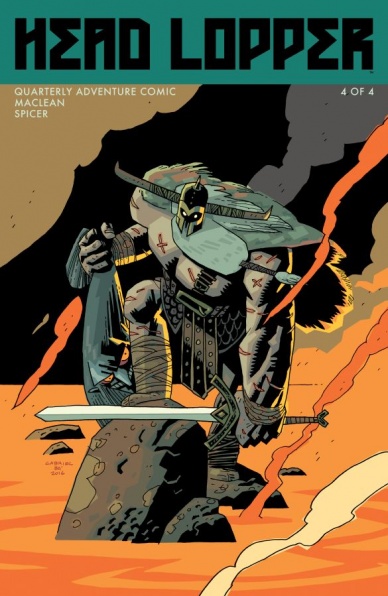
Head Lopper #4
Written and illustrated by Andrew Maclean
Reviewed by Michelle White
This is the last issue – for now – of Andrew Maclean’s rip-roaring swords-and-sorcery adventure, and a big, splashy conclusion to all the mayhem that’s come so far. Norgal, our lop-happy warrior with a killer dropkick, comes face-to-face with the demigod Barra – but it’s going to take more than a beheading to get the job done.
With each issue running about sixty pages, the longer format has suited Maclean’s concept beautifully, allowing for big battles, lots of banter, and multiples plotlines. This issue brings everything to a point, though, with most of the pages concerning the massive set-piece battle. This is where Maclean’s clean storytelling really gets to shine.
Continued belowMaclean’s art has the spirit of a woodcut and the flair of a late-night cartoon, and with one minimalist action sequence after another, it had already head-lopped its way into my heart. This issue continues on in the same fashion, but on a larger scale, keeping the action big, bold, well-paced, and clear as day. The basic layouts emphasize the confident lines of the art, and keep the reader arrested from page to page. All the while, Mike Spicer’s colours – limited, but well-chosen – skew exuberant and grim at just the right moments.
The severed head of Agatha Blue Witch has been a genius choice of sidekick, and that she plays a critical role in this final battle is fitting. And while there aren’t a ton of surprises here – if I had to put a limitation on this miniseries, I’d say it’s more a visual tale than a plot-heavy one – the story comes to its conclusion in a way that feels natural. The ambiguity of the last few pages, meanwhile, leaves some questions to be answered.
All told, this is a fun conclusion to well-thought-out, visually arresting miniseries. And with more of it to come, 2017 is looking awfully bright.
Final Verdict: 9.0 – A swishity-smashity magicky good time.
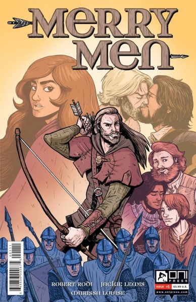
Merry Men #1
Written by Robert Rodi
Illustrated by Jackie Lewis and Marissa Louise
Reviewed by Matthew Garcia
I hesitate to call “Merry Men” #1 a queer retelling of the Robin Hood legend; it strikes me more as the Robin Hood legend told through a queer lens. A note in the middle of the book points out that the terms gay and straight didn’t exactly exist in medieval England, but that doesn’t mean queer people weren’t hanging around. Robert Rodi and Jackie Lewis’s new book for Oni Press isn’t so much stress an everything you thought you knew is wrong kind of story rather than a hey, this might have also happened narrative. Certainly, Robin Hood exists as a means to fight persecution and repression, to steal from the rich and give to the poor. In this medieval England where queer folk (referred to here as Merry Folk) are being forced out of their homes and banished by the wicked Sheriff of Nottingham, acting on behalf of Prince John, it’s obvious what Robin Hood will have to fight for.
“Merry Men” #1 is an interesting introduction into this world. Rodi and Lewis pack a lot of information in its pages. Not only do they introduce each and every one of Robin’s Merry Men, but they also stage a small coup, develop a relationship, and give some background about why a particular village is being targeted. For at least the first two-thirds of the book, Rodi and Lewis do well to balance out the various perspectives and voices, establishing the personalities of this group while still able to explore their questions and themes. Lewis’s artwork has a sort of fairy tale quality to it. The characters have big, expressive faces, but their bodies and movements have weight, and they’re all distinct from each other. It’s not flashy or over-the-top, just practical and efficient.
The Elton scene doesn’t land as strongly, however. Rodi and Lewis choose to crosscut the Robin Hood action with some minstrel storytelling. It feels like the scenes were designed to play off each other, but I didn’t see it, and, unfortunately, it kind of killed the momentum of the coup.
The queer lens fits well with the Robin Hood story. The book doesn’t feel at all gimmicky in dealing with this band of gay marauders out in the woods. It does seem like this could have been a legitimate occurrence in merry ole England. But this is still a Robin Hood story, and that brings its own expectations and requirements. “Merry Men” has found a great vessel for exploring its ideas, but its adventure elements probably could use more focus.
Final Verdict: 7.5 – A clever take on an old legend.

Prometheus: Life And Death #1
Written by Dan Abnett
Illustrated by Andrea Mutti
Reviewed by Alice W. Castle
There’s something strange about opening the first issue of a comic series only to be told on the plot recap page that this is actually part five of seventeen. Turns out, “Prometheus: Life And Death” #1 is a direct continuation of the “Predator: Life And Death” series from earlier in the year. That’s not necessarily a problem, though, as you’d probably be forgiven for not realising that without being told beforehand. Save for the characters and their situation, not much seems to be carried over. That’s largely because nothing much seems to happen in this issue, actually.
I’m continually confused by the fact that Dark Horse continues to make comics using the Prometheus license given the fact that the movie ended on a ‘To Be Continued…’ without answering any question it asked during the plot. That’s left the license comics in a bit of a pickle as they have very little to go on save for the iconography of the film. That’s pretty much all that happens in this issue where we get a recreation of the scene where the Engineer wakes up and kills everyone in its wake except this time it’s a bunch of Colonial Marines from Aliens instead. That’s largely all this issue has in terms of story which is… again, strange is the optimal word. It’s both a first issue and a fifth chapter in a story meaning characters are introduced as if you’ve already spent four issues with them and yet they still come off as incredibly arch and interchangeable.
The writing is sparse, the plot is essentially non-existant and the characters feel like the same marines from Aliens with different names who are being hunted by Handsome Squidward. The whole issue feels like someone managed to distill the feeling of “Is that it?” into twenty comics pages. The artwork from Andrea Mutti is at least interesting in how it brings a sharp grittiness to the linework in how it captures the feeling of Aliens more than Prometheus, but it doesn’t quite hold up inside the Engineer’s ship. Mutti’s lines are sparse and some panels lose a lot of detail when not focusing on a character meaning that the abstract environment of the ship is either confusing with little sense of geographic continuity or simply disappears from panels to focus on characters who are suddenly placed on blank white backgrounds.
I don’t quite know who this is for. If you liked either Prometheus or Aliens, you’d be better off just watching those again as this feels like a rehash of the former’s pivotal scene with the latter’s cast. Other than that, there’s nothing here for those not already familiar with those films, there’s probably not much here for you. In fact, there’s not much here for anyone.
Final Verdict: 4.5 – A shame because the ‘Fire And Stone’ story cycle from 2014 ended up being pretty good and this follow offers nothing new.

Sherlock: A Study in Pink #1 (of 6)
Script by Steven Moffat
Adapted and illustrated by Jay
Review by Ken Godberson III
Note: I used gender-neutral pronouns for the mangaka Jay in this review because, for the life of me, I could not find information on this artist. If you know, please let me know I can edit it later.
This is a strange one to review, isn’t it? The manga adaptation of several-years old now episode of a modernization of what essentially made the modern detective archetype. So, I slightly struggled on how to go about talking about this without it ending up just being me reviewing one-sixth of an episode that I already know the ending to. I settled onto just seeing how well the adaptation translates to the sequential art medium.
For those of you who’ve never heard of this: Sherlock is essentially what happens when the Arthur Conan Doyle’s stories were set in modern London, with all the benefits and detriments of that, that starred Benedict Cumberbatch (back when everyone everywhere thought he was the absolute greatest, including all those about to jump into the comments and go on about how they always thought he wasn’t that great) and Martin Freeman. Personally, it peaked at the end of Season 2 for me.
Continued belowBut enough of that, how well does Jay adapt the script? Not too bad, actually. The faces of the actors/tresses are captured just enough to recognize, but with enough flair to make it their own. There are some weirdnesses though, like when Sherlock makes…that face…before he is about to conduct an experiment. It was so weird that they actually used a “smile” sound effect to convey it further. Very unsettling. One other slight thing: when I said that there is enough differentiating the characters from their actors, it does work against the book at a time, specifically with Watson and Lestrade. There are times when they look very similar, and that would be very hard to believe if you had Martin Freeman and Rupert Graves together.
While the art does take liberties, for good and ill, it is the kind of “adaptation” where it seems to be just copy-paste of Steven Moffat’s script. It’s an adaptation! Spruce it up a bit! Don’t be afraid to go into some dissimilar places!
Final Verdict: 5.0- It’s a decent adaptation with some decent art. If you’ve seen the show, there’s really not much more it adds and I wouldn’t even bother tracking this down.

The Vision #8
Written by Tom King
Illustrated by Gabriel Hernandez Walta and Jordie Bellaire
Reviewed by Jess Camacho
After fixing up the house, the Vision family has resumed some kind of suburban normalness once again. In “The Vision” #8, the family is visited by Victor Mancha, the son of Ultron and brother of The Vision. Victor has not really spent time with the Visions and this is his chance to do so. King does something that a lot of writers can learn from. In a very short span, he not only sets up the plot of this issue but he also gives a full backstory on Victor’s place in all this that really did a lot for someone like me, who didn’t know a ton about him coming in. King toys with readers as he gives us this sense of serenity before things escalate into chaos. Each page leaves you on pins and needles because “The Vision” is not an easy read emotionally. You can feel that something is coming and you know the calmness will give way to some kind of disaster. We get just that at the end and while it’s not surprising, it still has an impact.
Walta and Bellaire continue to give this sort of surreal experience with “The Vision”. You aren’t reading your typical superhero comic and that’s why it constantly surprises me that this something Marvel is putting out in their sea of events and renumberings. Walta’s pencils are very detailed but it’s here in the art that the sense of dread comes in. Walta doesn’t visually give us a sad family. He gives us something normal (on the surface). He allows the Visions to smile and enjoy themselves but there’s this darkness in the background that Bellaire brings in her colors that adds a sense of dread the writing needs. One of the most visually appealing things that Bellaire does is the contrast between the Visions and the people who live in the D.C. area. They stand out so much and it engages the reader in understanding what they’re going through.
Final Verdict: 8.7 – Arguably my favorite issue of the series so far but heading into the last few issues, I expect things to get even greater.


