
There is a lot to cover on Wednesdays. We should know, as collectively, we read an insane amount of comics. Even with a large review staff, it’s hard to get to everything. With that in mind, we’re back with Wrapping Wednesday, where we look at some of the books we missed in what was another great week of comics.
Let’s get this party started.
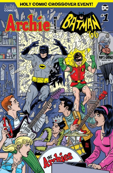
Archie Meets Batman ’66 #1
Written by Jeff Parker and Michael Moreci
Penciled by Dan Parent
Inked by J. Bone
Colored by Kelly Fitzpatrick
Lettered by Jack Morelli
Reviewed by Chris Egan
Comic book fans have seen a lot of publisher crossover events in recent years and this most recent one co-starring Batman seems like an obvious choice. The ‘WHAM-POW-BONK’ action of “Batman ’66” and the zany, tongue-in-cheek humor of classic “Archie” meld together into a perfect union. It’s still a shock that we got “Archie vs. Predator” and “Archie vs Sharknado” before this.
“Archie meets Batman ’66” #1 has everything fans of the Adam West TV show, the “Batman ’66” comic series, and “Archie” could ask for. Writer Jeff Parker teams up with Michael Moreci (Burning Fields, Roche Limit) to bring 1966 Gotham and Riverdale crashing together. No need for time travel or dimension hopping here, luckily Riverdale is just a short drive away. With 30 issues of the ’66 series and a handful of crossovers on his resume, Parker is the best man for the job. When you read his dialogue, whether it is banter between Batman and one of his many nemeses or one of Robin’s ‘Holy’ exclamations, you can hear the actors from the show; no matter who is speaking. He even revived Poison Ivy’s southern drawl, which you hear loud and clear just by little nuances or phrases he uses. He and Moreci excel with the huge cast of characters straight through.
There is almost no interaction between Batman’s team and the Archie gang in this debut issue. The book is split into two halves. We get a big action sequence with Batman, Robin, and Batgirl coming to the rescue and then a look into what Archie, Jughead, Betty, and Veronica are up to prior to an upcoming festival. The quips and references are spot-on for both franchises.
Longtime “Archie” artist, Dan Parent has dabbled in the DC universe with books like “Harley & Ivy Meet Betty & Veronica” but he is able to shine here, faithfully recreating the entire “Batman ’66” ensemble to interact with the “Archie” universe. Paired with that, Kelly Fitzpatrick’s colors are wonderful. Her work on both of these on-going series is truly what brings it all together. Hearty and bright. Exactly how these books should look. She can capture the heart of these retro styles while still using a more modern palette.
Issue 1 sets up a Batman: The Movie level crossover with every main baddie in the Rogue’s Gallery showing up to cause havoc in Gotham City and Riverdale. This looks to be one of the better “Archie” crossovers.
Final Verdict: 7.5 A funny and charming crossover that looks great, but probably won’t turn the heads of non-fans.

The Ballad of Sang #5
Written by Ed Brisson
Illustrated by Alessandro Micelli
Colored by Shari Chankhamma
Lettered by Crank!
Reviewed by Reed Hinckley-Barnes
“The Ballad of Sang” #5 brings this series to a close. Like the rest of the series so far, “The Ballad of Sang” #5 is filled to the brim with brutally violent action. This series has been all about Sang’s stylized, gore-filled fight against the gangs running the town he lives in, and this issue is no exception. The art by Alessandro Micelli still has it’s sketchy, frantic quality to it. The way that Micelli renders fights, and the way that Sang’s sword slashed through hoards of goons make the action fun and fast paced.
The story, though, is a little lacking. “The Ballad of Sang” has never been a series where the story was front and center, if anything, it’s just been an excuse for different groups to try and capture Sang, and a reason for the action to be happening. Which was good enough for the first four issues. The story was thin and set up the action, and the action was fantastic, so that was okay. In “The Ballad of Sang” #5, though, the series tries to reach for a kind of emotional conclusion that the rest of the series just doesn’t support. There is a page toward the end of the issue where the story stops dead in its tracks to explain why this emotional play should work, but at the end of the day, it still doesn’t.
Continued belowLike the previous issues in the series, “The Ballad of Sang” #5 has action and style to spare, and if you go into it only wanting action, then it will be plenty satisfying. But, if you allow yourself to buy into the story that it tries to weave here in this final issue, it ends up being far less satisfying than it could have been.
Final Verdict: 6.5 – While the action in “The Ballad of Sang” #5 is fun, the story ends up falling a little flat.

Batwoman #17
Written by Marguerite Bennett
Illustrated by Fernando Blanco
Colored by John Rauch
Lettered by Deon Bennett
Reviewed by Alexander Jones
Despite being such a popular character and raising to a new level of prominence with her upcoming debut on network television, Batwoman’s ongoing series has been flying under the radar. The sleepy flashbacks to Kate Kane’s past ground the pacing of the series to a halt. Thankfully, the new arc on the title, ‘Time of Your Life’ does a great job setting the hero back to her noir-based status quo. “Batwoman” #17 also shows off the characteristics that make Kane unique. Kane is suited for more darker stories and has an interesting supporting cast. Artist Fernando Blanco takes inspiration from J.H. Williams’s excellent past work on the series. Blanco’s unique splash pages and gritty art perfectly capture Batwoman’s world and makes her version of Gotham look unique from other titles.
The series opens with a mystery placing a familiar Batman foe front-and-center. Author Marguerite Bennett’s script is enhanced by Blanco’s vision, who even manages to make a flashback sequence visually dynamic. The duo pay homage to the Greg Rucka and Williams run by showing large spaces and allowing the characters time to catch up. Getting to know a happy Kate Kane is a fascinating prospect. Bennett’s scripts have done a great job adding several layers of subtext to the narrative but this new installment also has an interesting plot.
Blanco adds a unique visual element to almost every page of the issue. An added visual detail in the background enhances each page. Blanco also does a tremendous job constructing the layout of a page to make sure that it catches your interest. Blanco is also adept at crafting facial expressions which capture the attention of the reader. The design of the installment is also another huge selling point, with the title revealing more about the plot of the issue and showing off an enthralling visual sequence. Colorist John Rauch shows an adept understanding of how to color Blanco’s work. Rauch adds extra shades of color exactly where they are required.
The first chapter of ‘Time of Your Life’ shows a lot of promise. The more action-based focus of the narrative and Bennett’s slightly more straightforward script makes for a stronger comic book. Going forward, I hope future installments keep up the forward momentum of “Batwoman” #17.
Final Verdict: 7.5 – “Batwoman” #17 picks up the pacing of the series and introduces readers to a fan-favorite DC antagonist.

Damage #7
Written by Robert Venditti
Illustrated by Diogenes Neves
Colored by Alan Passalaqua
Lettered by Tom Napolitano
Reviewed by Gregory Ellner
Out of the “New Age of Heroes” introductions that came out of the ‘Dark Nights: Metal’ event, “Damage” has had a bad habit of being the most overwrought, continuously talking about how invincible and amazing the eponymous character is, without really doing much else. Fortunately, Robert Venditti seems to finally be breaking out of that character shilling, mostly by way of entirely changing the focus of the narrative for this issue.
By focusing on the team sent to stop DC Comics’ apparent answer to the Incredible Hulk, Venditti provides enough room to add some sympathy to the plight of Colonel Marie Jonas and why she undertook the effort of making Damage in the first place. By focusing on how things go wrong with the attempts to capture the monstrous man rather than on how amazing he is, there is an added depth to all involved, including the overzealous group of metahumans and cyborgs sent in to take him.
Continued belowDiogenes Neves uses a very dynamic art style, focusing on movements such as a blur behind the fast-moving assailants, a stream of bubbles behind those dropped into the ocean, and even a sense of motion to a standoff between Handyman and Damage, even as they do not physically move. At the same time, he is able to add gravitas to the more quiet moments with Colonel Jonas by focusing in on the more complex facial expressions of worry and anguish, rather than the more blunt rage and terror seen in the Damage attacks.
Alan Passalaqua’s colors have three different tones to them; a dark one of grays, dark browns, blues, and purples for the hospital room in which Jonas meets with the patient she came to see, a more muted sepia overtone with the flashbacks to a funeral earlier in her life, and the over-the-top deeper reds, blues, and oranges, among other colors, for the battle with Damage itself. The different color combinations show a difference in the overall tone of the scenes, from concerned to wistful to an overall tension of combat that involves facing the “real world” outside of the hospital or the flashback.
On the whole, while “Damage” isn’t amazing, it seems to be more or less finding its footing, in slow starts.
Final Verdict: 7.0- Though nothing amazing to write home about, a difference in focus and decision to downplay the overall praise of the eponymous character helps “Damage” #7 to do better than its predecessors.

Darth Vader Annual #2
Written by Chuck Wendig
Penciled by Leonard Kirk
Inked by Walden Wong & Scott Hanna
Colored by Nolan Woodard
Lettered by VC’s Joe Caramagna
Reviewed by Eric Goebelbecker
“Technological Terror” is another piece in the puzzle of how the Empire’s planet killer was built. It chronicles Vader’s first involvement with the Death Star’s construction via a mission to uncover and eliminate a group of saboteurs.
Wendig’s Vader has a rich internal life that connects him to young Anakin Skywalker in a way rarely seen in the comics. His fantasy about killing Tarkin recalls Anakin’s simmering rage. He recalls his time as a padawan on Geonosis while searching there for the saboteurs. When he reports how he handled the saboteurs to Tarkin, he pictures slaughtered Tusken Raiders on Tatooine instead of the saboteurs.
Kirk’s pencils expand and contract, slowing time for a tense confrontation between Tarkin and Vader, speeding up for a bombing on Geonosis, slowing again for an enlightening conversation with a loyalty officer, and so forth as the story unfolds. Scene changes remind us we’re in the Star Wars galaxy with Imperial shuttles flying to Tarkin’s starship and over a colorful Coruscant skyline.
The inks and colors play a role in setting each scene. Stations and starships have sharp lines and bright colors while sandy Geonosis is softer and more subdued. Vader’s mental images pop into the foreground with a reddish tint, coloring our perceptions.
The real payoff in this story comes near the end when Tarkin and Vader face off for the second time. Wendig nails the two characters with dialogue you can hear Peter Cushing and James Earl Jones deliver as they debate Tarkin’s reliance on his “Technological Terror.”
Final Verdict: 8.5 – “Darth Vader Annual” #2 gives us a unique view into the eponymous character and his first encounter with Tarkin’s Death Star.
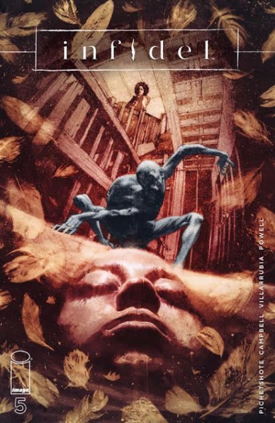
Infidel #5
Written by Pornsak Pichetshote
Illustrated by Aaron Campbell
Colored by José Villarurubia
Lettered by Jeff Powell
Reviewed by Dexter Buschetelli
“Infidel” is, first and foremost…unsettling, as a book like this should be; but great horror always strikes a balance. If your monster or demon or ghost is terrifying but your characters don’t feel real the result will be anything but horrifying. The human players in the story need to feel as though they inhabit the same world as us. Whether your setting is the world outside your window or a post-apocalyptic landscape, if the reader or viewer doesn’t connect to the cast, they’ll never fear the beast you attack them with.
In the foreword to “The Walking Dead” vol 1, Robert Kirkman notes “the best zombie movies aren’t the splatter feats of gore and violence with goofy characters and tongue in cheek antics. Good zombie movies show us how messed up we are, they make us question our station in society… and our society’s station in the world. They show us gore and violence and all that cool stuff too… But there’s always an undercurrent of social commentary and thoughtfulness.”
Continued below“Infidel” has this in spades. Pornsak Pichetshote delivers a commentary on an American culture of indifference and fear when it comes to anyone who is not cishet, white, Christian; and it is multi-layered. The conversation between Reynolds and Ethan on precisely what racism is in the third issue, as well as other beats and character interactions throughout the series, highlight this. Each character feels unique not only in their characterization but in how they view bigotry and intolerance. For Pichetshote, these things are not binary, but a spectrum.
The authenticity of the players of this story only furthers the frightening nature of its ethereal antagonists. The “literal specter of kyriarchy” as one reader calls it in the letters column of a previous issue. These things are an ocular degeneracy manifested, the visual representation of a spiritual degradation splattered on the page and infecting the sight of anyone who dares lay eyes on these panels. They are the stuff of nightmares, and they scare the bejeezus out of me.
This finale ignites the concoction it spent its previous four issues mixing. The final climax is a literal explosion shaking the foundation of not only its setting but also the cast. The characters who are left alive feel as though they will carry on past this series, but forever changed. The conversations between Medina and Aisha and the two contractors in the final pages nail down this book’s most central theme: hate. The hate we carry, and the hate we try to let go of.
Final Verdict: 9.3 – Don’t go in the basement. Never go in the basement.
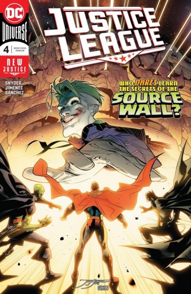
Justice League #4
Written by Scott Snyder
Illustrated by Jorge Jimenez
Colored by Alejandro Sanchez
Lettered by Tom Napolitano
Reviewed by Jacob Robert Nuckolls
Still Force! Source Wall! The Totality! Ultraviolet Corps!
Justice League #4 is packed with enough cosmic concepts and characters to keep even long-time DC fans checking previous issues to ensure their understanding of the facts. This issue is unique because it is told through the perspective of one of the DCU’s most haunting villains: Gorilla Grodd, a fitting narrative choice since this is the issue the Justice League comes face to face with the Legion of Doom.
Snyder writes these characters like someone who was raised on Super Friends and Justice League the Animated Series, resulting in a book that feels like it was penned by the Justice League’s biggest fan. The way he combines complex lore and comic book mythos of the Flash, Green Lantern, and Martian Manhunter provides a book that reads like a best hits album of these characters’ universes, giving us a hefty amount of backstory and world-building in only a few of Jimenez’s gorgeous panels.
Jimenez has been one of the consistently best parts of this Justice League re-launch; his sense of motion, cosmic energy, and free-flowing action deliver a terrific sense of scale. He has such a grasp on how to illustrate such intense concepts like the Totality, Ultraviolet Corps, Still Force, Speed Force, along with the unique abilities and designs of each of the characters. Sanchez’s color brings these events to life: his use of bright, cosmic colors is the perfect fit for this Justice League re-brand.
My only complaint is that this book’s plot easily gets lost in comic book jargon. Talks of the Keep, the Totality, Still Force, and Still Force tend to bog down the rising stakes rather than enhance them. It’s a tricky balance with a book like this.
Final Verdict: 8.0 – Despite its tendency to get lost in talks of ancient forces and energies, this issue is another strong installment of Snyder’s Justice League relaunch, providing a story with a satisfying amount of risk, character spotlights, and imagination.
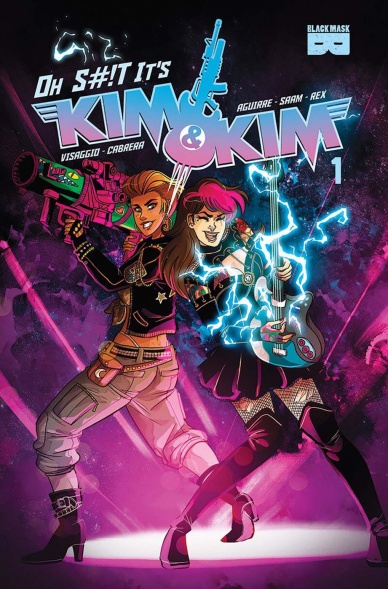
Oh S#!t it’s Kim & Kim #1
Written by Magdalene Visaggio
Illustrated by Eva Cabrera
Colored by Claudia Aguirre
Lettered by Zaak Saam
Reviewed By Kate Kosturski
Put on the ramen, fire up the van, and turn it up to 11: your favorite lady bounty hunters are BACK. Except . . . they’ve kind of gone legit. In Kim Q’s words – “There was a contract and shit. It was pretty official.” The constraints of a proper above the table bounty hunting and butt-kicking business do put a bit of a strain on Kim D. and Kim Q., so when their boss (ugh, a boss!) Kathleen sends them to space to retrieve a stolen painting, the Kims take the opportunity to go off script. There’s a little fun, a little flirting with their mark (art expert Xue Peng), some card games, and a good ol’ fashioned fight in the middle of a casino. Naturally, our gals make it out of that dust-up intact and escape with Xue back to their ship where Kim Q. has a plan. It’s time for a little family visit. Sounds like Kathleen’s going to have one heck of a damage report to approve.
Continued belowThe entire team from the first two “Kim and Kim” series are back for this new ongoing, and the joy at returning to characters they love springs off the page. Visaggio’s script is tight, balancing the right amount of exposition for new fans to get caught up with action and of course, her trademark wit. Cabrera gives the Kims very distinct but updated looks. Kim Q.’s hair has gotten longer while Kim D. opts for a shortcut that accents her white James Bond style suit beautifully. Xue Peng is mysterious and sexy (especially with that sinister smile that’s one part evil and three parts come hither) and perhaps may have caught Kim D.’s heart in the process. Claudia Aguirre’s colors spare no expense on bright and bold, and when you throw in panel design that allows for action to flow like a sitcom, you have the makings of a hit.
Intergalactic adventure never looked so good. Now if we could only just get that van back . . .
Final Verdict: 8.5 – Black Mask’s iconic characters get the ongoing series (in fact, this is the publisher’s first-ever ongoing series) that they so rightfully deserve. Welcome back, ladies.
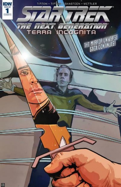
Star Trek: The Next Generation – Terra Incognita #1
Written by Scott Tipton and David Tipton
Illustrated by Tony Shasteen
Colored by JD Mettler
Lettered by Neil Uyetake
Reviewed by Michael Mazzacane
Star Trek as a media franchise had these paperback adventures that were largely self-contained and their canonicity was largely disregarded. That disregard opened up storytelling space and search for new storytelling frontiers and ways of telling a “Star Trek” story. ‘Terra Incognita’ continues that tradition by focusing in on a fairly minor character in the cast of The Next Generation, engineer Reginald Barclay, and his state within the crew of the Enterprise-D by replacing him with his mirror universe doppelganger. ‘Terra Incognita’ isn’t a clean jumping on point, it deals in the aftermath of another miniseries, but writers Scott and David Tipton provide enough expository info to catch new readers up to speed on the latest hidden adventures of the crew of Enterprise-D.
For all the science fiction adventure associated with Trek, those tend to be the highlights in between lots and lots of talking. That conversational aspect is both recreated exceptionally well and poorly by artists Tony Shasteen and JD Mettler. Shasteen’s pages do a good job of recreating that conversational feel with their paneling either playing on ideas of film editing or using overlapping panels. Their ability to layout pages so that these conversations and walk and talk have flow to them is excellent. I just wish the panel artwork itself wasn’t so inconsistent. While I doubt Tony Shasteen went the full Greg Land, his facial designs and figure work all read incredibly stiff and unnatural. For a character like Data it sort of fits, however, Captain Picard’s expressions seem keyframed from memes. Mettler’s color pallet doesn’t make things easier, their application seems like it has barely anything other than the flats. Which gives these characters a lack of depth making for tension in the specific representational aesthetic the book works in.
There are issues with the art in this book, however much like the macro qualities of page design, the staging in the panels does a good job of telling the story visually. Reginald Barclay in TNG wasn’t a sociable type, brilliant but quite. As such he wasn’t really given much thought by the crew, and the Tiptons and Shasteen use that to their advantage by making him a noticeable background player as major characters talk. Visually it’s the right way to represent how different Mirror Barclay is and what the prime TNG crew think of theirs.
Final Verdict: 7.0 – There are issues with the art that create unnecessary friction when many of the big picture decisions work in its favor. All in all, it’s a good start to a “Star Trek” story, that could use better art.
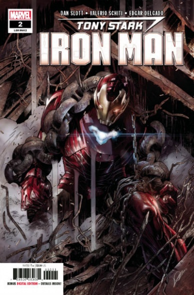
Tony Stark Iron Man #2
Written by Dan Slott
Illustrated by Valerio Schiti
Colored by Edgar Delgado
Lettered by VC’s Joe Caramagna
Reviewed by Gustavo S. Lodi
The entire creative team hits its stride on the second issues of “Tony Stark Iron Man.” If the first issue came up somewhat short on introducing the style, stakes and mission statement this series will focus on, this sophomore entry delivers that in space.
There is a lot going happening on this issue, as Slott clearly finds himself in a new sandbox. New supporting characters are being fleshed out, situations and concepts are being introduced, at the same time that new surprises and reveals make their way into the plot. It could come out as too much and disjointed, but it actually reflects the busy life of a very busy person. It connects thematically and tonally with the entire product.
Schiti’s and Delgado’s art find ways to deliver on all of those elements without letting it become cluttered or confusing. Panels – clearly busy most of the time – use inventive and traditional designs depending on the situation. In just a few pages apart, readers experience traditional grids introducing characters on their day-to-day lives, just to then see sharp vertical and diagonal choices for action pieces.
Facial expression and character designs are also a plus. While Tony sticks to his traditional smirk, the art team gets to extend their muscles on robotic characters like Jocasta (colors and lighting effects here taking center stage) or Gauntlet, with a sharply crafted weapon of choice. Pencils and colors walk hand-in-hand during the entire “Tony Stark Iron Man” #2 to show distinct characters throughout.
Back to Slott, this is world-building at its best. Not only in the sense that several elements are introduced, but also that they happen organically, through the lives of these characters and the situations they experience. The best examples are Rhodey’s PSTD following his resurrection and Jocasta’s struggle to belong and defend IA’s civil rights.
At its core, “Tony Stark Iron Man” #2 excites and captivates with sharply written moments and dialogue and beautiful art, making every page and character feel unique.
Final Verdict: 8.8 – What a new series should be about: exciting new opportunities, captivating characters, and beautiful art, “Tony Stark Iron Man” should further convince readers that this is going to be a very fun ride.
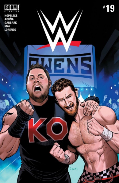
WWE #19
Written by Dennis Hopeless and Julian May
Illustrated by Serg Acuña and Rodrigo Lorenzo
Colored by Doug Garbark
Lettered by Jim Campbell
Reviewed by Elias Rosner
“WWE” #19 focuses on the fallout of Sami Zayn’s heel turn last issue which enabled Kevin Owens to defeat Shane McMahon in the Hell in a Cell match. After typing that, I should say that despite having never watched a single wrestling match nor being a wrestling fan, I understood the entirety of that sentence. Part of that is due to cultural osmosis and the surprising overlap in my areas of interests with wrestling fans. The other part is that “WWE” #19 does a fantastic job of being open to new readers.
This was the first issue I’ve read and yet, after a small hiccup where I thought Sami was Sheamus, there was no lack of clarity in motivations, events or identities. I was brought into the dual worlds of wrestling, of the stage personalities, of the (fictionalized versions) of the real people and the ways those two aspects blend into each other.
Acuña’s art is the right balance of intense action, such as the one panel of Kevin Owens’s car flying down the street, and quiet moments of contemplation. It does, however, lean on the simpler side in terms of detail, which makes some faces appear cartoony in ways they shouldn’t or having wads of popcorn be stuck to Zahn’s hand as if they were levitating. That sort of thing brought me out of the story, which, considering my lack of wrestling enjoyment, is a testament to the creative team’s ability to craft an engaging single issue that’s also part of an ongoing story and make it newcomer accessible.
While I can’t speak to Sami’s status as a main character, focusing on his struggles between wanting to remain a face but being dragged into being a heel by Kevin is what made this issue. I also now want to know what Daniel Bryan’s relationship with Sami is and what he did that was so terrible as to make the entire rest of the Smackdown Live faces, save Daniel, hate him.
I also could have done without the backup feature. Nothing ostensibly bad about it but it felt unnecessary. This could be because I know very little about the Flairs and their place in the “WWE” comic universe.
Final Verdict: 7.4. If all of “WWE” is as good as this issue, I may have to check out the rest of the back issues. Color me surprised.


