
There is a lot to cover on Wednesdays. We should know, as collectively, we read an insane amount of comics. Even with a large review staff, it’s hard to get to everything. With that in mind, we’re back with Wrapping Wednesday, where we look at some of the books we missed in what was another great week of comics.
Let’s get this party started.

Clue #2
Written by Paul Allor
Illustrated and Colored by Nelson Daniel
Lettered by Neil Uyetake
Reviewed by John Schaidler
Two issues into the comic book adaptation of “Clue” there’s a lot to like, and top of the list for me is Paul Allor’s comedic, self-deprecating, multi-layered script. The dialogue is clever, but always illuminating, either driving the story forward or revealing noteworthy bits of backstory that keep the wheels in your head turning. The cast is rather large, but all of the characters have distinct voices, allowing Allor and artist Nelson Daniel to create some wonderfully nonlinear, fast paced montages that seamlessly cut from one character to the next without any overt transitions – and it all works quite beautifully.
But the most entertaining voice, by far, is that of the butler, Upton. He doesn’t just “break the fourth wall,” he absolutely shatters it. Virtually every scene is punctuated and framed by Upton’s observations, providing us with a real-time, almost Ray Bradbury-esque commentary-within-a-commentary. In fact, as the self-appointed “omniscient narrator,” Upton snarkily informs us which characters know what, as well as their possible motivations – all while he stoically attends to his deceased boss’ absurdly varied requests, from a simple glass of ice water with lemon to “two turntables and a microphone, that goes without saying.”
Yes, there are a ton of words in this dialogue and monologue heavy chapter, but ironically, the illustrations carry much of the load. I think it’s testament Daniel’s work – in terms of both lines and colors – that it’s unobtrusive, engaging and efficient. It also just feels right, capturing a bit of the nostalgic quality that a throwback board game demands, while incorporating a freshness contemporary audiences crave. His interesting use of halftones reflects this dynamic well. In some ways, it feels pure retro, but it’s subtle and noninvasive. The visual story just flows, seamlessly without pause.
Same with Daniel’s use of colors. Predictably, most of the backgrounds and other elements within the scene match the featured character – Senator White, Mr. Green, Miss Scarlet, Colonel Mustard, etc. – but it never quite feels arbitrary or forced. It fact, the use of limited colors is a huge part of what makes the montages flow so well. And while Daniel constrains the colors within each panel, he uses a nice variety of shades and tints, creating a subtle complexity that gives everything excellent depth and shape. There is a 3D, architectural quality to virtually every scene that keeps us well grounded in the mansion locale, while harkening back to the board game’s simple, map-like construct. I remember, as a kid, desperately wanting to explore the mansion where “Clue” takes place. With the comic book, I feel like I am – and I don’t want to leave.
Final Verdict 7.7 “Clue” is off to a great start with a delightfully written, multilayered script, compelling characters and an unobtrusive visual style that echoes the board game. The mystery will no doubt deepen, but at this point, it’s fun enough just watching the characters be themselves.

Destroyer #3
Written by Victor LaValle
Illustrated by Dietrich Smith
Colored by Joana Lafuente
Lettered by Jim Campbell
Reviewed by Forrest Sayrs
“Destroyer” has a very impressive pedigree when it comes to the ideas of social activism and equality. So, it isn’t really surprising to see Victor LaValle’s comic take a turn towards those ideas. But in an issue dominated by flashbacks and exposition, the changes in tone and subject matter just become one of many more boxes to check off, rather than the hard-hitting social criticism it could have been.
“Destroyer #3” does a solid job of laying out a lot of the missing backstory. Dr. Baker’s history with ‘The Lab’ and the tragic murder of her son each get multiple flashback sequences. This backstory is absolutely needed to help contextualize Jo’s rage against the organization that is now hunting her, but the addition of a third flashback, on the origins of the Monster, starts to slow down the pace of the book. So much so, that we don’t even get to the anticipated reveal of The Bride.
Continued belowThe other thing slowing down the book is the entirely unnecessary sequence of the Monster trying to liberate a pig farm. I don’t know if LaValle intended this section as a critique of animal cruelty and Agribusiness, or of the futility of opposing such things with violence, but either way, the message is garbled at best, and doesn’t show us anything about the Monster that we didn’t already get from the illegal immigrant sequence last issue. These slowdowns are more frustrating than anything else, and while they don’t add any quality to this issue, at least the stage is set for #4.
Dietrich Smith’s art continues to be fabulously detailed, though there are some scenes, particularly those including Akai, where human proportions seem to shift from panel to panel. It does help Akai to seem something other than human, which he is, but also hurts his relatability in an issue that heavily features his backstory. Joana Lafuente’s colors are incredibly good here. Her palette shifts from the flashbacks to the present day help to set the mood of the issue and give considerable weight to the subject matter.
While I feel like LaValle’s politics in this issue were a bit scattershot, that doesn’t necessarily make them ill-conceived or misplaced. The treatment of black women in any workforce is a subject that desperately needs more visibility. But any powerful message will be blunted when it has to share space with other important issues.
Final Verdict: 7.2 – The message may have gotten muddled, but as a setup for things to come, this issue is ultimately fine.
Green Arrow #27
Written by Benjamin Percy
Penciled by Jamal Campbell
Inked by Jamal Campbell
Colored by Jamal Campbell
Lettered by Nate Piekos of Blambot
Reviewed by Devon Browning
Three is certainly no crowd in this week’s Green Arrow #27 with Oliver joined by fellow leaguers Wonder Woman and Flash. This issue begins a new journey for the archer in green, making it part one of the Hard-Traveling Hero arcs where writer Benjamin Percy gifts the audience with a determined Green Arrow and even more determined friends that wish to see him excel with that very mindset.
Aside from the very interactions between Oliver, Diana, and Barry that is both brilliant and pleasing, what perhaps makes this issue a worthy read is the foundation being primarily about corporate America and its impacts beyond the political and comic universe. The challenges these three heroes are met with regarding the current enemy, the Ninth Circle, are not only relatable… but explained by Green Arrow himself in a way that reels you in just a little closer to the story. It hits close to home, both literally and figuratively, allowing the reader the freedom to think and assess the subject at hand outside those white bubbles while still enjoying the comic itself.
While there’s always a forecast of the hero and villain enduring a storm of fists and in this case, arrows, in the conclusion of any Green Arrow story, both hero and villain are not restricted to one person here. Percy derails that simplistic conflict and introduces one on such a broad scale that the appearances of Wonder Woman and Flash are fitting rather than forced. Boy, if the exchanges between the three of them aren’t cackle-inducing, it’s by far the expressions artist Jamal Campbell graces the issue with.
Campbell’s style flows seamlessly from front to back, each panel clever and necessary. Both actions and expressions speak volumes throughout the issue, sharing an impressive talent of telling the story without the aid of words. And as well as he captures both the mood and feeling in color with every shift in the story, Campbell provides a realistic figure and aura through texture and color for each character.
More specifically? Campbell draws the Wonder Woman we deserve. Tall. Beefy. And keeping mouthy archers in line without breaking a sweat.
Final Verdict: 8.6 – Percy continues to deliver a compelling story that challenges Green Arrow and company as well as the reader with Campbell’s delightfully witty art that easily tells the story itself. A great read, and a better run to add to your subscriptions.
Continued below
Green Lanterns #27
Written by Sam Humphries
Illustrated by Ronan Cliquet
Colored by Hi-Fi
Lettered by Dave Sharpe
Reviewed by Gregory Ellner
When it comes to “Green Lanterns,” Sam Humphries’ writing can be very fast paced. Many events play out one after another, to a degree that some other comics may have spent several issues just explaining a few of them. While this is a benefit in keeping the story dynamic, it seems a bit disjointed in the case of “Green Lanterns” #27. Some of the scenes jump over explanations of how they connect, requiring some time for readers to think things out and mentally organize them. It keeps jumpy and energetic in its pacing, but perhaps slowing down a bit might be in order.
Ronan Cliquet’s artwork is, much like the writing, very lively, emphasizing movement and emotion over most instances of calm. Whereas the writing can get disorienting, the artwork helps to draw readers in, letting them enjoy the fun rather than get too lost in the specifics of how things are panning out. The Hive, an artificial intelligence of some sort, is particularly interesting, as its use of Kirby dots and static figures intentionally clashes with the more emotive and expressive figures in the majority of the story.
In terms of coloration, Hi-Fi’s vibrant shades paint a beautiful picture, from the various shades of green in constructs and uniforms to the contrasting colors and shadows of the Hive to the vast dark emptiness of space in which a new character is found.
From the writing to the pencils to the colors, “Green Lanterns” #27 gives a roller coaster ride of adventure for the beginning of the ‘Out of Time’ arc, for better or for worse.
Final Verdict: 7.5- A beautifully drawn and colored issue, albeit perhaps a bit too fast paced for its own good.
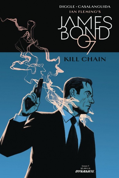
James Bond Kill Chain #1
Written by Andy Diggle
Illustrated by Luca Casalanguida
Colored by Chris Blythe
Lettered by Simon Bowland
Reviewed by Matt Lune
Dynamite has done very well by Mr. Bond. They’ve put some very talented people on this franchise and produced some excellent stories. “James Bond: Kill Chain” looks to be following that trend with the reintroduction of SMERSH and a fair few twists and turns in a fast-paced debut issue.
It feels like you can’t even swing a cat without hitting a double agent in the Bond ‘verse, and you can’t turn a corner without bumping into a beautiful femme fatale, so it was only a matter of time before we saw what lay in the center of that particular Venn Diagram. Rika Van De Havik is introduced from the very first panel as more than a match for 007, she’s even got him beat on the double entendres and, despite a suitably implausible name, she’s a great addition to the cast. She’s a step ahead of Bond at every point throughout this first issue, and if “James Bond: Kill Chain” were a movie, this issue would be the perfect pre-credits cold open.
Yet the beauty of these issues is that they tread the fine line between movie and novels really well, in a way that feels like the creative team is managing to incorporate all versions of Bond into their story. Andy Diggle crafts an engaging debut issue that set up a global mystery with nefarious organizations and complex characters. The dialogue feels natural and injects enough spy talk to make it feel smart without overwhelming you with exposition. There’s also the nebulous nature of the setting. The books were obviously set after the Cold War, so that time period is embedded into the character, yet most people know Bond from the movies, an arm of the franchise that has always moved with the times. That’s where Casalanguida’s art comes into its own.
There’s almost a touch of Darwin Cooke to the linework in “James Bond: Kill Chain.” High praise indeed, but a favorable comparison that’s entirely earned. Casalanguida keeps a frenetic issue moving forward with lightning speed and the action set pieces – which include a sparring match between Bond and Rika, and a chase that moves from car to boat to a rooftop climax – are all choreographed effortlessly. The characters have a classic design that wouldn’t feel out of place on the cover of a 50’s pulp novella, yet the technology they use (not to mention the car Bond drives) are cutting edge. Casalanguida also utilizes light and shadow to great effect: a gunshot to the head is cast in negative, and a panel of 007 sat drinking alone at a window channels Frank Miller with its subject, backlit from the window, cast in black and white.
Continued below“James Bond: Kill Chain” #1 embodies the spirit of a classic 007 tale while crafting a brand new adventure. There’s no reliance on nostalgia or overused tropes (something even the movies struggle with,) and the mystery that’s set up is instantly engaging and effortlessly thrilling. If anything, the book moves a bit too fast and is over too soon, giving it the feel of merely the prelude to the main story rather than an entirely satisfactory unit in its own right, but as the beginning of a greater story, this feels like something worthy of Ian Fleming himself.
Final Verdict: 7.8 – A well set up mystery with all the hallmarks of a Bond classic.

Kill the Minotaur #2
Written by Chris Pasetto & Christian Cantamessa
Illustrated by Lukas Ketner
Colored by Jean-Francois Beaulieu
Lettered by Clem Robbins
Reviewed by Kent Falkenberg
Stop me if you heard this one before: ferocious beast in the center of a labyrinth; headstrong hero spoiling for a fight; hero slays the beast, solves the maze, basks in glory. Song as old as time, tale as old as rhyme, right?
See, “Kill the Minotaur” #2 doesn’t completely overhaul the wheels of mythology, like the excellent gender-bent, peyote high of Fraction and Ward’s “ODY-C”. No, it’s much more straightforward. But sometimes, the joy in revisiting old stories is found in the telling. And in Chris Pasetto and Christian Cantamessa’s version, the labyrinth itself feels like a living, breathing entity. Finding the Minotaur is one thing, outlasting the maze will be quite another.
Lukas Ketner’s artwork in “Kill the Minotaur” is phenomenal. An early two-page splash spans the breadth of the labyrinth as Theseus gazes out upon it for the first time. The design is entrancing, as the maze is much more than a zig-zagging nest of walkways and dead-ends. Aqueducts and citadels punctuate the morass, vast statues overlook giant walls like uncaring sentries. Ketner’s hatching and fine-line scratching make it feel like every inch was carved by hand. The walls and pillars, eerily wrapped with what looks like veins, throb with an implication that whatever this place is built out of, it’s not mere marble or stone.
It’s also telling that, in the afterword to “Kill the Minotaur” #2, artist Lukas Ketner ties his love for the myth back to his earliest memories of watching Ridley Scott’s Alien. And while he’s speaking of a correlation between the Minotaur and the xenomorph, it feels like Pasetto and Cantamessa have taken some cues from that seminal work as well. Tension is wrenched from this uncanny setting – there are cracks in the walls that look like gaping, bloody maws and snap shut seemingly at will to an ever present, encroaching darkness, the feeling around every corner there will be somebody screaming or a slick mess of viscera to slip over – that doesn’t even need them to show the monster yet to bleed unease off the page.
“The Minotaur grows in power,” Theseus is warned. “The labyrinth shifts in order to confuse and contain the monster.”
“It’s a living prison,” the impulsive prince responds, incredulously.
Sure is. And overall, “Kill the Minotaur” #2 is brought to discomforting life by Lukas Ketner. Seriously, he is an absolute beast. From an impeccable design sense to clarity of action and emotion in his characters to conveying both velocity and impact with staccato-lined precision, his art is a highlight (and not just of the book, but of the week in general). Jean-Francois Beaulieu’s splashes of fuschia and turquoise lend it all an otherworldly glow.
“Kill the Minotaur” isn’t a drastic recontextualization. It doesn’t need to be. Pasetto, Cantamessa, and Ketner are just retelling the myth like the horror story it probably always was.
Final Verdict: 8.5 – Pasetto and Cantamessa’s story might not really be new, but Ketner’s art is a revelation.

The Mighty Thor #21
Written by Jason Aaron
Illustrated by Valerio Schiti
Colored by Veronica Gandini
Lettered by VC’s Joe Sabino
Reviewed by Elias Rosner
Who wields the hammer? Who is worthy of the mantle Thor? And what does it mean to be worthy? These are the questions that Aaron has been posing since he began his run way back in “Thor: the God of Thunder”, with each of his series coming at these questions from different angles: “Thor: the God of Thunder” asked what made Odinson worthy of the hammer while “The Unworthy Thor” asked if it is possible to become worthy once again. “Thor” asked who is worthy to replace the Odinson while “The Mighty Thor”, which is now almost as long as “Thor: the God of Thunder”, ponders the final of those three questions, what does it mean to be worthy and who determines what worthiness is. Finally, we have “Thors”, the “Secret Wars” outlier that dares to ask, does each hammer have a different standard of worthy?
Continued belowWell, the answer to that last question is definitely yes.
Ok, ok, I promise I’ll get to the review in a sec but let me explain why I did this thematic analysis here.
This issue sees the reappearance of Ultimate Thor or at least a manifestation of him through his hammer and according to Aaron, it was the rage and warrior spirit that made him worthy, which is an interesting counterpoint to the main universe Thor, whose worthiness is determined not by this but by compassion and a willingness to be selfless.
And all this is represented in this issue. Each panel is visceral in its action, every punch thrown feels harsh, orange plasma fires melt the mountains while demons that seem to be made of these fires literally raise Hel. Schiti does such a wonderful job bringing these scenes to life, making everything feel as grand and weighty as it should be. This is an issue that never lets up from the gas pedal, pushing us forwards as we approach what seems to be the end of this Thor.
Jane has taken a bit of a backseat these last couple issues so it’s nice to know that she’ll be back soon, even if that decision to return will have consequences. I have thoughts on what is to come but I’ll reserve my judgment until we get there. For those who’ve followed from the beginning, we always knew there would be an expiration date, but I, for one, never thought it would come this soon.
Final Verdict: 8.4. The War Thor is loose and, as this issue proves, heaven help anyone who stands in his way.
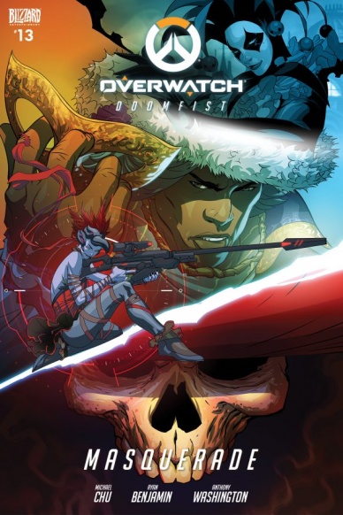
Overwatch: Doomfist: Masquerade
Written by Michael Chu
Illustrated by Ryan Benjamin
Lettered by Comicraft
Reviewed by Jake Hill
Overwatch has a new playable character, and with him comes a new comic. Though the villains are some of the most memorable characters in the Overwatch cast, the comics thus far have been almost entirely focused on the heroes. The newest issue “Masquerade,” completely flips the script, giving us our deepest dive yet into the nefarious Talon Organization.
Thus far, we’ve known that Reaper was a leader of Talon, with Widowmaker and Sombra as his treacherous lackeys, but this issue establishes Doomfist as the real brains behind the operation. Akande Ogundimu is like the Overwatch version of the X-Men nemesis Apocalypse- he wants to plunge the world into constant conflict so that only the strongest will survive.
He also rocks a tuxedo. The comic begins with his liberation from prison and follows Akande, Reaper, and Widowmaker as they manipulate the inner circle of Talon leadership. This means acting like genuine bond villains and going to swag casinos in Monaco and assassinating rival crime bosses in Venice. Overwatch comics stick closely to a house style, but Ryan Benjamin has fun with the different settings. The Casino is filled with sharply dressed humans and Omnics, and the dark streets of Venice have a grimy, noir feel to them.
Lots of comic artists use digital techniques (check out Fiona Staples Eisner award winning work on Saga or Jock’s art on Wytches for some excellent examples) but Benjamin’s digital work is totally unique. The tiles of the Venice catacombs, the lights shining off of the polished casino bar, all blur the line between comic and video game texture. While the technique isn’t necessarily better than more conventional comics, it’s cool and serves the setting well.
The creative team also has a fun time with character designs. Omnic crime boss Maximilien resembles other Omnics like Zenyatta but is menacing in a way we haven’t seen before. The elaborate costumes the familiar characters wear when they go to Venice are hilarious, and just begging to be made into in-game skins, especially Sombra’s take on Harley Quinn. By the end I found myself wanting to spend much more time with the villains, who make the heroes look boring in comparison.
Tie-in comics can sometimes get a bad wrap, but the Overwatch comics are essential. The game is very light on story, but the setting is vibrant and full of possibility. Though the comics aren’t pushing the medium to the next level, they’re short, sweet, and often add necessary depth to one of the most intriguing settings in video games. That goes doubly so for “Masquerade,” which lifts the curtain on the most mysterious (and thus most enticing) characters in the growing Overwatch cast.
Continued belowFinal Verdict: 7.8 – Who wouldn’t want to spend some time with evil robots and assassins in the seedy corners of the fluorescent world of Overwatch?

Rapture #3
Written by Matt Kindt
Illustrated by Cafu, Roberto De La Torre
Colored by Andrew Dalhouse
Lettered by Drew Sharpe
Reviewed by Michael Mazzacane
Look, I’m totally here for the ghostly, quasi-deity, giant cat-mummy-loa. Roberto De La Torre’s art is fantastic, its expression captures the curious yet smug superiority of cats. It is, however, part of an 8-page sequence that feels familiar and unnecessary with where we are in the miniseries. “Rapture” #3 opening sequence attempts some sympathy for the Devil as Babel villain monologue’s his life story* to the captured Shadowman, Jack Boniface. It is an effective sequence that is nice example of how cruelty begets cruelty … and that Babel is the supernatural Ash Ketchum.
Babel isn’t who I’m curious about though, that lies in his captive Shadowman. “Rapture” is supposed to offer Jack Boniface redemption and thus far he has been talked up, but remains an enigma. With 20 pages or so remaining, Kindt is going to have to run an extra tight ship to pull all of this off. I don’t doubt Kindt’s ability to bring “Rapture” to a mostly satisfying conclusion, this issue does a fine job setting everything up for an epic fantasy conclusion.
Cafu’s art isn’t anything to sleep on either, with his continued representation of the weird, nightmarish, aspects of the Deadside. Cafu makes a couple of really nice page turning action beats land with enough impact to split a load and then some, in two. What Cafu’s art and that sequence help illustrate overall is Tama’s passive indecisiveness, Kindt has been slowly pushing the lovable bookwork to look up and act and not look at the Book of the Geomancer for answers. That sort of storytelling hasn’t been around Shadowman thus far, it’s been a lot of talking about his importance and continual reference to his struggle. I get the stoic exterior masking the internal war surrealistically shown as a battle between Father and Son, but that struggle has been limited to brief panels. If I’m going to care about the emotional, stakes of “Rapture” in the finale I need to see more of that and less of Babel’s megalomaniacal god complex.
*Letterer Drew Sharpe did a fantastic job using the lettering to express Babel’s fractured psyche, overall voice, and selling the sequence.
Final Verdict: 7.0 – The penultimate chapter of “Rapture” sets up the finale and spectacular stakes well, hopefully, the landing isn’t Indiana Jones-esque.

Secret Empire #6
Written by Nick Spencer
Pencilled by Leinil Yu
Inked by Leinil Yu and Gerry Alanguilan
Colored by Sunny Gho with Java Tartaglia
Additional Art by Rod Reis, Joshua Cassara and Rachelle Rosenberg
Lettered by VC’s Travis Lanham
Reviewed by Alexander Jones
While “Secret Empire” #6 has some enjoyable moments, this issue detracts from the momentum of the overall series and fails to deliver on the surprise and intrigue of past installments. When the plot gets rolling and the series initiates the next big piece of the main story, the comic delivers on the premise and justifies the existence of “Secret Empire” as a whole. The overall story addresses big aspects of the series head-on, delivering on threads seeded by “Civil War II”.
While the main story in this comic features a tense battle, some of the additional plot threads of the comic make the story lose focus. The scenes with The Champions, for instance, show characters wandering around wondering who they should trust. These moments touch on the morality of the teen heroes but lack the urgency and stakes to carry the same weight as the core heroes’ resistance efforts. The beginning of the comic showing off the other Steve Rogers suffers from that same lack of urgency, severely handicapping what should be an exceptional title.
Some panels in “Secret Empire” #6 look exceptional, others are lacking in the same quality as the multiples inkers and contributors to the artistic backbone of the issue seem to indicate that this comic may have been a rushed to the printer. The large scale battle scenes from Yu are as strong as ever, the artist packs a ton of punch and complements the other blend of artists nicely. Rod Reis’ pages in particular pack the pop, punch, and experimentation with the medium of comics. Reis’ symbolism and visceral two pages are shockingly great, stealing the show from the rest of the contributors aside from Yu’s pulse-pounding fight scenes.
Continued belowReaders have seen similar versions of the fight showcased in the climax of this issue over the last couple of years but Spencer lovingly evokes a sense of nostalgia with the fight scenes. Tony Stark’s team in particular really feels like they are whimpering over the massive firepower from Steve Rogers. The ending in the issue is a big misstep for the series’ momentum as the pace in the comic suddenly lets up with a plot twist that comes out of nowhere. While I’m hoping that the next batch of issues shows that this comic still has more ways to explore the final conflict, I would have liked to see the book continue with the same pace until the big fight had properly come to an end.
While the overall comic is packed with great moments, “Secret Empire” #6 is not consistent enough to take home the bacon. For an event comic, the overall story packs a high level of quality and great character moments but the lingering threads stealing the screen time from Tony and Steve aren’t nearly as interesting. Going forward, I would like to see each piece of the comic ratchet up the tension as the series gears toward a final act.
Final Verdict: 7.5 – Even with too many artists and a muddled story, “Secret Empire” 6 still has enough great Iron man moments to enchant even the most cynical comics reader with awe.

Shaolin Cowboy: Who’ll Stop the Reign? #4
Written and Illustrated by Geof Darrow
Colored by Dave Stewart
Lettered by Nate Piekos of Blambot
Reviewed by Christopher Lewis
If the cover doesn’t give you a hint of what kind of comic this is then I don’t know what will. Geof Darrow sets the Shaolin Cowboy up against the revengers and King Crab (an actual crab) in the final issue of this mini-series. The revengers have been looking for the Cowboy since 2004’s Burlyman Comics miniseries, so this showdown was only a matter of time.
From a character perspective, the Shaolin Cowboy remains a good and decent man, unchanged by the events of the story. This is a good thing because people in this story are petty and ridiculous, which can be seen in the context of (or lack substance of) the revengers’ backstory for wanting to kill the Cowboy explained in this issue. The key to this comic is that Darrow shows how screwed up the real world is through satire, while also poking fun at ridiculous things in politics, people, and over reliance on iPhone usage.
Darrow’s art is beyond explanation and exquisite. Every panel in this issue has significant detail of the Shaolin Cowboy using two dogs with knives for hands as weapons against the revenging hoard. There are three to four pages of art showing the Shaolin Cowboy fighting with perfect flow and no dialogue that are top notch. In addition keep your eye on the background as one can always find comedy in graffiti, signs, and bystanders. Also, Dave Stewart’s colors throughout the entire story allow for easy differentiation between the multitude of detail in the background and are impeccable.
Final Verdict: 9.0 – If you are not reading this book you should be.

Super Sons #6
Written by Peter J Tomasi
Illustrated by Jorge Jimenez
Coloured by Alejandro Sanchez
Lettered by Rob Leigh
Reviewed by Frida Keränen
“Super Sons” has been one of the most fun Rebirth titles, a mix of action and humour with the World’s Finest children taking the lead. This issue, which starts a new arc titled ‘Planet of the Capes,’ is no exception. Superboy finally gets to meet Robin’s Teen Titans, but will he ever get to work with them?
A lot of superhero comics seem to rush from big event to another these days. “Super Sons” offers a refreshing change to this by picturing some more mundane scenes of heroes’ lives. Artist Jorge Jimenez manages to capture these little moments just as well, if not even better, as he does bigger action scenes. The heroes tackle some very minor crimes, with the scene where Robin aggressively confronts a man about jaywalking being almost weird to read.
Continued belowThat doesn’t mean that there isn’t a lot happening in this issue, though. The Teen Titans coming to town is fun to see since they’ve been discussed in past issues and the villains for this arc show up soon after. Two of the villains fail to give a memorable impression, but the villain that shows up last causes a change in Robin that gives us a final page that looks equal amounts creepy and humorous.
Jimenez’s lively style still fits the comic perfectly despite there being a few faces where I’m not sure what emotion they’re supposed to convey. Jimenez draws children well, which is, of course, a must for a series starring kid heroes, but is worth mentioning since not all superhero artists have a good grasp on it. There are some creative page layouts in this issue as well as some blander ones. The action looks dynamic and Alejandro Sanchez’s colouring complements it well. The way the colouring conveys different sources of light gives the issue a vibrant look.
Jon and Damian’s personalities contrast each other starkly and it shows as much in their character designs as it does in their dialogue, with Jon having a rounder face and big eyes and Damian being drawn using sharper angles. Peter Tomasi has put a lot of effort and care into writing these characters and it shows. The scenes depicting the Kents’ home life are quite adorable and Clark’s comment about Batman made me laugh out loud.
Final Verdict: 7.8 – “Super Sons” #6 is an entertaining read with an ending so bizarre-looking that you definitely want to see what happens next.

Time & Vine #1
Written and Illustrated by Thom Zahler
Colored by Luigi Anderson
Reviewed By Kate Kosturski
Time travel is the hot commodity of the moment, from Doctor Who to Outlander to Timeless. “Time & Vine” combines the best of time travel with the main character of the hit bestseller and film Sideways – a good glass of wine – to provide an adventure through space, time, and grapes. Zahler’s story starts off strong with the right mix of exposition and action – a little bit of backstory on our characters (a winery owner and an English teacher looking for a summer adventure) with hints of more in their lives to be uncorked, and then it’s right to some good ol’ fashioned jumping through the decades to find adventure, romance, and some life truths along the way.
Anderson’s bright, full-bodied pastel color palette and Zahler’s simplistic line style to add to the warm and friendly prose that draws you in the story. At times, I found things a little too simple in the art, which could pose problematic if this story moves into deeper emotional territory. Colors stay consistent throughout, which is confusing to those readers that look to change in color to signal some sort of change in the book (setting, plot). To compensate, Zahler gets very text-heavy (more than I have seen in my regular comic reading), which I found off-putting – this is a comic book, a format where pictures (not prose) are central to telling the story.
It’s very easy to rely too much on the gimmick of wine to tell the story, and fortunately, this first issue focuses on the humans and not what is in their wine glasses. The wine is a secondary character, as it should be – this is a story of life, and finding joy, adventure, and miracles when you least expect them, not what one drinks in that journey.
Final Verdict: 7.5 – he one word that comes to mind with “Time and Vine” is fun, and that is what readers will get from start to finish. With less text and some more depth in the art, this could earn a long-term place on my pull list.
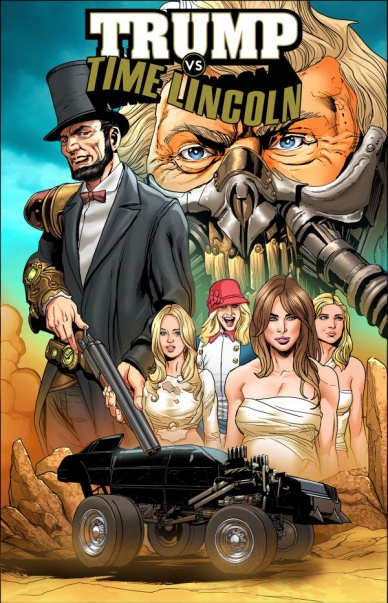
Trump vs Time Lincoln #1
Written by Alfred Perez
Illustrated and Lettered by David Hutchison
Colored by Lee Duhig
Reviewed by Nicholas Palmieri
Look, if you’re going into a comic titled “Trump vs Time Lincoln,” which has a Mad Max-inspired cover depicting Trump as Immortan Joe, you probably know what you’re going to get. I can confirm that there is zero false advertising going on here.
Continued belowSo what does that mean about the quality of the comic? It’s hard to say. The story can be a mess, throwing in random historical figures seemingly on a whim, and with plot points jumping from one to the next with little reason. Hutchison’s art is surprisingly effective, using an angular style that makes those chase and battle scenes pop. My one big issue with the art came from Duhig’s coloring: often times, everything is too dark. If you have dark brown on dark gray on black, there’s little room for contrast, meaning that Hutchison’s linework ultimately suffers.
Still, though, the creators bring solid enough work to serve as a vehicle for some Trump jokes. And let’s be real, that’s the main reason anyone would read something called “Trump vs Time Lincoln.” There’s no deep political statement here, nothing that’s going to make anyone think. It’s also probably not something that will stand up a few years from now, or even potentially a few months from now, given how timely some of the jokes are. But right here, in this moment, it provides a fun time for those who might be enticed by the cover.
Final Verdict: 6.5 – Exactly what it says on the tin. Not exactly a quality comic, but if the title sounds like something you’ll enjoy, you’ll probably enjoy it.


