
There is a lot to cover on Wednesdays. We should know, as collectively, we read an insane amount of comics. Even with a large review staff, it’s hard to get to everything. With that in mind, we’re back with Wrapping Wednesday, where we look at some of the books we missed in what was another great week of comics.
Let’s get this party started.

Adventure Time #42
Written by Christopher Hastings
Illustrated by Zachary Sterling & Phil Murphy
Backup Written and Illustrated by Ian McGinty
Reviewed by Matthew Garcia
By now, Christopher Hastings and Zachary Sterling have sort of fell into their stride for “Adventure Time,” moving away from the influence of the previous creative team and starting to develop their own voice for the series. While they haven’t quite gotten to the levels of weirdness or experimentation as past contributors, they’ve established a more comic-strip setup for their run, which makes the book still fun and enjoyable and really shows how well Adventure Time lends itself to all kinds of storytelling types.
In this adventure, Finn and Jake, sent to get the Olyphant Drive on behalf of Peppermint Butler, infiltrate the bear kingdom, being run by the King of Ooo. Hastings and Sterling get some cute gags out of the adventure and plenty of genuine chuckles (I laughed harder at the bear belly rub thing than I had any right to). I think they’ve shown they can comfortably work in the Adventure Time world, but I wish they would attempt to do more with the title. The jokes are fine but the delivery is kind of forgettable.
There’s also a backup by Ian McGinty called “Sir BMO,” playing off the Lady in the Lake myth, with BMO being granted knightly honors. Again, it’s cute and I like the slightly stretched-out way McGinty draws the characters, but it doesn’t stick around long afterward, either.
Final Verdict: 6.5- There’s potential for this series to be as exciting as it once was, but the jokes are solid enough to keep me coming back.
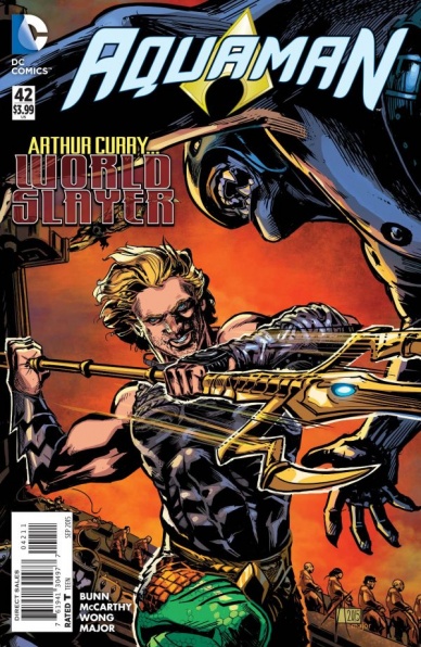
Aquaman #42
Written by Cullen Bunn
Illustrated by Trevor McCarthy, Jesus Merino, Walden Wong and Guy Major
Reviewed by Jess Camacho
For all the negativity the New 52 received, one of the very best and consistent series over the last 3+ years has been “Aquaman”. It presented us with a fun, straightforward, action adventure story that helped legitimize Aquaman for a new batch of readers, myself included. I typically enjoy Bunn’s writing but “Aquaman” #42 is a mess. There are two storylines happening here, one in the past where Atlantis is slowly being invaded and another taking place in the present where Aquaman is destroying alien temples and fighting off people from Atlantis who want to bring him back. He and Mera are not on speaking terms and Arthur is very much on his own. One of the biggest problems here is that this new direction feels like something far too different from what was going on before “Convergence”. There was a lot of world building involved in the Johns and Parker written runs and there was a real focus on the relationship between Aquaman and Mera. Bunn has immediately split the two of them up and it doesn’t make a ton of sense. “Aquaman” #42, in the flashbacks, feels like the first 40 issues of this series but when we get to the present day, the story becomes this overly dark and almost too Conan the Barbarian storyline. “Aquaman” was at its best when Aquaman and Mera were struggling with ruling Atlantis. There was a big cast of characters already built up there and it was a series that tried (successfully) to be something different from the rest of the DC lineup. “Aquaman” #42 is far too much of a renegade, loner story and not enough “Aquaman”. The bright side with “Aquaman” #42 is that Mera is the Queen of Atlantis and if we can get more of that, this story might have legs.
There’s also way too many people involved in the art with Trevor McCarthy doing the layouts and he, Jesus Merino and Walden Wong doing the “finishes”. All of the faces are inconsistent and if they didn’t have specific classic traits (like their costumes), you’d have no idea who they are. Some of the action heavy scenes are too muddled with very little movement and it becomes tough to keep what’s happening straight. The layouts, however, are very good and there are a couple of double page spreads that could have been amazing to look at. Guy Major’s coloring somehow still works and he does a nice job differentiating the past from the present.
Continued belowFinal Verdict: 4.0 – This might be my last issue of “Aquaman” for the forseeable future
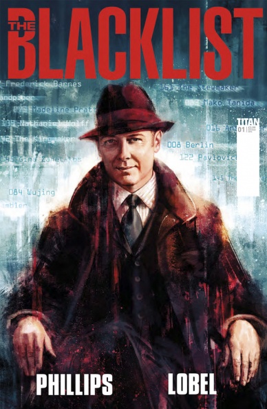
The Blacklist #1
Written by Nicole Phillips
Illustrated by Beni Lobel
Review by Ken Godberson III
This issue was very much a testament to how much an actor or actress truly brings to a character. Because this is essentially an episode of The Blacklist without James Spader.
I will say that it is a good that they have one of the shows writers, Nicole Phillips, does the scripting for the comic. As such, the dialogue from the show’s characters feels very natural. The book is going to focus on side stories; this specific one on an assassination of a protestor that frames the FBI. One would say that, in this current climate of power abuse from law enforcement, that this plot would be kind of ill-conceived. But I have seen worse plots (both in this show and other police/FBI shows) so I won’t begrudge it that. According to the recap page, these stories take place in the middle of season 2, after the Berlin Arc is concluded. Now, as someone who hasn’t seen the end of that arc, I will say that I wasn’t left confused and they do a well done job on introducing new readers.
The artwork Beni Lobel and colorist Esther Sanz is fine. They do a good job capturing the likeness of the actors and actresses. They also make a good effort to utilize both shadow and silhouette, which definitely works for the spy genre that The Blacklist is rooted in. I really did like that, regardless of where he was, whether at a graveyard or a horse race, Red is never fully in the light, which works very well for his character. That said, while the art isn’t bad, it isn’t very distinguishing and it has faults. There are some scenes where faces are… not great. One panel in particular has our soon-to-be-dead protester being afraid for his his life… but it doesn’t look like it at all. It looks very off and because of it, feels emotionally disconnecting.
There is one final thing I have to criticize. You know how sometimes there will be a dialogue box at the end of a page before the page turn in order to set up the scene after the turn? That’s done here, several times in succession. The problem is that these boxes look the same (color, font) but it is different people talking and it really did confuse me. I had to reread those pages a few times to understand who was talking.
Final Verdict: 5.0- Just watch the show. It isn’t segregated to just side plots and has 100% more Spader in it.

The Disciples #2
Written by Steve Niles
Illustrated by Christopher Mitten
Reviewed by Kevin McConnell
Aliens frighten me. Yes I know they do not exist, per say, but the thought of them worries me to the point of a panic attack. Frankly, I hate that Steve Niles plays on my fears in “The Disciples.” The vastness of space and the loneliness of it only furthers my fears. I am not the easy scaring type and yet here we are reviewing this looking up in the sky.
The story starts Medias in res of a hunt for an alien on a spaceship aptly named Nessie. Our heroes Dagmar and Jules are dealing with their compatriot Rick may or may not have been inhabited by an alien. If you have ever seen Aliens, you know this feeling of being attacked by an unseen alien. Niles paints the confusing and paranoia of being stuck in space without anyone to help you. The characters do not do a lot of talking between them. You really do not get an idea of what they are all about aside from the fact they have done this before. It is a little bit of a letdown considering what happens just before the characters exit Nessie. I will not spoil it here, all I can say is it would have been impactful if I got more of an idea of what one of the characters was like before the story started.
Continued belowContrary to the lack of discussion, Christopher Mitten perfectly executes Niles writing with excellent art. Mitten uses the panels to show the claustrophobia of being stuck in a narrow space ship. The faces of the characters show their fear and frustration of trying to figure this out what is going on. His style is not super detailed as you would might expect. While normally this would be a strike against a sci-fi style book it really does not feel necessary considering the story as a whole. The characters are looking for an intruder in their ranks, you think about this very little when the movement is so fast. The action of each panel tell the story perfectly without words in which this book as very little.
That is probably the biggest strike against “The Disciples” is the lack of actual dialogue. Niles isn’t involved in the actual artwork but it is clear he has a lot of faith in Mitten to make it work. I was left to interpret what the characters were thinking based more on the art. Sadly this makes the story as a whole very choppy without a lot of explanation. I felt as if I was missing a page or two during the reading of the book. The action puts the main reason why Dagmar, Jules and Rick are in space to begin with in the background.
My faith in Niles in this story isn’t quite there yet with issue #2. He has a great story scary space story that suffers from lack of character development. Just when the story gets going I was at the end of the book wanting more. I am not saying this is a good way however more like why did it end here. But considering the end of the book setups original premise it can be overlooked slightly.
Final Verdict: 6.5 – A choppy story makes for a quick read that is propelled by A+ artwork. It might be tough to read this issue to issue but I have a feeling the trades will work much better. Proceed with caution.
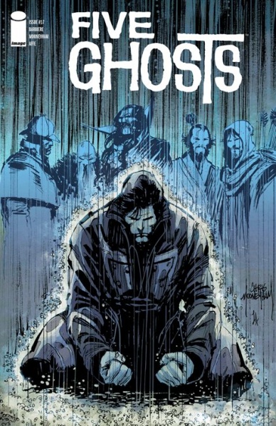
Five Ghosts #17
Written by Frank J. Barbiere
Illustrated by Chris Mooneyham
Reviewed by Michelle White
It had a globetrotting first arc – a swashbuckling second arc – and now, the vampiric third arc comes to a close. In a ghoul-haunted corner of Romania, Fabian has encountered a bloodthirsty Dr. Moreau. Help comes in the form of Dr. Van Helsing (of course), and Fabian Gray’s inner Dracula.
Chris Mooneyham’s art has always been astounding, and this arc keeps to the same high standard. Playing with pulp conventions, and – this time around – mixing in elements of Gothic horror, it’s hard not to linger over every flamboyantly-rendered-but-precisely-laid-out page. The confident draughtsmanship and detailed scene-setting are consistently immersive, lending this arc the weight and atmosphere of a much longer work. The issue contains the beautifully blocked action this series has always delivered, highlighted and offset by Lauren Affe’s glorious pastel colours.
In terms of plot, this conclusion leaves me a little befuddled; but then, I’ve come to expect a certain amount of narrative looseness from this series. Fabian’s adventures have, almost by definition, tended to rely on dei ex machinis, with the ghosts stepping in rather late to save the day. The fun is in the sense of narrative play – you never know when or how Fabian’s ghosts will change the game. Most importantly, the cliffhanger drawing us into the next arc has a solid emotional hook, underlining the element that’s been pushing Fabian forward all this time.
With its gobsmacking art and freewheeling storyline, the charisma of this title cannot be denied. And while I’d understand waiting for the trade paperbacks – or, better yet, the deluxe hardcovers – picking up the issues serially plays into the pulpy tone perfectly. Whatever the format, though, you’d be remiss not to embark on this stylish adventure.
Final Verdict: 8.0 – Still the best-looking adventure comic on the shelves.

Grayson #10
Continued below
Written by Tim Seeley and Tom King
Illustrated by Mikal Janin
Reviewed by Brian Salvatore
“Grayson” has been a favorite of mine since the start of the series, as it did a few things that I advocate comics to do – make it easy to pick up at any issue, tell a self-contained tale that has ties to the greater shared universe, and not be afraid to have a little humor in there. The first 8 issues, plus the annual and the ‘Futures End’ issue all presented stand alone, done in one, stories that all helped build up the world of Spyral, establish Dick’s new status quo, and show of Mikal Janin’s (and, on occasion, Stephen Mooney’s) exceptional artwork.
This issue doesn’t exactly break that formula, but it, along with last month’s #9, begins the process of making this into a more conventional title. This issue is the second in an established arc, with not just thematic carryover from the last issue, but actual story threads left dangling there are addressed here, and this issue ends with a cliffhanger that will, seemingly, be picked up in August’s installment. While I’m not against sustained arcs, there was something about the ‘espionage thriller’ feel that really lent itself to the one-shot nature of the stories. It also made this the perfect book for me to tell new readers to pick up any month because ‘as long as you know that Dick Grayson was once Robin, is now a spy undercover, and that he has an ass to kill for, you’re all set.’ That isn’t exactly true anymore.
What hasn’t changed is Janin’s incredible art. His aesthetic choices really heighten both the inherent sexiness of a Dick Grayson comic and the spy-film pastiche that the book embraces. His characters are always looking one way, but you see their brains are taking them someplace else – everyone is deep in thought, and trying to convince the world that they aren’t. Essentially, he’s showing people who lie for a living lie for a living. His action scenes are smooth and fluid, and look like what professionally trained agents fighting should look like.
This issue also dangles the most major tie to the ‘main’ DC Universe yet, with having Lex Luthor pop up. Everything about this scene was written perfectly – Luthor, now a Justice League member, was acting exactly in his ‘rights,’ and Dick, as a longtime hero, was acting exactly as he should as well. This is the world that Geoff Johns putting Lex in the League was creating, and Tim Seeley hits all the right notes with their interaction.
Final Verdict: 7.2 – Still a strong title, but it is losing a little of its breezy feel. I know this is the path for a book becoming ‘bigger,’ but I’m still going to pout a little about it. But just a little.
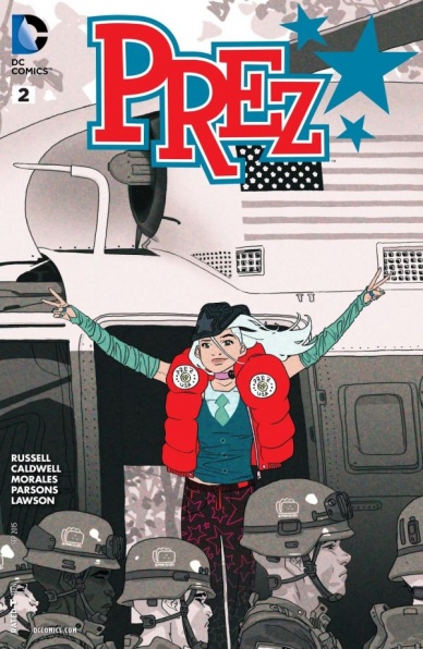
Prez #2
Written by Mark Russell
Illustrated by Ben Caldwell
Reviewed by Alice W. Castle
Picture a world in which American politics was less like House Of Cards and more like Mean Girls and you’ll have a sense of the fun-poking satire that “Prez” aims for. It brings a sense of ridiculousness to its view of the political landscape that befits the notion of a world in which a 19 year old girl can be elected president as a joke. This issue sees Mark Russell and Ben Caldwell dive into just how exactly this election came to pass, but it does so in a way that it almost forgets about it’s own main character.
Beth Ross is a 19 year old girl working a go-nowhere job in a fast food restaurant and her father just passed away from an influenza infection and she’s just been elected President Of The United States as a joke because a video of her went viral on the internet. As a character, she should be fascinating. Her view of the world is one of the most unique views possible and her insight into being thrust into the wide world of politics would be amazing to delve into. However, Russell and Caldwell instead focus on the political machinations surrounding Beth and the book loses a lot because of that. While the book continues to be funny and irreverent, it’s hard to find the emotional core of the story when the book’s focus is not on Beth Ross.
Continued belowSadly, that turns the book from a story about a girl getting elected president into a series of vignettes about the political dealings that caused her to be elected. Sure, the book is pretty and Ben Caldwell does an amazing job in juggling making this world feel like a real extension of the current state of America with the ridiculousness of the satiric elements, but without an emotional core to the story, it’s hard to find a way to really dig into the book.
Final Verdict 6.1 – I really want to like this book, but that will only happen if Russell and Caldwell can focus on Beth Ross as a person.

We Are Robin #2
Written by Lee Bermejo
Illustrated by Jorge Corona
Reviewed by Keith Dooley
Gotham City is populated with regular people that have answered a calling to become heroes in “We Are Robin” #2. They just happen to be teenagers. Lee Bermejo continues to tell an exciting and mysterious tale involving Duke Thomas (who was first introduced by Scott Snyder and Greg Capullo in “Batman”) and new characters that have distinct personalities. Duke is the narrator of the issue and Bermejo gives him a voice that is both complex and relatable. Here is a teen whose parents have gone missing, yet retains a positive outlook and has the determination to find his parents while figuring out the identity of the mystery person/entity who is supporting him and the other “Robins” of Gotham. Bermejo’s dialogue sounds fresh, natural, and is exactly how you would hear a teenager speak while experiencing the thrill and danger of attempting to emulate the hero they revere above all others.
Jorge Corona (with breakdowns by Rob Haynes) is the ideal artist for a title featuring teenagers. These are characters that are untrained, yet have natural abilities and street smarts that keep them alive. “We Are Robin” #2 is chock-full of action that is visceral and unpolished. This is how teens would battle in a brawl. Corona has the Robins climbing down fire escapes, bouncing with pure energy from place to place, and fighting with both unbridled enthusiasm and seriousness. Corona gives each character a distinctive look, with costumes that are utilitarian, amateurish, and fitting of their personality.
The color palette utilized by colorist Trish Mulvihill is dark and dingy with hints of color that are not too bright. The Gotham City in “We Are Robin” #2 is rough, dirty, and has a lived-in quality. Mulvihill aids in conveying those qualities and brings the city to life. The iconic Boy/Girl Wonder costume colors of green, red, and yellow are obviously evident, yet blend in with the grime of the city. The joy these characters feel shines through the darkness and creepy lighting that both Corona and Mulvihill instill in every panel.
That joy, as well as its unique voice, is what distinguishes “We Are Robin” #2 as an exciting book among the Bat-titles. Duke and these Robins are heroes who have a desire to be heroes. Bermejo, along with the book’s artistic team, are creating an exciting world as well as one of the best new series of 2015.
Final Verdict: 8.9 – After two issues, “We Are Robin” has already proved itself worthy to be mentioned alongside the other great books coming out of the Bat-editorial offices.


