
There is a lot to cover on Wednesdays. We should know, as collectively, we read an insane amount of comics. Even with a large review staff, it’s hard to get to everything. With that in mind, we’re back with Wrapping Wednesday, where we look at some of the books we missed in what was another great week of comics.
Let’s get this party started.

Written by Garth Ennis
Illustrated by Goran Sudžuka
Colored by Ive Svorcina
Lettered by Rob Steen
Reviewed by Gustavo S. Lodi
“A Walk Through Hell” has impressed its audience with some of the best writing from Garth Ennis in recent years. Sharp, intriguing and using violence to move the plot forward – not for its own gratuitous sake – the series has kept readers in the dark even more than its two main protagonists.
With this issue, there is still a lot to appreciate, but pacing for the first time feels off, almost as if this issue is an intermission to stronger reveals later down the road. And while this may have certainly been intentional, taken as a stand-alone issue, “A Walk Through Hell” #3 is lacking.
Sudžuka’s art remains very strong if only held back by limited plot possibilities. Opening pages offer a tremendous use of blacks, to a point it seems the artist borrowed from Frank Miller’s style of pulling the black ink out to reveal the whites, rather than the other way around. The mood is set perfectly right off the gate. When the story takes readers back to flashbacks moments, the same level of detail seen in past issues remains obvious, with the bureau’s briefing rooms brimming with whiteboards, photographs and facial expressions on the most supporting of characters. Svorcina’s colors are effective, but suffer from a very monotone palette: there is only so much an artist can deliver with grey walls, grey buildings, and grey suits.
Back to Ennis’s plot, “A Walk Through Hell” adds more cards to the tables and starts to prepare the setting for bigger reveals. Readers get to experience what the two main agents have known prior to the extreme situation they are facing at the warehouse, past events are linked to names and faces only referred to in past issues.
But the absence of any true reveal, as cryptic as they could be, hinders this third entry to be on par for what came before. It simply becomes too much guessing and assumption, with little substance. Hopefully, further issues will bring the series’ quality back to that of its first issues.
Final Verdict: 6.9 – While still delivering on sharp character dialogue and a very interesting premise, the pacing of “A Walk Through Hell” #3 simply does it more damage than good.

Written by Brian Michael Bendis
Illustrated by Patrick Gleason
Colored by Alejandro Sanchez
Lettered by Josh Reed
Reviewed by Reed Hinckley-Barnes
While I’m not the biggest fan of some of the choices Brian Bendis has made since the start of his run on the character, removing Lois and Jon from the picture was really disappointing for me, I will say that the way he writes Superman is pretty close to perfect. He feels powerful and entirely in control of the situation, but without ever coming off as condescending. Similarly, Patrick Gleeson does a great job of making Superman feel imposing without ever making him threatening. And the work that Gleeson does separating the body language of Clark Kent and Superman reminds me of Frank Quitely’s work in “All-Star Superman,” and I don’t think it’s possible to give higher praise than that.
Out of Bendis’s two Superman books, “Action Comics” #1001 seems like it is going to focus more on the day to day life of Superman and Clark Kent, much smaller stories. When it comes to Superman, those are generally the flavor of stories that I prefer. Even though it’s a bit strange that Superman is spending this much time investigating an arsonist, and characters in the story even express that, it’s really nice to just see Superman and Clark Kent existing in the world.
Continued belowNice is the word that I think would best describe “Action Comics” #1001. I’m not trying to damn it with faint praise, but that’s just how this issue, and Bendis’s work so far on Superman in general, feels to me. It’s nothing revelatory, but it’s good. This it’s fun, well-crafted superhero comics. And if you want to read a fun Superman story, “Action Comics” #1001 is exactly that.
Final Verdict: 7.0 – “Action Comics” #1001 is a fun superhero story that captures the character of Superman.

Written by Nick Spencer
Penciled by Ryan Ottley
Inked by Cliff Rathburn
Colored by Laura Martin
Lettered by VC’s Joe Caramagna
Reviewed by Eric Goebelbecker
‘Back to Basics 2’ continues the reset started in issue #1, but with a lot of the details out of the way, the action picks up, and the quipping continues apace.
This Spider-Man feels light but still substantial. Peter is back with Mary Jane and in, one might say, a good place. Despite losing his job and withstanding not a small amount of public embarrassment, it’s as if a weight has been lifted from his shoulders.
Ryan Ottley’s pencils add to the light mood. His Spidey is dynamic, leaping out of panels and throwing devastating kicks. He even looks good when he takes a punch.
We see four D-list villains in two different fights, and the fisticuffs are pure Spider-Man. He runs circles around the hapless felons, slinging webs and delivering quips with the proportionate speed and strength of a spider; they never had a chance.
The pencils and dialogue gel together perfectly. Peter is animated and expressive as he processes a Curt Connors that can control his reptilian side.
Connors shows Peter that he is working with the device that gave him his spider powers and a flashback to a Ditko-esque Peter evokes Amazing Fantasy #15 with lighter inks and a touch of sepia.
Ottley’s Mary Jane is gorgeous, and he renders three different versions of her in a single panel with some able assistance from Rathburn.
This all works together to give us a new-old Spider-Man. We’re back-to-basics with Peter in school, out of work, and dating his true love.
But that can’t last. If it does, we’ll call it stale in a few issues, and an accurate portrayal of Spider-Man needs one more crucial element: the legendary Parker luck. Spencer knows this and throws a spanner in the works on the final page.
Final Verdict: 8.0 – “The Amazing Spider-Man” #2 continues the fresh start with a fun story and excellent artwork.

Written by Geoff Johns
Illustrated by Gary Frank
Colored by Brad Anderson
Lettered by Rob Leigh
Reviewed by Chris Egan
We are now at the halfway point of “Doomsday Clock” and issue #6 is great, if not a little controversial in how it continues the story. Do not expect it to pick up where #5 left off, to put a pin in any cliffhangers, Geoff Johns has another story to tell us. As Marionette and Mime are brought further into the Joker’s mad world, we are thrown back and forth between present day and Marionette’s childhood. This gives us a peek behind the curtain at what motivates her and what led her to become the person she is now. If any sympathy can be felt for her and Mime, this shows us why.
In tandem with these time jumps, the majority of the villains are meeting to discuss the chaos that is ripping the world apart. Leaning into the criminal mastermind side of the Joker’s psyche, we get to see him what he does best: play the long game. Something that Johns is doing with us. All at once, he sinks his fangs deeper into Mime & Marionette, looks to recruit new gang members and is parading around with a sedated and paralyzed Batman. There is a lot of information thrown around, but few pieces are snapped into this puzzle. What we do get are some great character interactions and brutal violence.
Gary Frank’s many-paneled pages keep the action close and highly detailed, keeping in touch with the Alan Moore roots of this book. Jumping between tightly framed action and character close-ups the reader is drawn into everything from the fights to the thoughts and emotions of each character. At times he uses these close frames like jump cuts in a film. Seeing what he wants to show you, jumping between and over actions. There are moments which are lost on us and can be disorienting when following from panel to panel. It can be hard to engage with the artwork when it is staged like this; our eye will lock in on the best panels and drift over the rest. Framing aside, Anderson’s colors are gorgeous, if not a little flat, allowing for the shadows and shading to dance across them to bring light and texture to the forefront.
Continued belowWithout getting the expected answers from the last issue, some readers may be disappointed, but this is a well-done issue and one of the best in the series. It does not have the huge action and settings of the previous issues but presents plenty of essential backstory to keep us engaged in the characters.
Final Verdict: 8.0 – A villain-centric character study, with bloody violence strewn throughout, that may leave readers scratching their heads over what’s to come.

Written by Amy Chu
Illustrated by German Erramouspe
Colored by Brittany Pezzillo
Lettered by Tom Napolitano
Reviewed by Michael Mazzacane
“Green Hornet” #5, the finale to this latest arc, is an all-around solid finale. It ties everything together and sets things up for another round later on. There isn’t anything overly stylish about Amy Chu’s script or German Erramouspe and Brittany Pezzillo’s art, but it is functional in a way that you can’t knock it too hard. The biggest complaint that feels reasonable is recognizing that the unmasked Oko’s monologue’s presentation is a bit stiff and maybe a tad too long at 3 pages.
This issue, and run of the title overall, is sound in a way that makes you wish it took a bit more of a chance somewhere in the presentation. Erramouspe and Pezzillo’s art reminds me of Riley Rossmo’s work, except this art team feels contained. The page designs are overall blocky and undercut the sense of dynamism Erramouspe evokes from the perspectives and figure work they use once things heat up. Pezzillo manages to make mono-color backgrounds feel engaging as they play off Erramouspe’s action lines and screen-toning. Oko running through the motorcycle calvary is an effective four-panel sequence, you just have to focus in and find it with how the panels are sized. The various montage style sequences that bookend the issue make their point but lack flow.
The best overall action page in this issue is the follows that dismissal of motorcycle calvary as the Espada henchmen descend on Green Hornet and Kato from above, shown at a high angle. This panel is followed soon after by a counterweight of Hornet and Kato fighting them, shown from a low angle. It’s an effective bit of contrast that makes good use of different sized panels. As everyone battles it out in the rain, the fight sequence feels alive compared to the other pages. The page as an overall unit in this example has a coherence that the other pages don’t quite achieve. They aren’t technically bad but lack something that makes them engaging as a whole as opposed to a series of panels arranged to fit a page.
I hope this creative team gets to stick on this title or work together on something else, it seems like they’re starting to work well together.
Final Verdict: 7.0 – It isn’t splashy, but “Green Hornet” #5 hits all the right beats as a finale in a way most comics don’t.

Written by Tini Howard
Illustrated by Celor
Colored by Michael Russell
Lettered by Crank!
Reviewed by Gregory Ellner
“Hack/Slash” has always been rather raunchy about its subject matter of undead serial killers, playing into the various tropes of the genre with glee as it simultaneously doesn’t hesitate to make its protagonist’s life complete hell in the process. Tini Howard doesn’t stop any of that in “Hack/Slash: Resurrection,” and ‘Return to Haverhill’ demonstrates a kinder side to our slasher slayer through the writer’s way of delving into her attempts to help people, and even an entire town, with decidedly high levels of concern for everyone involved. As Howard admits through Cassie’s internal monologue, Hack isn’t really one to care much about other people or places on any kind of long-term basis (with some exceptions), so her devotion to saving Haverhill from a vampire invasion comes as a surprise for someone who is mostly just in it to kill monsters, the consequences be damned.
Vampirella and Vlad provide a sizable chunk of humor to the book, with Howard using them to examine the world of Hack/Slash through a more detached, yet compassionate lens, especially in the case of the former. The opportunity to play both of them against Cassie provides a lot of humor where the conflict with the vampire Chet is much more serious.
Continued belowCelor’s pencils draw a quick-paced story, with thin linework in action scenes, and heavier with quieter times. Facial expressions, in particular, are well handled, with close-ups on each of the characters providing a lot of emotional range, from concern to anger to joy to comical exasperation and more.
The bright color scheme fits well into the style of the new age vampire hunter tale, especially when it comes to the tale of Caraway Cordero. Cooler blue colors are used for Vlad, but browns, oranges, and dark greens rule the day in the Cordero household, giving a very different, “new old west” feel to the area, while the darker colors of the night, similar to the cool colors of Vlad, vide a sense of foreboding as well as one of the end of a part of the story.
Final Verdict: 7.5 – Cassie Hack’s team-up with Vampirella continues with a fun vampire slaying story that has Hack/Slash’s trademark, yet welcome, crass attitude, with an extra helping of humor and horror both.
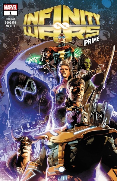
Written by Gerry Duggan
Illustrated by Mike Deodato Jr
Colored by Frank Martin
Lettered by Cory Petit
Reviewed by Dexter Buschetelli
Remember when David Gabriel, Tom Brevoort, and C.B. Cebulski arrived on Genosha, and when they finally found Wanda Maximoff she shook the entire Marvel Universe by whispering “no more mutants”?
Okay, that may not be exactly how it went down, but Marvel did promise no major crossover events for 18 months following the finale of Secret Empire. While we certainly aren’t seeing anything on that large of a scale we are now moving into the beginning of “Infinity Wars”, an attempt it would seem to cash in on Marvel’s most recent success in its cinematic universe.
Following on the heels of the “Countdown” series and one-shots, “Infinity Wars Prime” sets off this event with a bang. Mike Deodato, who illustrated the openings of each of the “Countdown” installments comes on with his gorgeous style for this introduction while Gerry Duggan treats us to a mystery box in the form of new character Requiem and a shocker of a moment involving one of the biggest of big bads.
With the stones in the possession of Adam Warlock, Turk Barrett, Doctor Strange, Black Widow, Drax the Destroyer, and Captain Marvel we’re sure to see some intriguing character interactions as others seek them to gain their power. Not to mention extra folds being wrinkled in like Loki seeking out the God Quarry and the questionable involvement of the nefarious time lord himself, Kang; so there’s sure to be a lot going on in the next five months.
Events always have the possibility of faltering as they move along into their narrative. Most recently Secret Wars rode high until a disappointing finale, and Secret Empire was highly divisive among fans and critics throughout, but if this issue is any indication of what we are in store for it will be quite a ride. No one really expected “no more events”, but will this one be worth it? We’ll just have to follow along and see, and there’s quite a lot to follow along with across twenty-five core issues and tie-ins. So, Marvel, this had better be worth it.
Final Verdict: 8.3 – A great start that I hope to not regret buying into by the end.

Written by Ben Coleman and Dylan Meconis
Illustrated by E.A. Denich
Colored by M. Victoria Robado
Lettered by Aditya Bidikar
Reviewed by Alea Perez
Coleman and Meconis pay an endearing and humorous tribute to comics, conventions, and pop culture in “The Long Con” #1, in which news reporter Victor Lai is sent to ground zero of the apocalyptic event that wiped out much of the world in 2018. Set in 2023, readers are first introduced to life after the apocalypse via a bleak and ravaged desert landscape – appropriately colored in varying shades of putrid beiges and browns. However, the action doesn’t stay there for long; the setting shifts soon thereafter to both the present and past Los Spinoza event center, home to the decades-old pop culture convention that is meant to parody San Diego International Comic-Con, complete with ads that take up entire sides of buildings.
Continued belowWhere there is a need to provide readers with further context or backstory, Denich provides wide shots of Victor and Dez in their surroundings, though even these merely shift the focal point while leaving out fine detail. Occasionally, amusing details can be found, such as the ironically existing, framed newspaper clippings proclaiming the end of civilization; who knew there would still be a demand or infrastructure for organized news after the apocalypse?
Remaining panels reinforce this is a character driven story by featuring basic backgrounds that fully focus the reader’s attention on the characters in lieu of the setting. Many of the issue’s backdrops are featureless, single-toned muted pastels and grey-tinged purples that both suggest decay. There’s also a periodic inclusion of silhouetted, two-toned or ombre backdrops, which drive home the lack of life and progress in this new reality.
The writing itself is conversational and accessibly humorous, playing on situational gags like prop guns being mistaken for actual weaponry or depicting endless lines of attendees that Dez admits could be for a multitude of things: the bathroom, a panel, or badges for next year’s con. Flashbacks thankfully show a more lively color palette, a diverse crowd of men and women, as well as various persons of color. Excitingly, “The Long Con” ends on a cliffhanger that whets the appetite of readers hoping to hear more of what Dez has been up to for the story’s past 5 years.
Final Verdict: 7.8 – Like preview night, “The Long Con” has provided a glimpse of what is to come, with expectations of further exposition and backstory mixed with continued effectively simple humor and solidly drawn visuals.
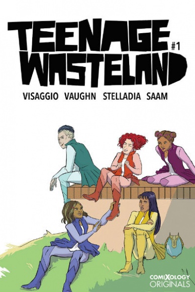
Written by Magdeline Vissagio
Illustrated by Jen Vaughn
Colored by Stelladia
Lettered by Zakk Saam
Reviewed by Elias Rosner
Announced, and dropped, at SDCC this year, “Teenage Wasteland” is a comic that by all accounts should work. It’s got a stellar writer on board, a great twist on the standard Magical Girl/Power Rangers premise, and just a general “F*** you and your rules” attitude. It channels all the teenage angst of an era gone by and juxtaposes it against a genre not devoid of angst but one that tends to lean more…positive, for lack of a better word. This leads to pages, such as the one with the flying punk ponies, terror goo fly monster, and the phrase “Rackin’ frackin’ power supply,” that got me grinning with joy.
Character designs are solid, the writing is mostly natural with just the right balance of punk-rockery, self-aware mockery, and earnest comradery, and the story has gotten me curious about these characters and what the team has planned for them. And yet, despite the charm and ingenuity at play, something about the comic doesn’t click. A minor complaint I have is that there are bouts of overdone rage from Ellie that, at the moment, seem manufactured instead of an expression of her loneliness in a new town and the loss of her father.
The larger and most noticeable issue is the visuals. The coloring ranges from stylized and hyper-neon to a more naturalistic but still bright palate. Sometimes this works to the comic’s advantage, like during the aforementioned goo-bug fight or during the transformation sequence but most of the time it makes the art seem flat and the solid color backgrounds harsh.
The art itself also has a similar range. Some panels are well composed, with great facial expressions but other times, the characters appear still and off-model, to borrow an animation term. Arms bend at awkward angles, faces appear twisted or empty and there is a sketchy quality to everything that doesn’t quite gel and yet…the more I read, the more I get used to the art. It is rough but in a way that shows the care put into it. This will lose people, it almost lost me, but these teenagers have too much chemistry together to give up on it yet.
But I do take offense to the marching band slander.
Final Verdict: 5.8 – An off-putting art style and strange color decisions bring down the score but the comic has the potential to be a good addition to the genre.
Continued below
Written by Steve Orlando
Illustrated by Laura Braga
Colored by Romulo Fajardo, Jr.
Lettered by Saida Temofonte
Reviewed by Jacob Robert Nuckolls
Last year, audiences fell in love with Princess Diana, sweet, idealistic, hero who was always believing the best in people. In Wonder Woman #51, Steve Orlando pens an exceptionally touching glimpse into Diana’s belief in human goodness and her desire for reconciliation.
The issue tells the story of the developing relationship between Diana and her former enemy Moon “Mayfly” Robinson. In a series of prison visits and flashbacks, Orlando and company paint a content-packed, concise relationship in as little as one panel at times. Whether it is Moon’s heartbreaking backstory, Diane’s unfaltering belief in Mayfly’s potential for goodness, or the touching moments between the two of them, this team provides an intimate portrait that reminds us of why we love Diana.
Likewise, Braga’s artwork strikes an impressive balance between high-concept action sequences and intimate conversations over the course of several years. Particularly impressive is her panel-by-panel comparison of Moon and Diane’s different upbringings. It does beautifully what every comic artist should strive to do: illustrate and accentuate the intent and words of the script without overshadowing or outdoing them. This issue works best in its subtleties, the quieter moments as Diana expresses her unfailing belief in Moon’s potential.
Final Verdict: 9.5 – We love comics for the characters; Orlando and company provide an intimate, small-scale story that is chocked full of the reasons to love Wonder Woman.


