
There is a lot to cover on Wednesdays. We should know, as collectively, we read an insane amount of comics. Even with a large review staff, it’s hard to get to everything. With that in mind, we’re back with Wrapping Wednesday, where we look at some of the books we missed in what was another great week of comics.
Let’s get this party started.
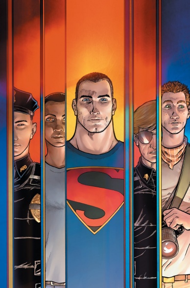
Action Comics #43
Written by Greg Pak & Aaron Kuder
Illustrated by Aaron Kuder
Review by Ken Godberson III
“Action Comics” #42 was on its way to being one of my Single Issues of the Year. “Action Comics” #43 shot all of that in the foot.
Let’s get the positives out of the way: Aaron Kuder and colorist Tomeu Morey’s artwork is the best art the Superman books got going right now. I may have a problem with DC more or less appropriating Conner Kent’s look in a vain effort to make Clark seem younger, but this art team can make it look good. Something that I take a great appreciation for is the variety of body type on display. Sure you have musclebound Clark, but then you have athletic Lee, lanky Dante and plus sized Officer Petruzzeli. It’s a very appreciative consideration.
I really did enjoy the “You’re all Superman Now” scene. The best Superman stories don’t have to be, strictly speaking, about Superman, but about us as people. That we all have the capacity to choose good and how we are stronger than we think we are.
Now we get to the colossal problem this issue has in the context of the arc Pak and Kuder had set up: It backtracked on its message.
This arc was taking a great look at some of the massive problems the United States has with overzealous police with too much power. And then it made the leader of the antagonizing cops some shadow creature thing, absolving them of blame. And it only gets more out of touch with reality the further the issue goes. Like “Civil War”, it presumes to be deep and topical but it ends up hackneyed and sending incredible mixed messages when mixing it with the superhero genre.
It’s truly a shame, because this book was the one that, for me, was making lemonade out of this lemon of an idea behind “Truth”.
Final Verdict: 5.2- Great artwork and the occasional heartwarming moment marred by #NotAllCops backtracking.
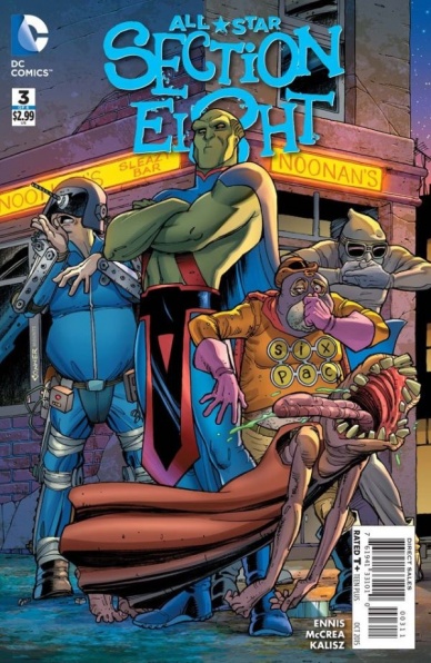
All-Star Section Eight #3
Written by Garth Ennis
Illustrated by John McCrea
Reviewed by Keith Dooley
Sixpack might just have his eighth member of his band of misfit superheroes: J’onn J’onnz, A.K.A. Martian Manhunter. “All-Star Section Eight” #3 is another zany and clever romp from the mad minds of writer Garth Ennis and artist John McCrea. Although the miniseries is lacking in a focused plot, each issue has not suffered because of it. Ennis and McCrea have succeeded at doing something admirable and difficult to pull off: consistently make us laugh hard. Ennis’ wordplay is pure fun and he’s even able to milk laugh-out-loud moments from censored profanity sprinkled throughout the issue (and especially in the most hilarious moment, which involves J’onn). The addition of Martian Manhunter is used to great effect, with Ennis three for three when it comes to writing genuinely funny and outrageous situations involving well-known heroes. The unlikely heroes themselves aren’t too shabby.
McCrea’s visuals are usually gross, have the perfect balance of cartoony and gritty, and (especially in this issue) give us epic splash pages containing nuanced humor involving heroes and villains of every persuasion. It feels as if anything is possible with each turn of the page and McCrea uses his canvas without confining himself. In one huge, dramatic panel, Martian Manhunter’s face epically fills the page with an expression of pure horror and disgust. McCrea also lets loose when it comes to the seven heroes. Thanks to McCrea, I want to see these revolting characters on a regular basis.
John Kalisz gleefully colors the farce that is “All-Star Section Eight” #3. Blood, guts, and other assorted fluids are colored with a rawness that almost invokes nausea. And that’s a good thing. Kalisz’s colors add a feeling that the outrageousness of this setting is taking place in the real world, which leaves us unsettled and off-kilter. Through all the zaniness (and just to shake things up), there is a particular page that is colored in such a way that evokes olden times of kings, queens, and chivalry.
Continued belowJudging by “All-Star Section Eight” #3 and the previous issues of this miniseries, Ennis, McCrea, and Kalisz are more than deserving of helming further adventures of this merry band. Here’s to hoping this six issue frolic isn’t the last we see of these characters or of Ennis and McCrea.
Final Verdict: 7.9 – If you haven’t already, start reading this book. Knowledge of these characters’ past exploits is not a requirement.

Batman #43
Written by Scott Snyder
Illustrated by Greg Capullo
Reviewed by Kevin McConnell
I have always been a fan of new villains coming into the world that old hero inhabit. In the case of Batman he has had so many true new villains throughout the years it seems like an incredibly daunting task to find something truly fresh. But with the introduction of Jim Gordon as Batman, any new threat to the world of Gotham is going to feel like something brand new.
Scott Snyder & Greg Capullo on the open page of this month’s “Batman” give a great visual metaphor of a villain literally blooming before our eyes. It is a new day in Gotham one where things are not like they used to be nor will they ever be the same. As Jim Gordon settles into being Batman, Bruce Wayne is settling into not being the Caped Crusader which may see a little odd at first. Synder’s characterization of the two is fascinating in the sense that he was essentially flipped the script on these two. Gordon still approaches his work as Batman much like a patrol man would using his street smarts to understand the reasons why this is happening. He is not the Batman we are used to seeing which is a smart play, it would have been very boring for Gordon to become a Batman clone. Snyder gives much need depth to Gordon and sets him apart from Bruce Wayne with just the right amount of distance.
This exchange is happening in the day time which is also unusual for Batman proper throughout the years. Capullo and Danny Miki handle this with the greatest of ease further adding to the sense of wonder this “new” Batman has. Capullo’s work speaks for itself his details are plentiful, his lines are clean and he makes effective use of the panel space to give a full look at this new world. Miki adds to the proceedings with a bright color pallet that adds to the mystique of the metaphor from the first pages. Capullo & Miki also get a chance to flex in an excellent two page spread during a battle near a shark tank that might be my favorite page out of any book this year. This brings things back to the darkness and it delivers on all the things I love about Batman.
In addition to the new status quo, Clark Kent and Alfred are trying to make sense of the new Bruce Wayne and how to get the old him back. Alfred takes on a father role in this issue showing his history with Bruce Wayne and how the events of Endgame altered him as well. It is a very interesting detour to give focus to Alfred here because of how much Snyder wants Bruce Wayne to not be Batman. I have no idea how long this change may last but it is giving some rich ideas that might not have been there in the previous incarnations of Batman. With that Snyder gives a wonderfully creepy intro to Mr. Bloom near the final pages with a certain classic villain that cannot be missed. Mr. Bloom is a real danger in Gotham and I cannot wait to see what his next move is going to be.
Final Verdict: 8.0 – An excellent introduction to a new Gotham and a terrifying villain who might make a “Dark Knight” at of Jim Gordon just yet. Highly recommended.

“Grant Morrison’s 18 Days” #2
Written by Grant Morrison, Gotham Chopra,& Sharad Devarajan
Continued below
Art by Jeevan J. Kang
Reviewed by Stephenson Ardern-Sodje
Two issues into his retelling of the Mahabhatara (an ancient Hindu historical/philosophical text) and Morrison is already pushing the boundaries of the word ‘Epic’. While a single drop of blood is still yet to be spilled in issue #2, Morrison and Kang are ramping up the tension to dizzying heights, constructing a battle to end all battles.
While Morrison’s storytelling ability has been proven time and again it’s still quite an undertaking to adapt such revered source material. Morrison’s approach is to play it large, harnessing the natural grandiosity of the original text with strong, archetypal characters who dictate their intentions with all the bombasticity of a Greek tragedy.
His dialogue feels almost Homeric at times, and this issue is littered with pretty hefty speech bubbles as characters traverse the complicated customs upheld in ancient Indian pre-battle rituals. However, the speech flows smoothly, both informing us on the intricacies of Hindu mythic society and the individual personalities of the many strong characters involved in this multi-layered epic.
Kang’s art offers a great balance of epic scale and intimacy and, although this issue is mainly politicised pre-amble establishing characters’ motivations, he still manages to show us a taste of the vastness of the setting and the two opposing forces. His panelling is generous and regular and by limiting himself to rarely more than four a page, he’s able to keep the characters’ faces large and expressive, executing their conversations with a tacit stoicism that offers new depth to their speeches.
The costume/character design of the original 2010 release of this series is what drew me to it initially, and Kang’s reworking and redesigns manage to capture the mixed historical and futuristic nature of the timeless world this story is set in. The mix of old and new gives this book a really unique visual aesthetic, from the weaponry to the spacecraft to the armour – think LOTR’s elves in Tron bodysuits – Kang and Morrison’s vision of this Eastern epic feels both familiar and fresh.
While the terminology and characters might not be as instantly recognisable to a Western audience as Greek or Roman mythology, “18 Days” deserves a place in the pantheon alongside similarly bonkers classical re-imagining “ODY-C” as recommended reading for all fans of fresh new fantasy.
Final Verdict: 6.5 Strong, polished, and poised for action, this issue promises even bigger and better things to come.

Howard the Duck #5
Written by Chip Zdarsky
Illustrated by Joe Quinnones
Reviewed by James Johnston
Straight up, before Marvel Comics shuts down once it runs out of movies to produce, Chip Zdarsky and Joe Quinnones need to work on a “Spider-Man” book. Just a forty-issue saga where Spider-Man goes through all his personal tragedies and just cries on them. The finale is when someone reminds Peter Parker how “Clone Saga” ended.
“Howard the Duck” #5 wraps up Zdarsky and Quinnones’s first arc with the character by more or less setting up the book’s relaunch this October. The first throwaway villain is defeated, some Marvel heroes show up to give legitimacy to this book or something, and Howard’s friend Tara reveals a shocking secret. I’m just going to give away that spoiler her since the comic came out last week. Tara used to be part of the Skrull Kill Krew AKA the single best team that came out of 90’s Marvel. That, along with Rachel Cole Alves and Ghost Rider are the three concepts you need to make me buy your book no questions asked.
Thankfully, I don’t really need to ask any questions. “Howard the Duck” seems to be maturing into the book it needs to be after the mild awkwardness of this first arc. I’m starting to see where it’s headed and the irreverent jokes packed into this comic are starting to land more with everything happening around them. Zdarsky and Quinnones are a nice pairing for Howard and I can’t wait to see what they’ll bring in October.
Final Verdict: 7.3 – Honestly I’ll buy anything with Skrull Kill Krew in it.
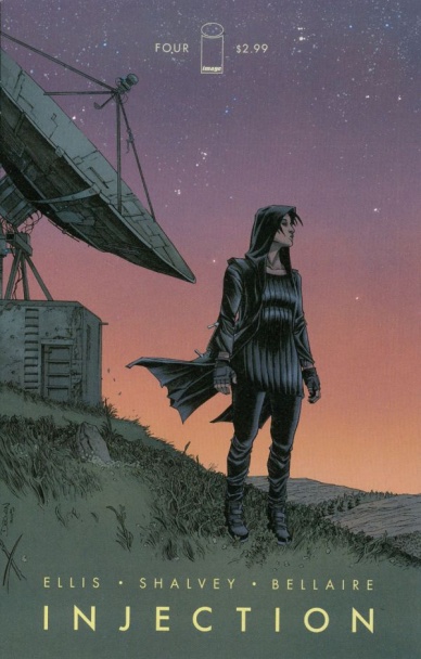
Injection #4
Written by Warren Ellis
Illustrated by Declan Shalvey
Reviewed by Alice W. Castle
One of the things that’s fascinating me about “Injection” is how it always feels like Ellis, Shalvey and Bellaire are presenting a jigsaw with a piece missing. I don’t know if this is particularly a good or bad thing, but it does make for an interesting experience. Piece by piece, each issue has given us a little more grip on the world that “Injection” takes place in as well as the characters that inhabit it. While we knew the five characters the story has been following where part of a governement-sanctioned group doing… something and that something went wrong, the writing purposefully holds those details back. This issue helps piece a little bit more of that mystery together, but the effect is one that I can imagine being polarising. While I am invested in the mystery that “Injection” is weaving, I could definitely understand if others found it simply frustrating instead.
While the writing feels like it’s constantly forcing the reader to piece together a mystery with only half the clues, I think everyone can immediately appreciate how gorgeous “Injection” is. While this issue doesn’t have any of the flashy setpieces that some of the previous issues have had, Delcan Shalvey and Jordie Bellaire continue to impress as one of the greatest art teams working in comics today. Shalvey imbues the world of “Injection” with a quiet, oppressive dread. Something always feels off about the world. The way shadows and inkwashed and coloured by Bellaire brings a pronounced darkness to the world and it is simply beautiful. This comic could have no story and I would still pay full cover price just for the art.
While it’s still early days for this comic, I think it’s safe to say that this issue will be the breaking point for some readers. While the mystery of what The Injection even is and whether the fantasy elements of the story are even real is something I’m invested in, the way the mystery is presented – with huge swaths of the comic’s backstory just omitted from the reader so far and fed piecemeal, issue by issue – is something I can imagine many having trouble with. Regardless, “Injection” is one of the best looking titles on shelves right now thanks to Declan Shalvey and Jordie Bellaire, even if Warren Ellis’ writing is at its most impenetrable here.
Final Verdict: 7.1 – It won’t be for everyone, but it was definitely for me.

King Tiger #1
Written by Randy Stradley
Illustrated by Doug Wheatley & Rain Beredo
Reviewed by Matthew Garcia
In the 90s, Dark Horse launched this shared universe line of books called Comics’ Greatest World. It had tons of characters and tons of action, capitalizing on whatever exxxxxxxtreme and awesome thing the creators were watching. It was most definitely a product of its time period. It’s been like 20 years, but for the first time ever, one of the characters, the martial arts-based sorcerer King Tiger, has finally gotten his own series. Straight out of Cinnibar Flats, King Tiger is trying to achieve balance, train an assistant, chill with his girlfriend, and lock away demons in a huge portal. However, something nefarious is brewing far out in the Nevada desert.
For such a colorful book that promises so much action, it’s actually relatively quiet. Most of the issue is catching us up to speed on what’s happened in the greater CGW universe. I’m going to be honest with you: I had never heard of the Comics’ Greatest World line of comics; I didn’t have any idea that this was the latest chapter is some bigger, more grandiose story. But I never felt lost. The exposition scenes may have spent way too much time giving us the appropriate backstory and referencing all these crazy events from somewhere in the past, but it was a decent enough introduction into the world we’re dealing with.
Even if King Tiger’s first solo story’s hitting shelves in 2015, the art still has a 90s vibe to it. Wheatley thankfully steers away from perspective-shattering staging or odd, overly elaborate angles. His art is clear, but it never felt to me like his characters move. They’re like snapshots of people in the middle of the action, and going from panel to panel felt more like a slideshow than some living story. Beredo’s heavily rendered colors also keep the book still, especially because he renders some pages fairly realistically but other times just does some basic shadowing.
Continued belowThe story picks up at the end, when Stradley and Wheatley finally finish filling in the blanks and King Tiger gets to meet monsters. You can feel their collective energy picking up once the plot starts, and it’s definitely the more fun segment of the book. “King Tiger” is a four-issue series, and maybe a quieter start was necessary as the pandemonium of the rest of the plot kicks in, but I sort of wish they balanced out that tone better when catching us up.
Final Verdict: 6.3 – a delayed liveliness gives this book an odd, quiet tone that doesn’t really fit with what the book wants to be.

Star Trek/Green Lantern #2
Written by Mike Johnson
Illustrated by Angel Hernandez
Reviewed by Jess Camacho
Crossovers can be tricky business but none more trickier than big brand mashups like “Star Trek/Green Lantern”. A creative team could easily fall into the trap of simply referencing past events or throwing in tons of quotes just to serve fans in the most basic way. At two issues in, Johnson and Hernandez have avoided that but also haven’t offered quite enough in terms of what the conflict of this story is.
“Star Trek/Green Lantern” #2 picks up right where issue one left off with members of the Enterprise gaining power rings. Hal Jordan, seeing that one of the Klingons has acquired a yellow ring, springs into action to save the Enterprise and fight the newly powered up Klingon. Johnson writes some really good dialogue here as the characters settle into their new powers and he definitely has a sense of humor about this series as a whole. I like that Kirk and Spock don’t have rings at this point because it does give other characters a chance to be spotlighted and save the day. Hal Jordan especially doesn’t come off too cocky and unlikable as some writers have written him before. The problem is that there’s not much of a plot to speak of. This is now two issues in and I couldn’t tell you what the conflict here is. The last page promises some big things but for all the fan service here, I need a little bit more meat to the story.
Hernandez’ art is strong. I don’t have a fondness for the new movies so I wasn’t really expecting the characters to look like those actors. Regardless, the character work is strong. The powered up characters wear clothing that immediately fits them in with the rest of the corps but also still feel very Star Trek-y. The character expressions of Uhura and Chekov are pretty much perfect as they capture both confusion and excitement simultaneously. It’s a visually fun book that captures the spirit of both franchises perfectly.
Final Verdict: 7.3 – Really fun with lots of stuff that works but needs more a concrete plot.

String Divers #1
Written by Chris Ryall
Illustrated by Nelson Daniel
Reviewed by Brian Salvatore
The idea of comics coming from a toy line is a very 1980s concept – G.I. Joe, He-Man, etc – but there is almost nothing, aside from that off-the-page inspiration, that feels dated about “String Divers.” Ashley Wood’s toy creation translates seamlessly into the comic medium, and borrows a heavy dose of comic inspiration along the way.
The book is about androids that have been developed to explore string theory, and make it less of a theory and more of a known absolute. They are investigating the subatomic timelines/universes known as ‘strings,’ and trying to learn about them and save them from destruction. The characters give off a serious Metal Men vibe, where each android has a personality built into their specific skill set. In fact, the Metal Men might be the closest comics analogue, especially when you factor in the relationship between creator and android.
Visually, this book is a challenge for Daniel, as the Divers all look exactly the same, save for their coloring (and some very subtle eye work), and so he has to take bits of their personality and adapt that into body language, while still reinforcing the idea that these are androids who are only capable of their programmed actions. Daniel does exactly that, though – if I were a little more familiar with the characters, I think I would be able to distinguish them from the way they stand around – Red cowering, Orange slouched and overthinking, etc. The human characters, similarly, have body language that tells us more about them than their limited dialogue does, and Daniel really does a fine job at catching the reader up in what is, essentially, a middle chapter in this team’s lifespan, and give us a good idea as to what is going on.
Ryall does that as well, aside from a (very necessary) page or so of expository text, everything you need to know about the book is told to you through the voices of the characters, and is presented as straightforwardly as possible. The last few pages really up the stakes for the book, and certainly piqued my interest going forward. While it may not quite be “G.I. Joe” yet, there’s hope for the book to outgrow the ‘toy to comics’ stigma.
Final Verdict: 8.1 – A solid debut, and one that makes me want to drop $40 on an action figure


